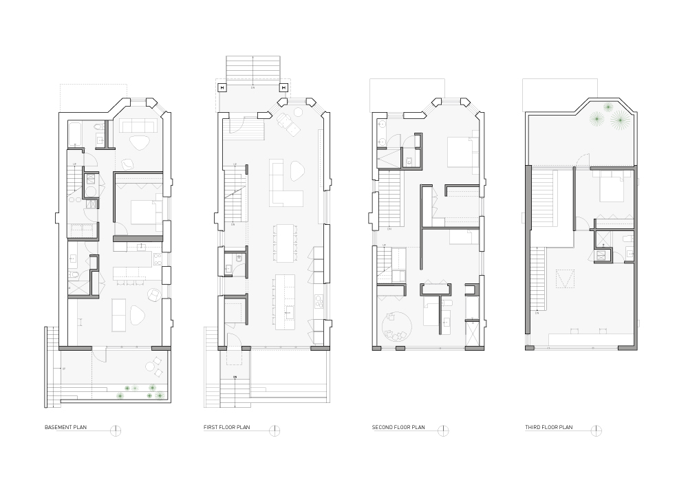
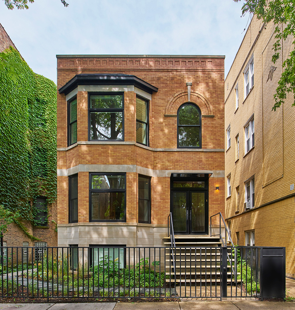
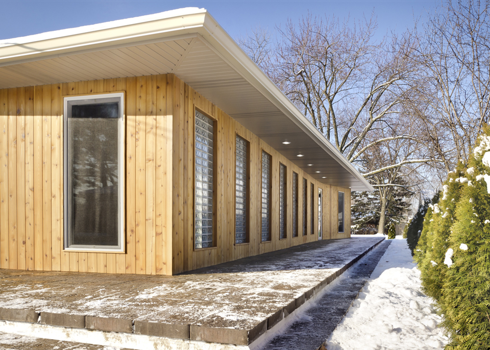
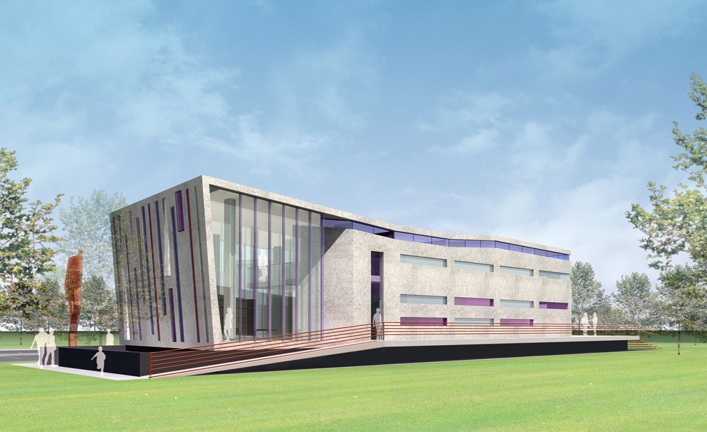
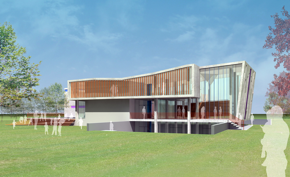
Three Oaks House
Type: Residential - New Construction
Program: Single-Family Home
Location: Three Oaks, Michigan
Construction: Van Overberghe's Construction
Status: In Construction
Brief: New 3,800 SF Single-Family Residence with Guest House and Pool
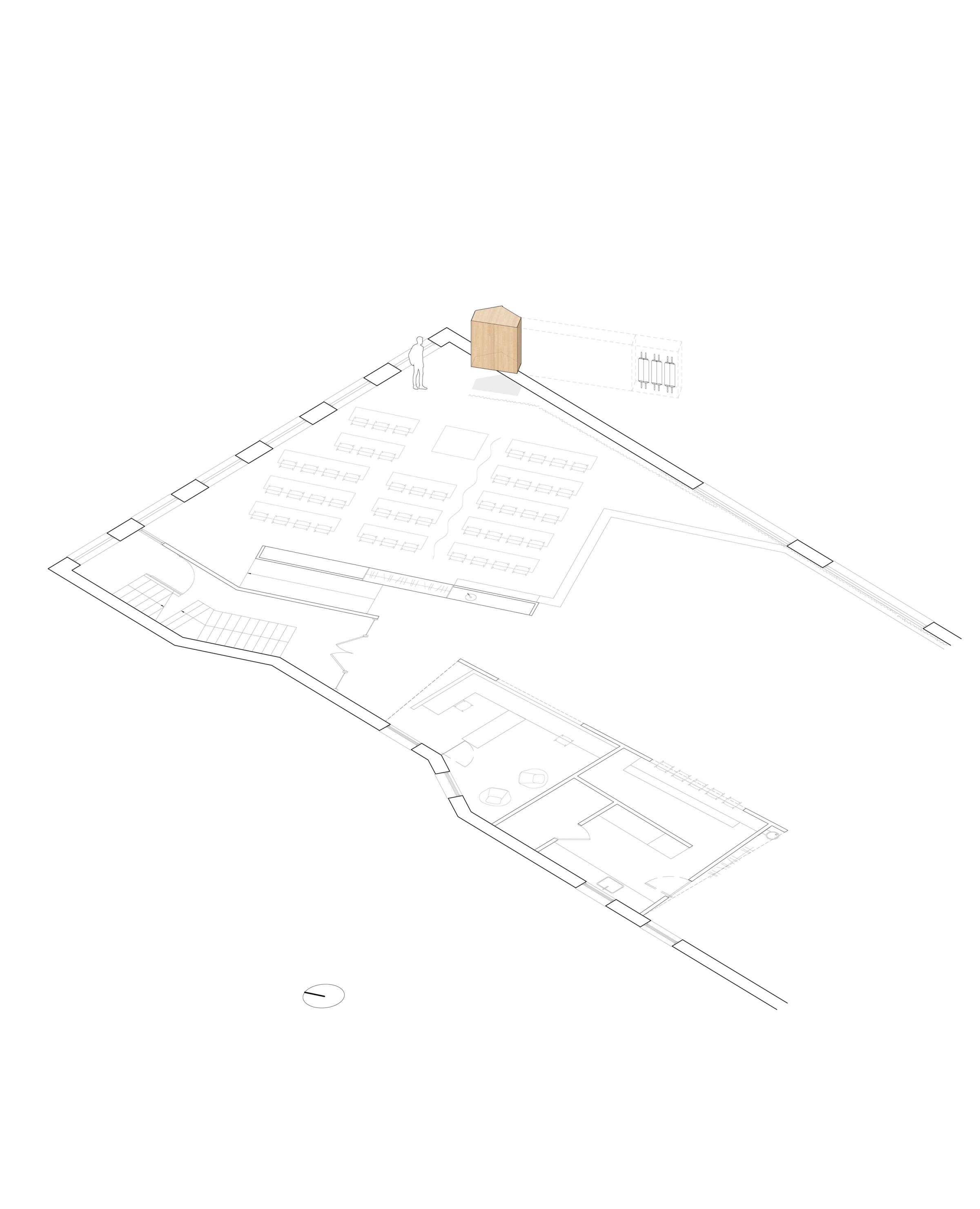
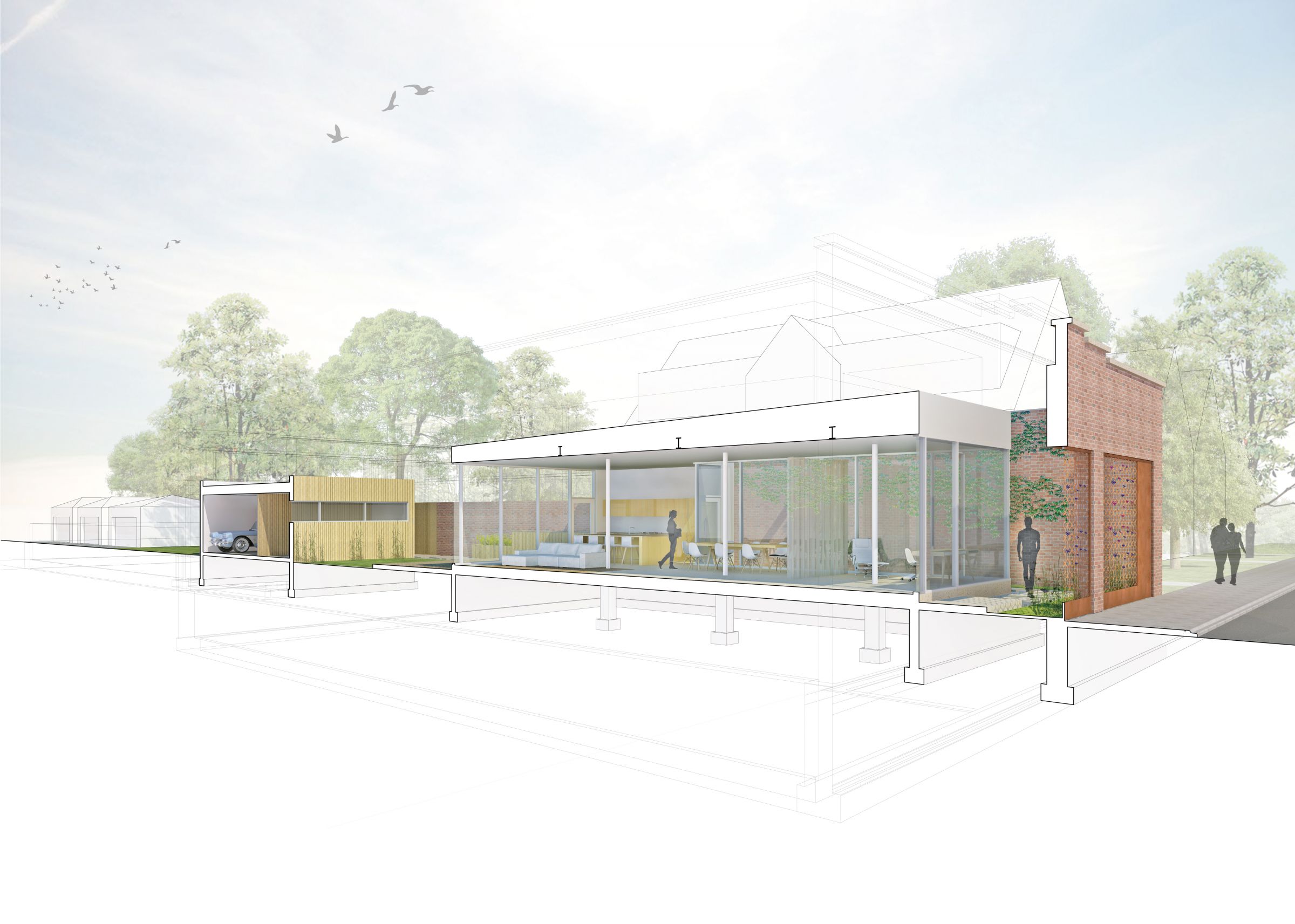
Site
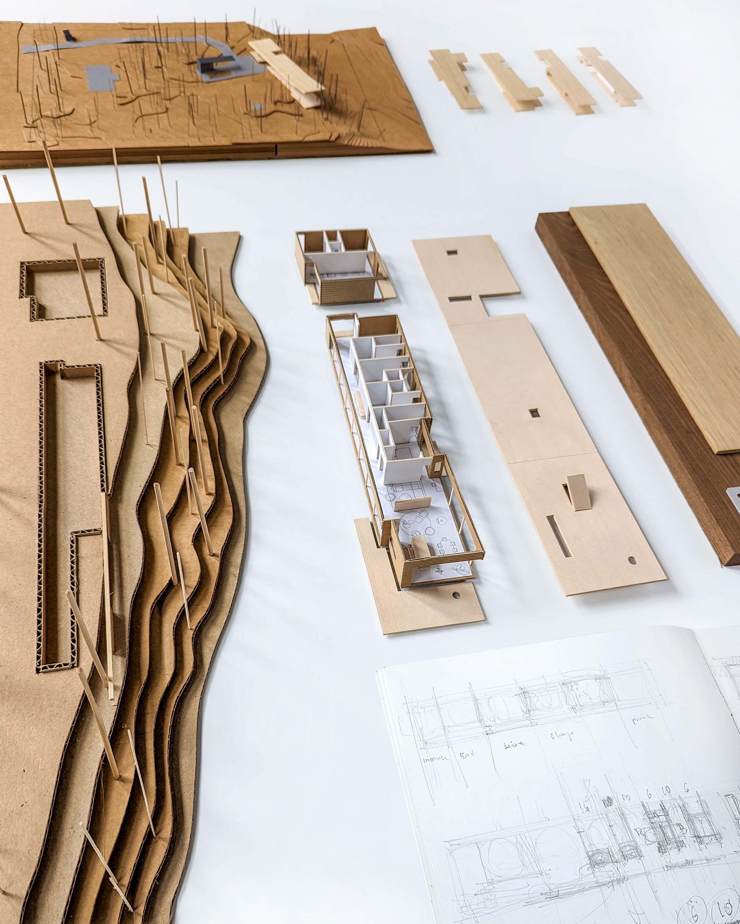
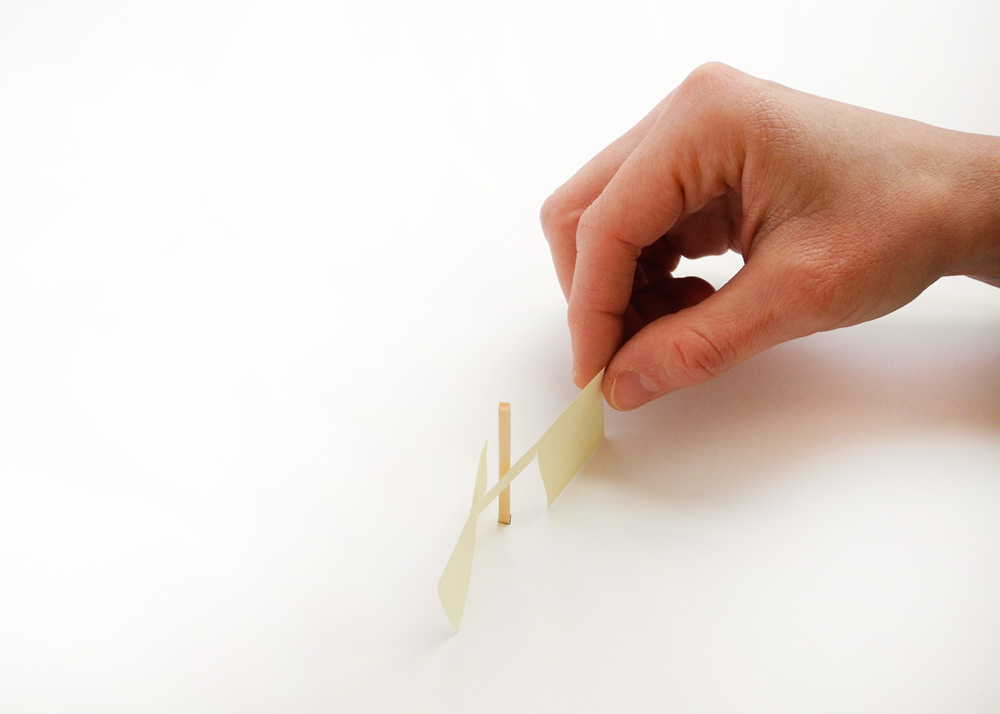
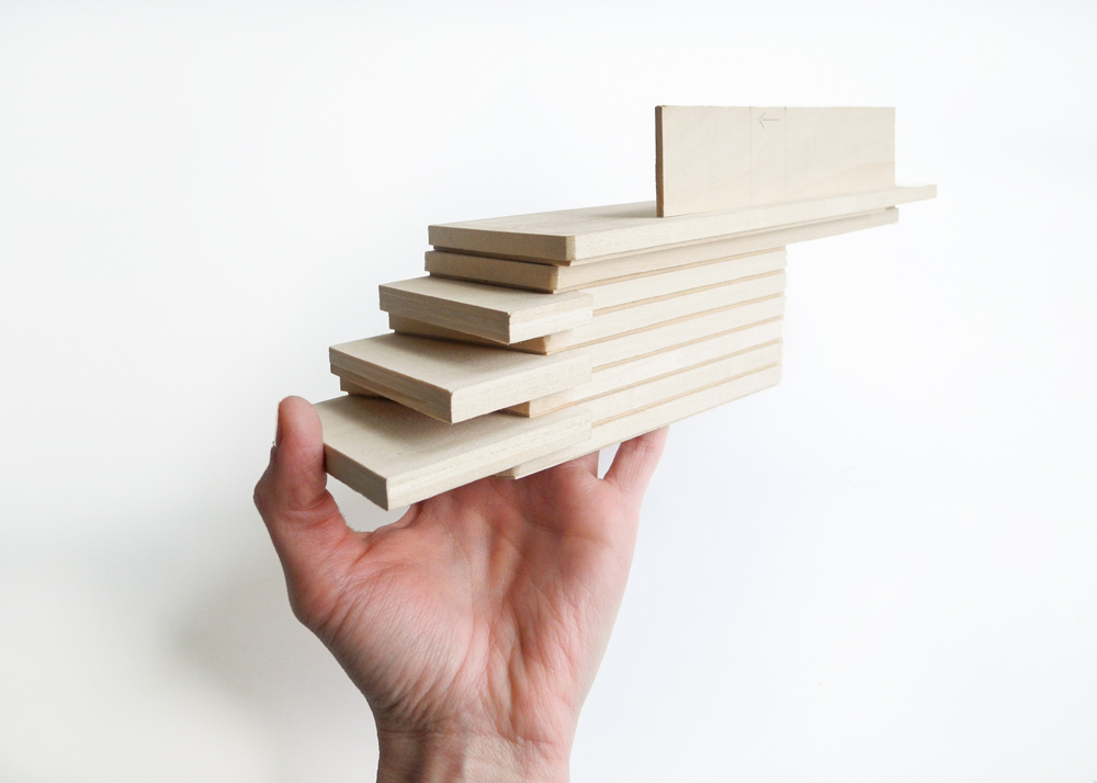
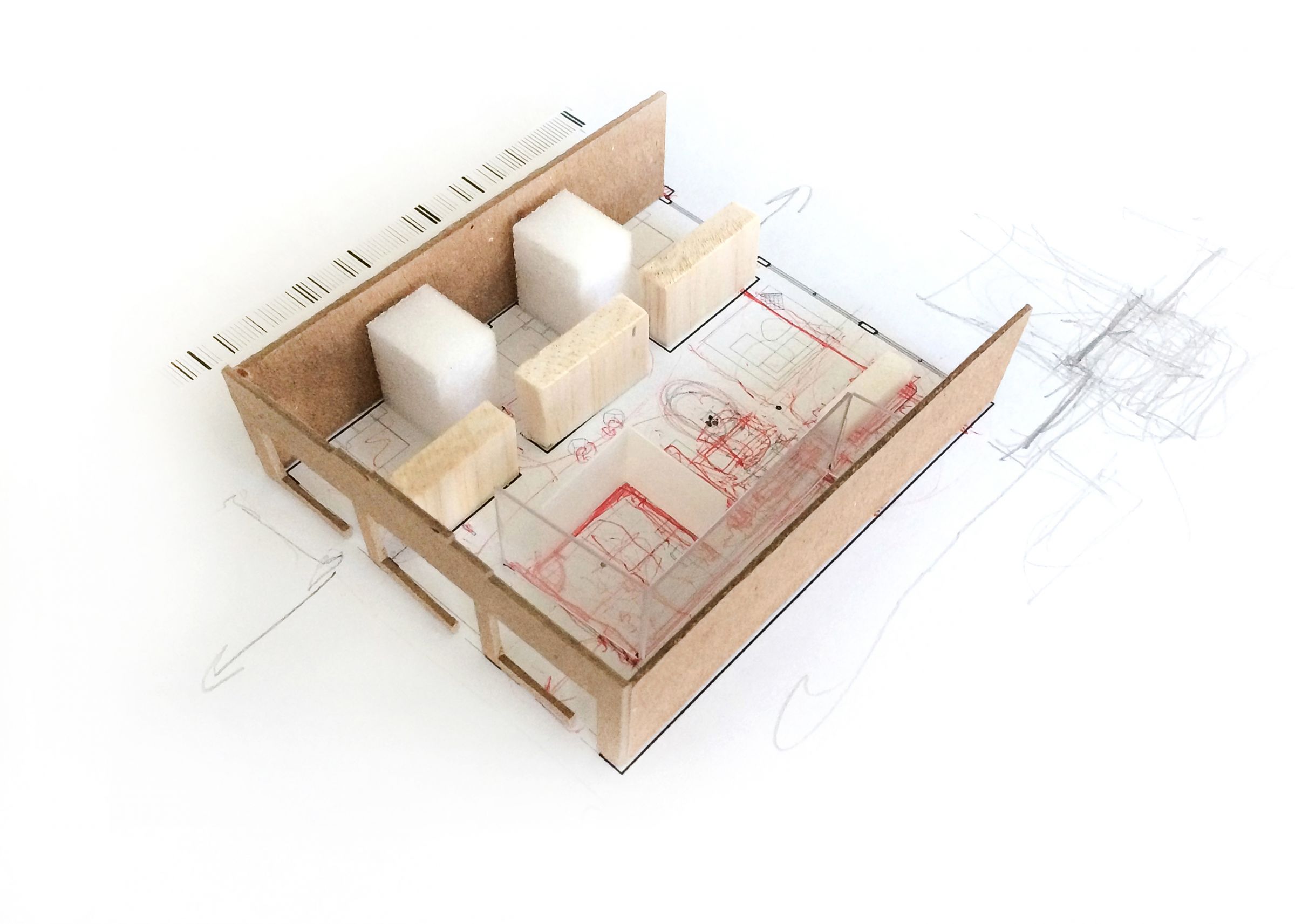
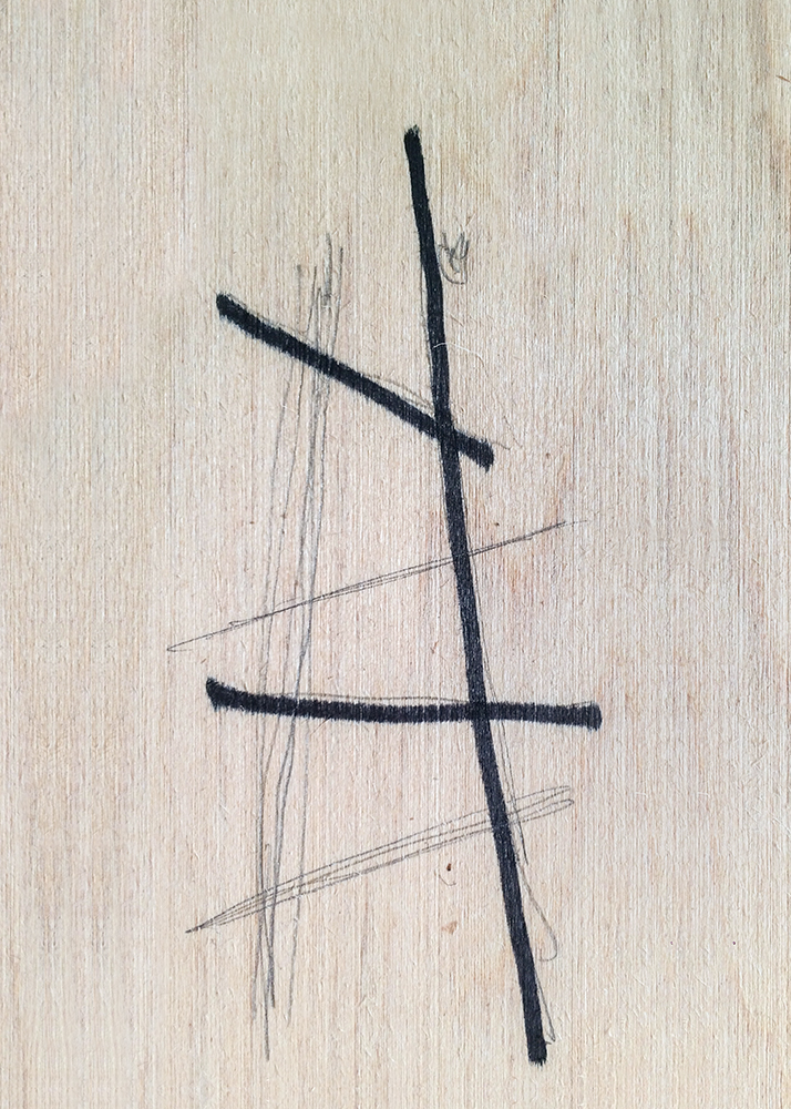
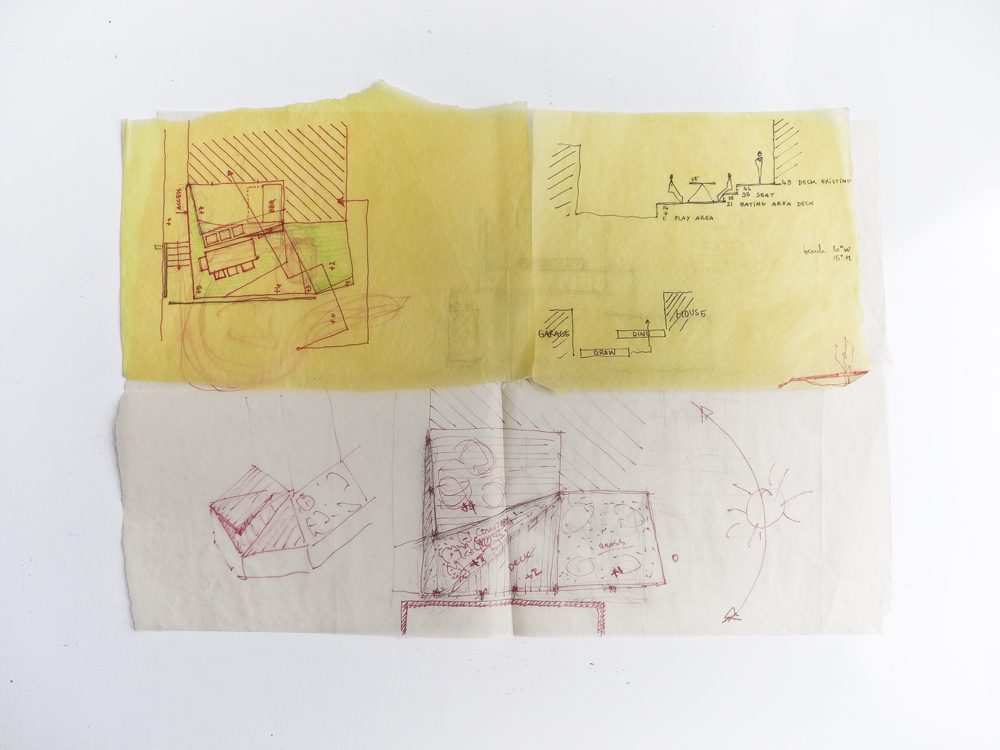
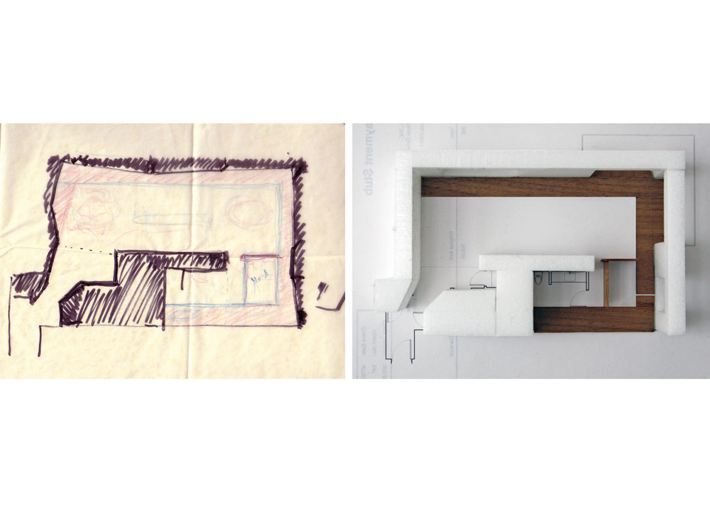
Concept Sketch
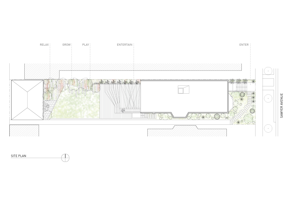
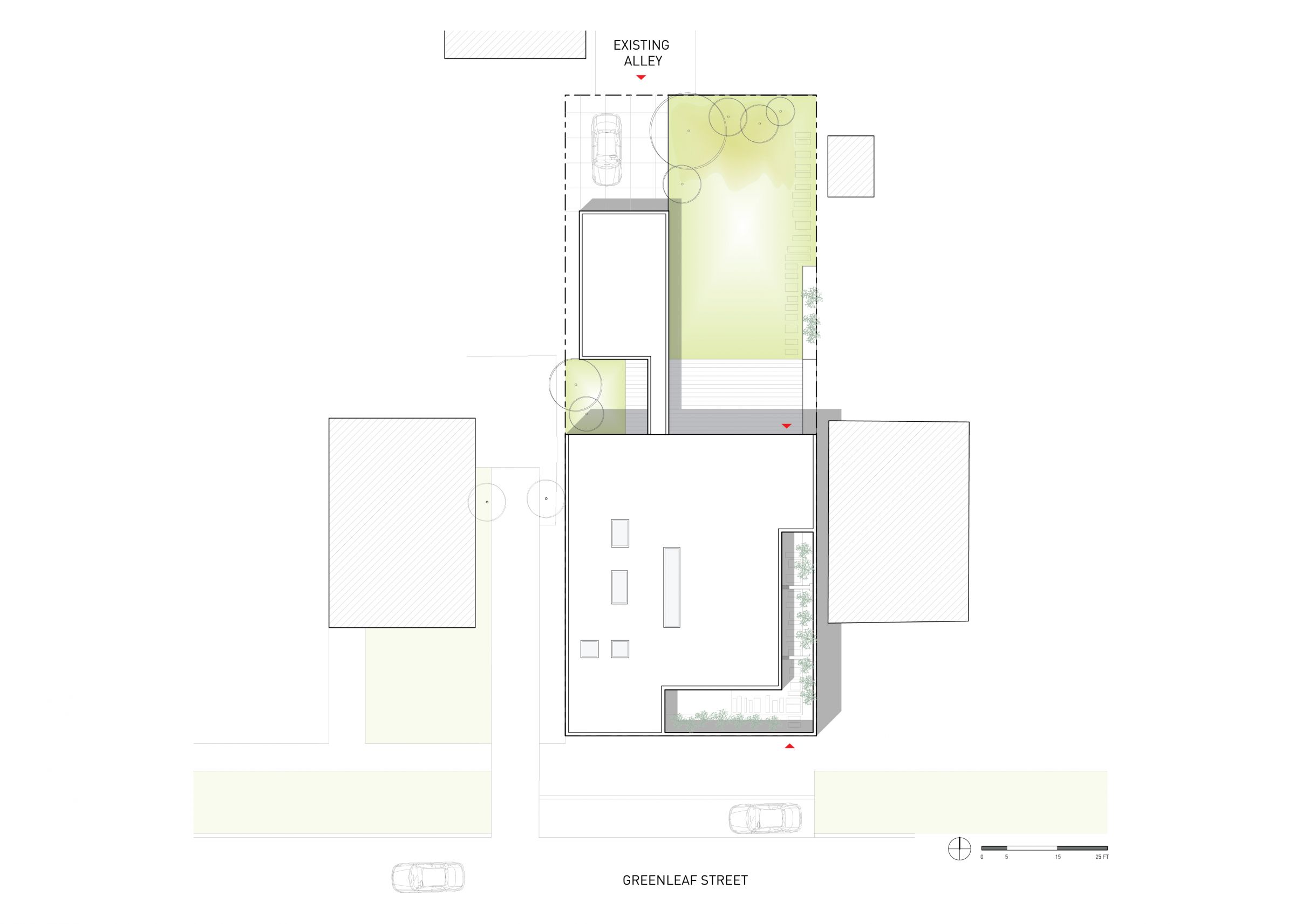
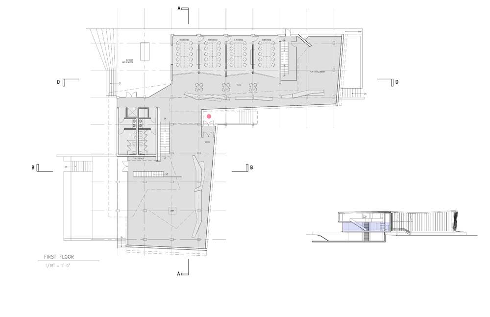
Site Plan
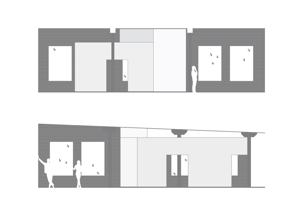
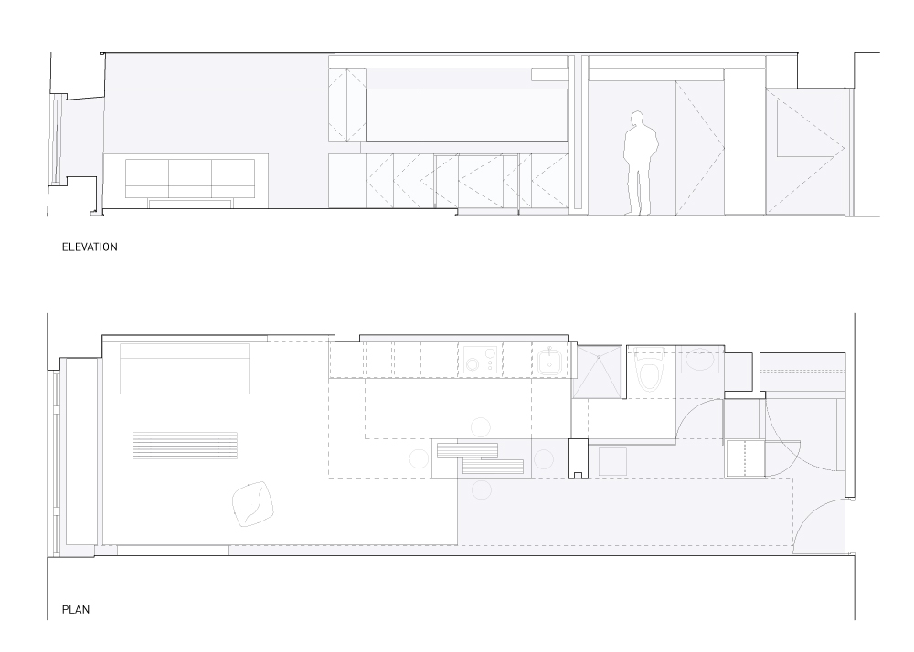
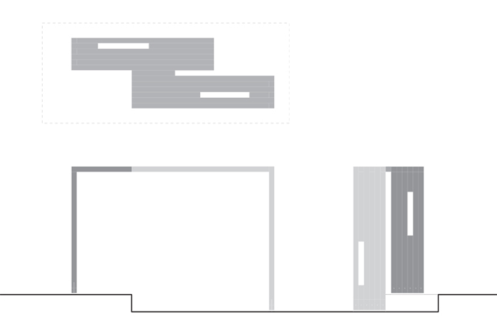
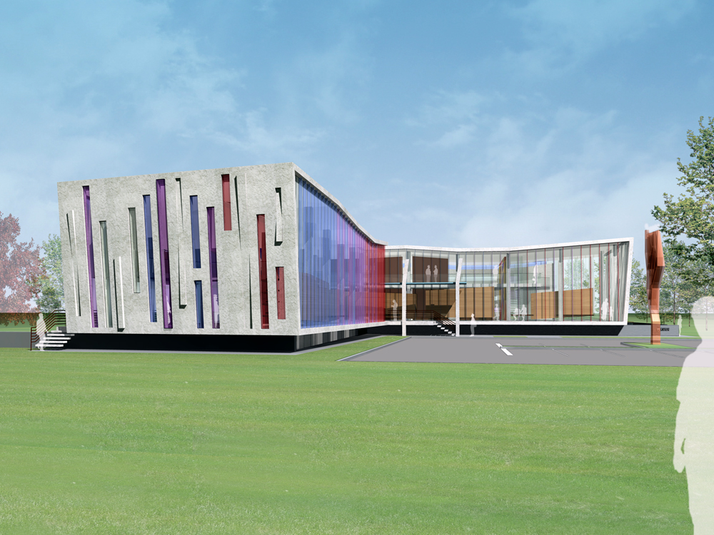
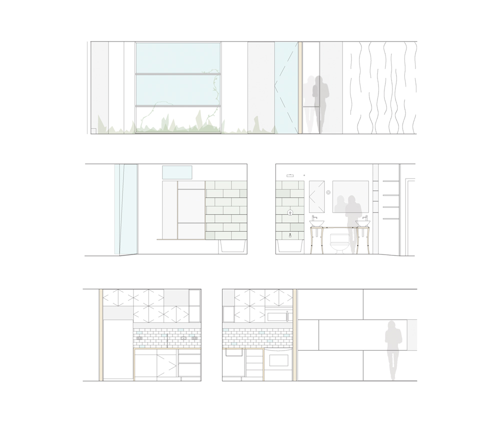
Elevation
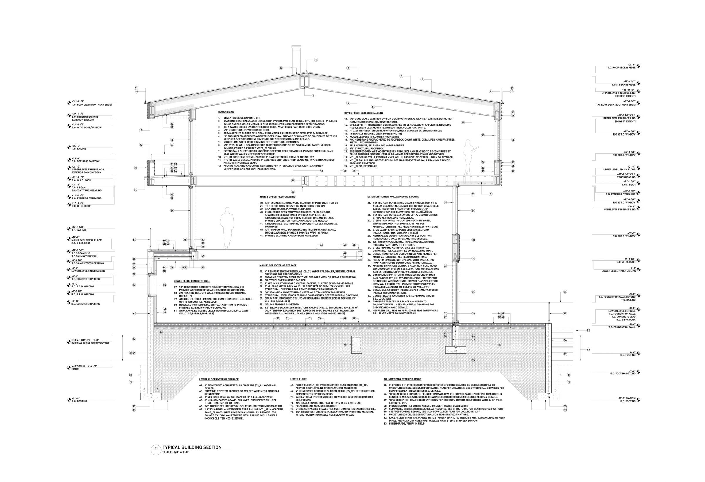
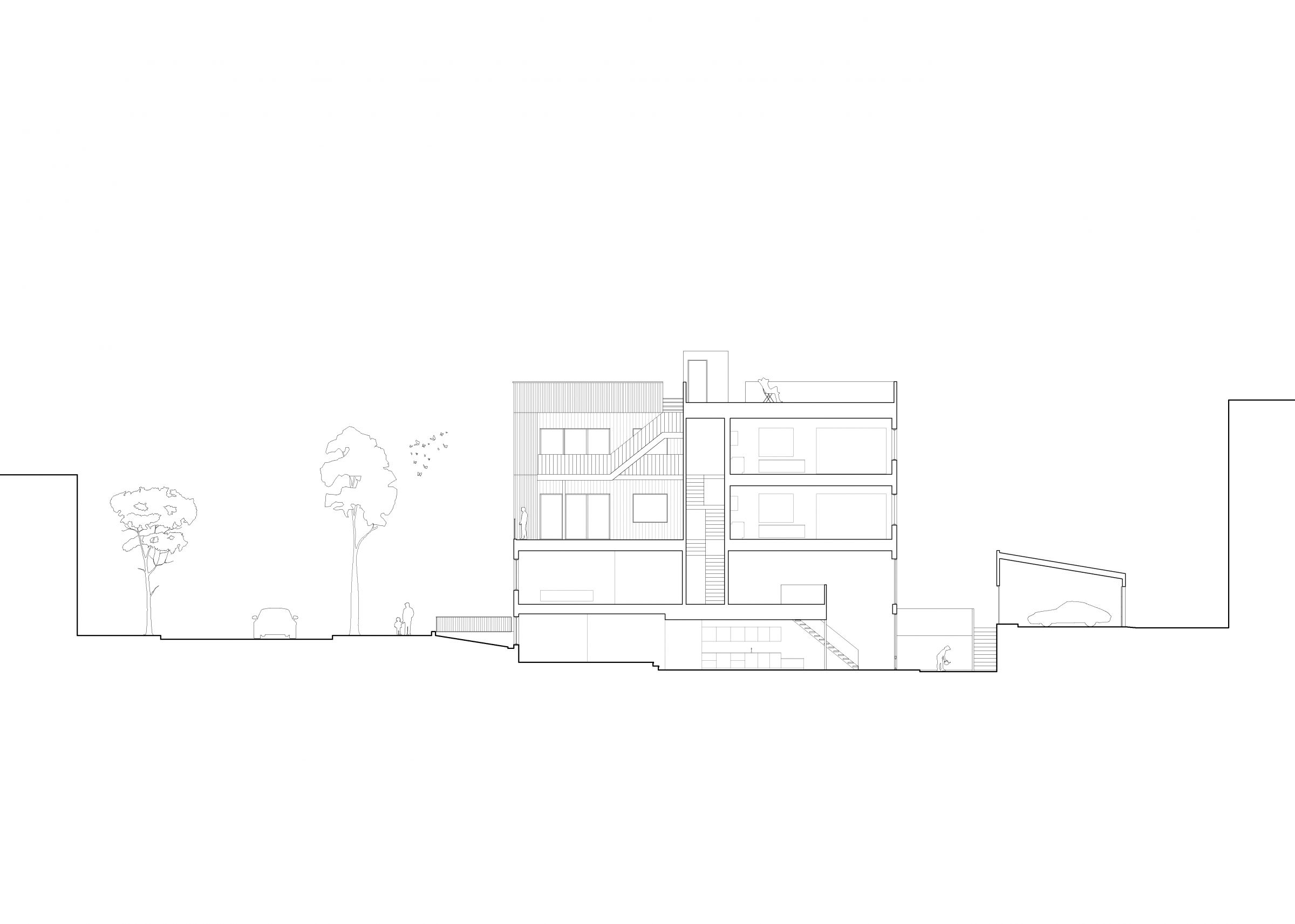
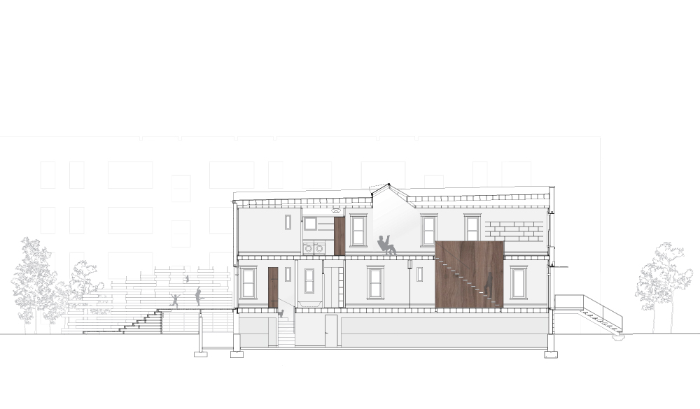
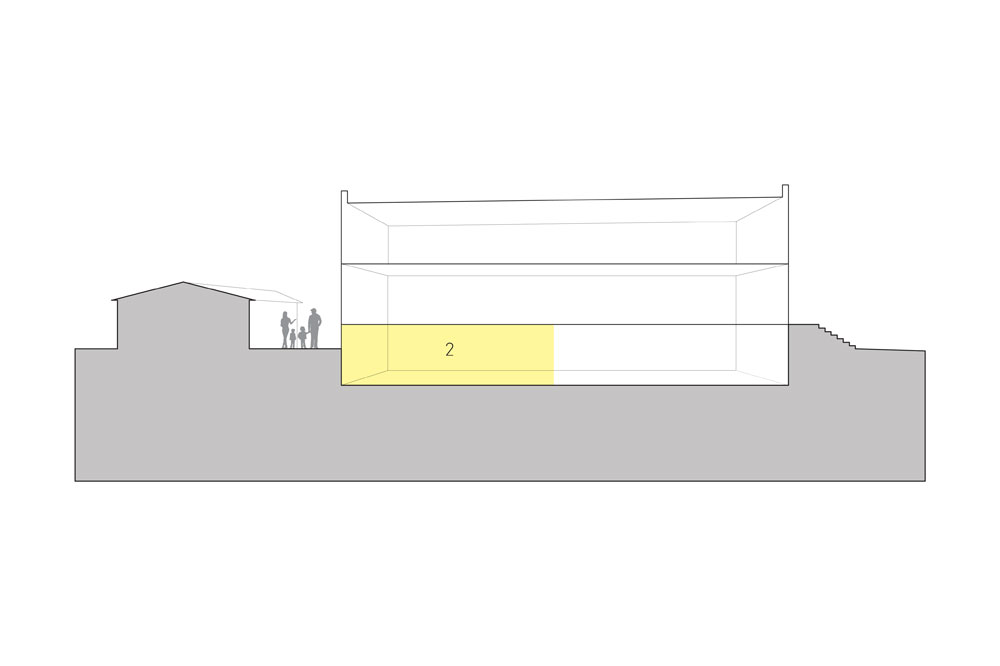
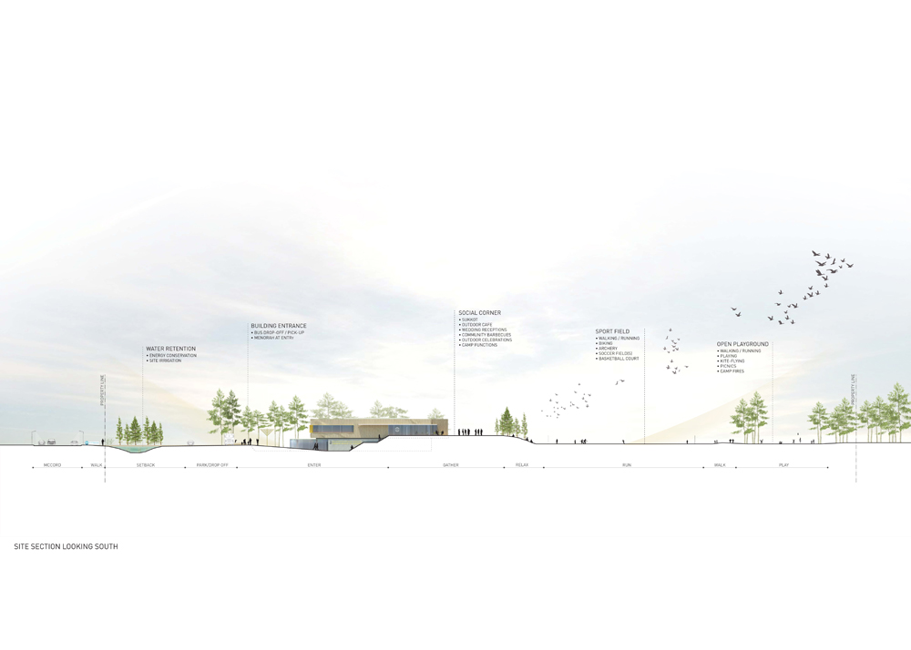
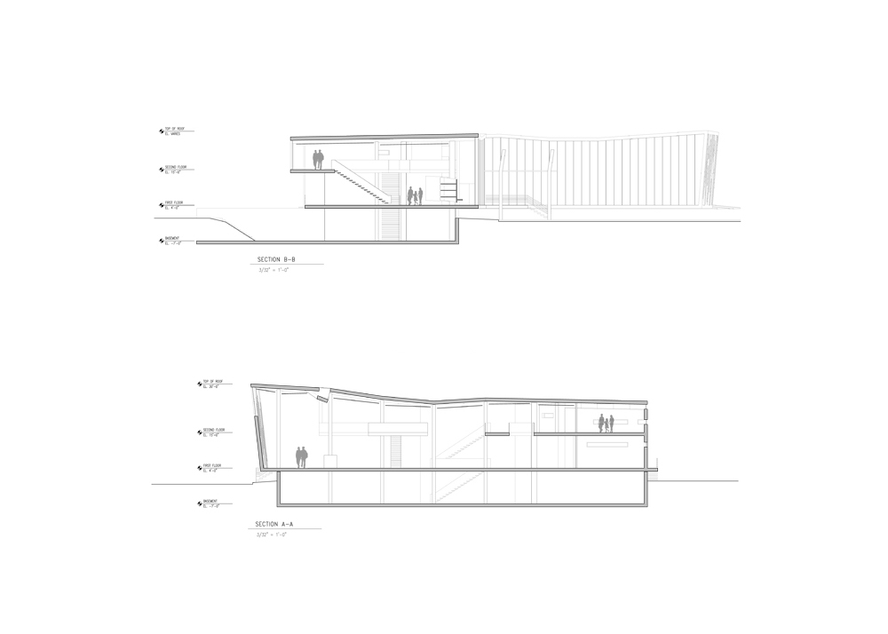
Section

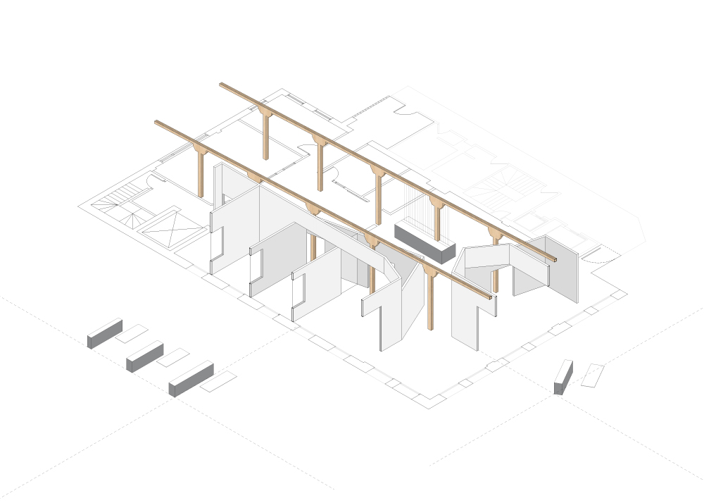
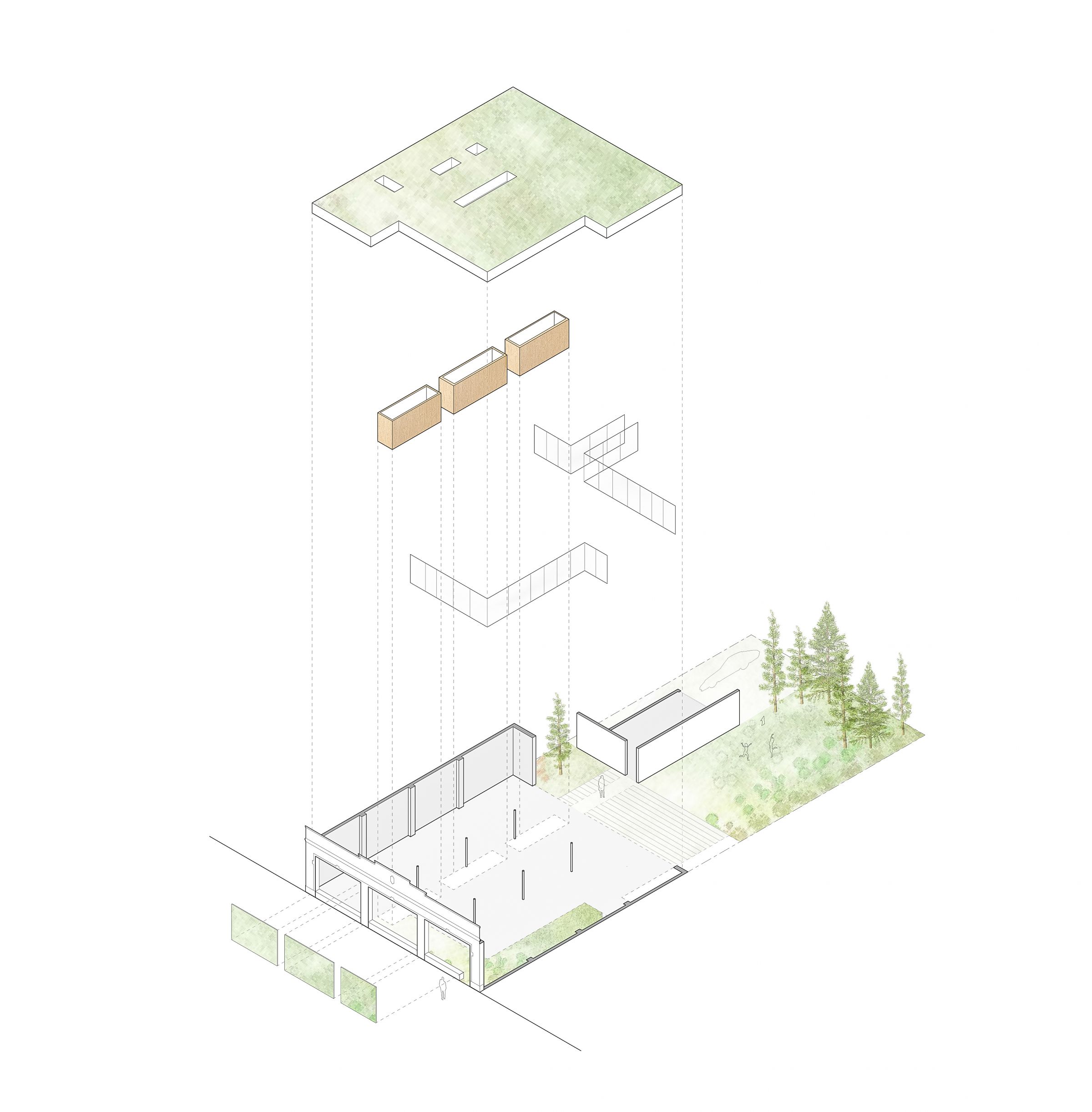
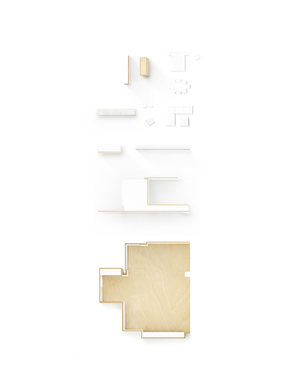
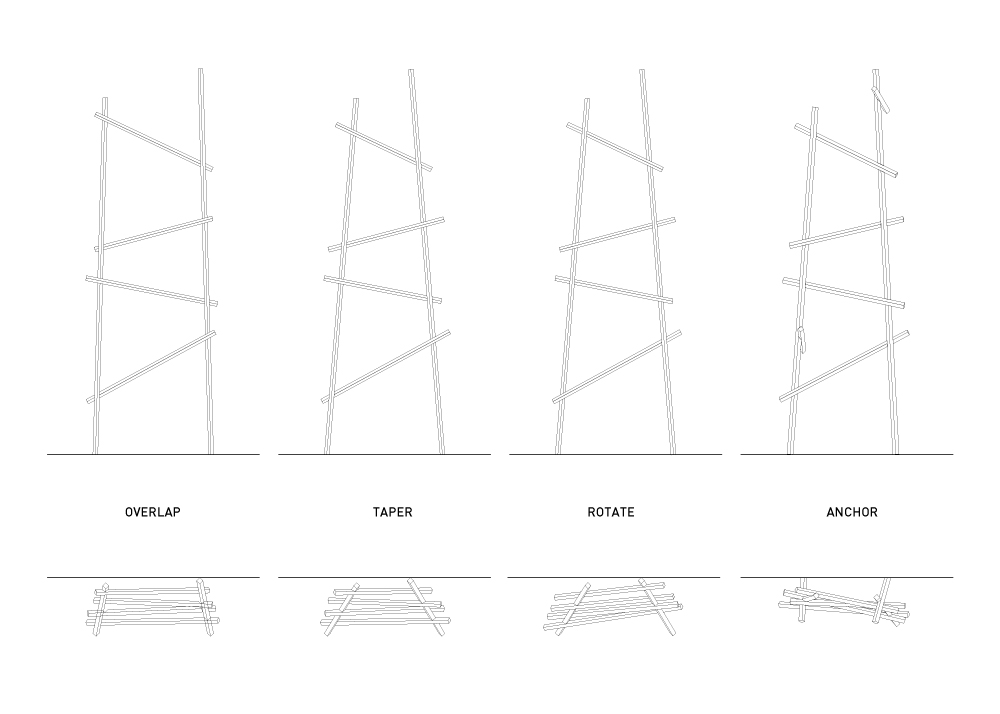
Organization Diagram
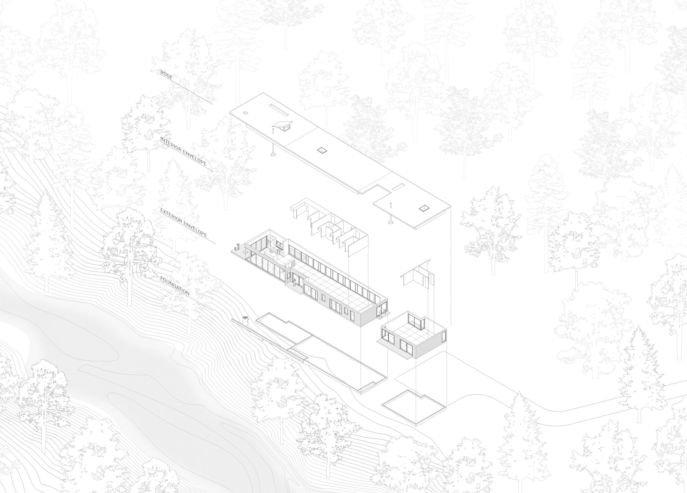
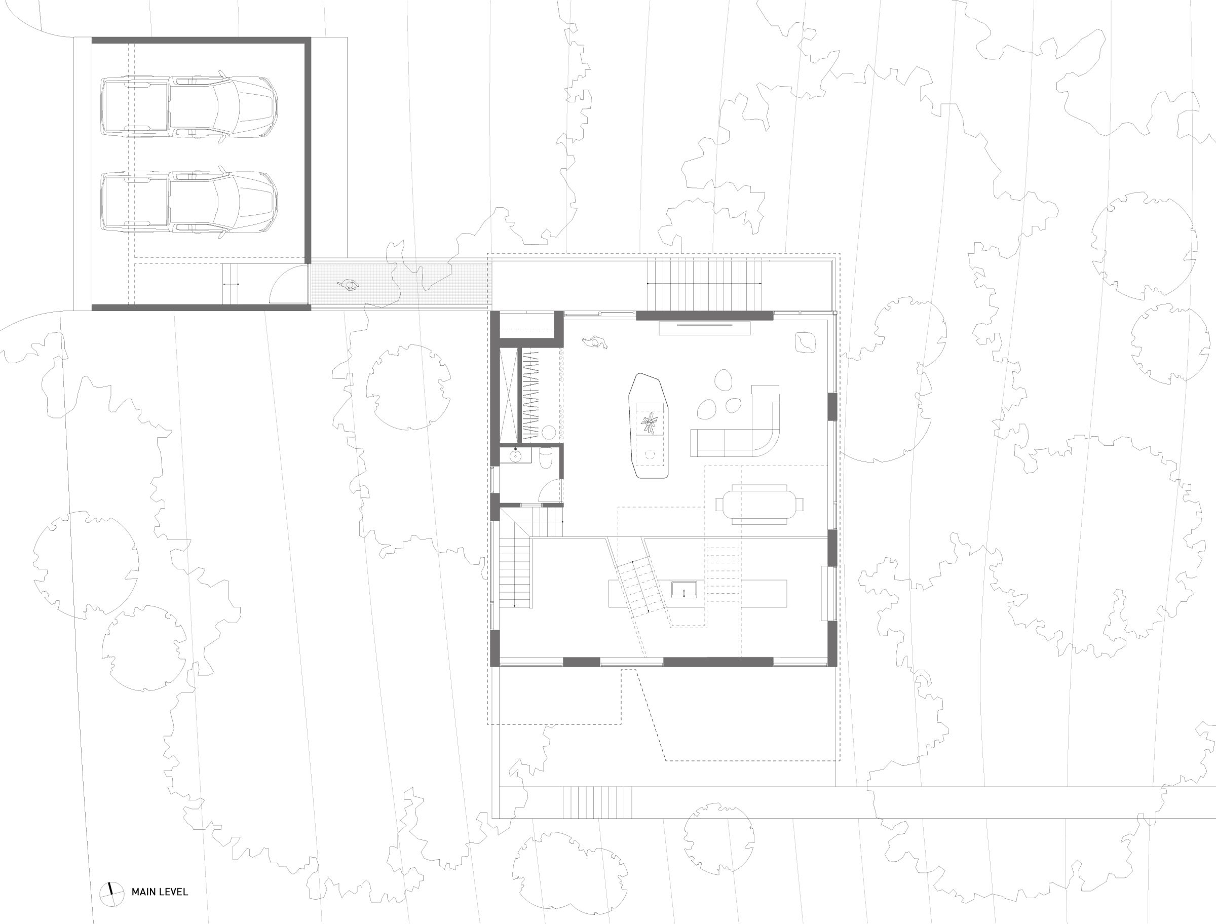
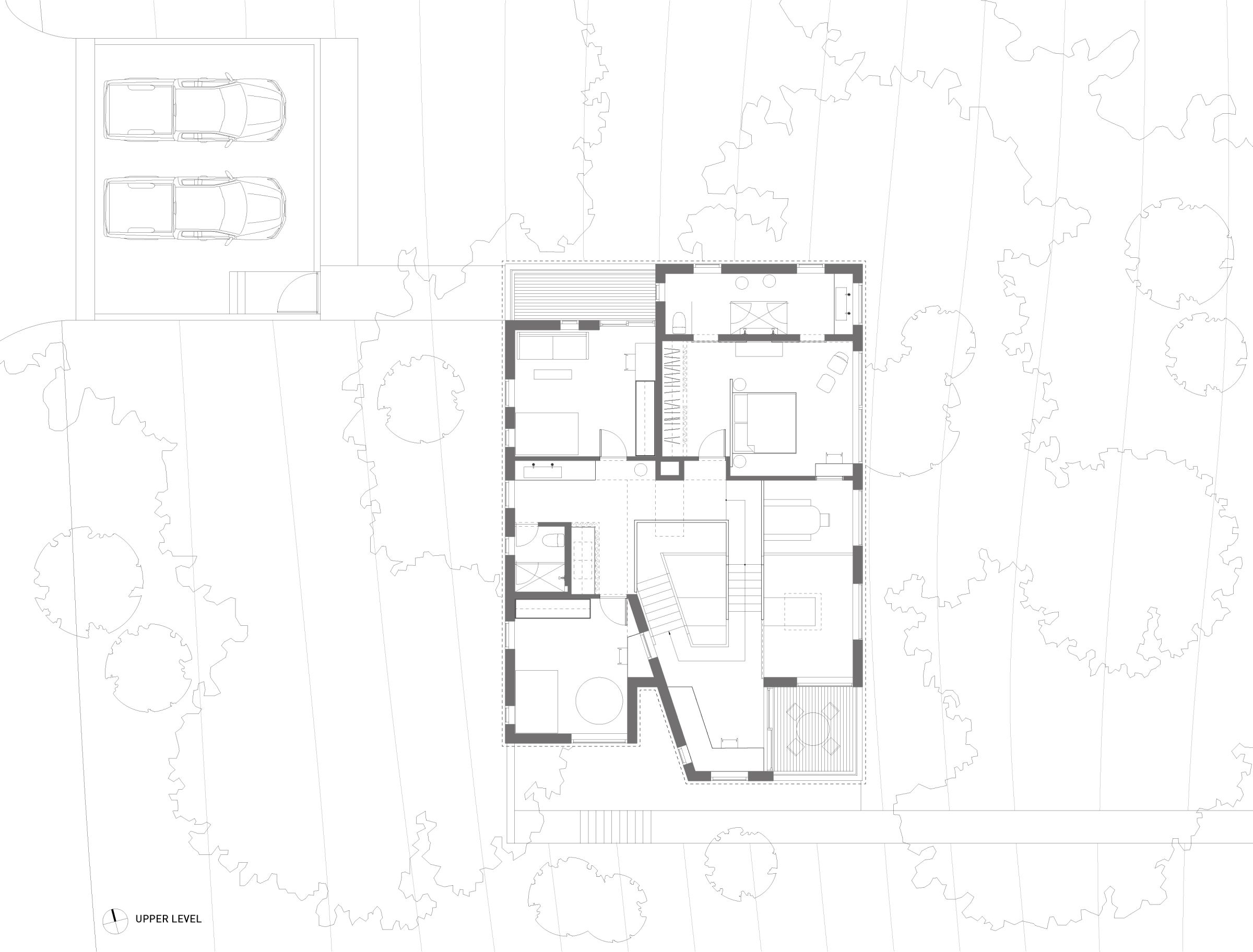
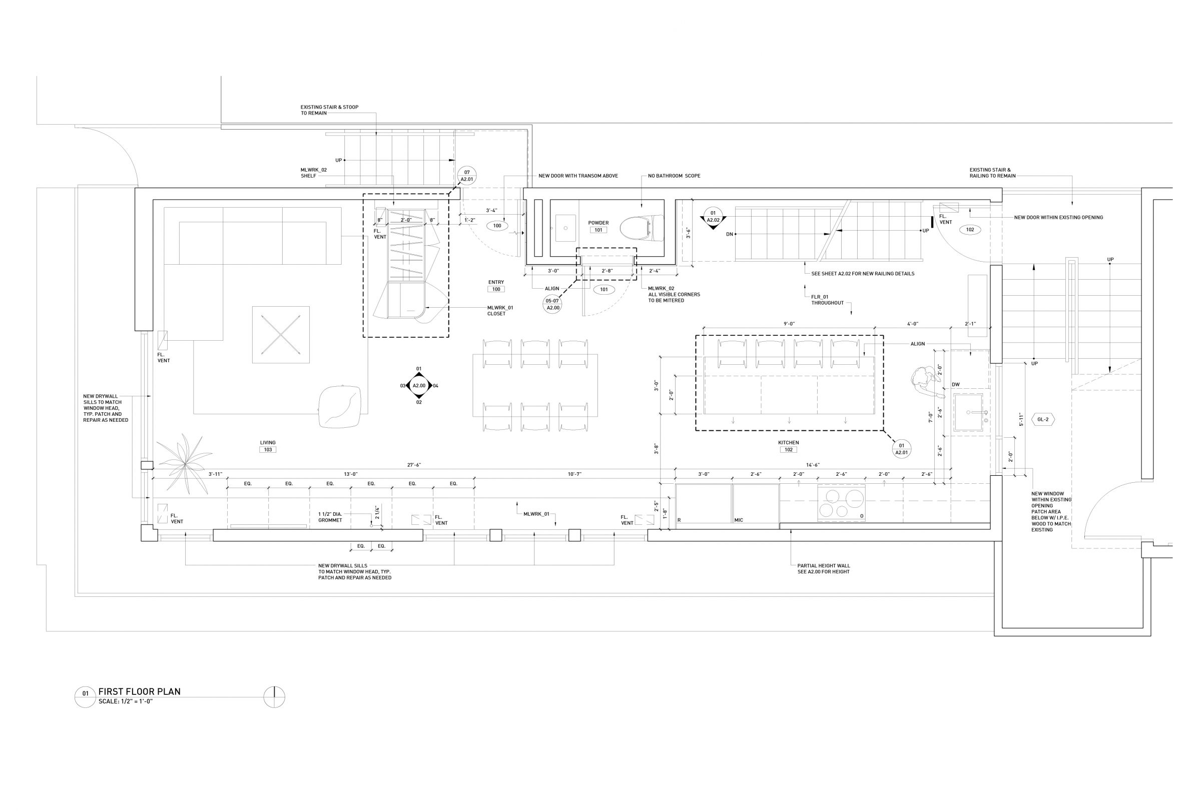
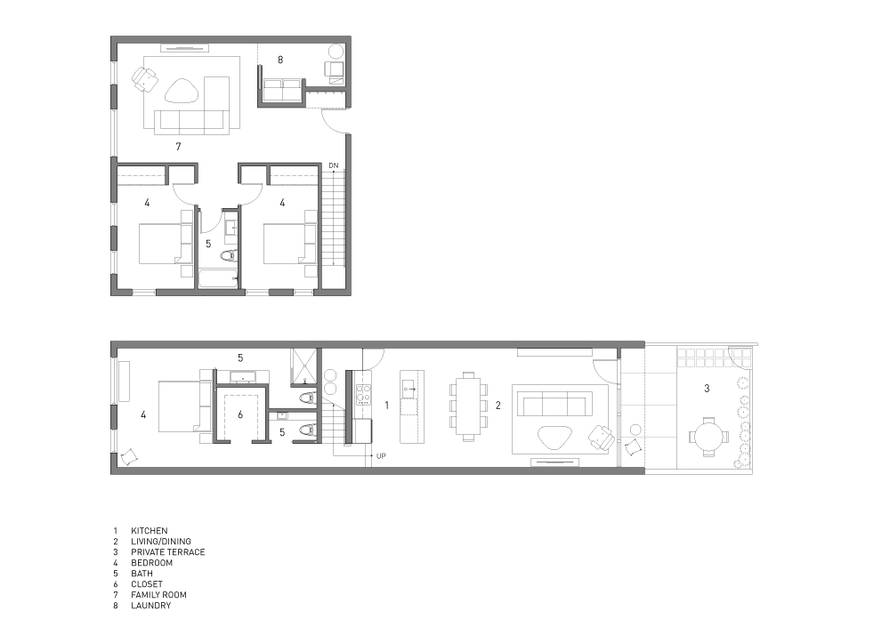
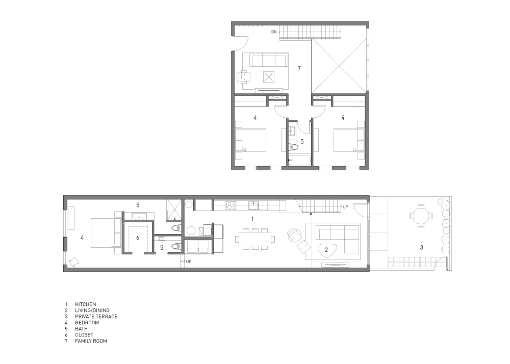
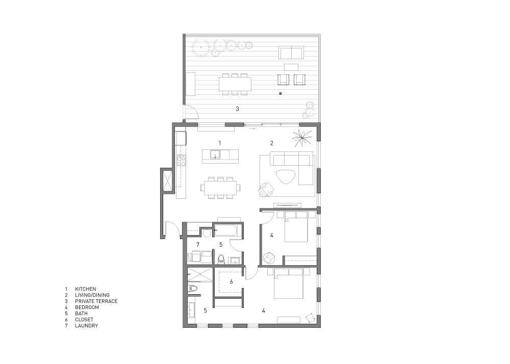
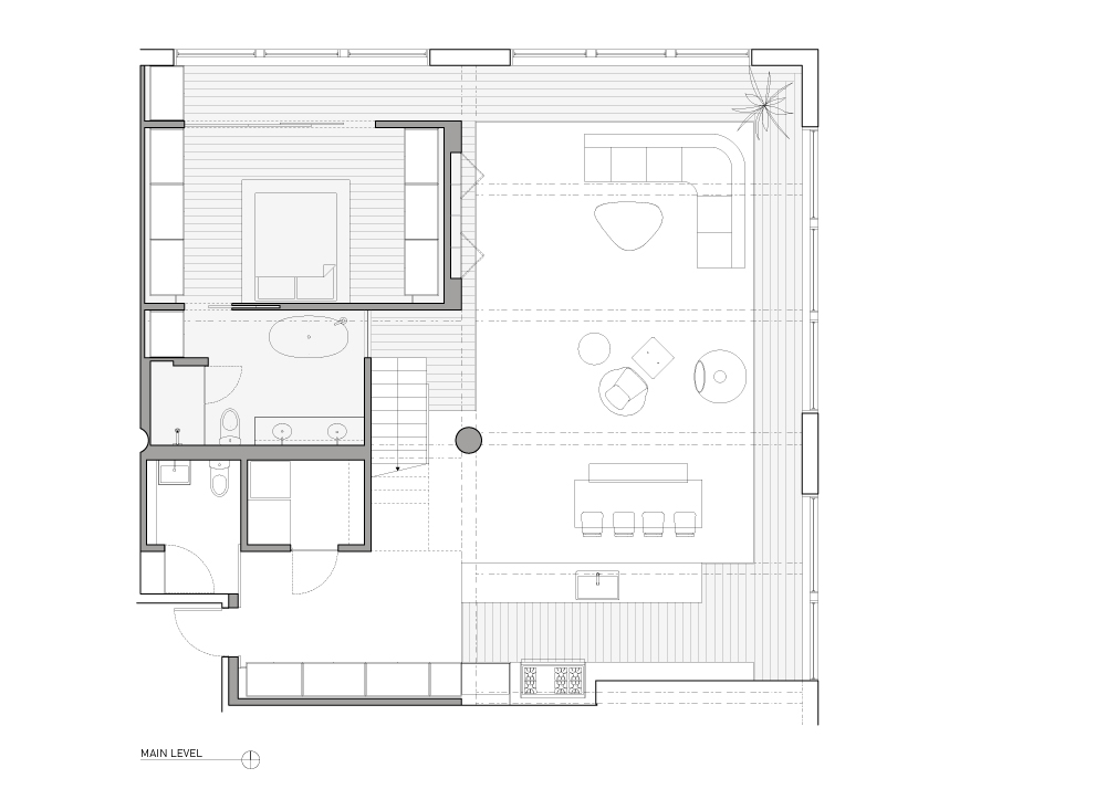
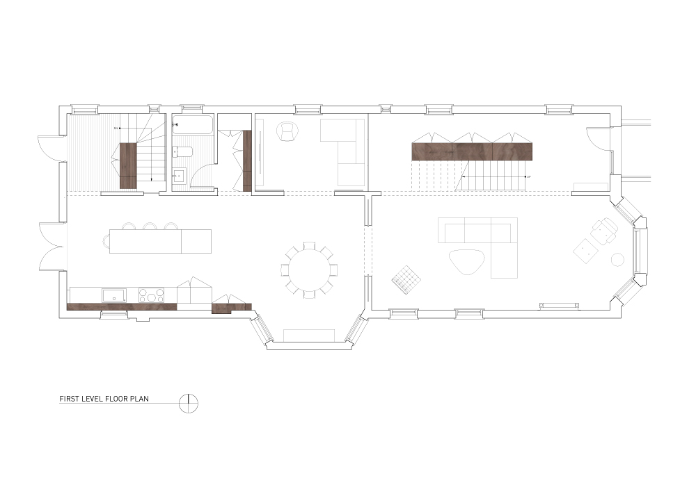
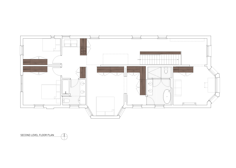
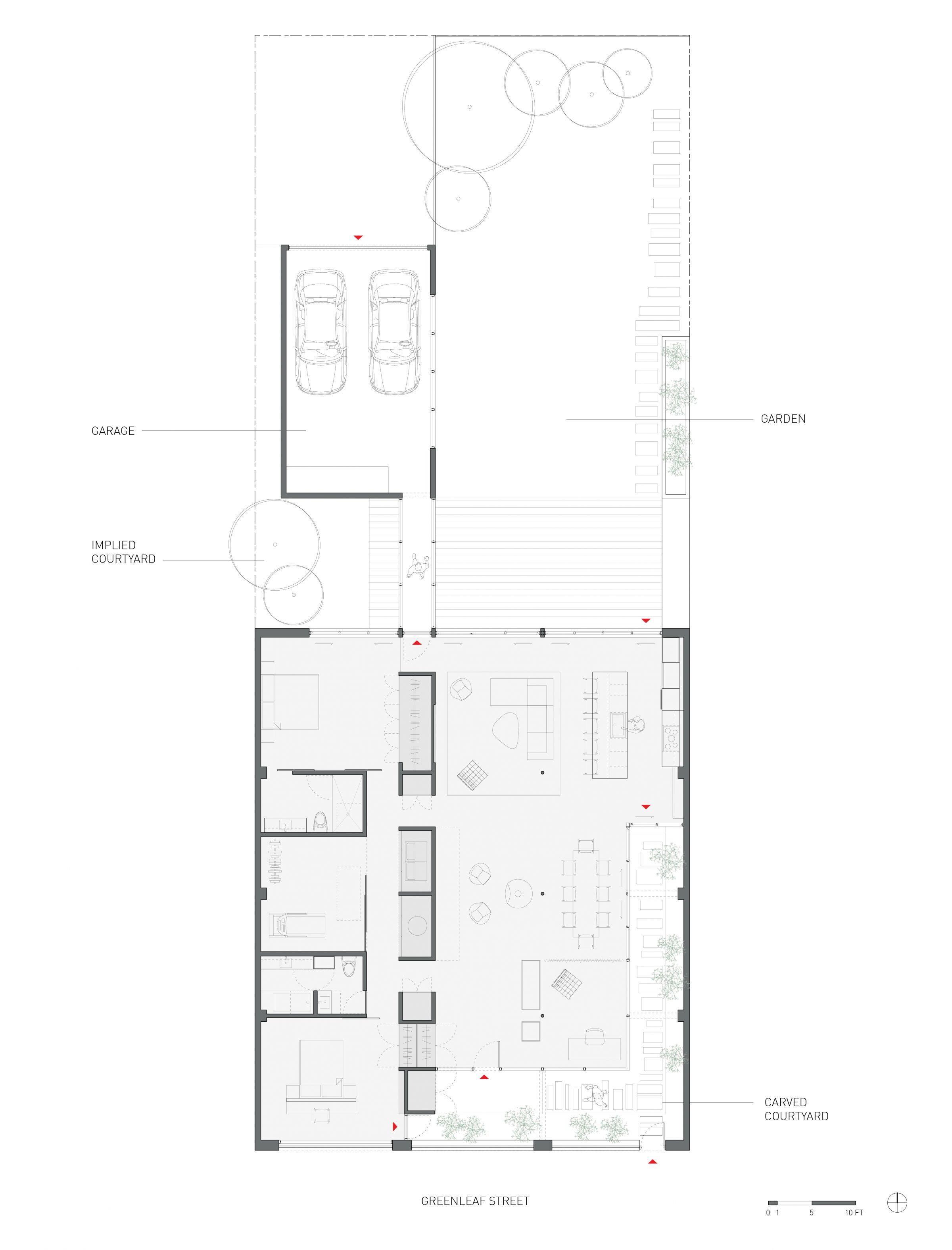
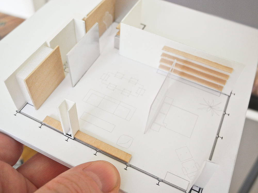
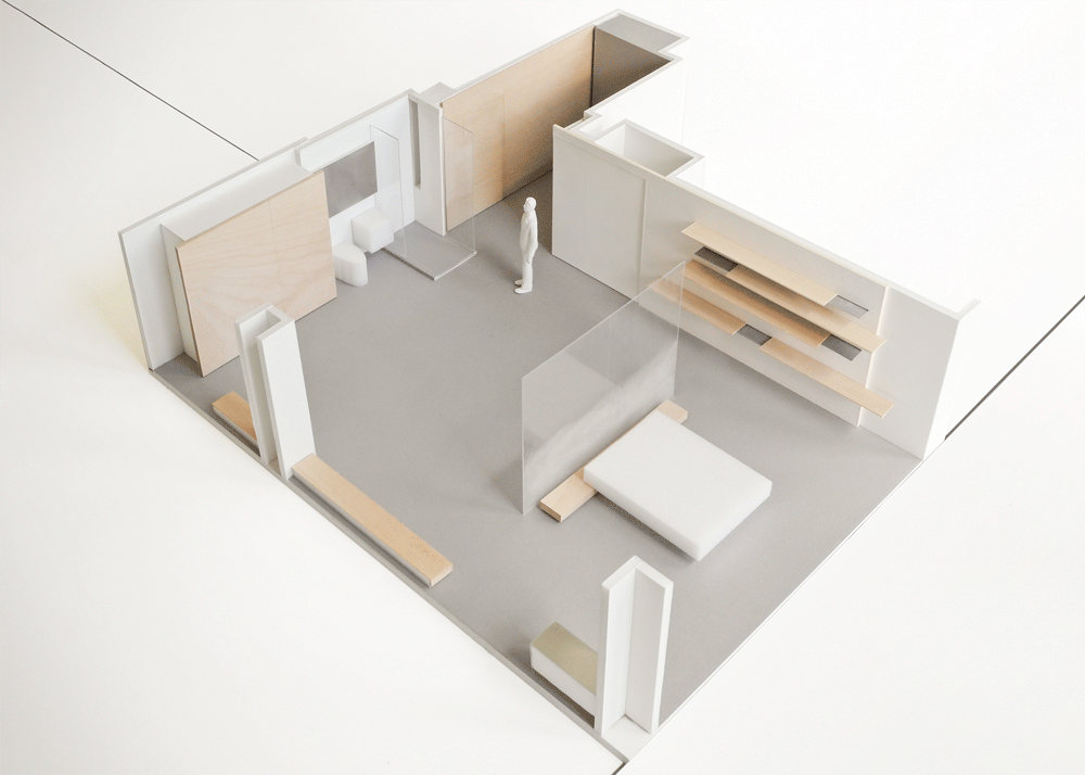
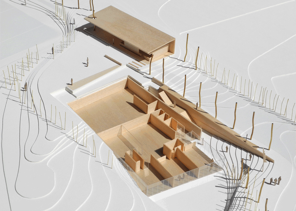
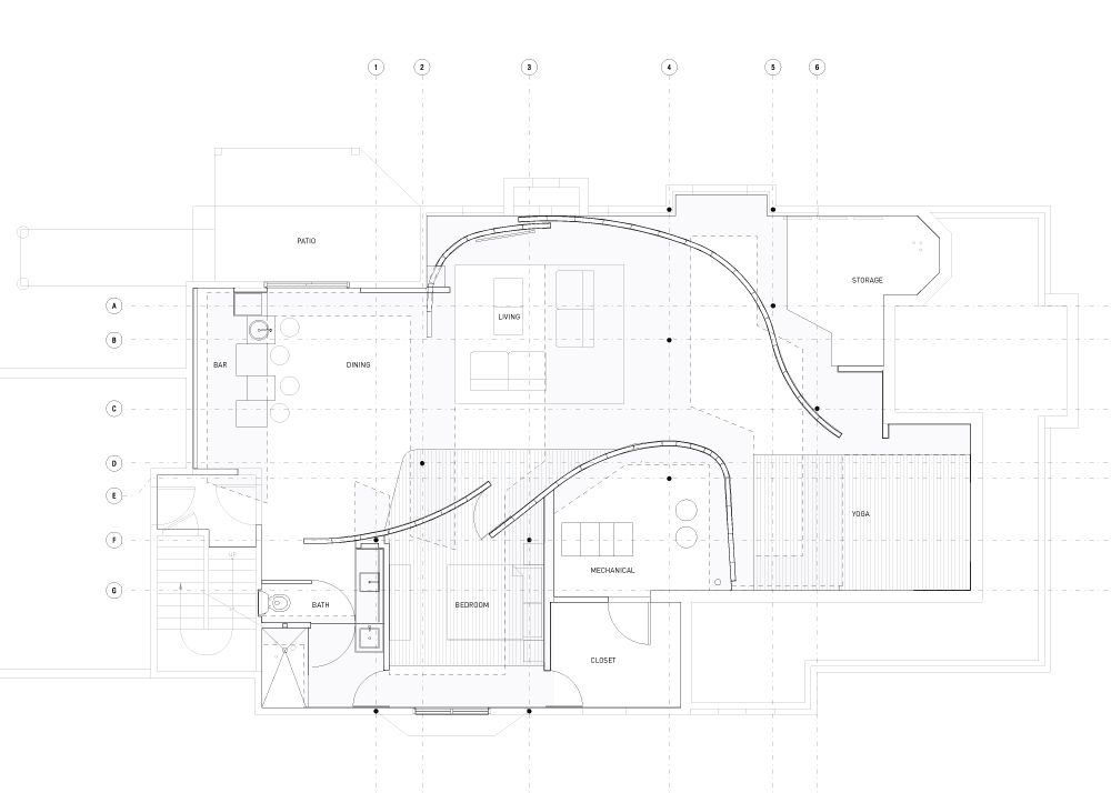
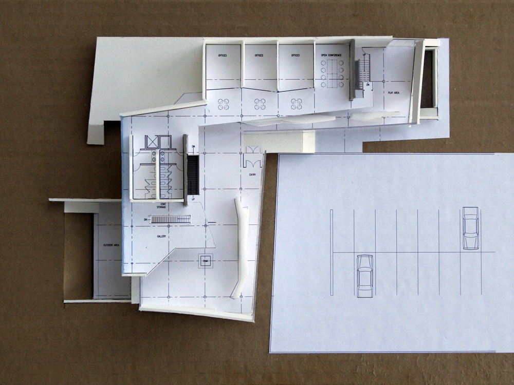
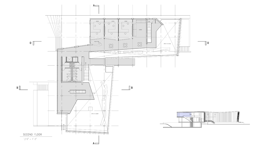
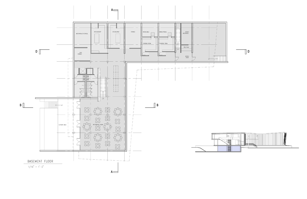
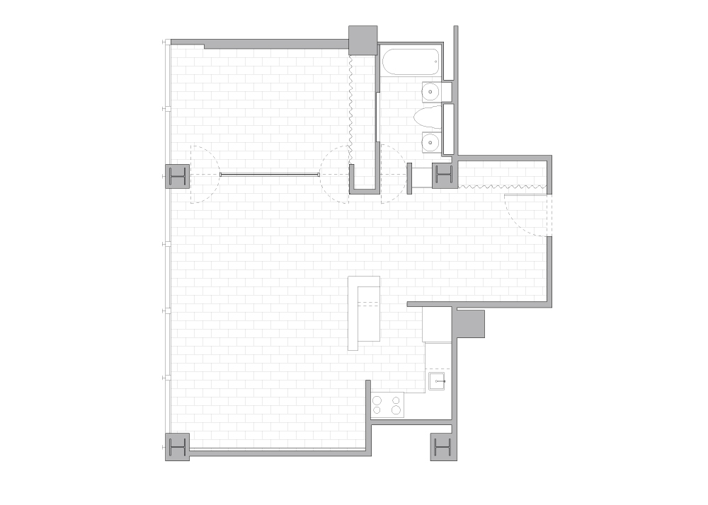
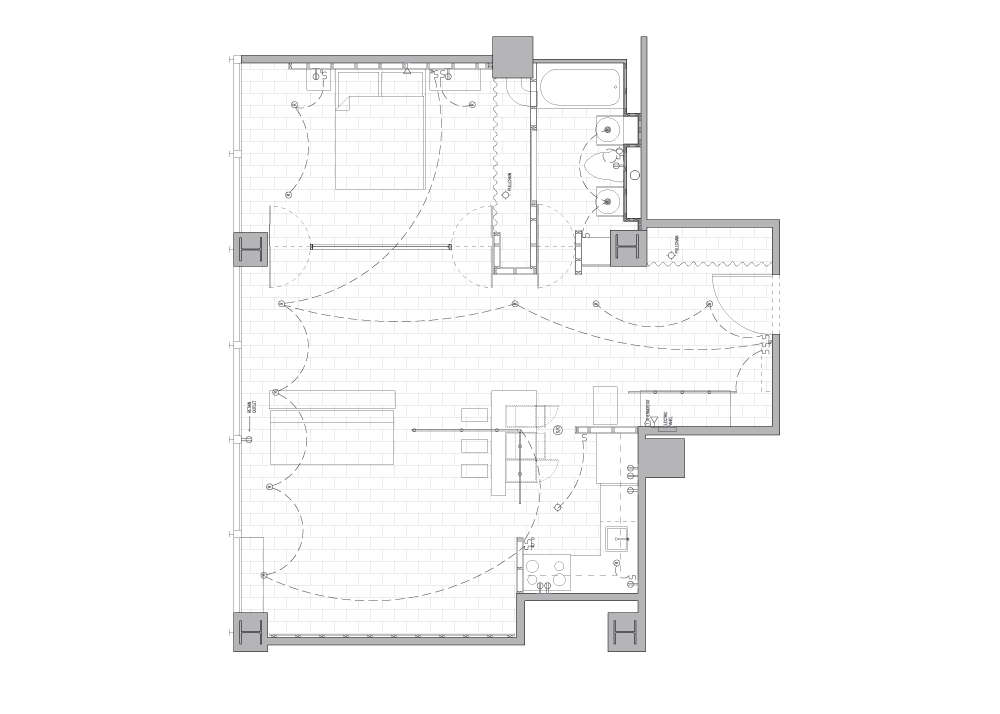
Floor Plan

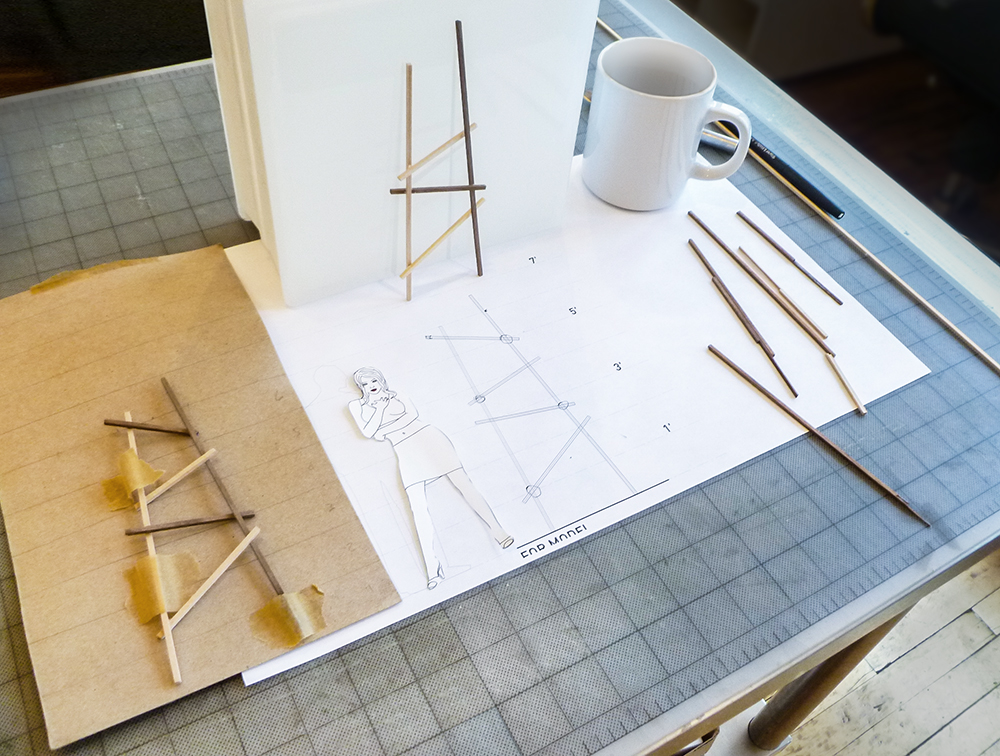
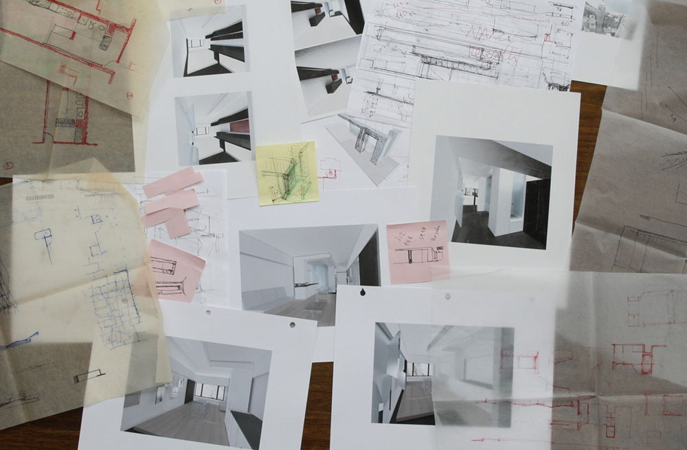
Design Process
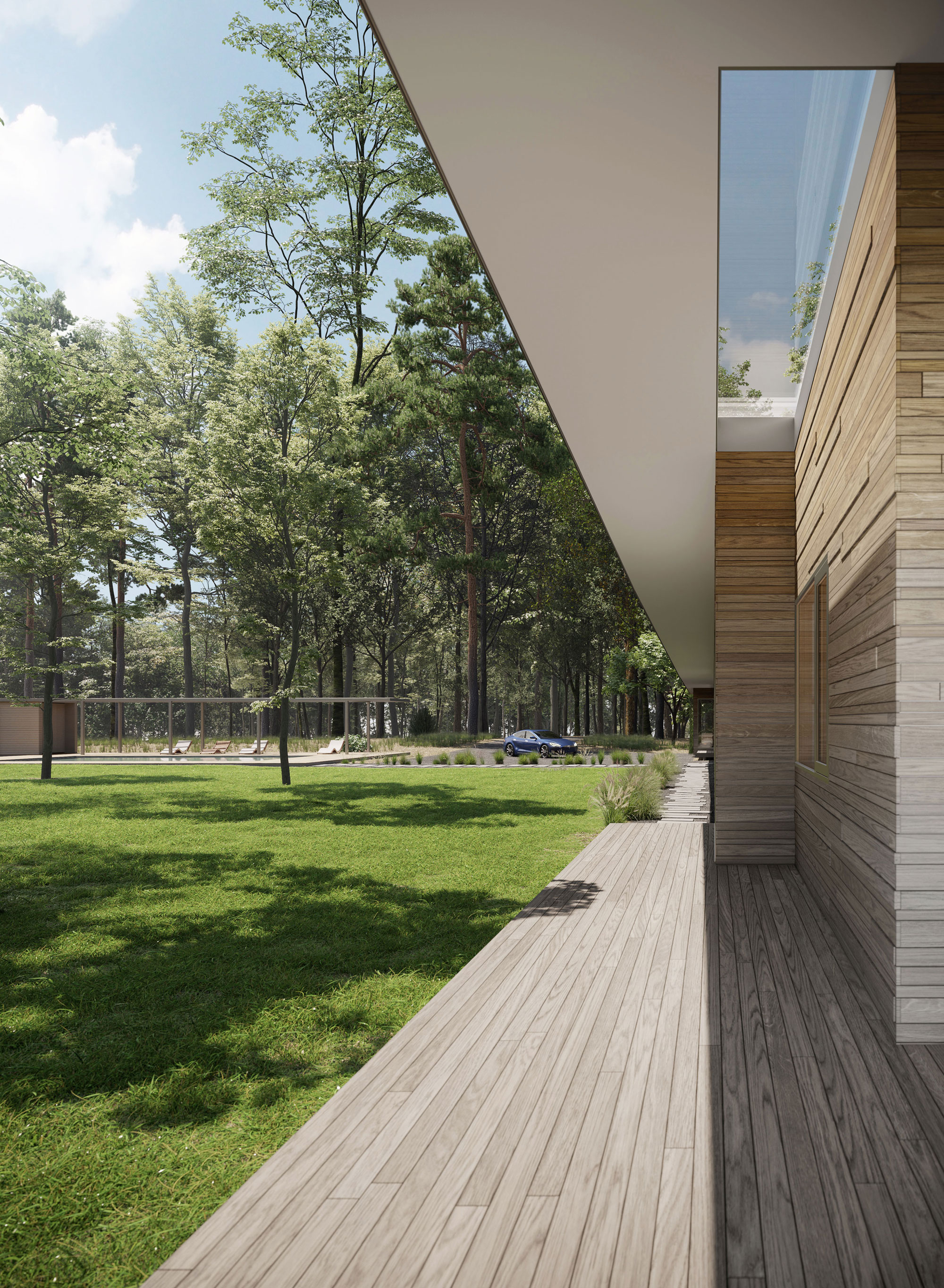
Ravine View
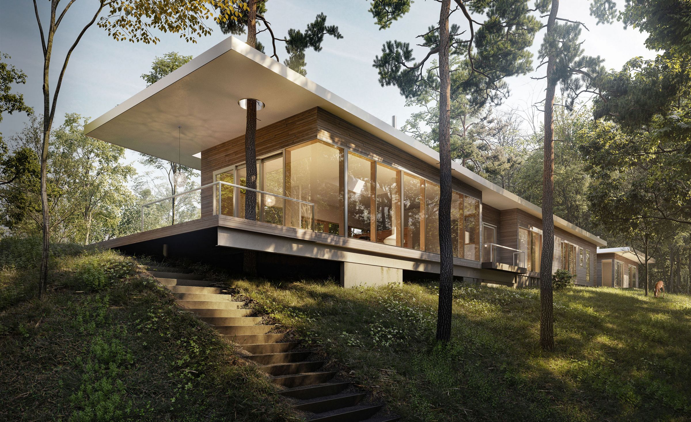
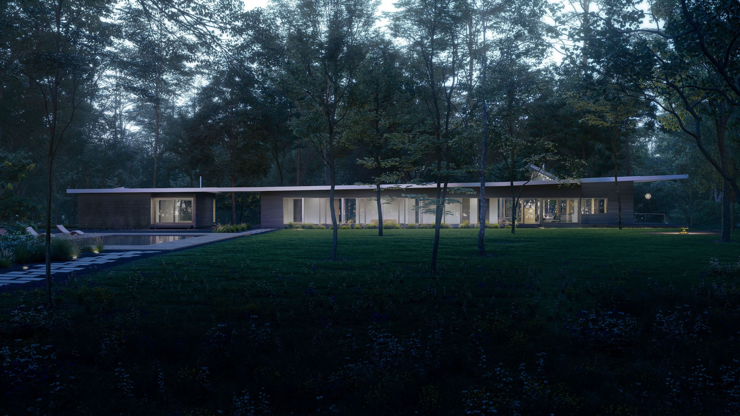
Elevation
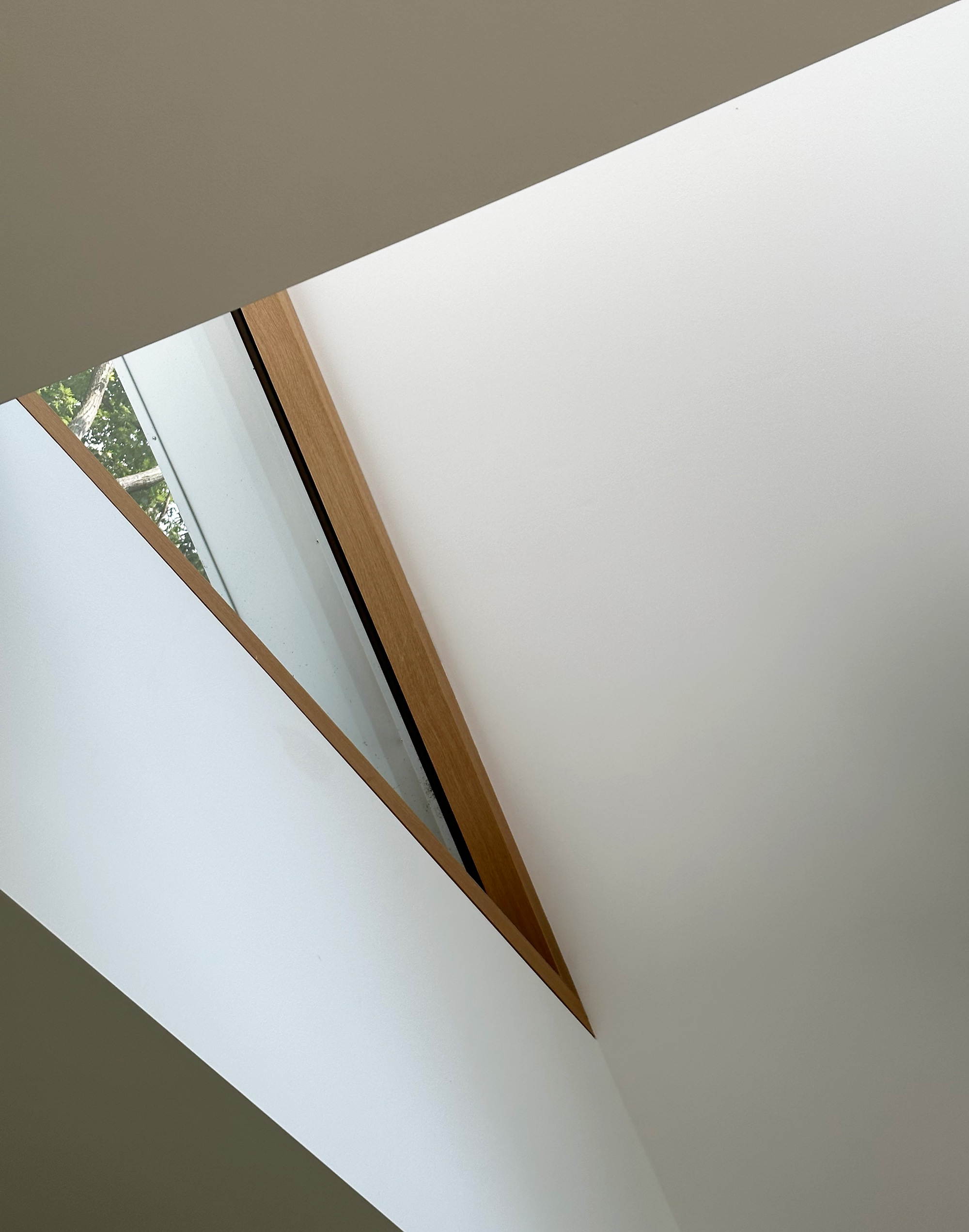
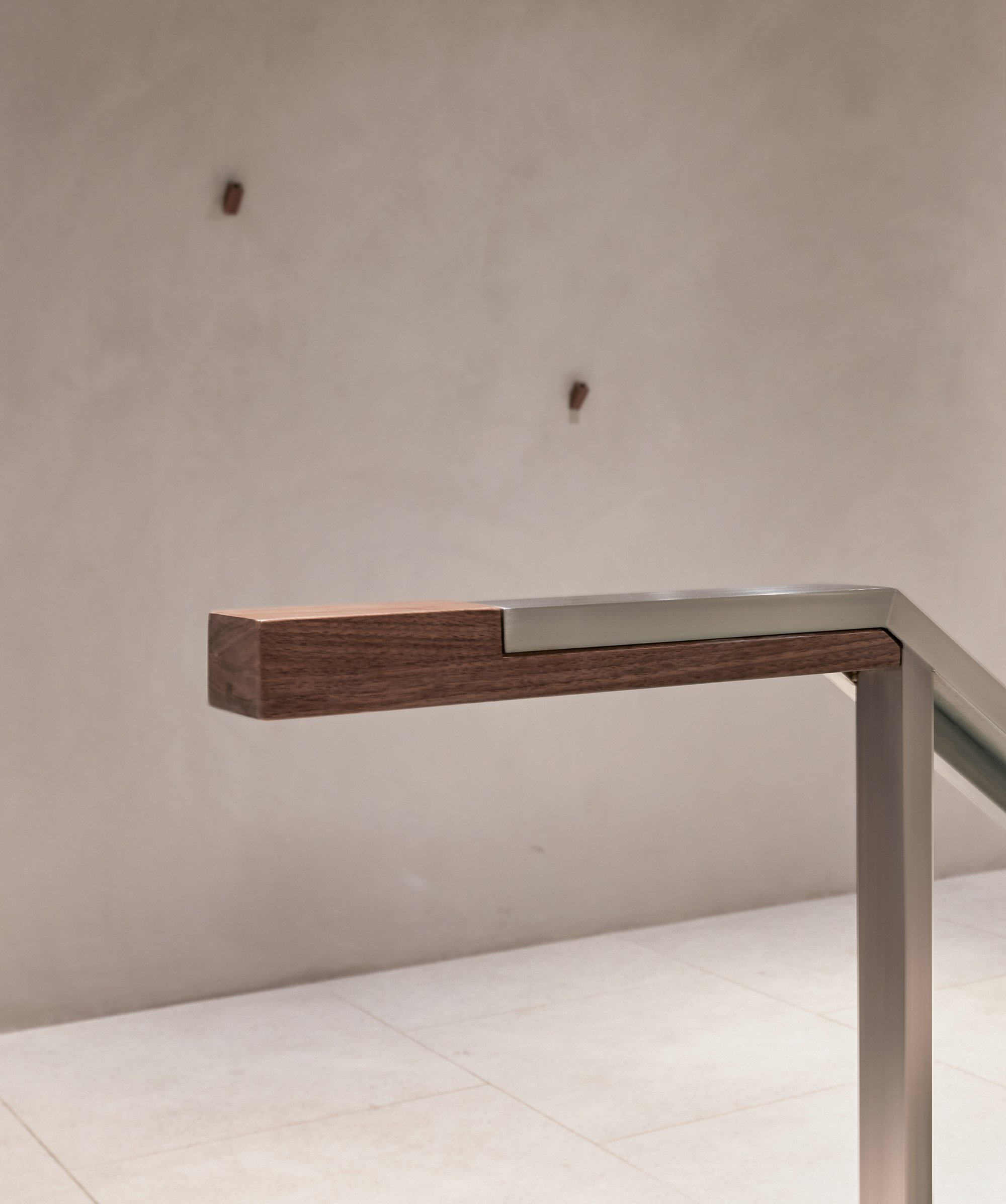
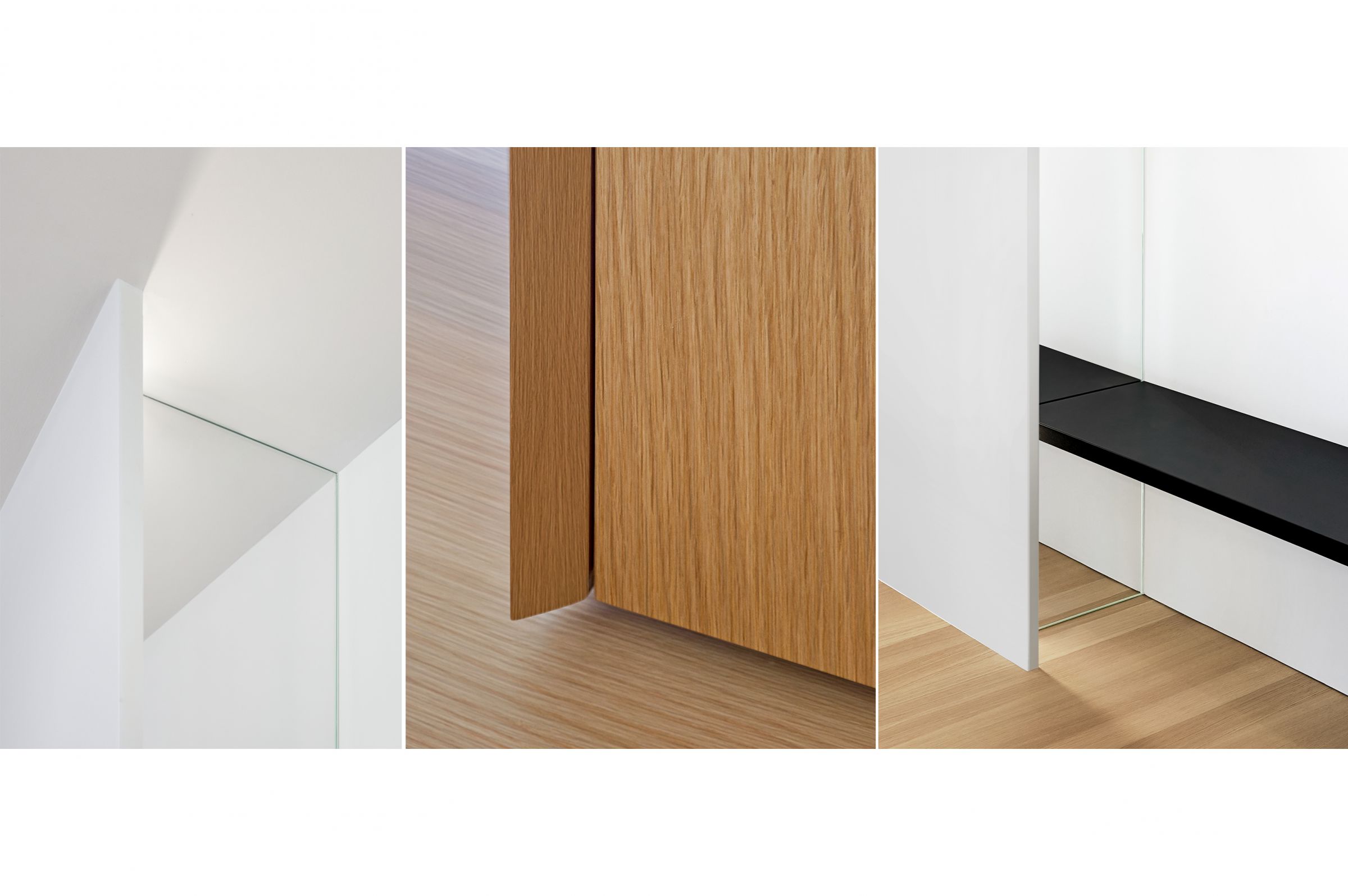
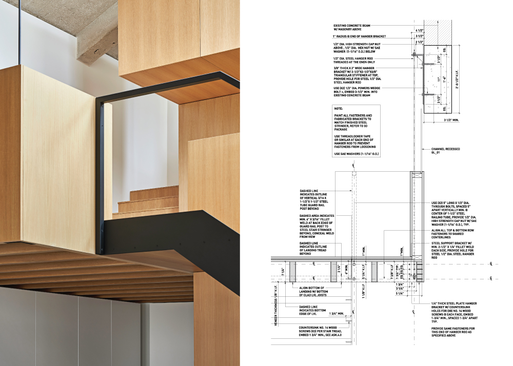
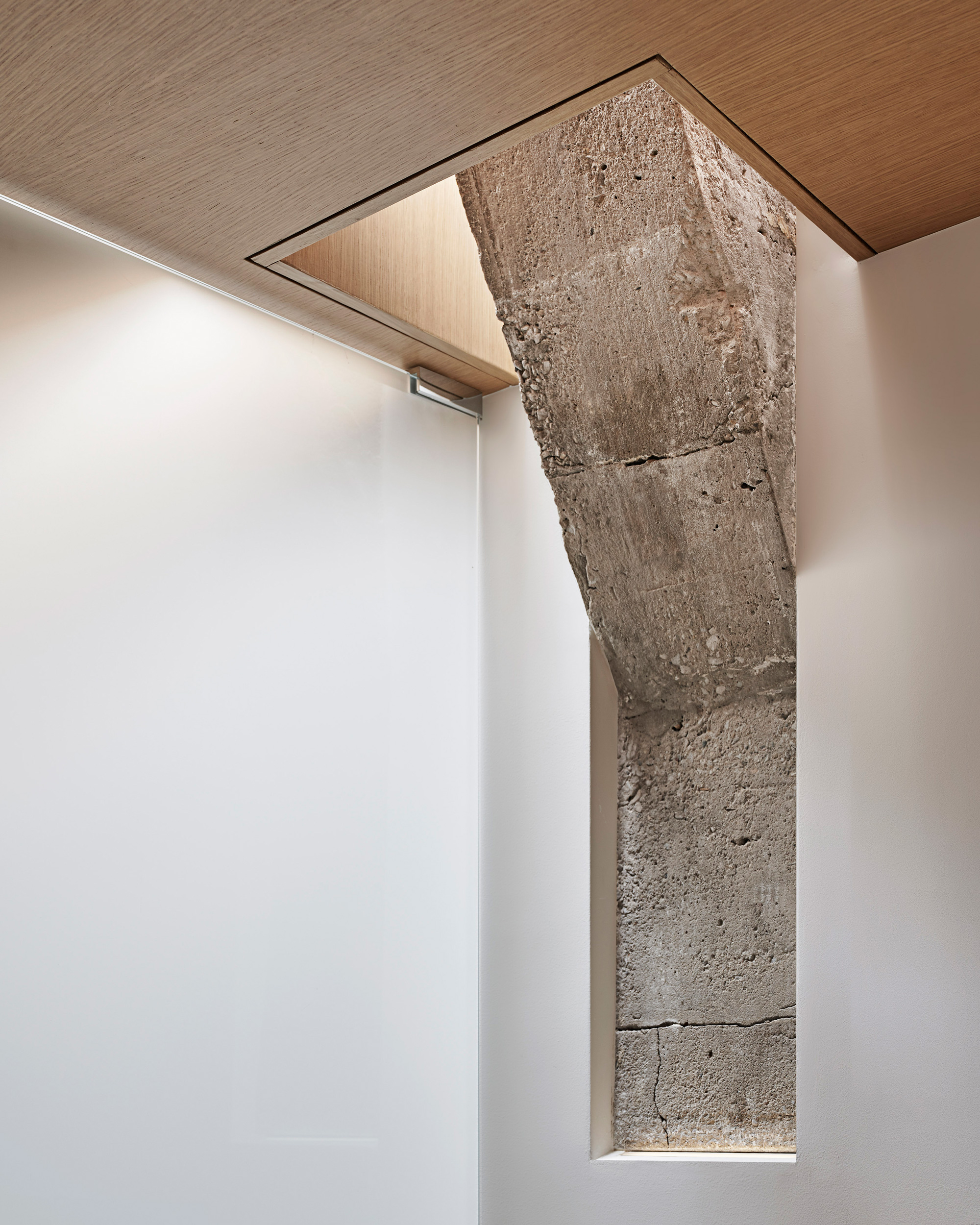
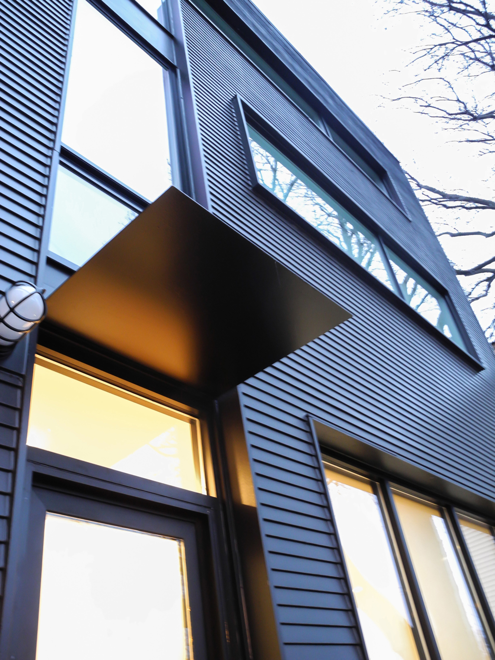
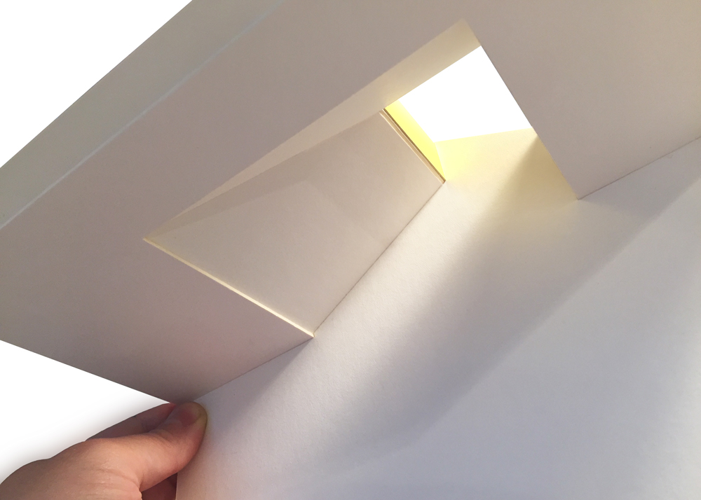
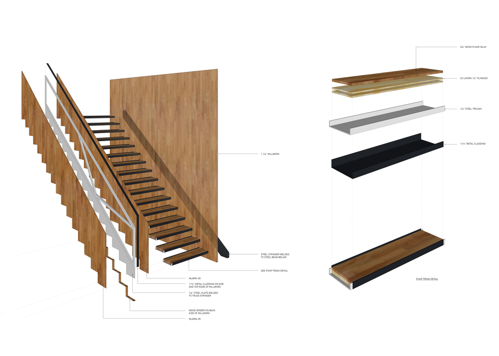
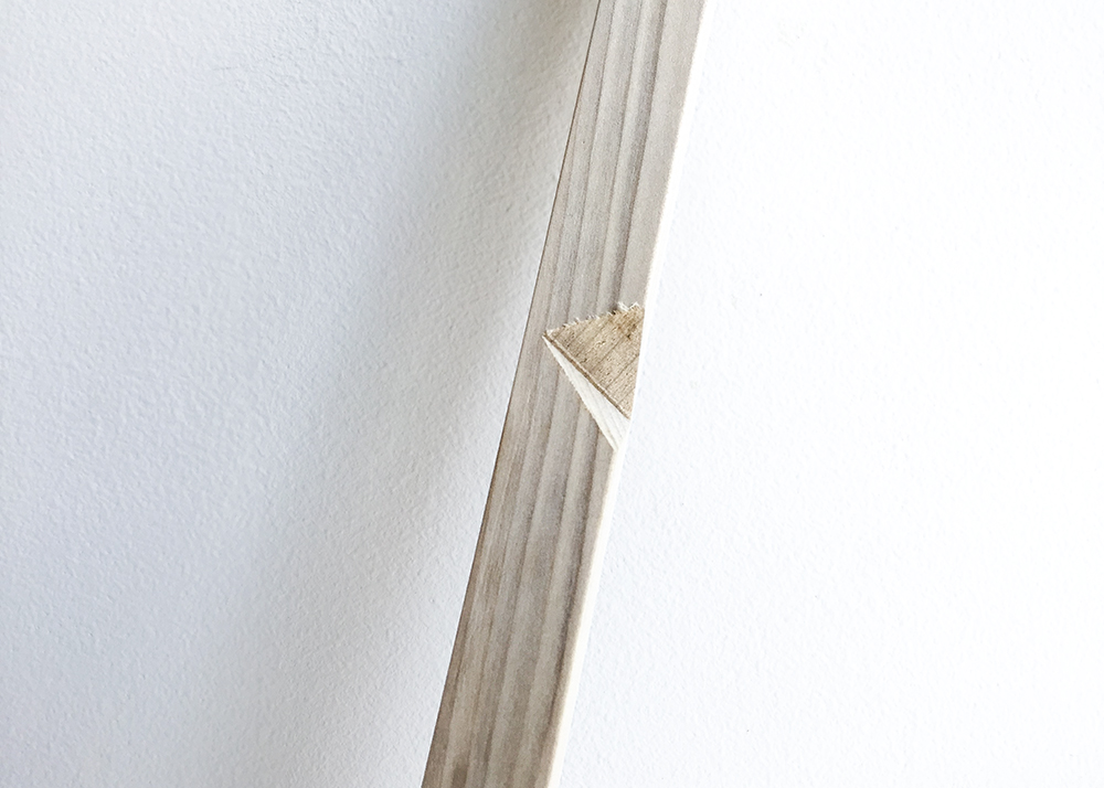
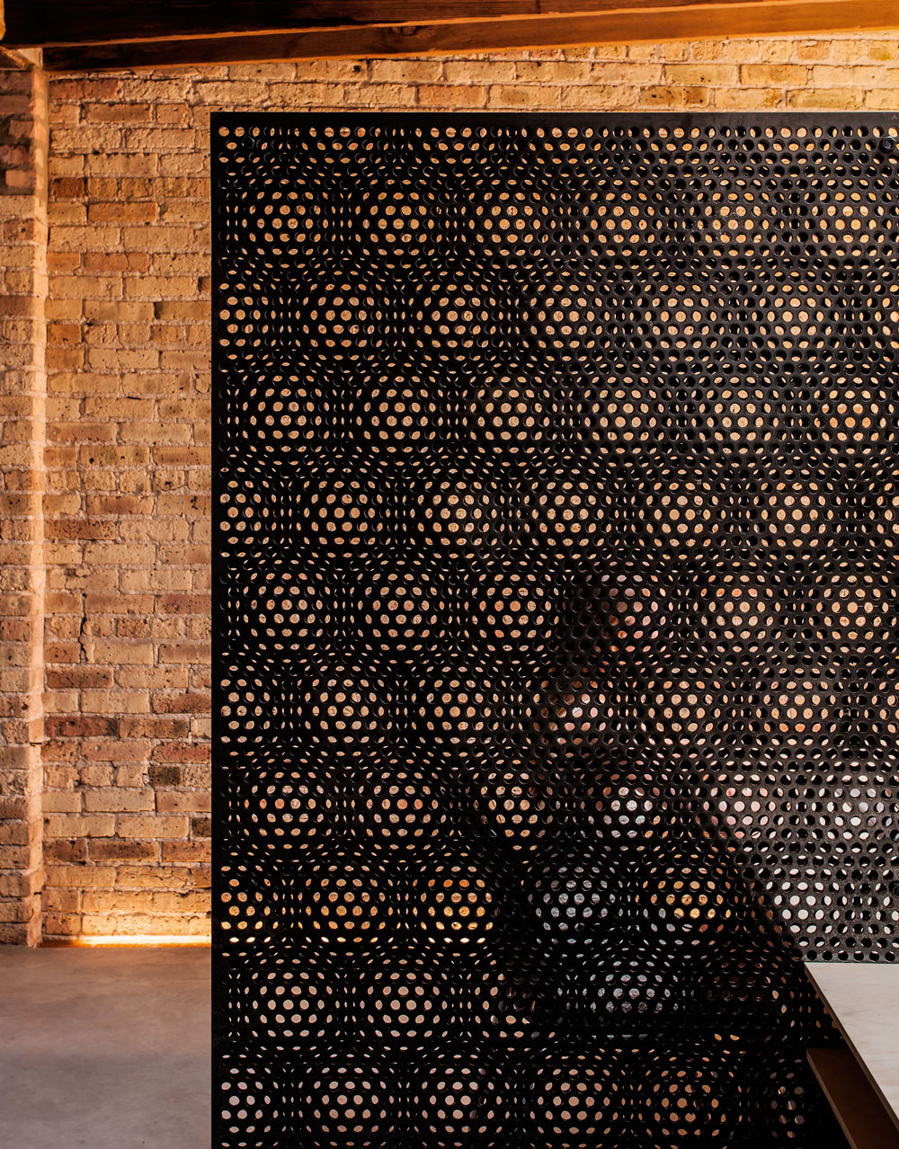
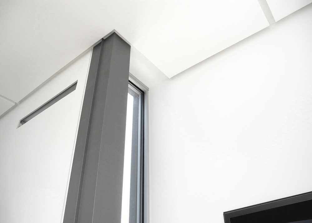
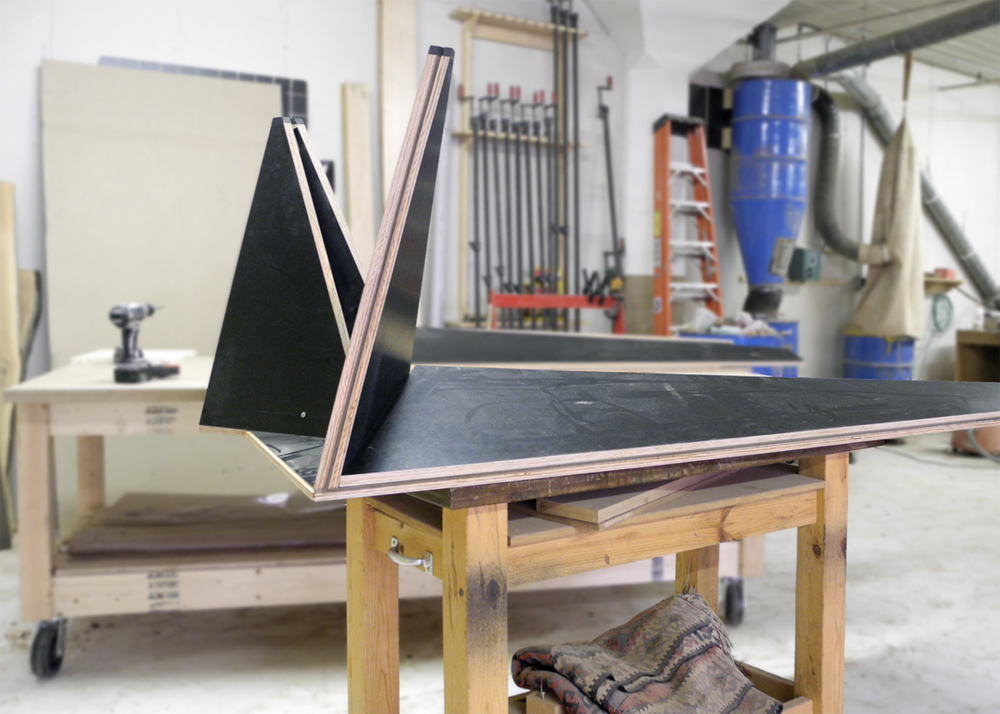
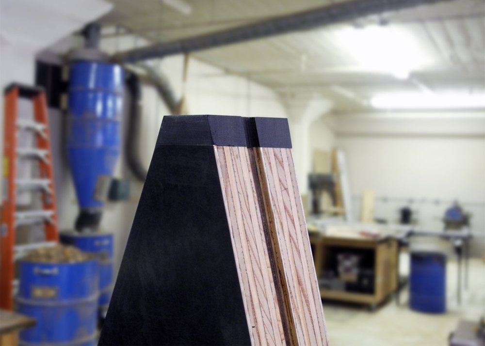
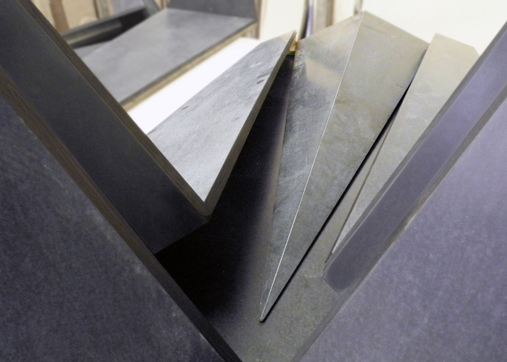
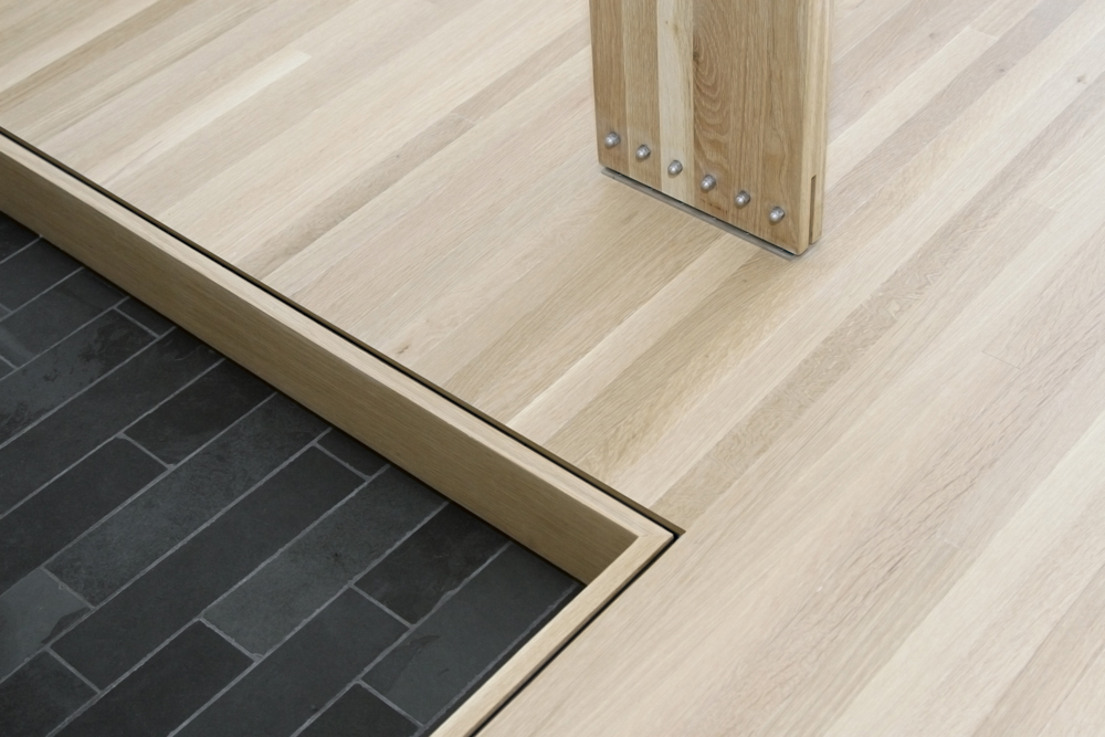
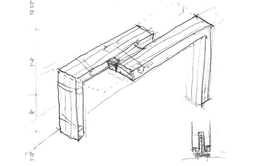
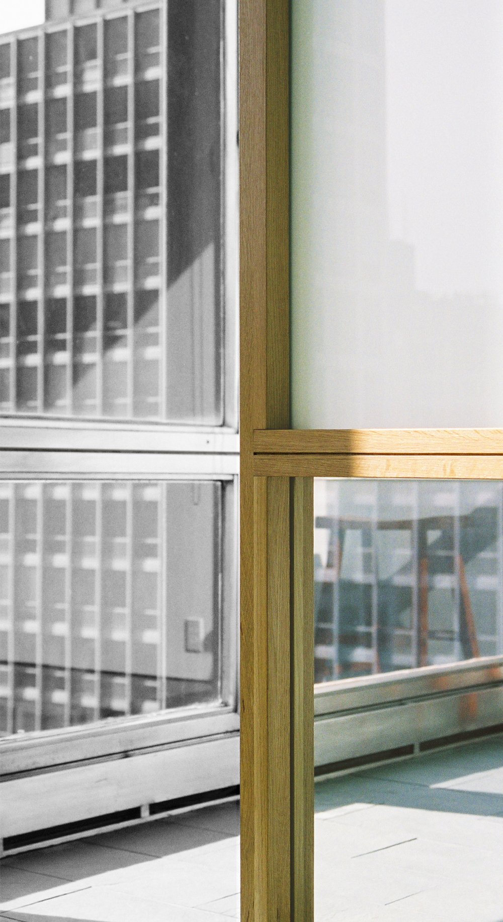
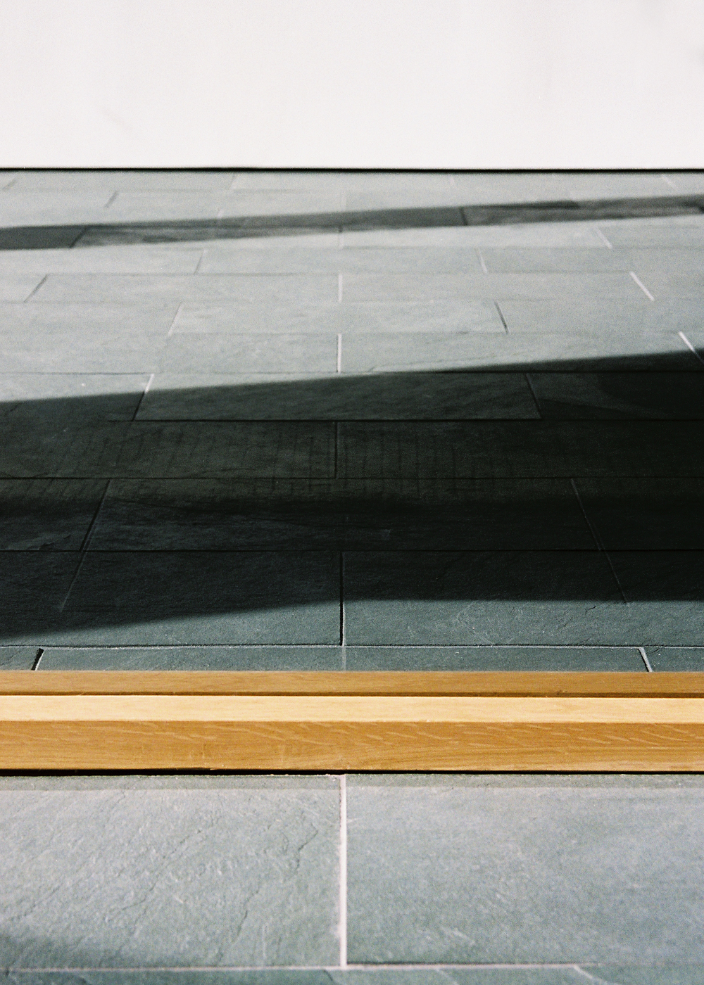
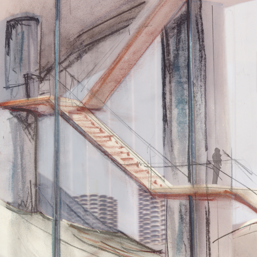
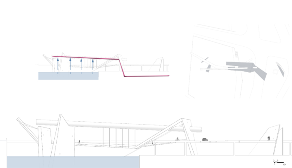
Roof Detail
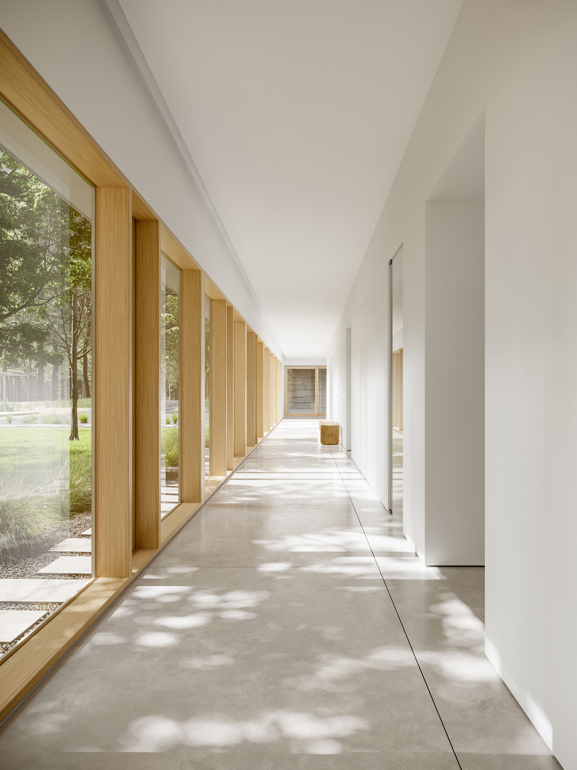
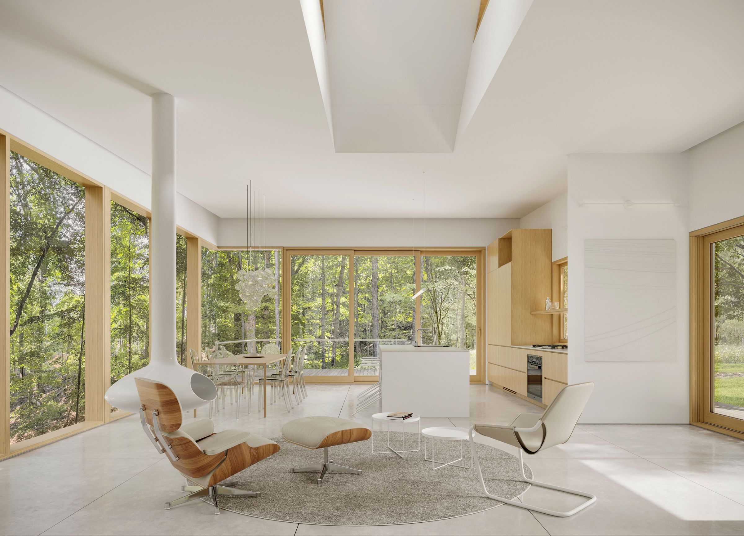
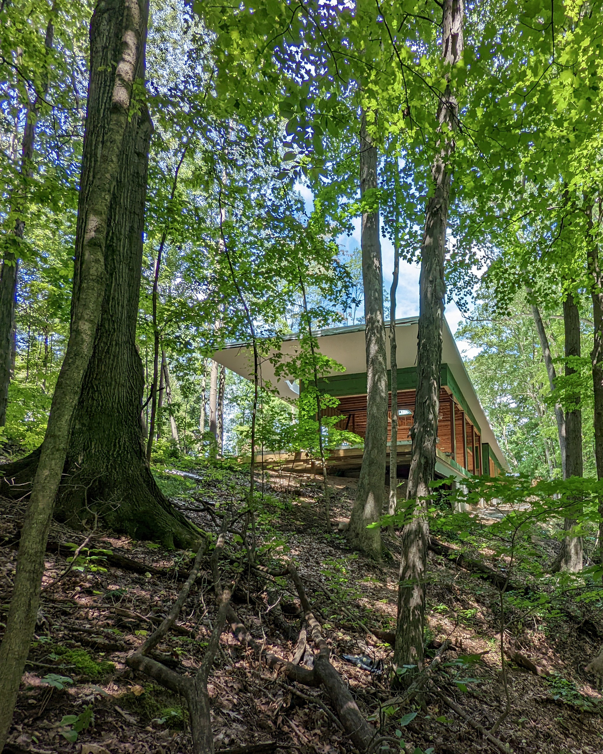
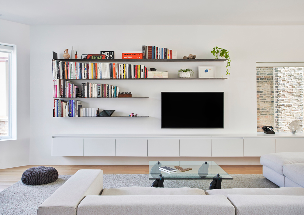
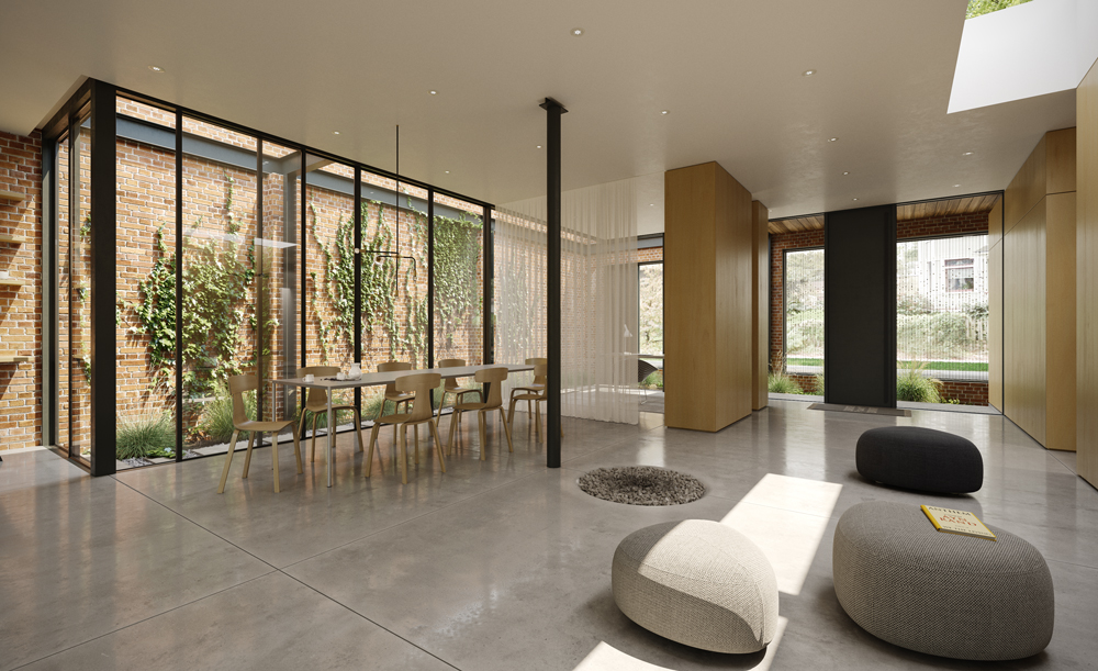
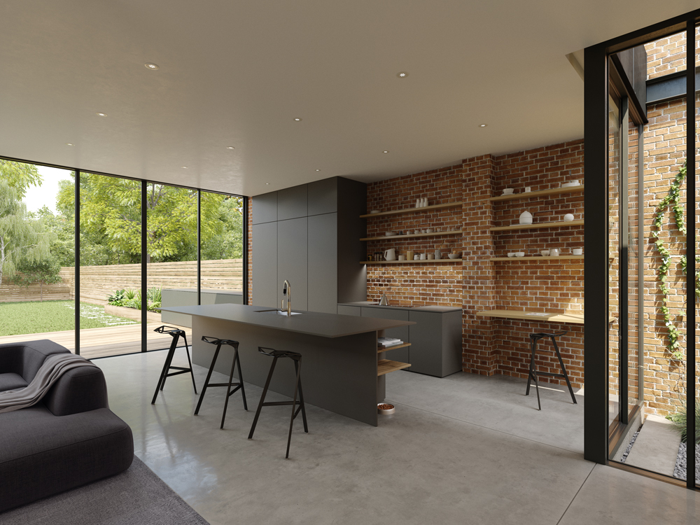
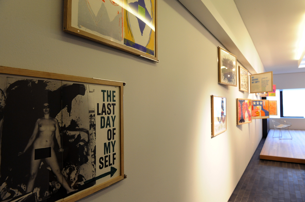
Gallery
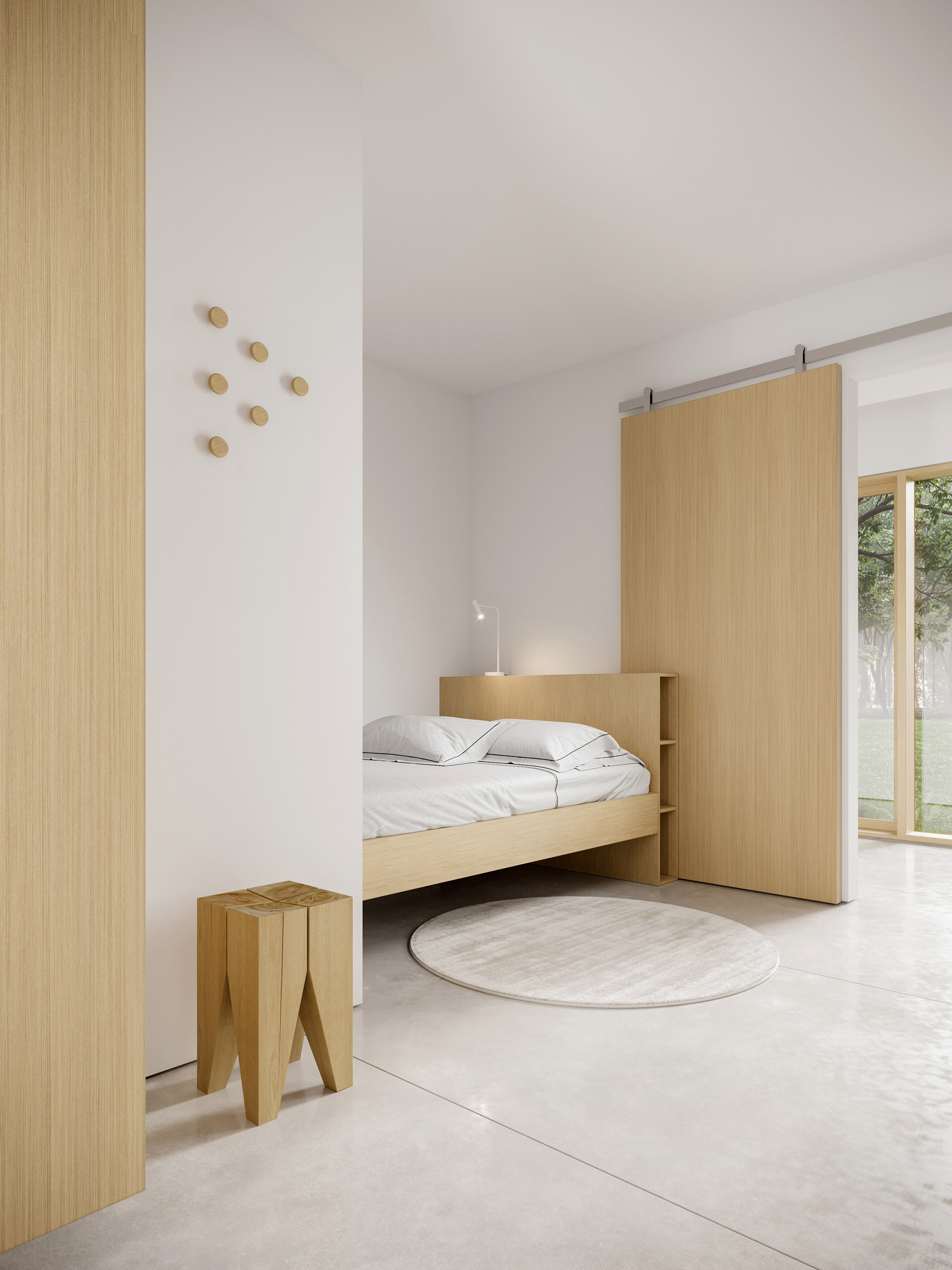
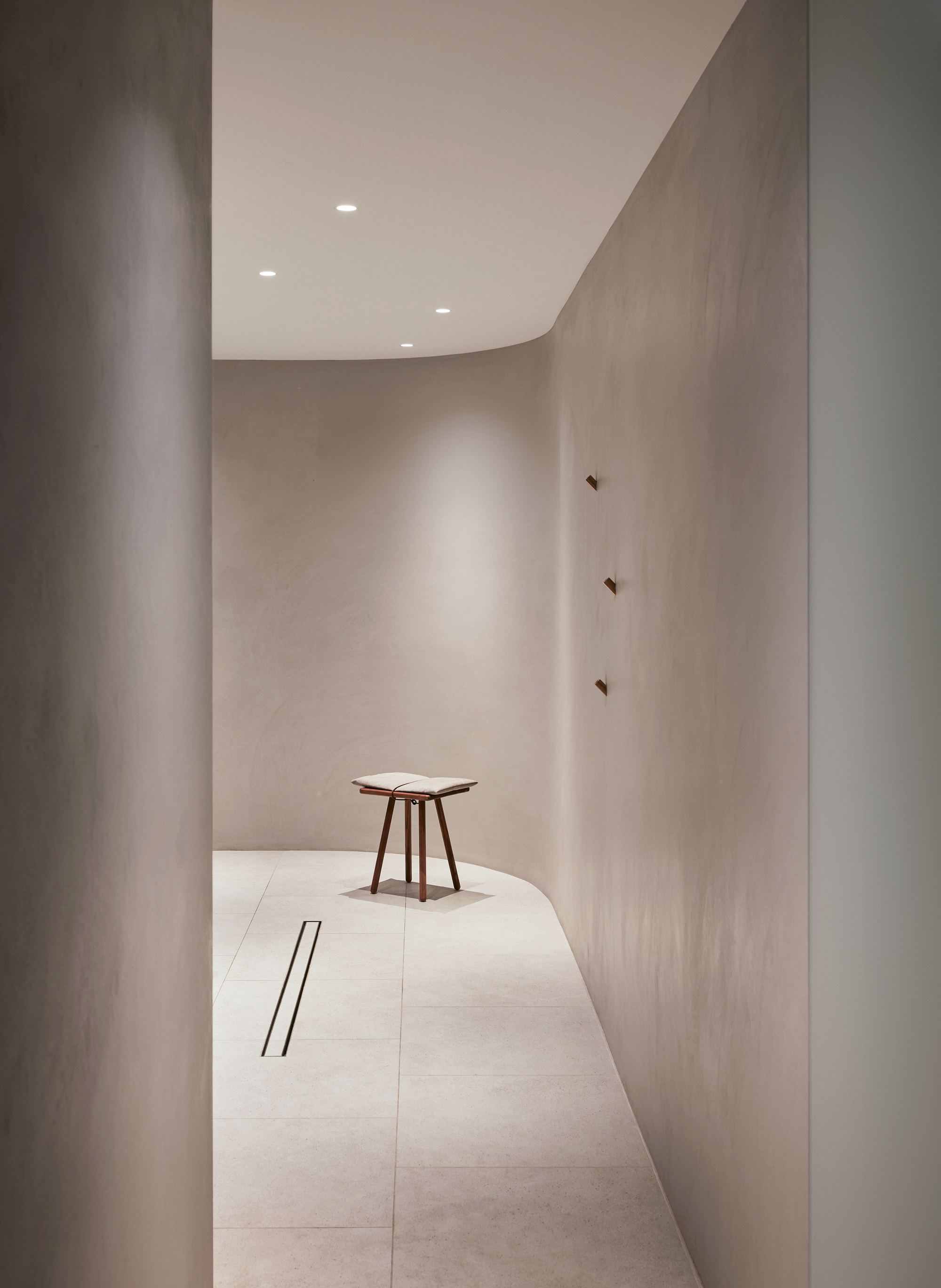
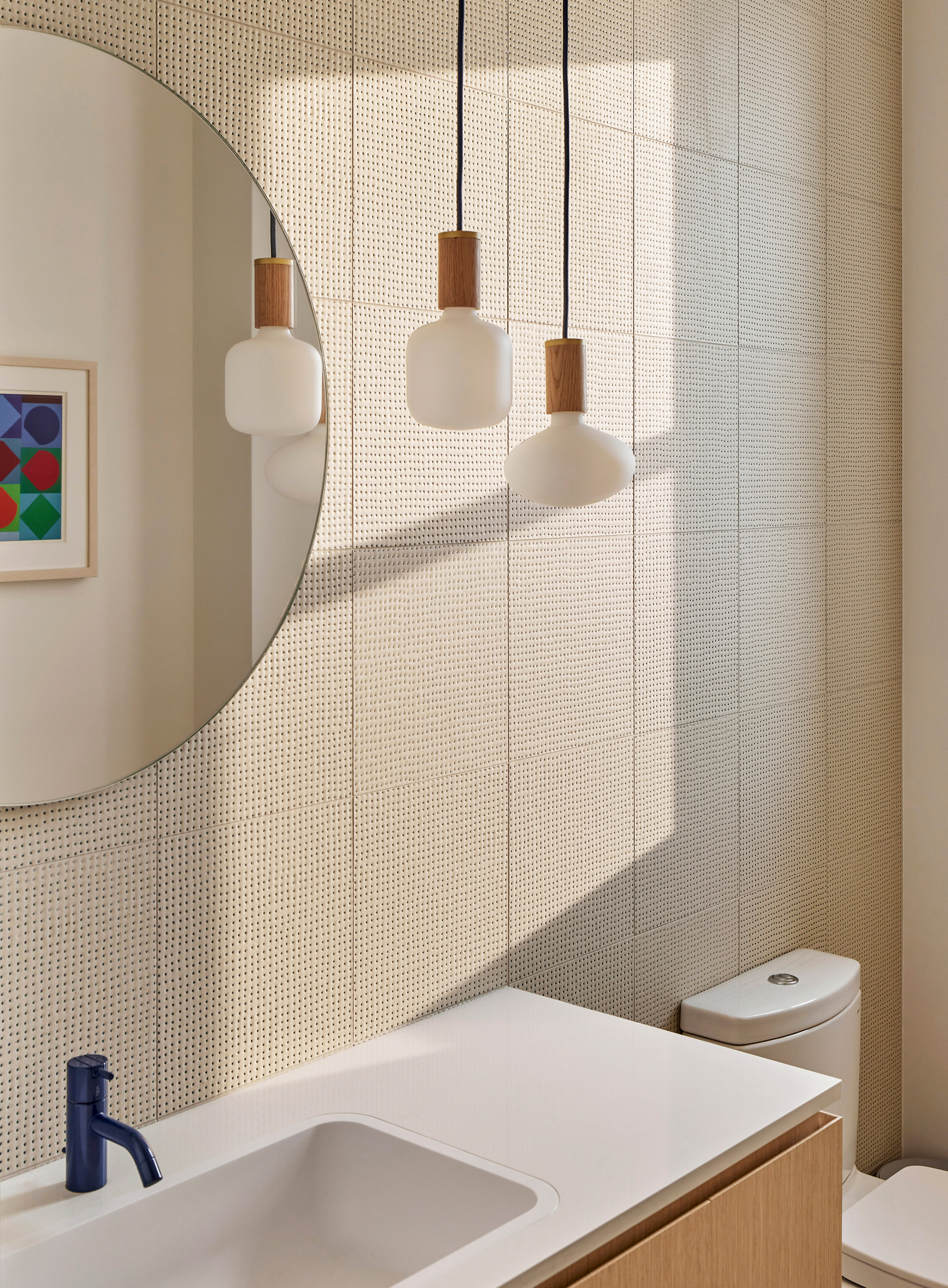
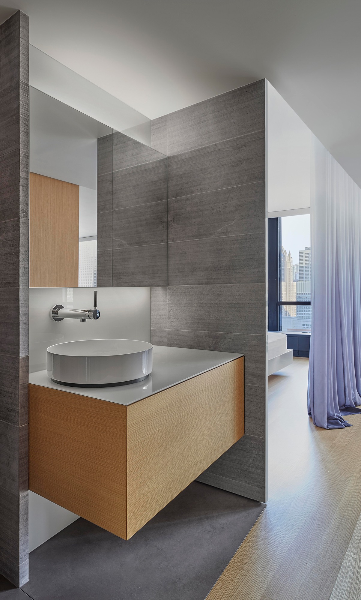
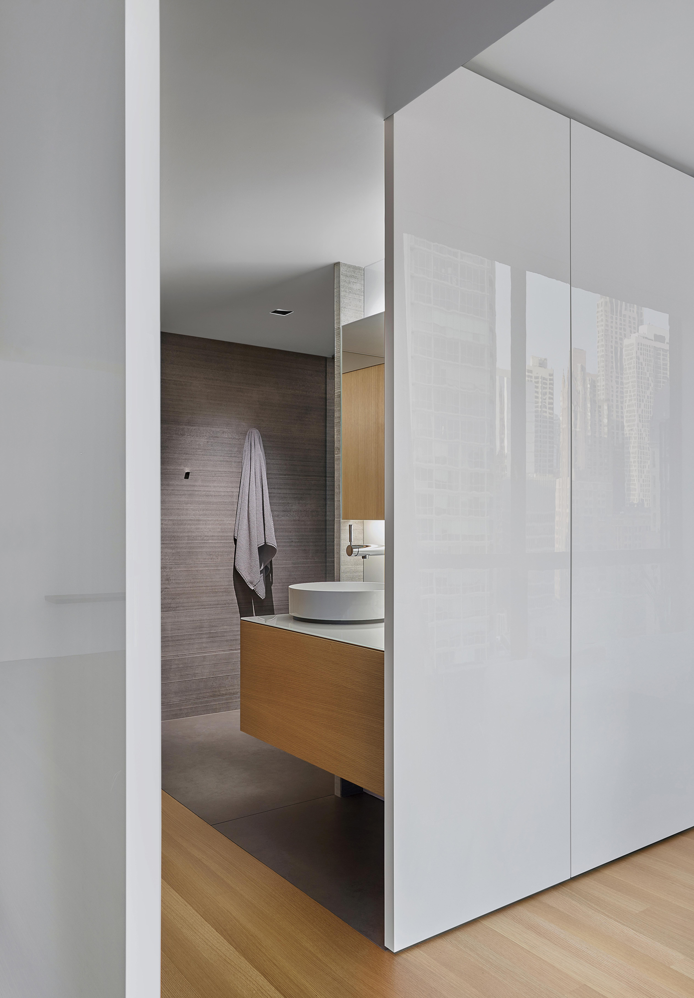
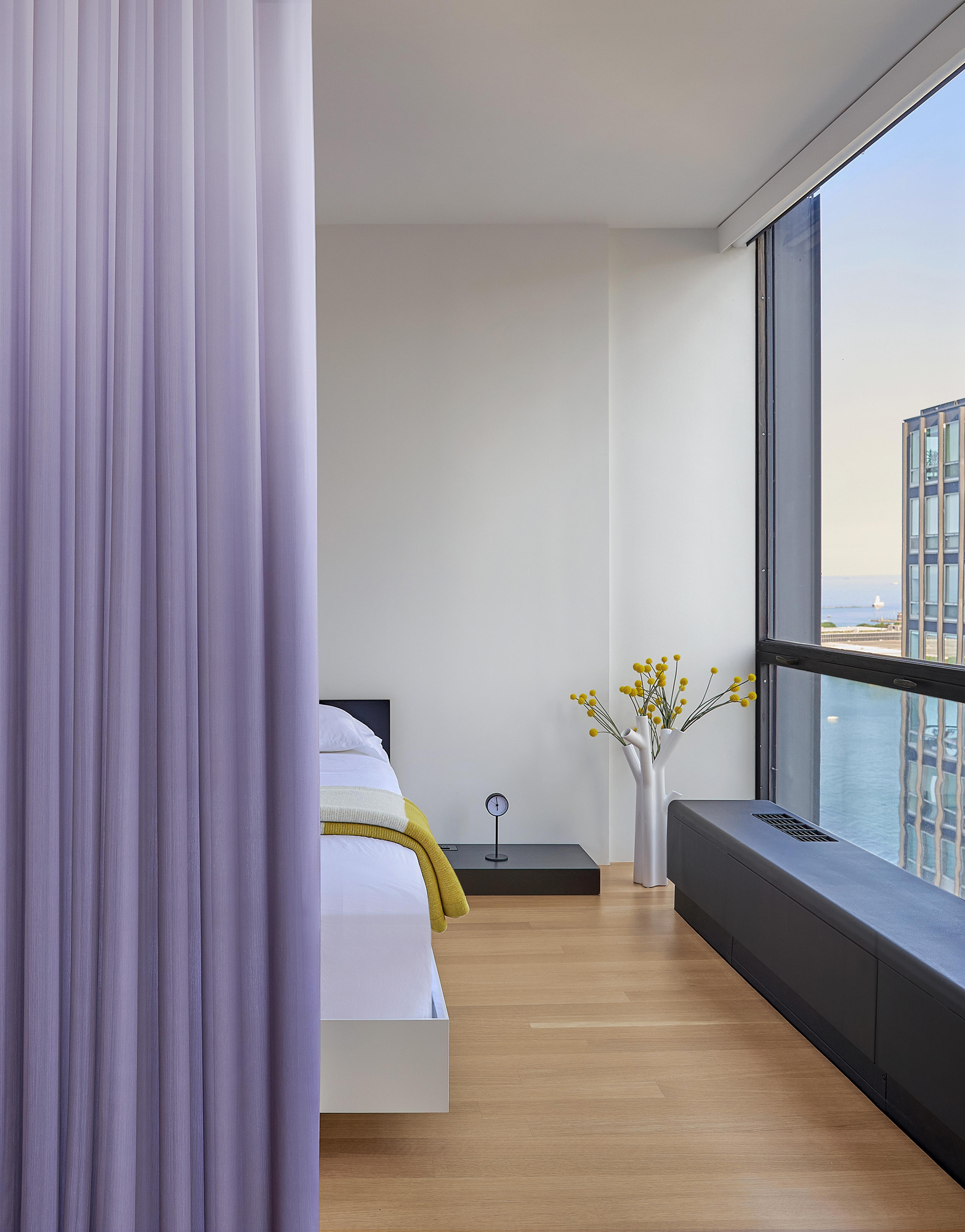
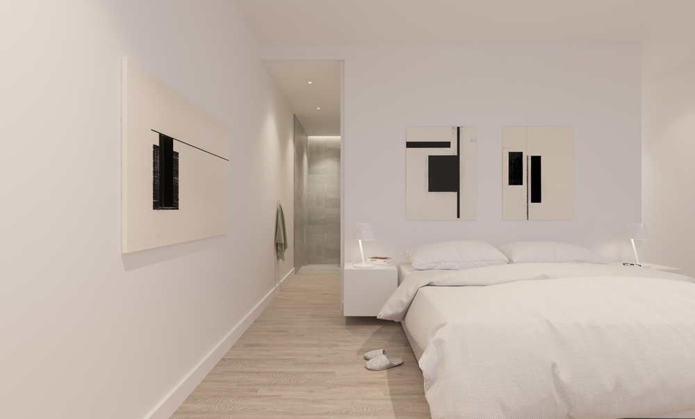
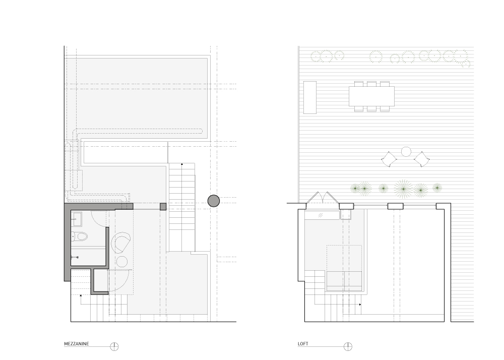
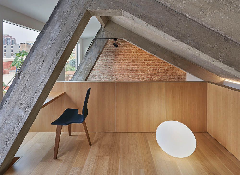
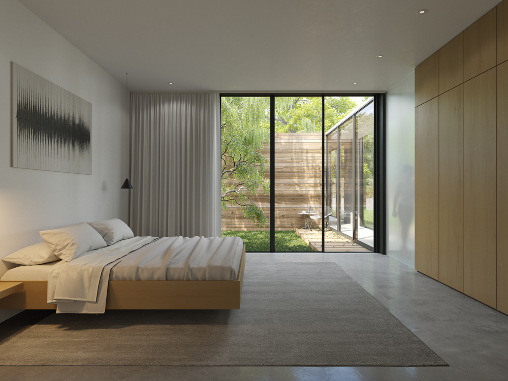
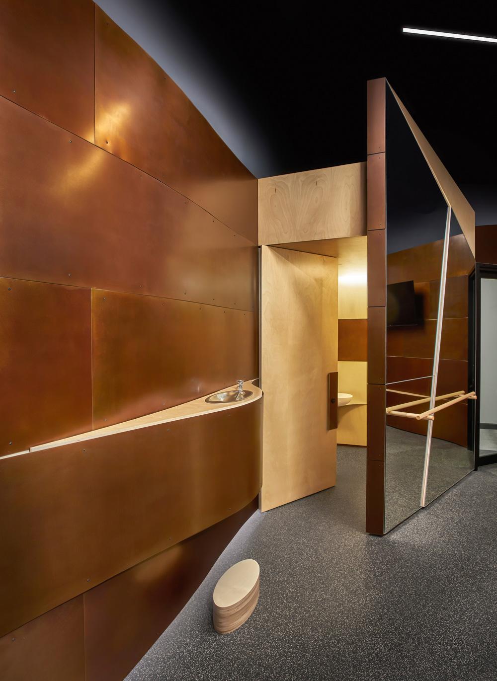
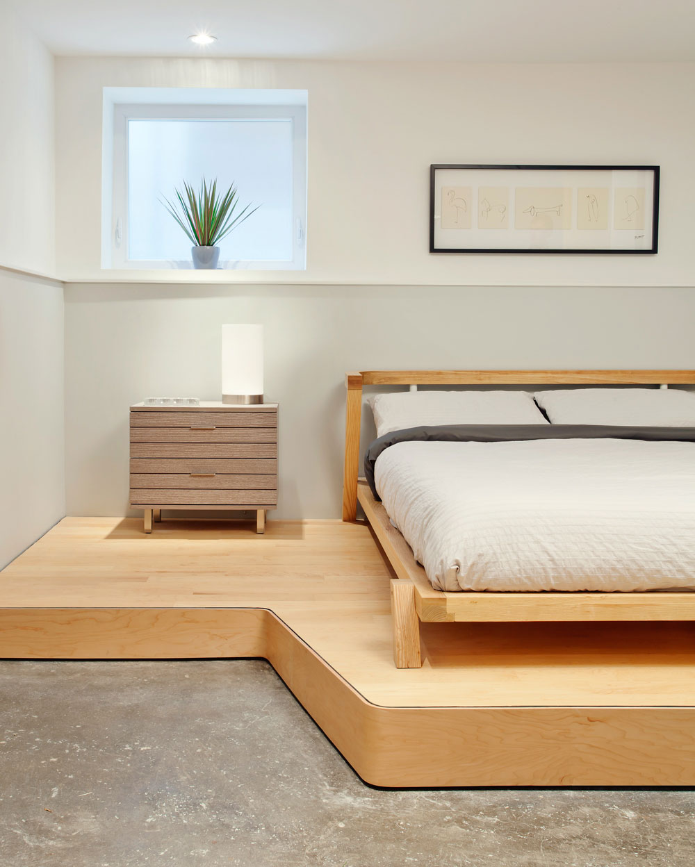
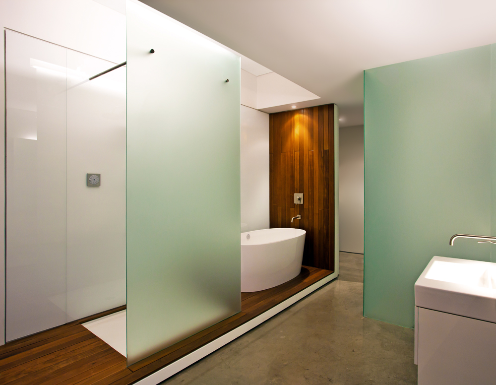
Sleeping

Sleeping Niche
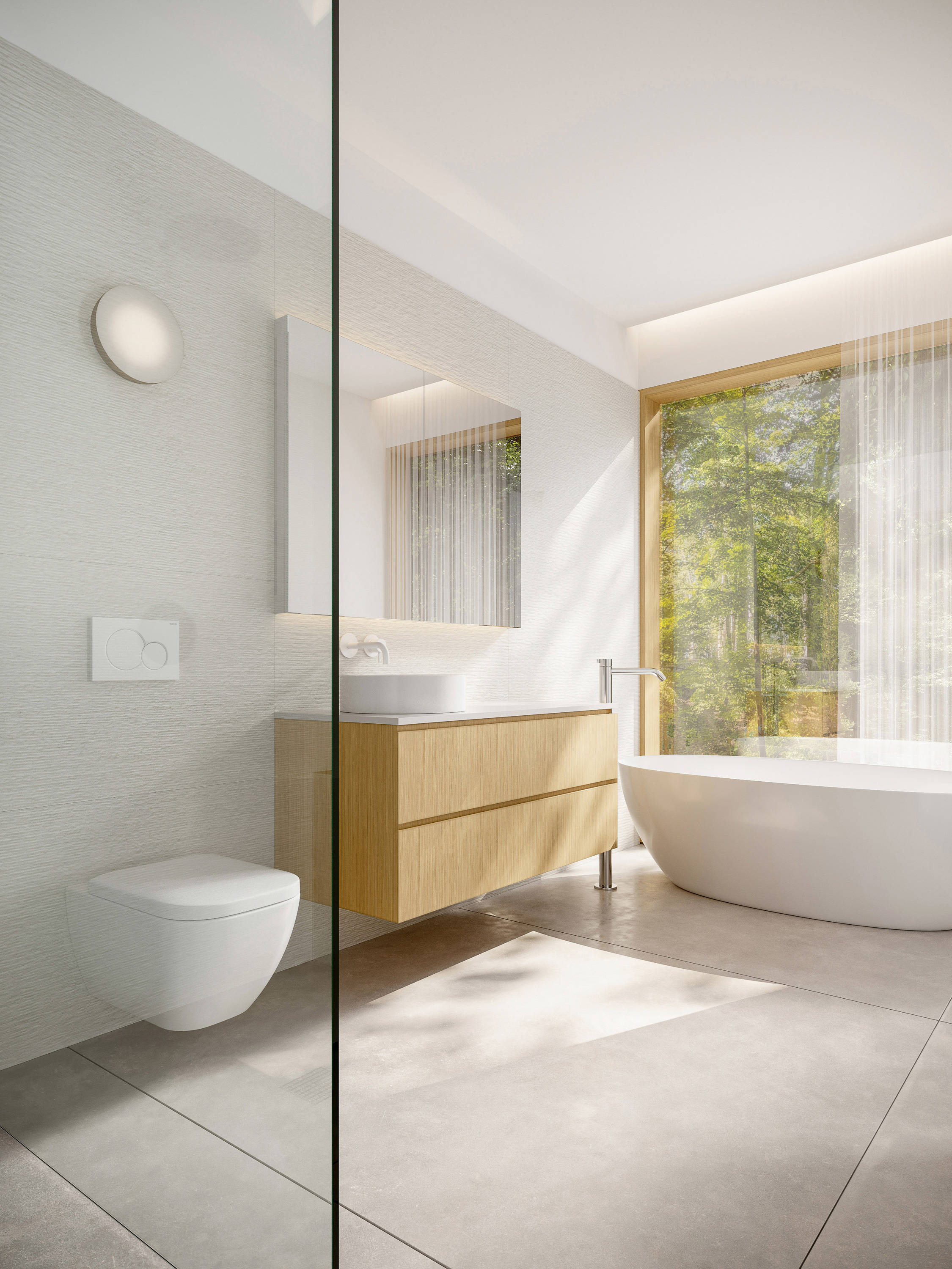
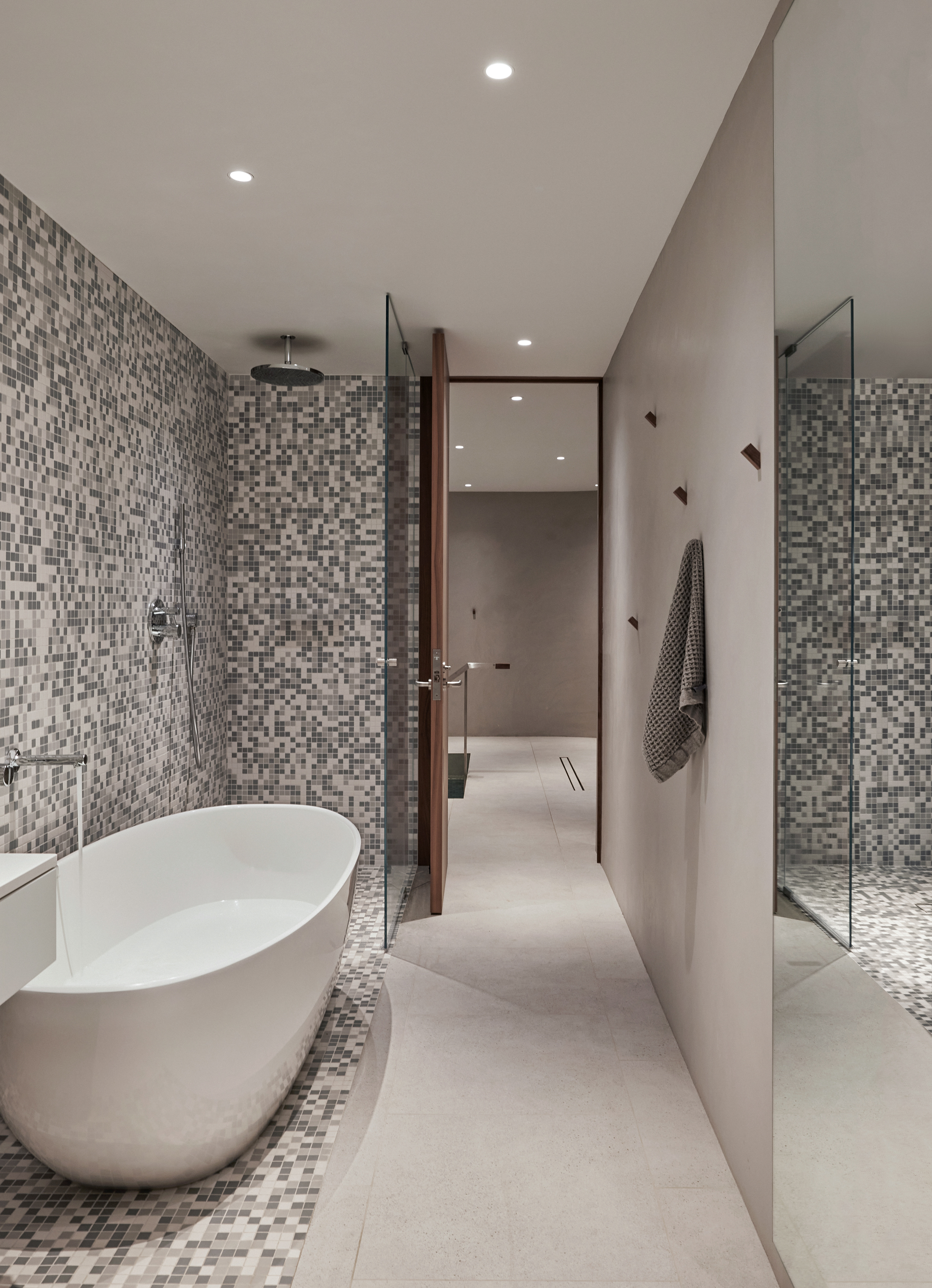
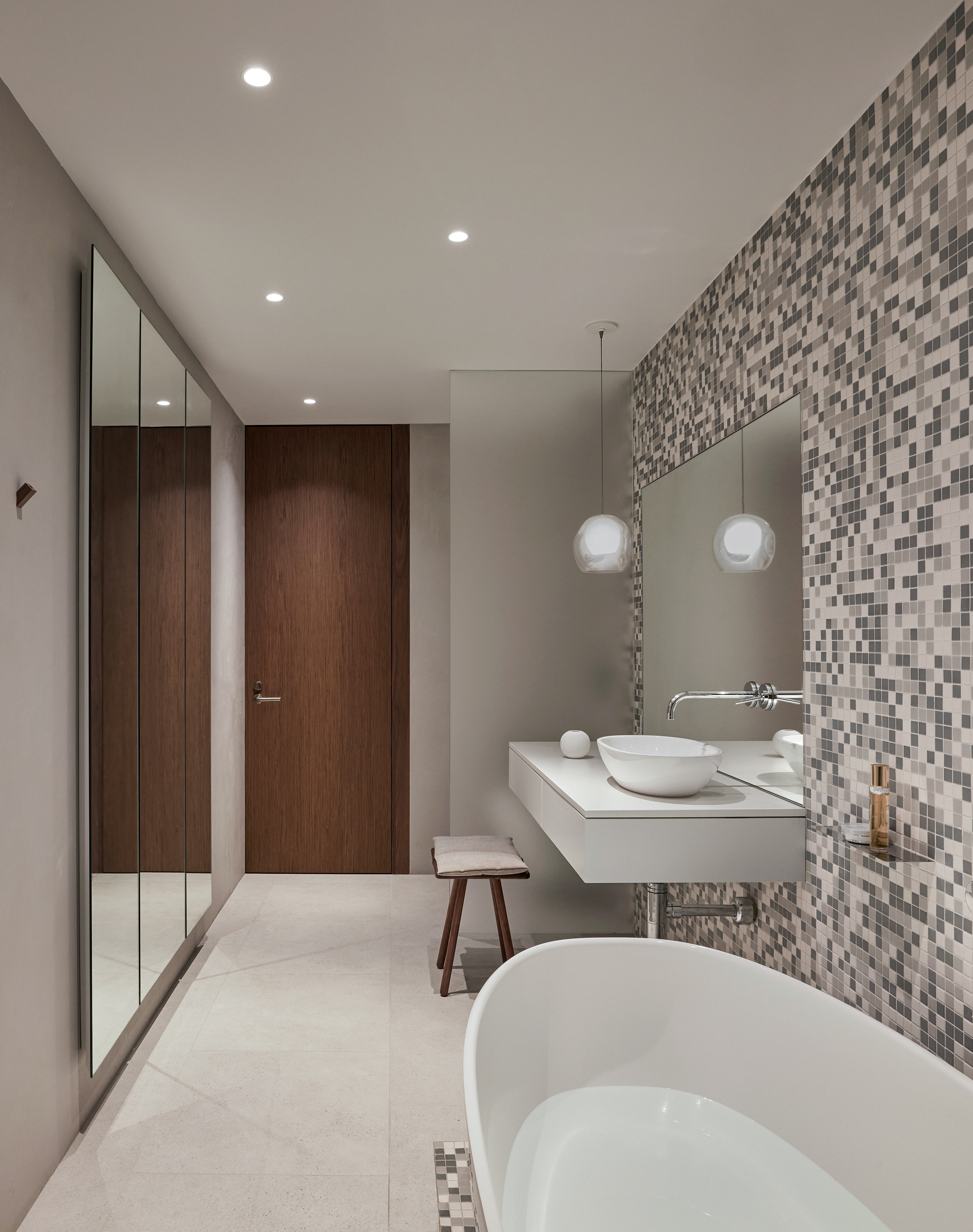
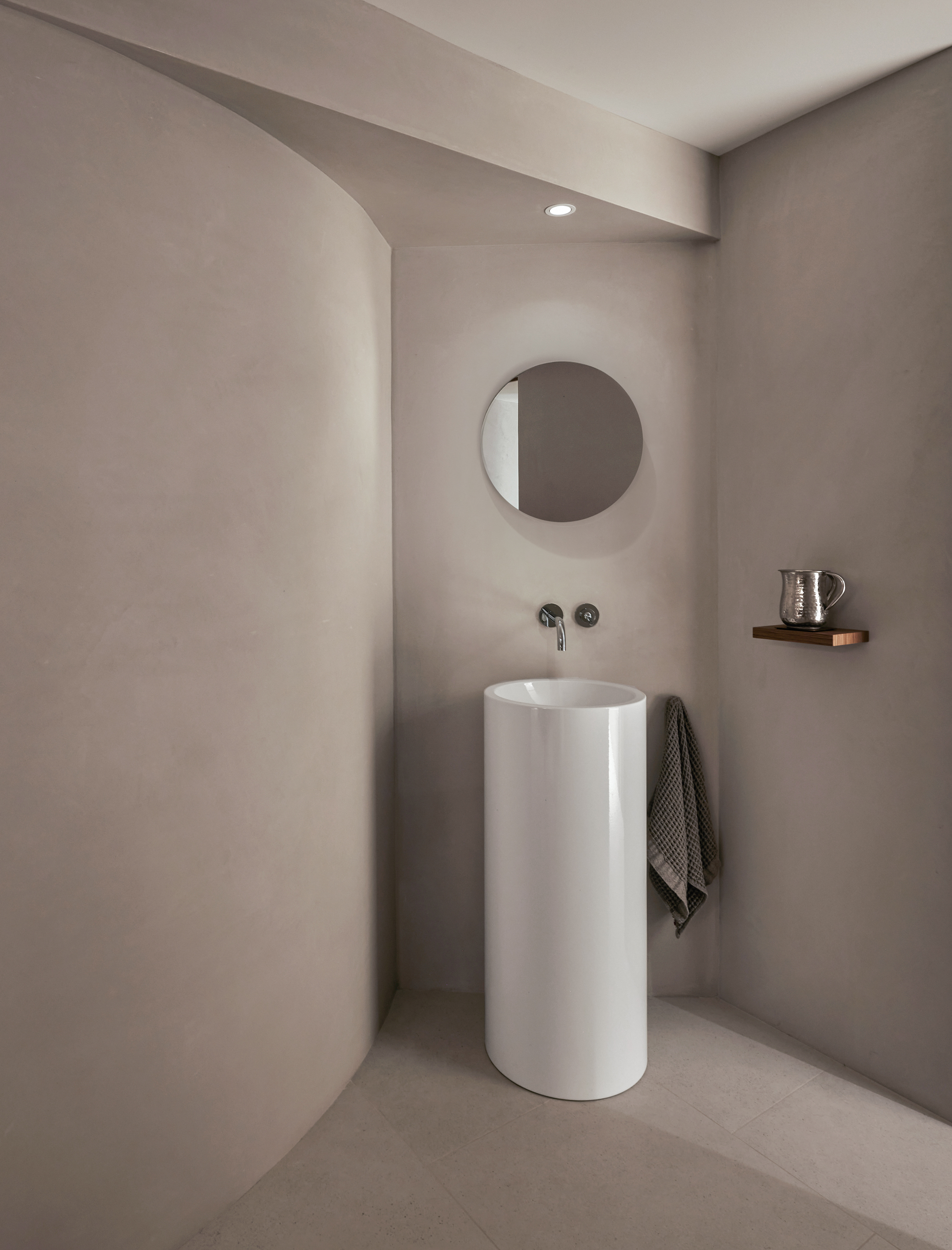
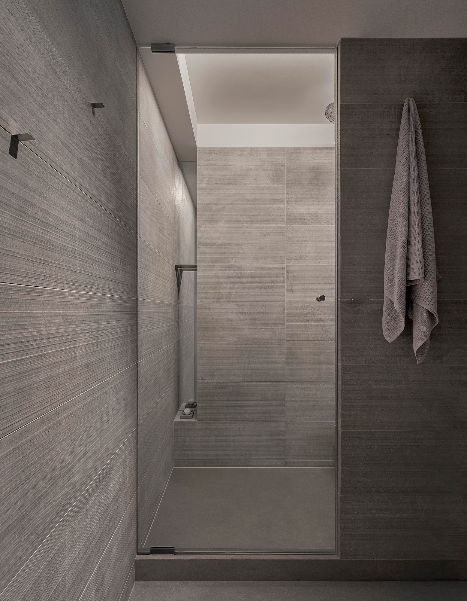
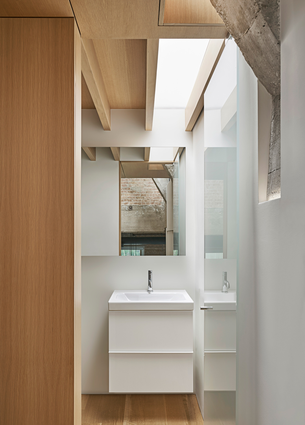
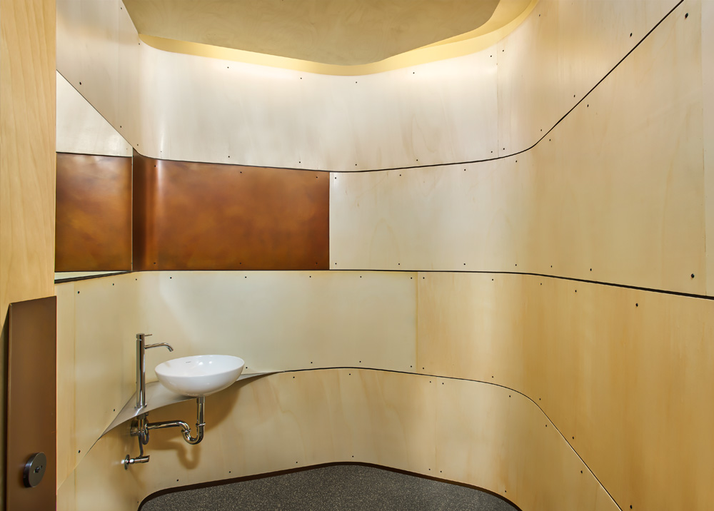
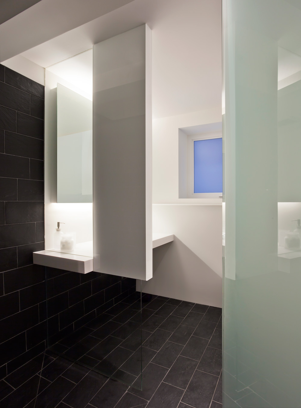
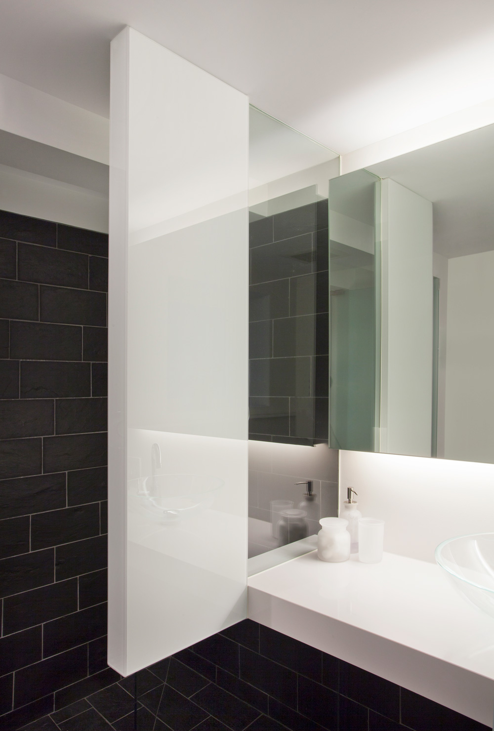
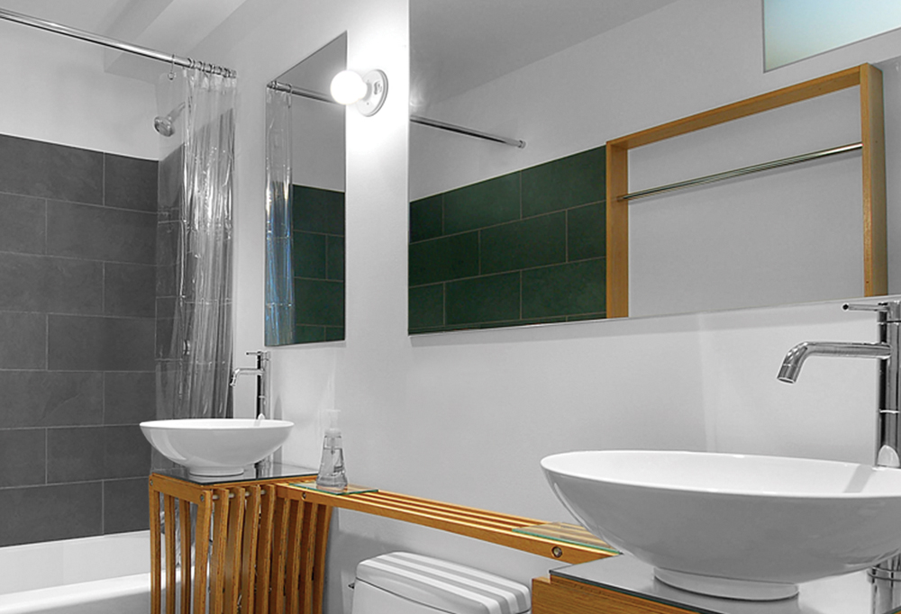
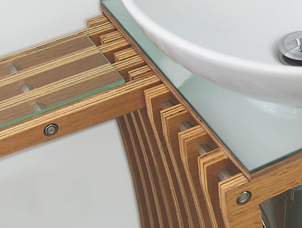
Bathroom
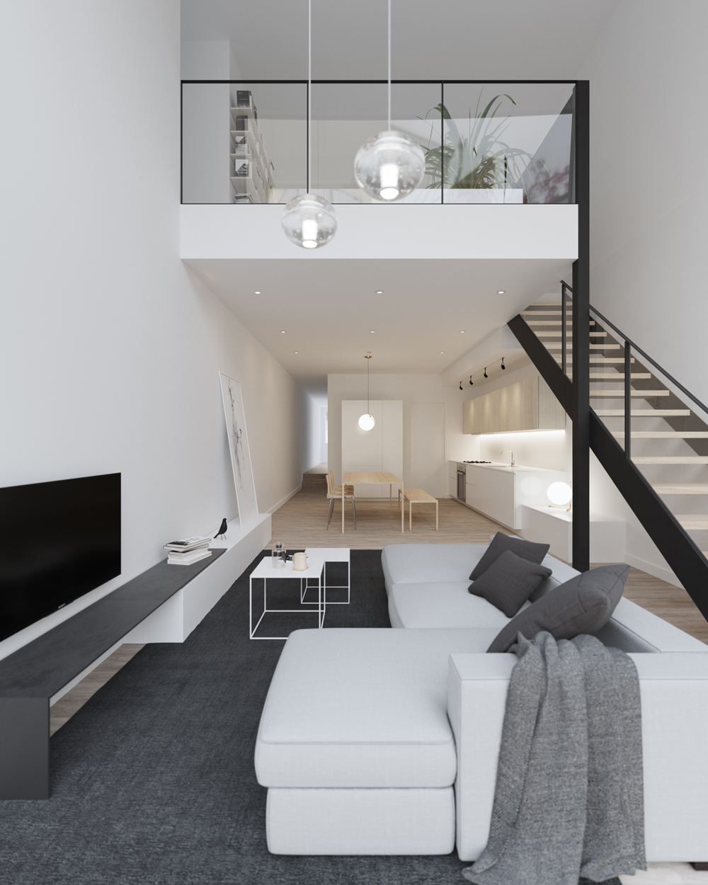
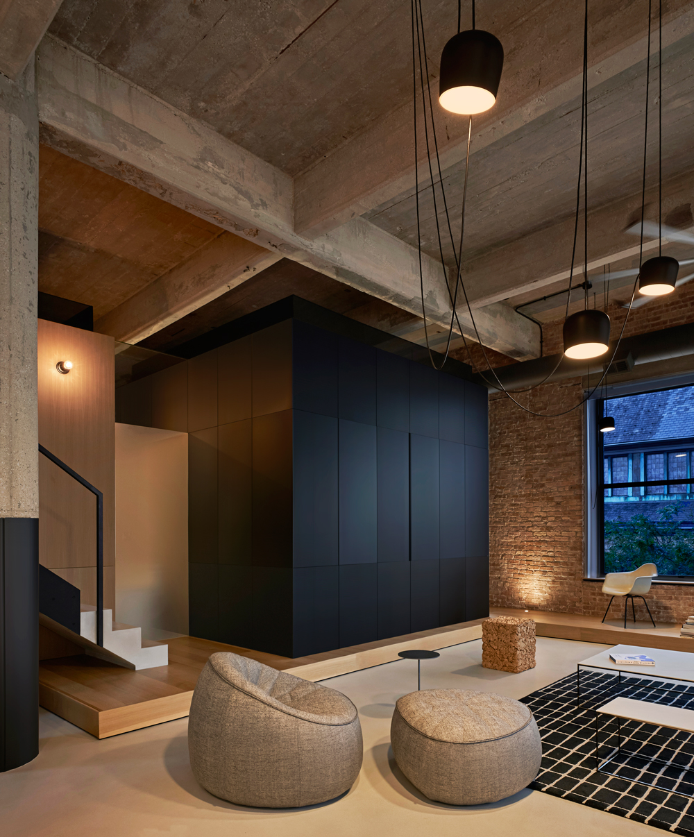
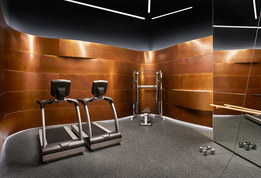
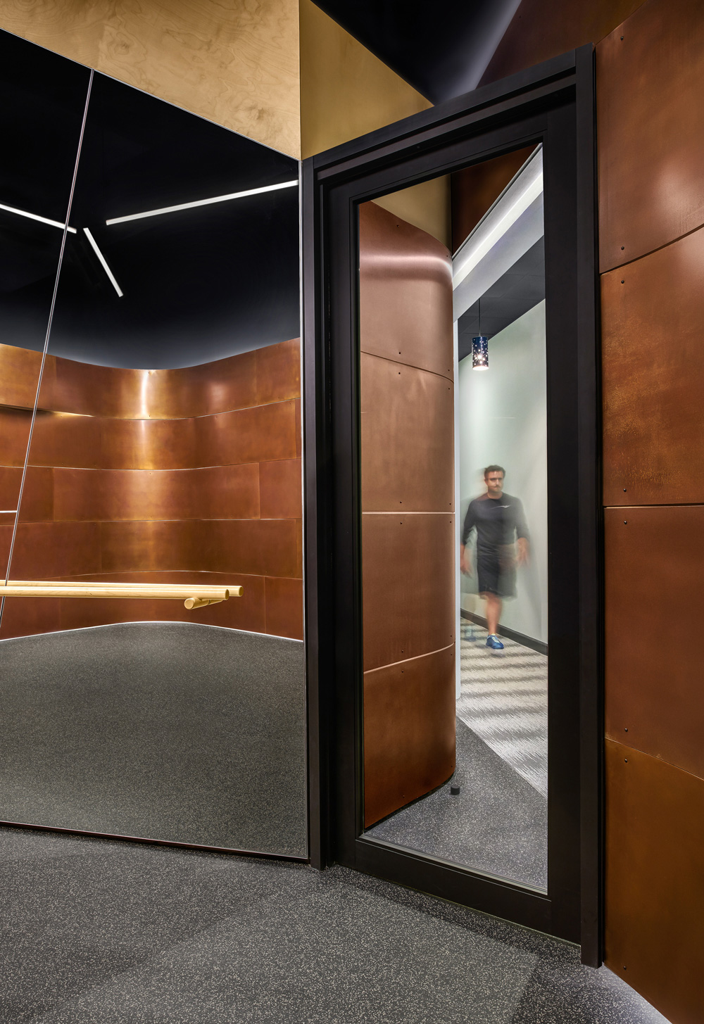
Living
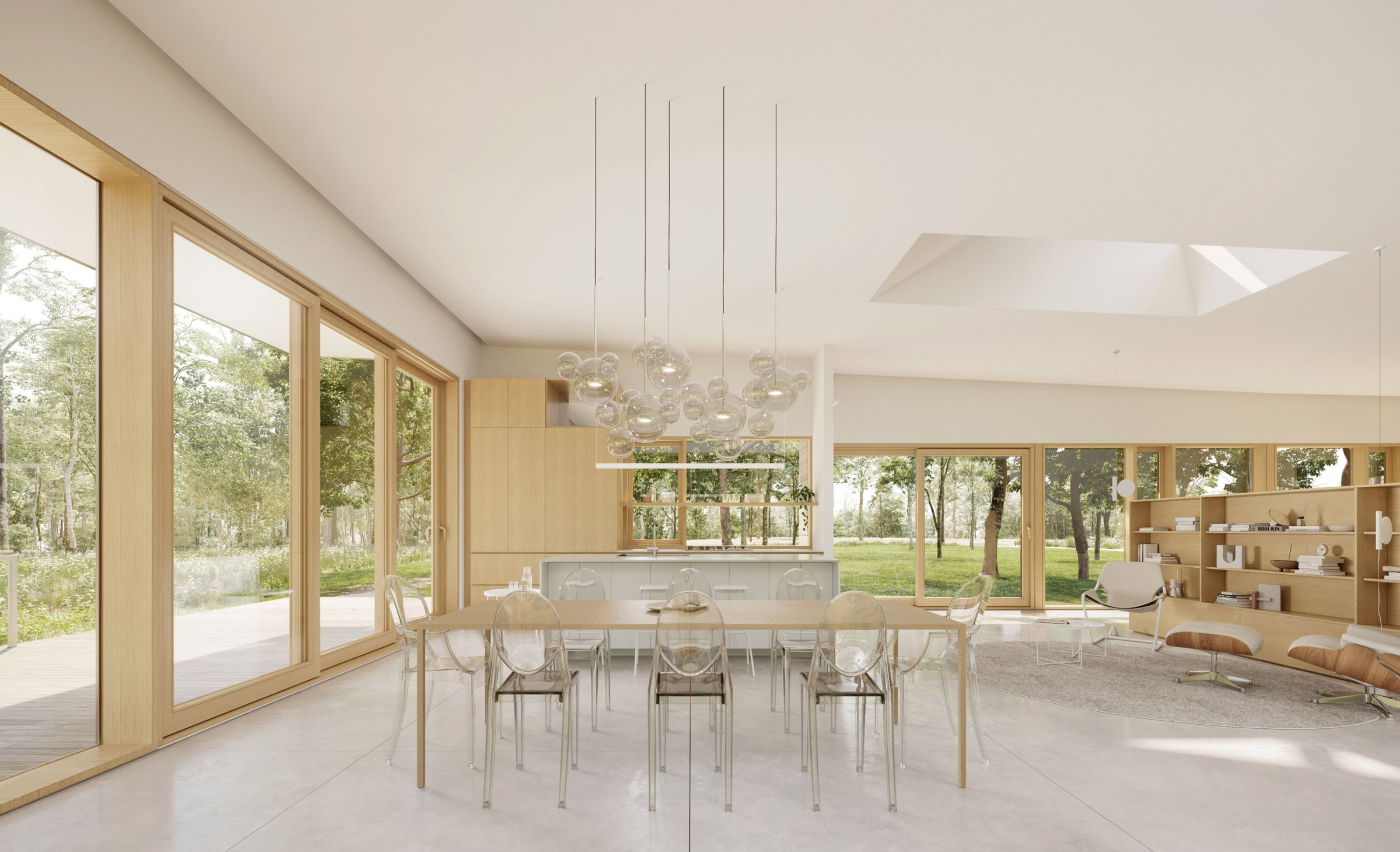
Living
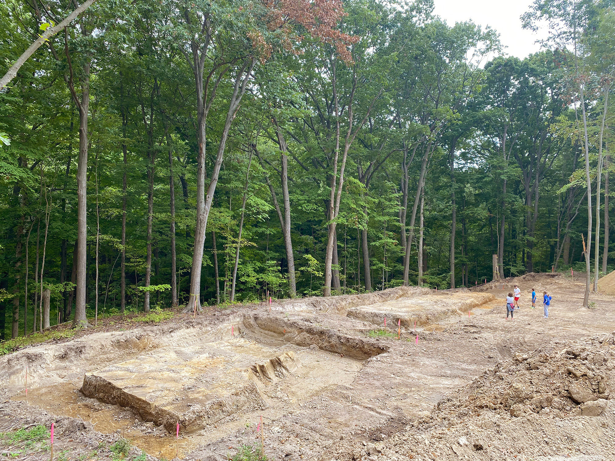
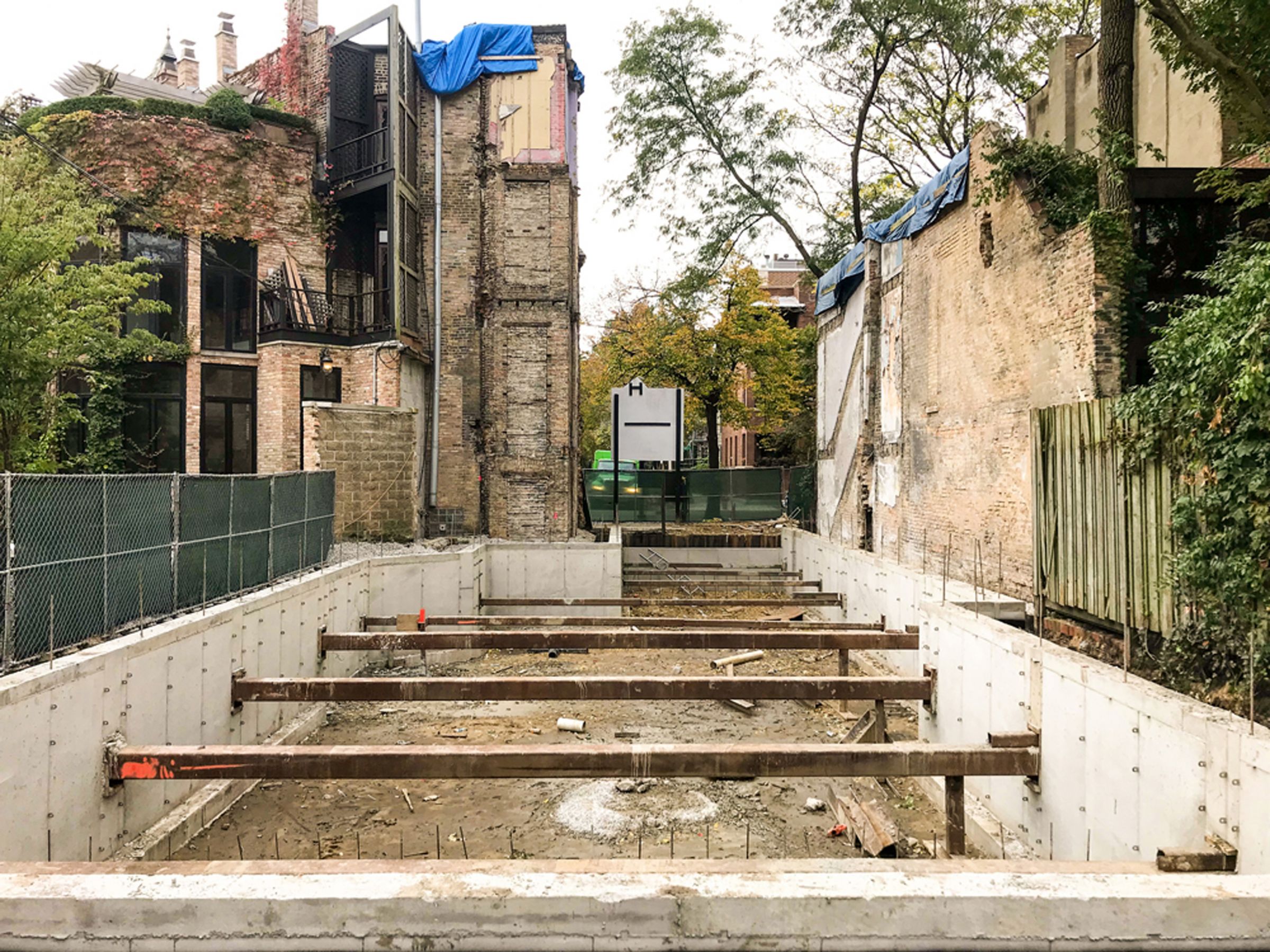
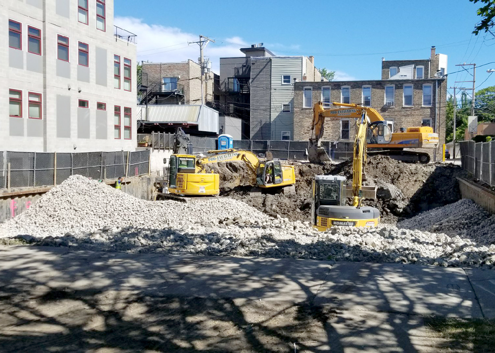
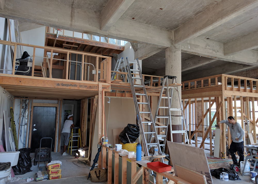
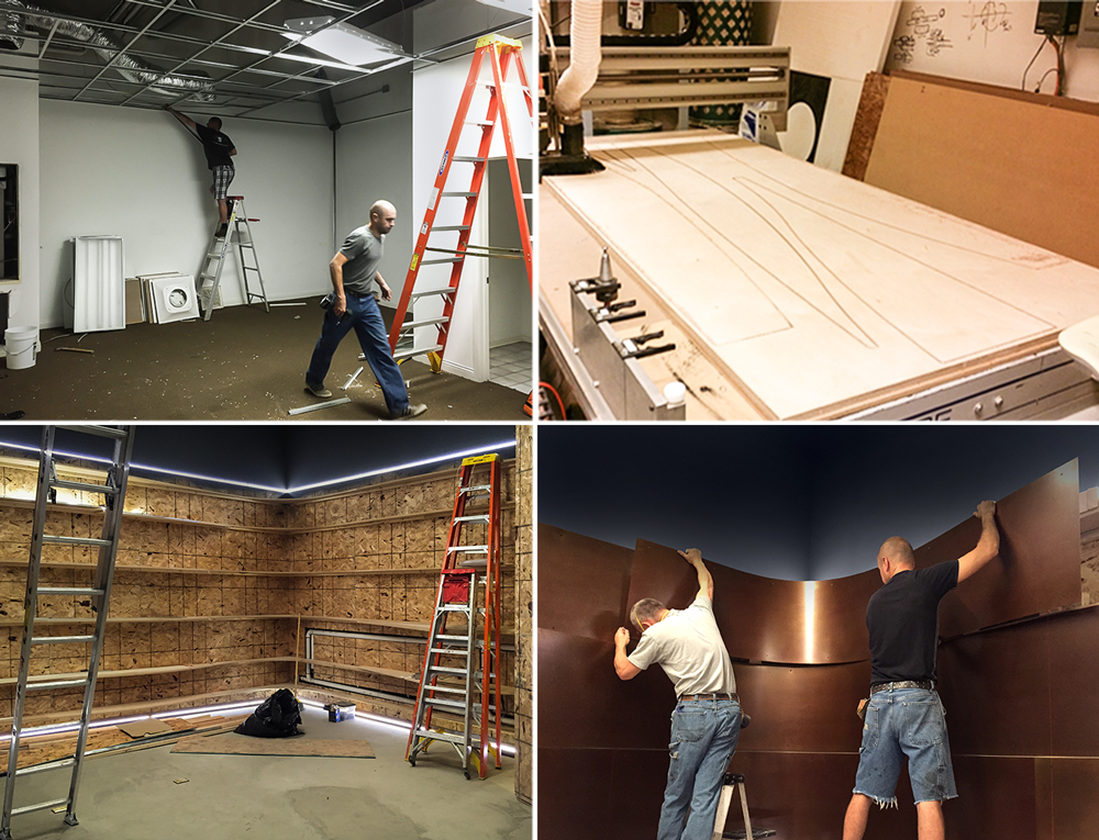
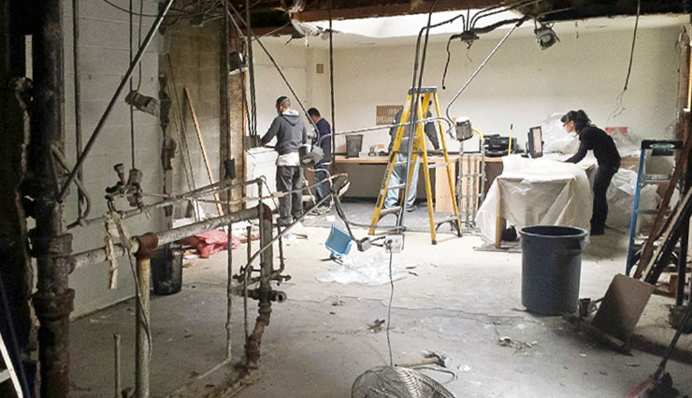
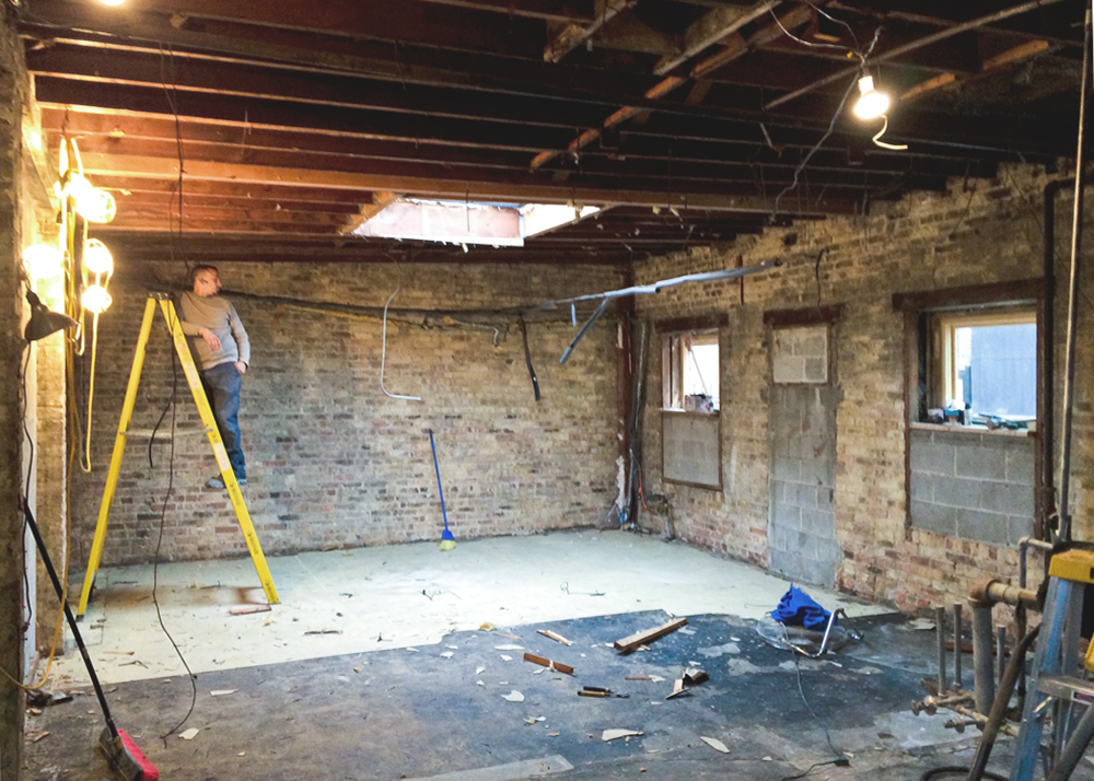
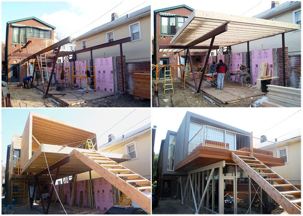
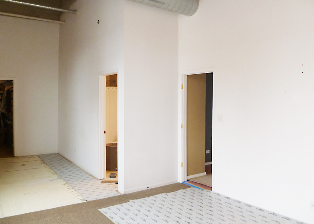
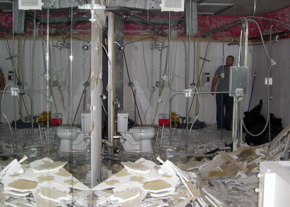
Excavation

Excavation
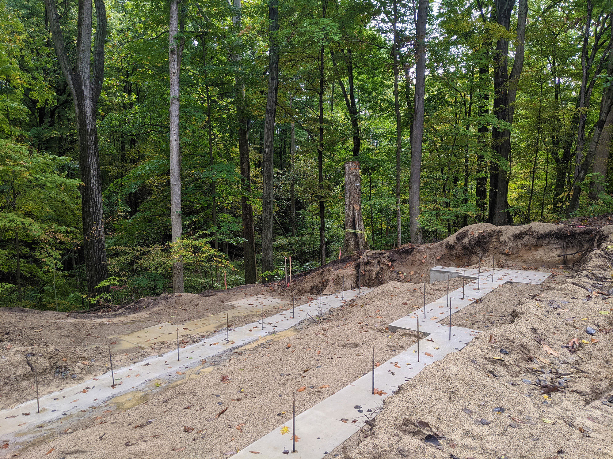
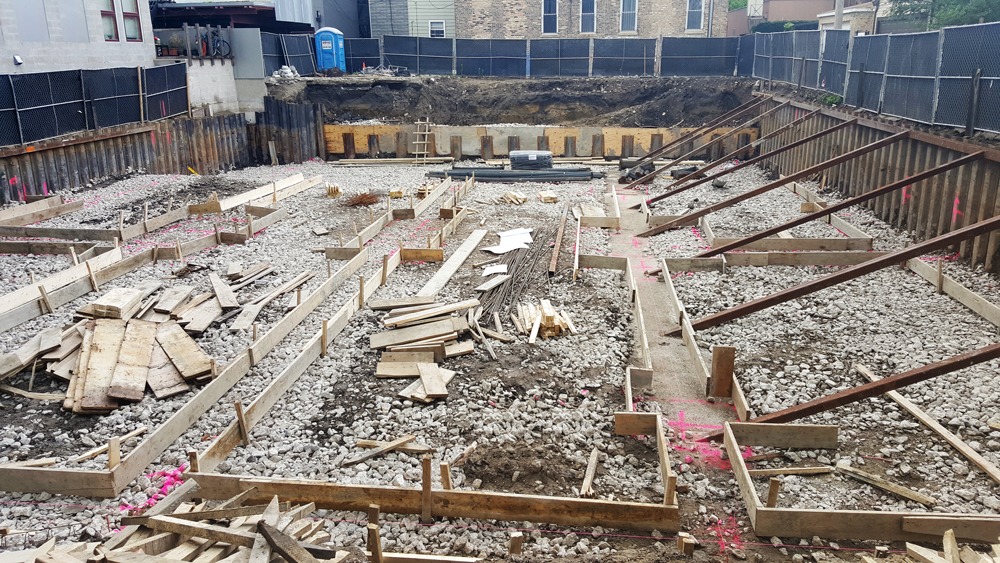
Foundations
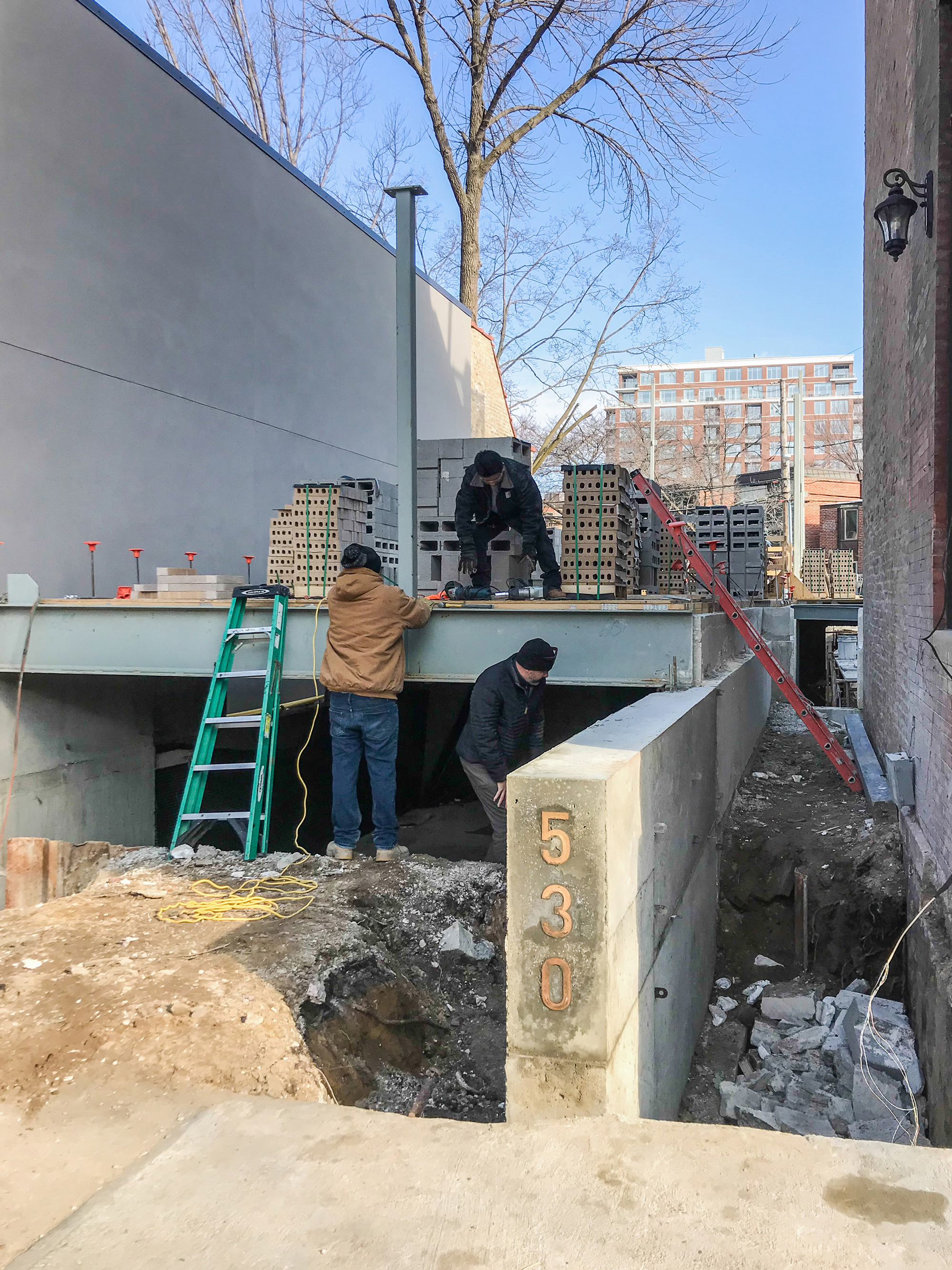
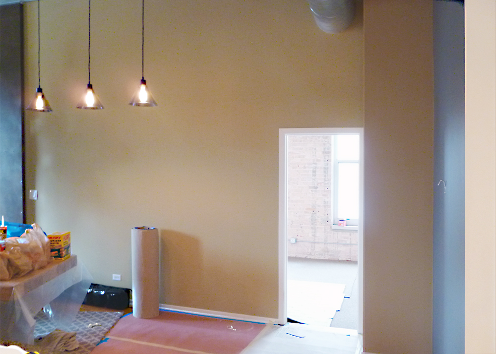
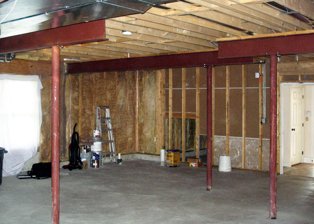
Steel
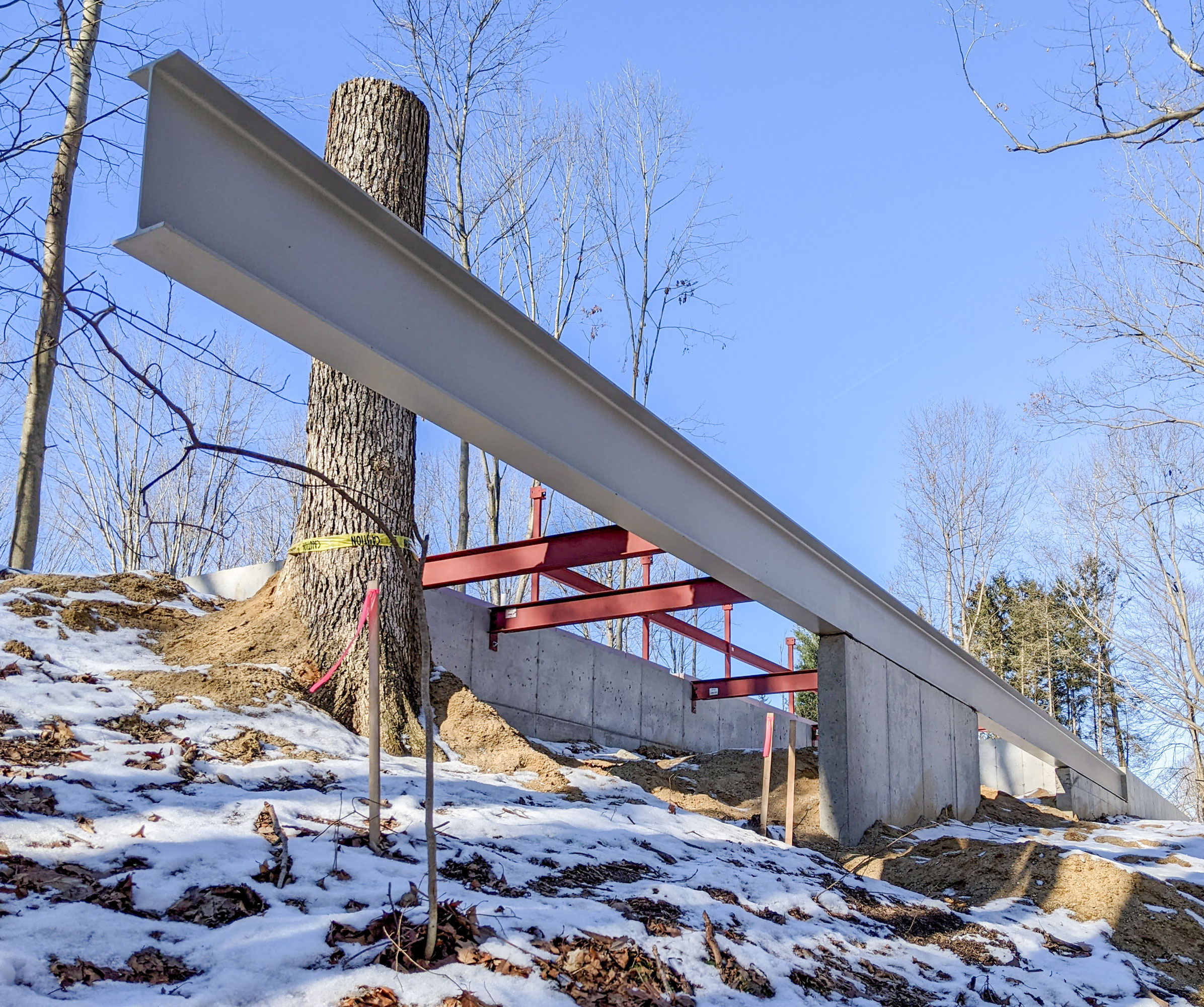
Steel

Steel
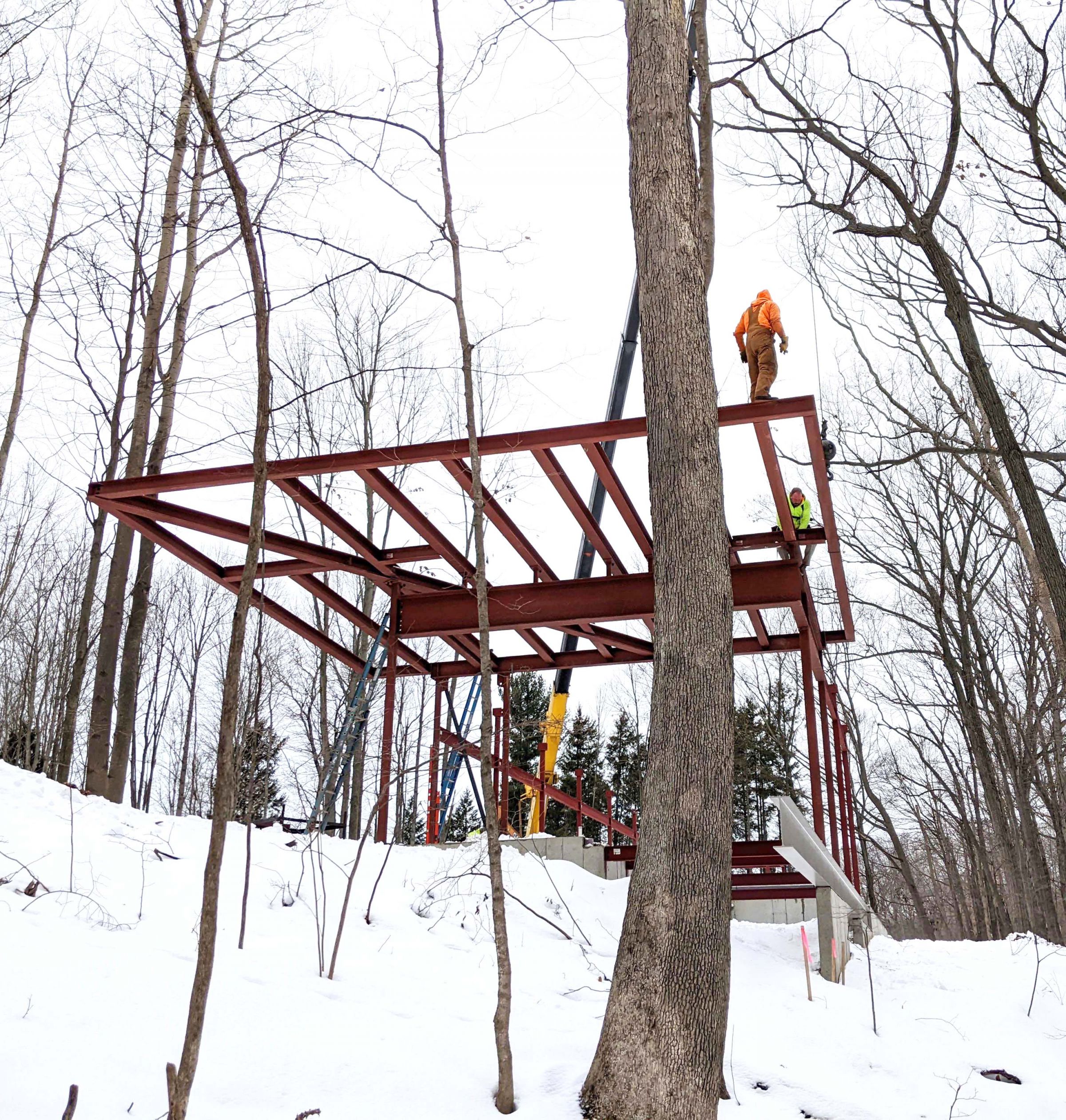
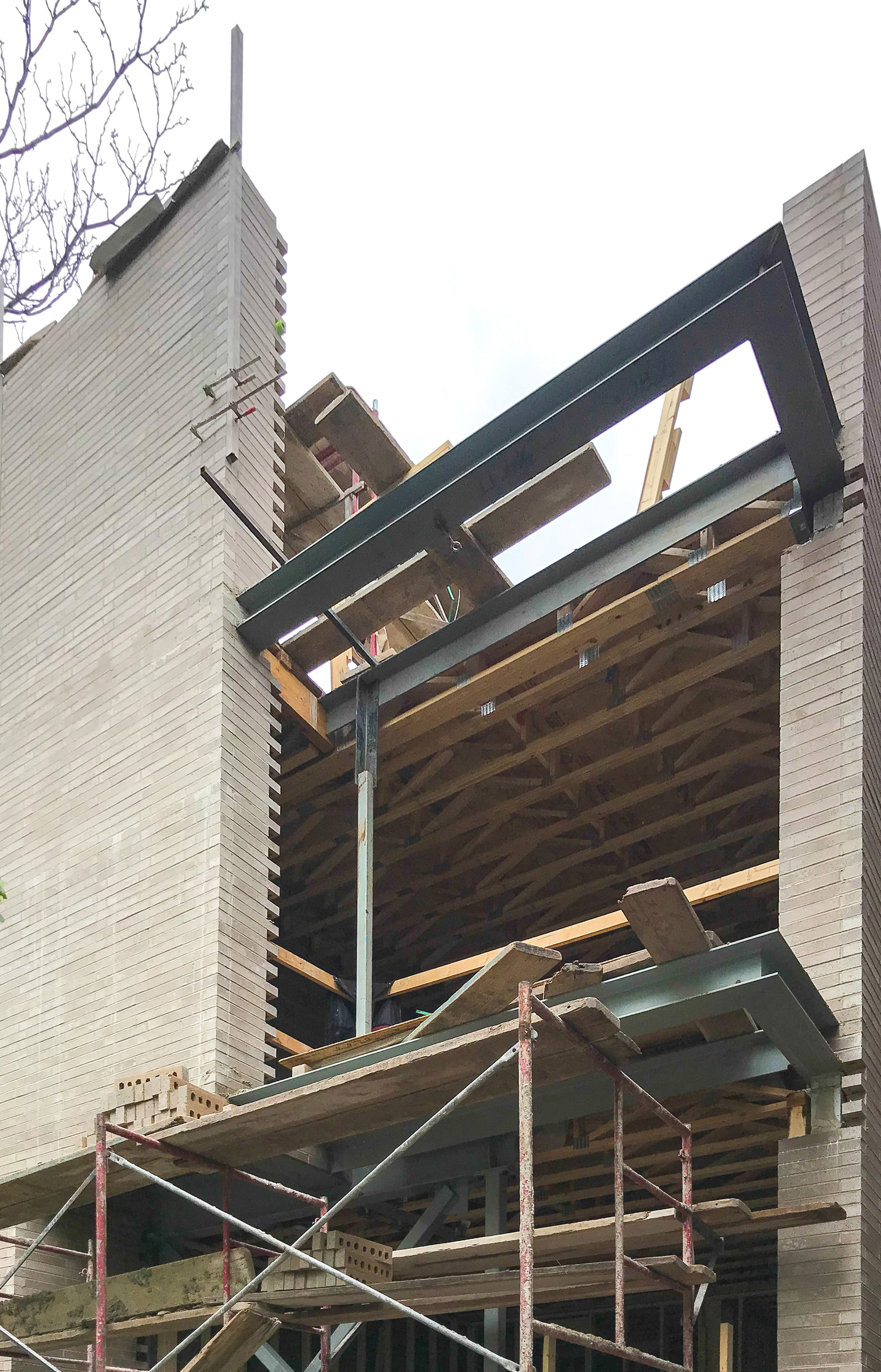
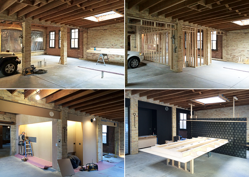
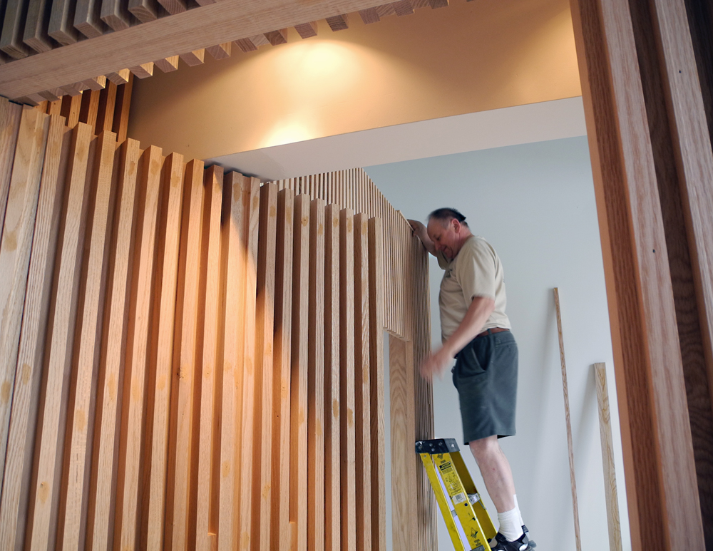
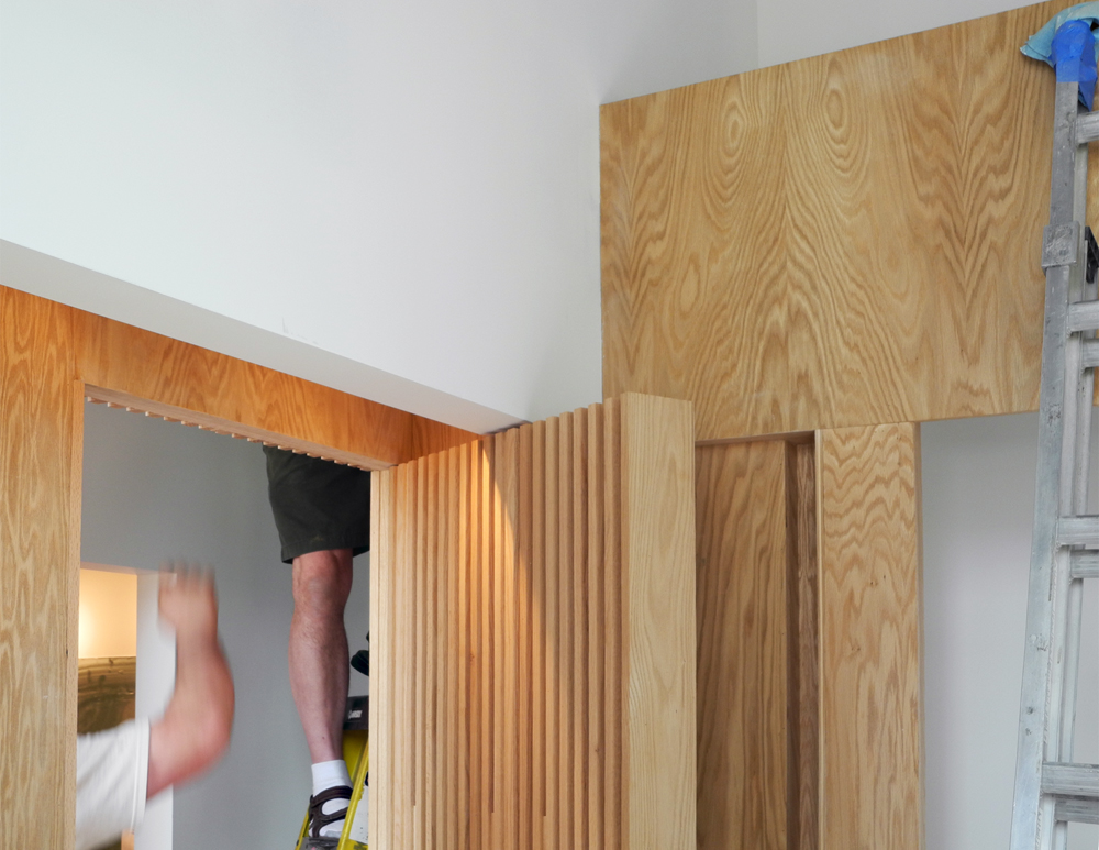
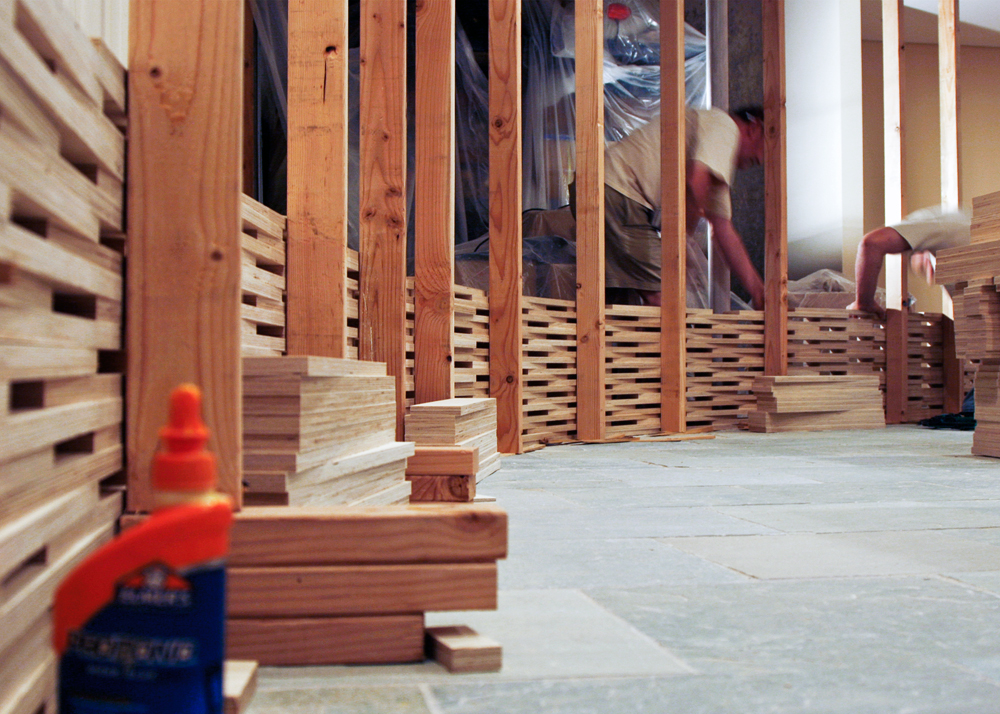
Framing
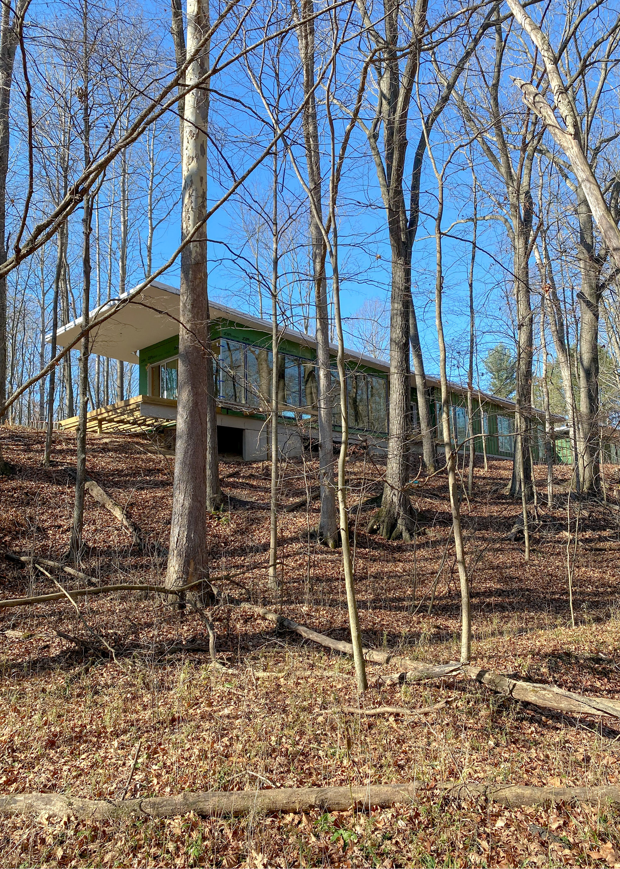
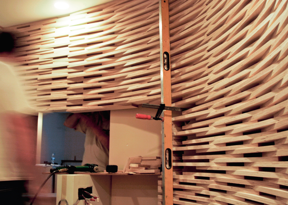
Cladding
Skylight Detail
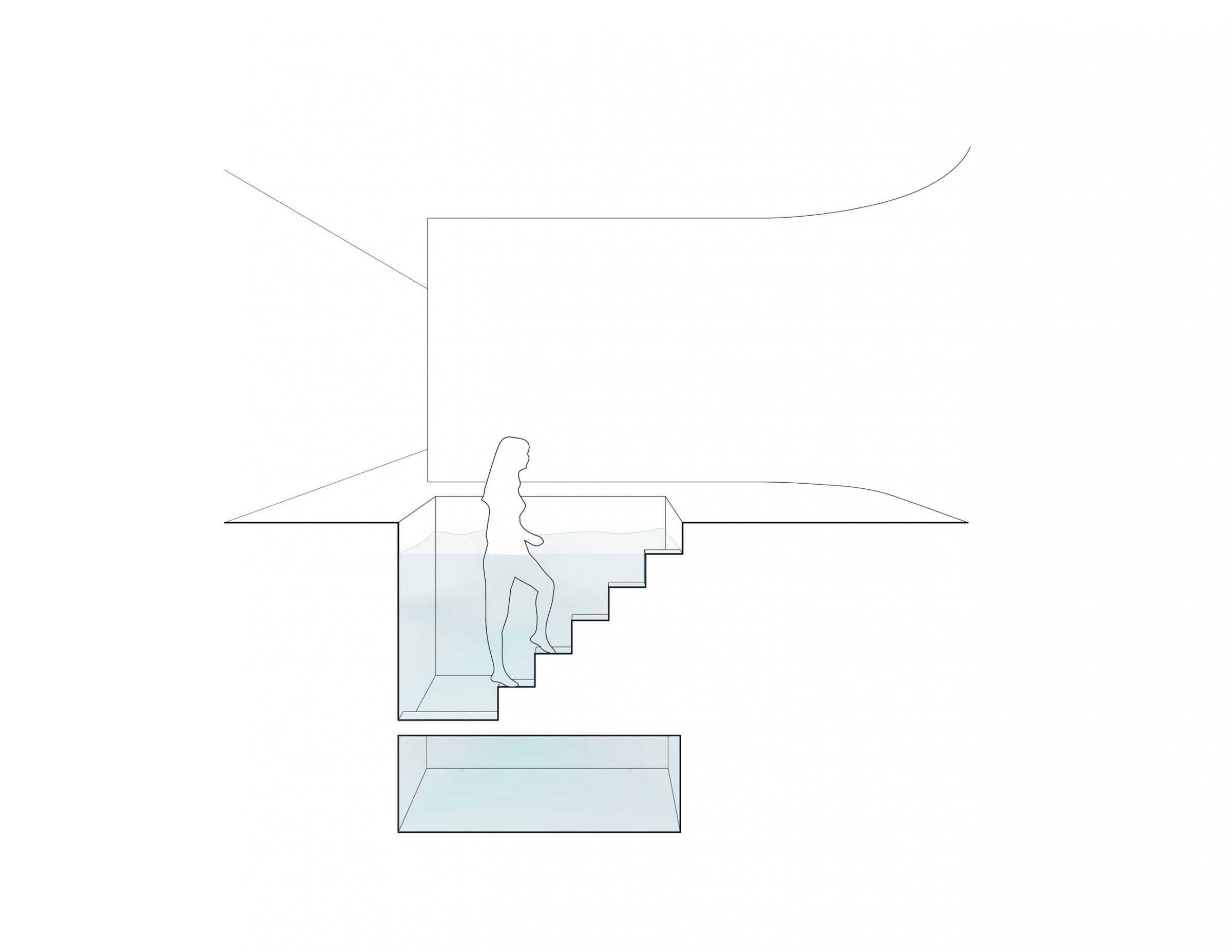
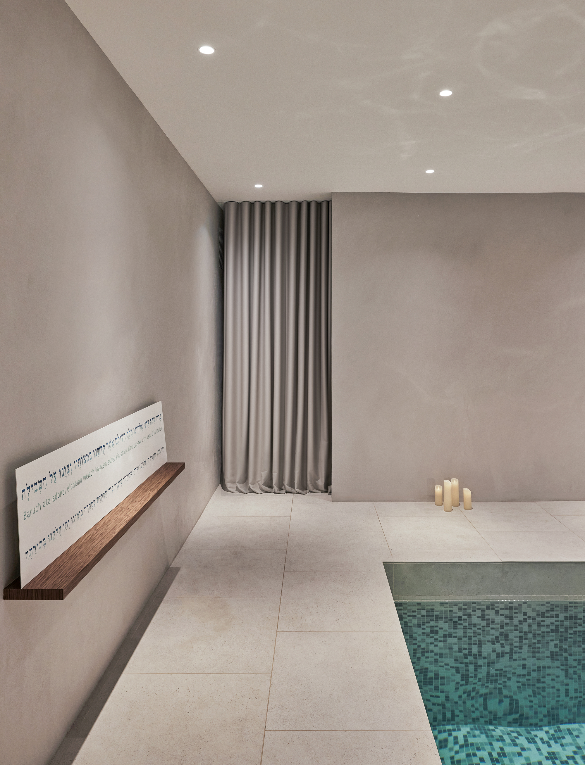
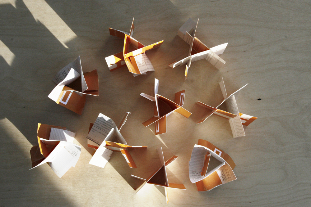
Mikvah Pool Section
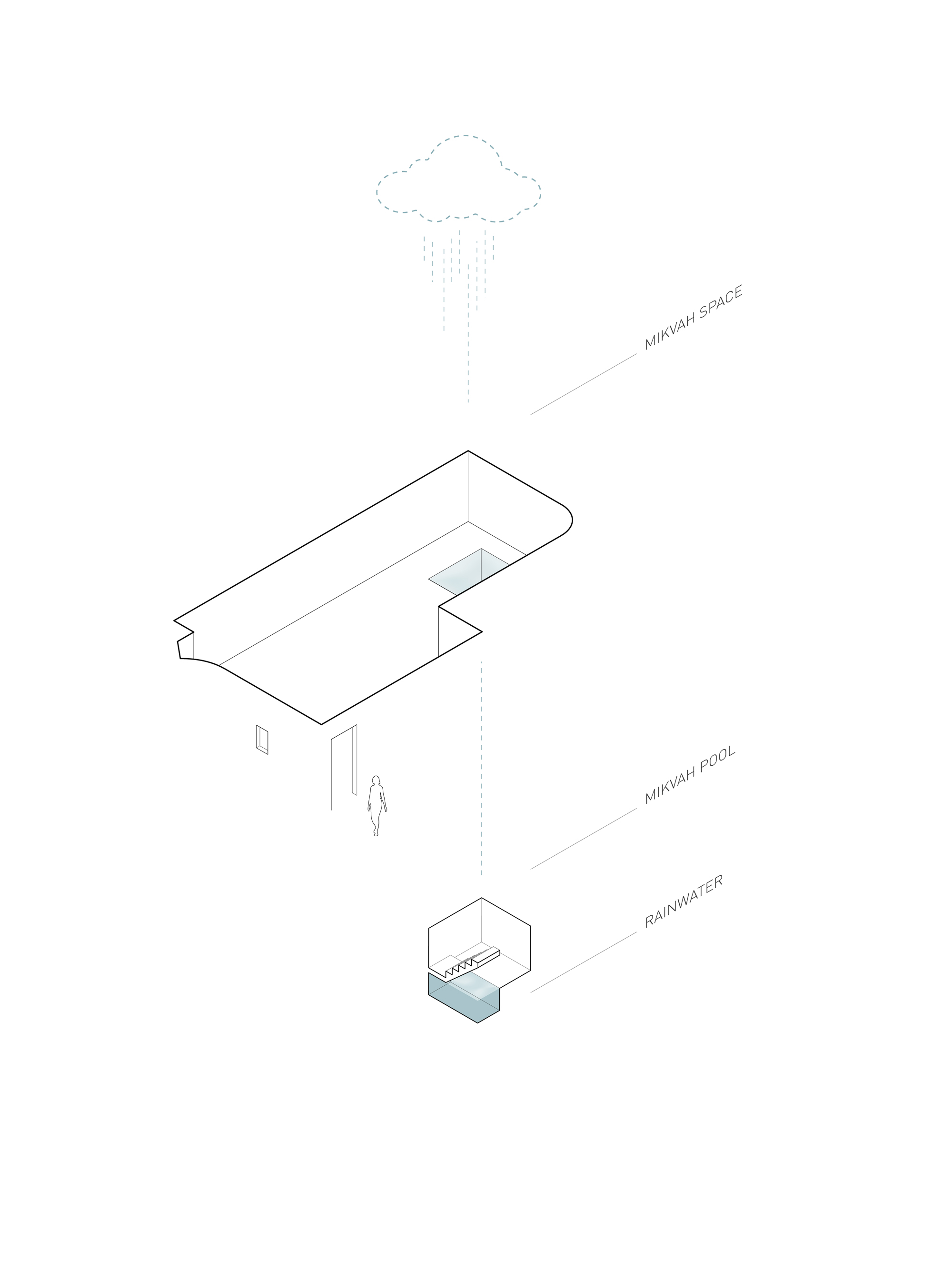
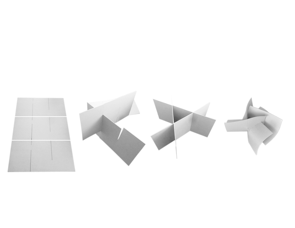
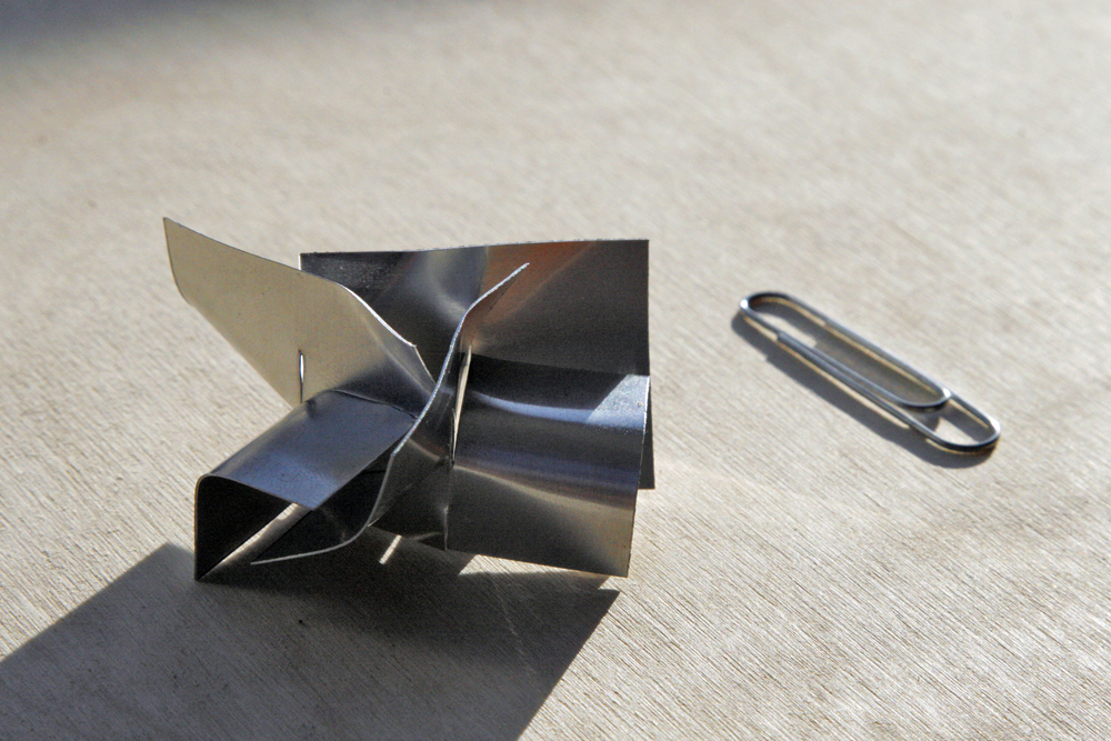
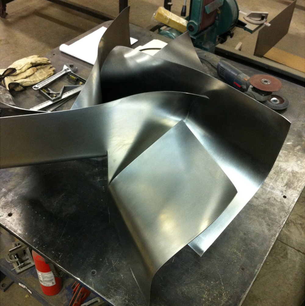
Organization Diagram
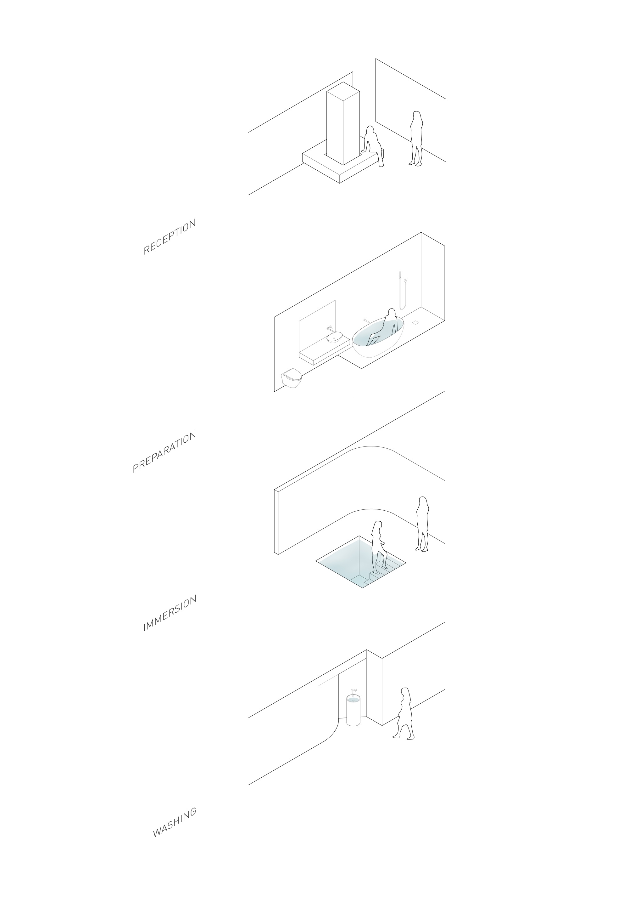
Mikvah Immersion Process
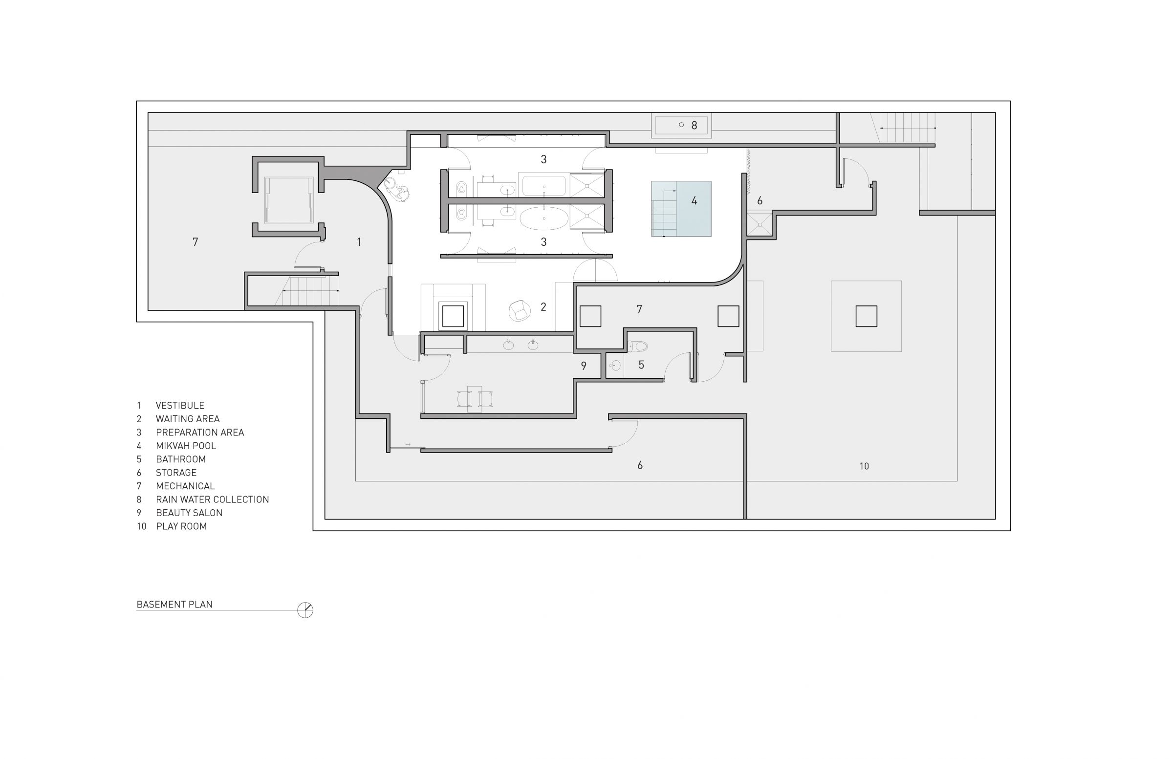
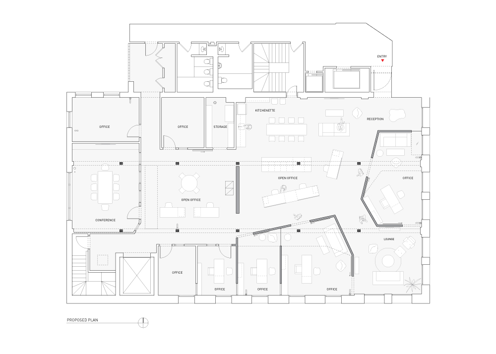
Proposed Plan
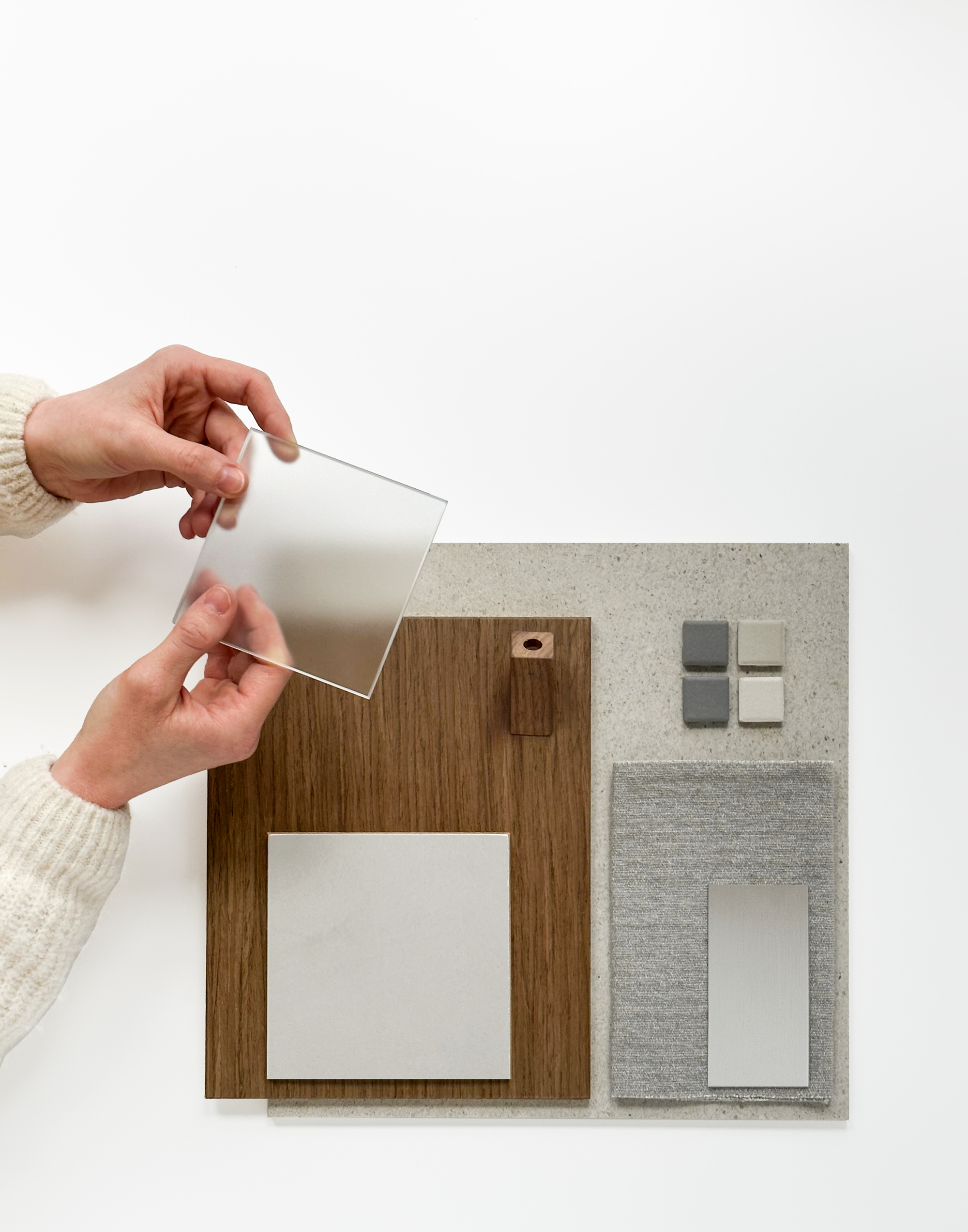
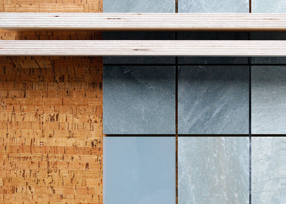
Material Palette
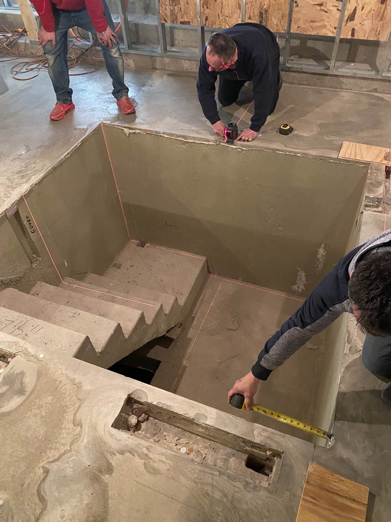
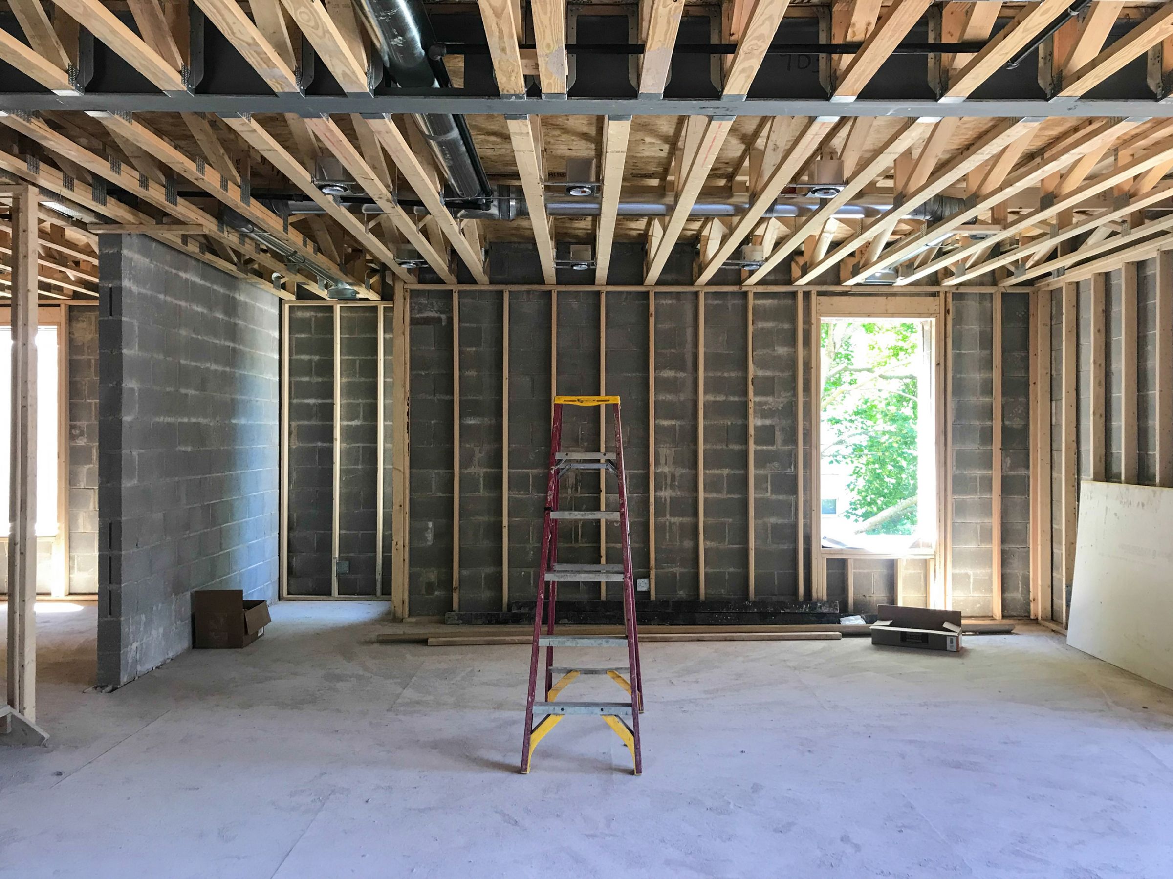
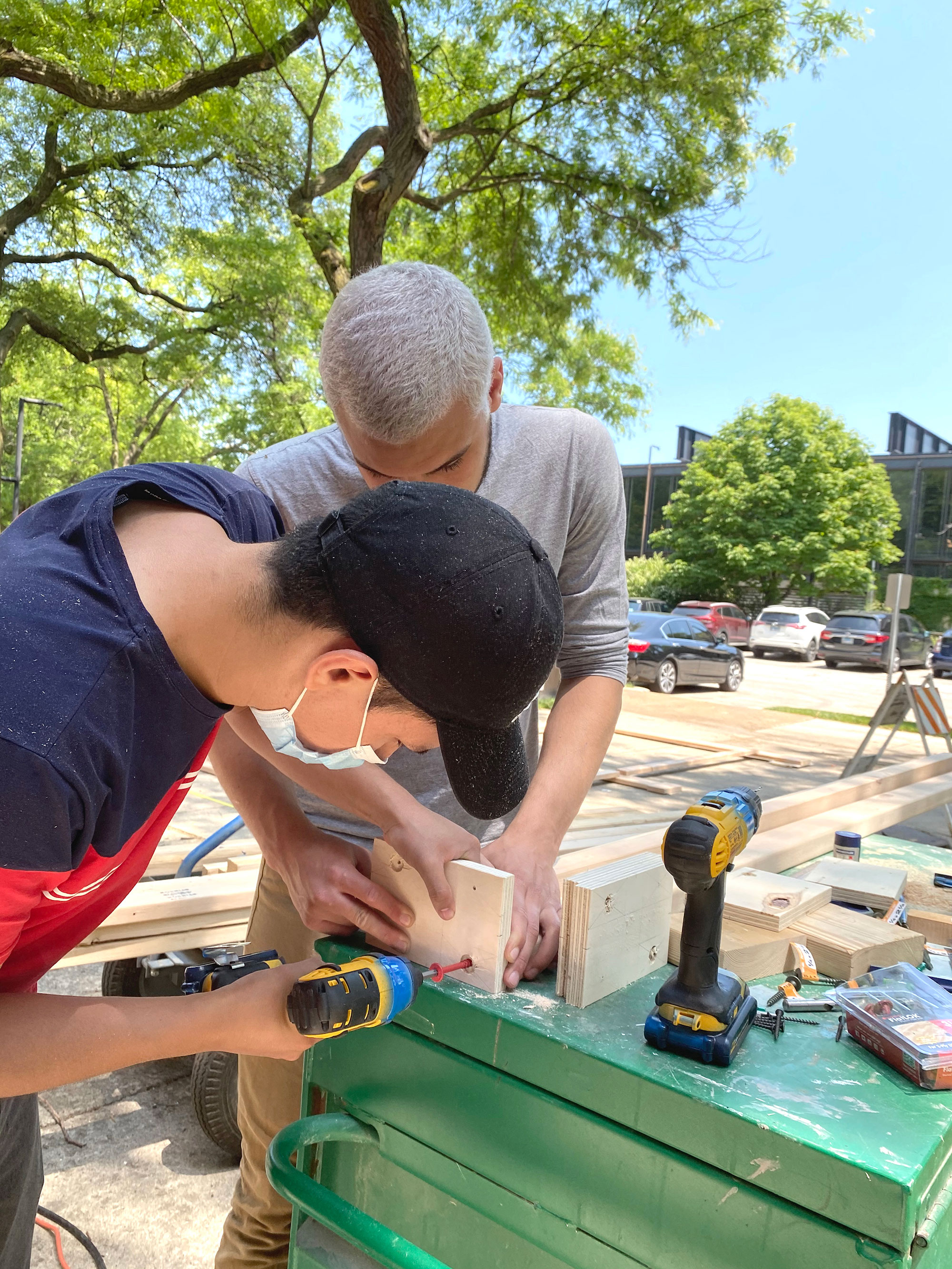
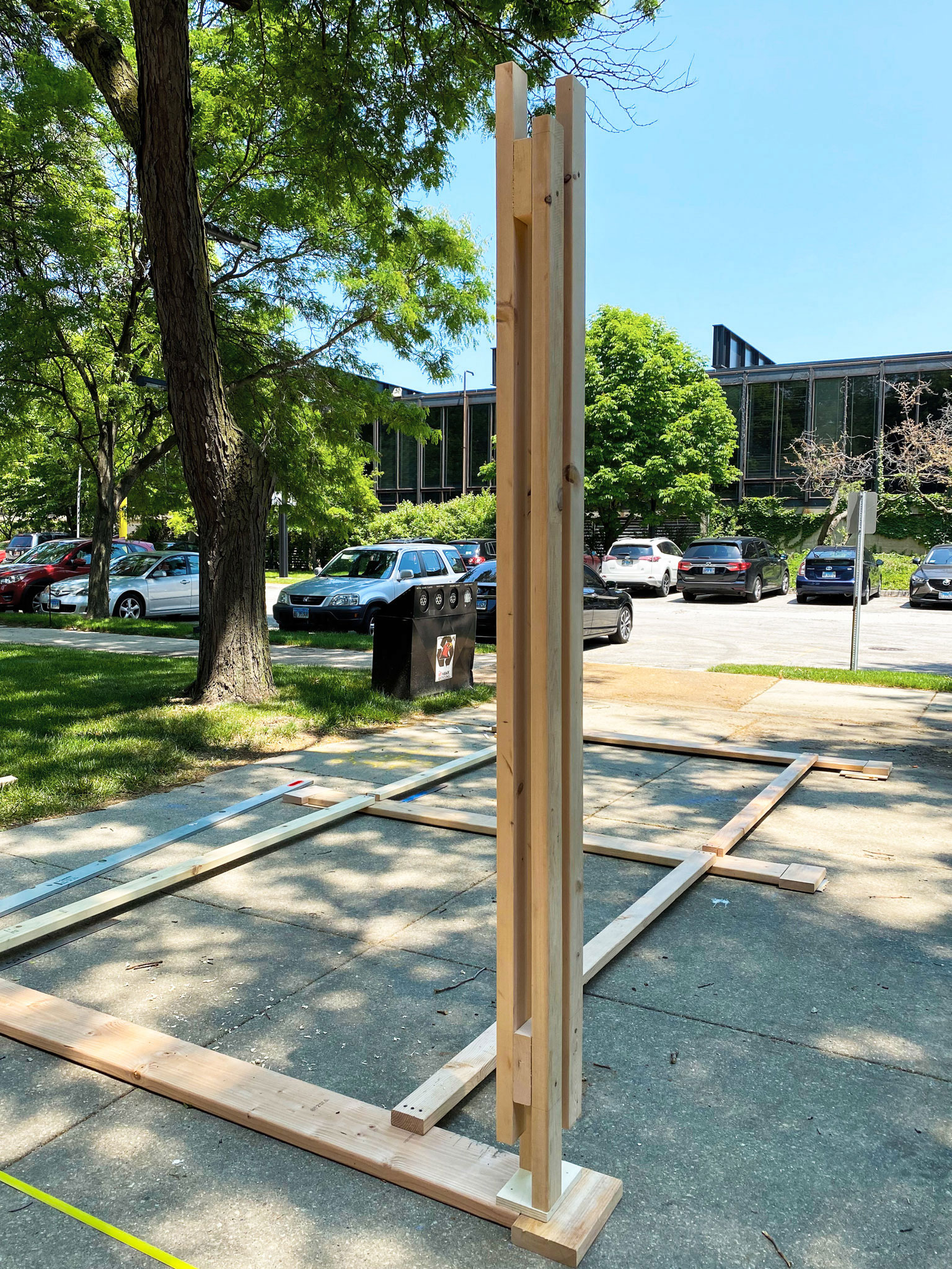
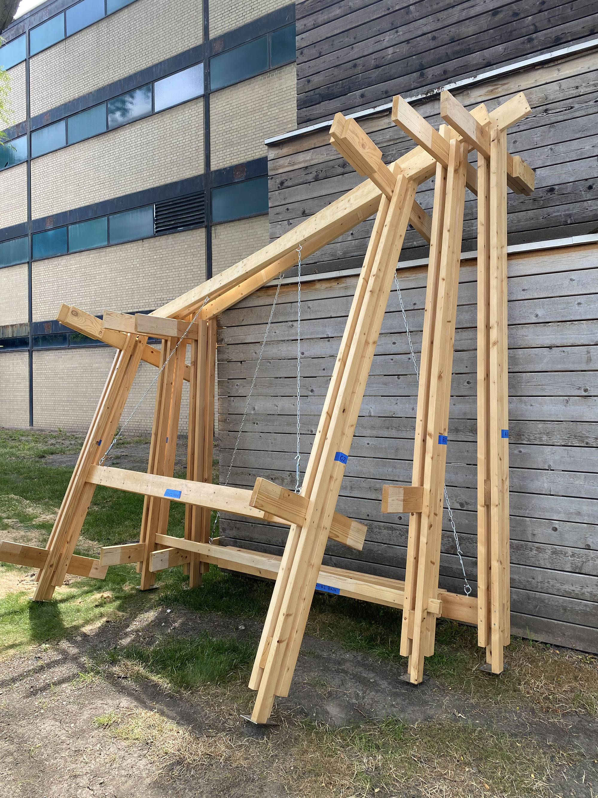
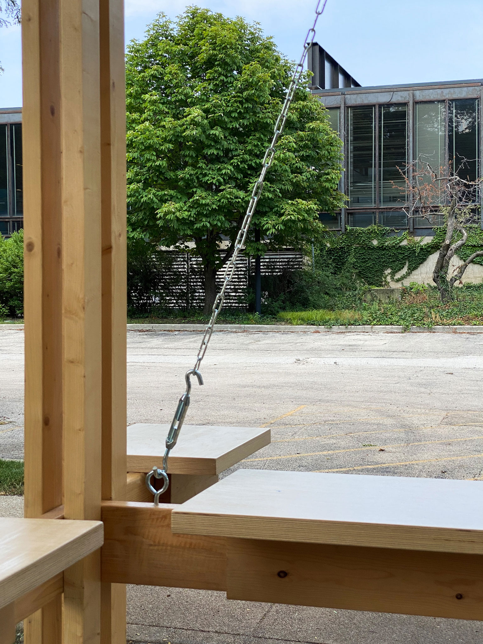
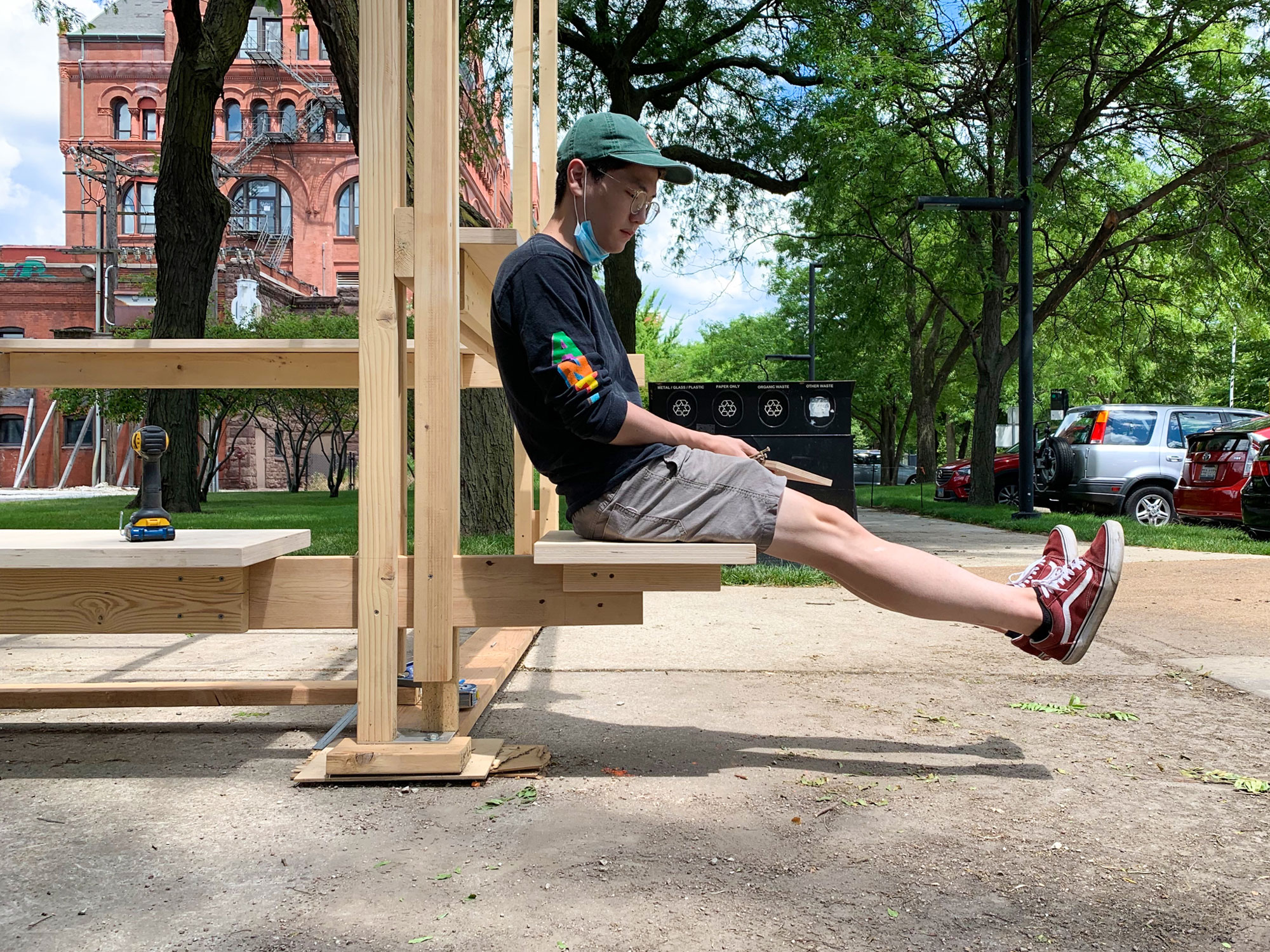
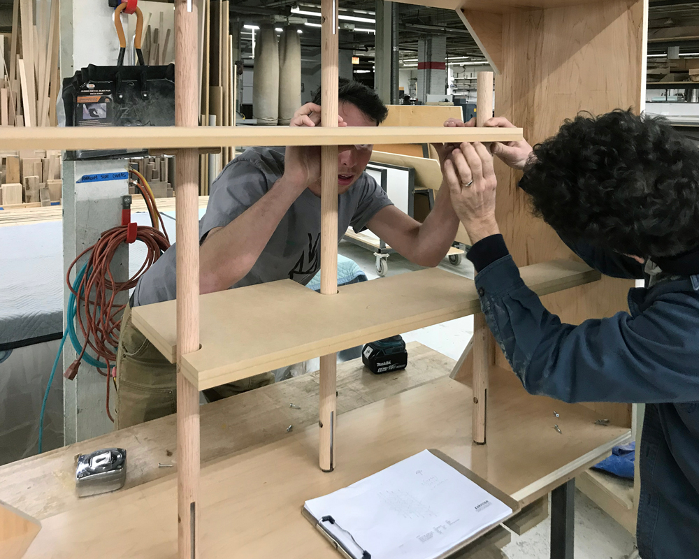
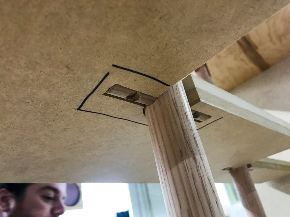
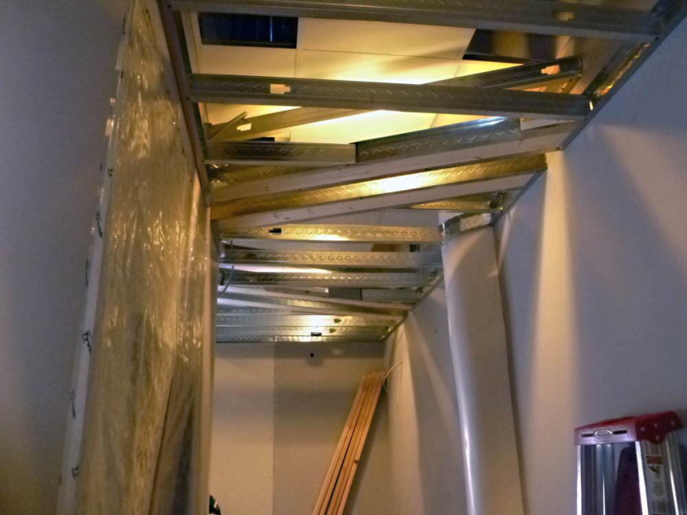
Construction
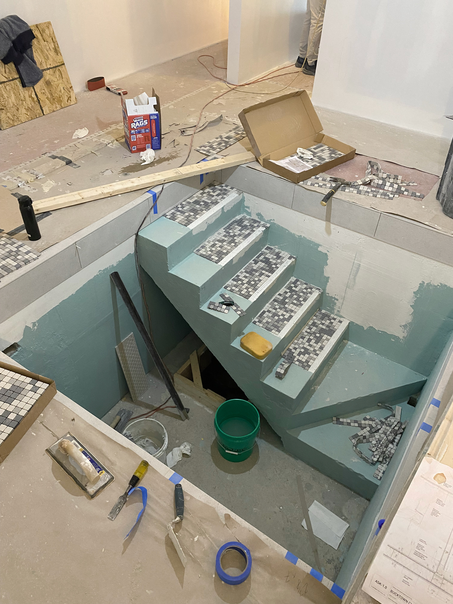
Construction
Design Process
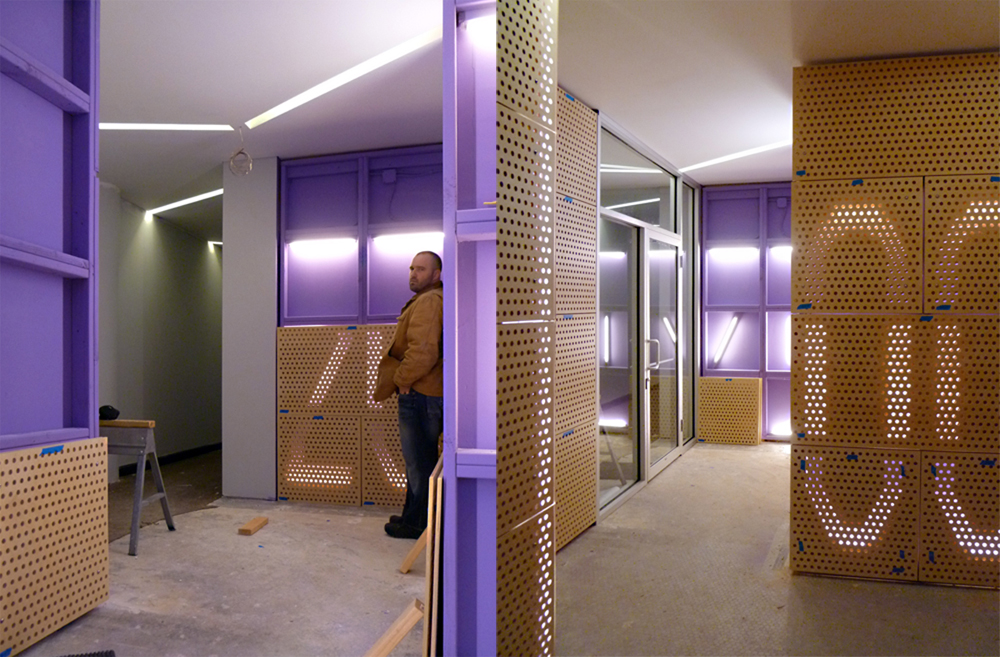
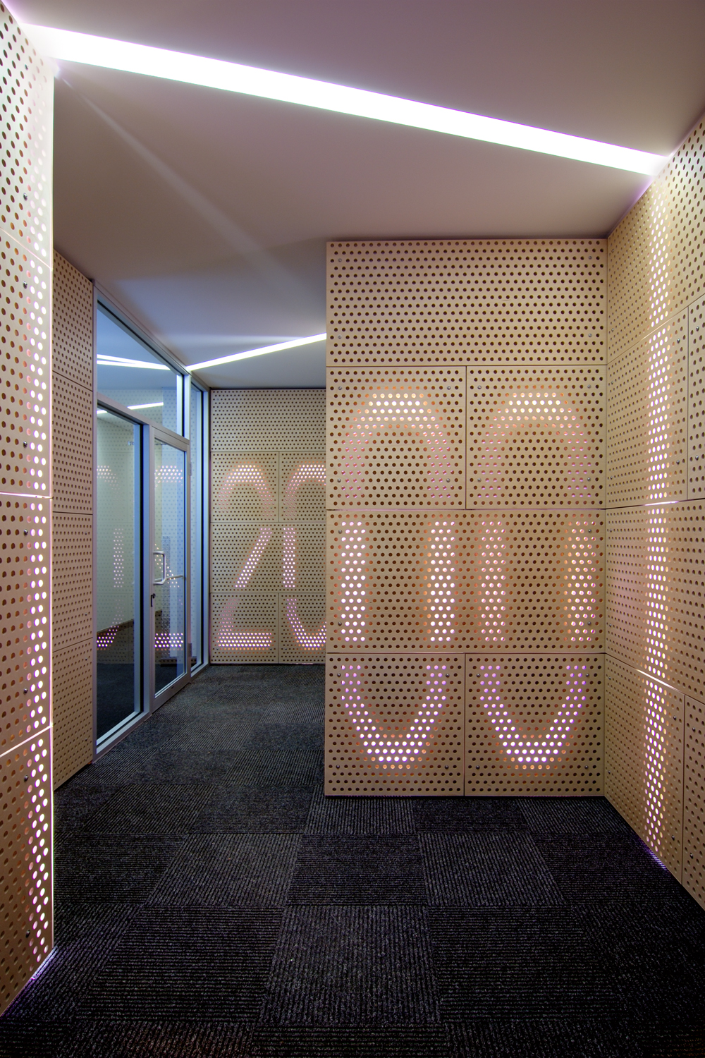
Reception © Mike Schwartz
Reception © Mike Schwartz
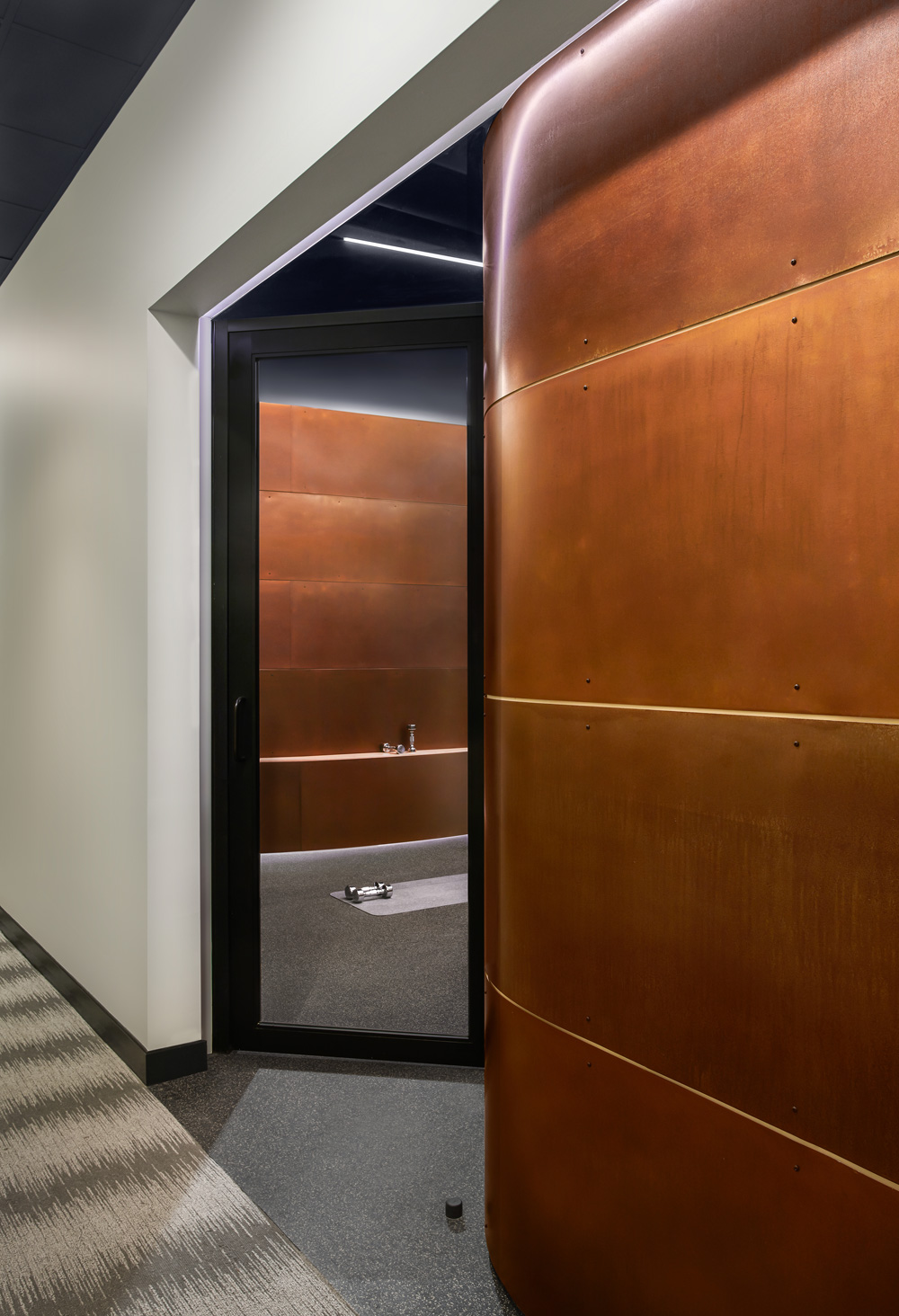
Mikvah Pool © Mike Schwartz
Preparation Room © Mike Schwartz
Preparation Room © Mike Schwartz
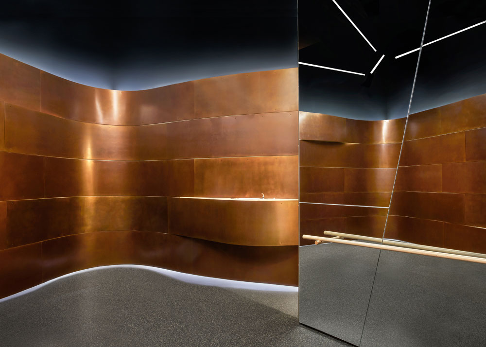
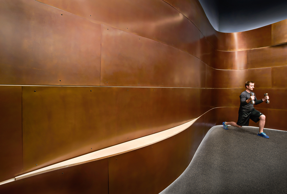
Mikvah Pool © Mike Schwartz
Mikvah Pool © Mike Schwartz
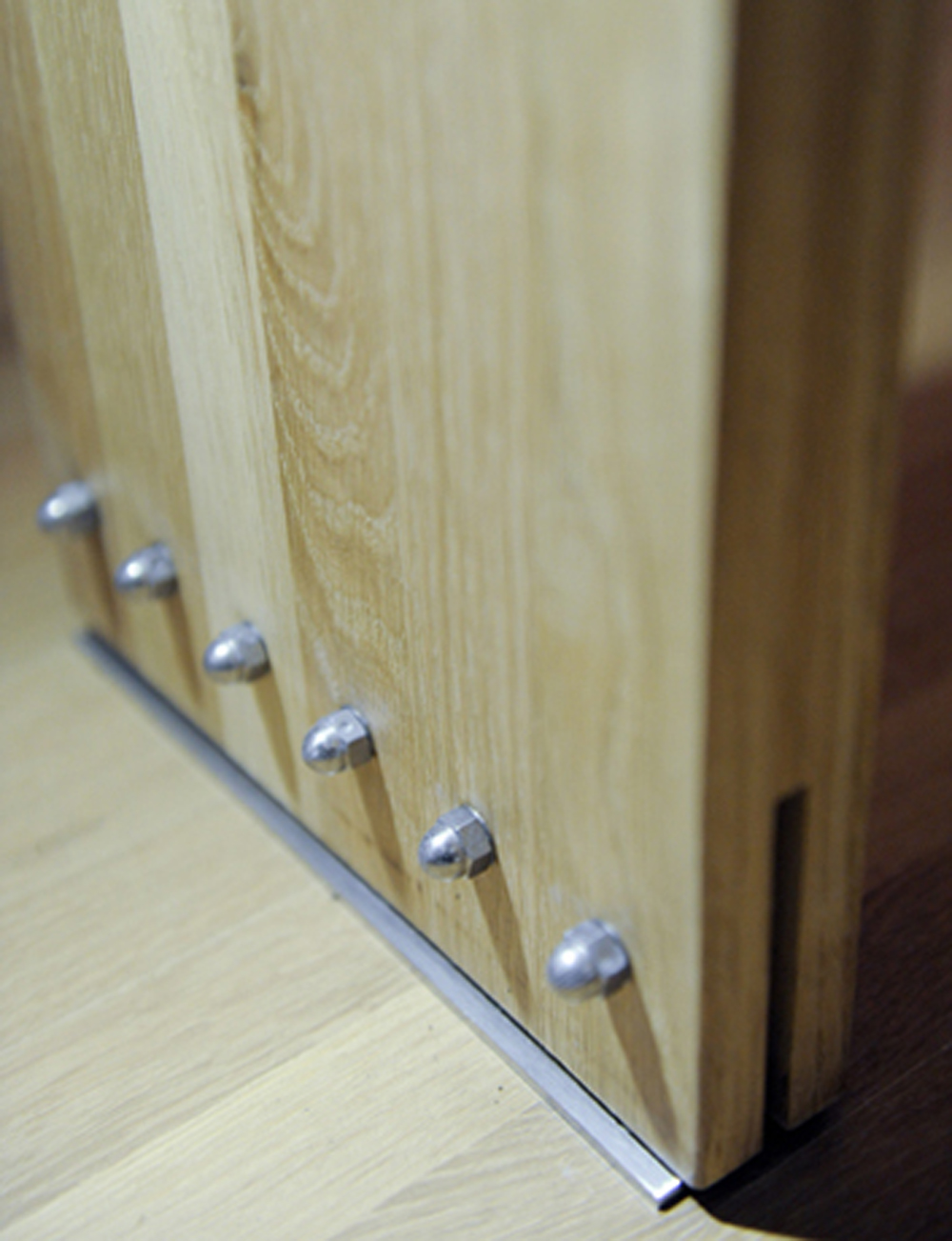
Mikvah Handrail Detail © Mike Schwartz
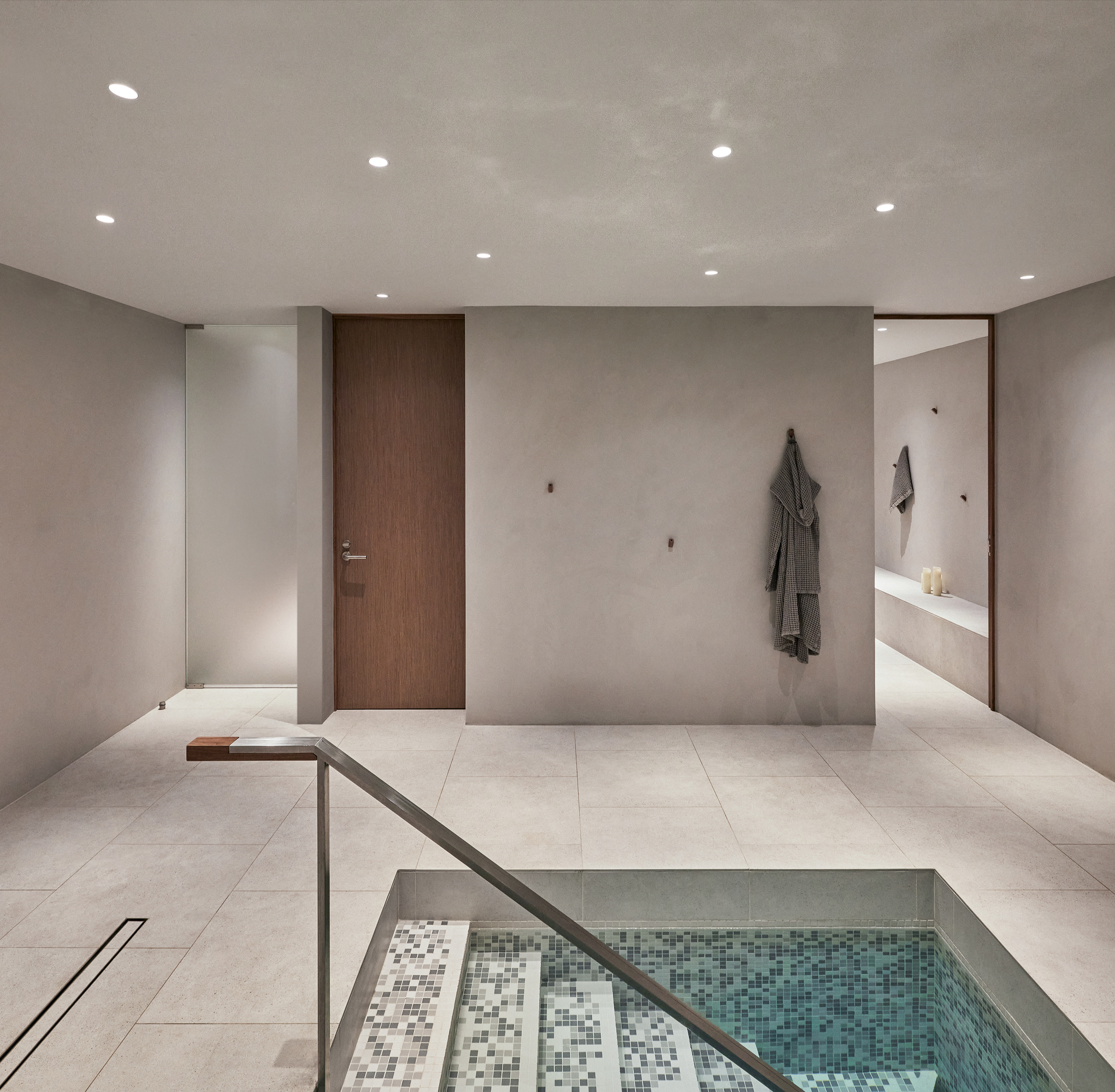
Mikvah Room © Mike Schwartz
Handwashing © Mike Schwartz
Reception © Mike Schwartz
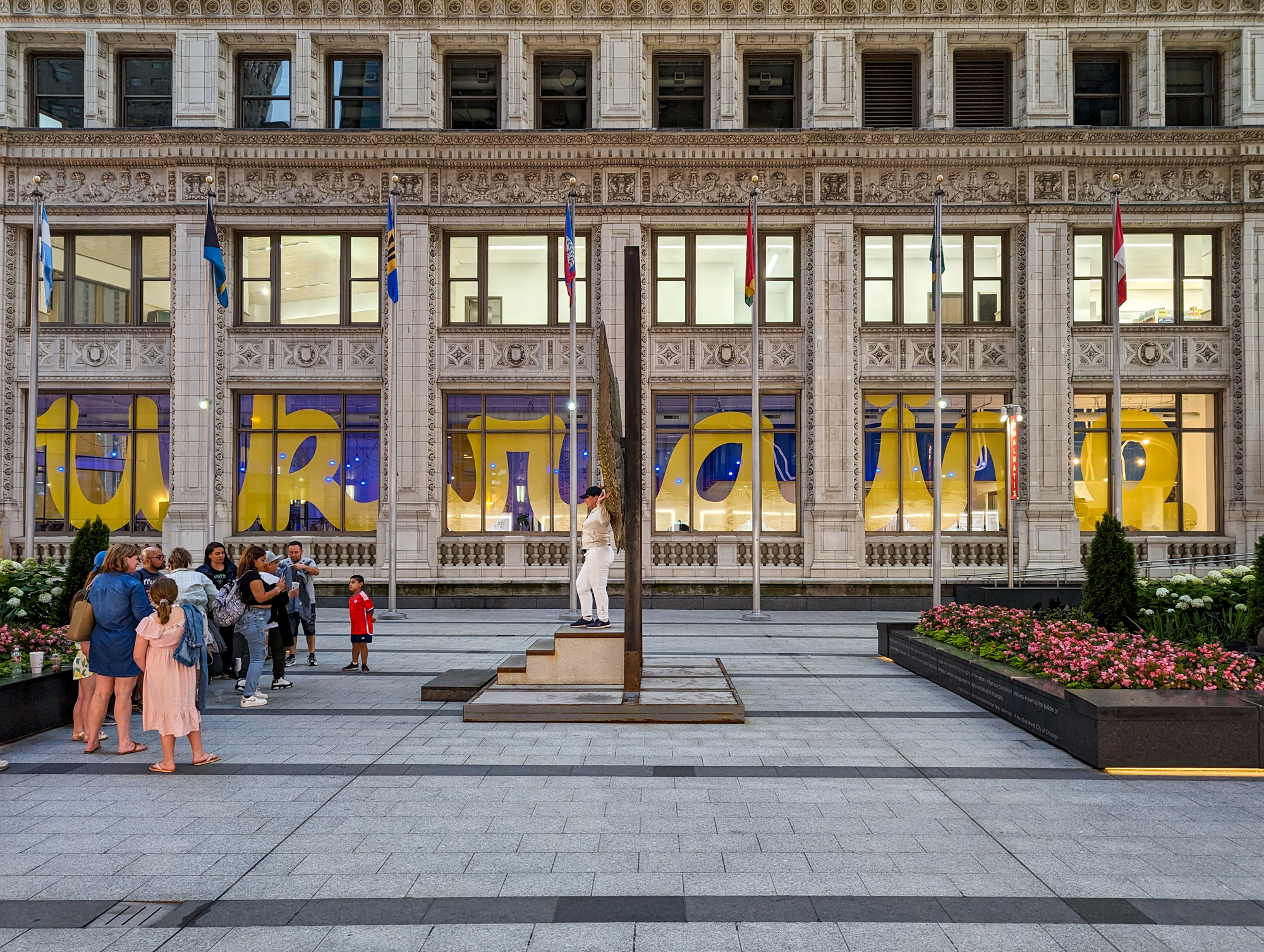
Pop up Logo by Matthew Hoffman

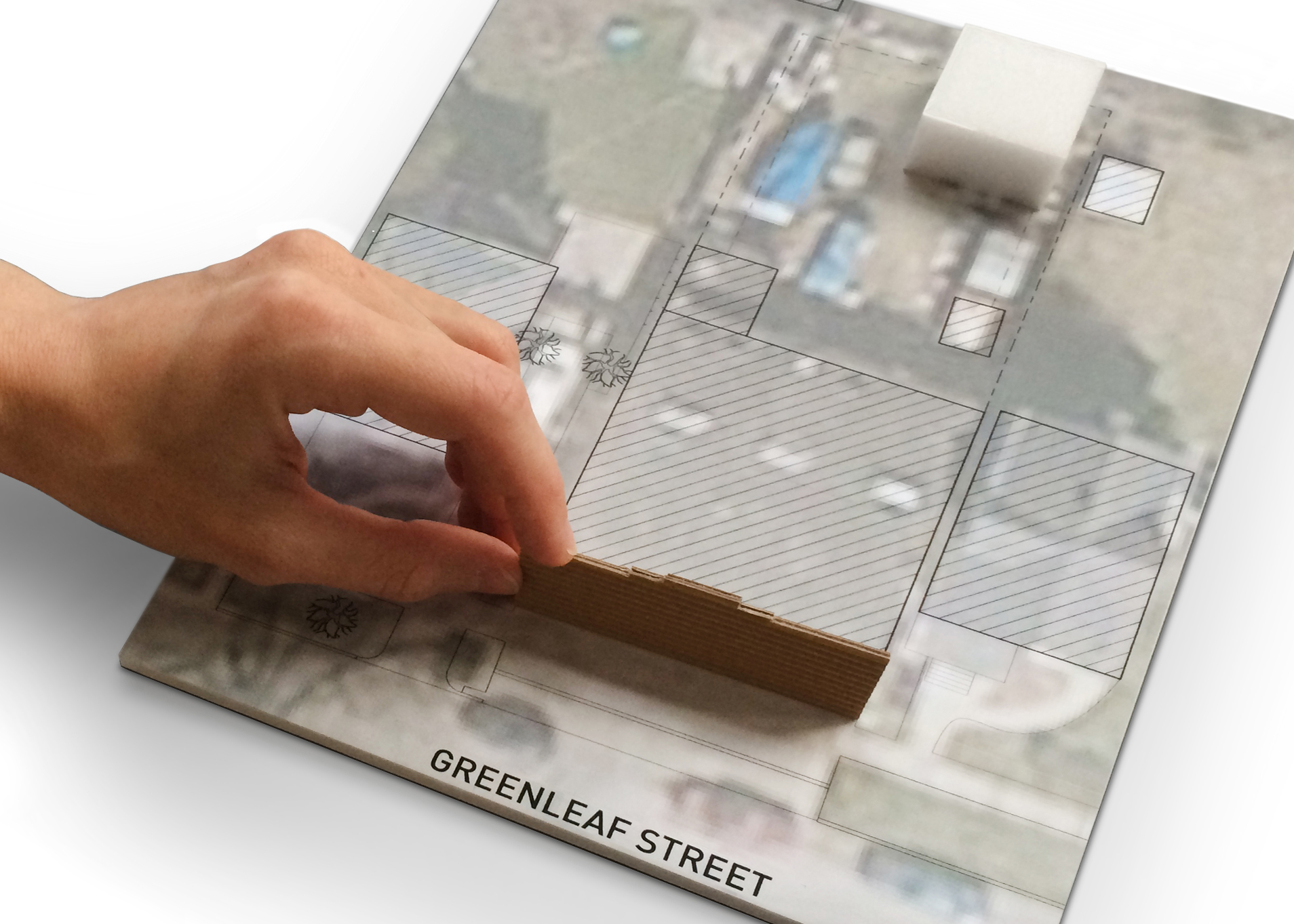
Road Map
Existing Conditions
Mural Design
Mural painted by Artist Luna Prysiazhniuk
Columns Design
Columns Vinyl Installation
Vytynanka Design
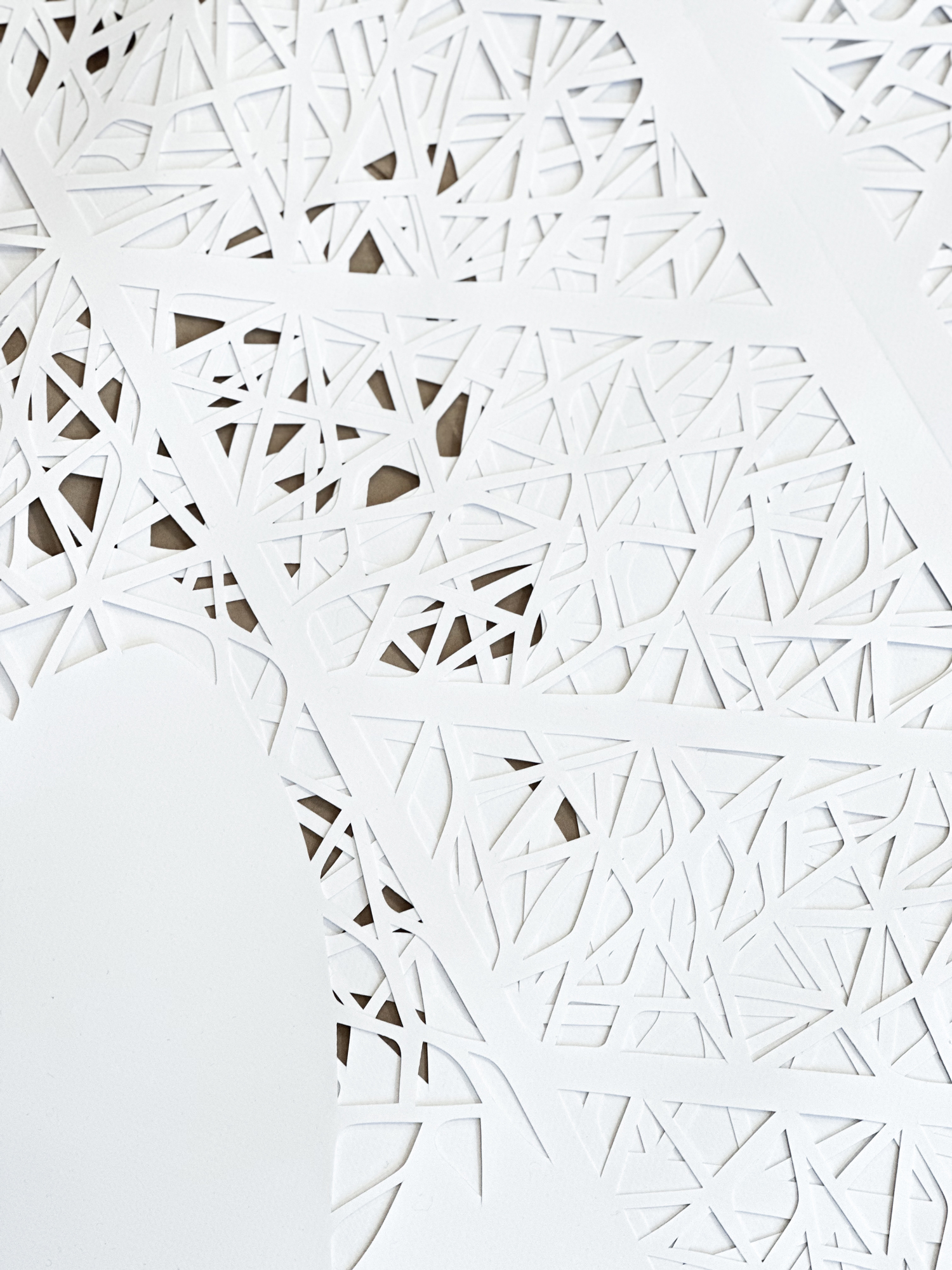
Vytynanka Installation
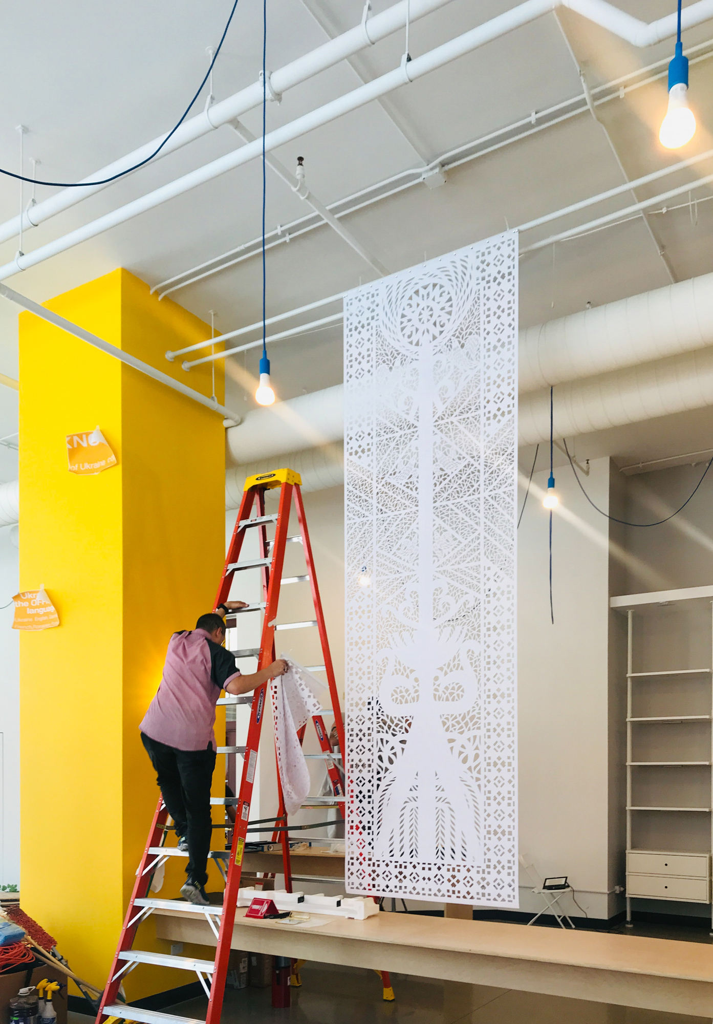
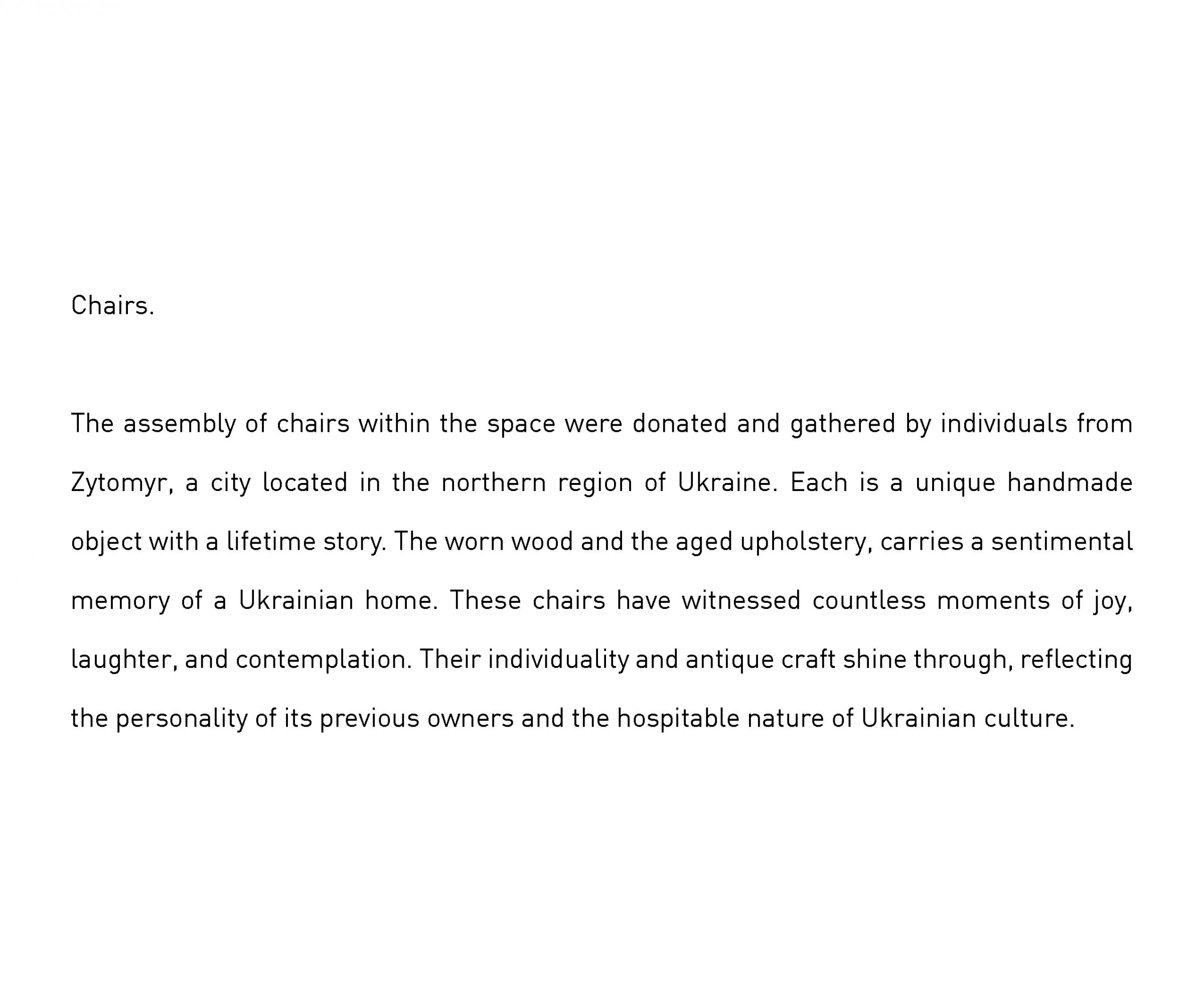
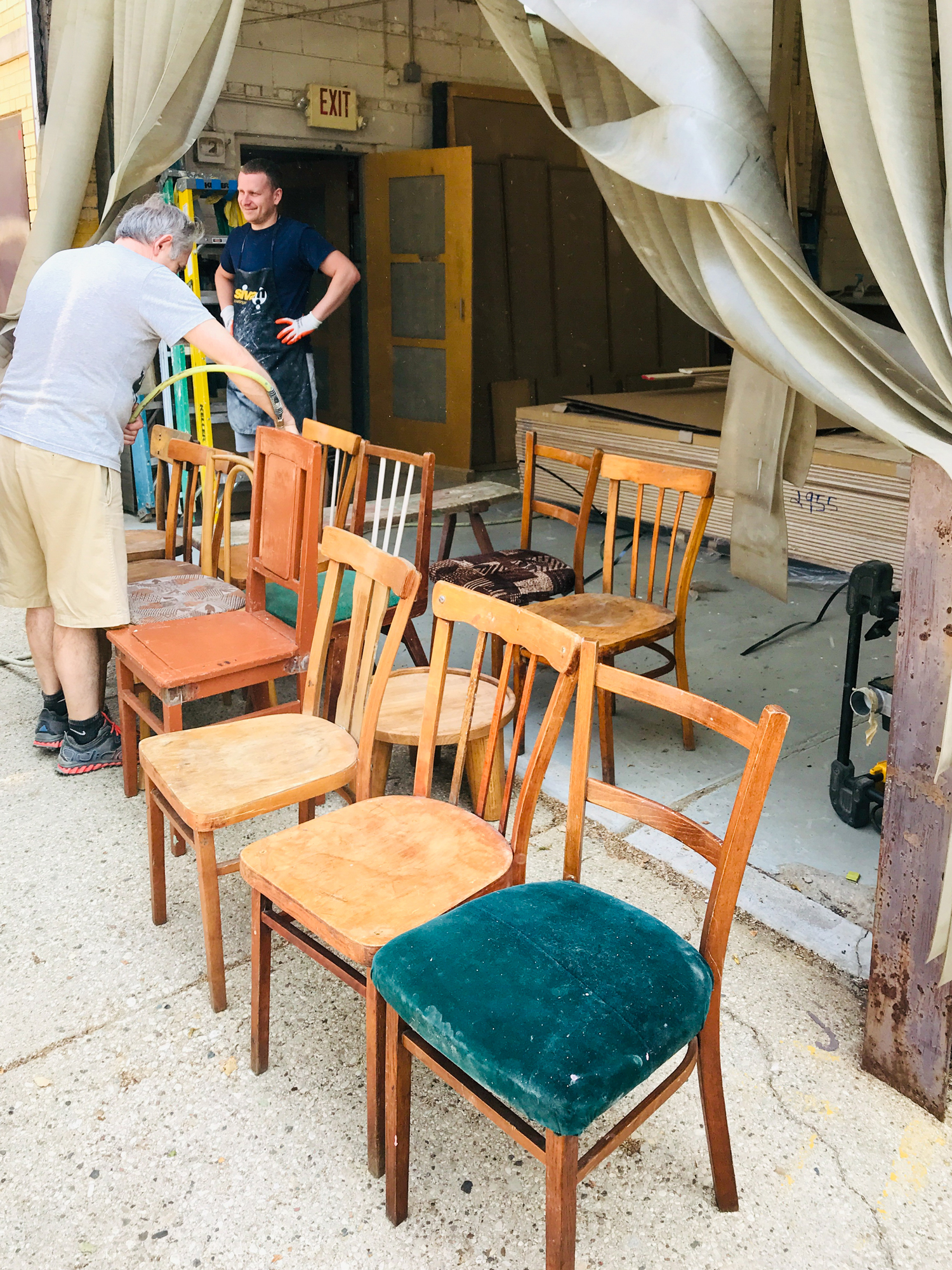
Chairs Assembly in Chicago
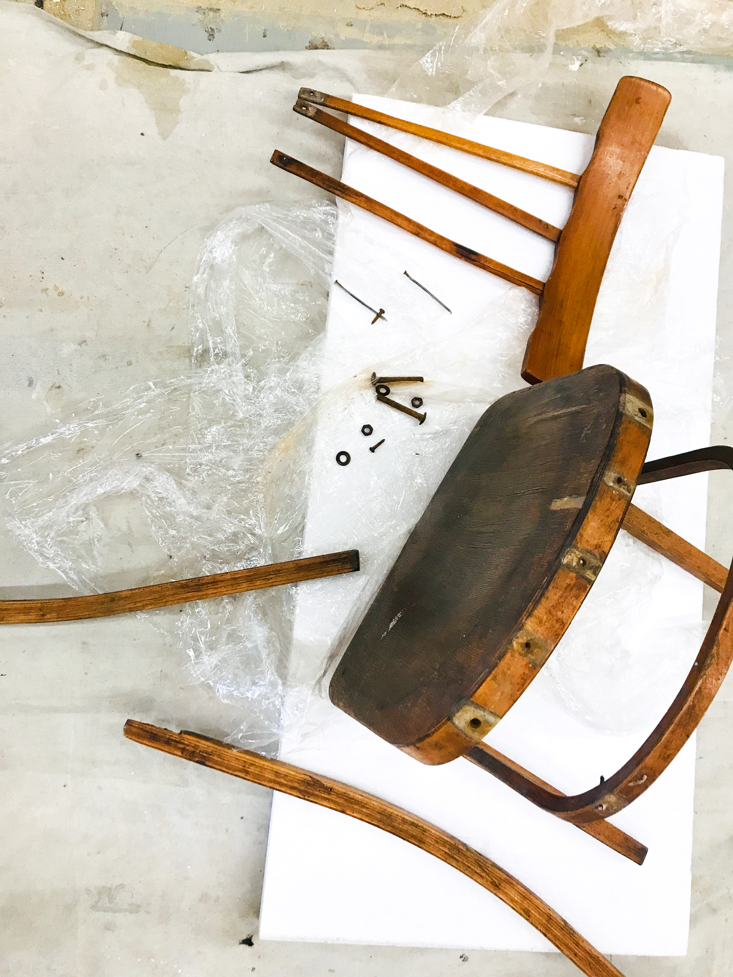
Chairs Selection in Ukraine
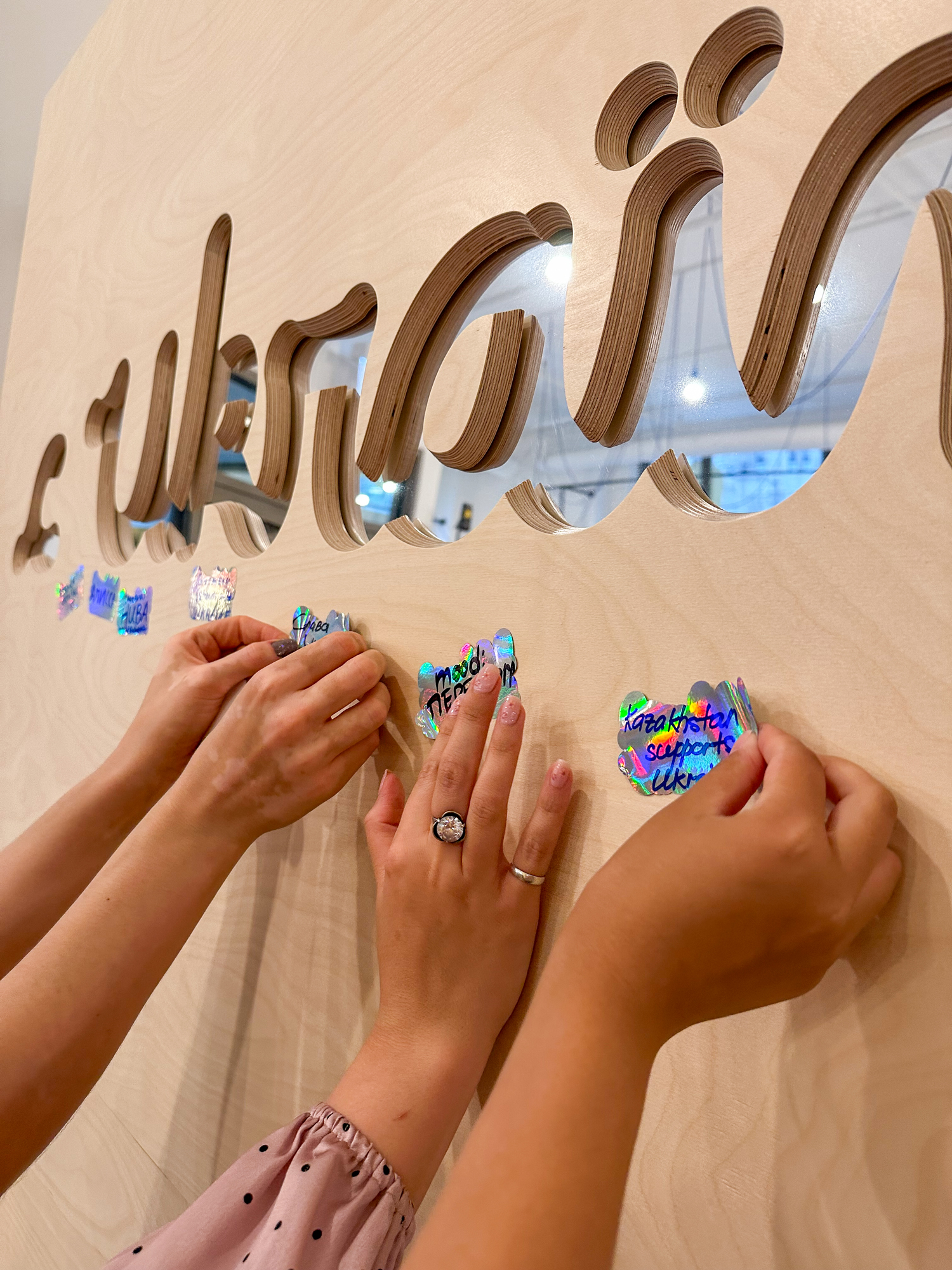
Support Wall

Support Wall
Window Art Installation Meeting
Window Art Installation Meeting
Window Art Installation
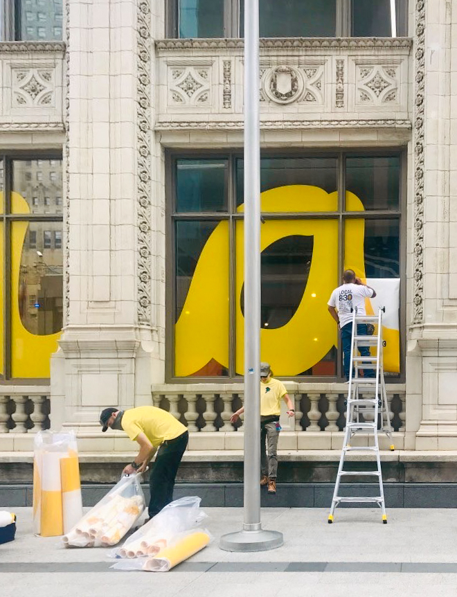
Window Art Installation
© Maksym Prokopiv

© Maksym Prokopiv
© Maksym Prokopiv
© Maksym Prokopiv
Site Plan
Site Views Framing
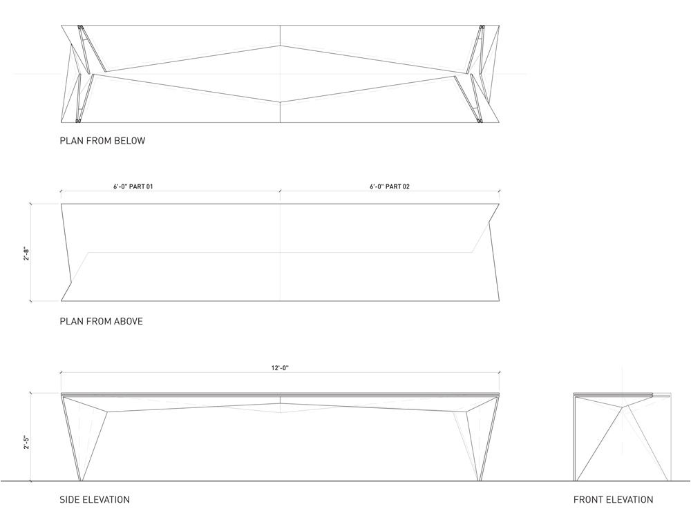
Site Section
Cross Section
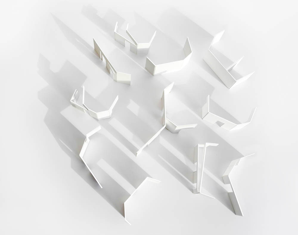
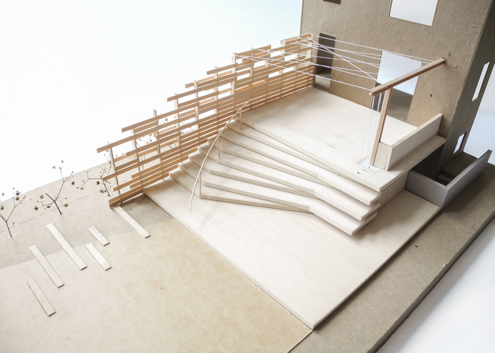
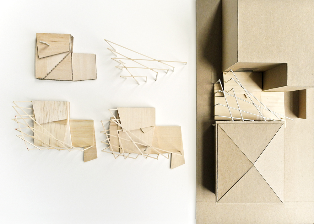
Study Model
Sequence Model
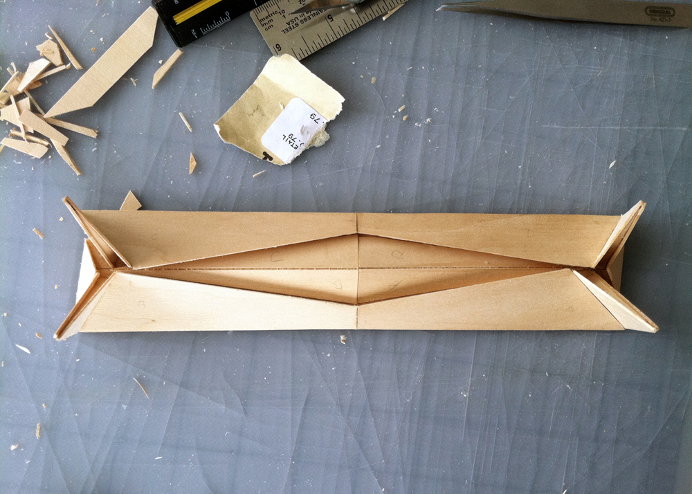
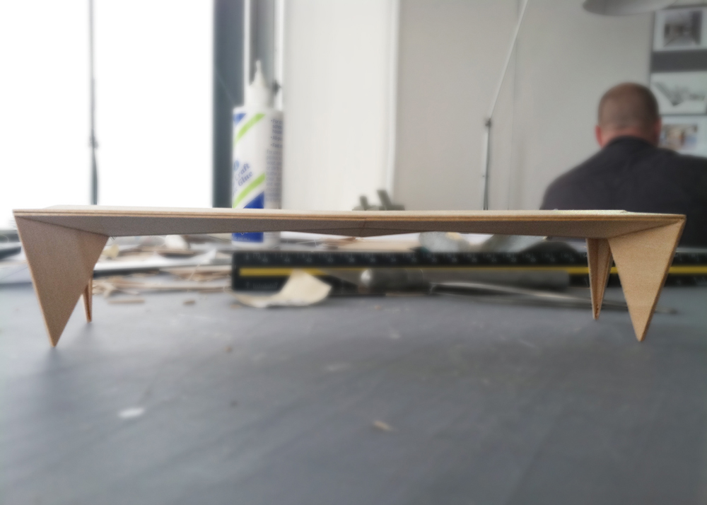
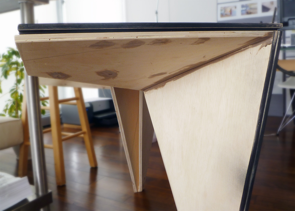
Steel Framing Diagrams
First Level Plan
Second Level Plan
Third Level Plan
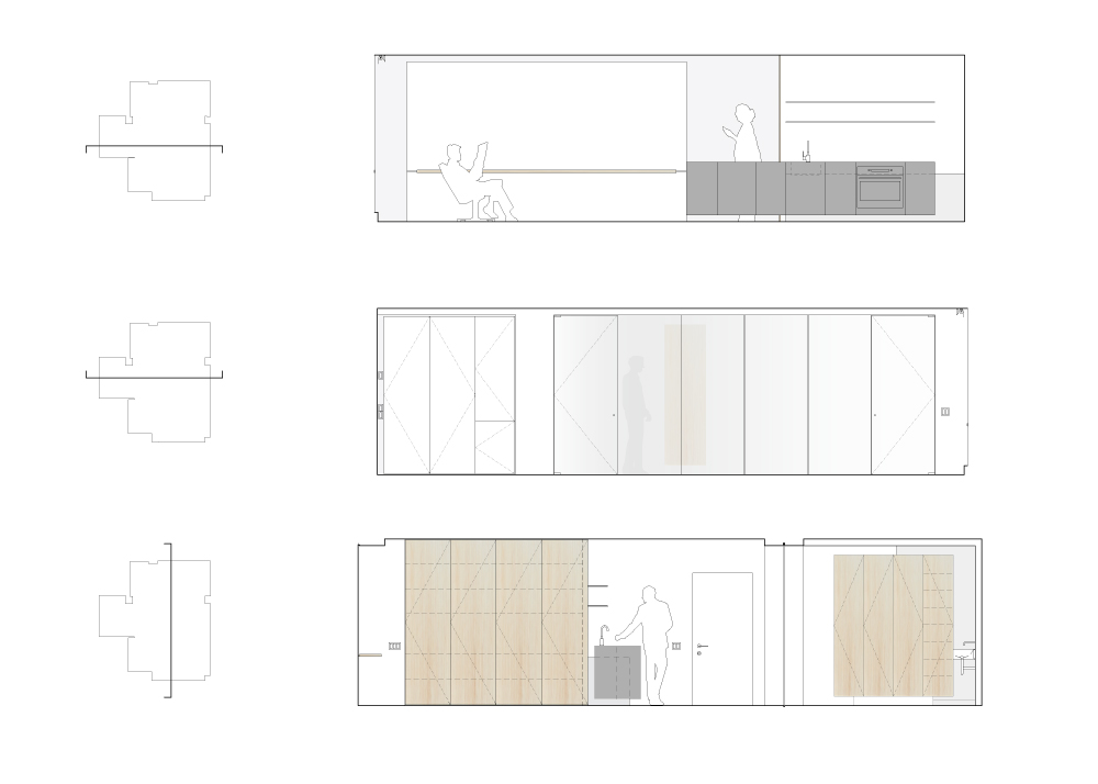
House Detailed Section
Birds eye View from Entry Road
East Facade
View from the Lake
North Facade
Lower Level Deck
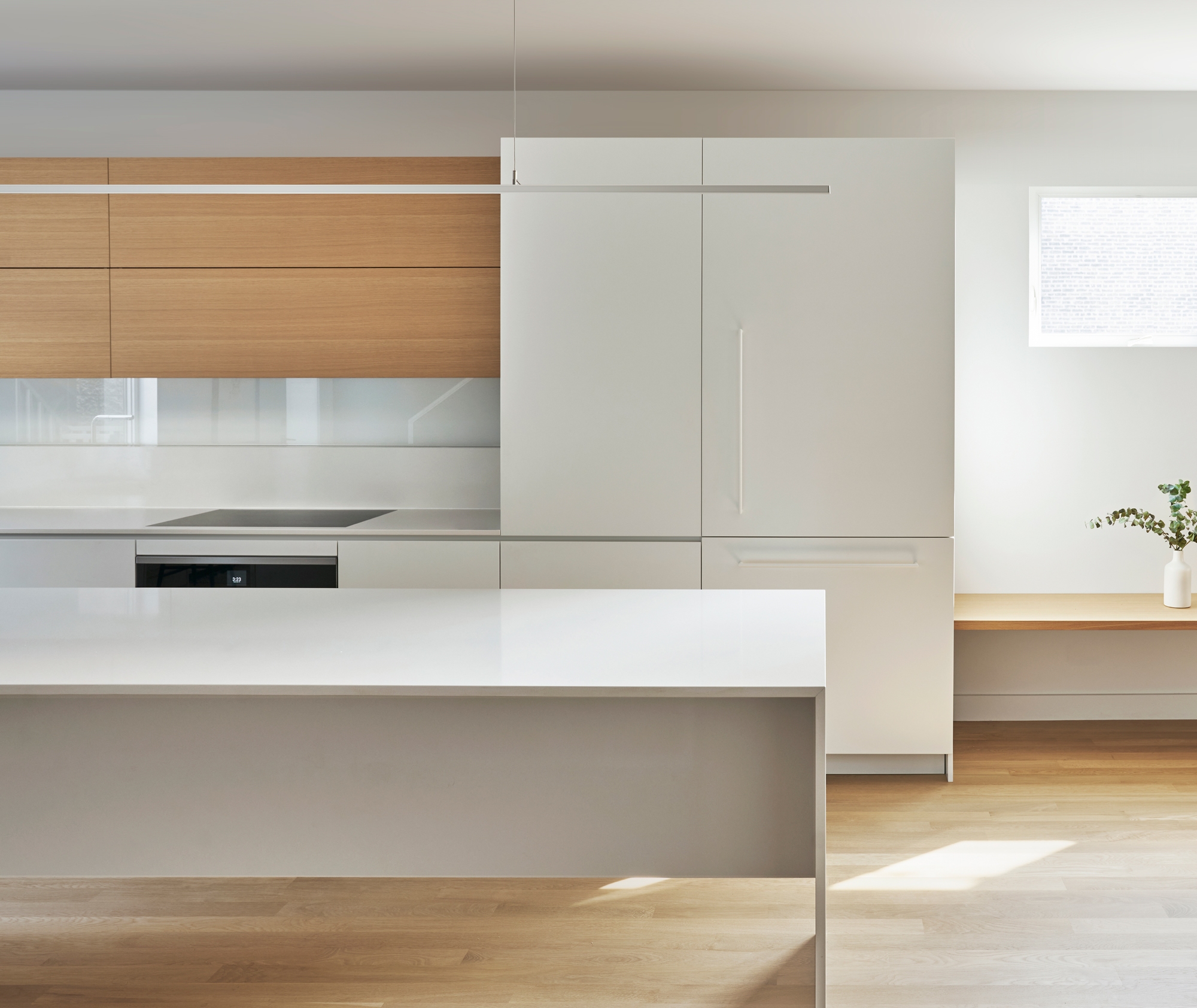
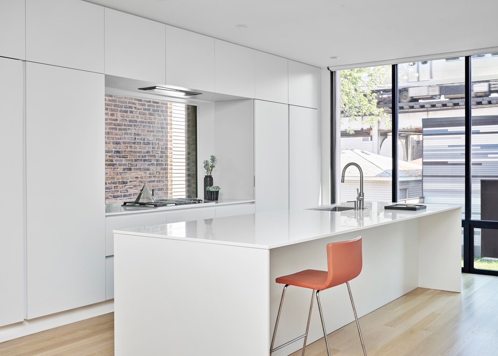
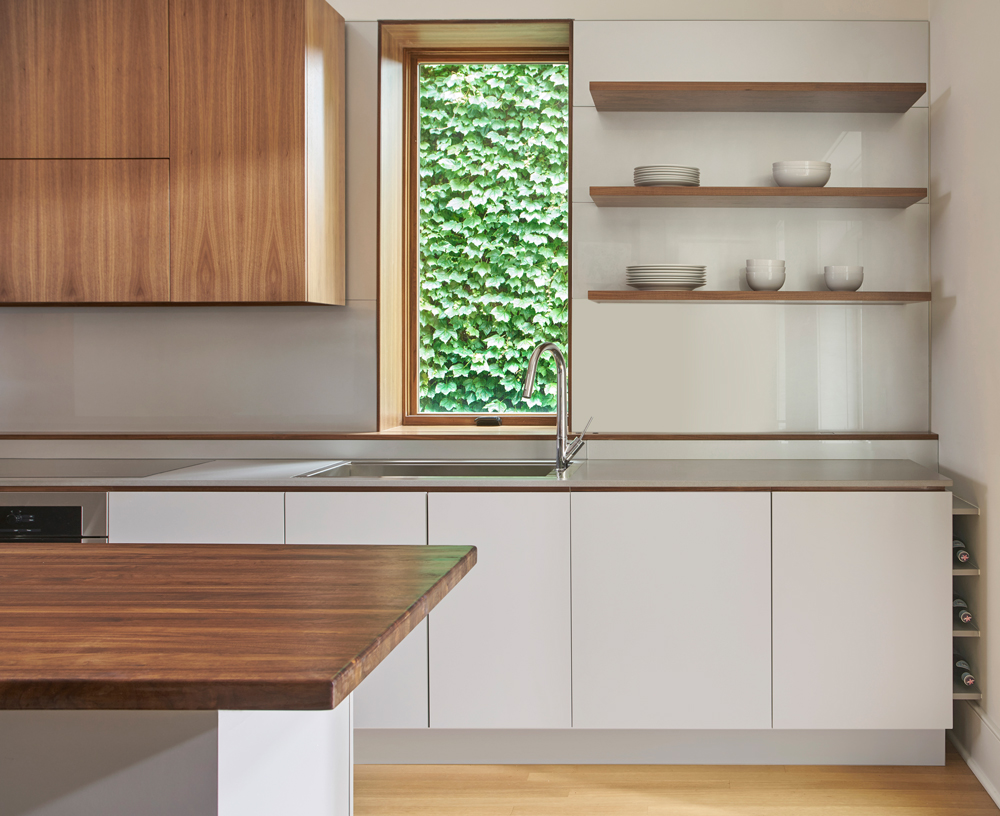
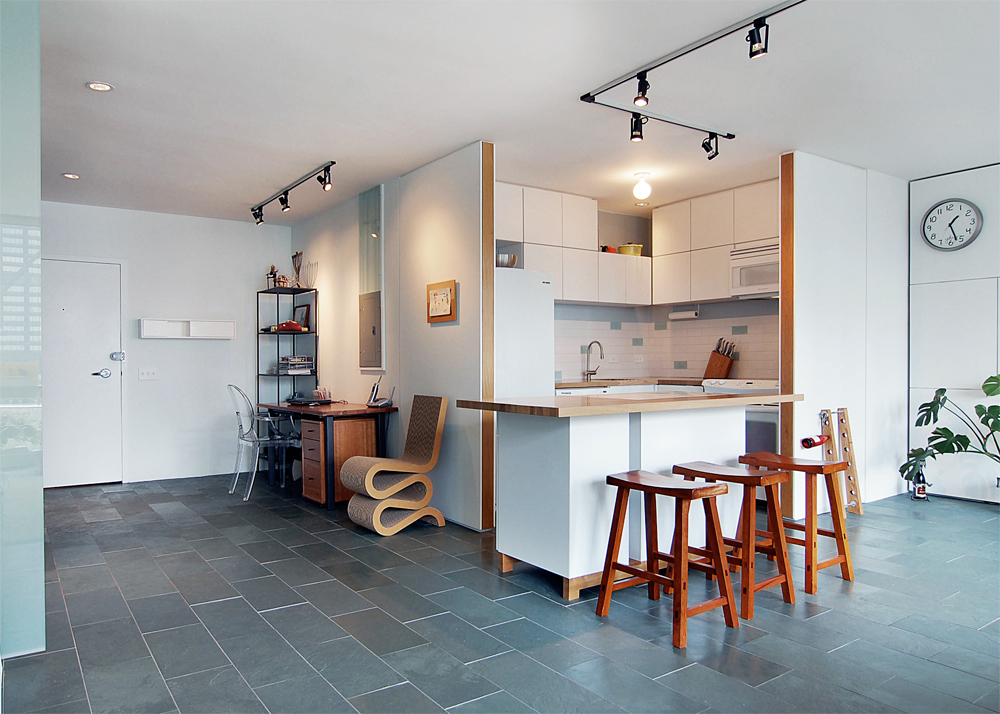
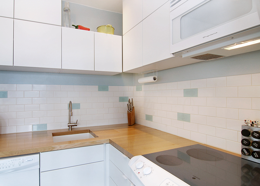
Kitchen
Kitchen
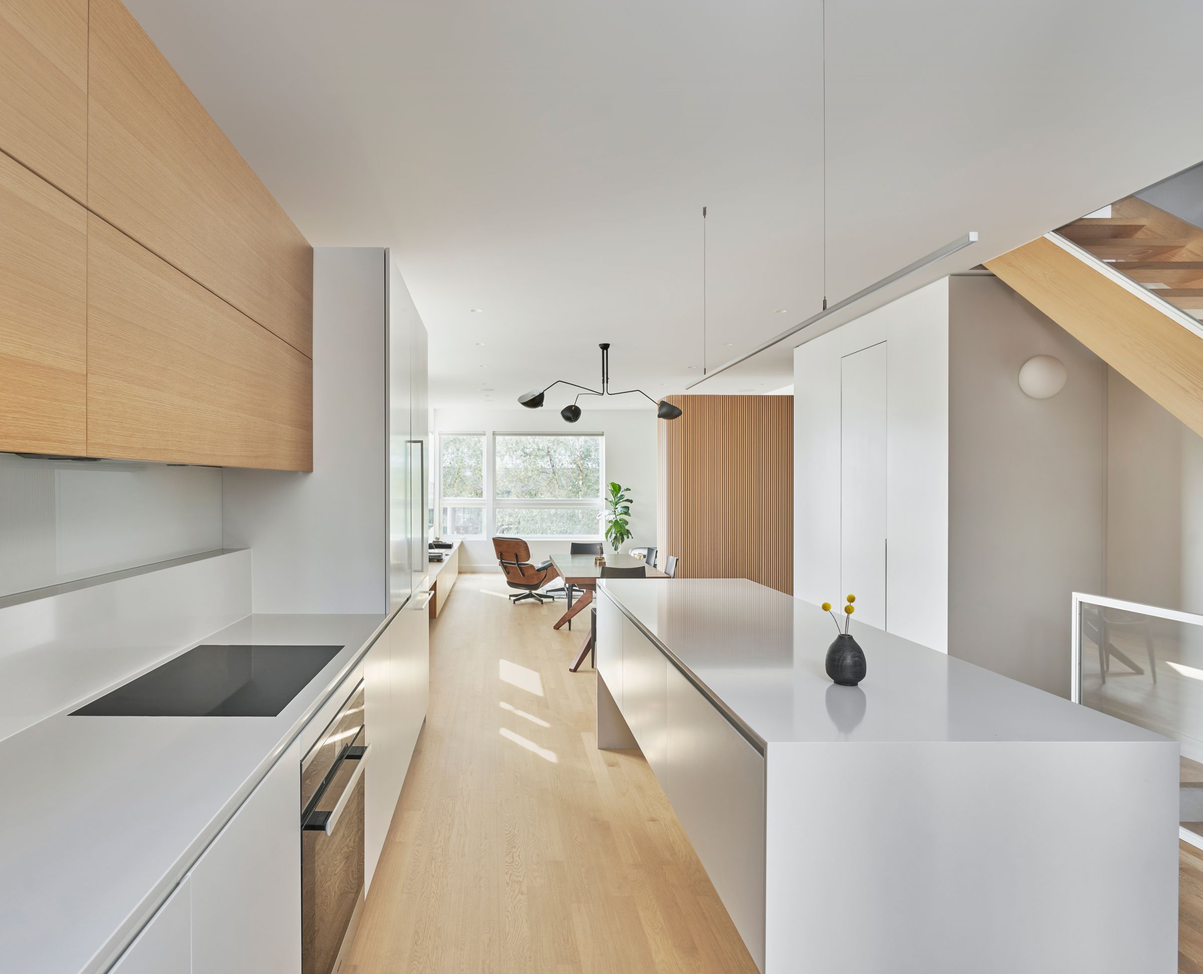
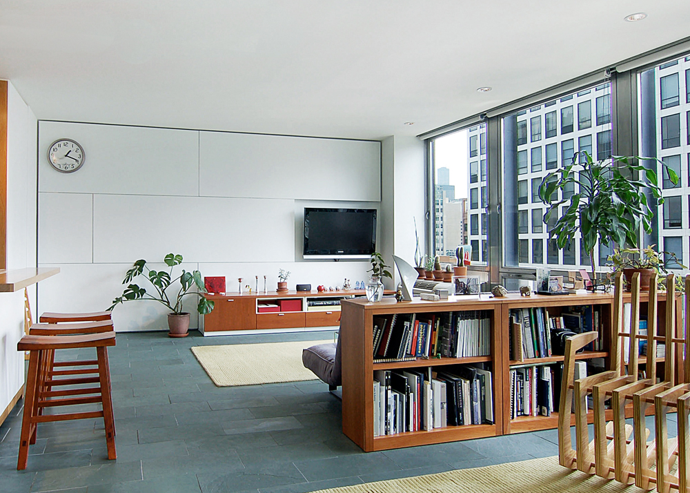
Main Living Space
Main Living Space
Mezzanine Office
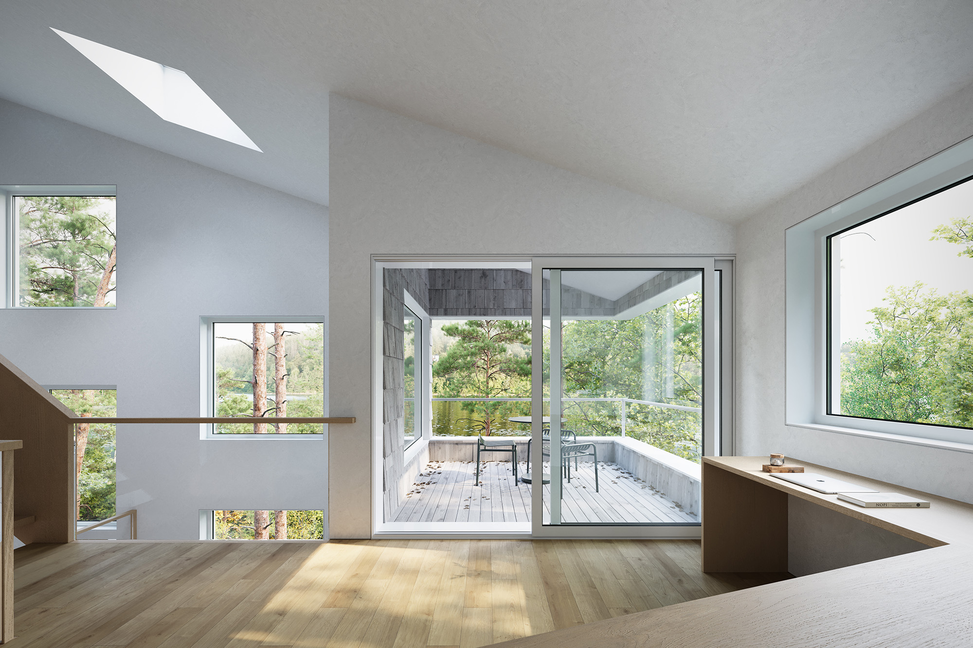
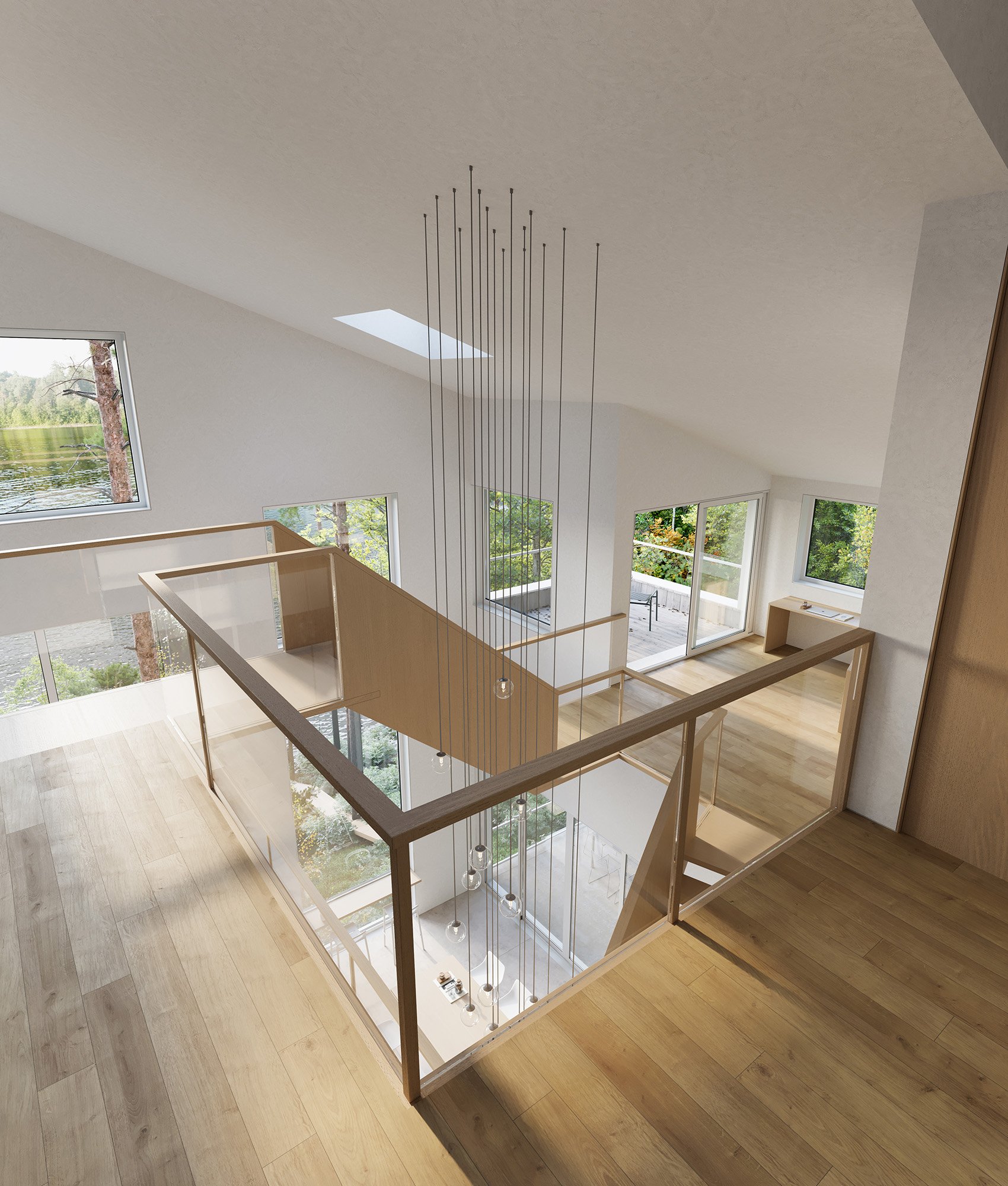
View from Upper Level
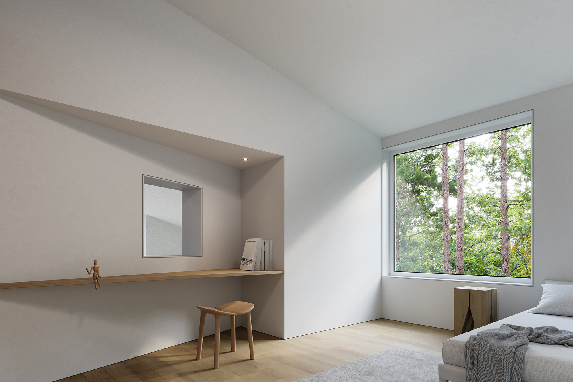
Upper Level Bedroom
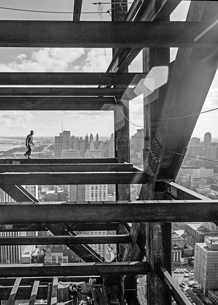
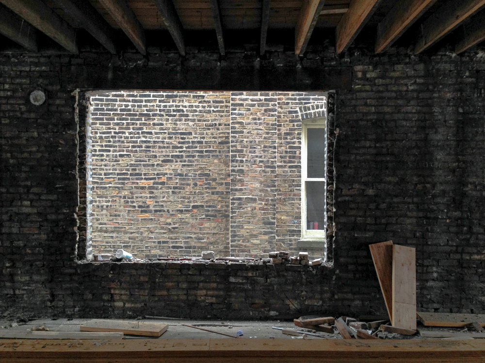
Erecting Hancock @Ezra Stoller
Project Location
First Visit
Concept
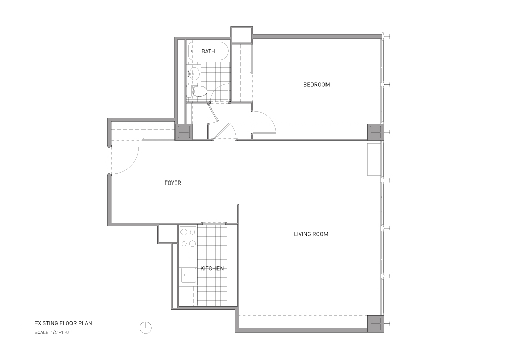
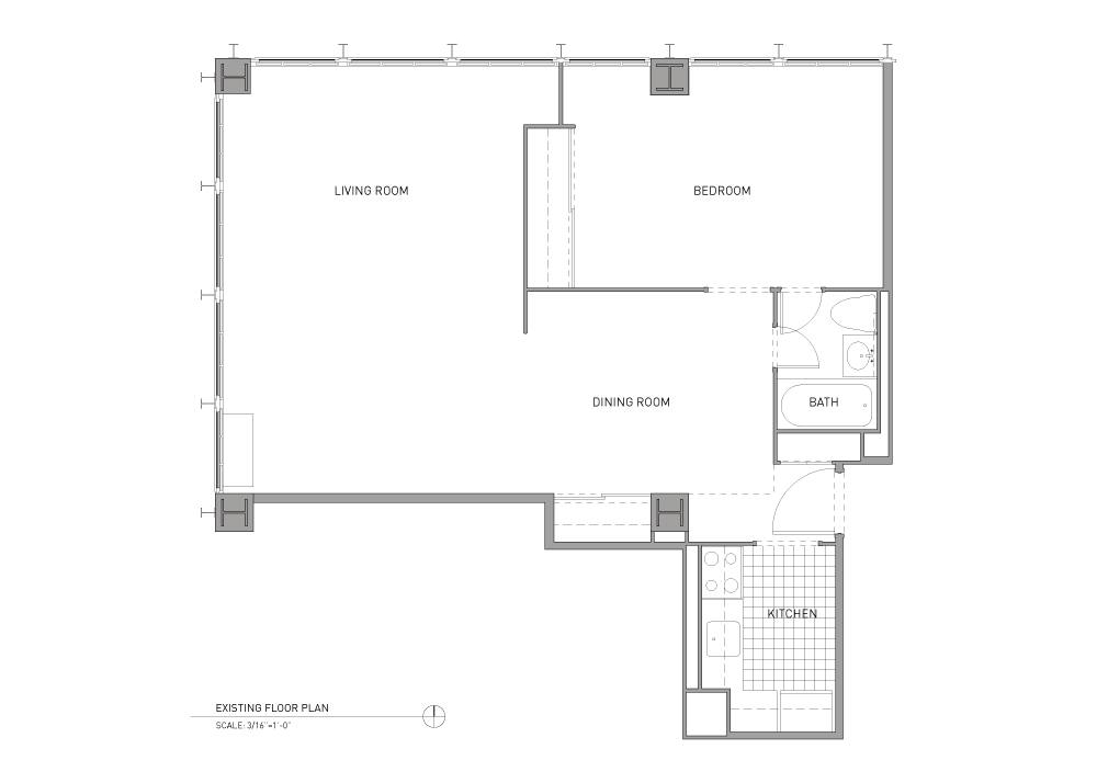
Existing Plan

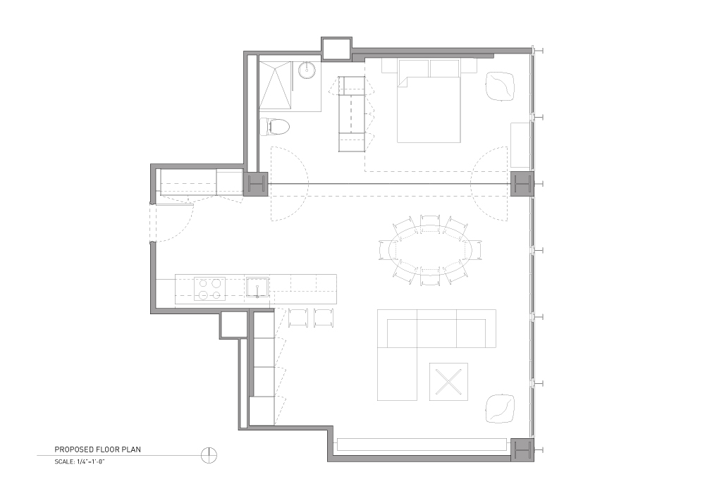
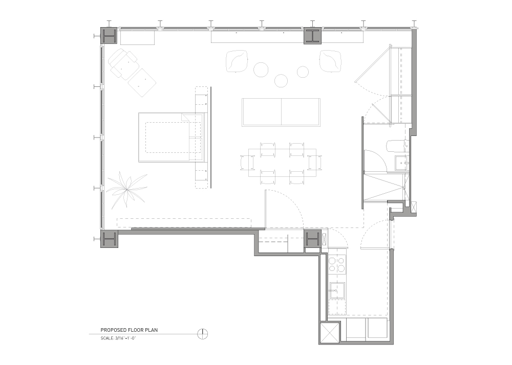
Proposed Plan
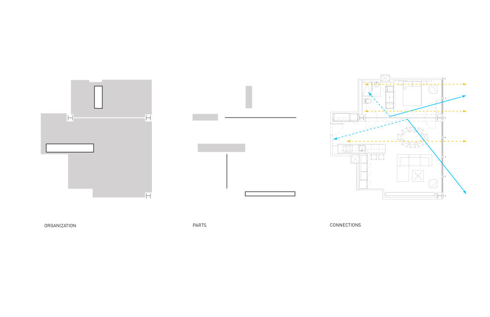
Organization Diagram

Demo
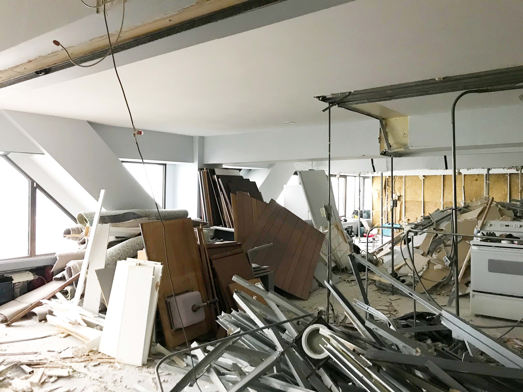
Revealing

Revealing
Structure revealed © Adrien Williams
Living © Adrien Williams

Living © Adrien Williams
Entry © Adrien Williams
Kitchen © Adrien Williams
Kitchen © Adrien Williams
Kitchen © Adrien Williams
Bath © Adrien Williams
Kitchen © Adrien Williams
Living © Adrien Williams
Guest area © Adrien Williams
Living © Adrien Williams

Bedroom © Adrien Williams
Bath © Adrien Williams
Bedroom © Adrien Williams
Bedroom © Adrien Williams
Schematic Model

Concept Drawing
DetailDrawings

Installation
Installation
Closed Ark © Adrien Williams
Operational Ark © Adrien Williams
Door Detail © Adrien Williams
Project Location

Organization Sketches
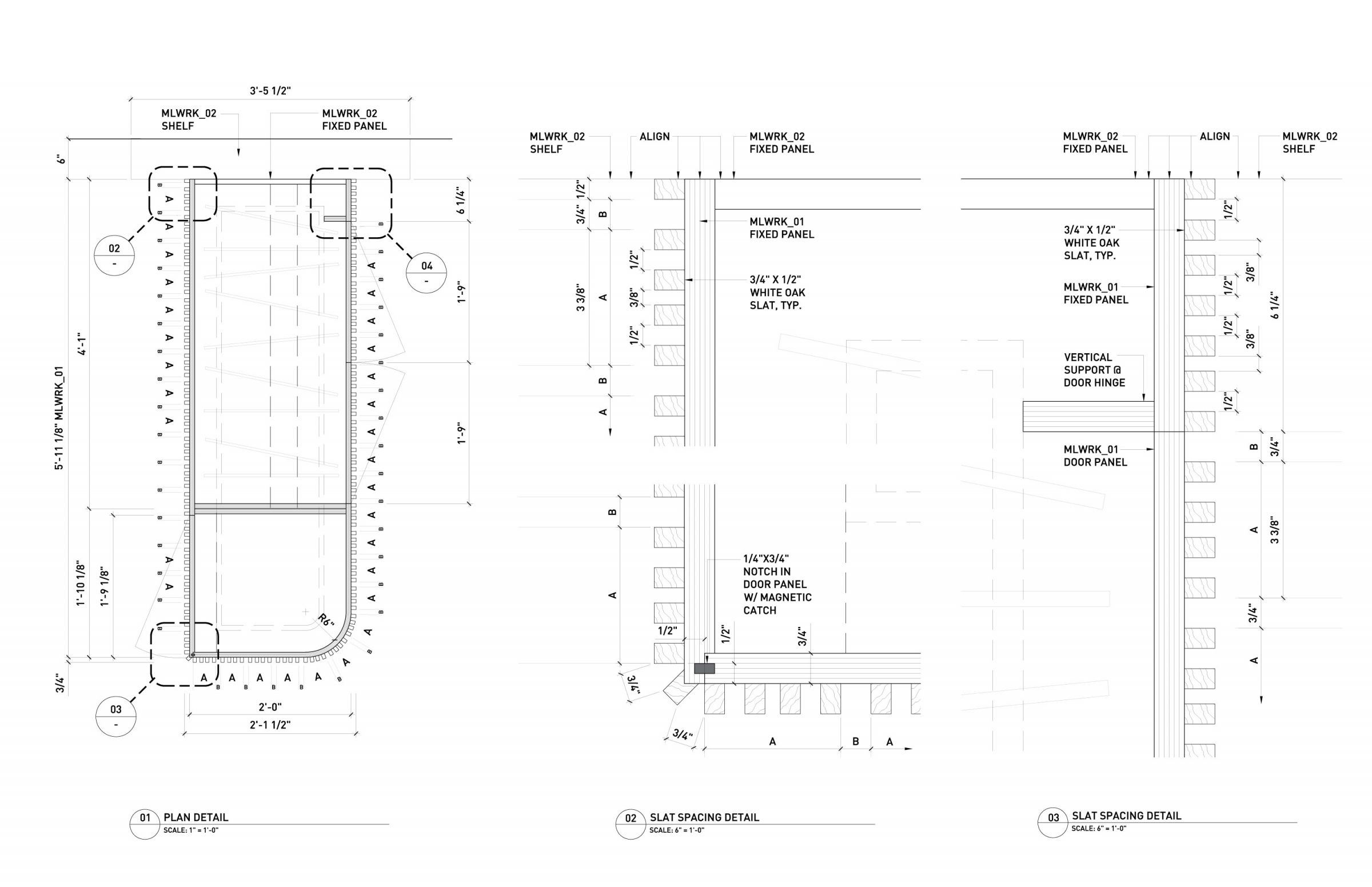
Millwork Study
Organization Diagram
Existing Plan
Proposed Plan
Prior Conditions
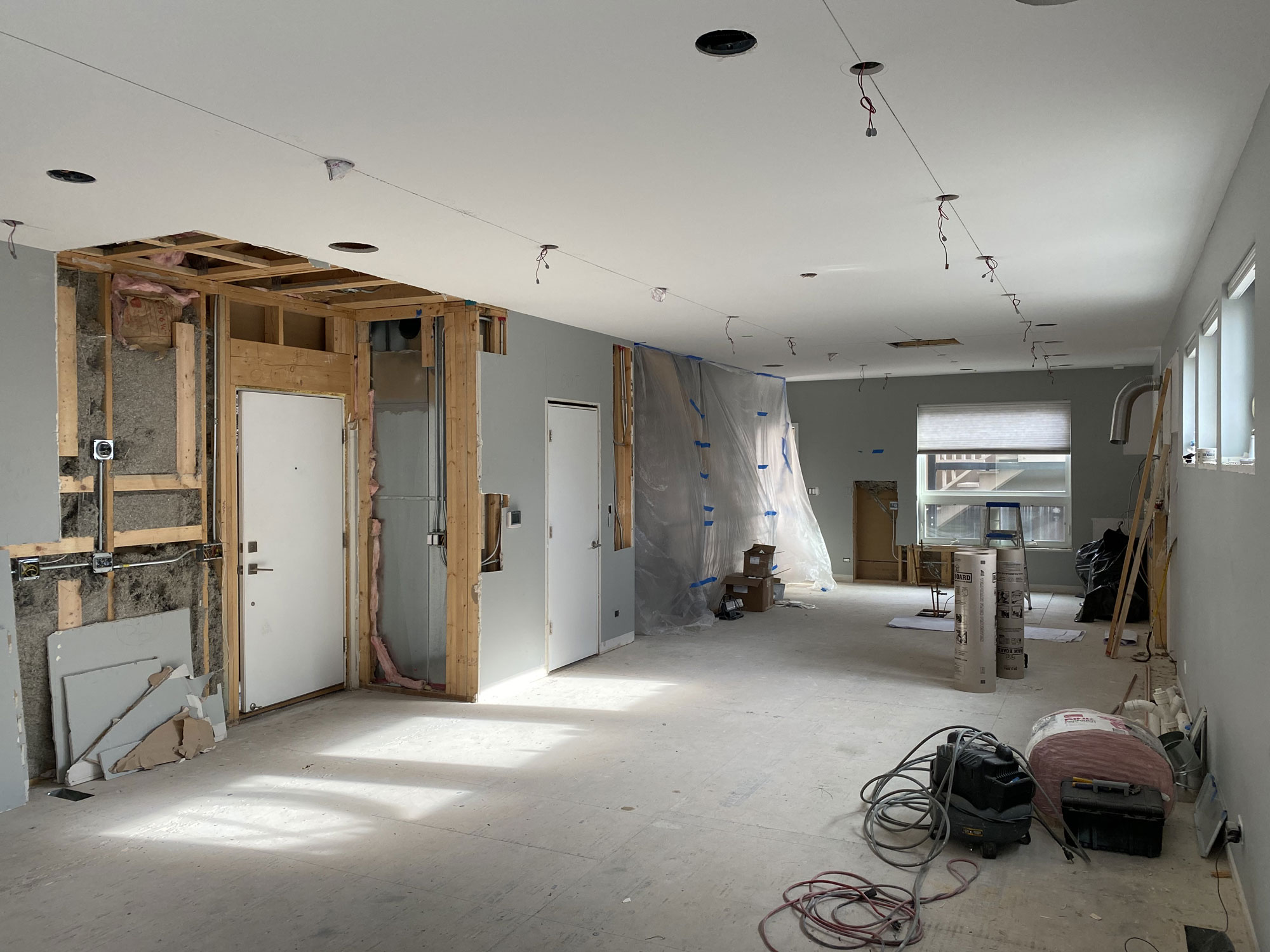
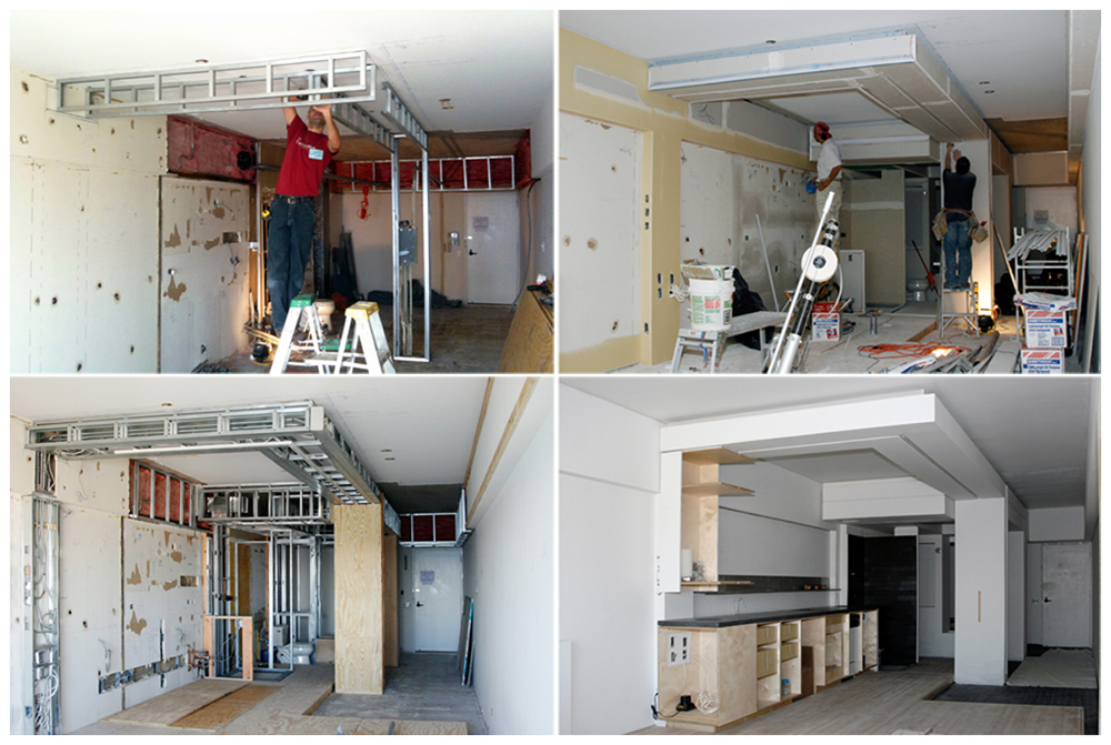
Construction
Construction
Millwork Details Mock Up
Construction
Gallery © Mike Schwartz
Gallery © Mike Schwartz
Entry © Mike Schwartz
Morning Light © Mike Schwartz
Kitchen © Mike Schwartz
Kitchen © Mike Schwartz
Dining © Mike Schwartz
Living Room © Mike Schwartz

Front Entry © Mike Schwartz
Entry Door © Mike Schwartz
Secondary Entry © Mike Schwartz
Secondary Entry © Mike Schwartz
Family Room © Mike Schwartz
Work Area © Mike Schwartz
Gallery © Mike Schwartz
Main Bedroom Entry © Mike Schwartz
Dressing Area © Mike Schwartz

Dressing Area © Mike Schwartz
Powder Room © Mike Schwartz
Secondary Bedroom Entry © Mike Schwartz

Gallery © Mike Schwartz
Guest Room © Mike Schwartz

Guest Room © Mike Schwartz
Project Details © Mike Schwartz
Imperfect Model
Imperfect Drawings
Imperfect Process
Imperfect Components
Imperfect Scale
Imperfect Option

Imperfect Connection
Imperfect Fabrication
Imperfect Top
Imperfect Top
Imperfect Top
Imperfect Legs
Imperfect Underside
Imperfect Use

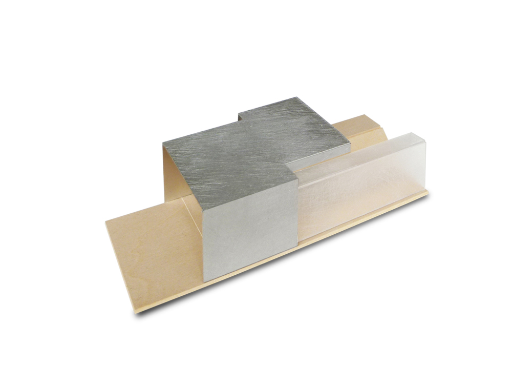
Parti
Site Location
Organization Model

Organization Diagram
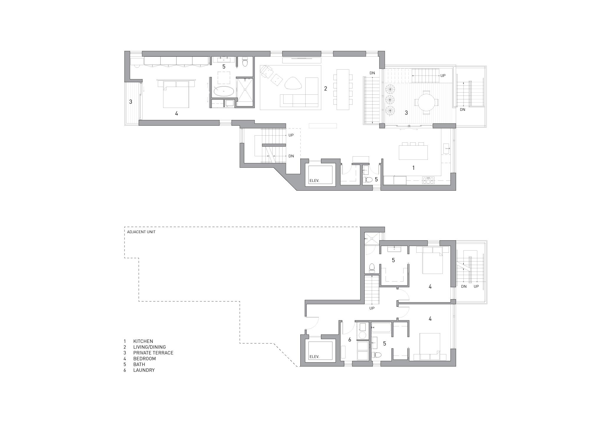
Lower Unit Floor Plan
Penthouse Floor Plan
Street Elevation
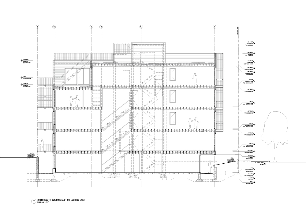
Construction Drawing: North-South Section
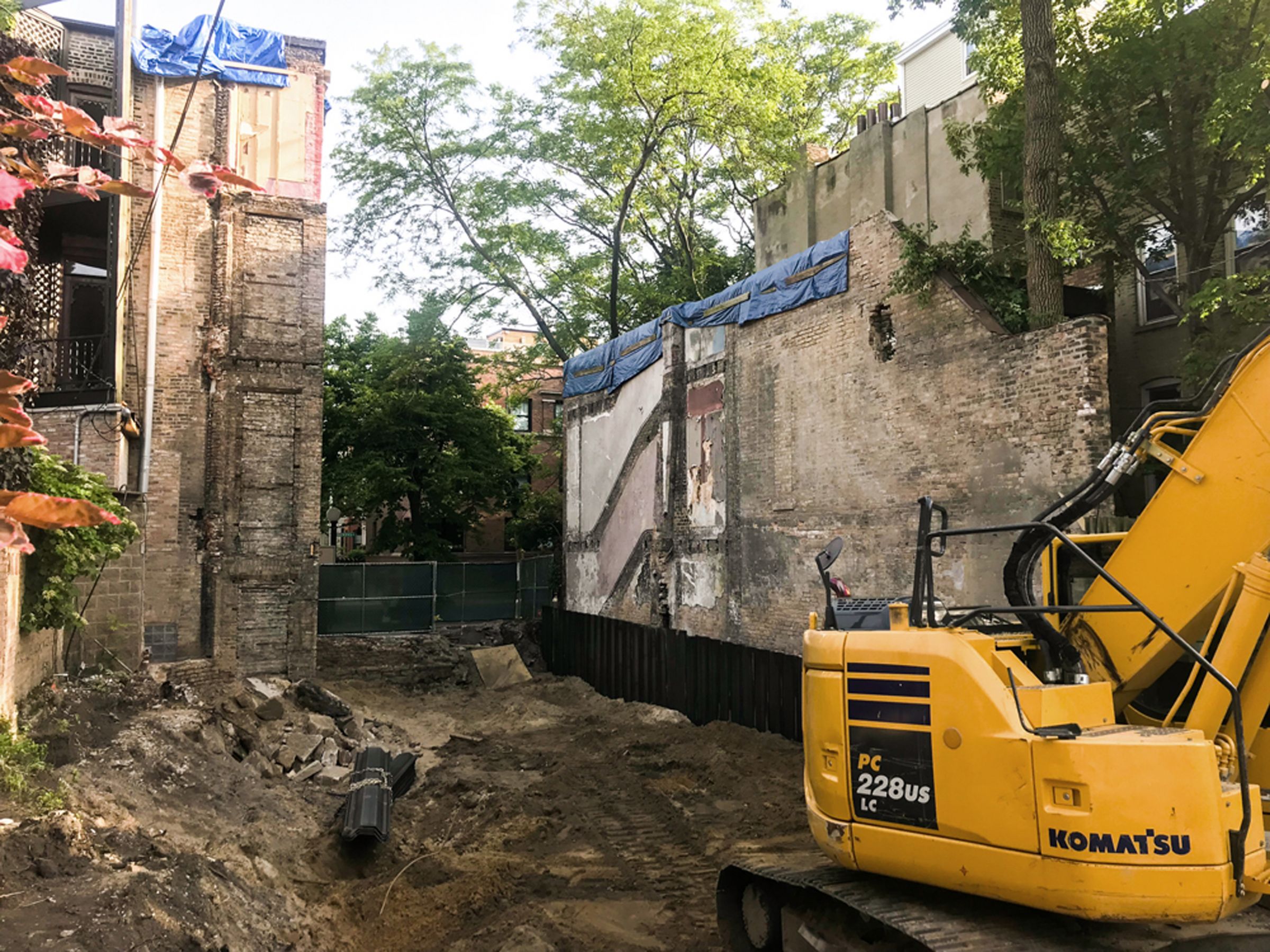
Construction: Site Excavation
Construction: Foundation & Shoring
Construction: Concrete
Construction: Topping out
Construction: Interior
South facade © Mike Schwartz
Aerial view © Mike Schwartz
South facade © Mike Schwartz
South entry © Mike Schwartz
Lower unit patio © Mike Schwartz
Lower unit patio © Mike Schwartz
Common stair © Mike Schwartz
Entry © Mike Schwartz
South facade © Mike Schwartz
Upper unit master bedroom © Mike Schwartz
Upper unit kitchen © Mike Schwartz
North facade private deck © Mike Schwartz
North facade common stair © Mike Schwartz
In between space with garage © Mike Schwartz
North facade common stair © Mike Schwartz
North facade © Mike Schwartz
South facade © Mike Schwartz
Schematic Model
Organization Diagram
Cost Analysis
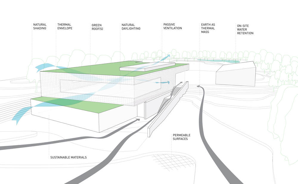
Sustainable Features

Exterior View
Exterior View

Site Organization
Street Elevation Diagram

Bird Eye View
Plans
Layout Configurations
Interior View
Interior View
Study Model
Proposed plan
Millwork details
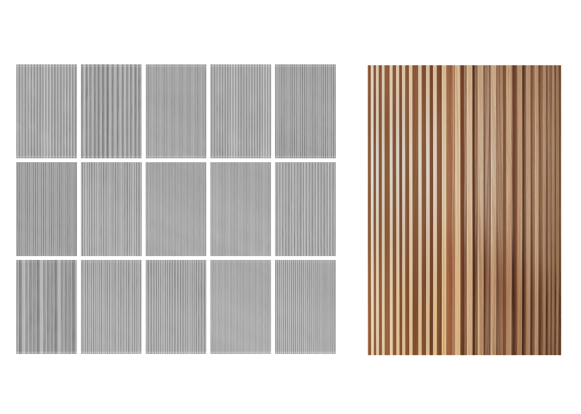
Millwork Pattern Iteration
Construction
Island Detail © Mike Schwartz
Kitchen © Mike Schwartz
Stair Composition © Mike Schwartz
Stair Detail © Mike Schwartz
Utility Volume © Mike Schwartz
Entry Millwork © Mike Schwartz
Entry Millwork © Mike Schwartz
Millwork Detail © Mike Schwartz

Between the Millwork © Mike Schwartz
Historical reference: 1900' Chicago Surface Lines
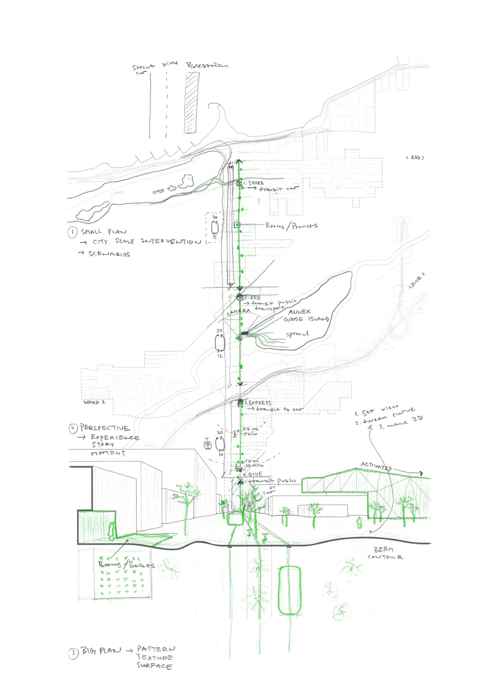
Avenue Layout Diagram
Avenue Section Today

Avenue Section Proposed
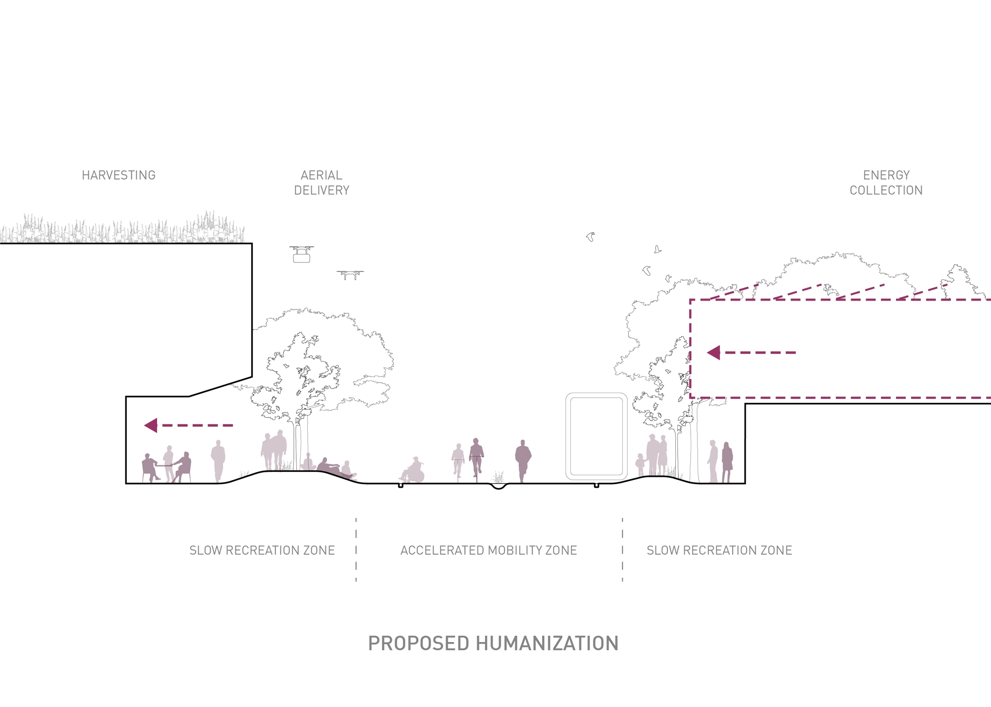
Avenue Section Proposed
The Avenue Can Grow
The Avenue Can Transform

The Avenue Can Connect Us
Plan View

Construction Drawings
Construction Drawings
Construction
Assembly
Components
Bar Detail
Seating Detail
Evaluation

Testing
Testing

Alien Reflection
Alien Celebration
Design Approach Study Models

Existing Plan

Proposed Plan

Diagrams
Elevations
Existing Conditions
Construction

Construction
Entry © Mike Schwartz
Kitchen & Dining Area © Mike Schwartz
Living Area © Mike Schwartz
Kitchen © Mike Schwartz

Millwork © Mike Schwartz
Living Area © Mike Schwartz

Millwork Details © Mike Schwartz
Sleeping Area © Mike Schwartz
Sleeping Area © Mike Schwartz
Bathroom © Mike Schwartz
Bathroom © Mike Schwartz
Bathroom © Mike Schwartz
Bathroom © Mike Schwartz
Sleeping Area © Mike Schwartz
Towards 860/880 © Mike Schwartz
Site Location

Organization Model
Organization Diagram
Site Plan
Longitudinal Section
Cross Section
Building Materials
Proposed Street View

Lower Units Interior View
Lower Units Interior View
Lower Units Interior View
Upper Units Interior View
Lower Units Floor Plan
Lower Units Floor Plan
Upper Units Floor Plan
Construction: Excavation
Construction: Foundation
Construction: Masonry
Construction: Masonry
South Facade Day © JC Buck
South Facade Dusk © JC Buck
East Facade © JC Buck

East Facade © JC Buck
East Entry © JC Buck
Northeast Corner © JC Buck

South Facade © JC Buck

View from Roofdeck © Mike Schwartz
Common Stair © Mike Schwartz
Upper Unit Deck © Mike Schwartz
Upper Unit Deck © Mike Schwartz

Lower Unit Kitchen © Mike Schwartz

Upper Unit Bedroom © Mike Schwartz
Northwest Corner © Mike Schwartz

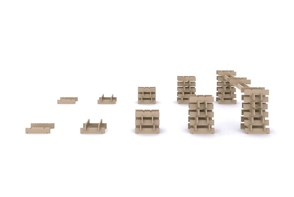
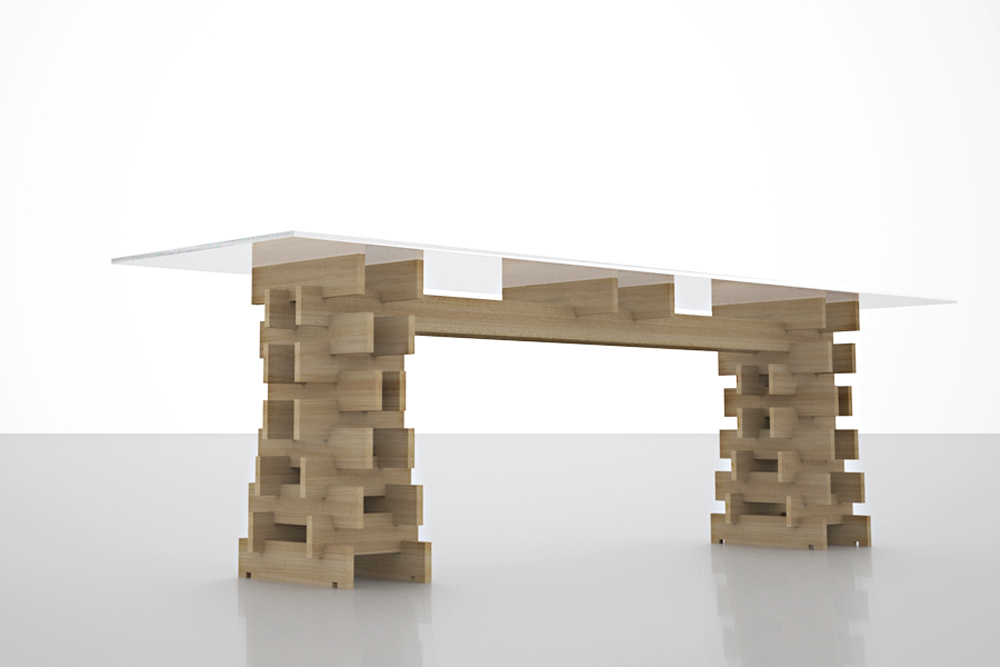
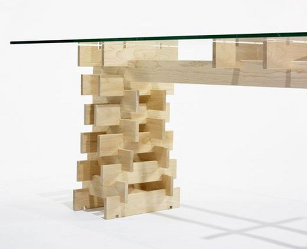
Components
Process
Drawings
Connections
Model
Prototype
Mock-up
Organization Diagram

Interior Elevation
Section
Main Level Floor Plan
Upper Level Floor Plans
Prior Construction
Demolition
Construction
Mezzanine Detail
Main Level © Mike Schwartz
Kitchen © Mike Schwartz
Toward Entry © Mike Schwartz
Sleeping Volume © Mike Schwartz
Living Room © Mike Schwartz
Master Bedroom © Mike Schwartz

Master Bedroom © Mike Schwartz
Master Bathroom © Mike Schwartz
Stair Composition © Mike Schwartz
Utility Volume © Mike Schwartz

To Mezzanine © Mike Schwartz
From Mezzanine © Mike Schwartz

Mezzanine © Mike Schwartz
Mezzanine Bathroom © Mike Schwartz
Loft Detail © Mike Schwartz
Loft © Mike Schwartz
Living Room at Dusk © Mike Schwartz
Parti Model
Partition Studies
Intervention Diagram
Interior Elevations
Proposed Plan
Interior Model
Building Artifact
Construction: Framing
Construction: Transformation
Column to Enclosure © Mike Schwartz
Column to Opening © Mike Schwartz
Column to Space © Mike Schwartz
Column to Entry © Mike Schwartz

Column to Circulation © Mike Schwartz
Open Workspace © Mike Schwartz
Suspended Storage © Mike Schwartz
Column to Storage © Mike Schwartz
Planting Screen Detail © Mike Schwartz
Private Office © Mike Schwartz
Office Lounge © Mike Schwartz
Private Office © Mike Schwartz
Views Through © Mike Schwartz
Entry © Mike Schwartz
Threshold © Mike Schwartz

Concept Study Models
Proposed Section
Proposed Plans
Existing Conditions: Exterior
Existing Conditions: Interior
Construction: Excavation and Underpinning
Construction: New Aperture
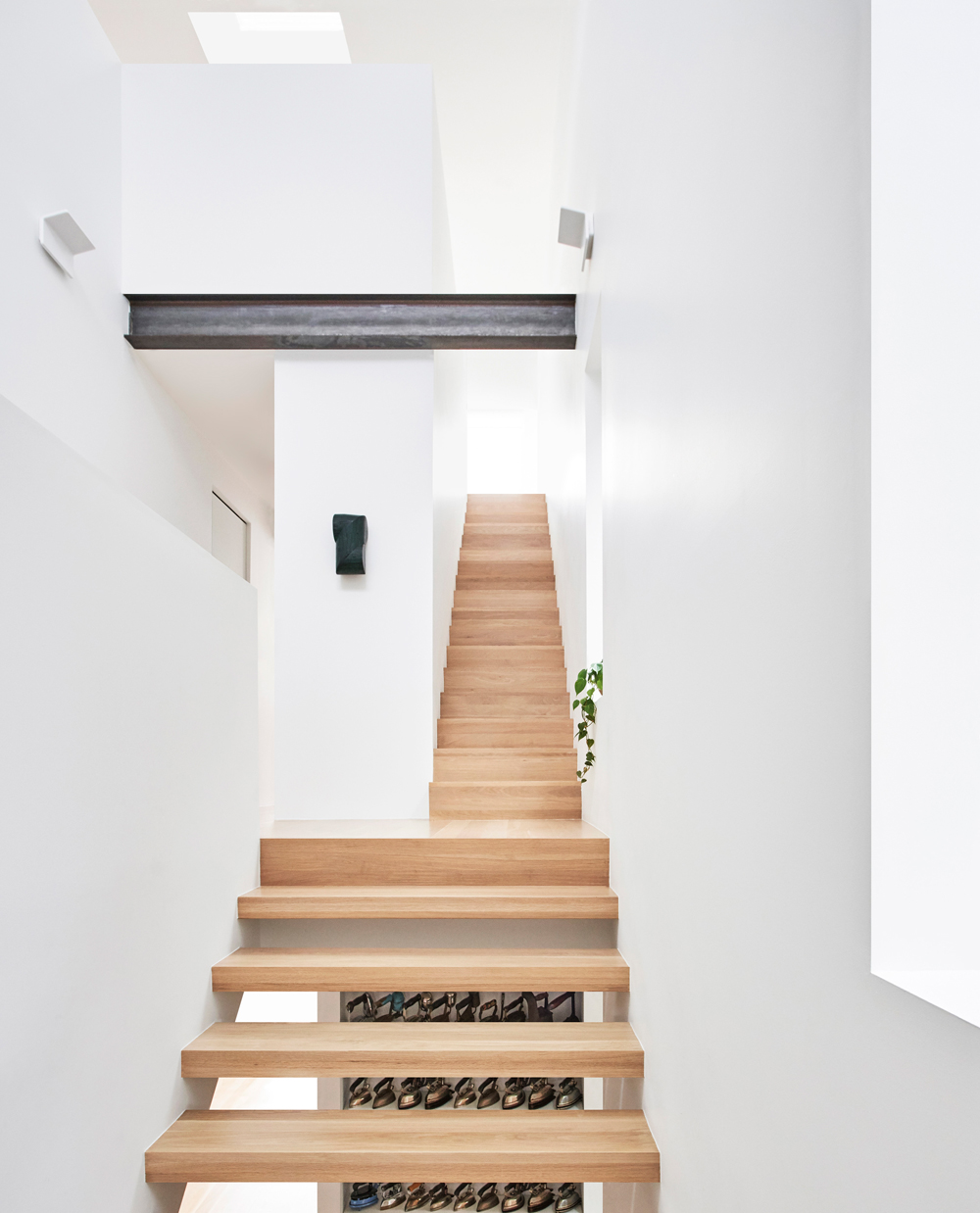
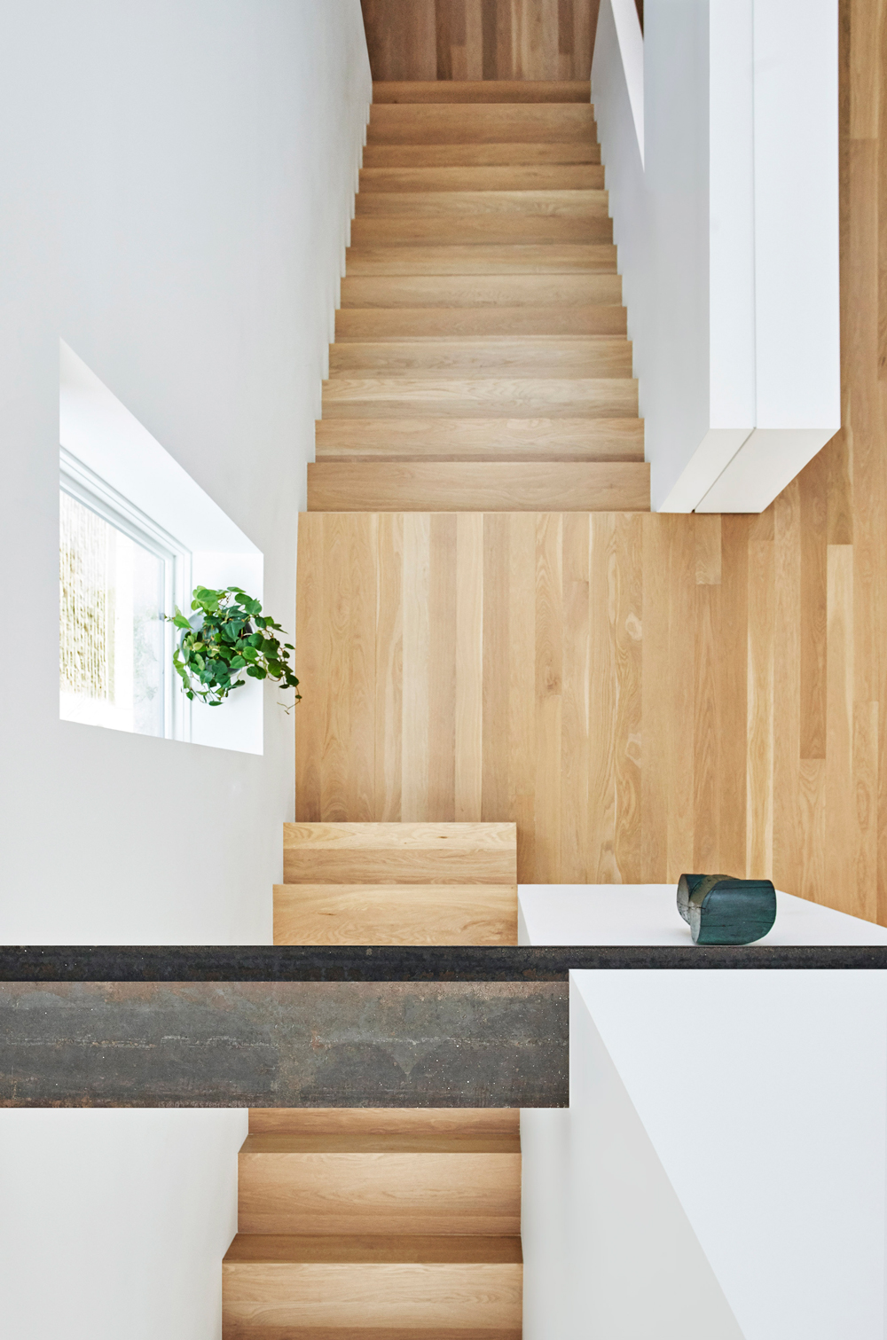
Main Stair © Mike Schwartz
Main Stair © Mike Schwartz
First Floor © Mike Schwartz
Living Area © Mike Schwartz
Kitchen © Mike Schwartz
View of Second Floor © Mike Schwartz
View of Third Floor © Mike Schwartz
Second Floor © Mike Schwartz
Third Floor © Mike Schwartz
Third Floor Office View © Mike Schwartz
Black Facade © Mike Schwartz
Canopy Detail © Vladimir Radutny Architects
Existing Conditions

Proposed Site Plan
Study Model of Stair Assembly
Final Model of Deck
Deck Assembly Diagram and Material
Deck and Screen Section
Construction
Detail View of Stair Assembly
View of Deck
View of Screen

View of Deck
Existing Conditions: Exterior
Existing Conditions: Interior
Proposed Plan: First Floor
Proposed Plan: Second Floor
Proposed Section
Skylight Study Model
Stair Assembly Diagram
Stair Construction

Stair Profile Mike Schwartz
Greeting at Entry Mike Schwartz
Kitchen View Mike Schwartz
Kitchen Detail Mike Schwartz
Towards Front Entry © Mike Schwartz
Upper Level Landing © Mike Schwartz
Upper Level Landing © Mike Schwartz
Upper Level Landing © Mike Schwartz
Upper Level Landing © Mike Schwartz

Master Bedroom Storage © Mike Schwartz
Maser Bedroom Entry Detail © Mike Schwartz

Master Bathroom © Mike Schwartz
Front Entry © Mike Schwartz
Front Elevation © Mike Schwartz
Existing Conditions: Exterior
Existing Conditions: Interior
Study Model: Beginning
Study Model: Parti
Organization Diagram
Proposed Site Plan
Proposed Floor Plan
Perspective Section
Wall Section Detail
Proposed Site Section

Proposed Exterior
Proposed Entry Sequence
Proposed Living and Dining
Proposed Kitchen
Proposed Master Bedroom
Program Components
Existing Plan
Proposed Plan
Diagrams
Interior Elevations
Pre-Existing Conditions
Construction: Layers
Construction: Bathroom
Construction: Touch Ups

Living Space © Bill Zbaren
Towards Kitchen © Bill Zbaren
Island Detail © Bill Zbaren
From Entry © Bill Zbaren
Island Corner © Bill Zbaren
Towards Sleeping Area © Bill Zbaren
Bathroom Wet Area © Bill Zbaren
From Shower © Bill Zbaren
Inside Sleeping Area © Bill Zbaren
Concept Sketch
Concept Model
Existing/Proposed Plans
Intervention Diagram
Study Model
Intersection Study
Inner Plywood Profiles
Existing Conditions
Construction Process
View from Corridor © Mike Schwartz
Main Space © Mike Schwartz
Detail View of Wall © Mike Schwartz
Utility Core © Mike Schwartz
Inside the Core © Mike Schwartz
Main Space with Equipment © Mike Schwartz
Towards Entry © Mike Schwartz
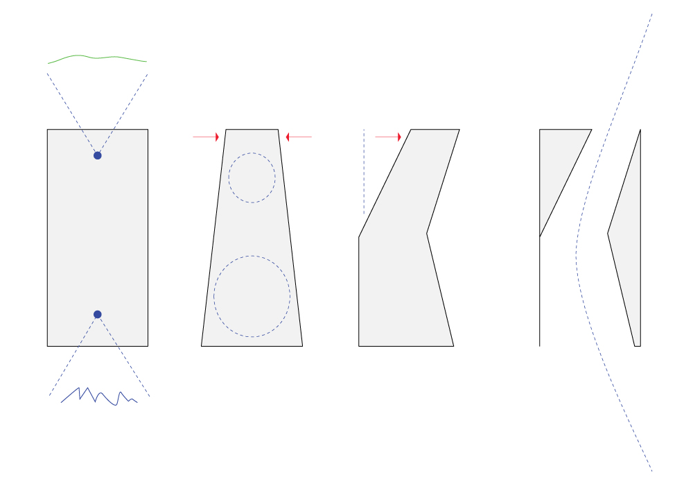
An idea
Exploring Connections

Exploring Connections
Developing an idea
Studying the Form
Finalizing the Proportions

Refining at 1 to 1
Refining at 1 to 1

Symbi in situ
Symbi in situ
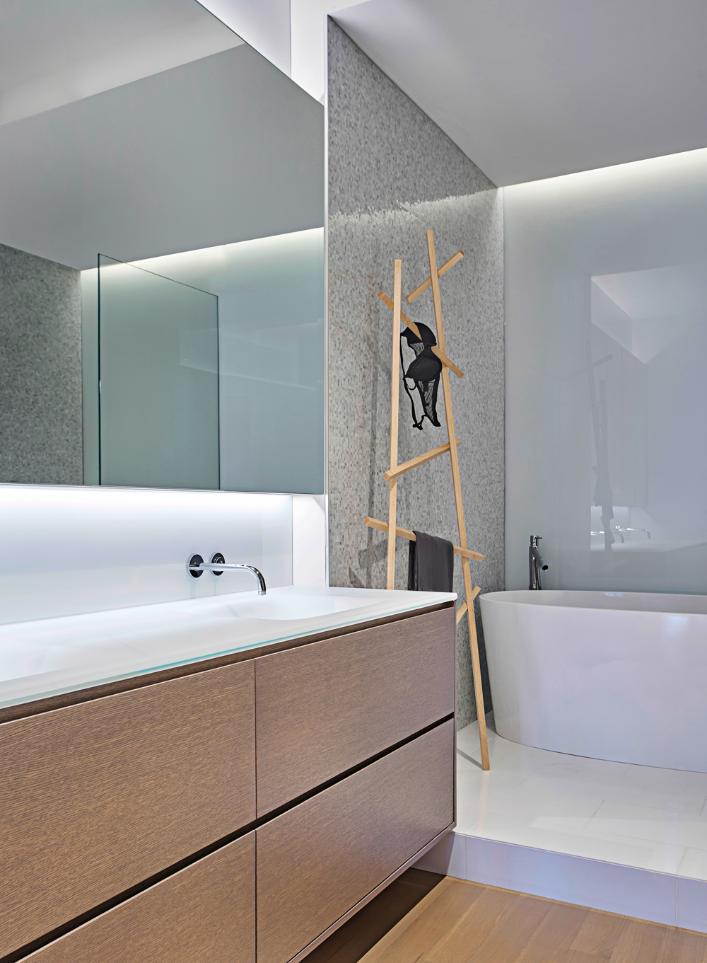
Symbi Detail

Artist Benjamin Bellas

Site Plan

Building Envelope Strategy
Program Allocation
Proposed Floor Plan
Model Development
Proposed Section

Seasons
Interior View
Interior View
Approach
Concept Sketches
Study Model
Existing Plan
Proposed Plan
Enlarged Study Model
Pre-Existing Conditions
Construction: Shelving Detail
View of Living Space © Bill Zbaren
View of Dining Space © Bill Zbaren
View of Kitchen © Bill Zbaren
View of Storage Volume © Bill Zbaren

View Towards Sleeping © Bill Zbaren
View of Sleeping Area © Bill Zbaren
Glass Partition Detail © Bill Zbaren
View from Kitchen © Bill Zbaren
View Inside Bathroom © Bill Zbaren

Bathroom Detail © Bill Zbaren
Bathroom Entry © Bill Zbaren
Entry Door Detail © Bill Zbaren
Design Approach Study Models

Office Organization Model
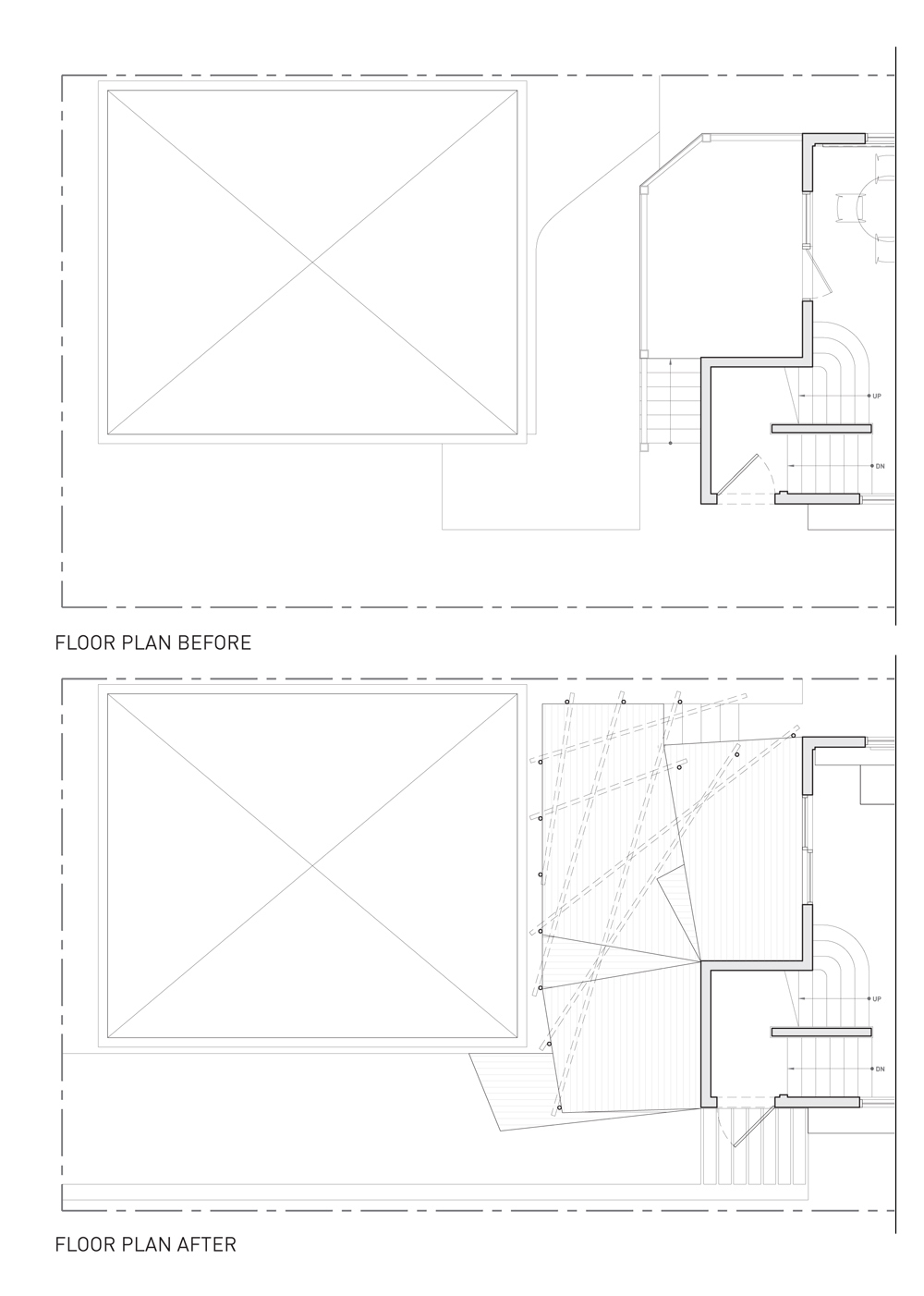
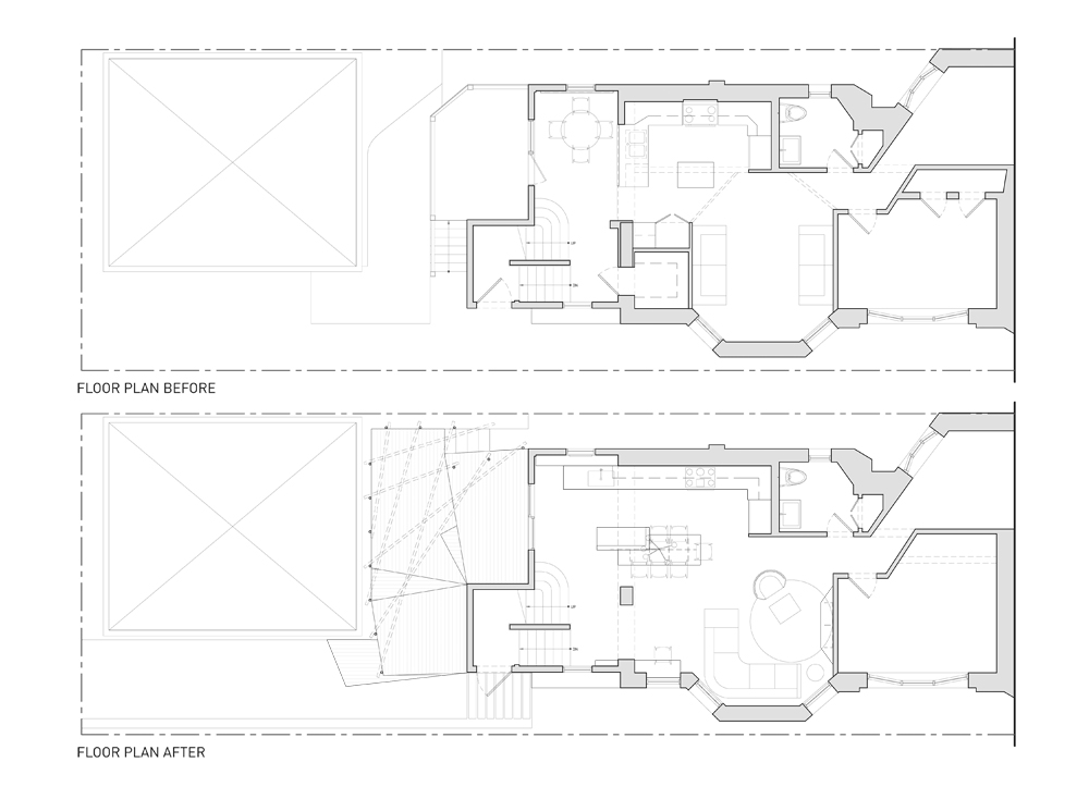
Floor Plan Before
Floor Plan After
Diagram: Binding Partition
Study: Screen Pattern
Open Workspace Elevations and Details
Previous Conditions: Exterior
Previous Conditions: Interior
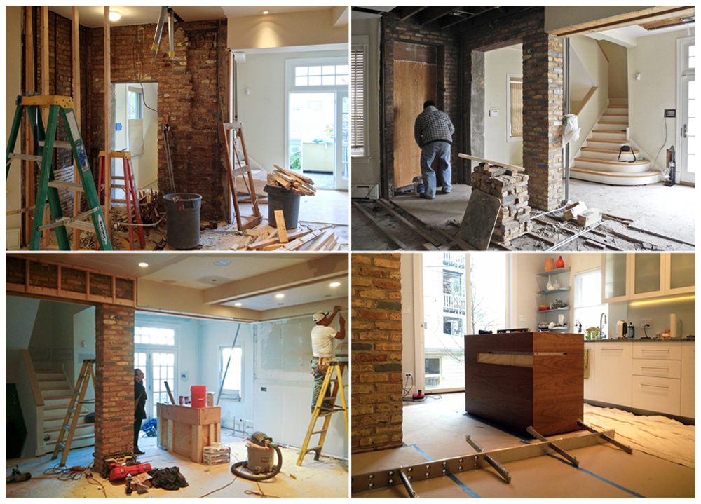
Demolition
Demolition
Construction Transformation
View of Entrance Elevation © Mike Schwartz
View of Binding Partition © Mike Schwartz

View of Private Office © Mike Schwartz
Detail View of Desk © Mike Schwartz
View of Office from the Garage © Mike Schwartz
Garage View © Mike Schwartz

View of Open Workspace © Mike Schwartz
Detail View of the Screen © Mike Schwartz
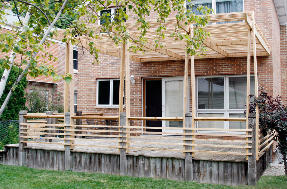
Concept Sketch of Exterior Solution
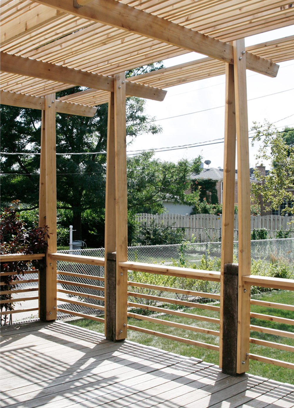
Study Models of Exterior Deck and Trellis
Deck and Trellis Final Model
Prior Exterior Condition
Construction Progress
View from Lower Landing @ Mike Schwartz
View of Eating Landing @ Mike Schwartz

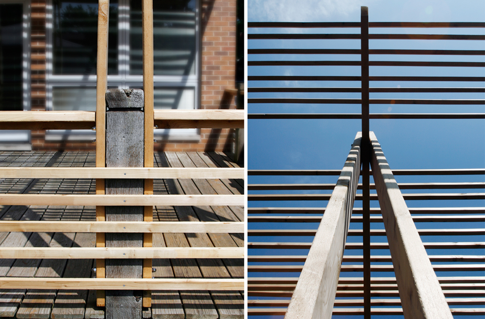
Trellis Detail @ Mike Schwartz
Lower Landing
Area of Work_Kitchen, Dining, Living
Study Model of Main Level
Floor Plans of Main Level
Prior Main Level Conditions

Construction of Main Level Renovation
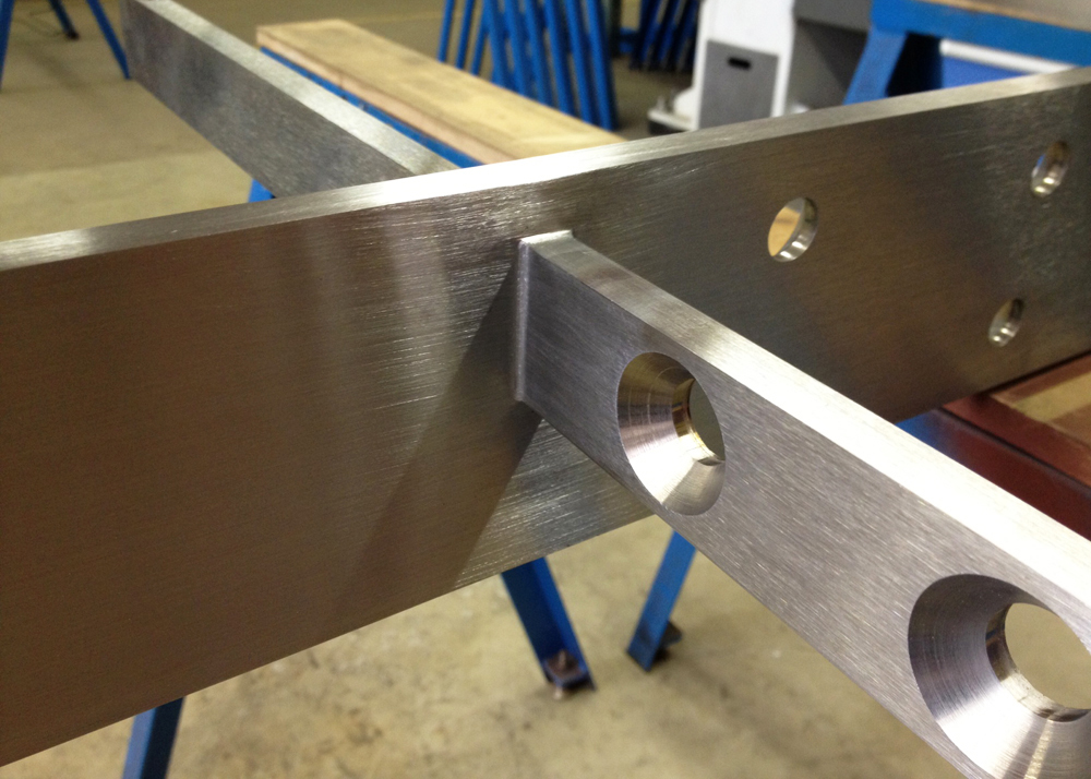
Glass Steel Support Detail
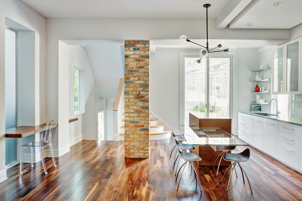
View of Completed Renovation @ Mike Schwartz
View of Kitchen Island @ Mike Schwartz
Kitchen from Side Entry @ Mike Schwartz
Kitchen Cabinets Detail @ Mike Schwartz
Shelf Detail @ Mike Schwartz
Area of Work_Basement
Prior Basement Conditions
Basement Remodel
Living Area_Basement @ Mike Schwartz
Sleeping Platform @ Mike Schwartz
Shower and Vanity @ Mike Schwartz
Vanity Detail @ Mike Schwartz
Concept: Parts Study
View of Models: Assembly Results
View of Model: Assembly Sequence
View of Model: Material Choice
In-Progress Fabrication
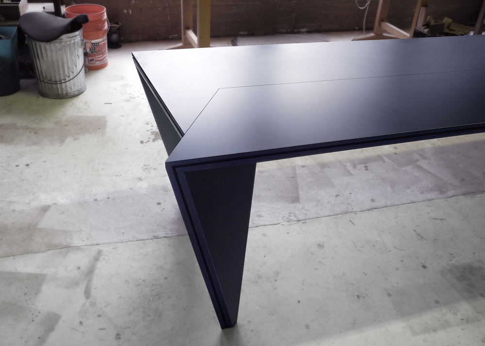
View of Table
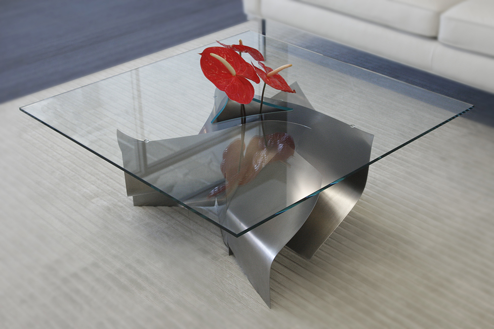
Table Detail
Concept Sketches
Study Models: Site and Form Development
Facade Studies
Circulation and Sustainable Features Diagram
Site Section
Site Plan

Model: Program Animation
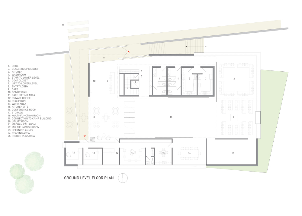
Ground Level Floor Plan
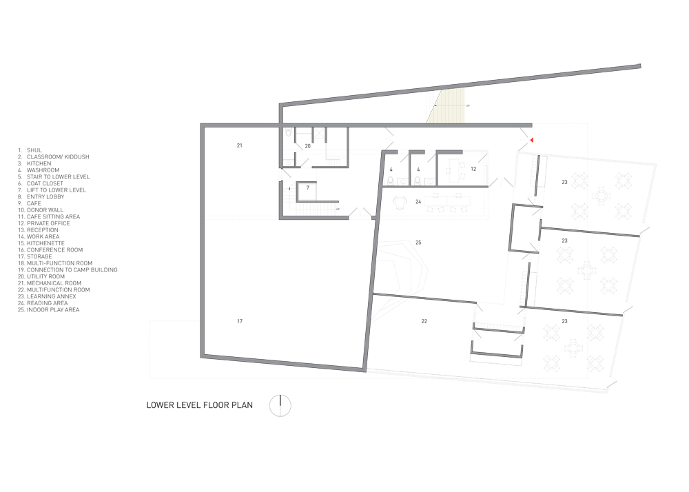
Lower Level Floor Plan
Rendering View of Main Entrance

Rendering View from Rear Plaza

Rendering View Inside the Shul
Saving Prentice Exhibition Board
Existing Conditions: Exterior
Existing Conditions: Interior
Proposed Site Plan
Design Development Process
Proposed Section and Plan
Construction
Construction: Interior Skylight Framing
Detail View of Exterior Wall © Chris Bradley
Evening View of Addition © Chris Bradley

Morning View of Addition © Chris Bradley
View Inside the Mikveh Pool © Chris Bradley
Detail View of the Bookshelf © Chris Bradley

View of the Bookshelves © Chris Bradley
View of the Sanctuary Space © Chris Bradley
View of the Sanctuary Space © Chris Bradley
Study Models: Circulation and Form Development
Study Model: Program Diagram
Project Parti Diagram: Parts
Project Parti Diagram: Parts Assembled
Study Model: View at Grade Level
Floor Plans
Elevations
Rendering View from Garden
Rendering View at Upper Deck Level
Rendering View Inside the Studio
Existing Conditions

Existing Conditions
Construction
Construction: View Inside the Office Looking East
View of West Deck
View of Upper Deck
Interior Ceiling Detail
View of Stepped Garden
View of Swimming Pool
Initial Impressions: Views of The Landscape

Concept Sketch and Model
Boundary, Raised Platform Studies
Axonometric Organization Diagram

Floor Plan
Existing Conditions
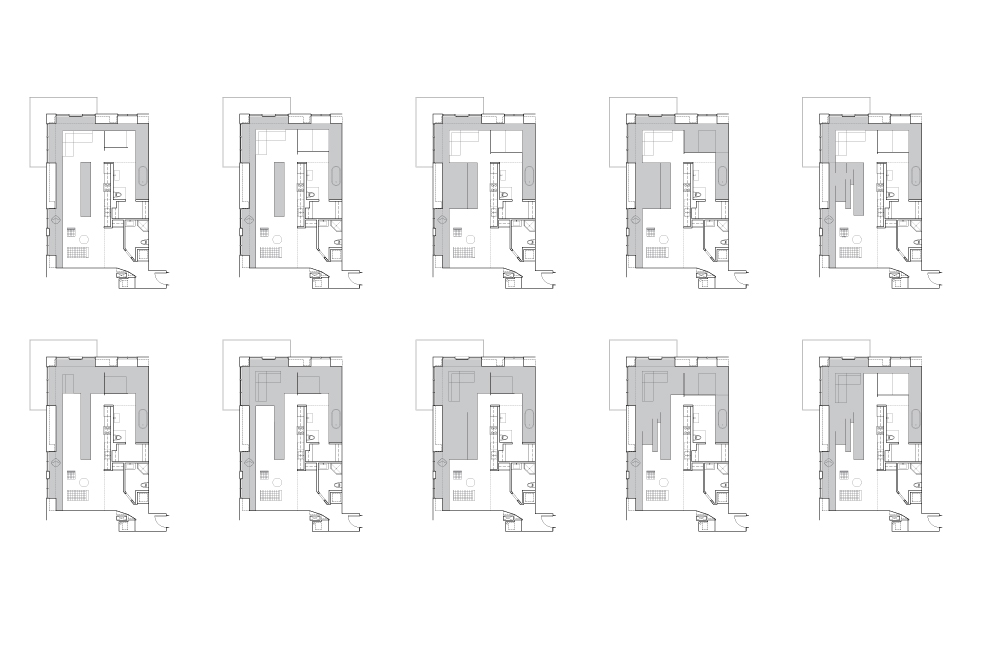
Construction: Defining the Kitchen Volume
Entry: Clad with Black Metal Doors, Enclosing Mechanical Room, Laundry and Guest Bathroom
Sitting Area
Guest Bathroom Enclosure

Guest Bathroom Enclosure: Privacy Configuration

Main Living Space
Built-Out Wall: Looking North

Living Area
Master Bathroom
View of Models: Initial Sexy Tables
View of Model: First Sexy Standing
View of Model: Sexy Legs
View of Model: Mature Sexy
View of Model: Big Sexy Standing
Sexy Drawings
View of Sexy Mock-Up
Construction: Sexy Body
Construction: Sexy Foot Detail
Construction: Sexy Underbelly
View of Big Sexy Standing
View of Big Sexy Rear
View of Big Sexy in Sitting Position
Study Model: View Towards the Enclosure
Iterative Study of Skin Pattern
Wood Wall Pattern Mock-up
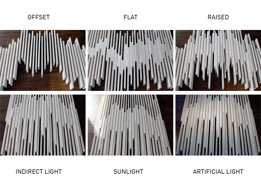
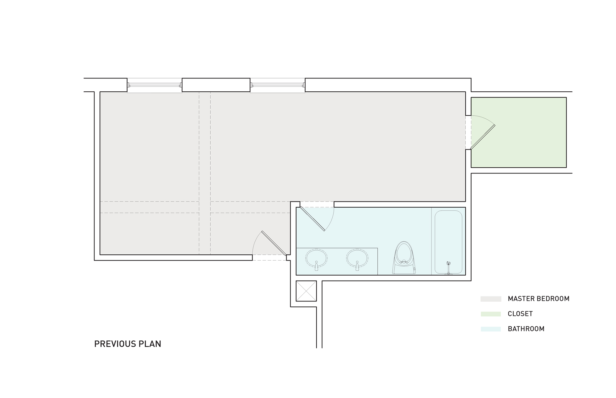
Floor Plan: Previous
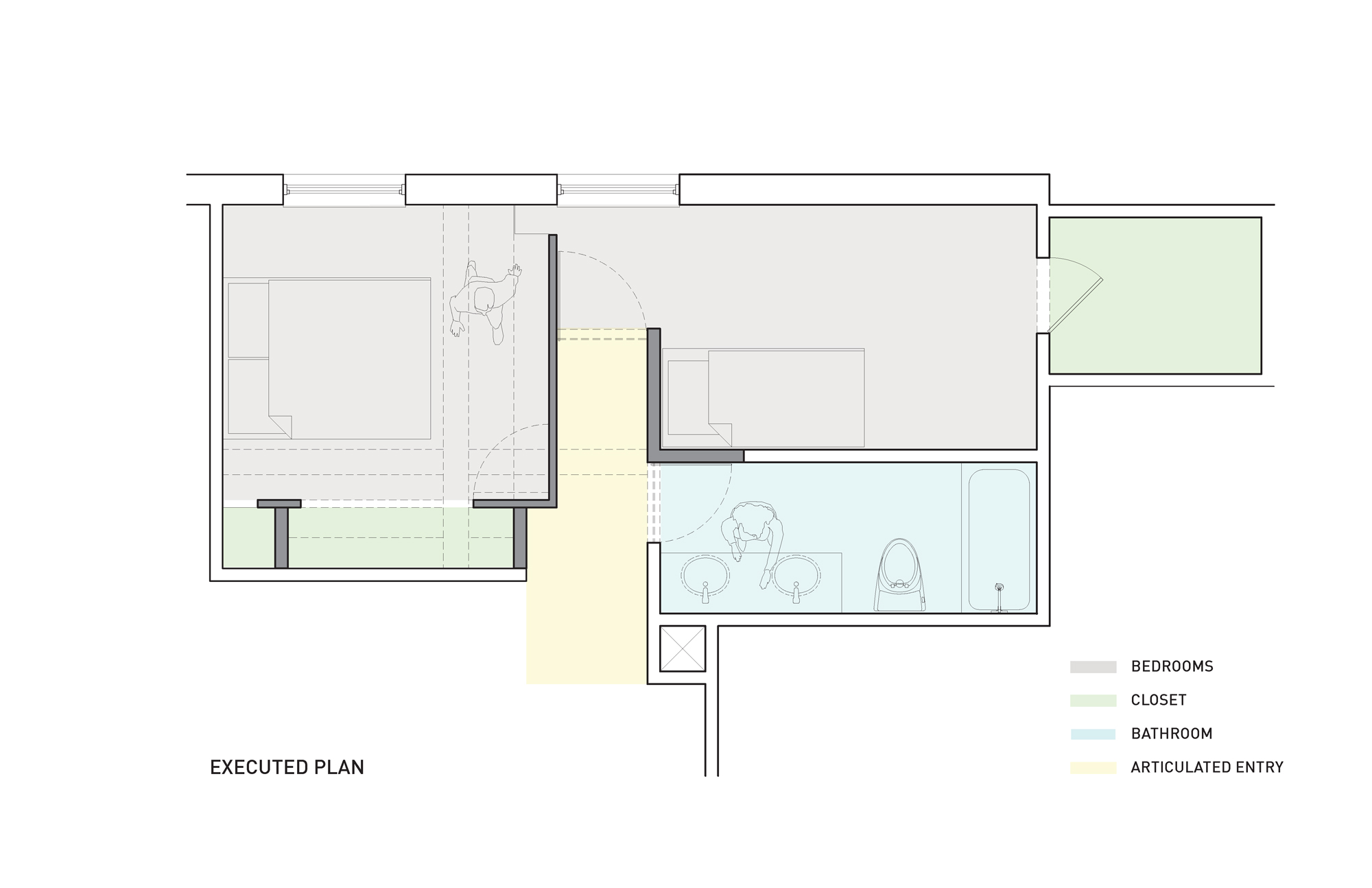
Floor Plan: Executed
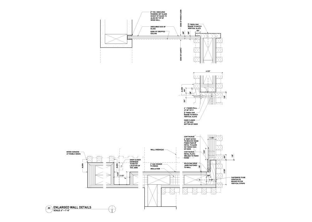
Enlarged Detail of Wall
Existing Conditions
Existing Conditions
Construction: Framing

Construction: Door Detail
Construction: Door Detail
Concealed Bedroom Door

View of New Bedroom Enclosure
View of Bedroom Enclosure
View Inside Transition Corridor
Bedroom Wall from Inside the Room
Bedroom Wall Detail
View of Wall Inside the Second Bedroom
Wall Detail
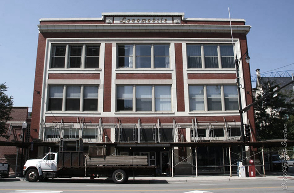
Chicago's Historic Motor Row on South Michigan Avenue
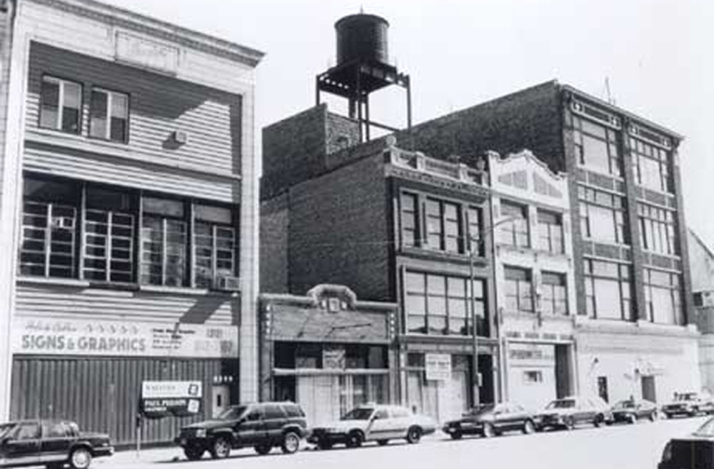
Locomobile Lofts Building
Wayfinding Strategy Concept
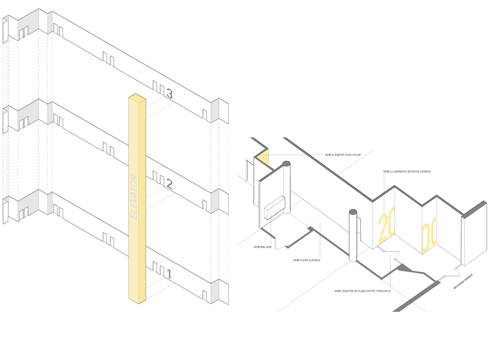
Address Signage Perforation Study

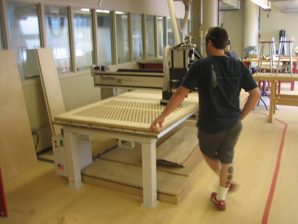
CNC Panel Fabrication
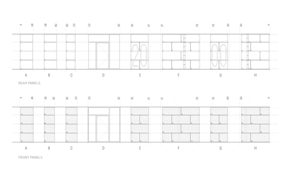
Wood Panel Layering and Assembly
Material Palette

Vestibule Prior to Construction

Construction of the Lobby Ceiling
Construction: Signage Panels
View Inside the Vestibule © Renae Lillie
View of Vestibule Cladding © Renae Lillie

Cladding Detail
Hallway Views from East and West © Renae Lillie
View From the Elevator

View From the Outside © Renae Lillie
Concept Diagram
Process Sketch
Wood Screen Walls: Geometry

Diagrams: Ceiling Enclosure

Proposed Plan
Existing Conditions
Building Up the Screen Walls
Building Up the Screen Walls
Materials and Texture
View From Entry © Nathan Kirkman
View Toward Washroom © Nathan Kirkman
View Toward Bar © Nathan Kirkman
View of Bedroom © Nathan Kirkman
View of Wall Detail © Nathan Kirkman
View Inside the Yoga Room © Nathan Kirkman
Initial Impressions: Montage View From Unit
Process Sketches
Unit Elevation and Plan
Demolition
Construction Sequence
Completed Project © Candice C. Cusic
View of Living/Sleeping Area © Candice C. Cusic
View Toward Entry Corridor © Candice C. Cusic
West Art Wall: One Cent Life Portfolio © Candice C. Cusic

View of Hinged Art Frame: Robert Indiana - Four Winds © Candice C. Cusic
View From Entry © Candice C. Cusic
View From Bathroom © Candice C. Cusic
View of Living Area © Candice C. Cusic
Kitchen Cabinet Enclosure
Floor Edge Detail
View at Entry: Storage Enclosure © Candice C. Cusic
View Toward the City © Candice C. Cusic
TV Enclosure Pattern © Candice C. Cusic
Concept Sketch
Line Drawings
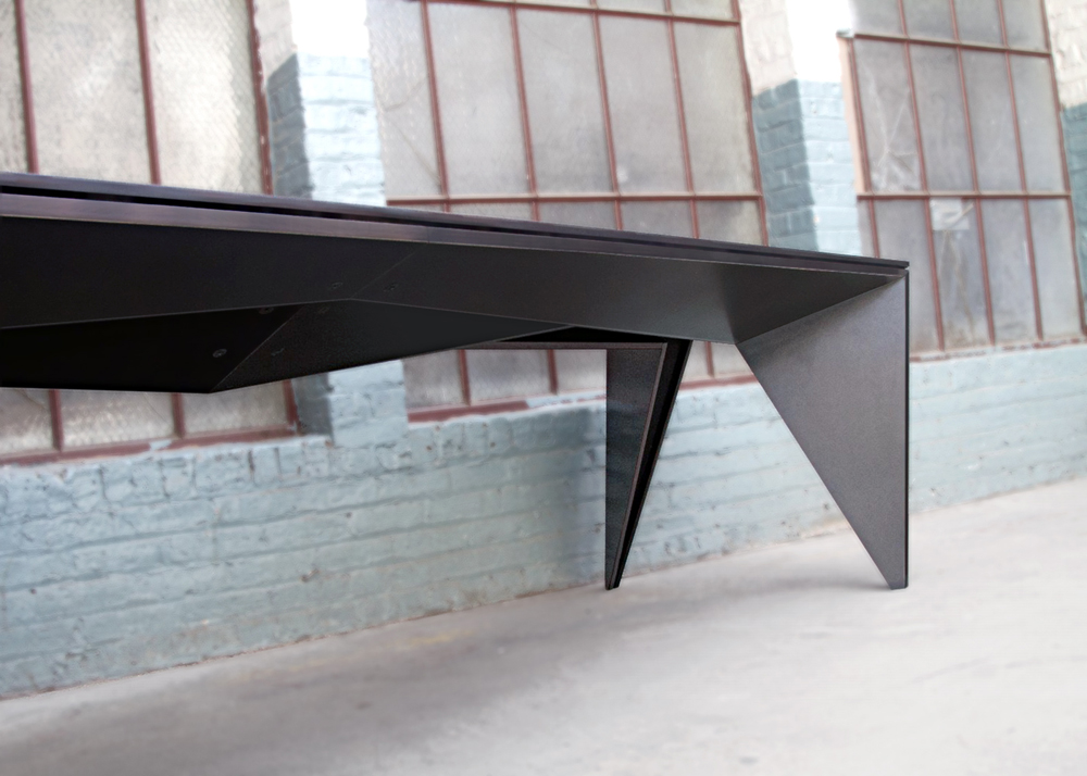
View of Table

View of Table
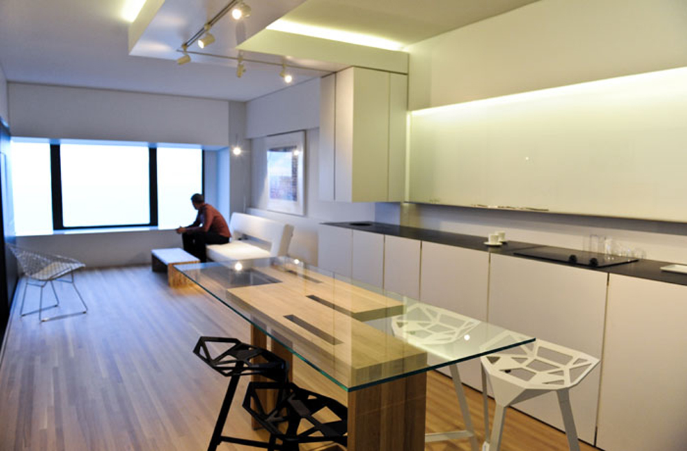
Table Leg Detail
Sun Path
Process Sketches
Drawings: Elevations
Prior Condition
Axonometric View of Assembly Sequence

View Toward the House
View Under the Canopy
Railing Detail Connections: Outside and Inside Corners

Column Detail Connections: Deck and Canopy
View Under the Canopy
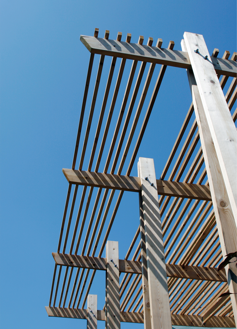
Detail: Beam to Column Connection
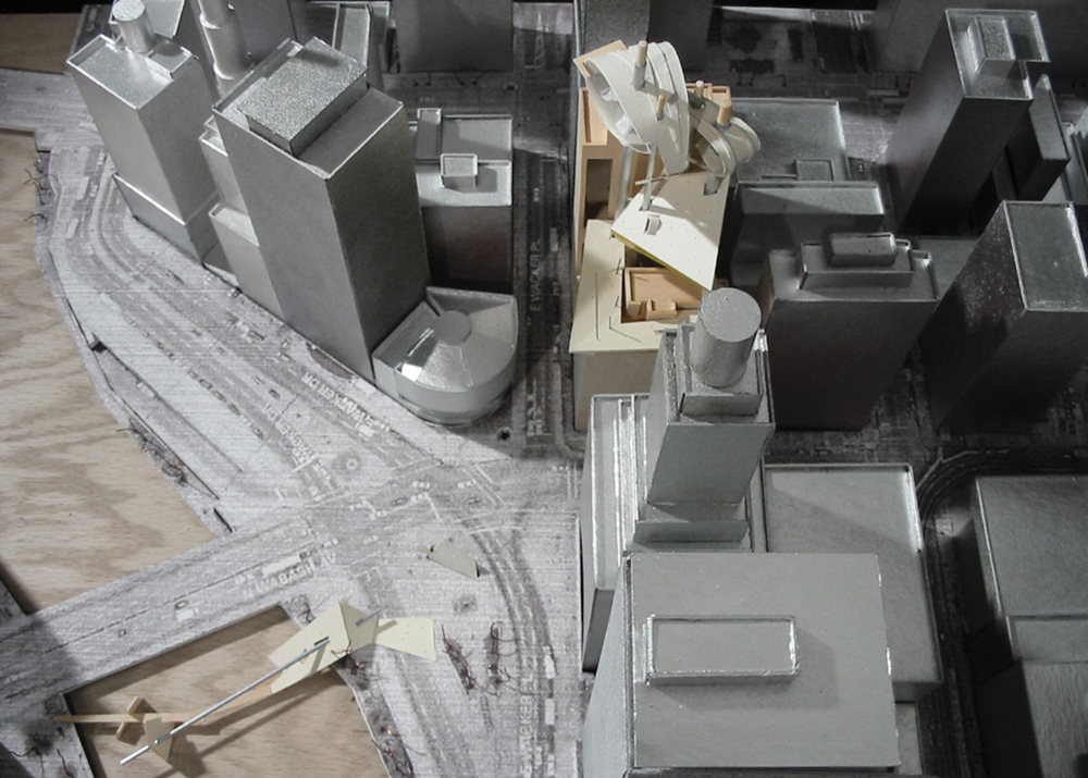
City Block Diagram
Parti

Passive Strategy: Light and Air Optimization
Building Model: Birds Eye View
Building Model: Elevation View
Building Model: Axonometric View
Floor Plans
Exterior Rendering
Interior Rendering: Lower Level
Interior Rendering: Upper Level
Exterior Rendering
Concept Diagram

Piece Index
Assembly Sequence
Rendering View of Table
Rendering View of Table
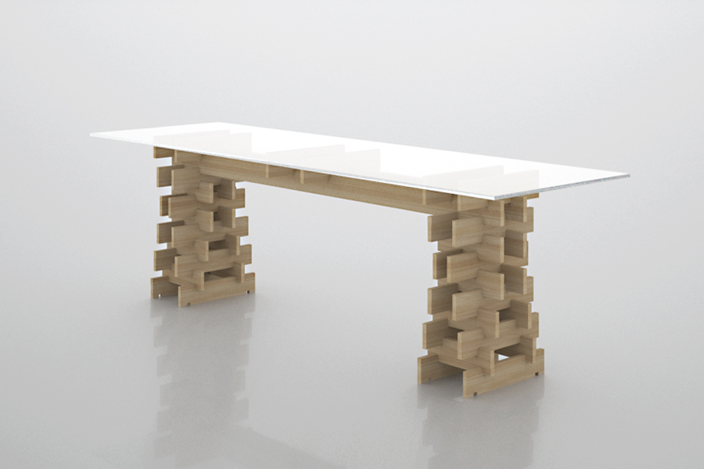
Table Leg Detail
View of Table

View of Table
Concept Diagram
Building Model: Plan View
Upper Level Plan
Ground Level Plan
Lower Level Plan
Sections
Color Inspiration: Marc Chagall Le Coq Blanc Les Deux Amants

View Toward North
View Toward South
View Toward East
View Inside the Sanctuary
View From Entry
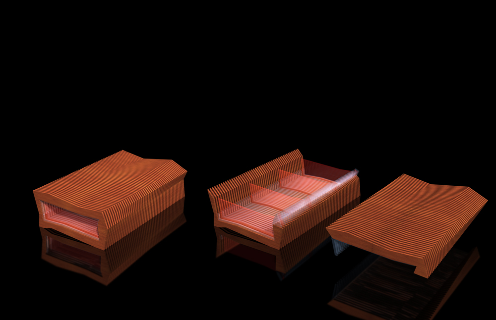
Box Transformation
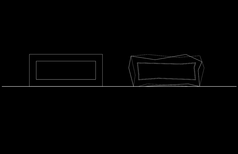
Renderings
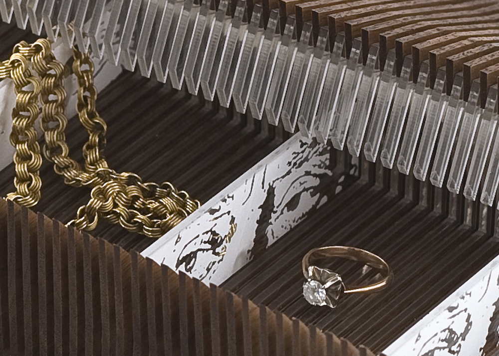
Jewelry Box Interior
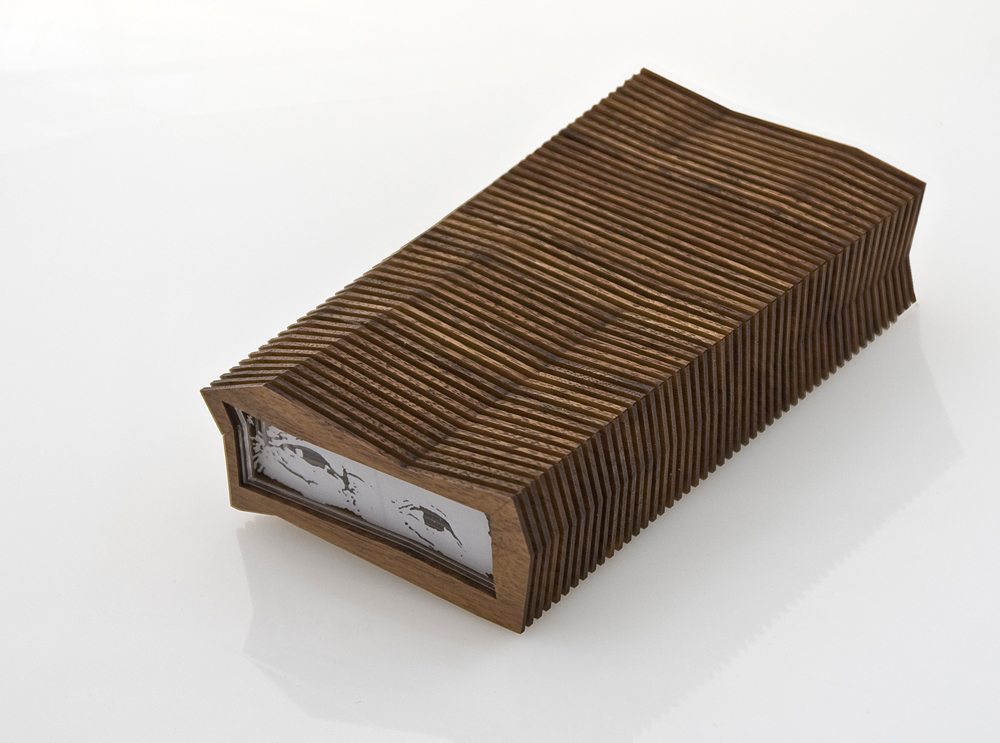
Jewelry Box Closed
Form Studies
Plywood Sheet
Chair Arm Detail
View of Chair
Concept

Concept Studies

Final Product
Project Location
Schematic Rendering: View From Outside
Original Plan
Schematic Plan
Construction Plan
Interior Elevations
Demo
View of Kitchen
View Inside Kitchen
Kitchen Island Detail
Living Room
View Toward Bedroom

Bedroom View

Glass Partition Detail
Glass Partition Detail
Bathroom View
Vanity Detail
Drawings
Details

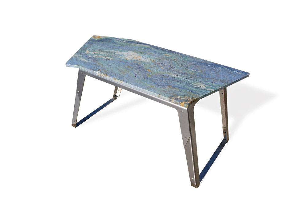
View of Stand

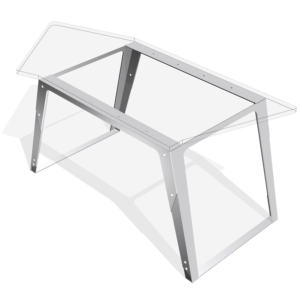
Rendering of Table
Elevations

Table Assembly Drawings
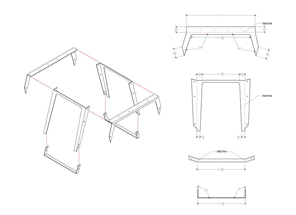
Table Leg Detail

View of Table
Model
Model
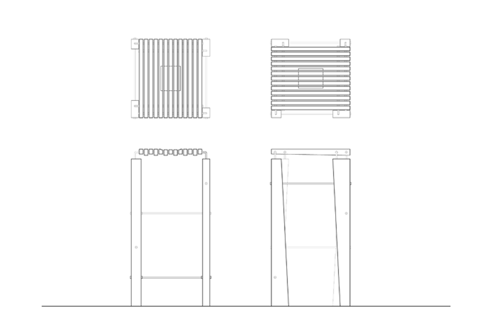
Plan: Initial Sheet Metal Profile
Elevations
View of Table
Stonehenge
Ponte di Rialto: Venice

United Kingdom Parliament
London Eye
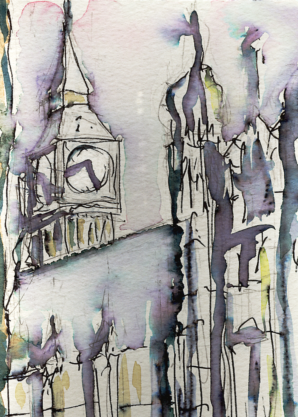
Big Ben
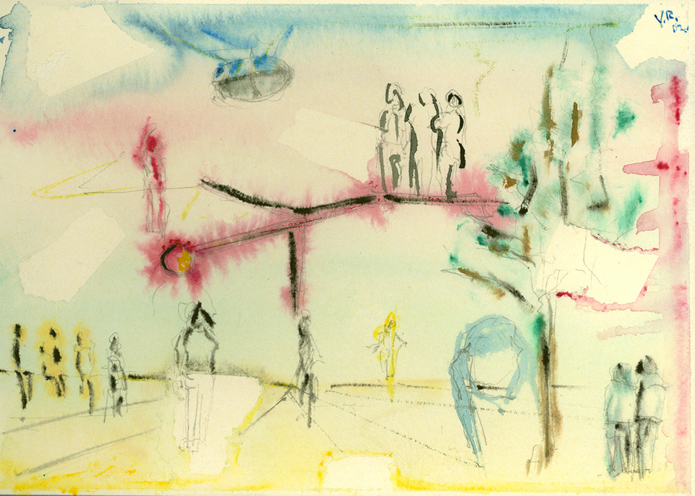
London Streetscape
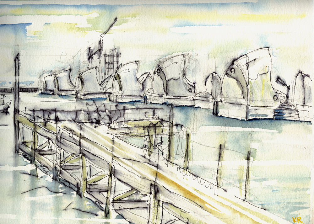
Thames Barriers: England
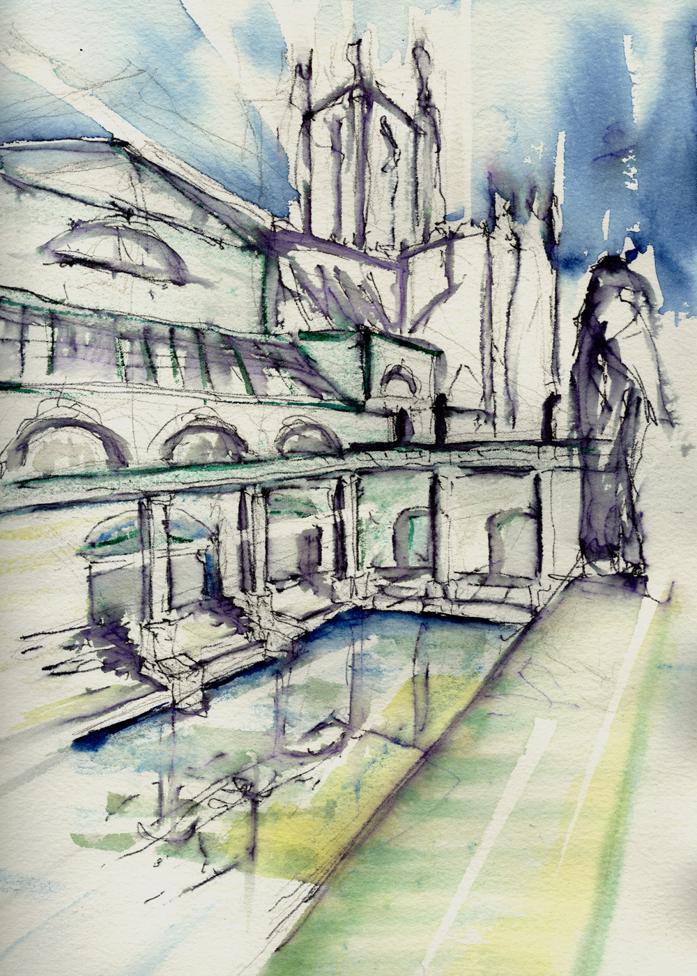
Roman Baths: England
Mevaggissey: England
Greenwich: England
Eden Project: England
Dutch Landscape
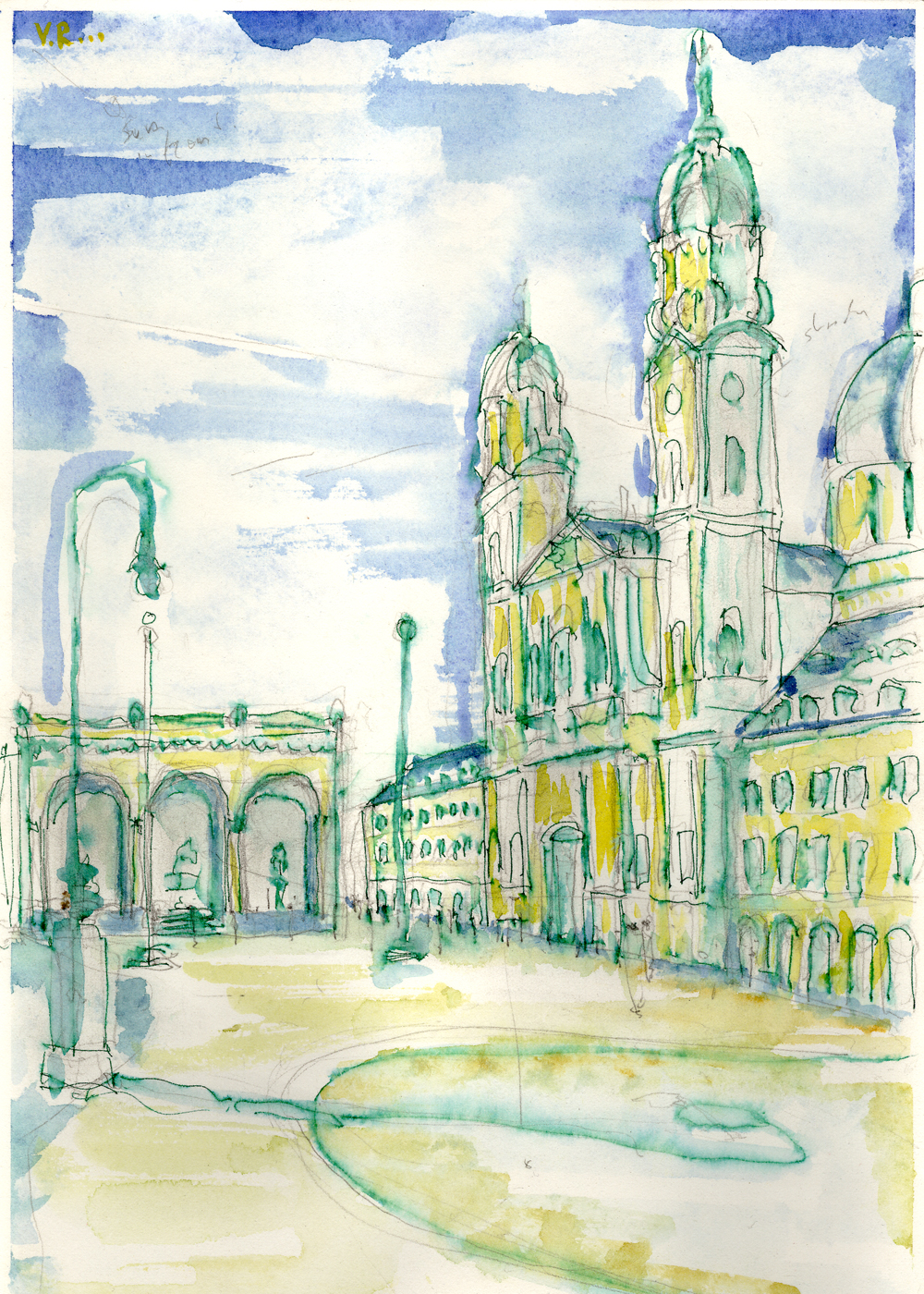
Odeonsplatz: Munich
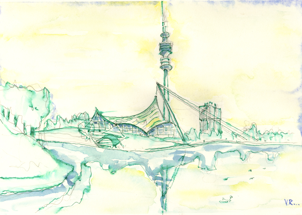
Olympic Village: Munich
Barcelona
Bilbao Streetscape
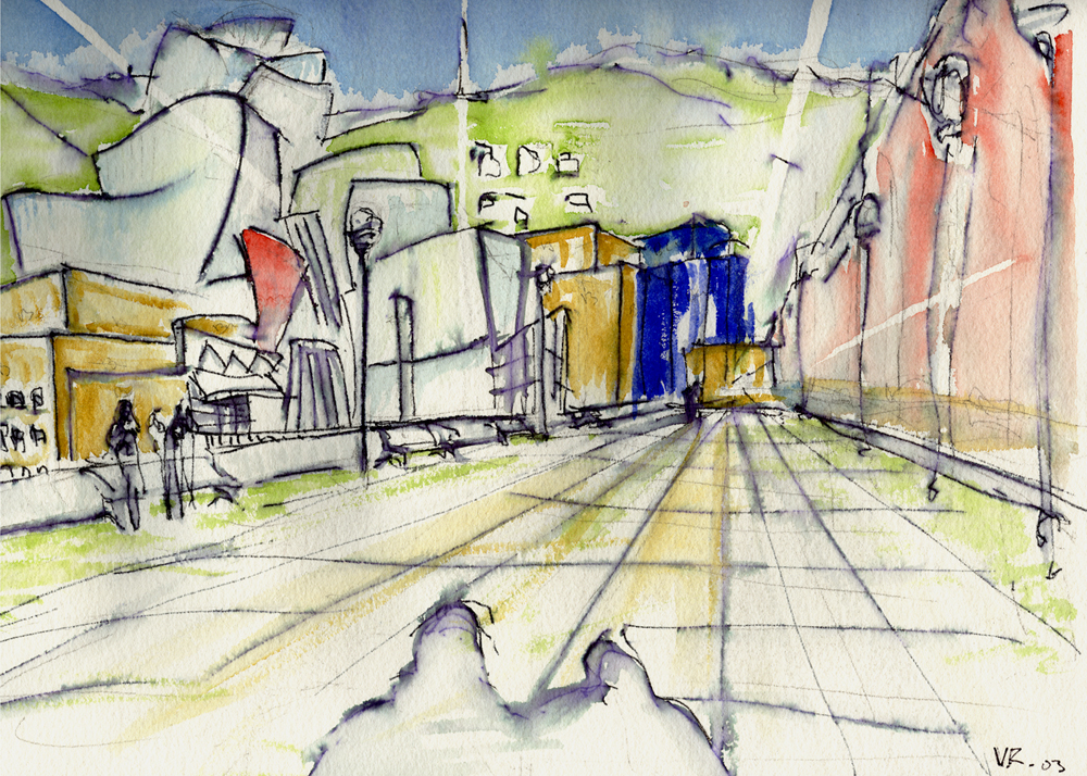
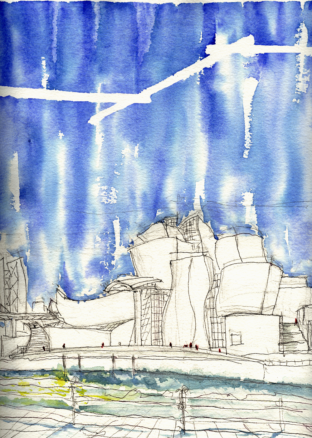
Guggenheim Museum: Bilbao
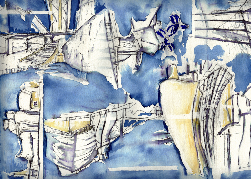
Guggenheim Museum: Bilbao
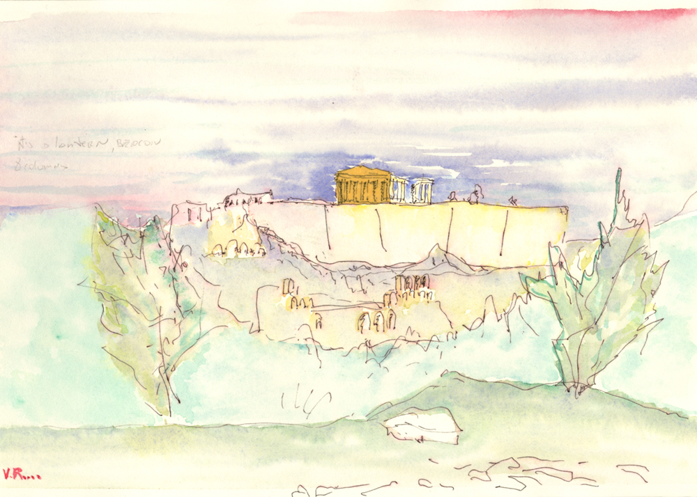
Parthenon: Athens
Elevations

Top View

Detail of Amber Connection

Front View
Concept Image: Catalyst for Imagination
Design Evolution

Birdseye Model View
Aerial View: Project Location
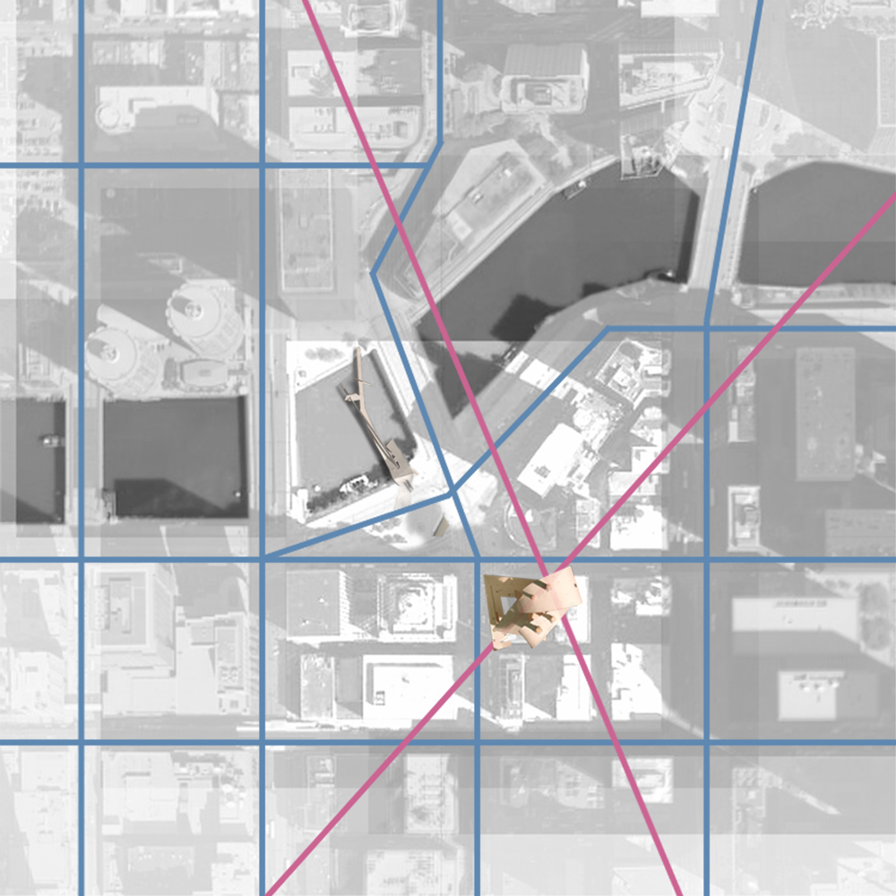
Diagram: Skin and Structure

Program Description
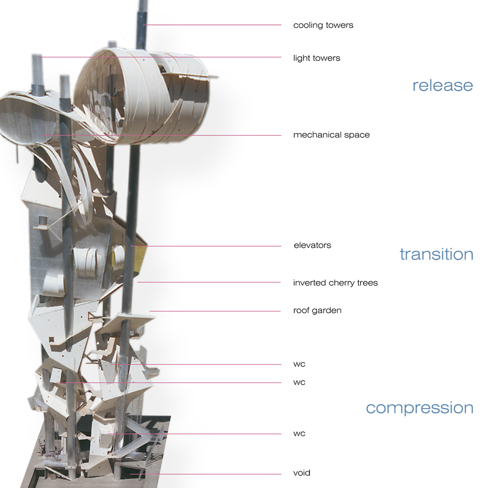
Compression Space: View Looking Up
Floor Plans: Street Level Plans
Compression Space: View Toward the Unknown
Compression Space: View Toward the Mysterious
Compression Space: View Toward the Bathroom Pod

Section: Through the Transition Space
Diagrams: Enclosure, Water Harvesting, Daylight Collectors

Exterior View from City Garden
Exterior View of the Release Space
Section: Through the Release Space
Release Space: View Toward the City
Exterior View from the Chicago River

Exterior View Looking North
Exterior View Toward TOSI
Diagrams
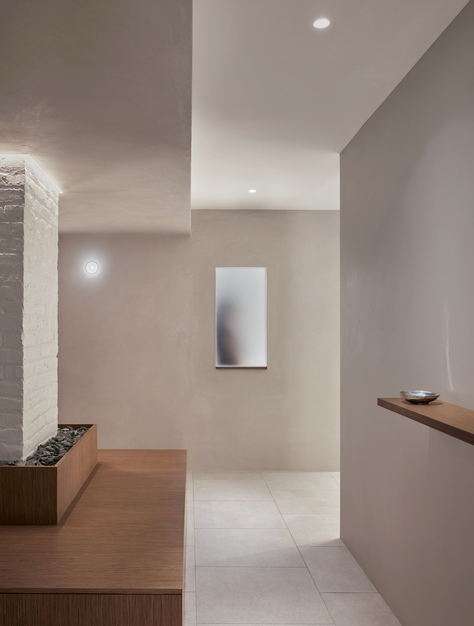
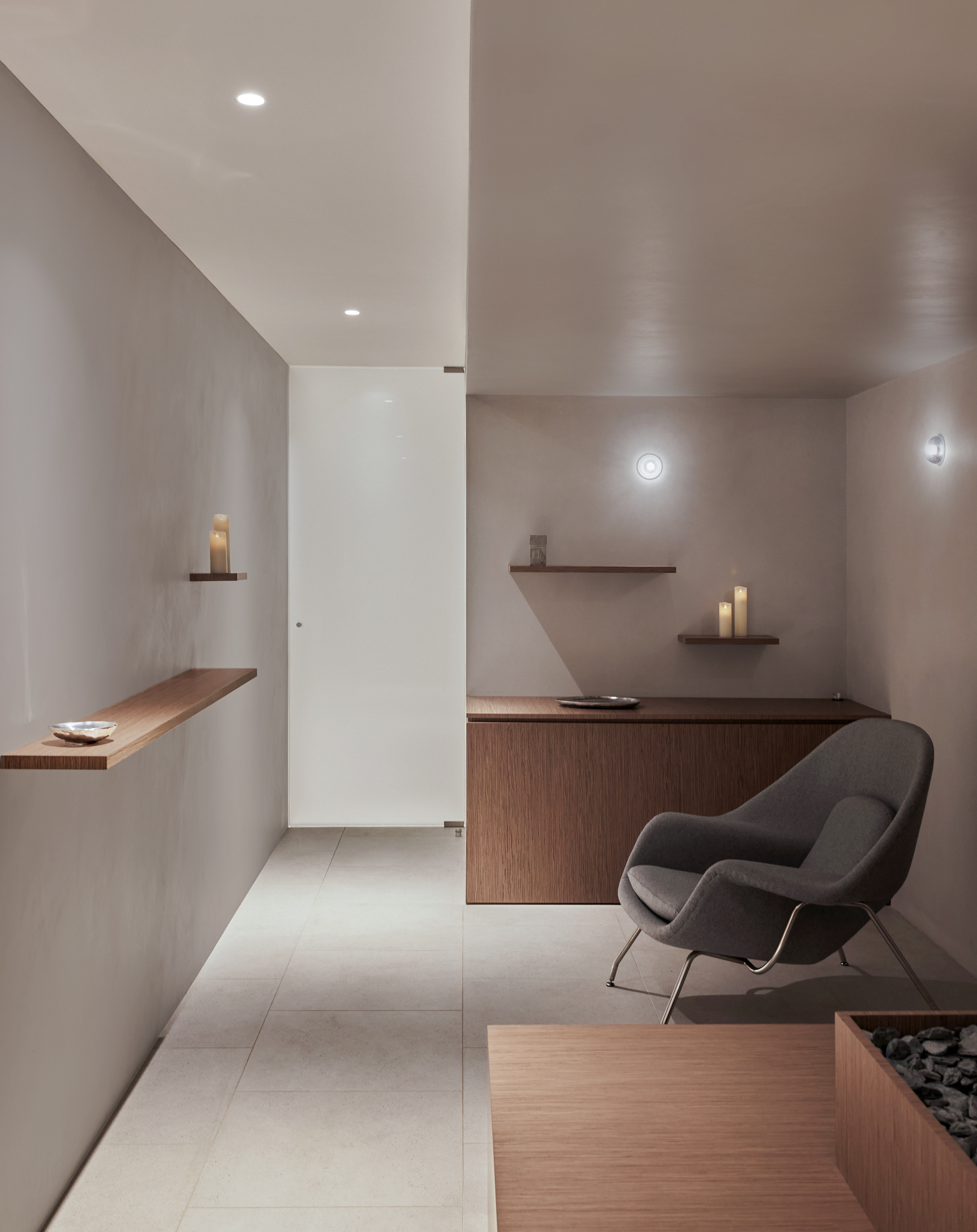
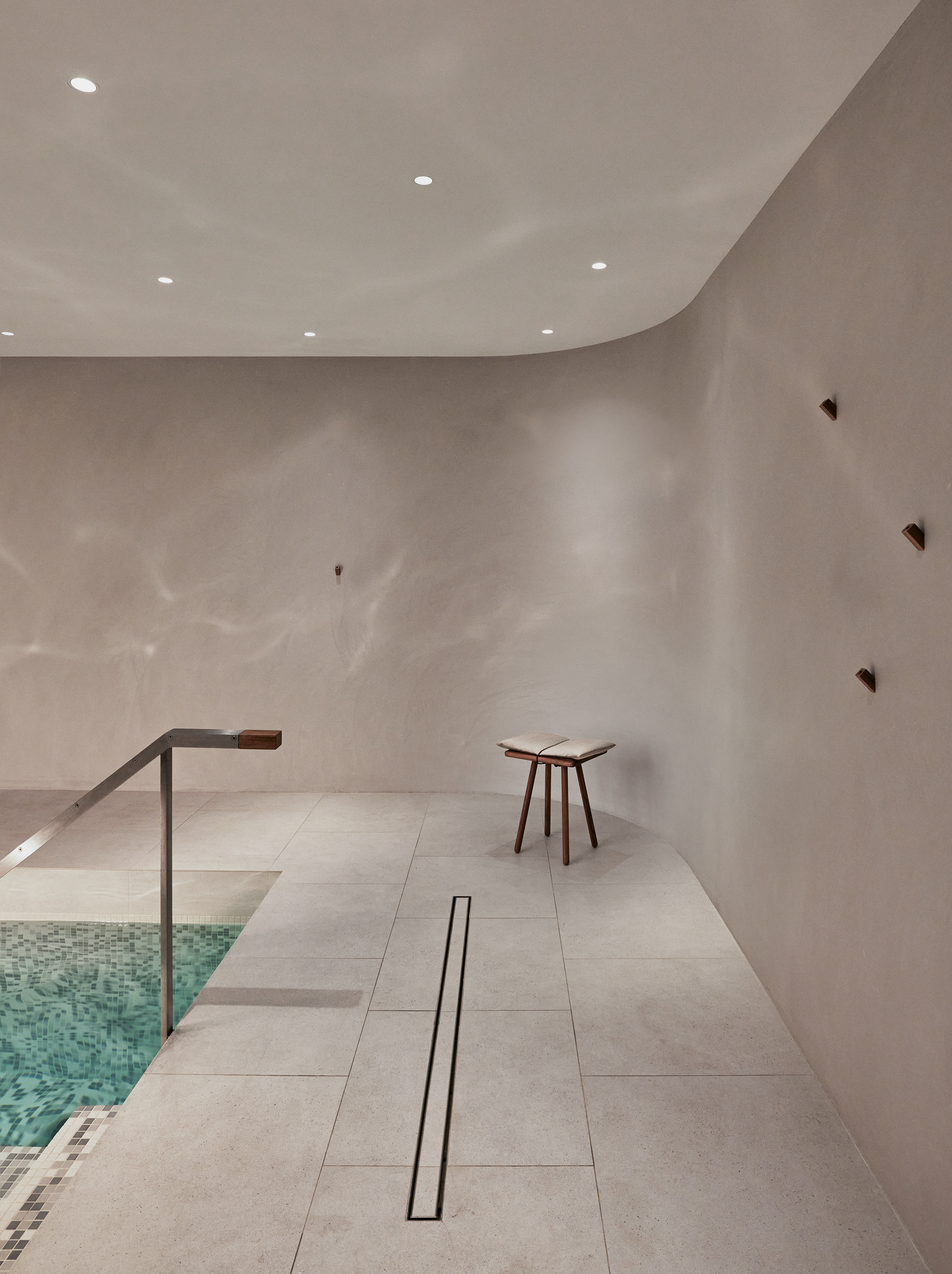
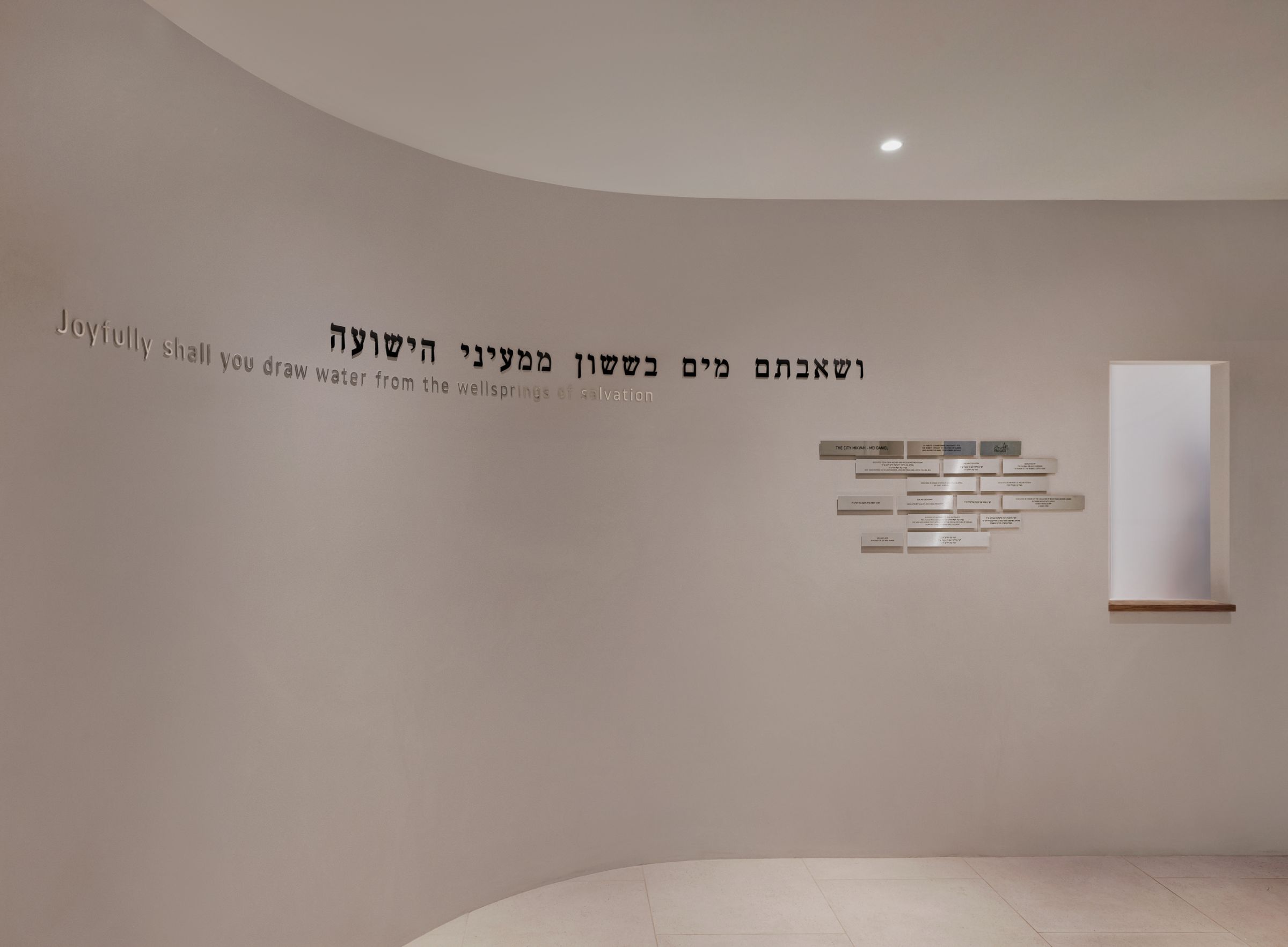
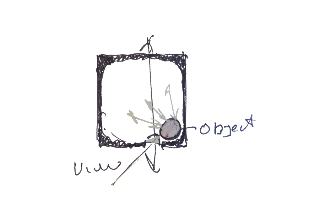
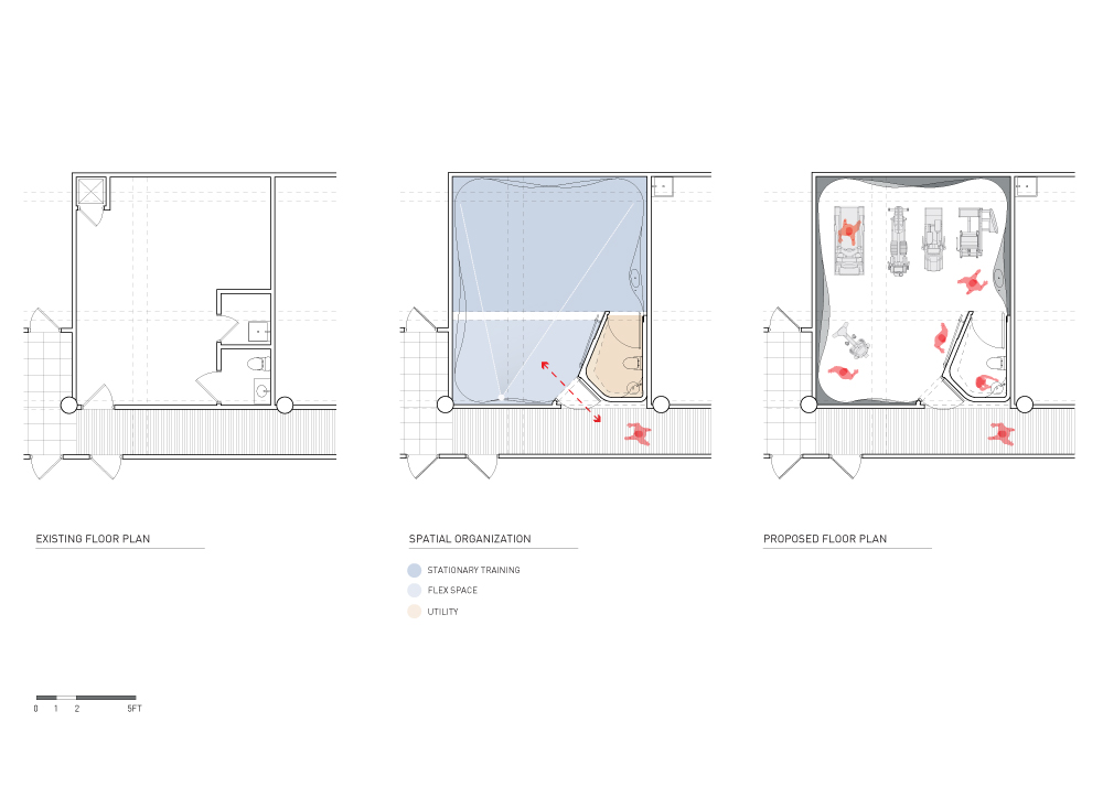
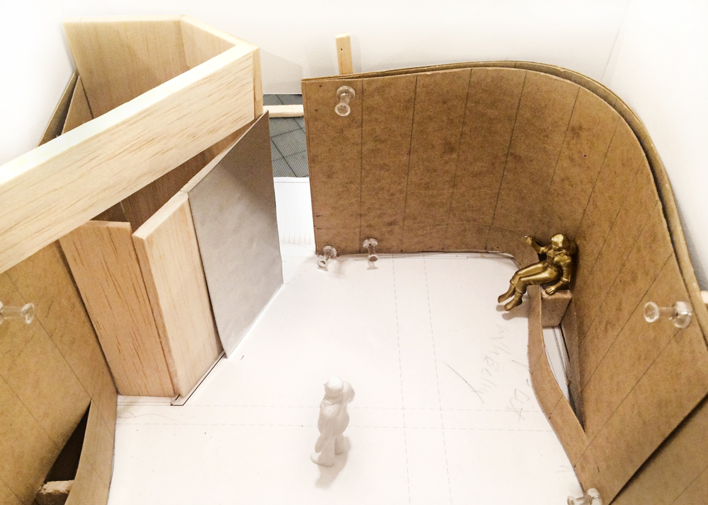
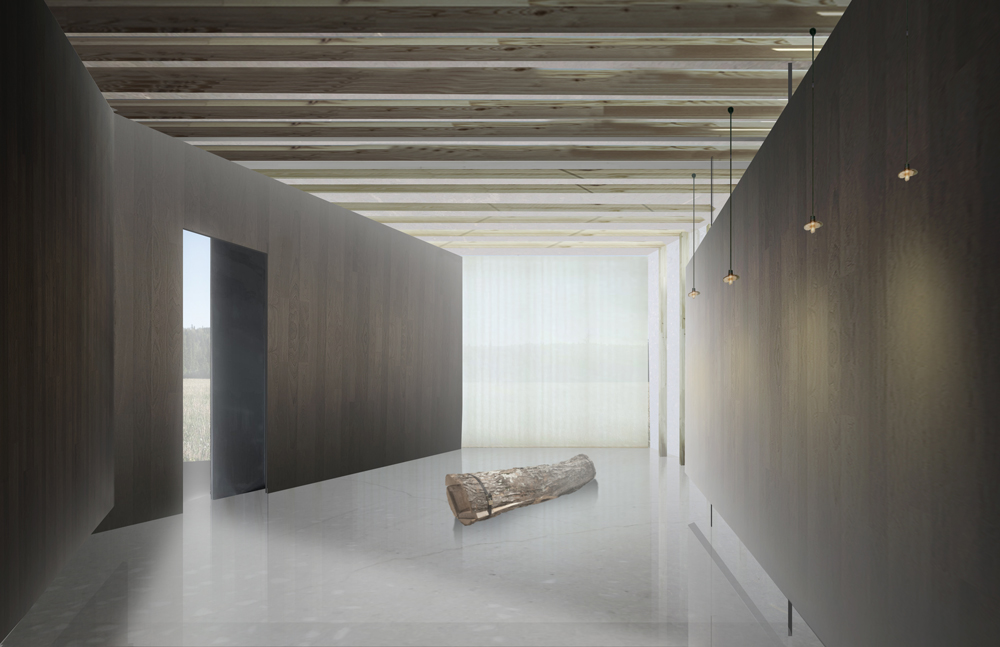
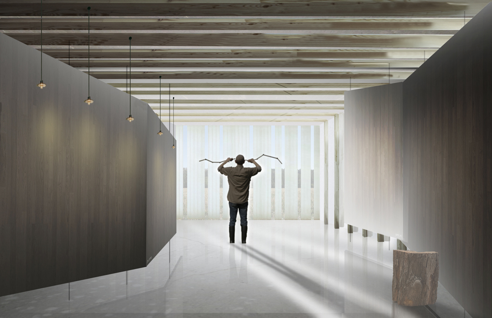
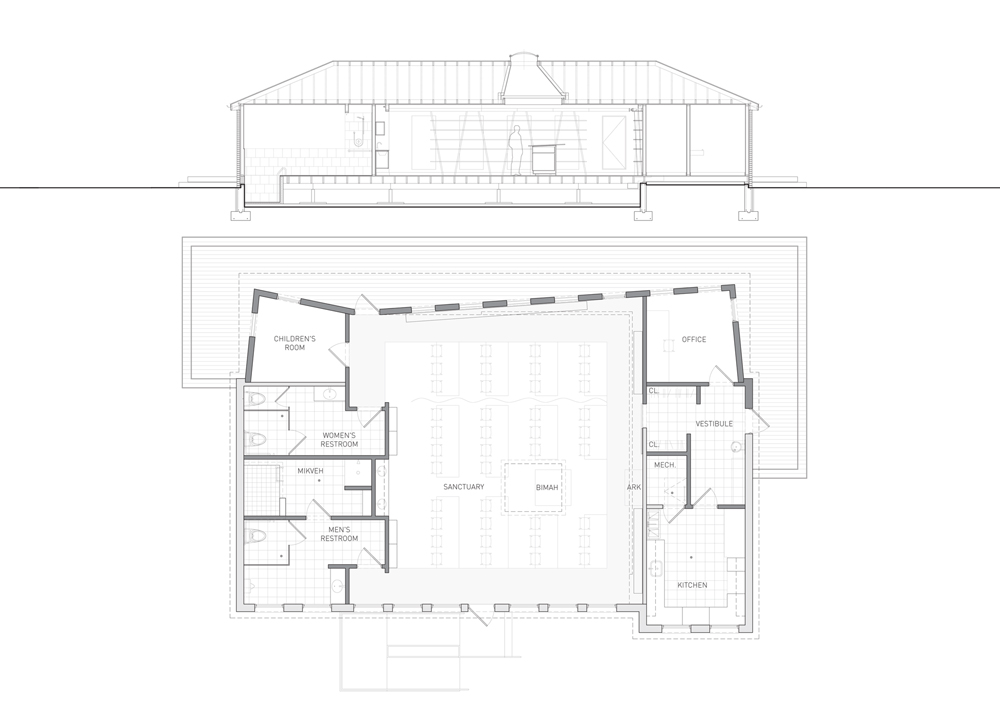
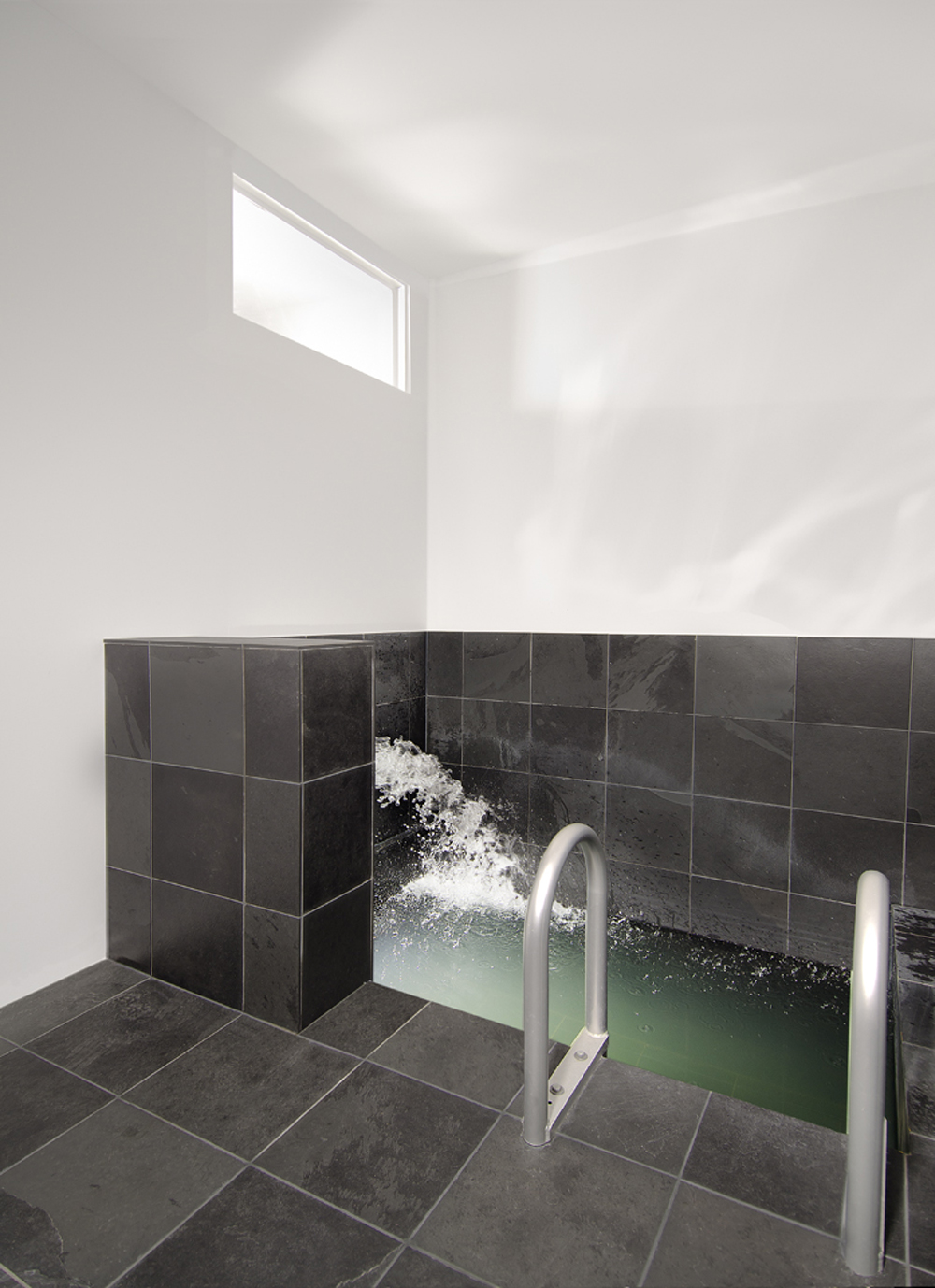
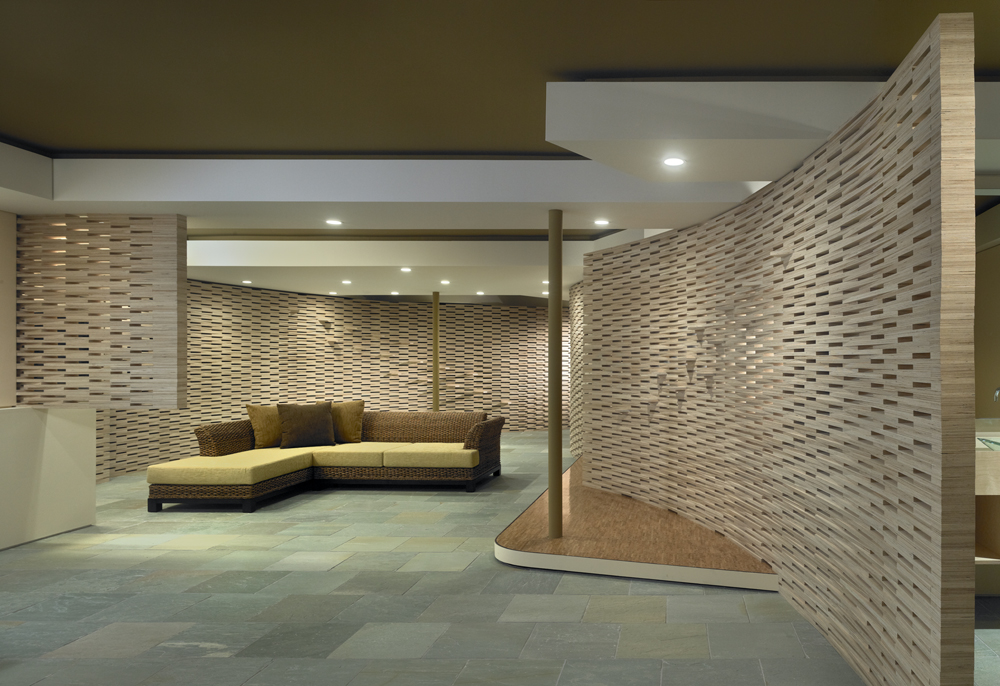
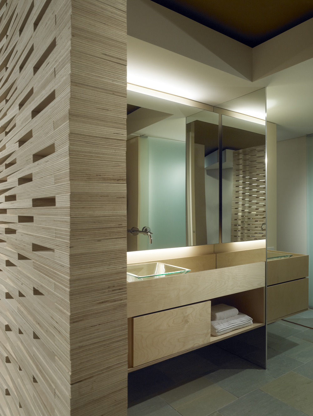
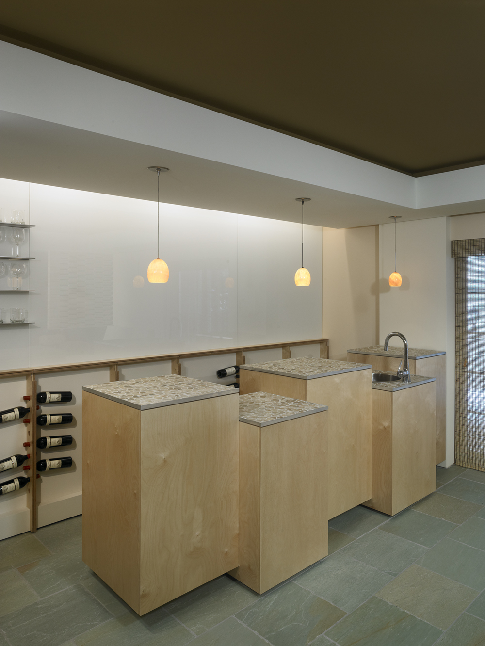
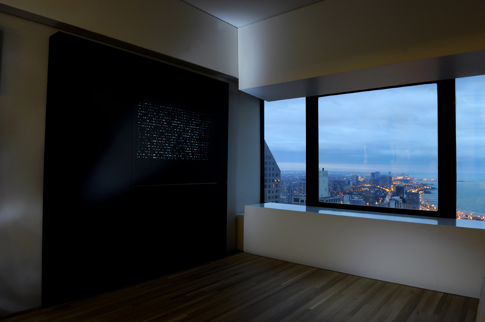
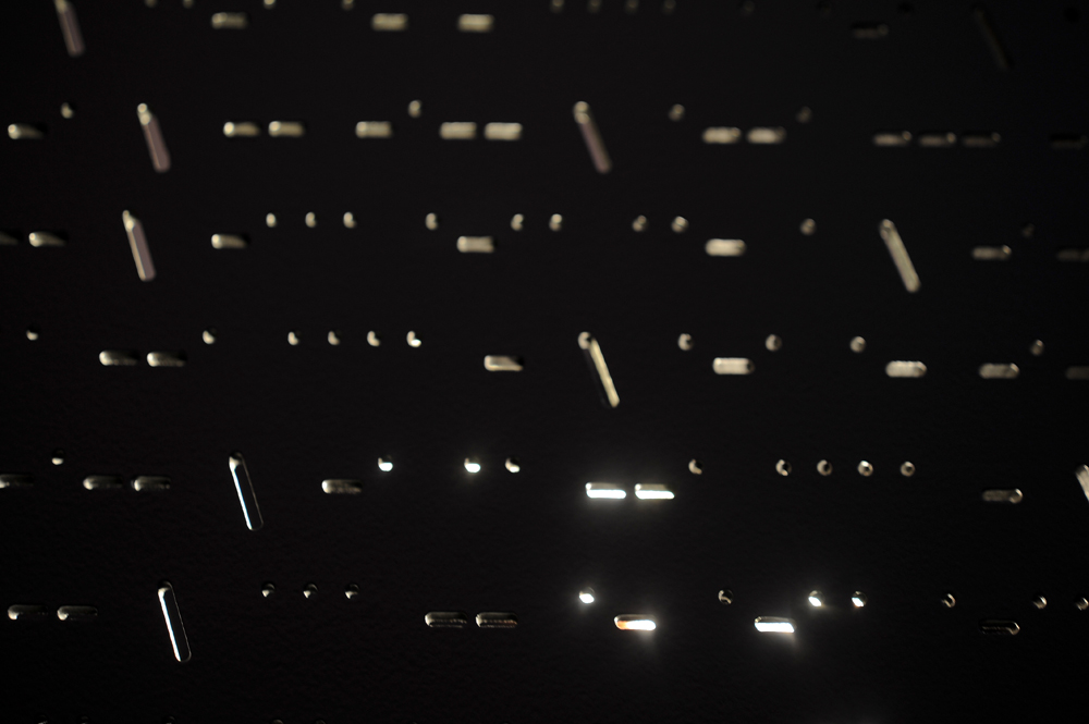
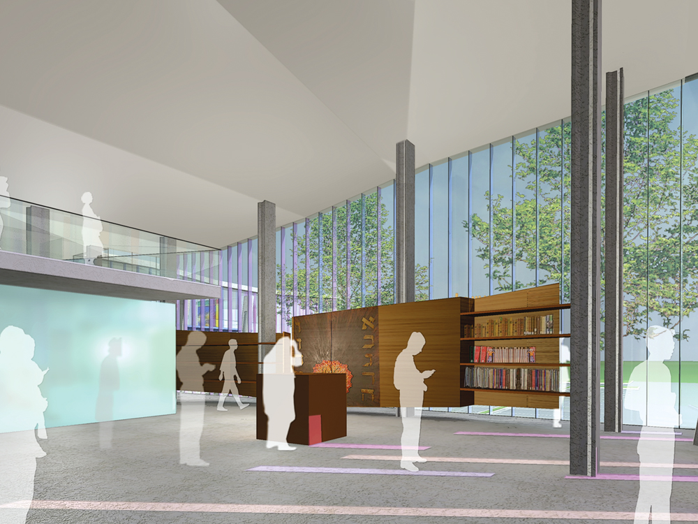
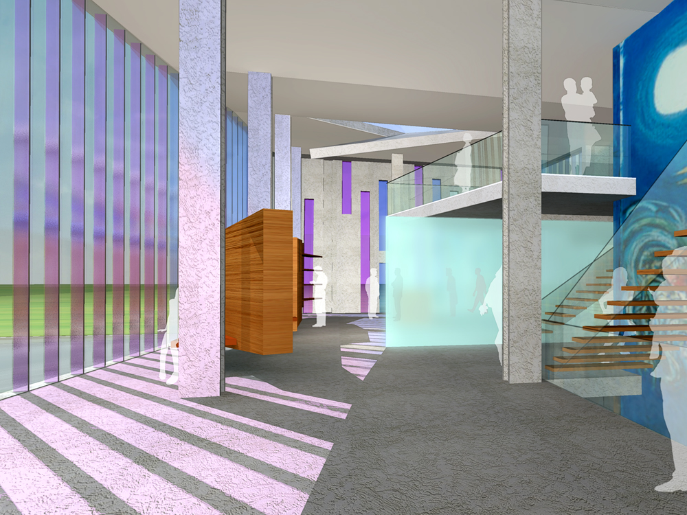
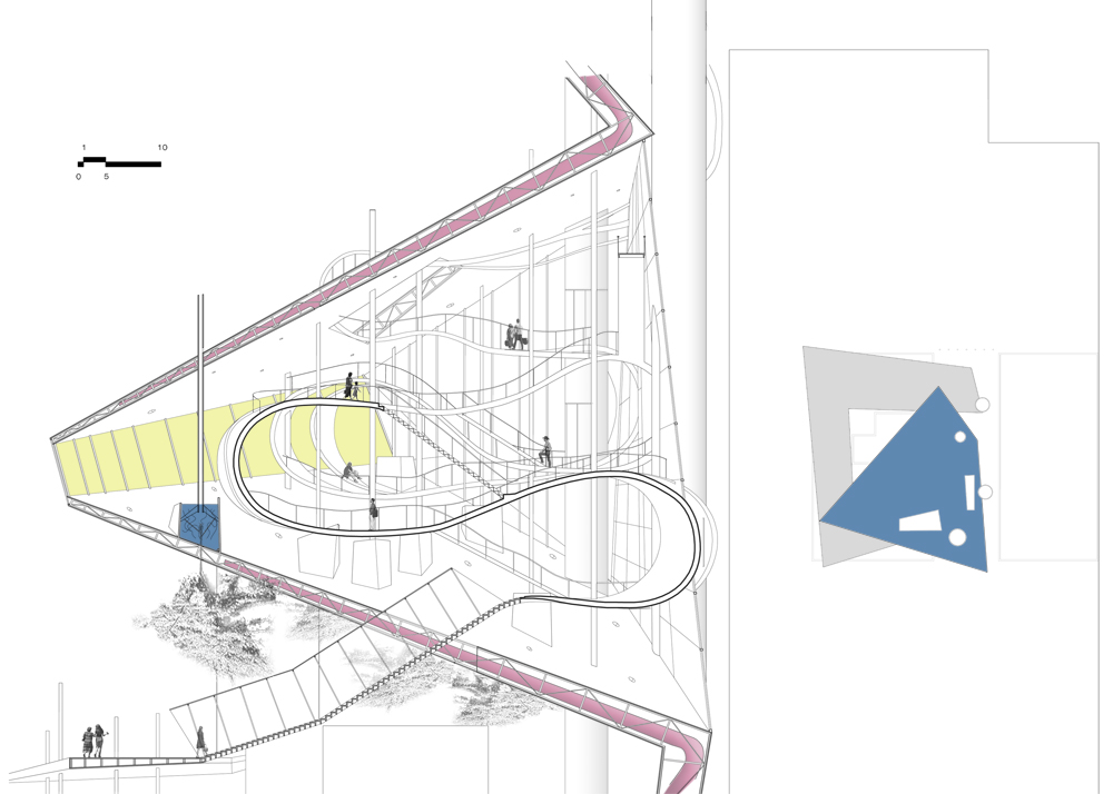
A Mikvah holds profound spiritual significance in Judaism, symbolizing purification through ritual immersion in water. Its name, ‘mikveh’, originates from the Old Testament book of Genesis and translates to when G-d gathered waters during the creation. While early Mikvahs were simple earthen constructions dating back thousands of years, the modern ones resemble serene spa-like facilities, primarily serving observant Jewish women. The Mikvah pool must be constructed of concrete and in accordance with strict Rabbinical laws. It needs to be integrated into the ground or become an integral part of a building structure. Typically consisting of two pools: a lower section for rainwater collection and an upper immersion pool replenished with tap water.
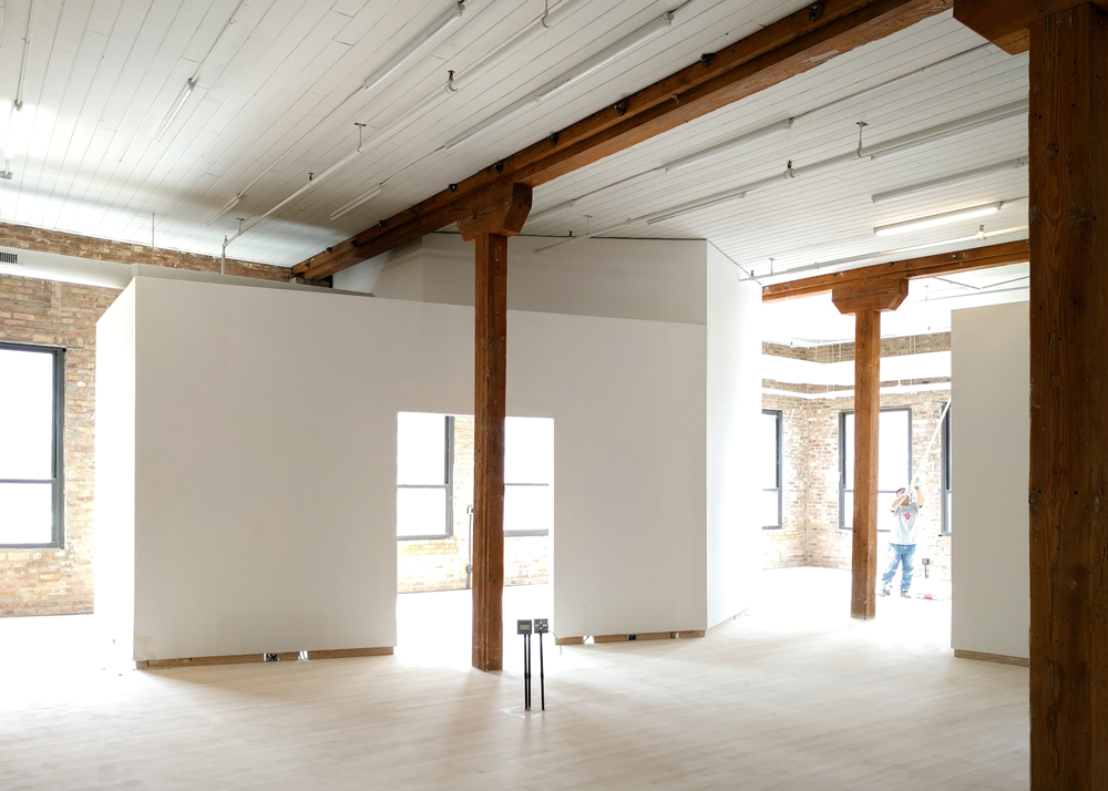
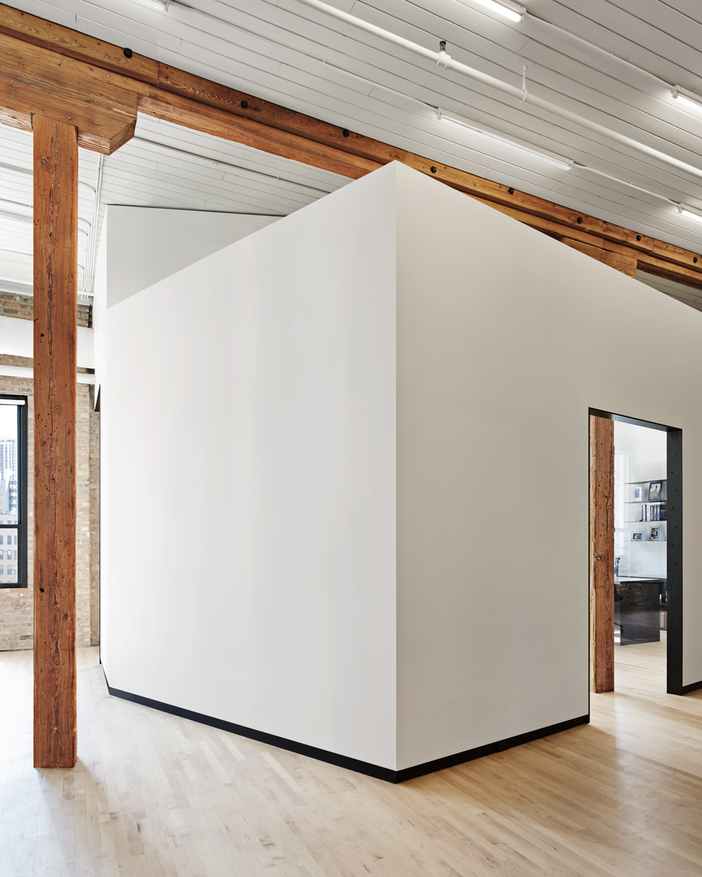
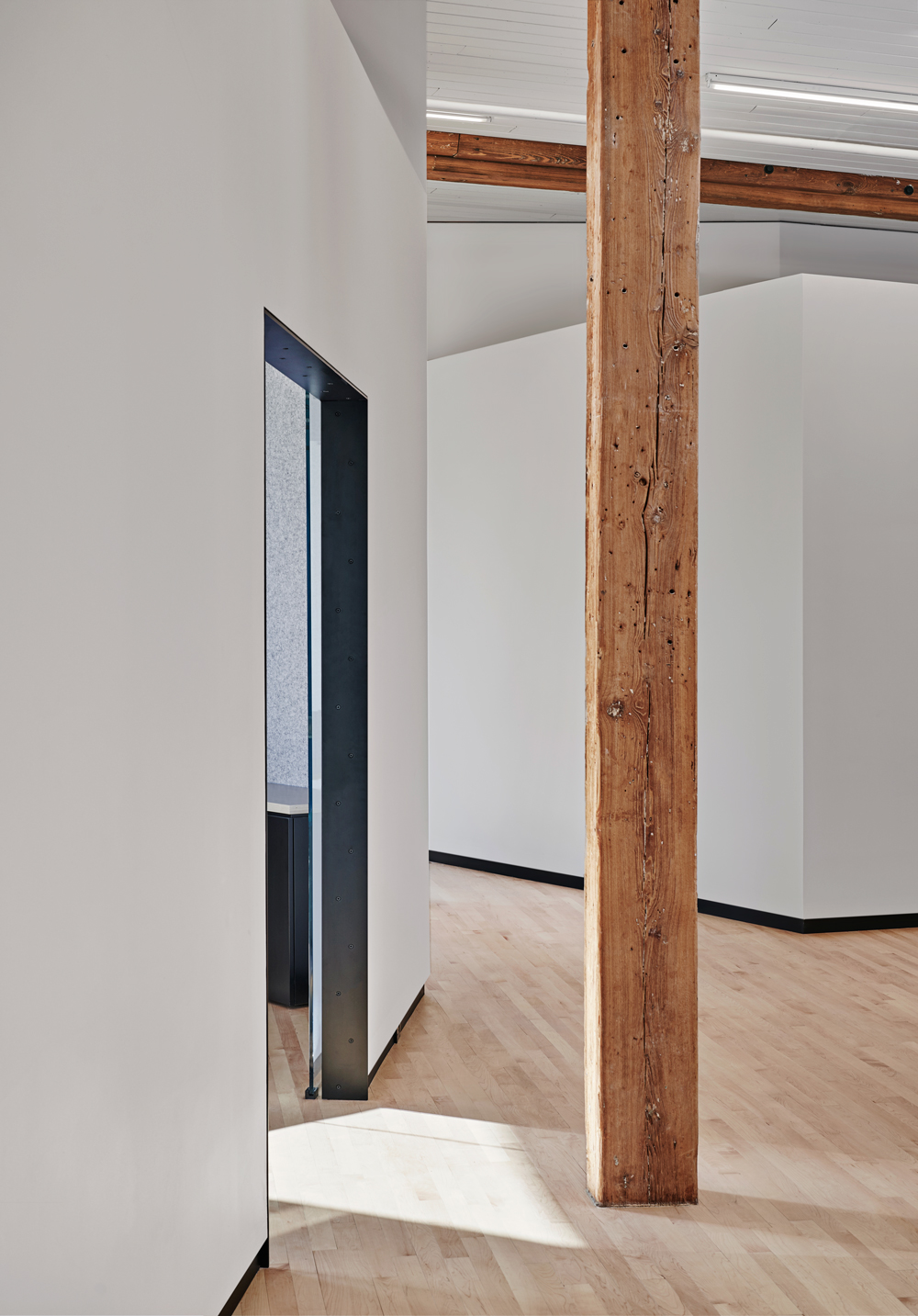
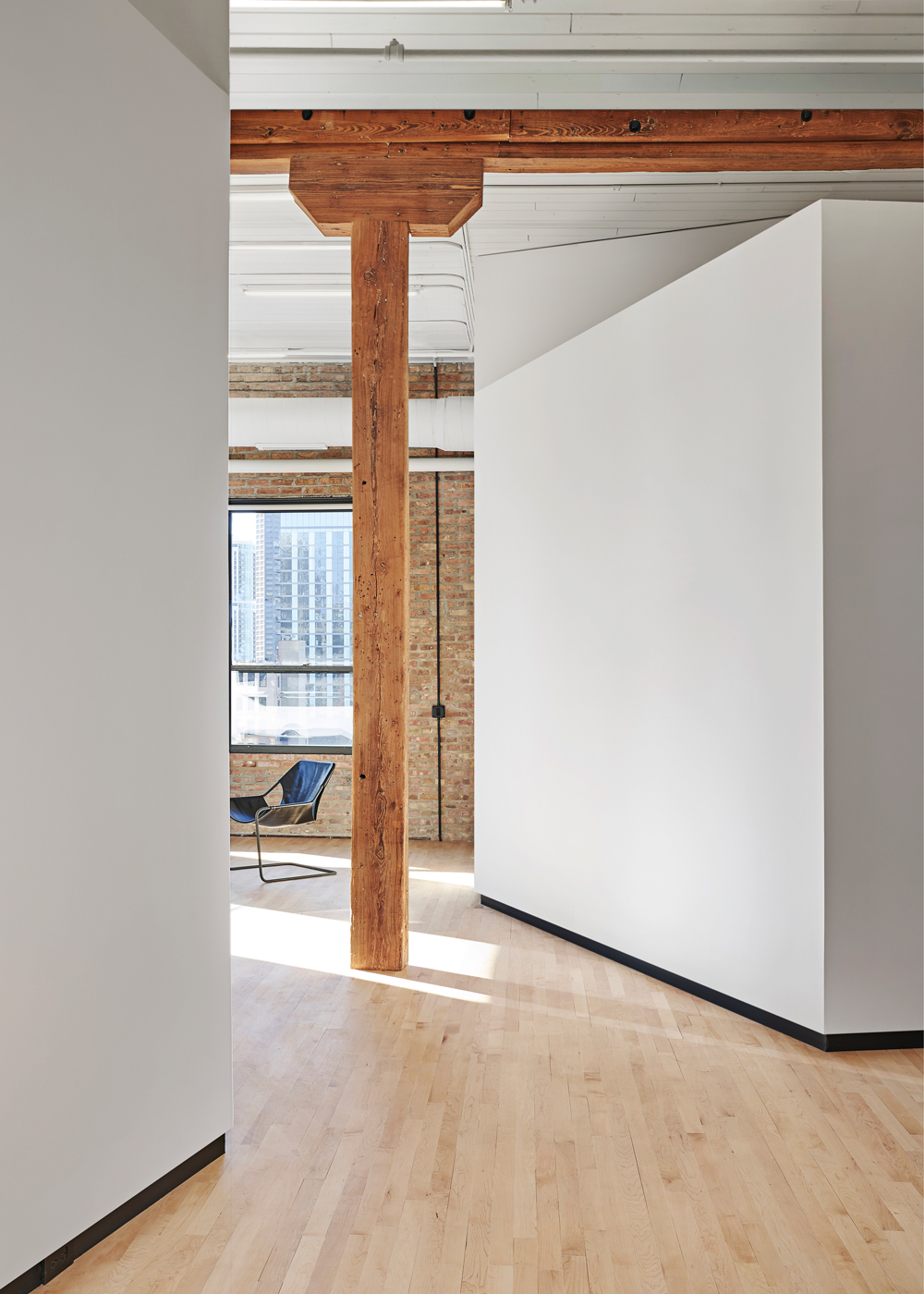
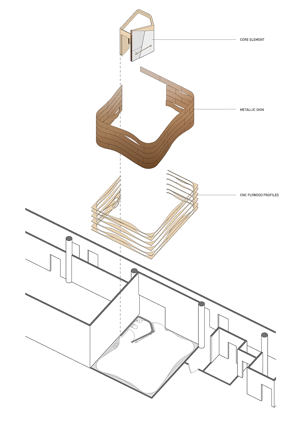
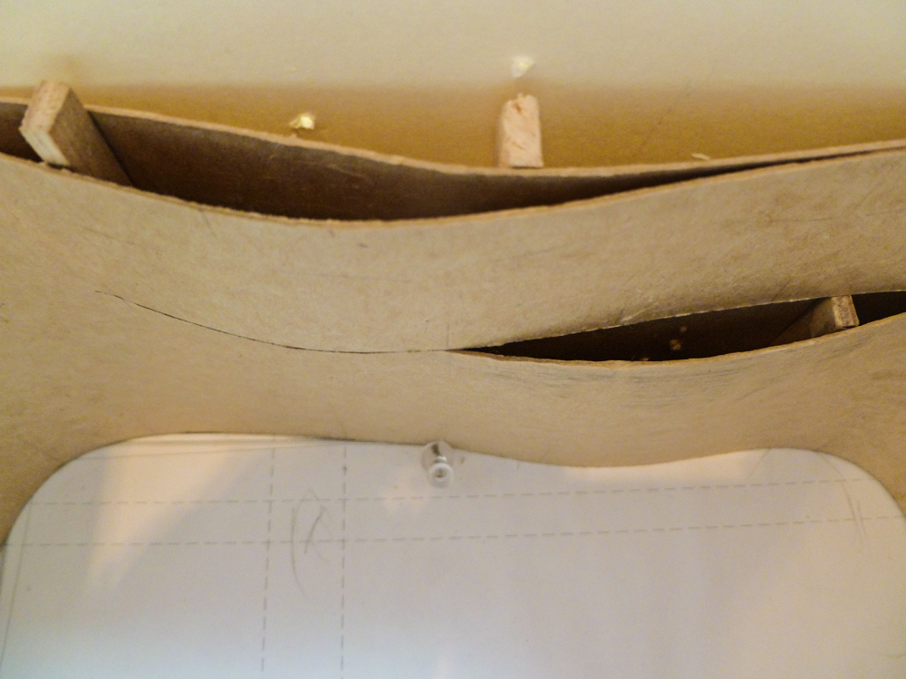
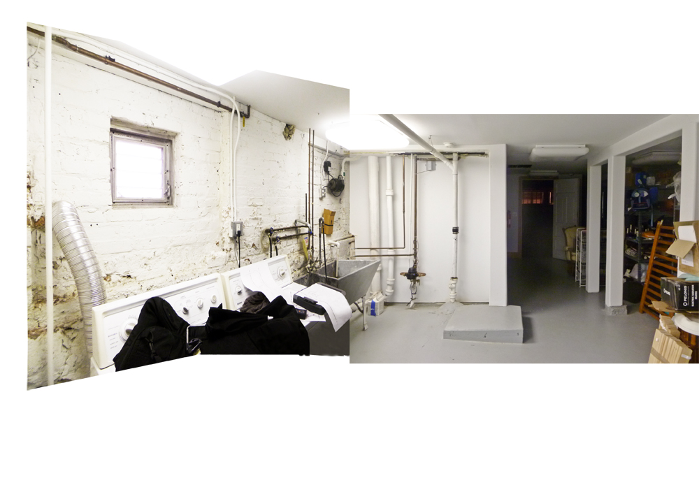
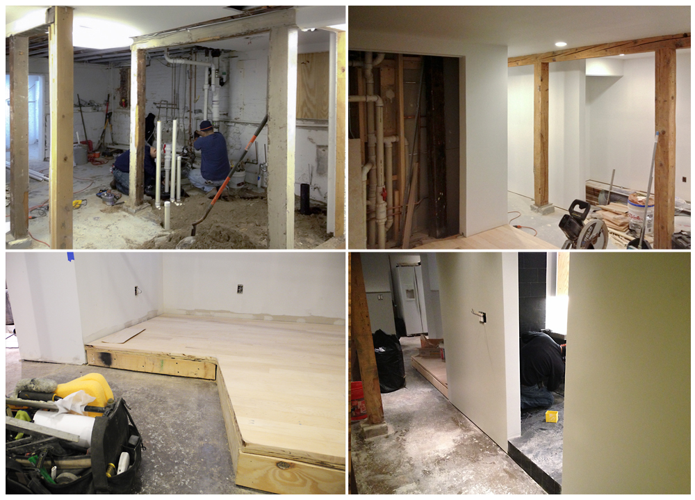
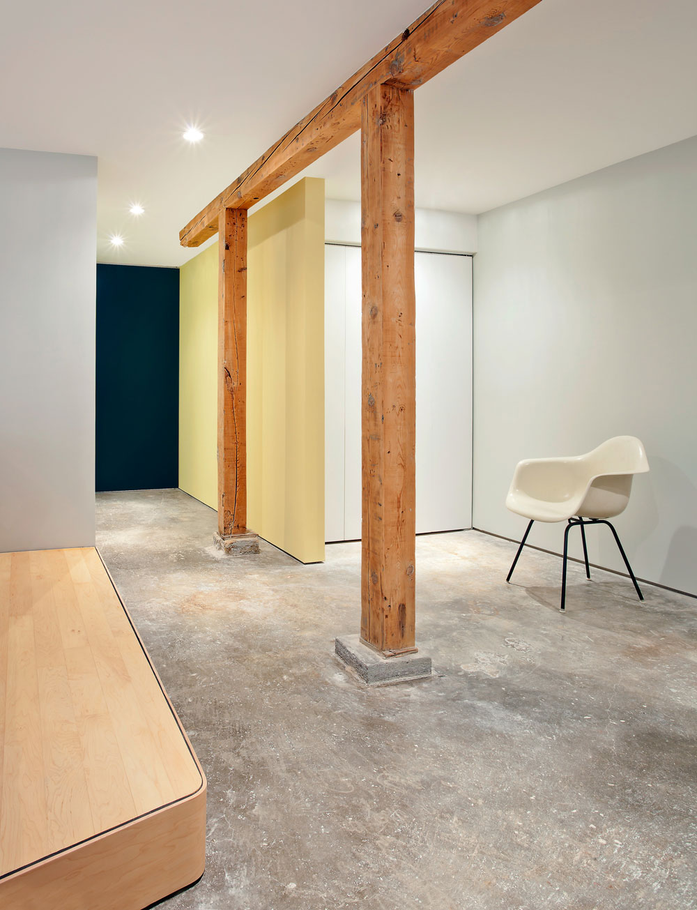
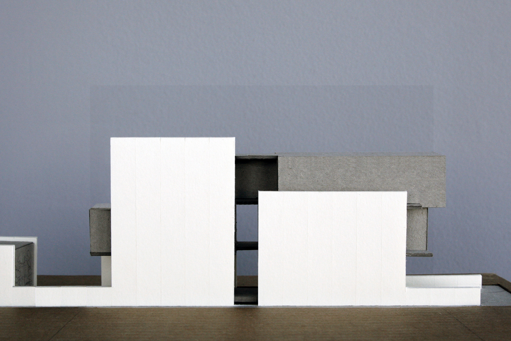
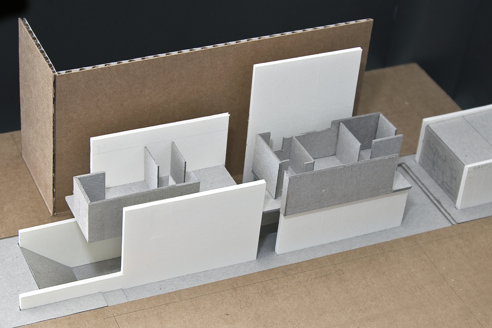
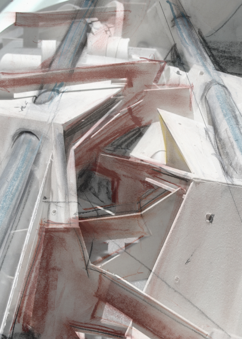
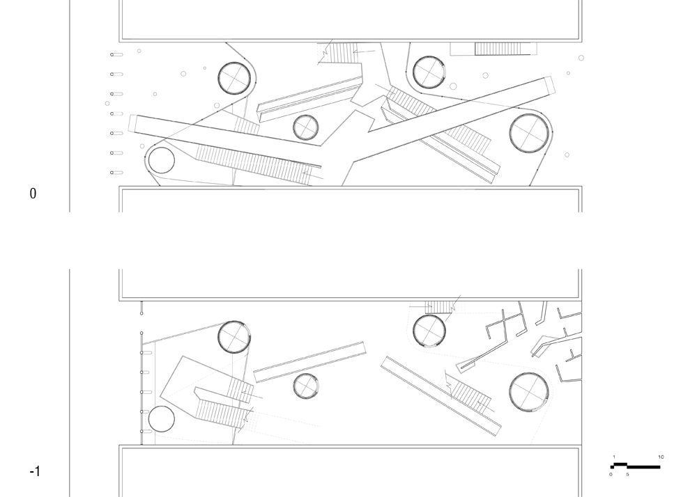
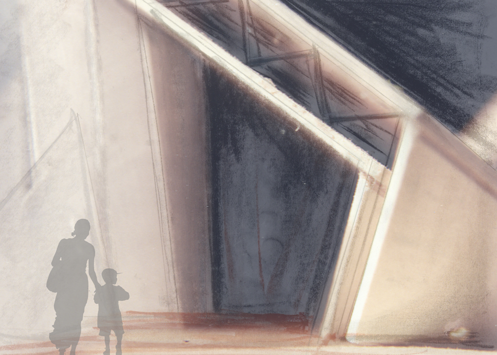
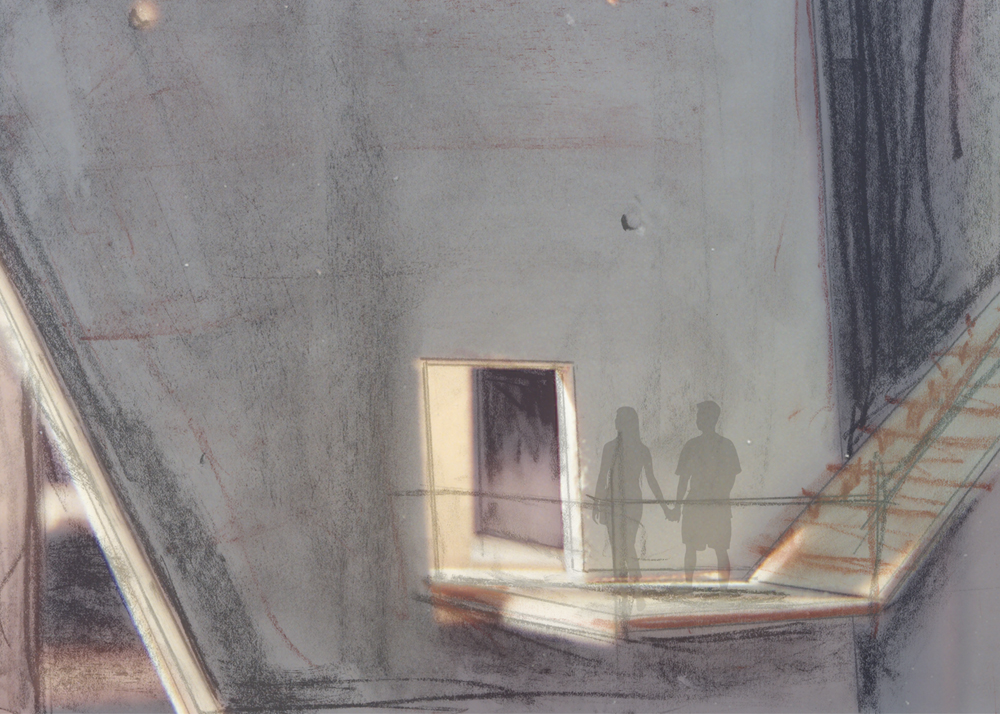
In our Mikvah project, we designed this immersive spiritual space in the lower level of an existing four-story religious facility. Challenged with the existing infrastructure of low ceiling, columns, beams, and footings, we transformed these obstacles into design opportunities for unexpected spatial results. Our approach involved choreographing ceiling changes, meandering walls, and built-ins, incorporating the existing architectural conditions into a holistically unified space.
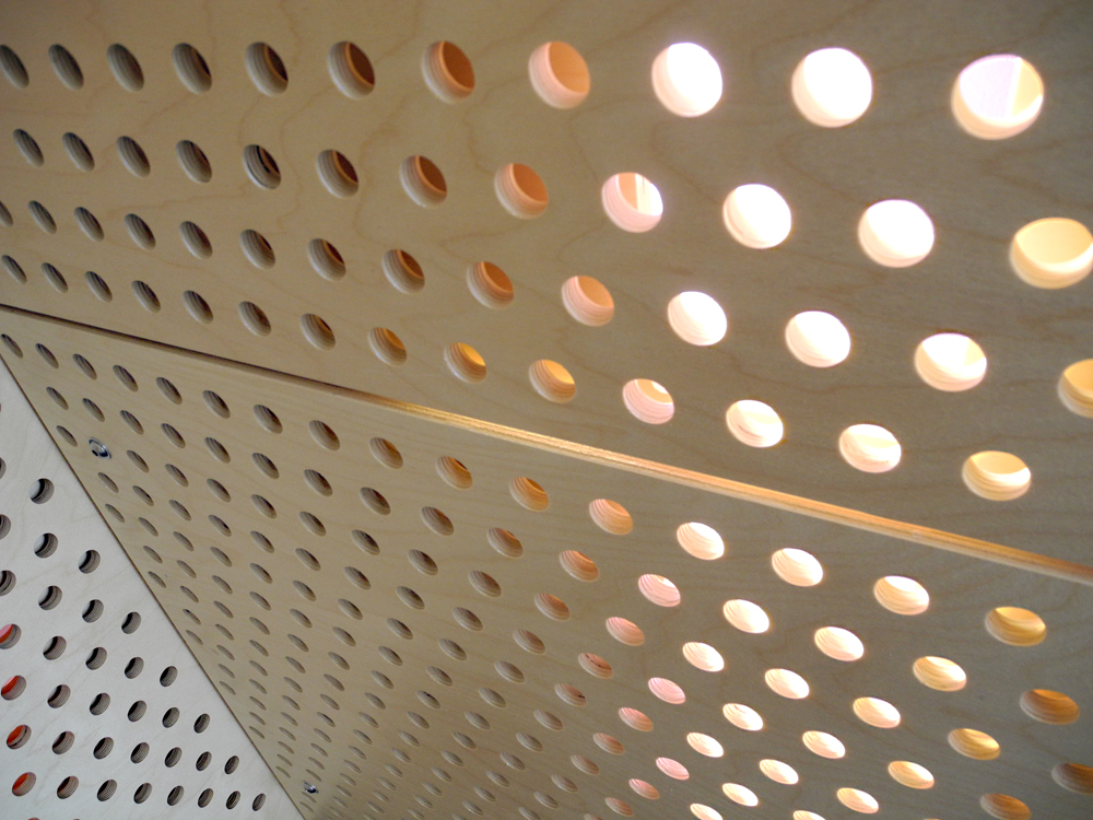
Our aim was to transcend the physical realm and provide a backdrop for a spiritual experience. Guiding the user through each step of the ritual sequence from reception, preparation, immersion, and washing. We drew inspiration from imagery of originally built Mikvahs, utilizing a harmonious earthen tone material palette to evoke a mystical ambiance enriched by the interplay of light, shadow, and reflectivity.
Recognizing the intimate significance of Mikvah use in Jewish tradition, particularly for women, we created a space filled with intimacy and a sense of sacred.
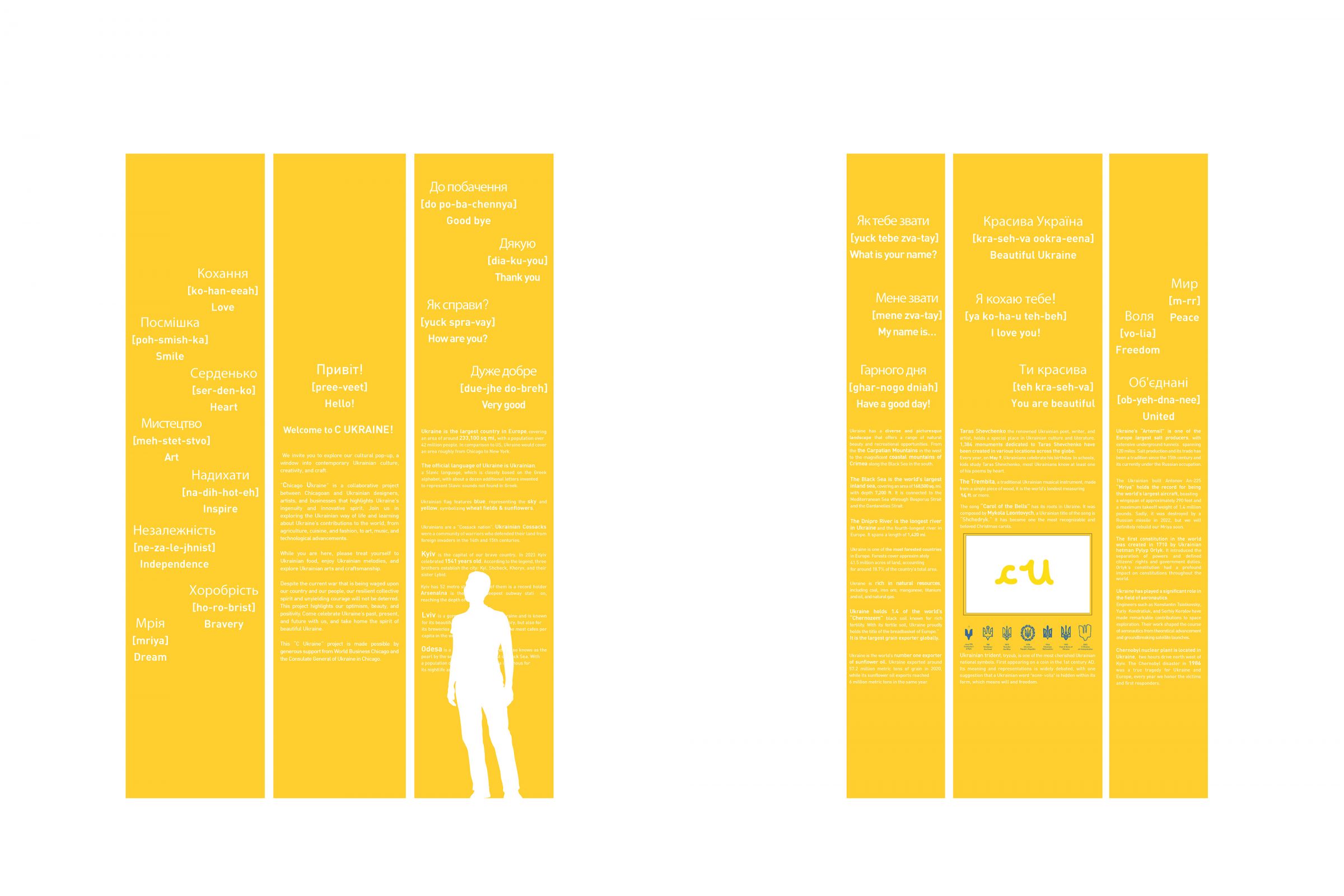
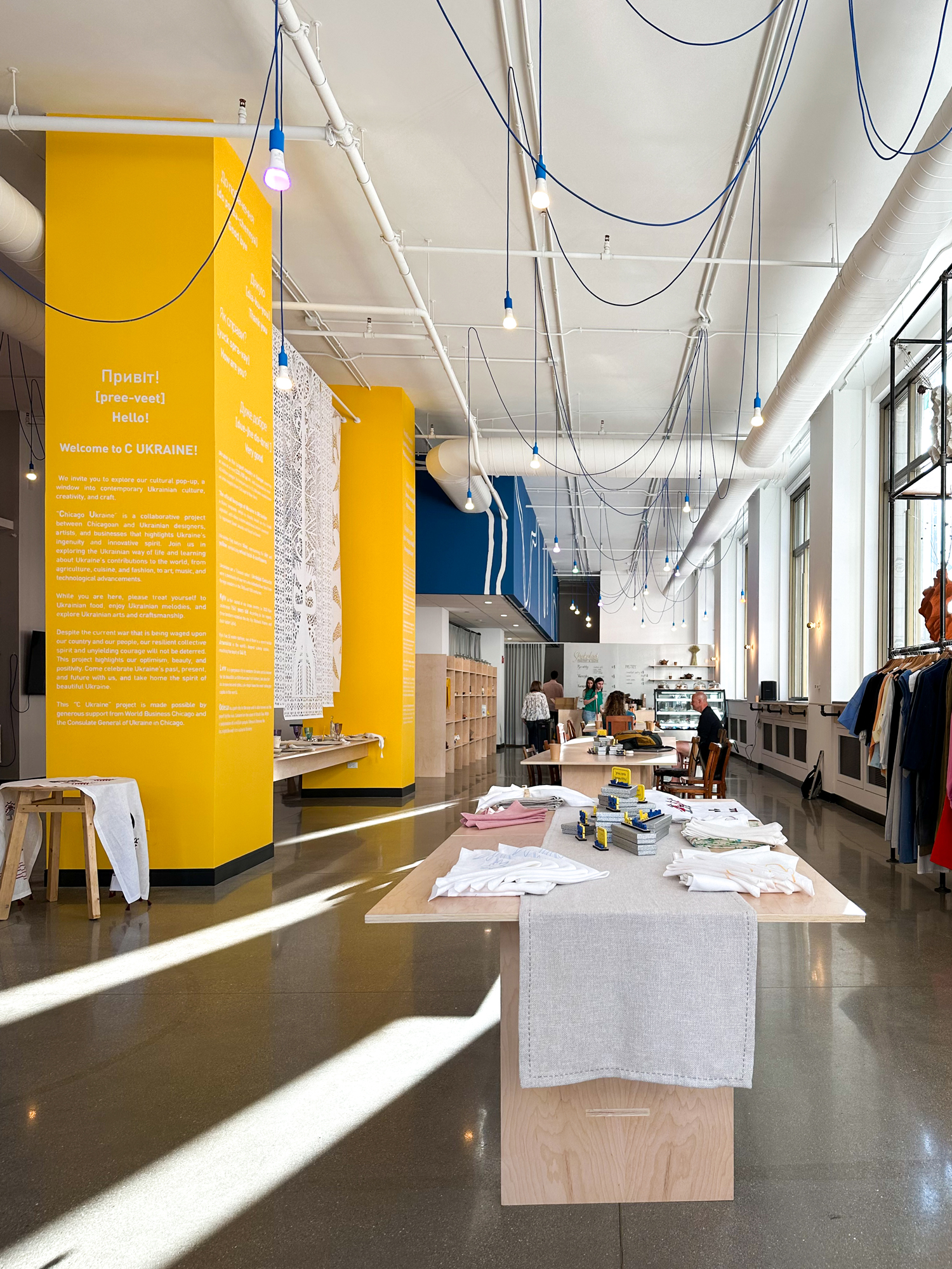
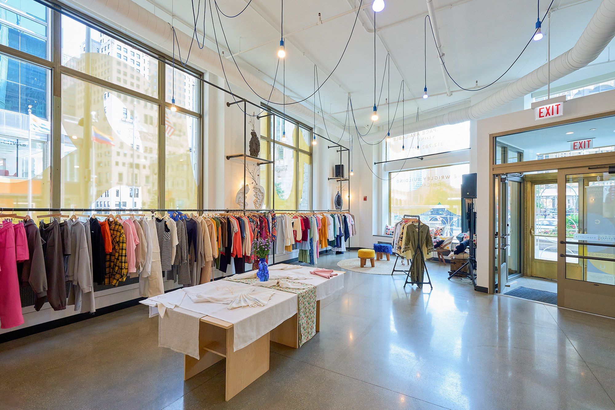
Привіт! Hello!
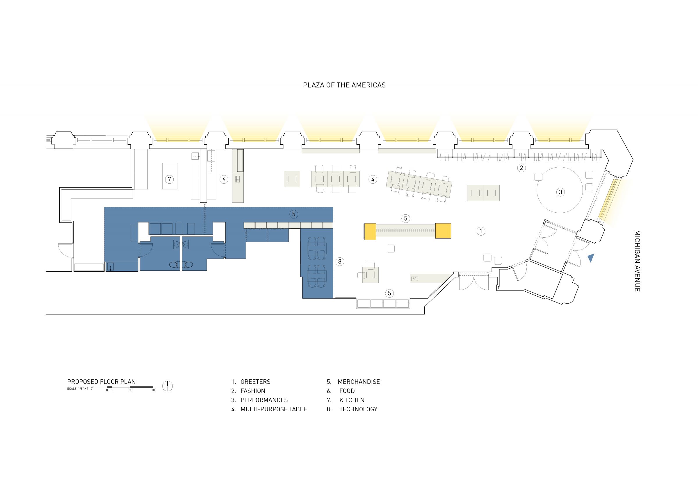
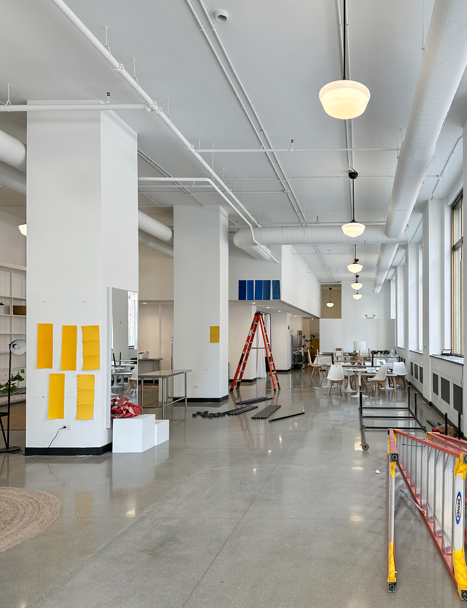
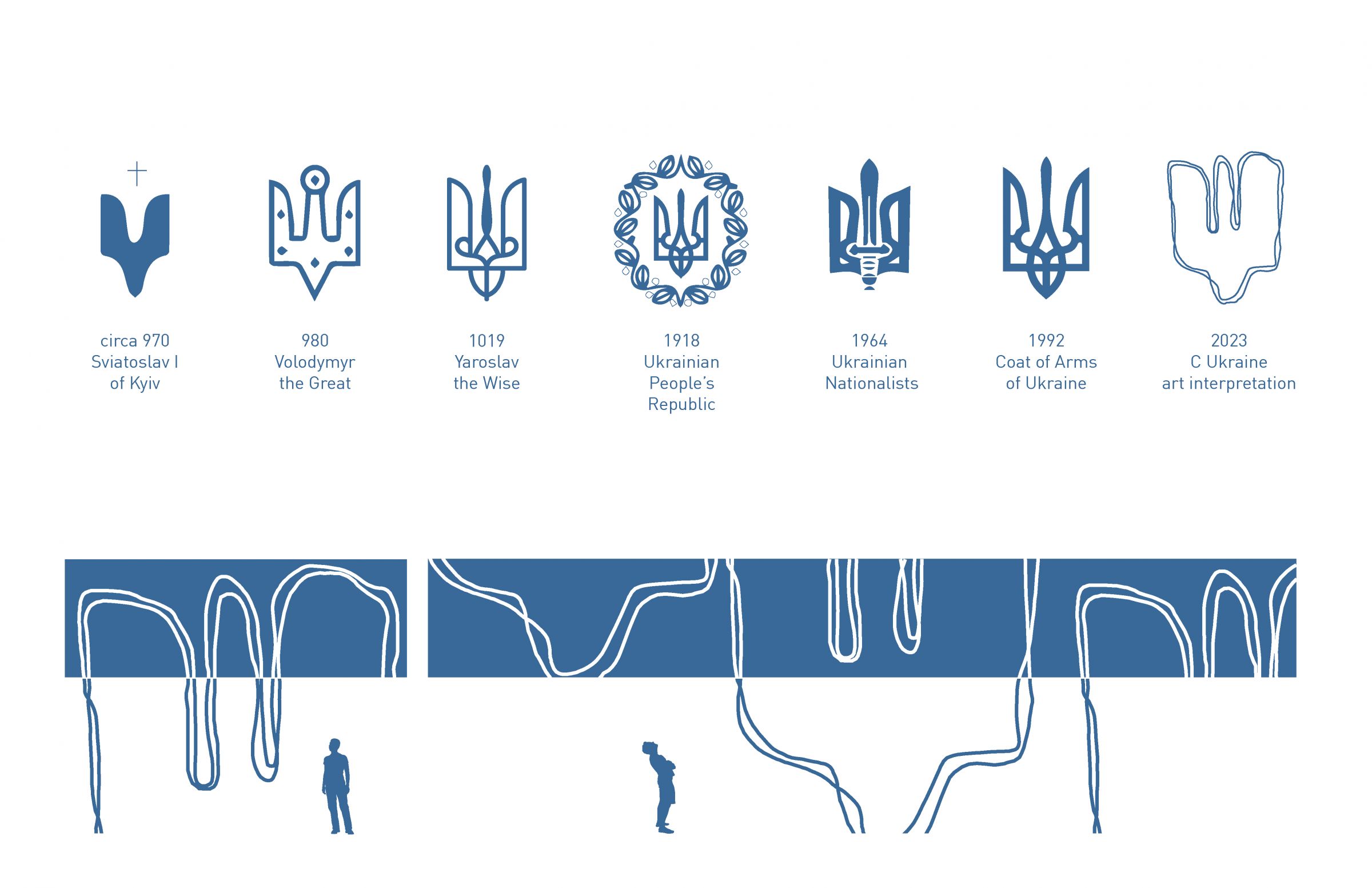
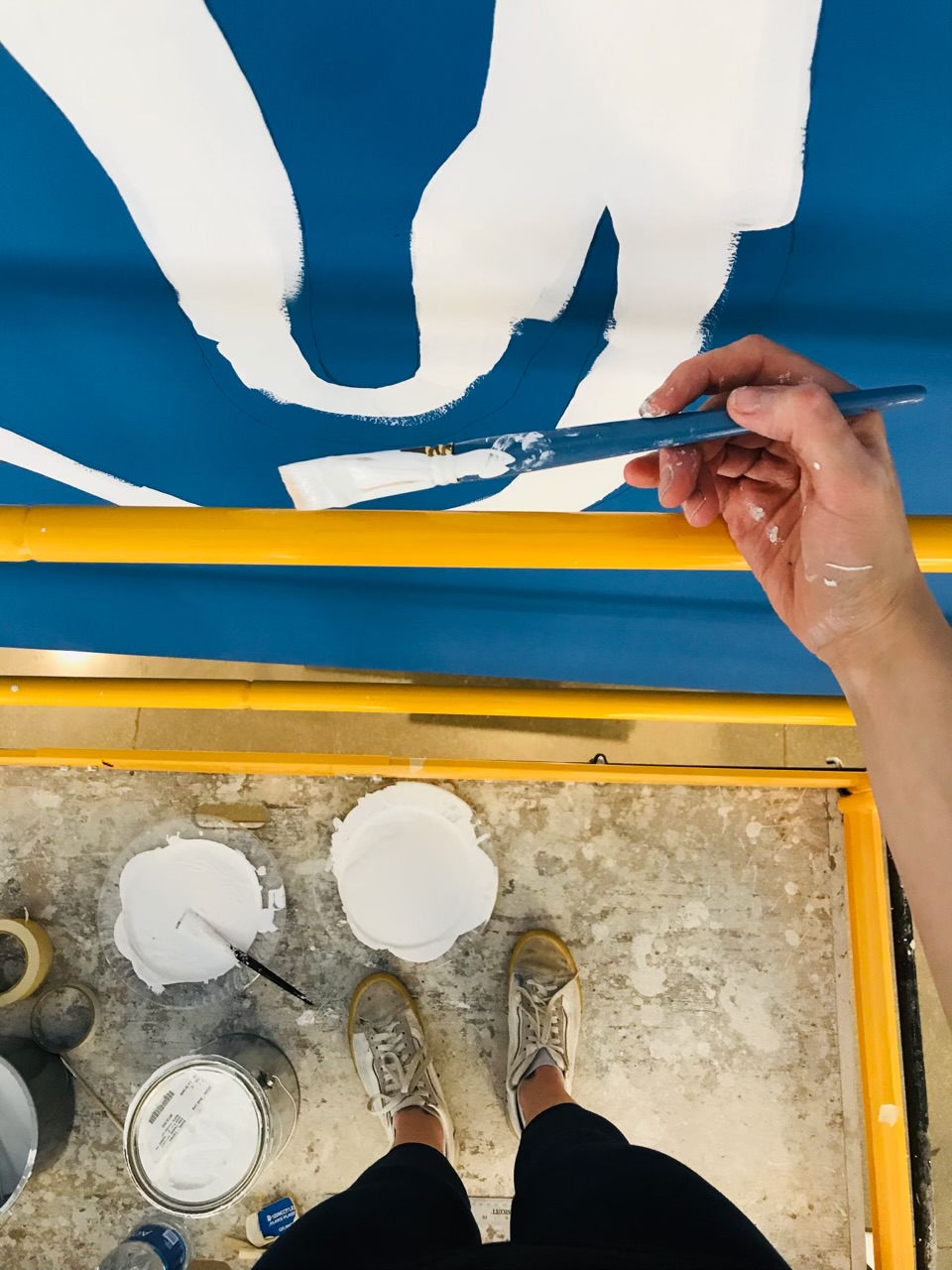
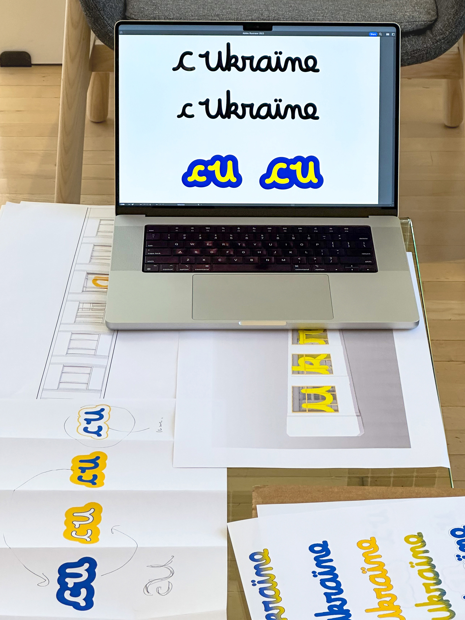
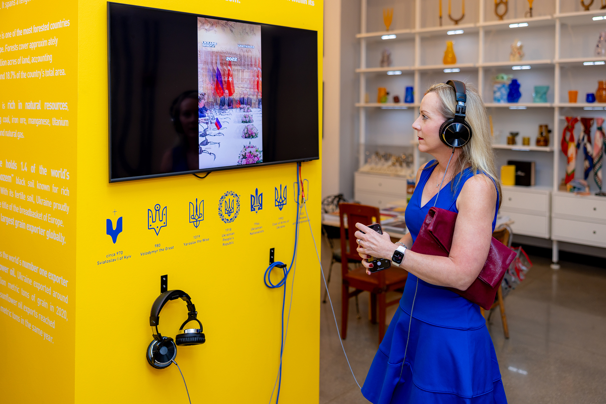
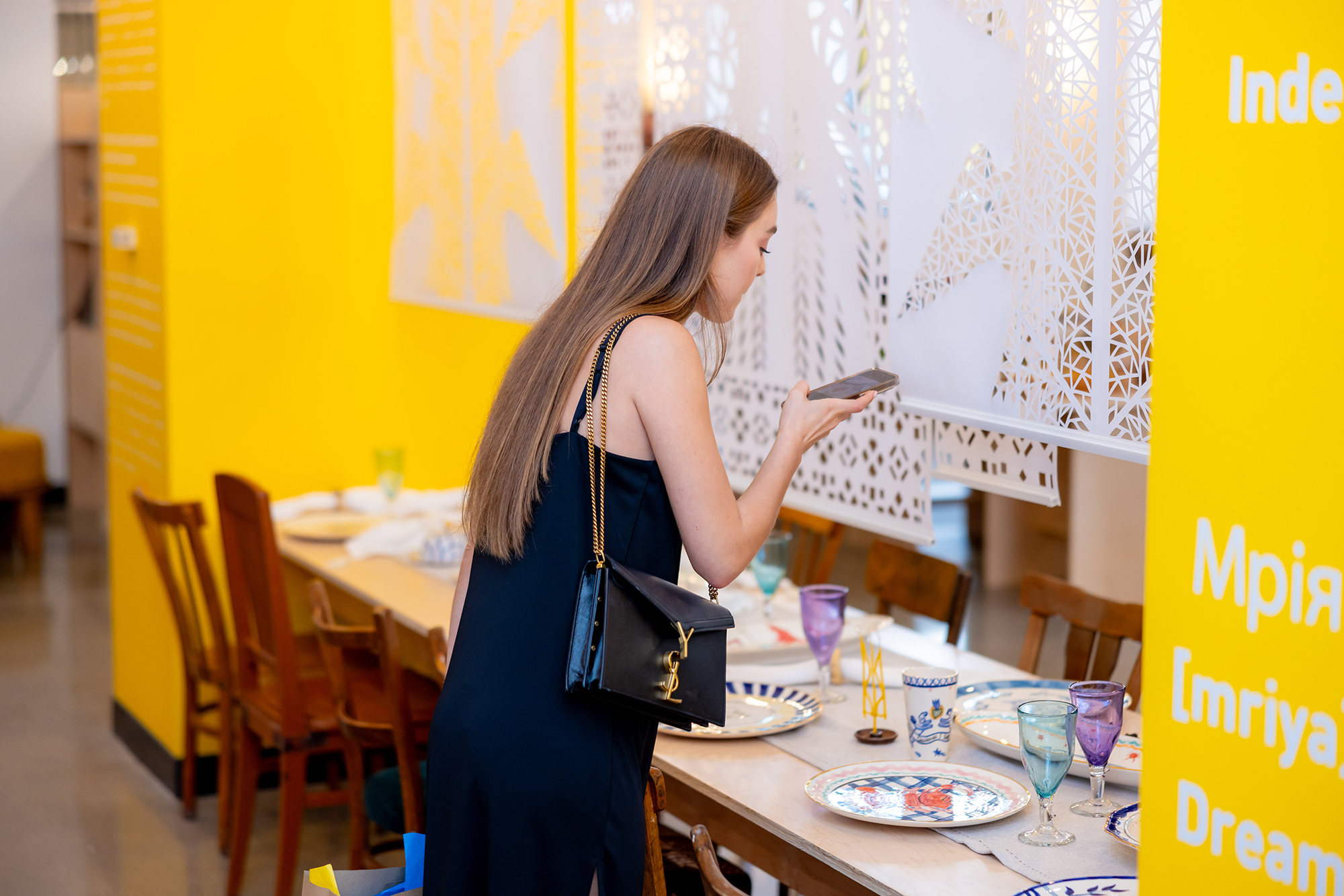
C Ukraine, is a window into contemporary Ukrainian culture, creativity, and craft.
“Chicago Ukraine” is a collaborative project between Chicagoan and Ukrainian designers, artists, and businesses that highlights Ukraine’s ingenuity and innovative spirit. It presents the Ukrainian way of life and contributions to the world, from agriculture, cuisine, and fashion, to art, music, and technological advancements.
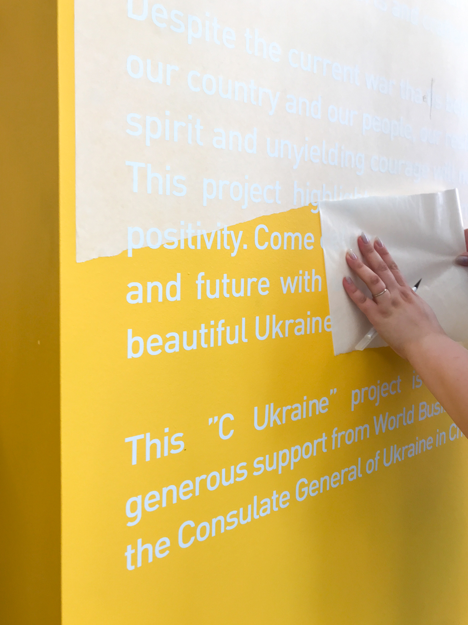
Despite the war that is waged upon Ukraine and its people, the resilient collective spirit and unyielding courage is not deterred. This project highlights the optimism, beauty, and positivity, celebrating Ukraine’s past, present, and future.
This “C Ukraine” project was made possible by generous support from World Business Chicago and the Consulate General of Ukraine in Chicago.
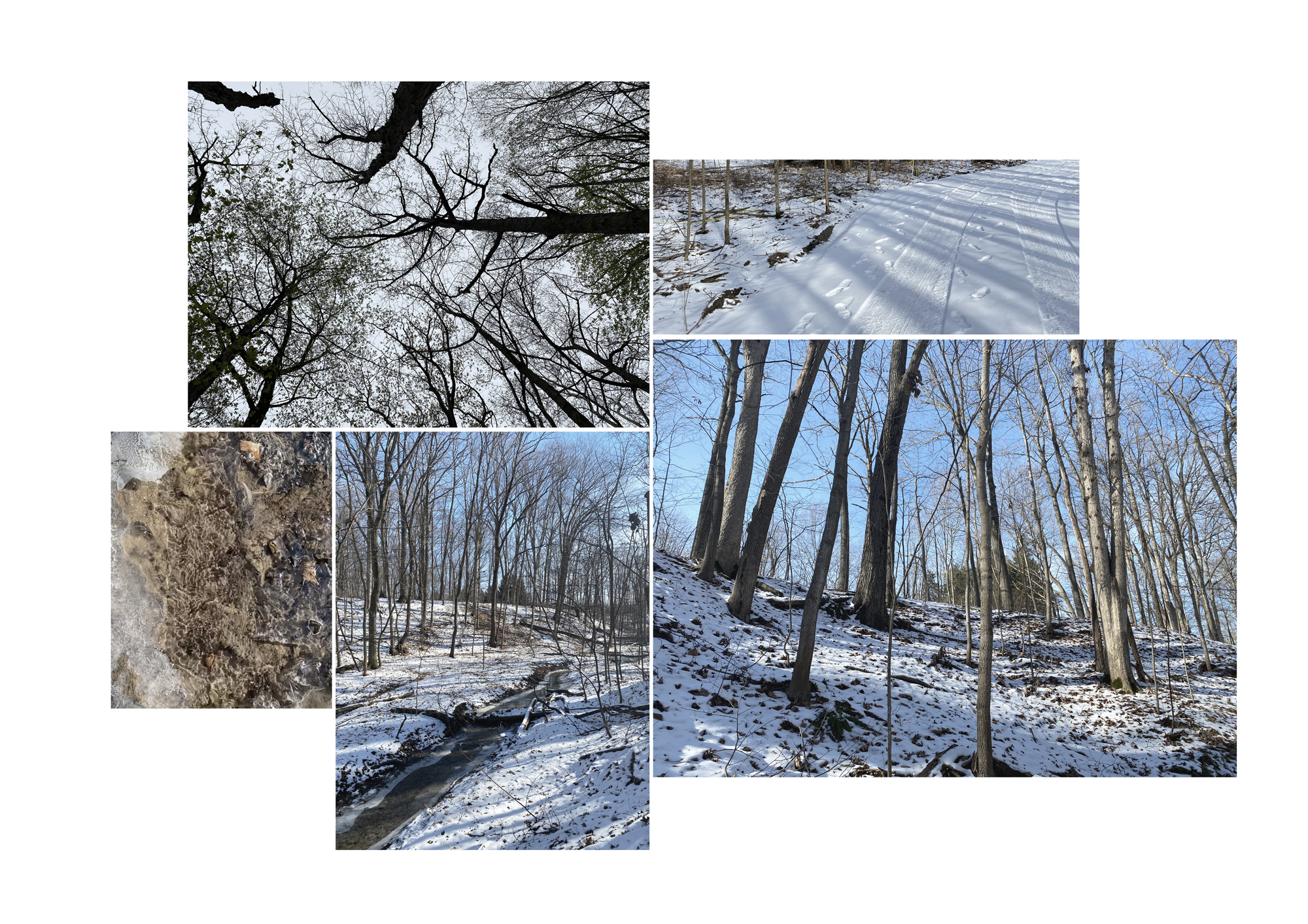
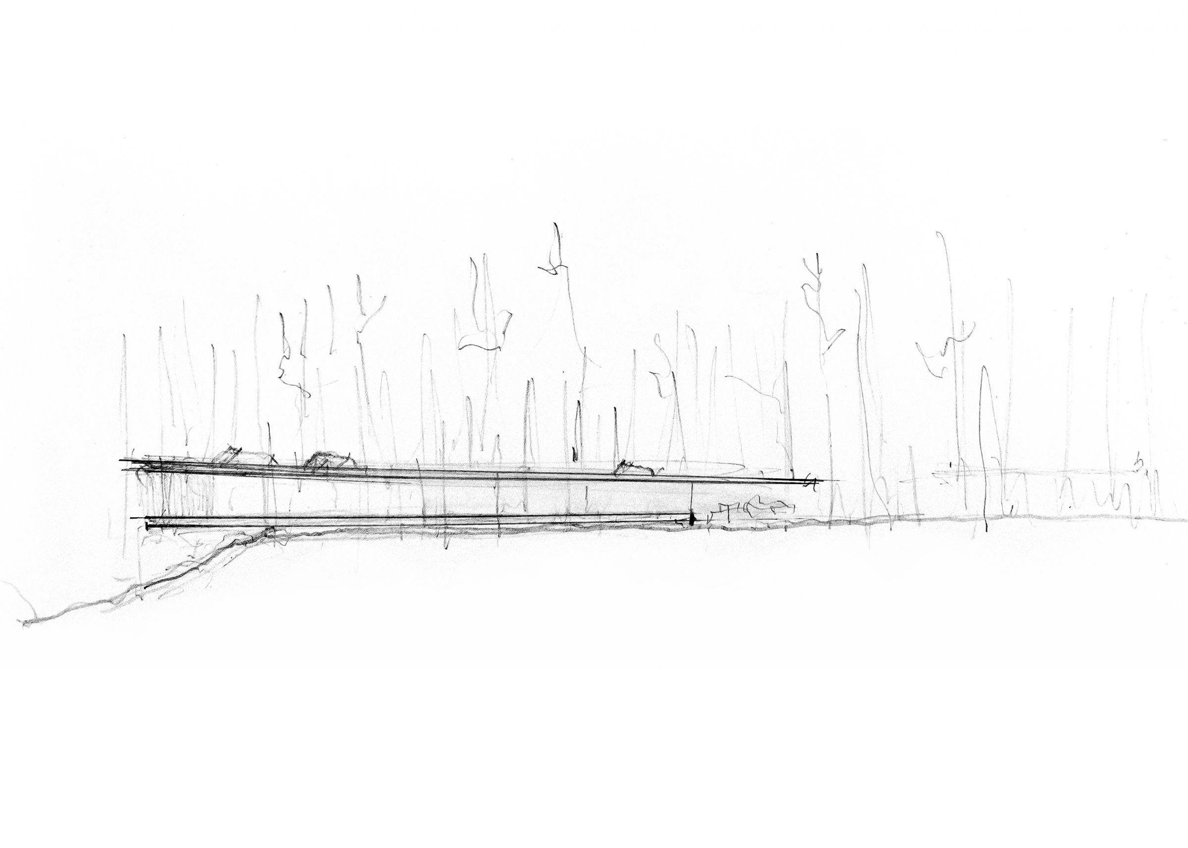
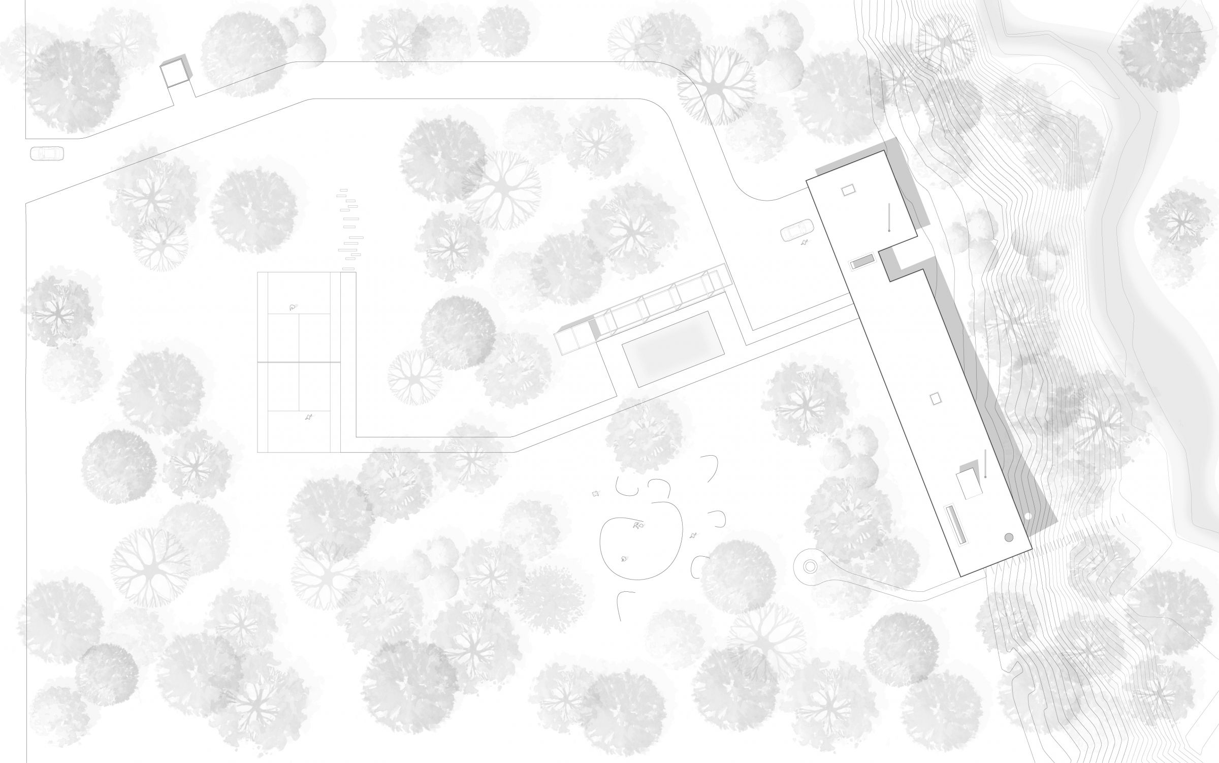
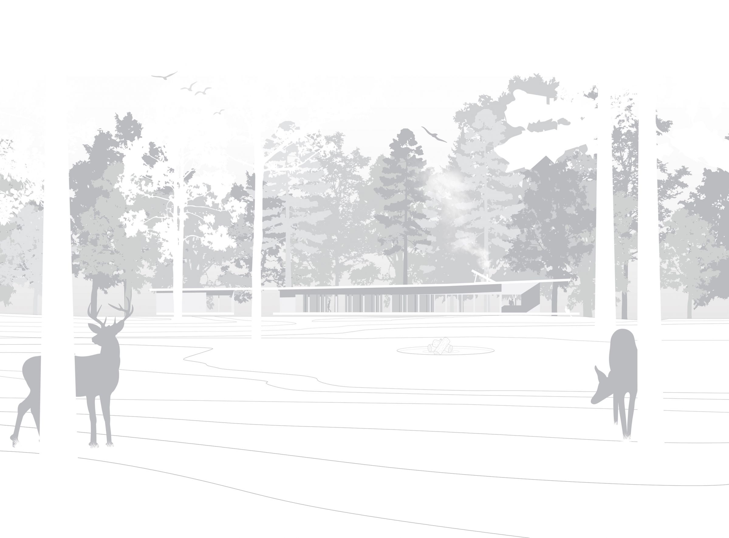
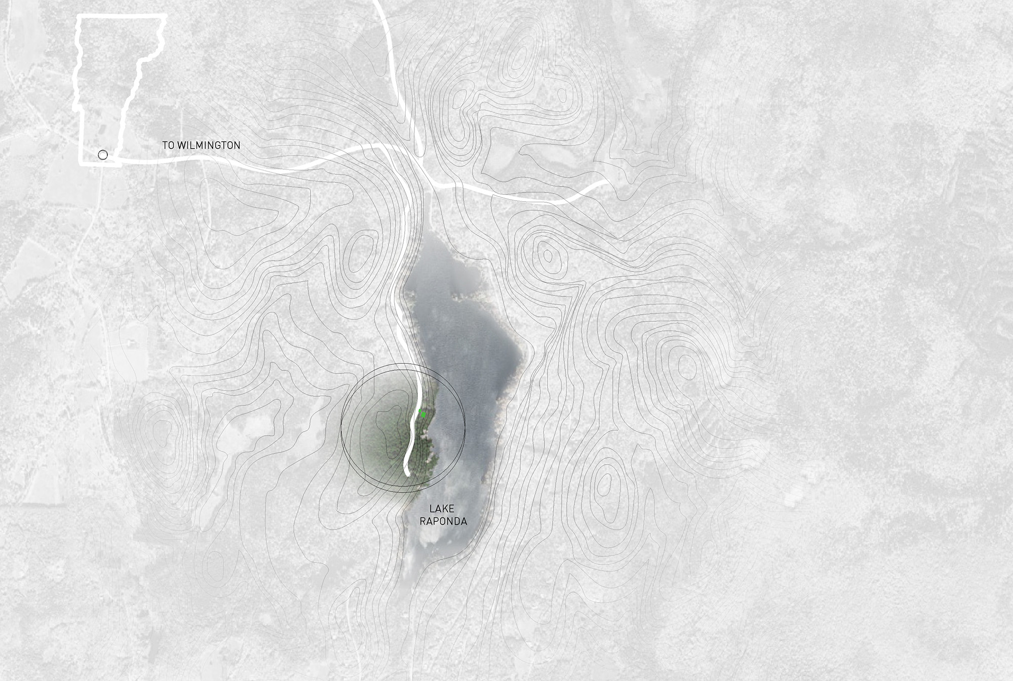
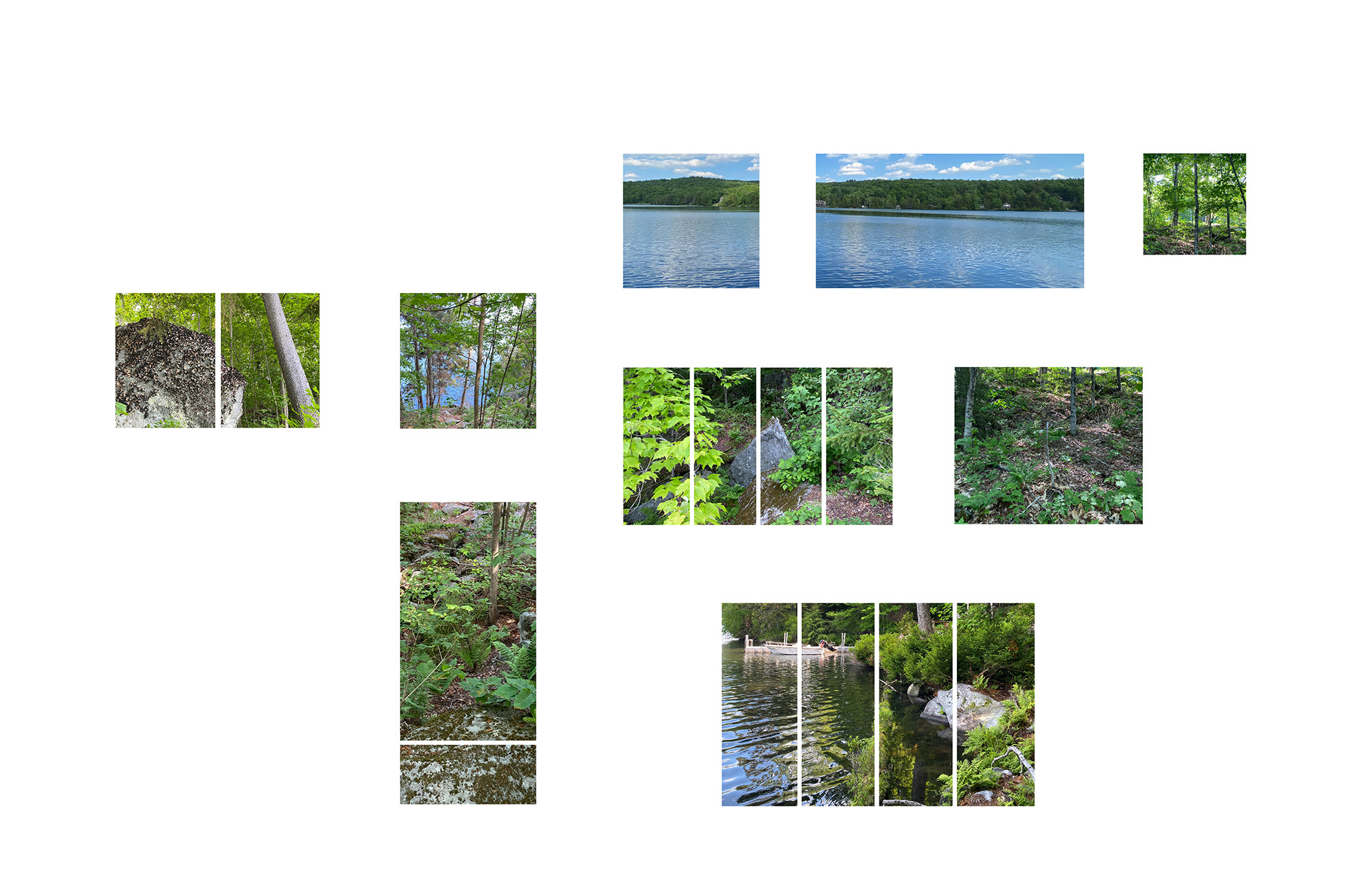
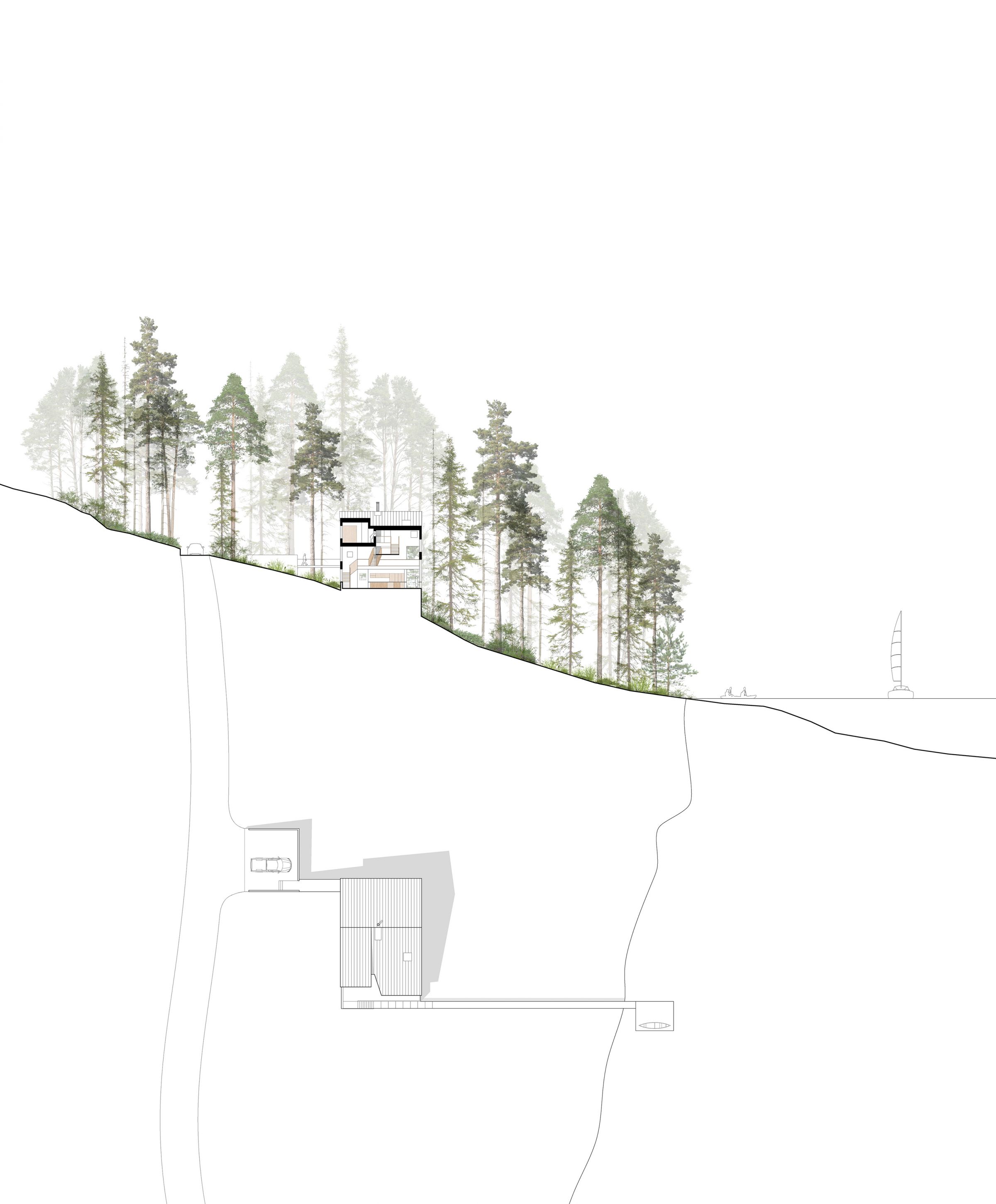
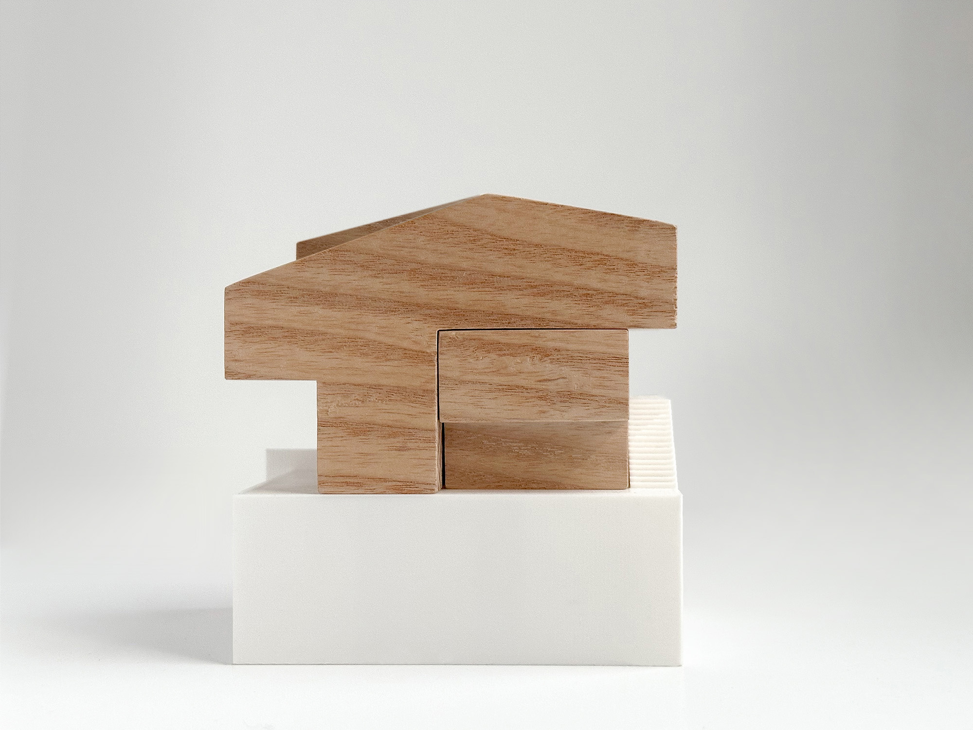
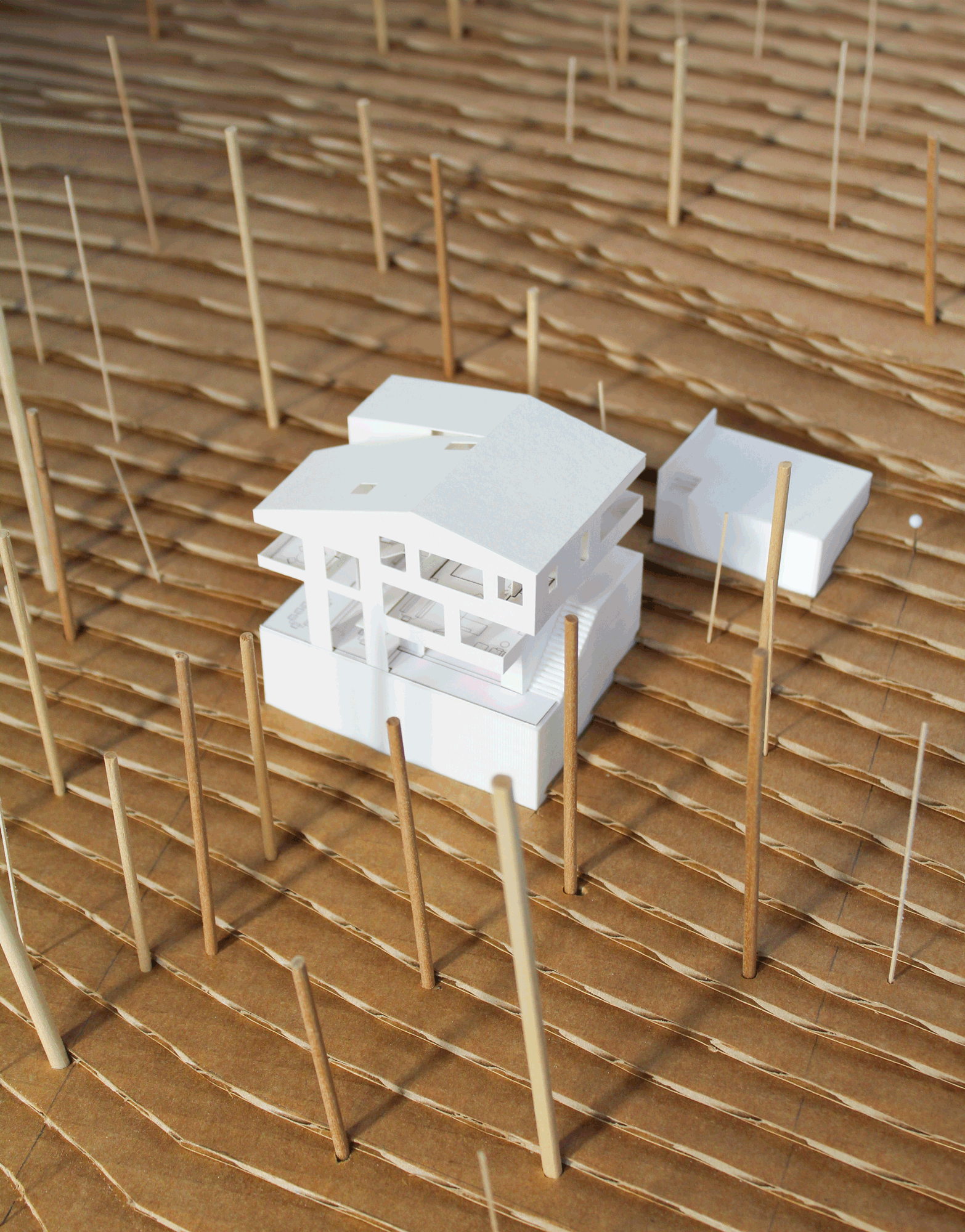
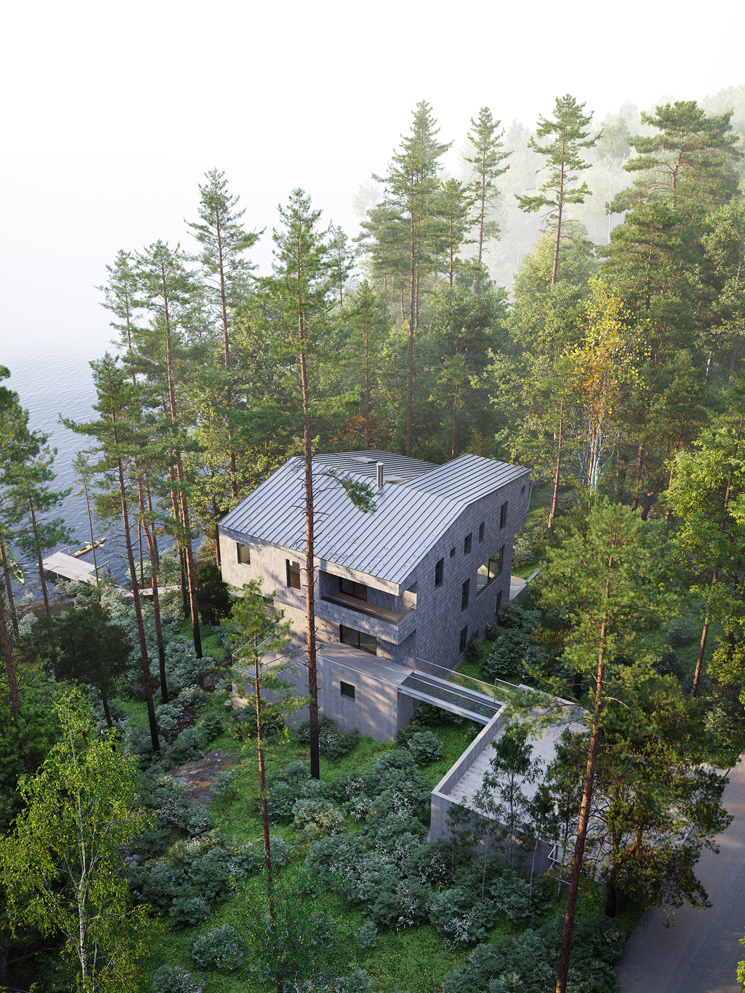
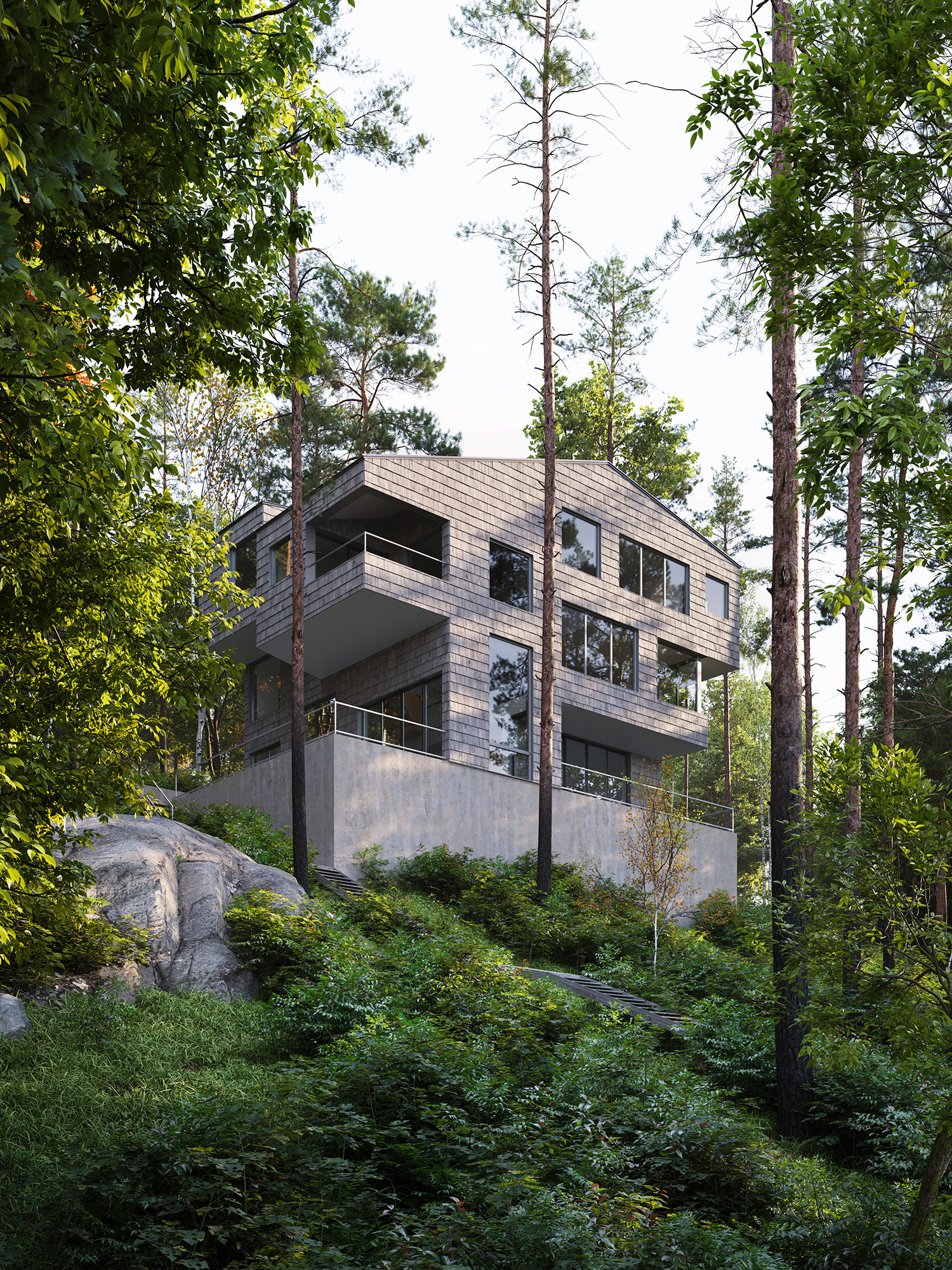
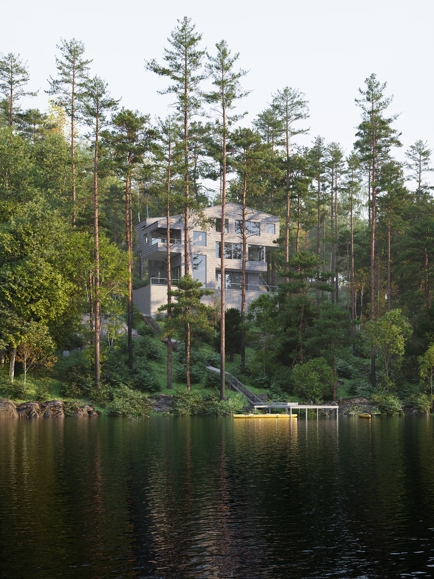
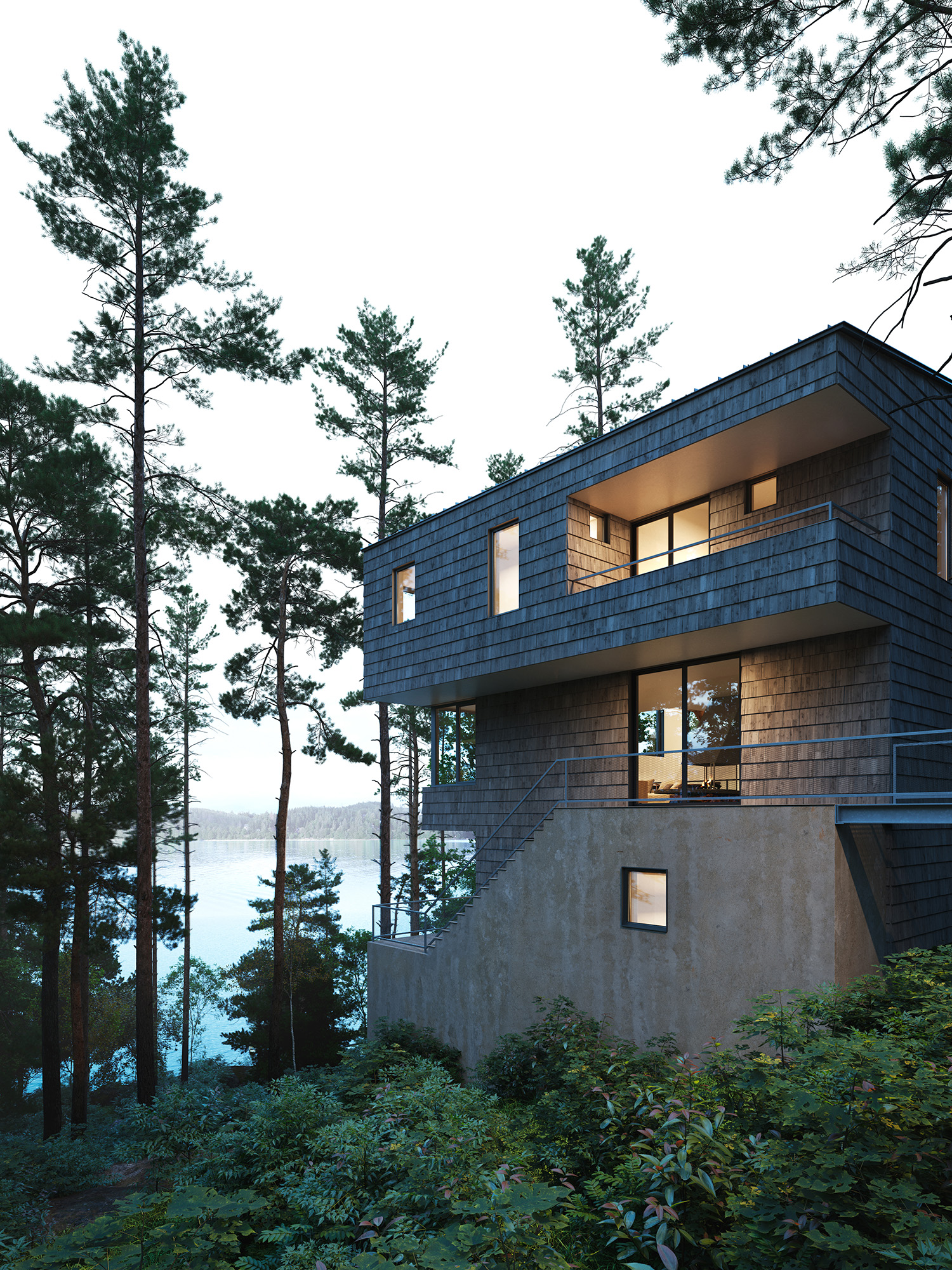
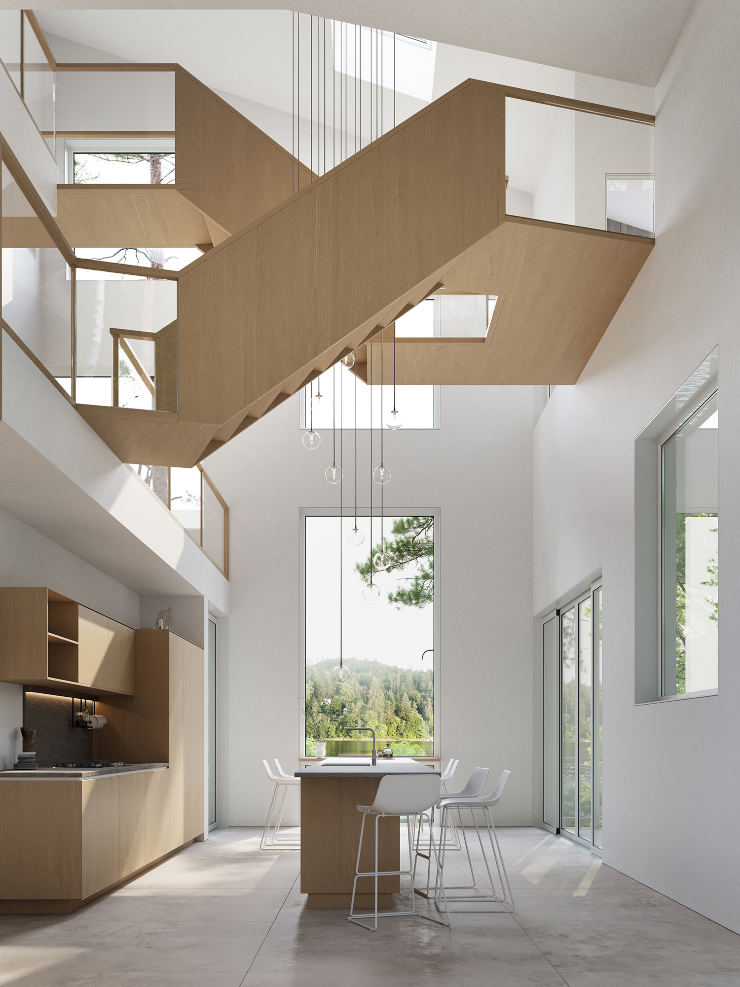
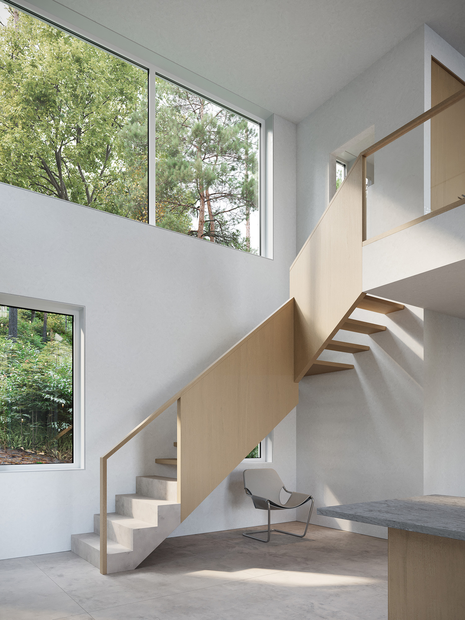
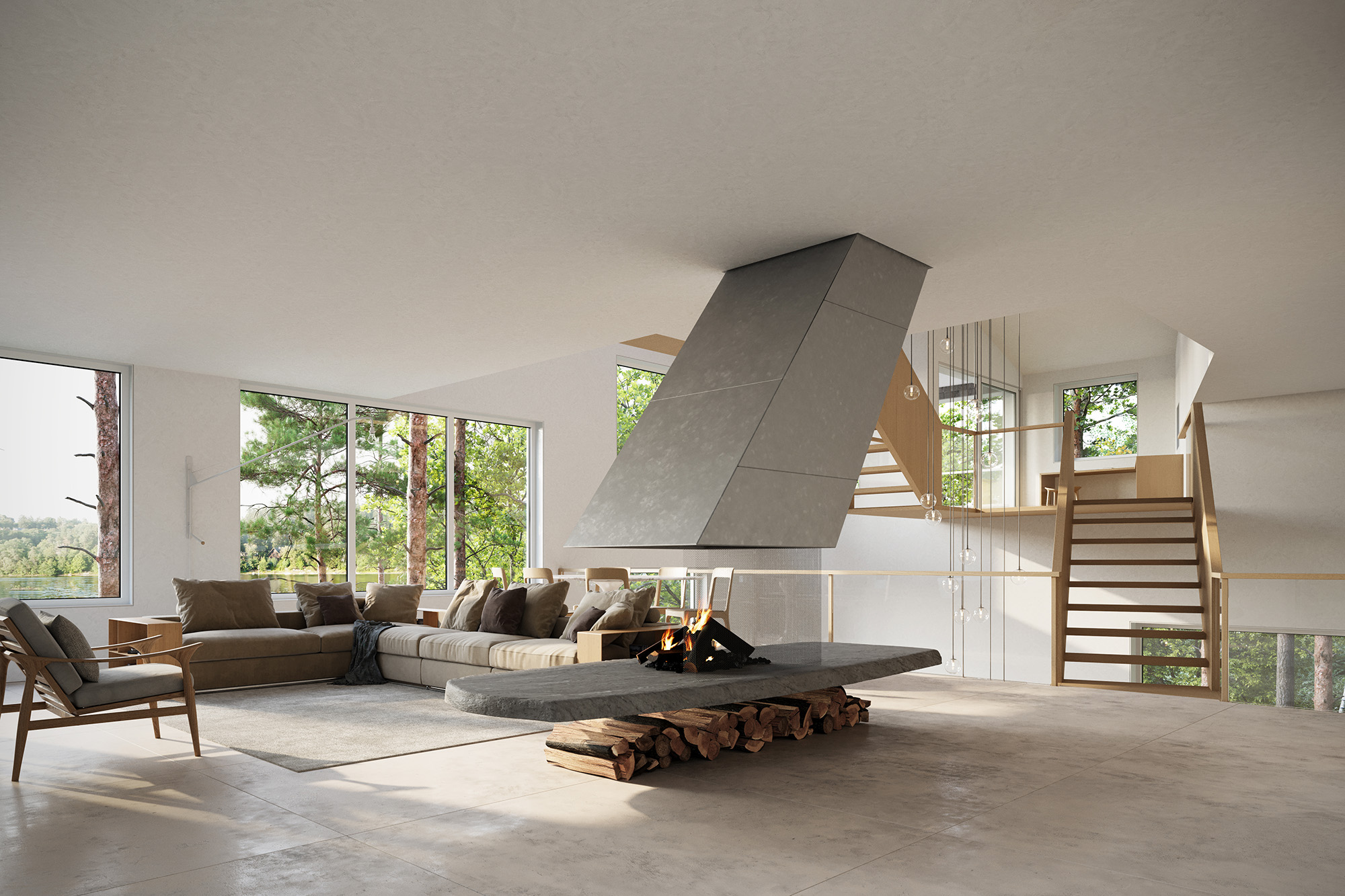
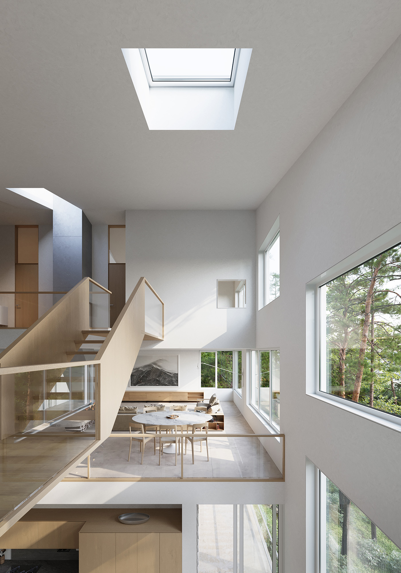
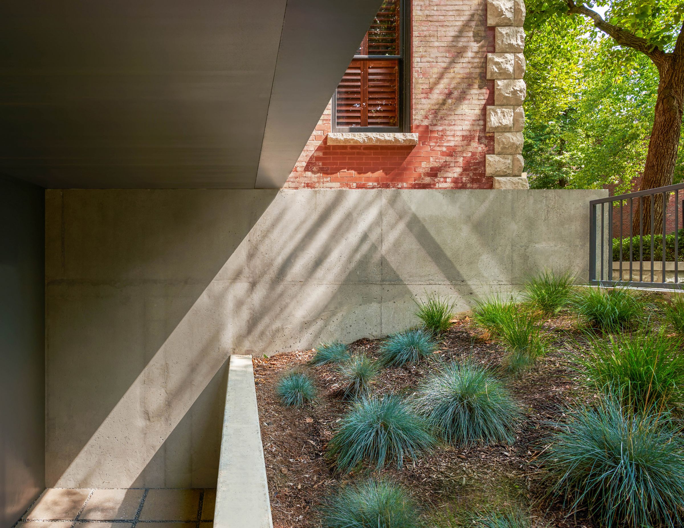
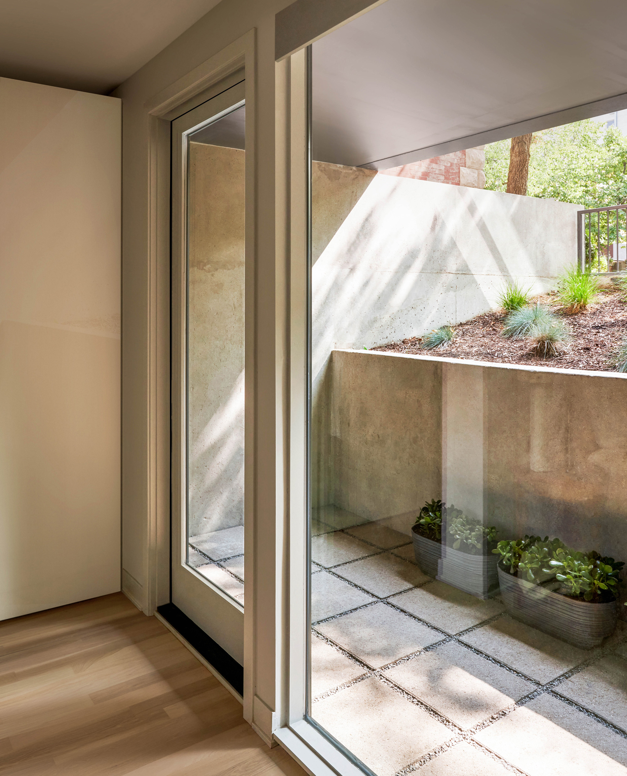
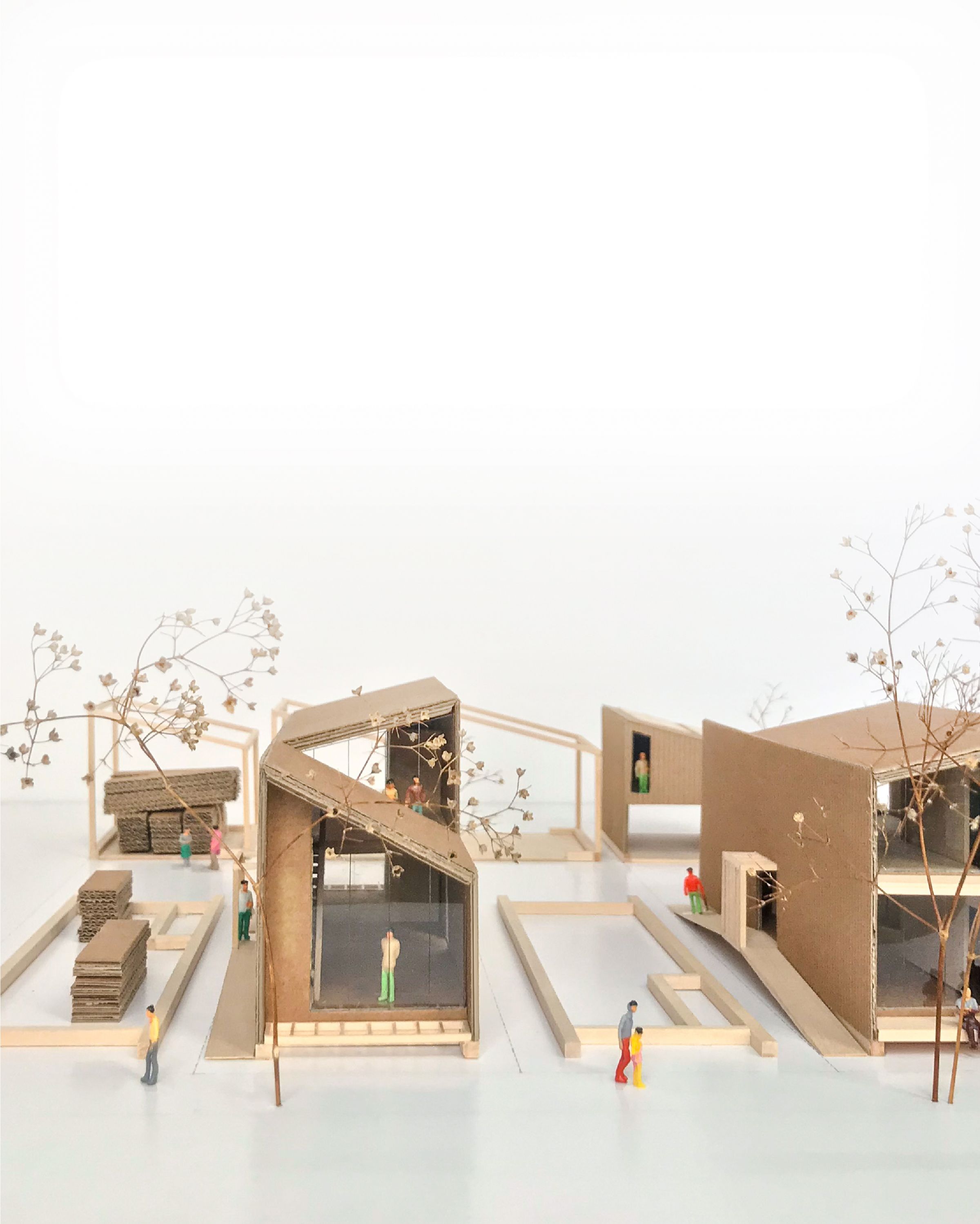
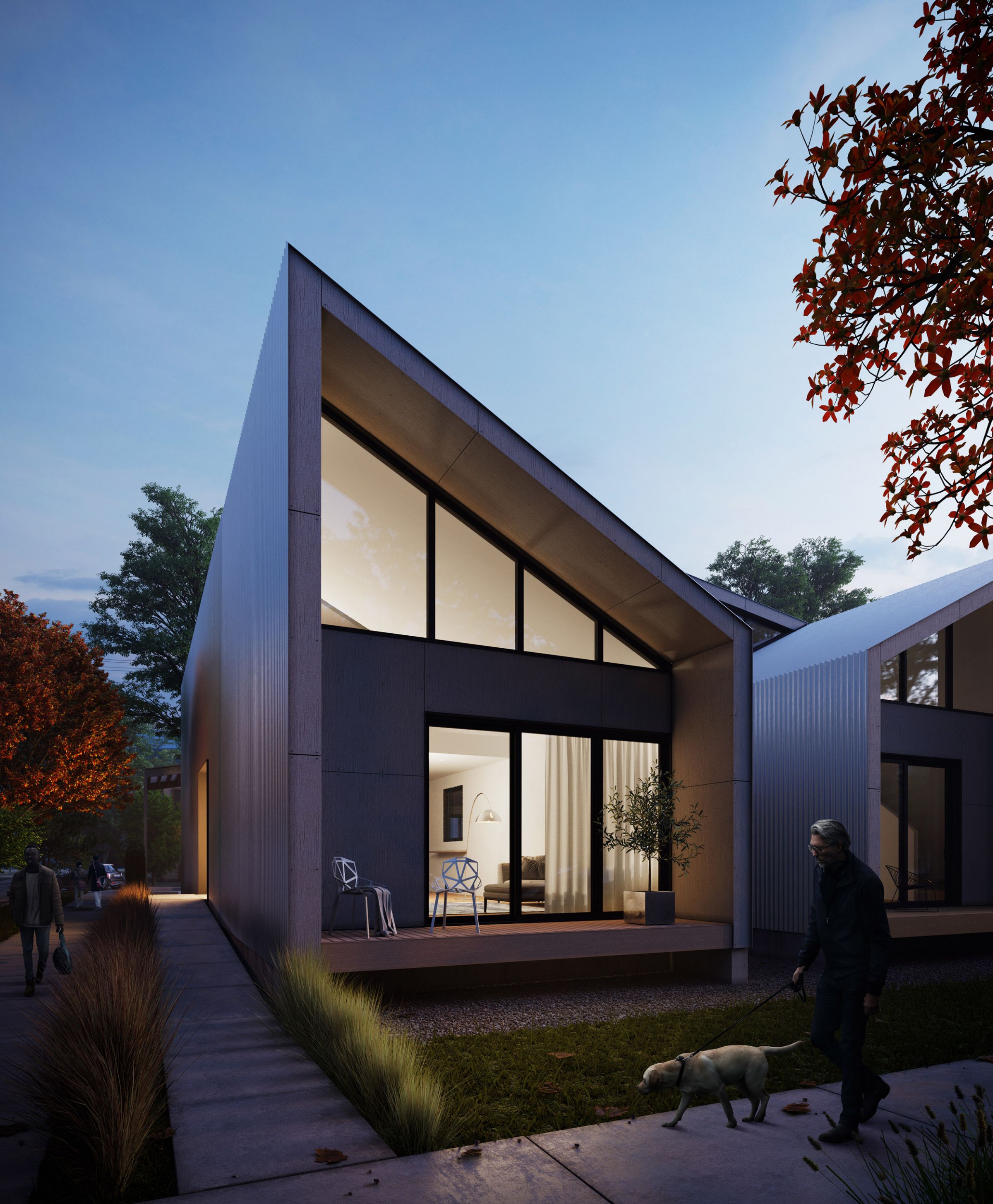
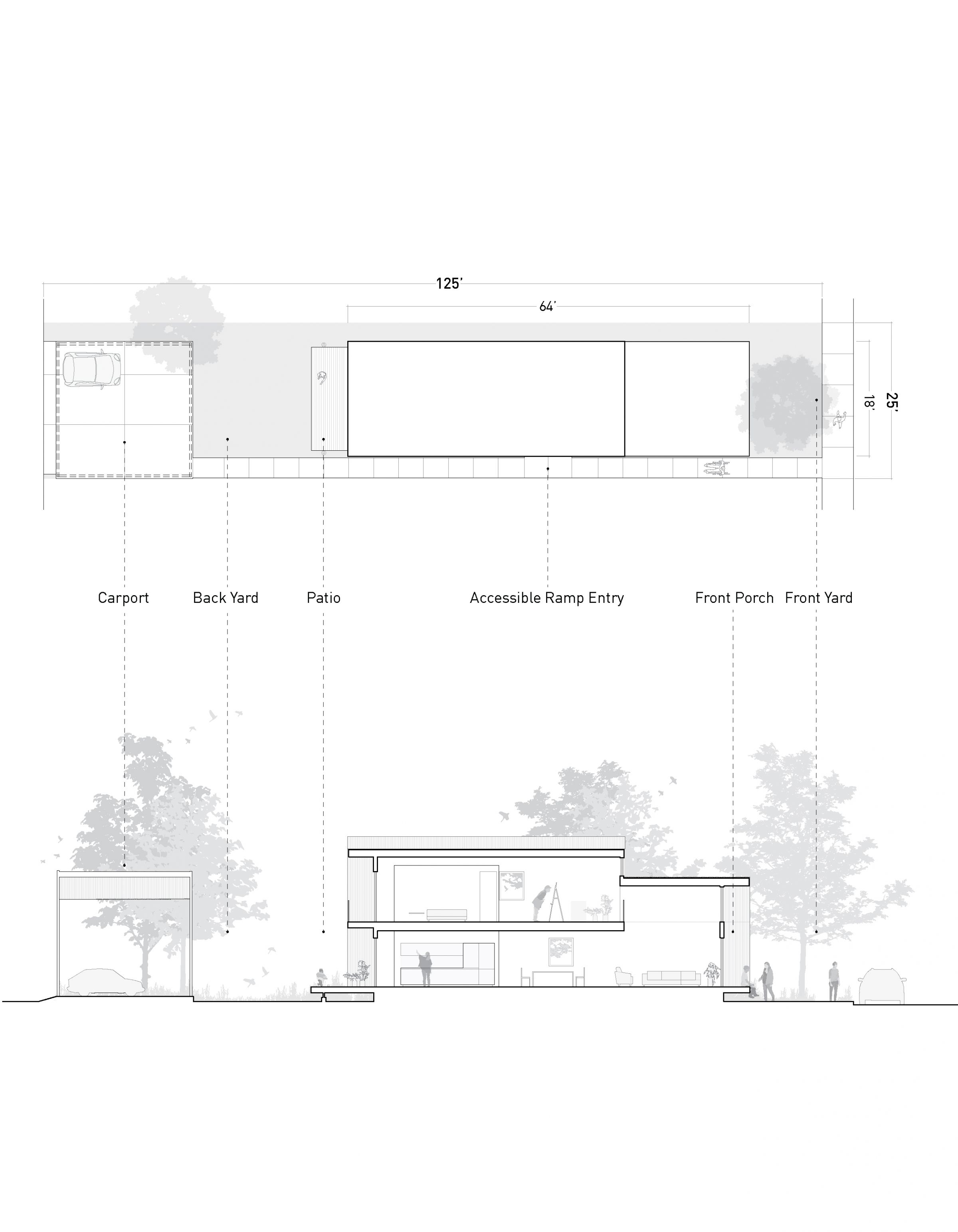
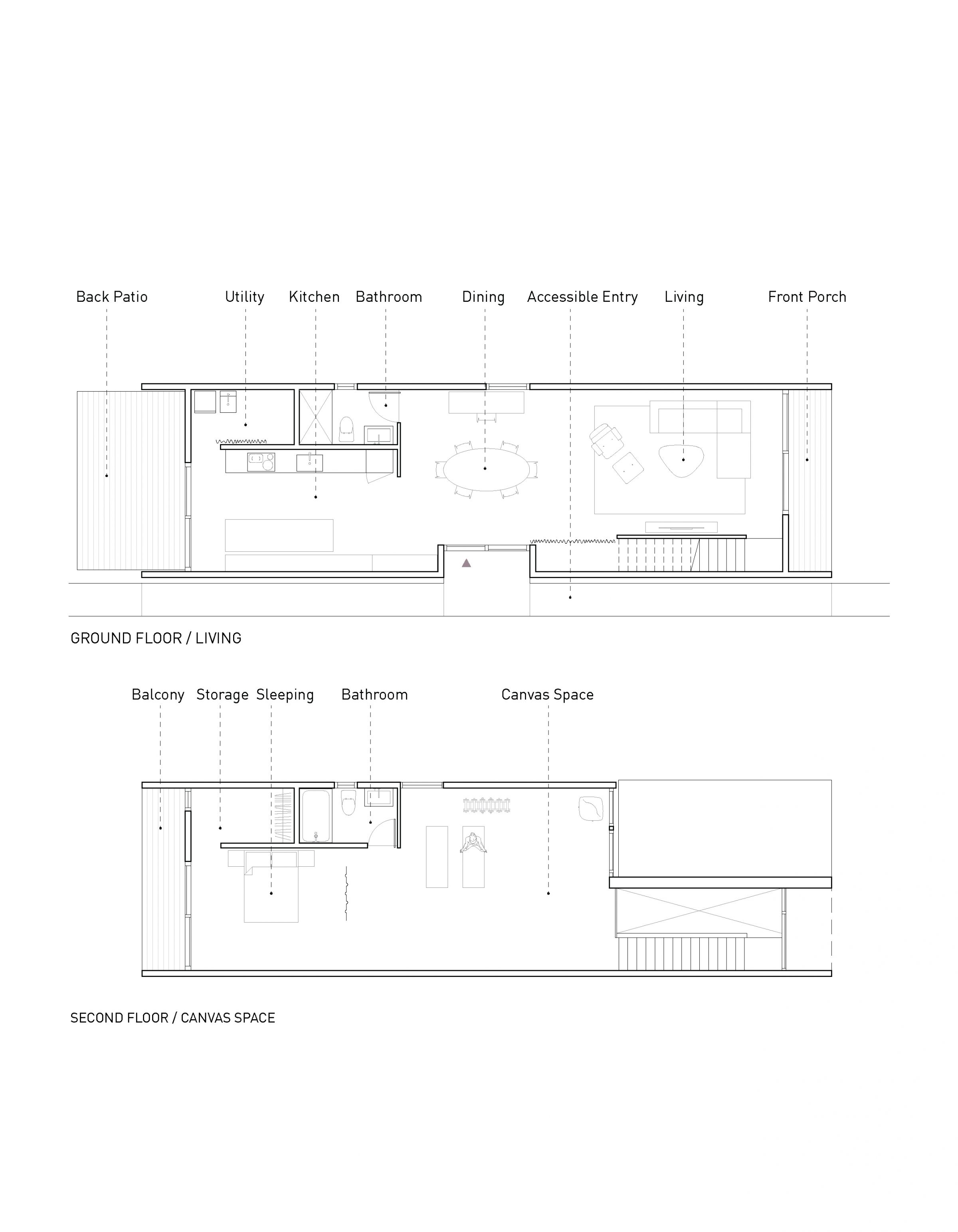
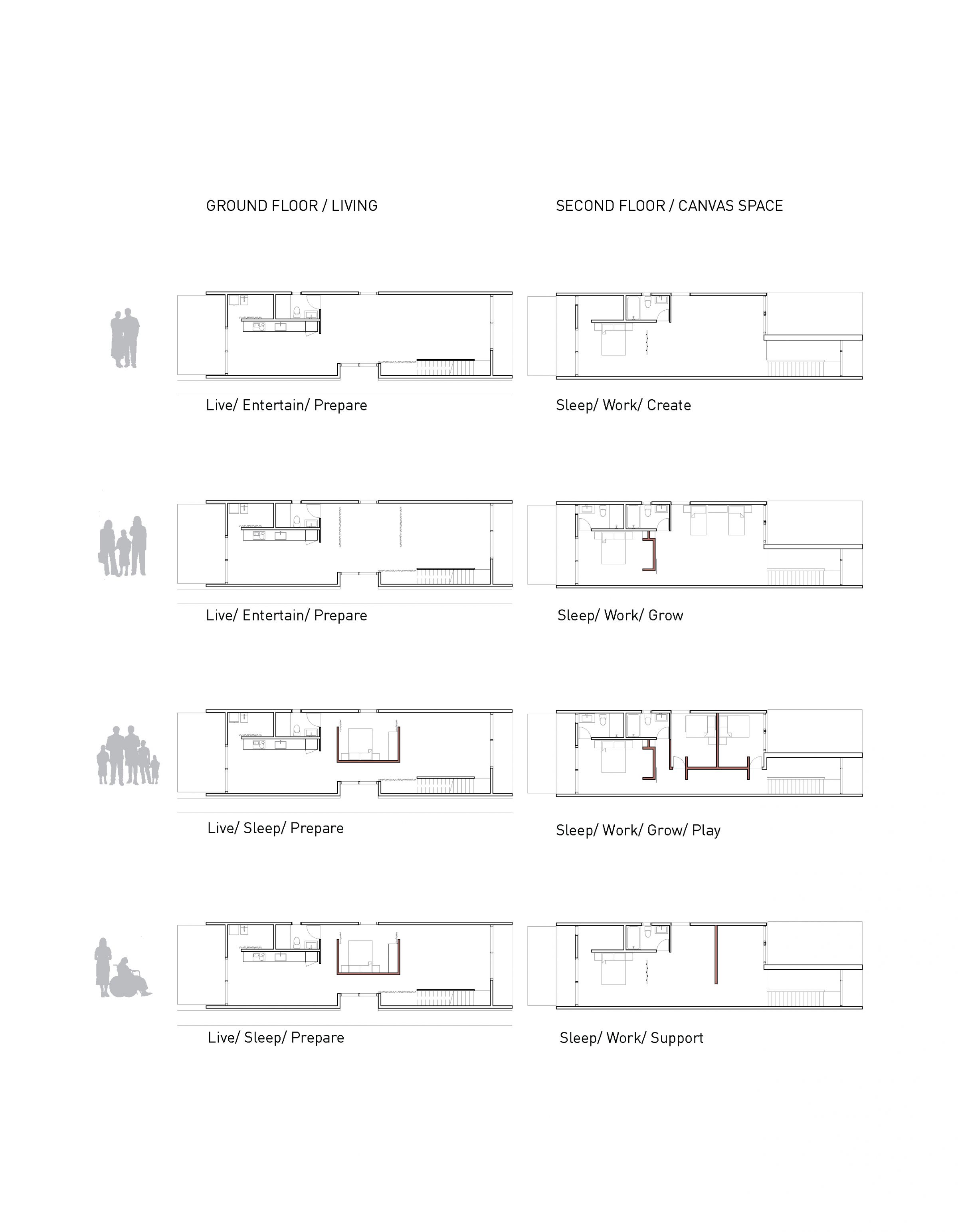
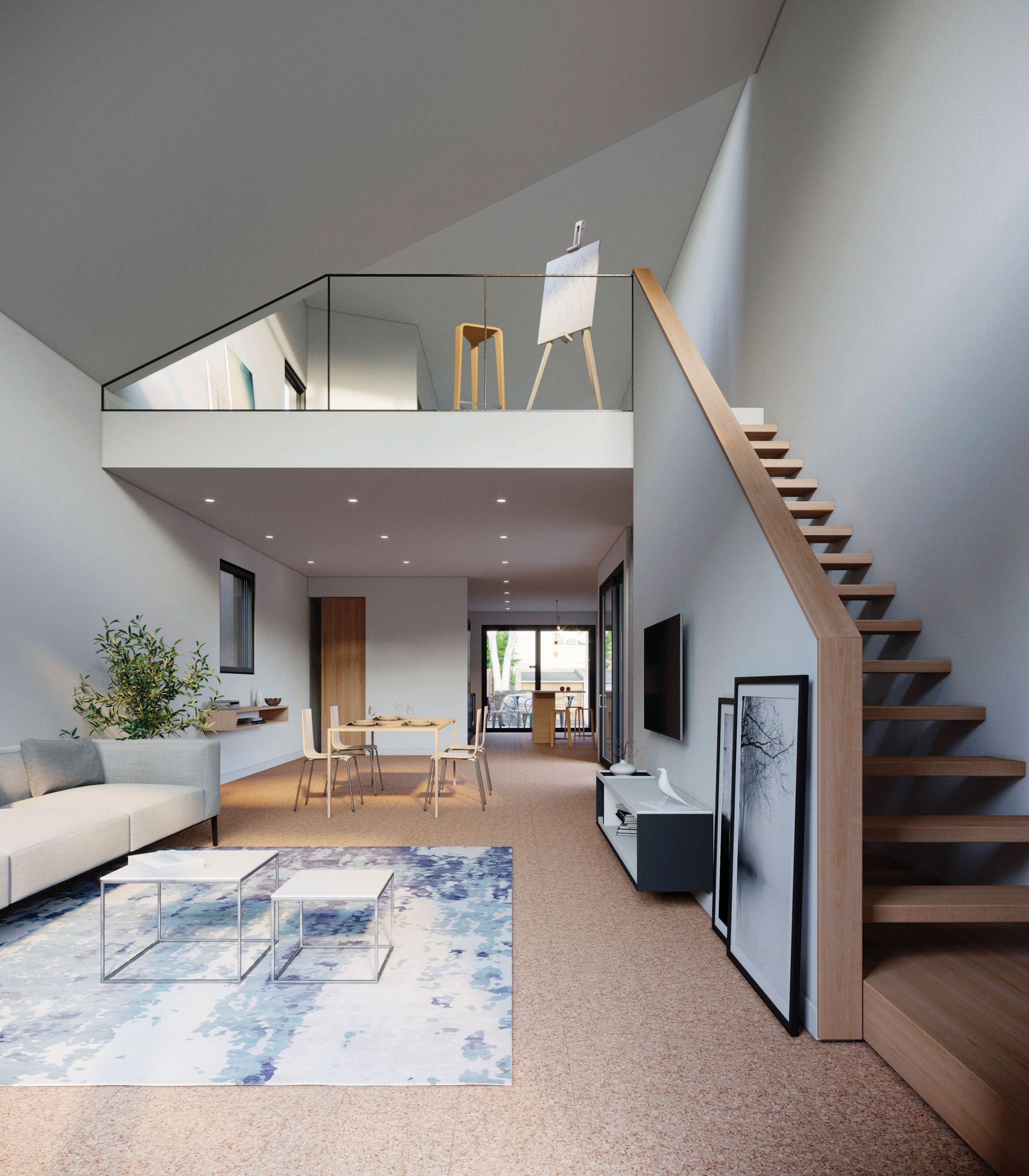
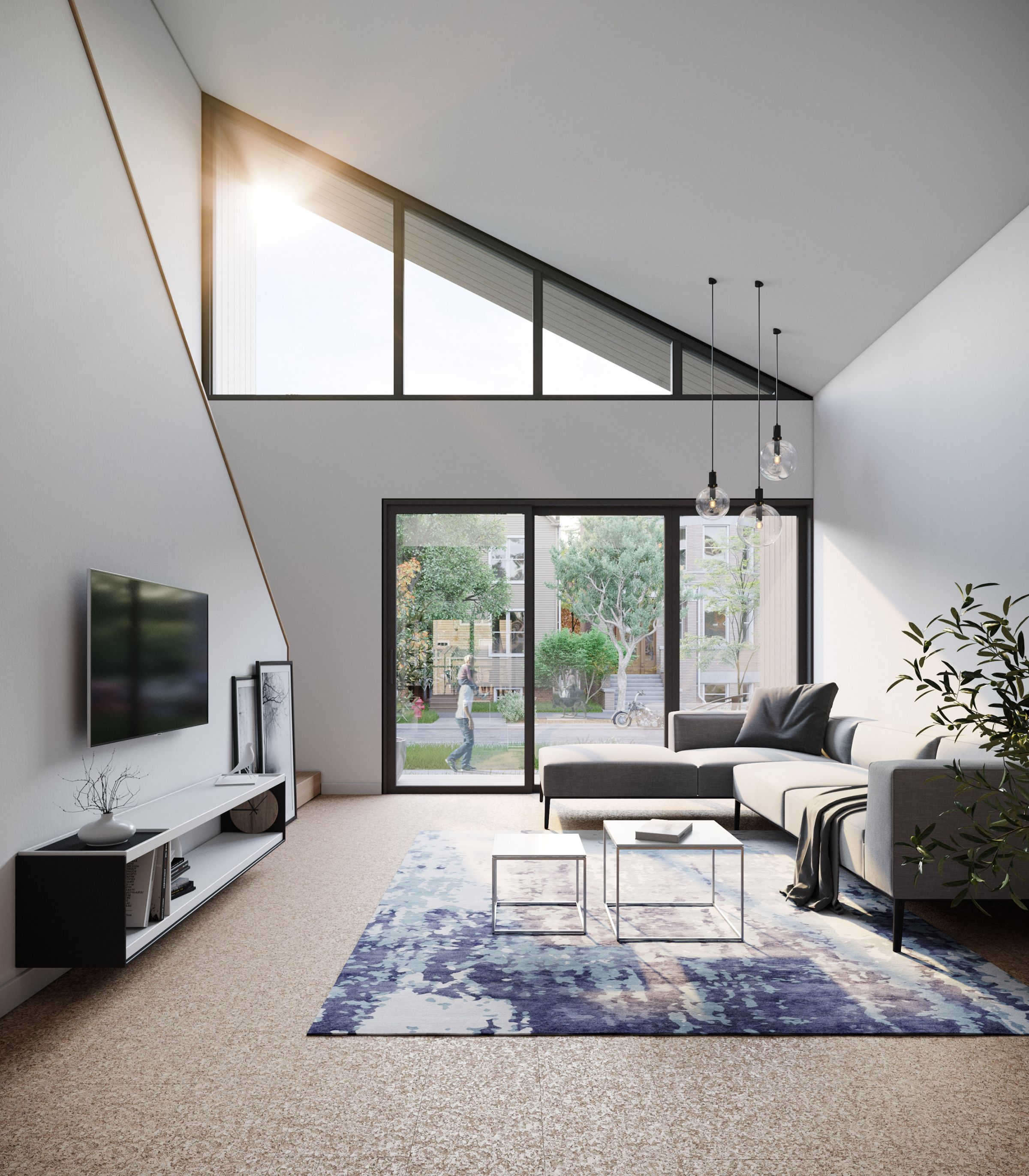
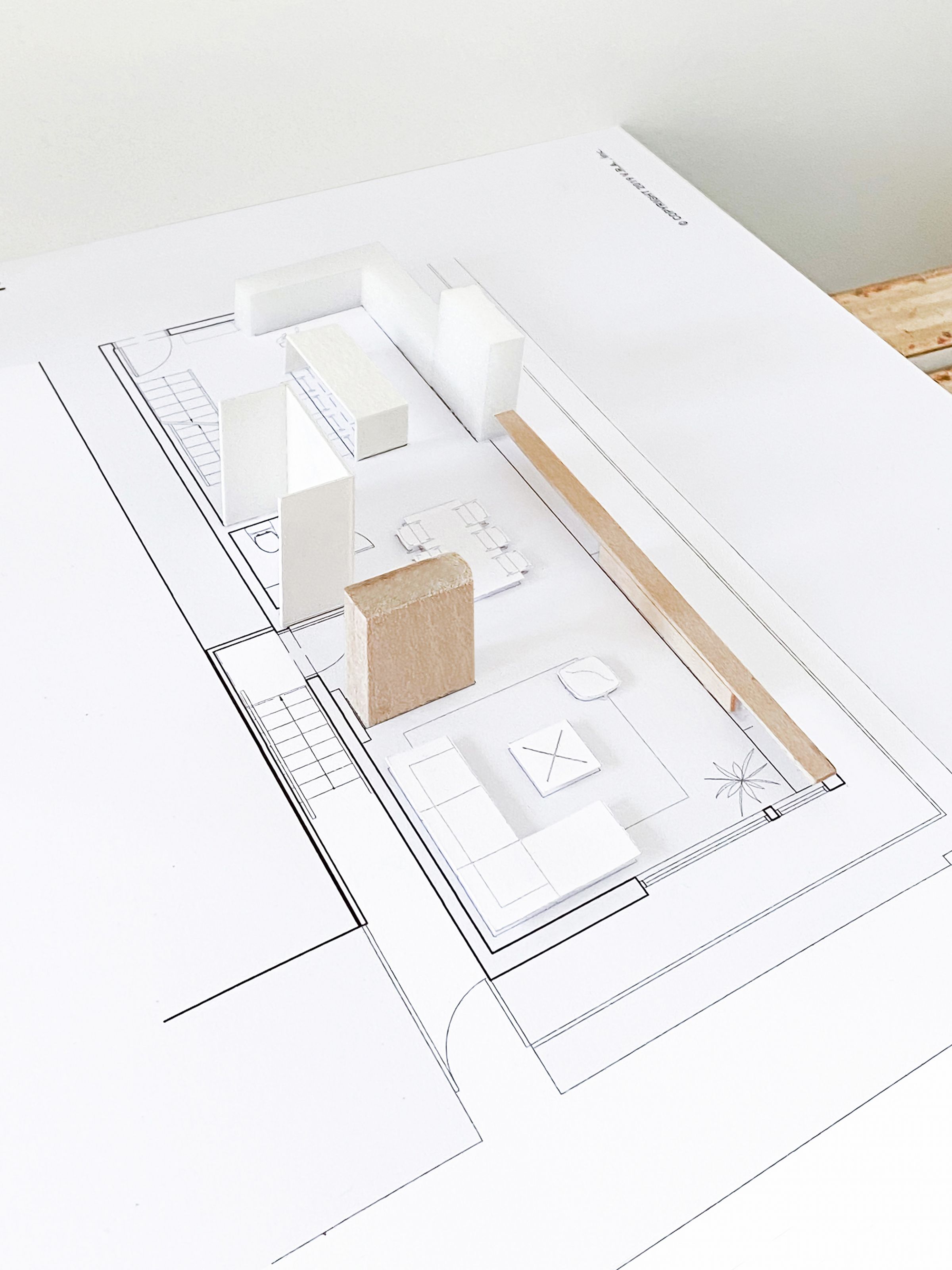
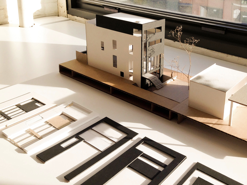
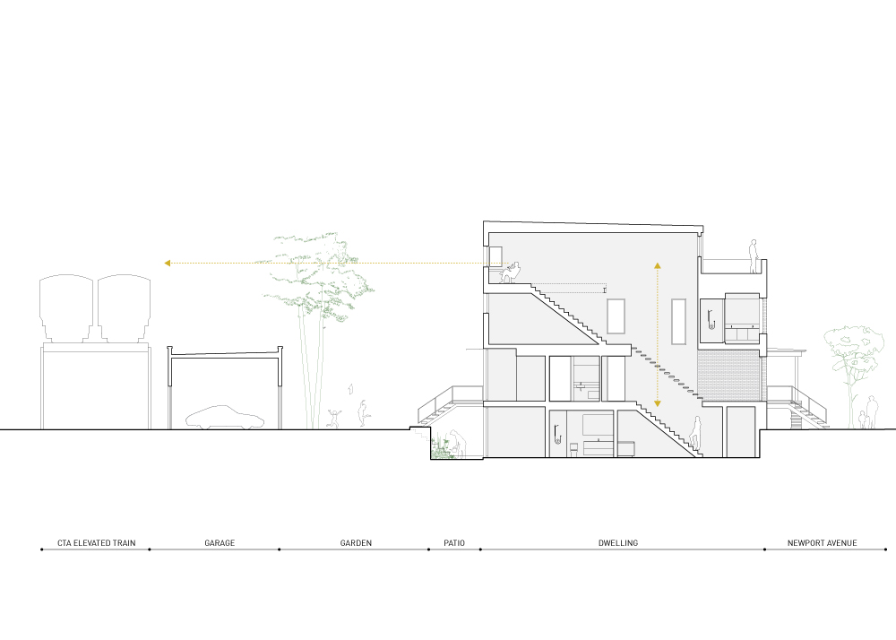
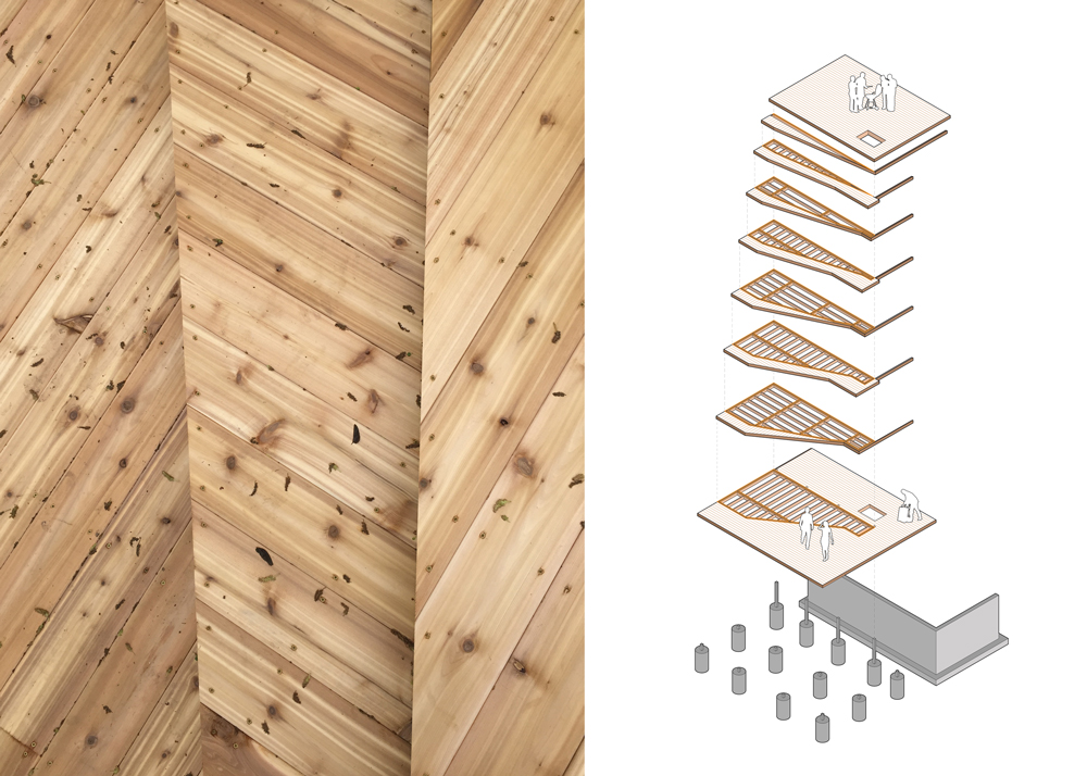
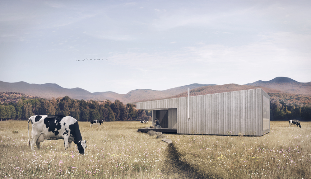
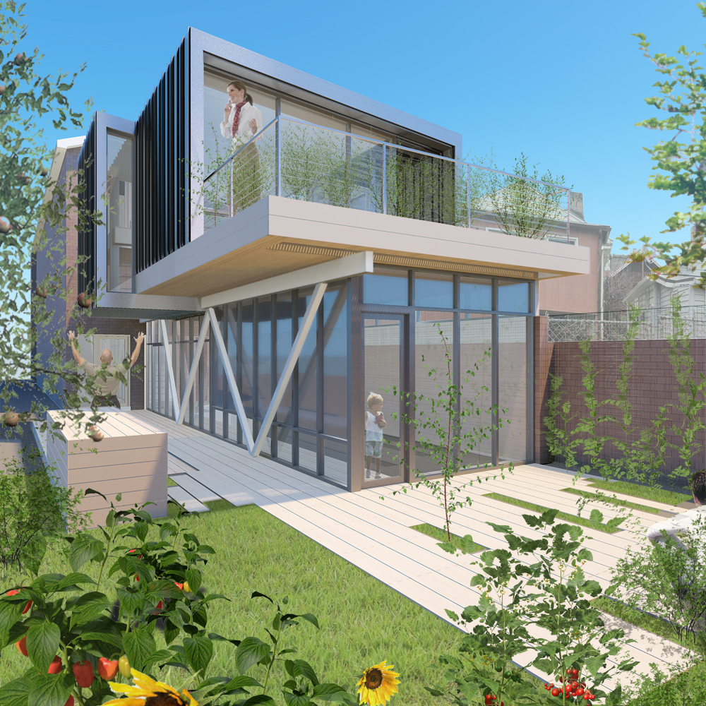
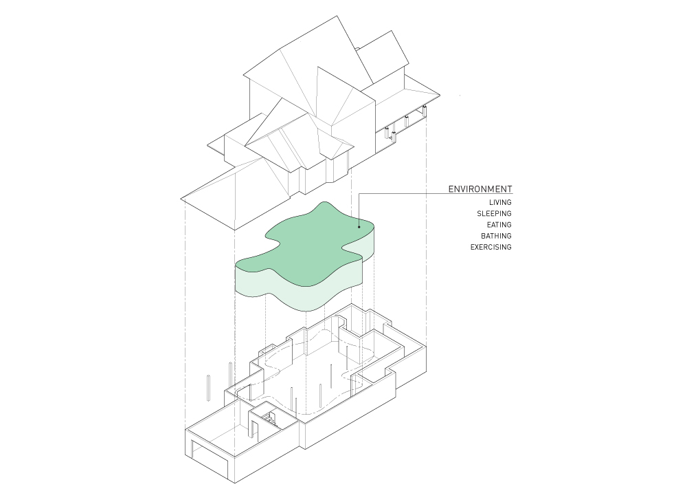
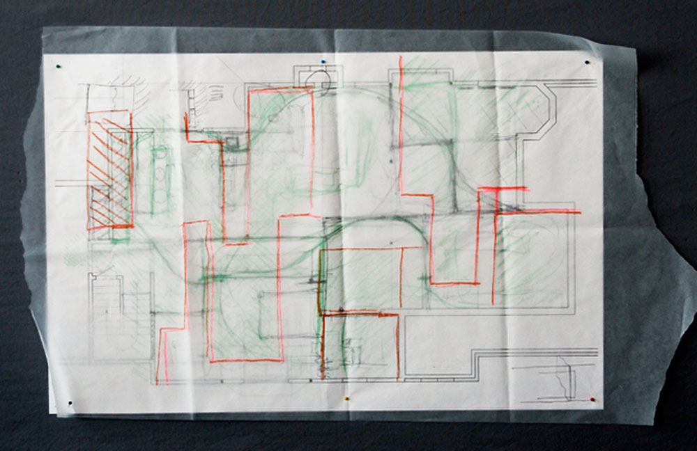
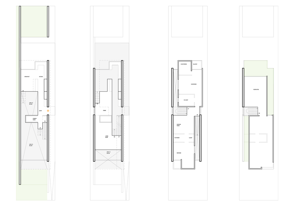
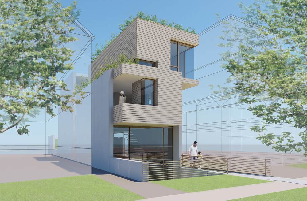
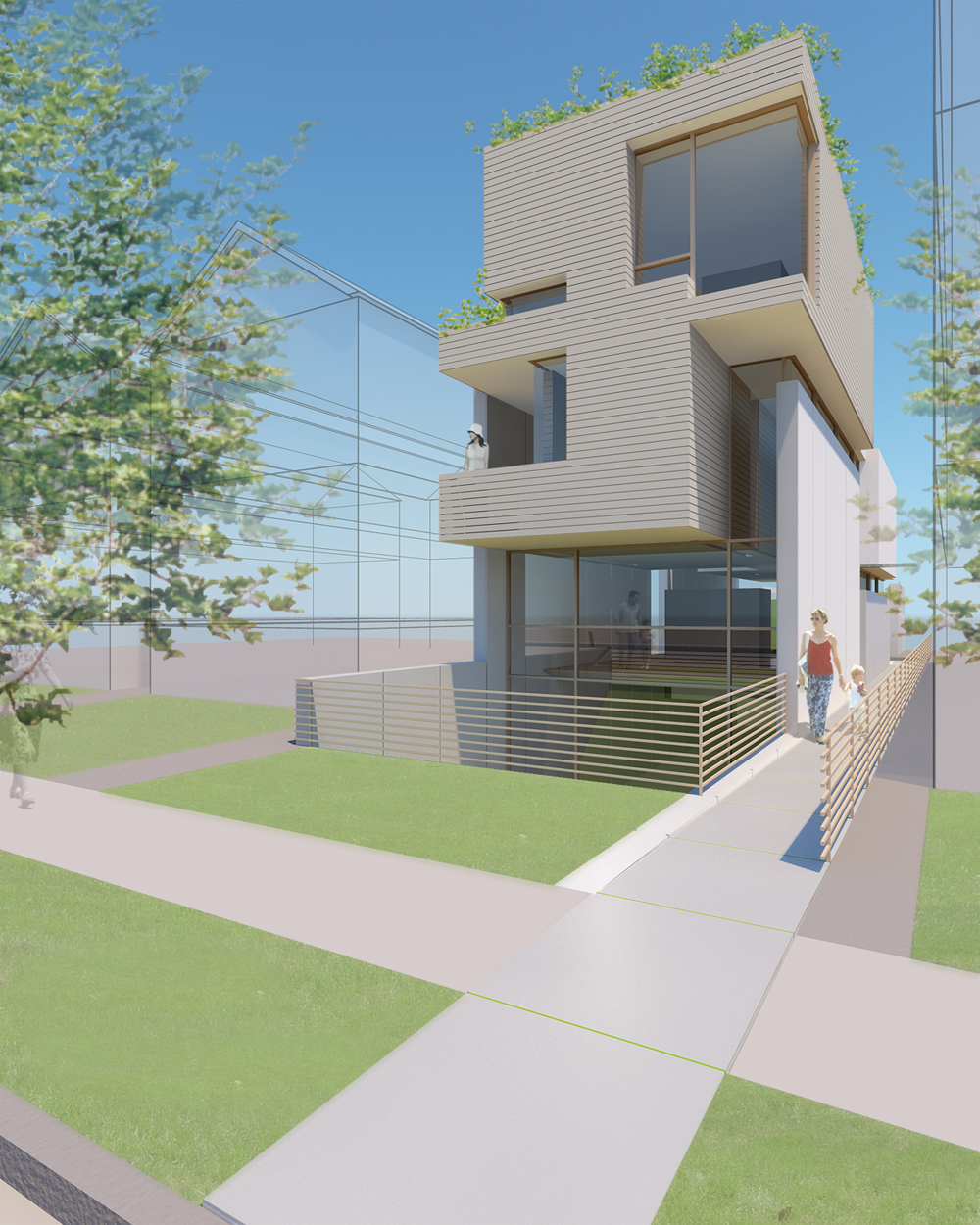
Nestled on the edge of Lake Raponda near Wilmington, Vermont, this serene yet challenging site is embraced by century-old trees, moss-covered boulders, and a beaver lodge. Our clients, an active family with three young children, acquired this secluded property for their second home as their desire to be closer to nature made this a perfect spot to build on.
In our design explorations, we aimed to find a solution with minimal impact on this undisturbed, barren site while meeting the pragmatic needs of our clients. Iteratively working in section, we navigated the complexities of building on a steep slope, considering environmental factors, and adhering to strict zoning constraints. Our proposal included two platforms at varied elevations, with the smaller one serving as a staging area during construction and later transforming into a carport with storage. The second platform gracefully rose out of the slope, hosting the new dwelling. Maintaining a small footprint for minimal site disturbance, we evolved the house plan vertically to optimize views and maximize natural light. The building structure was designed using smaller segmented members of steel and engineered lumber to accommodate challenges in deliveries to this remote site.
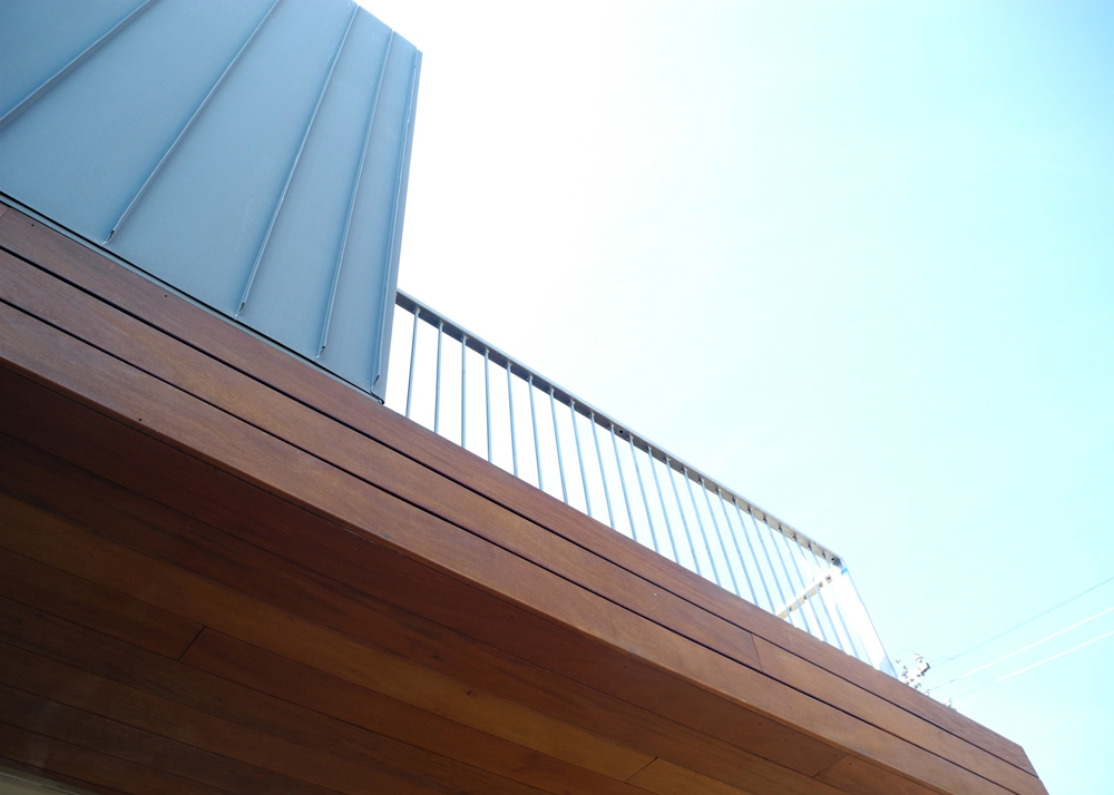
Exterior material selections were guided by vernacular expressions of the surrounding architecture and the material’s ability to weather and blend harmoniously with the surroundings. Envisioning the building skin transforming over time, echoing the grey granite rock formations on the site, we aimed to metaphorically foster a symbiotic relationship with its immediate context.
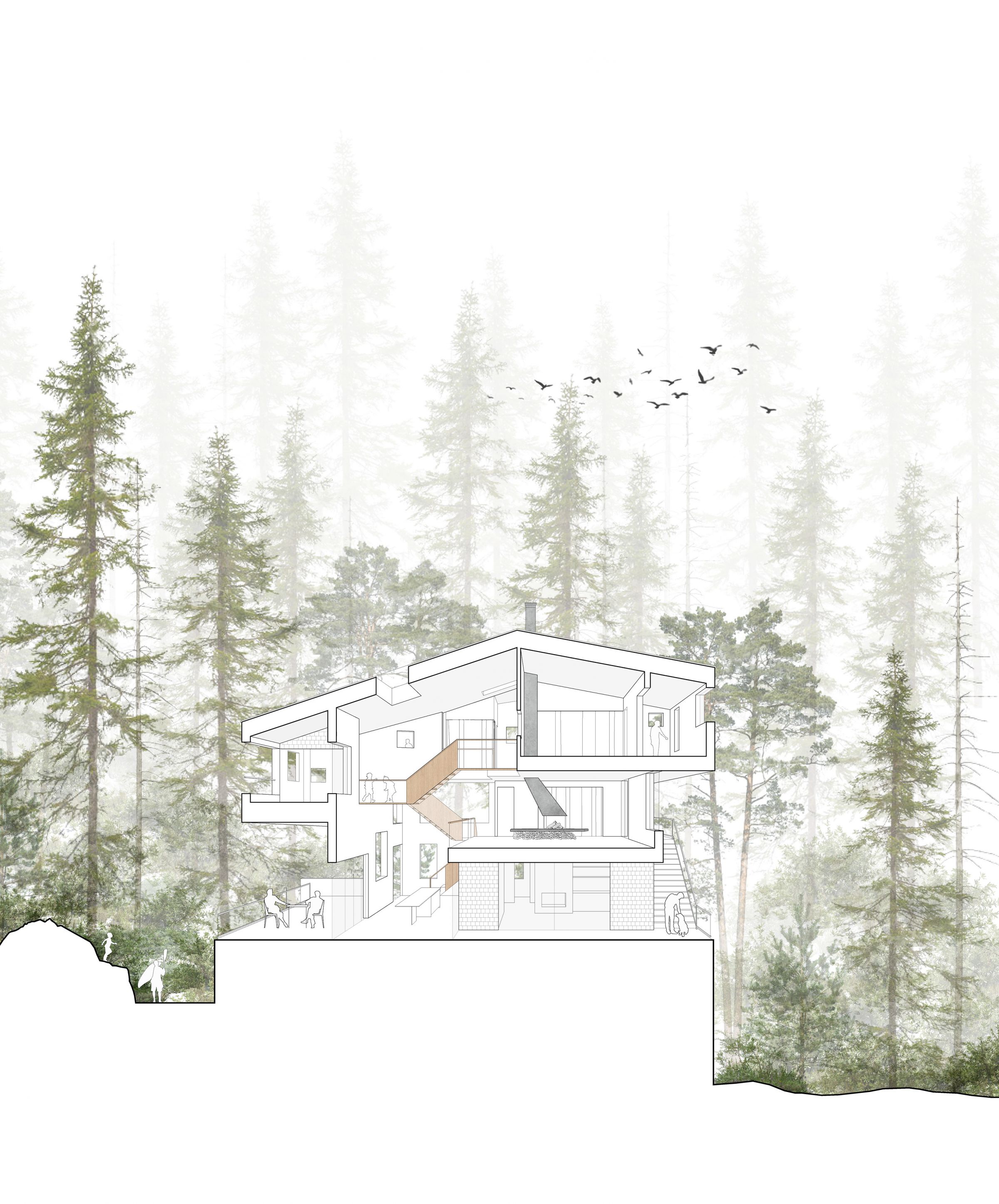
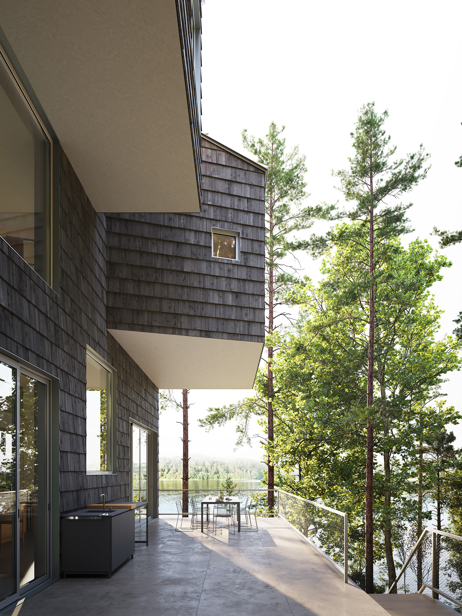
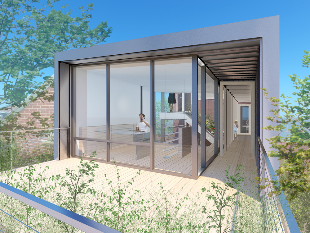
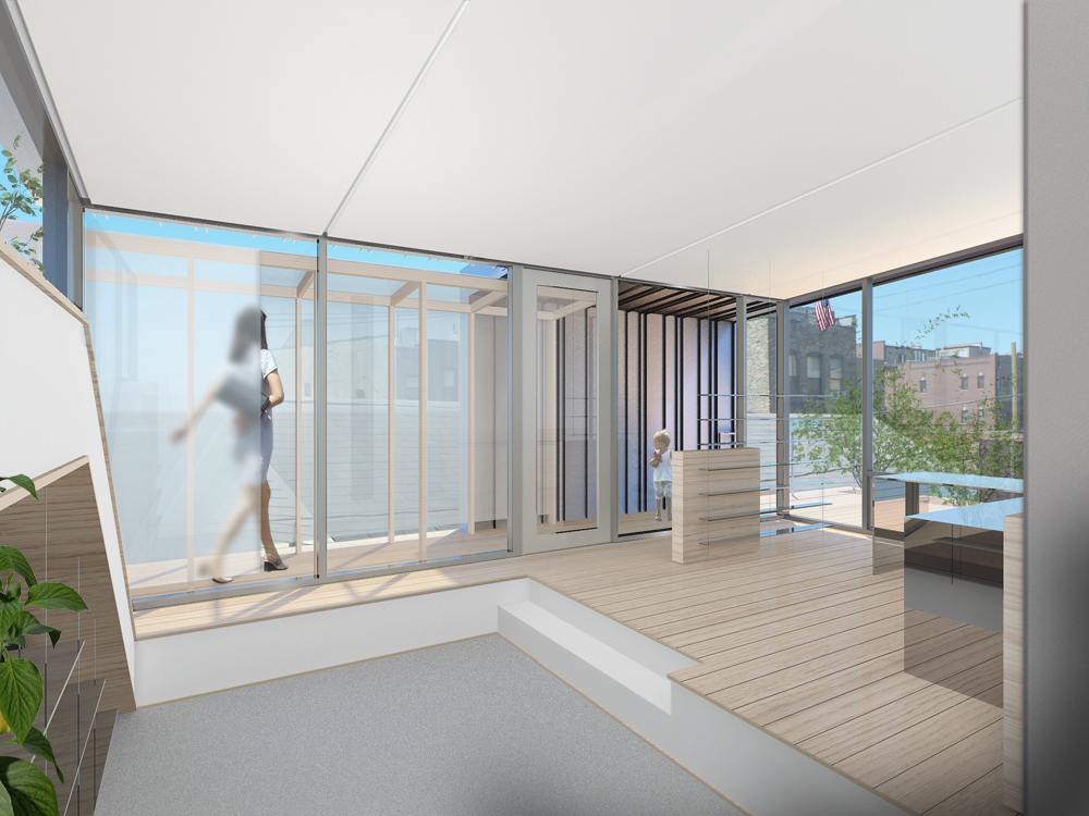
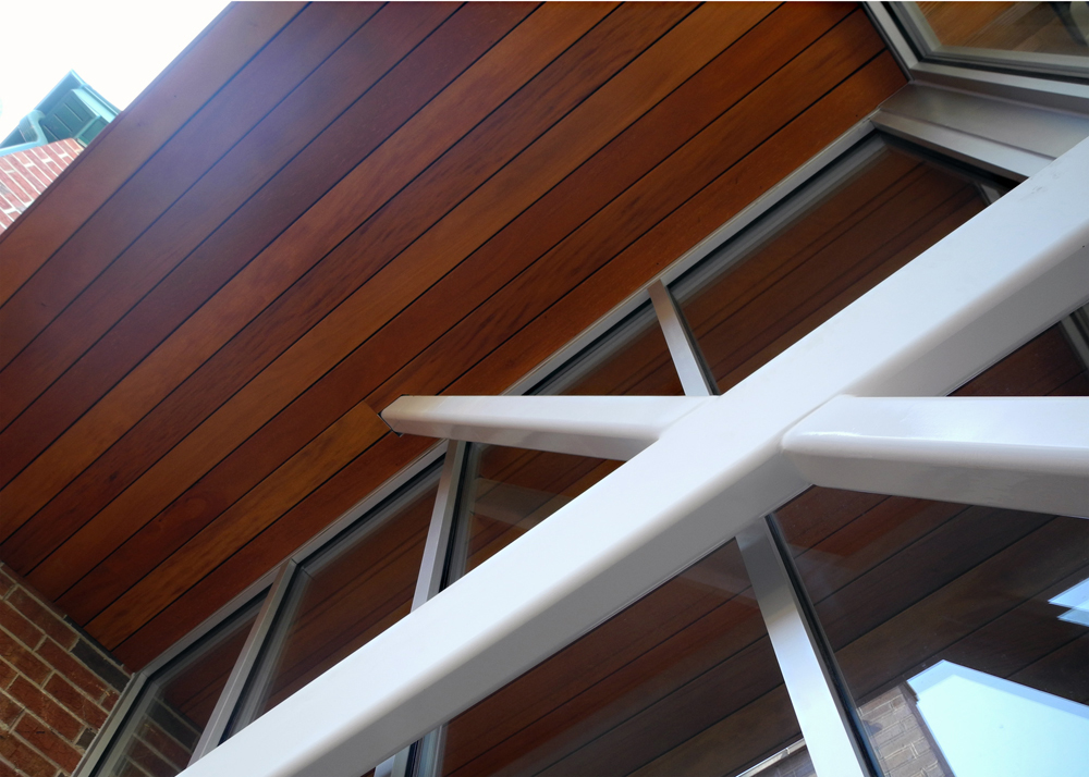
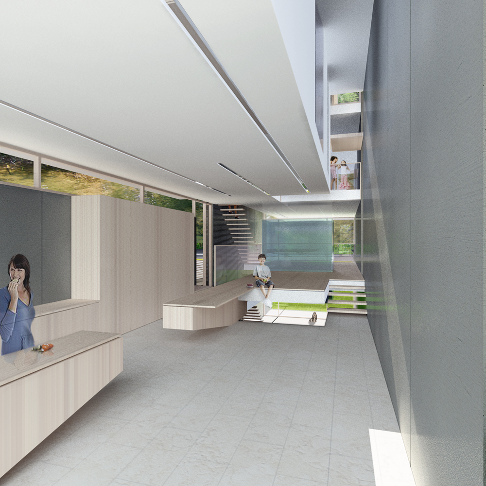
We imagined that upon one’s approach to this cedar-clad home, the carved massing would unfold, revealing deep overhangs that offer shelter along exterior pathways from seasonal elements. Simultaneously, these overhangs would frame viewing corridors, providing carefully choreographed glimpses of Lake Raponda along the slope. Above, the outdoor rooms extend the interior planning and are strategically nested at different levels for varied connection with the landscape. The organization of sleeping and living spaces was oriented towards cardinal directions and the rhythmic journey of the sun, resulting in a distinct spatial quality in each part of the house. Interior windows would enhance connectivity within, while oversized punched window openings unify all the spaces. These openings would serve as apertures for uninterrupted views, facilitate cross ventilation, and enhance the penetration of daylight on this heavily forested site.
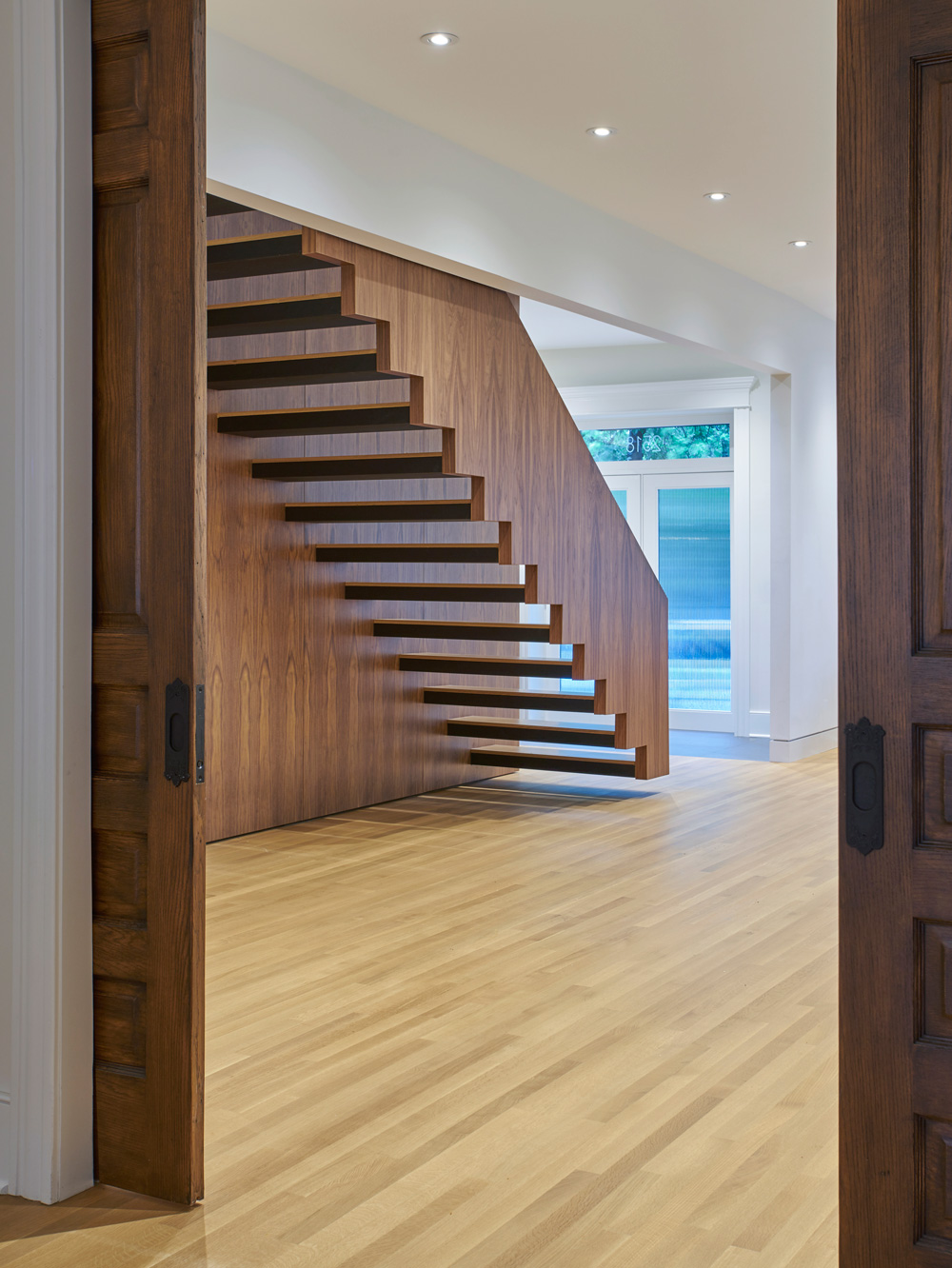
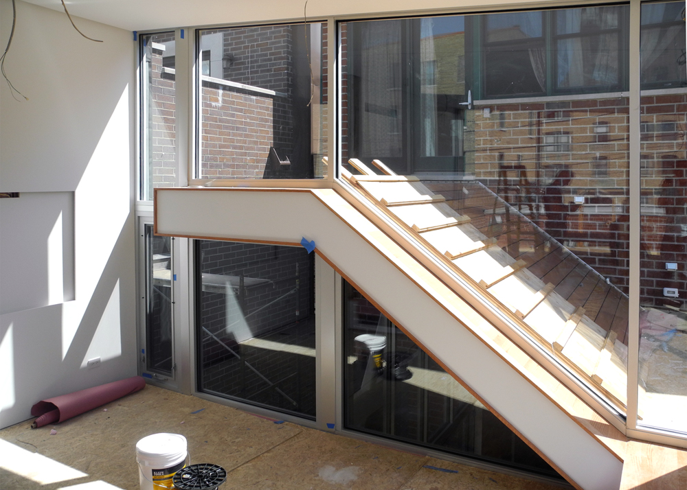
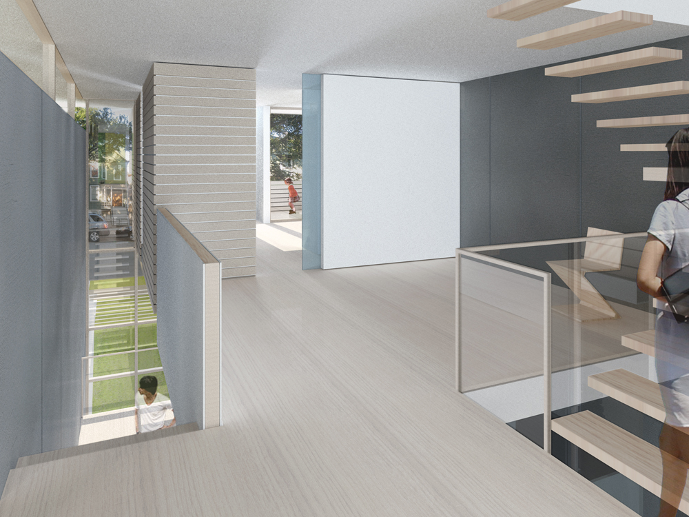
A sculptural cross-laminated timber stair threads its way through a three-story void, providing vertical circulation and serving as a focal point. This suspended internal circulation not only acts as a visual and vocal communication for the family but also offers a vantage point for observing the beauty of the surrounding nature from an elevated perspective.
Although this project will not come to fruition, it nevertheless embodies our ongoing architectural interests, reflected in the conception of this home. Our emphasis on providing optimal natural light, crafting diverse forms for visual connectivity, and selecting context-appropriate materials to achieve cohesive harmony were the guiding principles for this site-specific dwelling.
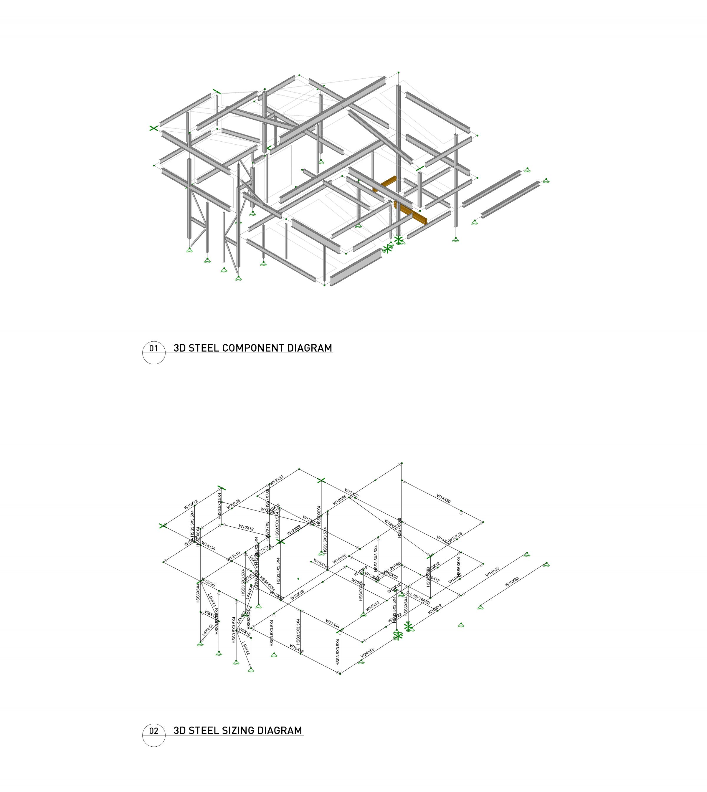
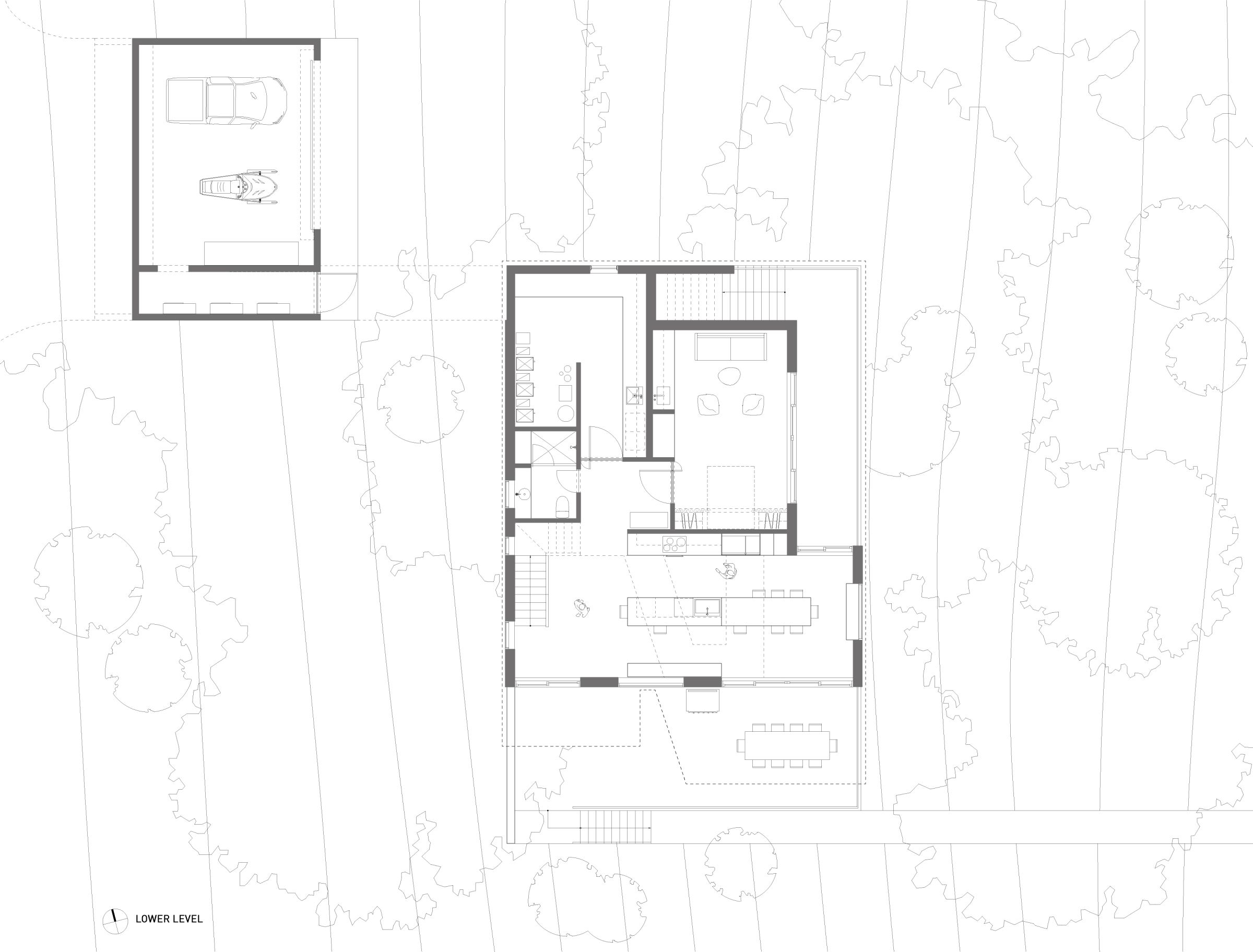
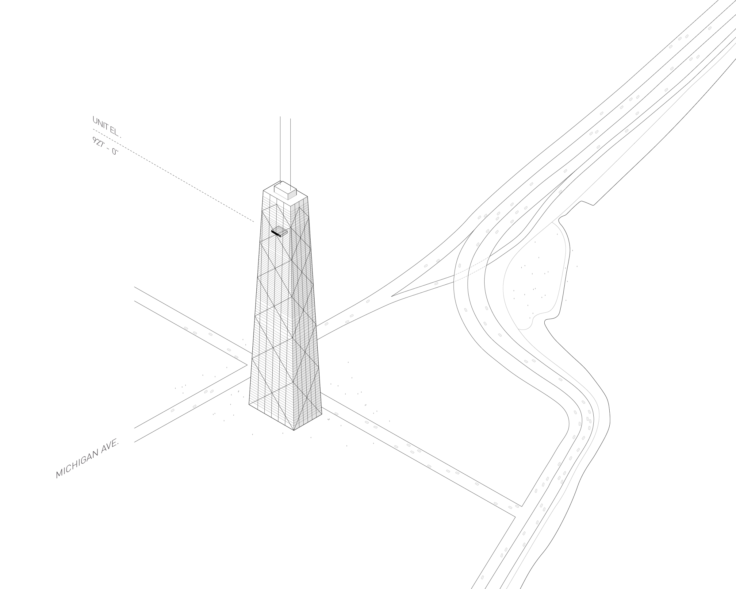
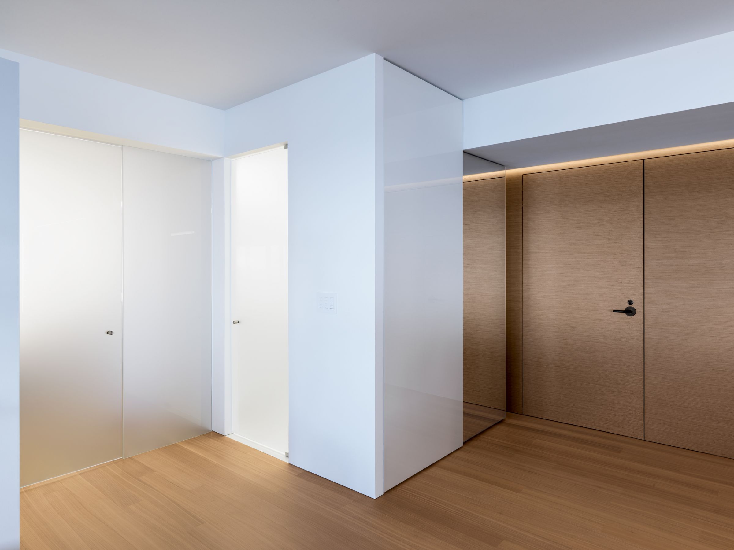
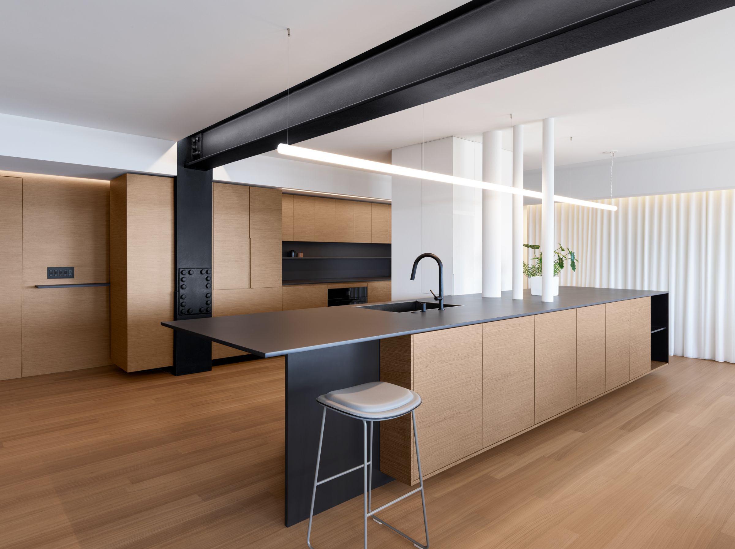
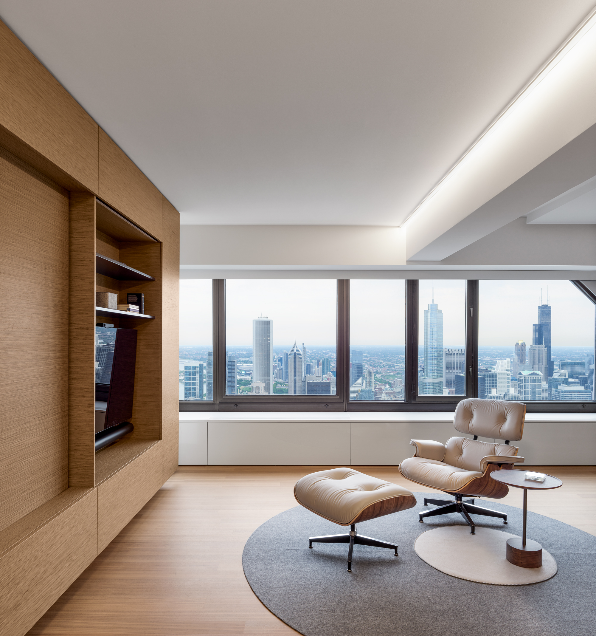
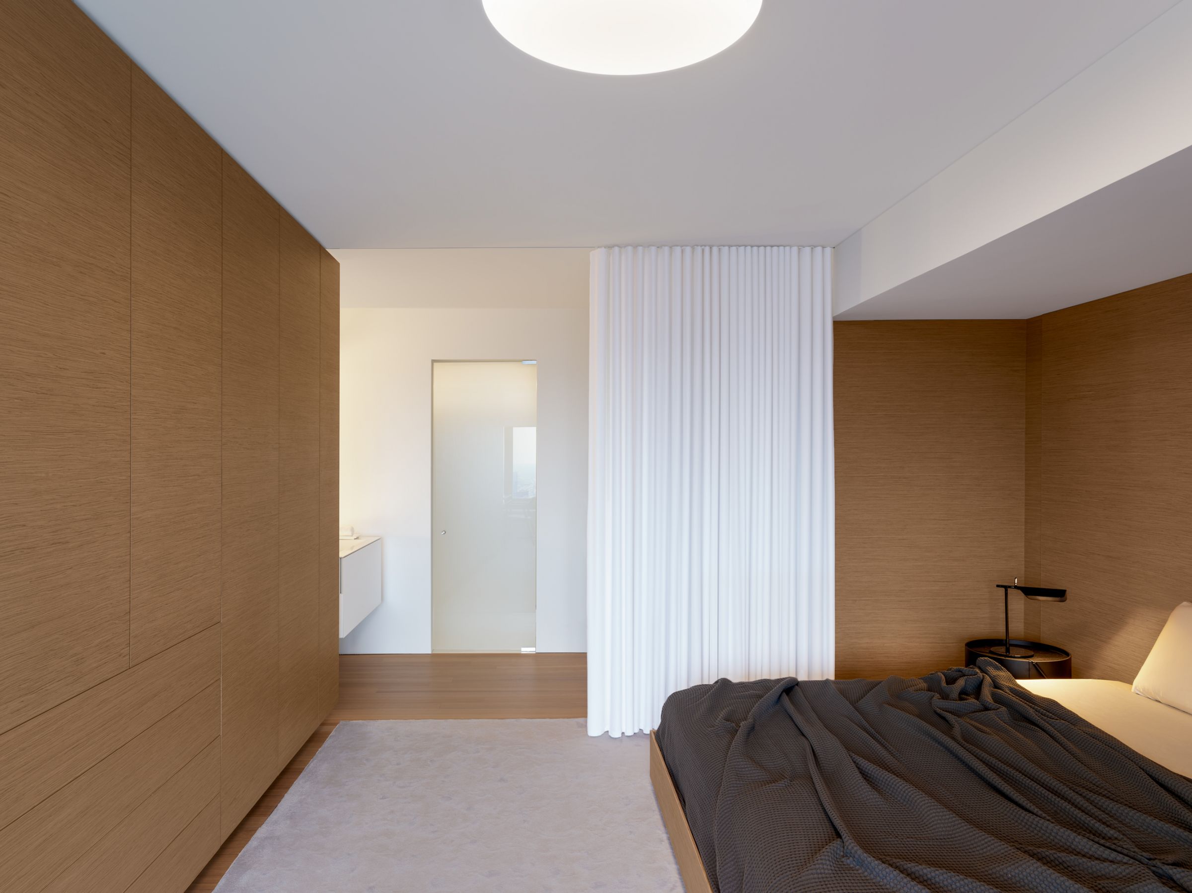
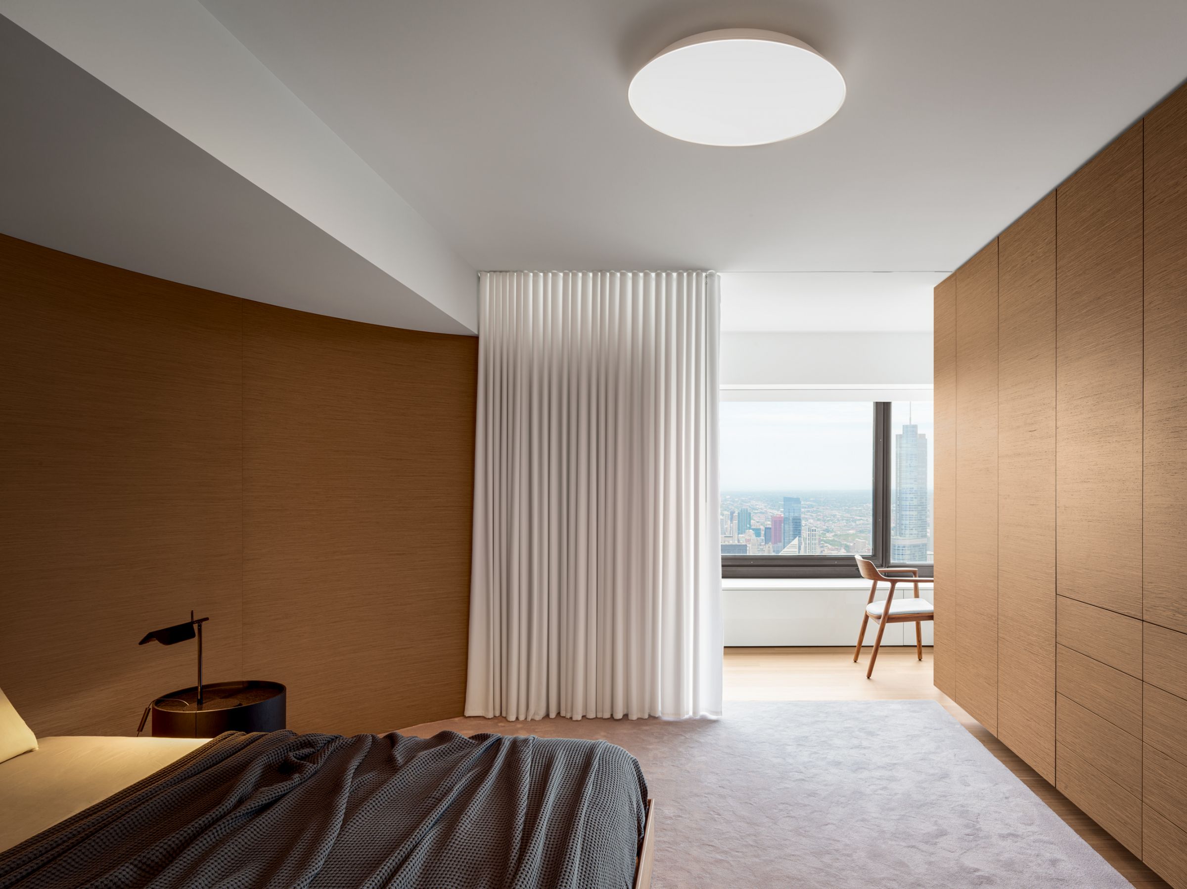
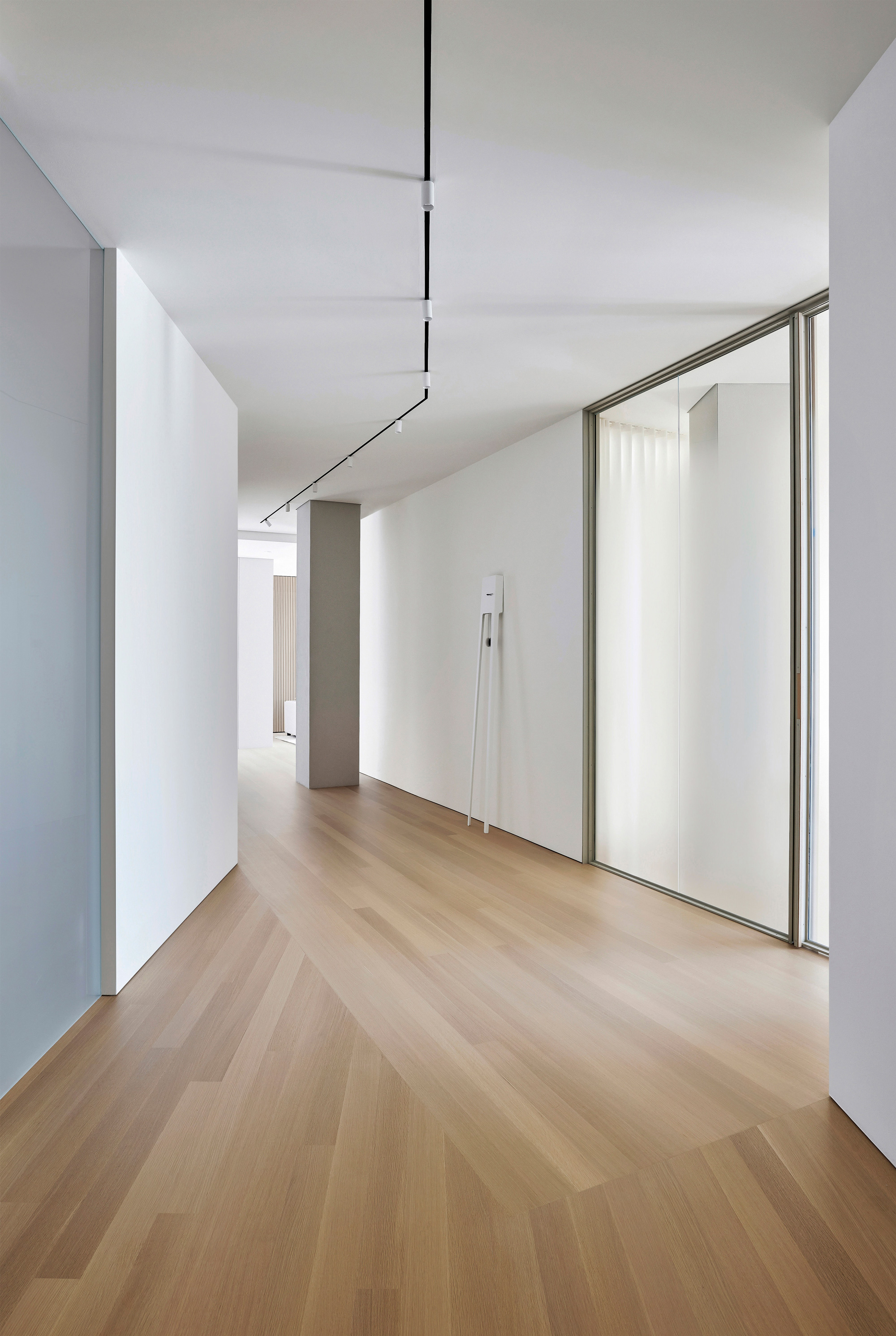
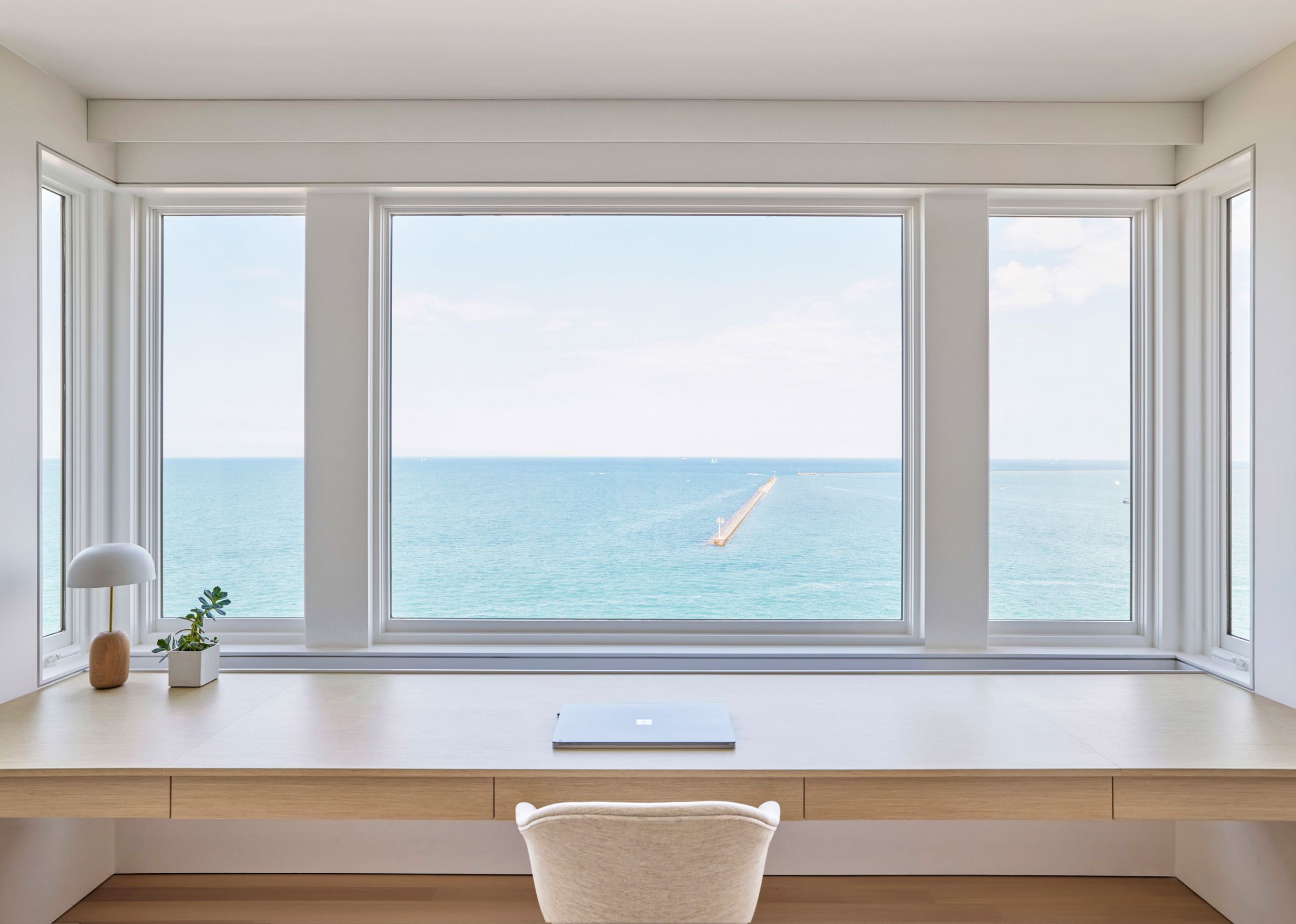
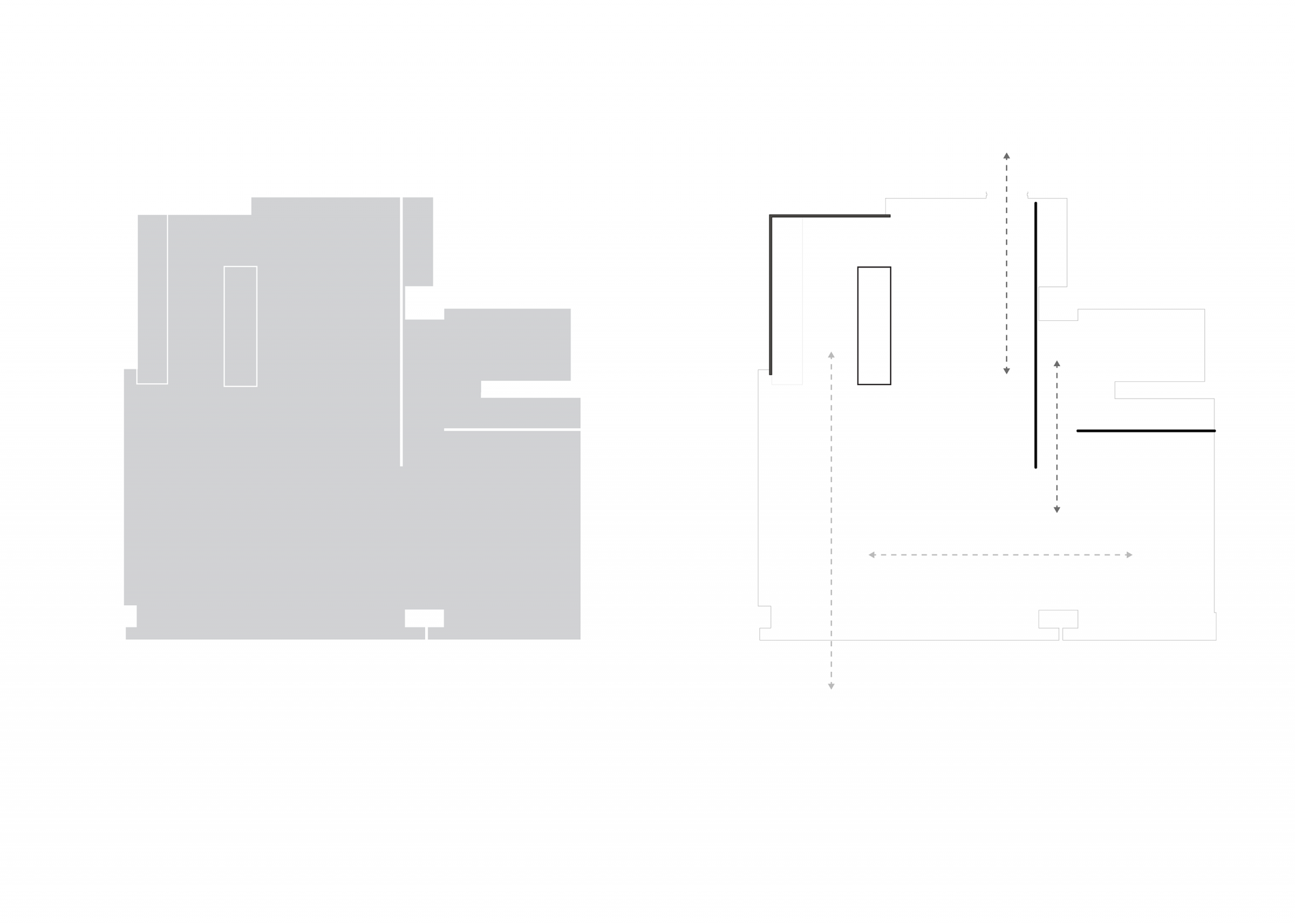
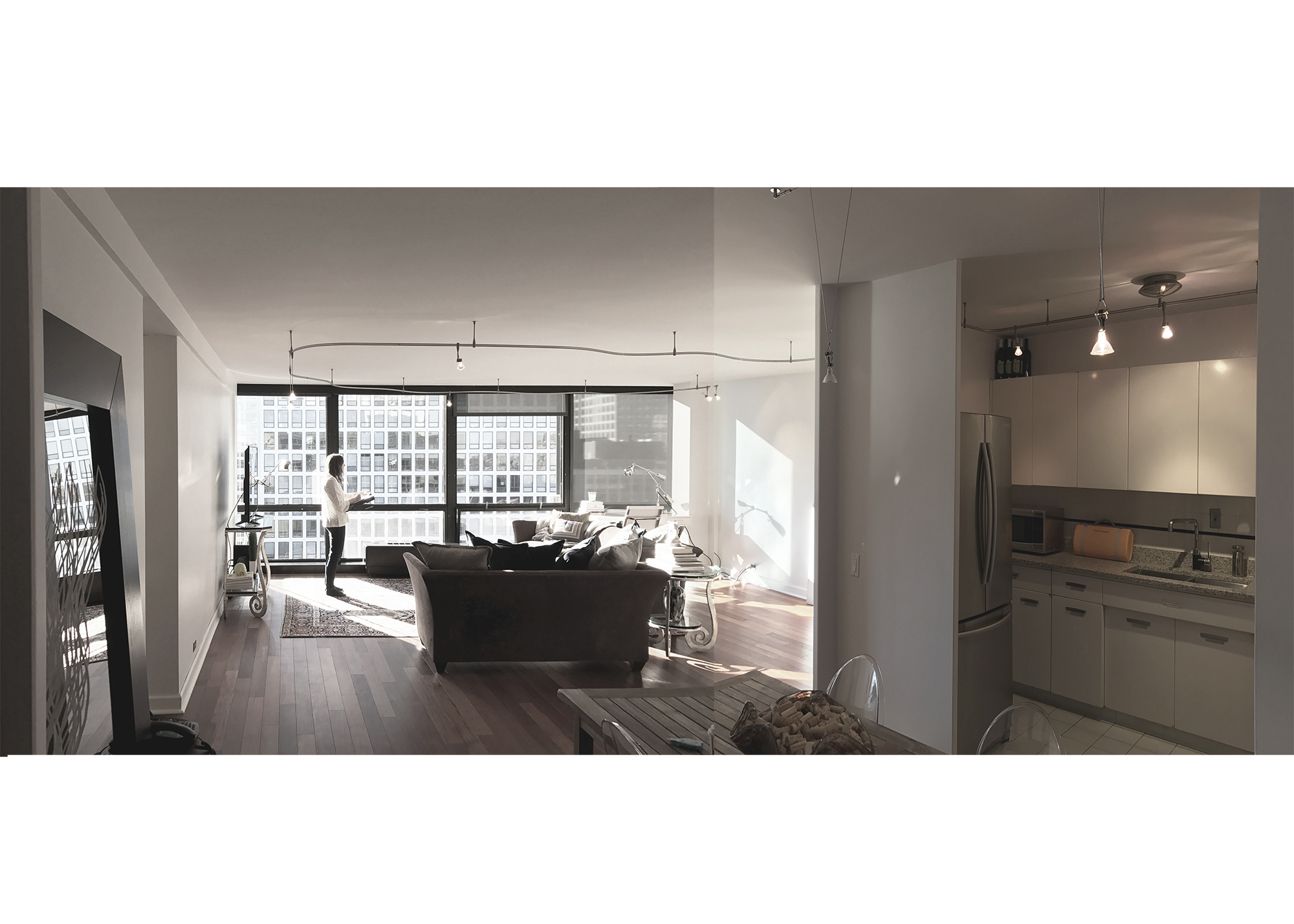
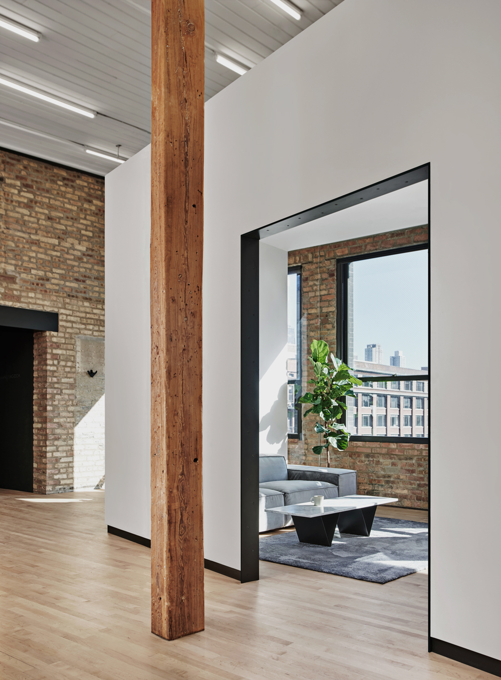
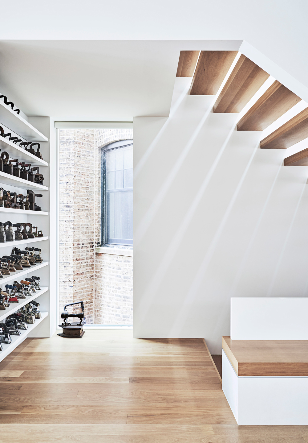
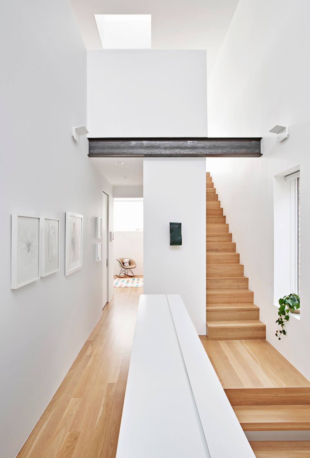
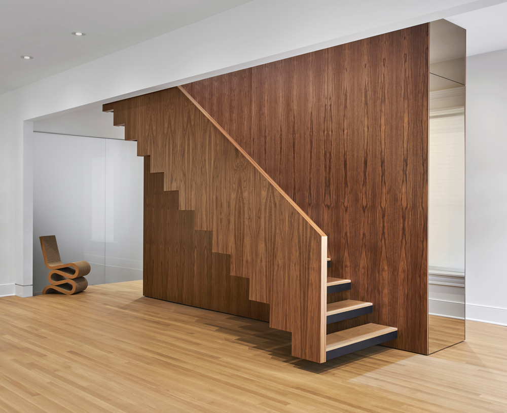
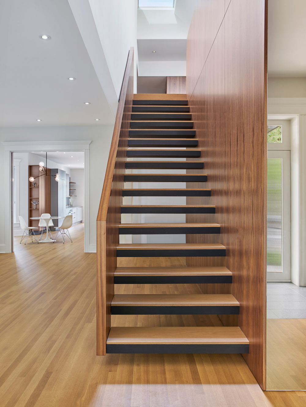
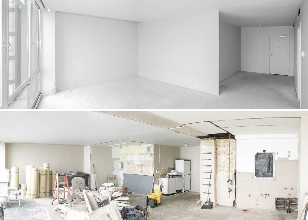
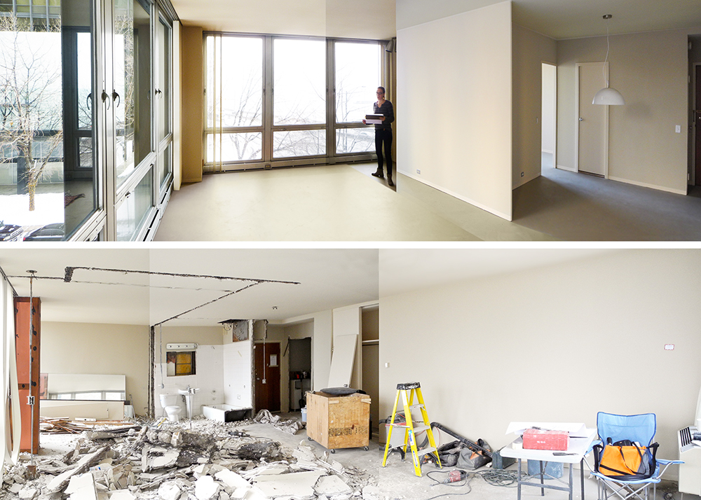
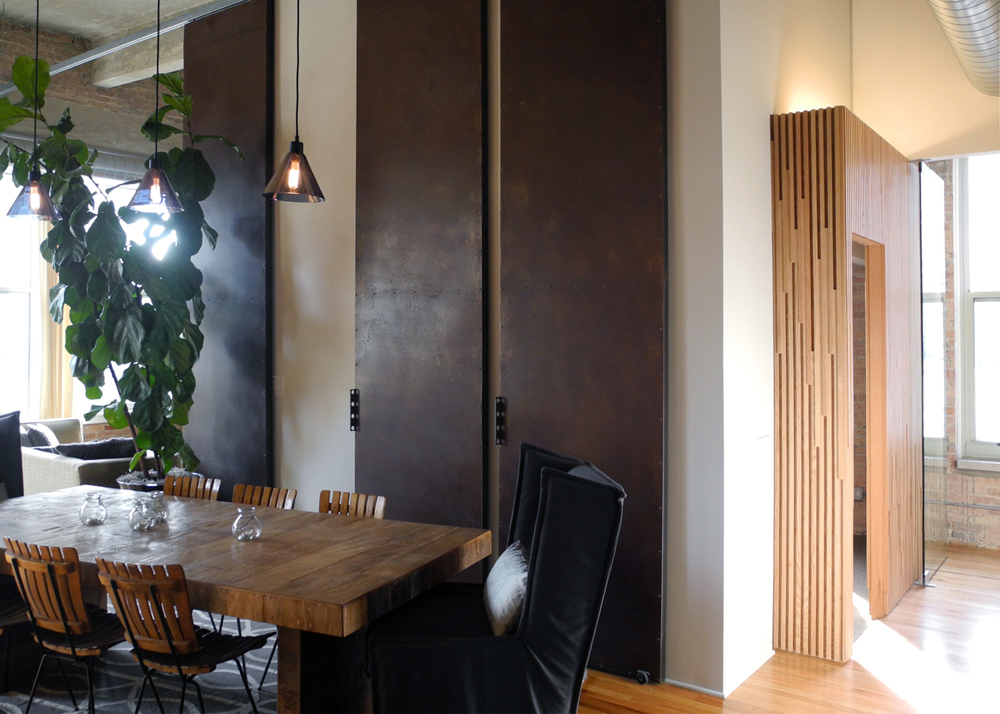
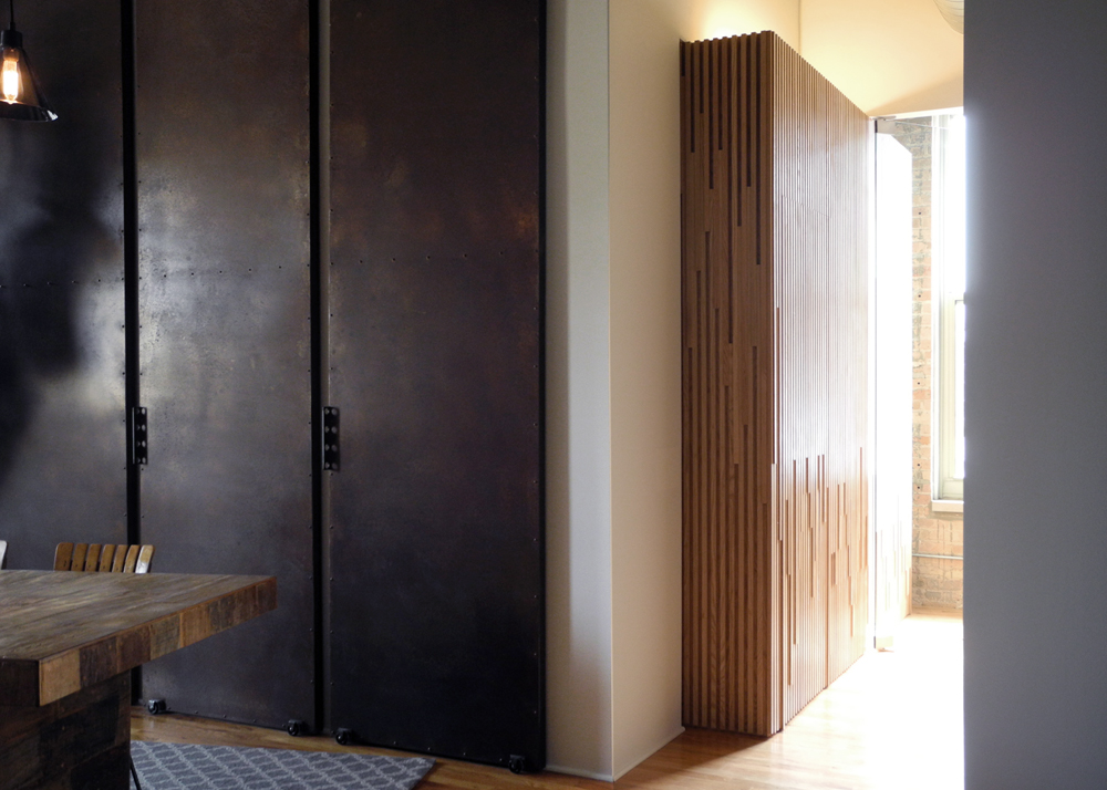
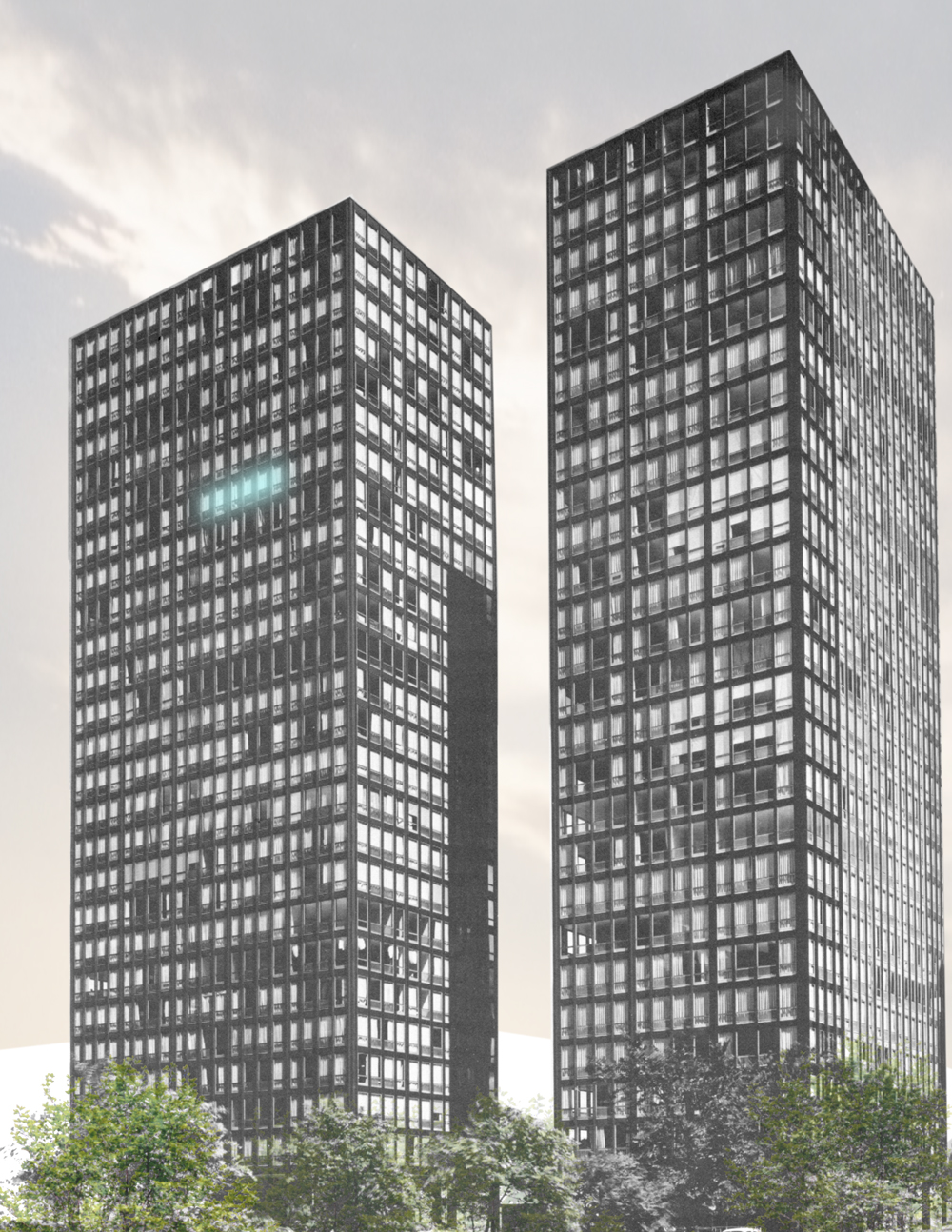
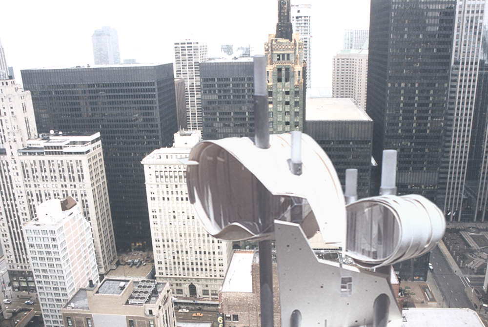
Completed in 1969, the John Hancock building is considered a structural engineering masterpiece. Its soaring, monumental presence in the Chicago skyline has since become synonymous with the city and is arguably the most recognizable residential high-rise building in the world. Yet, the apartments within it and their spatial qualities are seldomly shown or discussed.
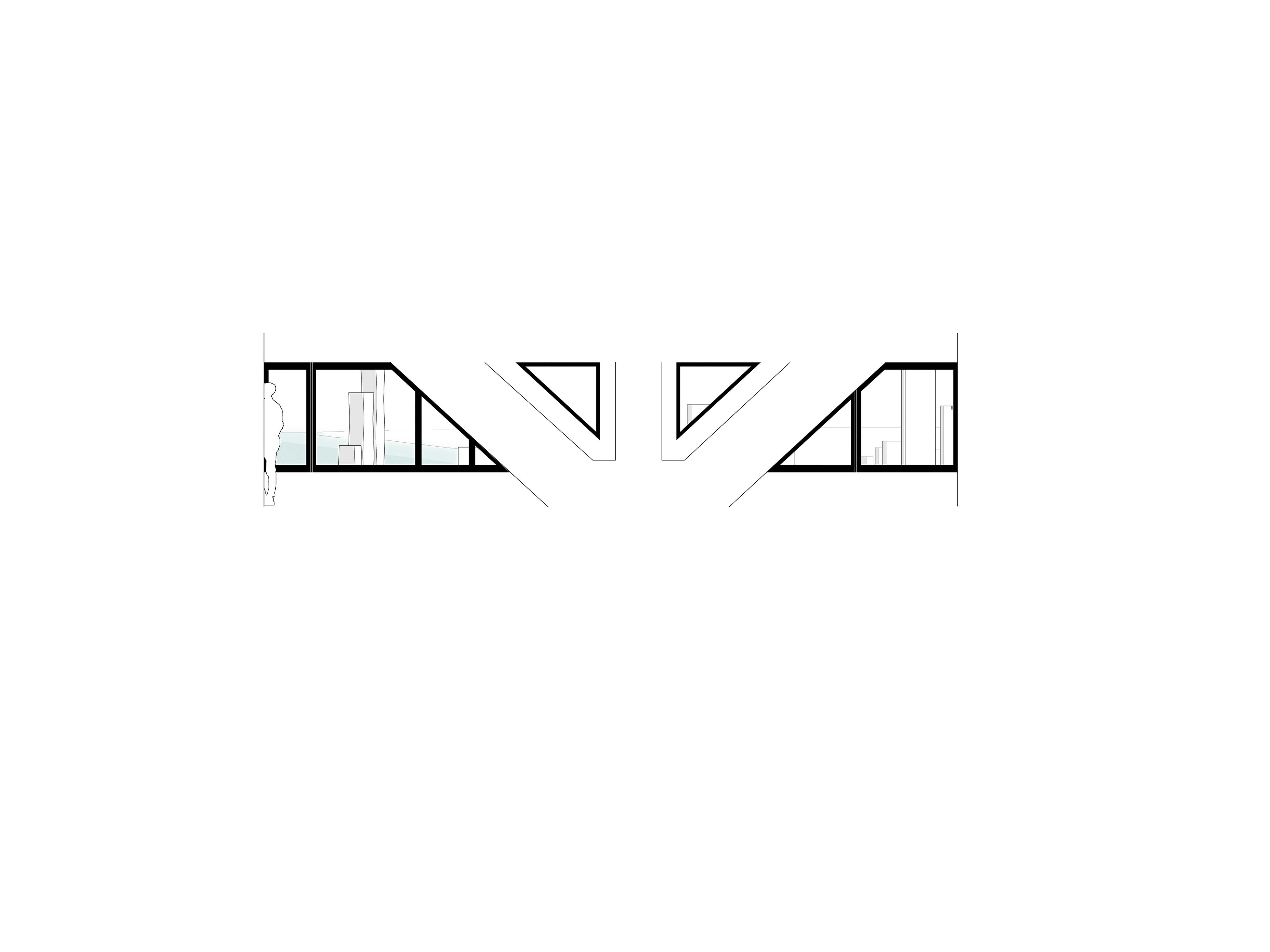
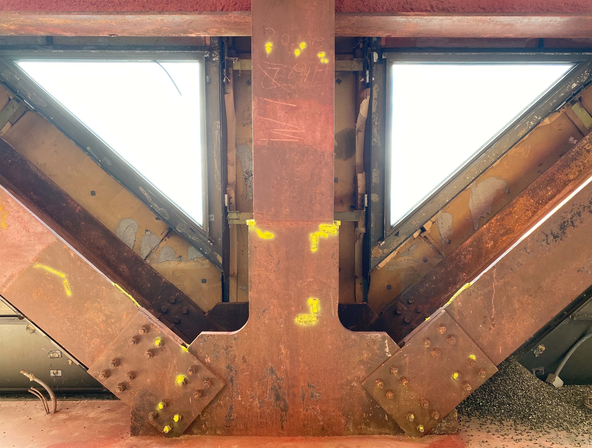
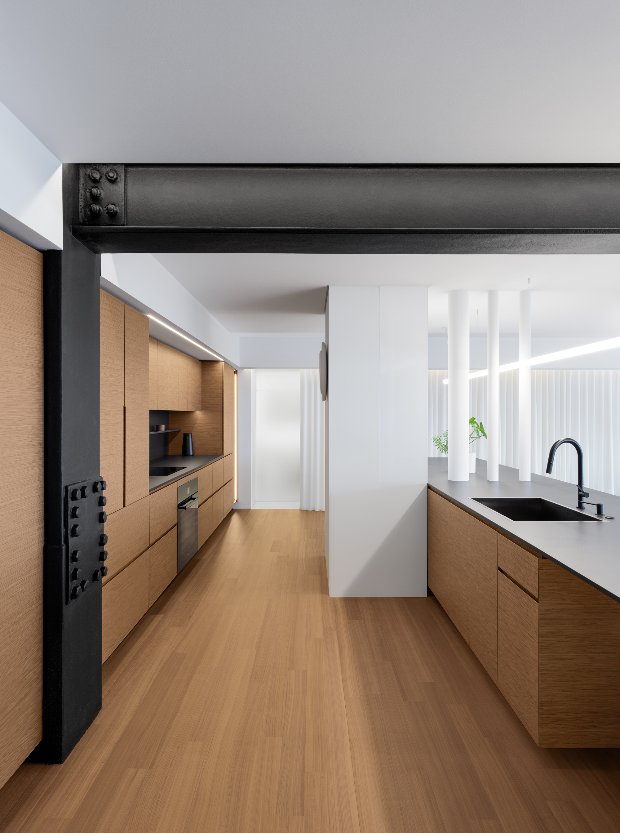
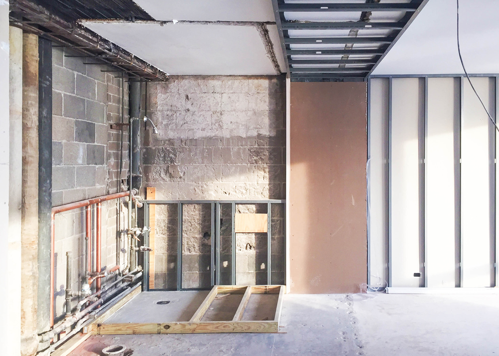
In our first visit to this 84th floor residence, we were surprised with how compartmentalized and dark the unit actually felt. Unless standing directly at the exterior wall, the deep footprint, built out structure, and low ceilings severely limited outside views and natural light. The apartment’s main feature, steel cross-bracing, was concealed beneath a thick layer of fireproofing and drywall, which made the exterior wall appear heavy and less approachable. Fortunately, the two bedrooms on either side of the living areas were far less obstructed and had a much better connection to the skyline.
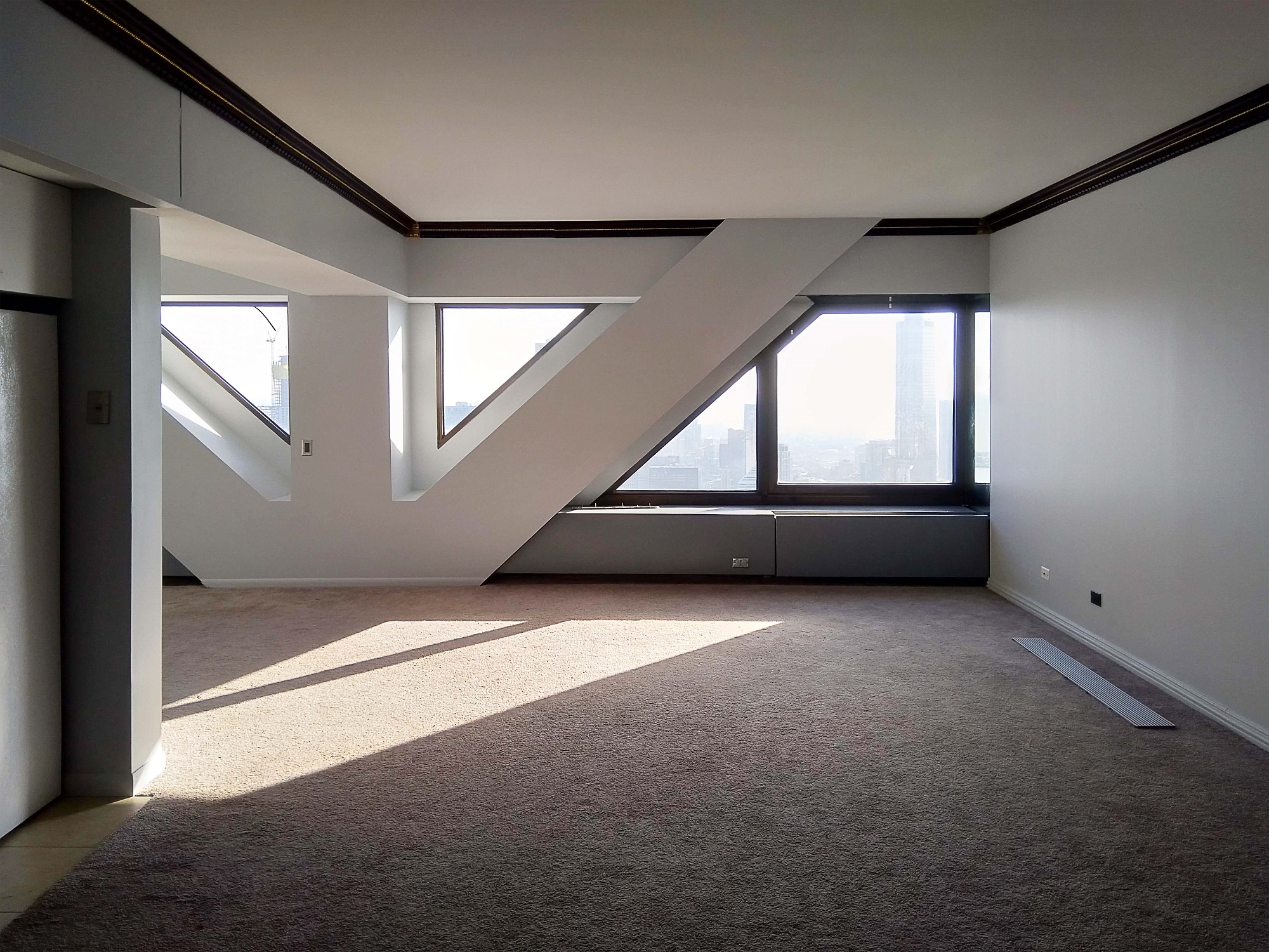
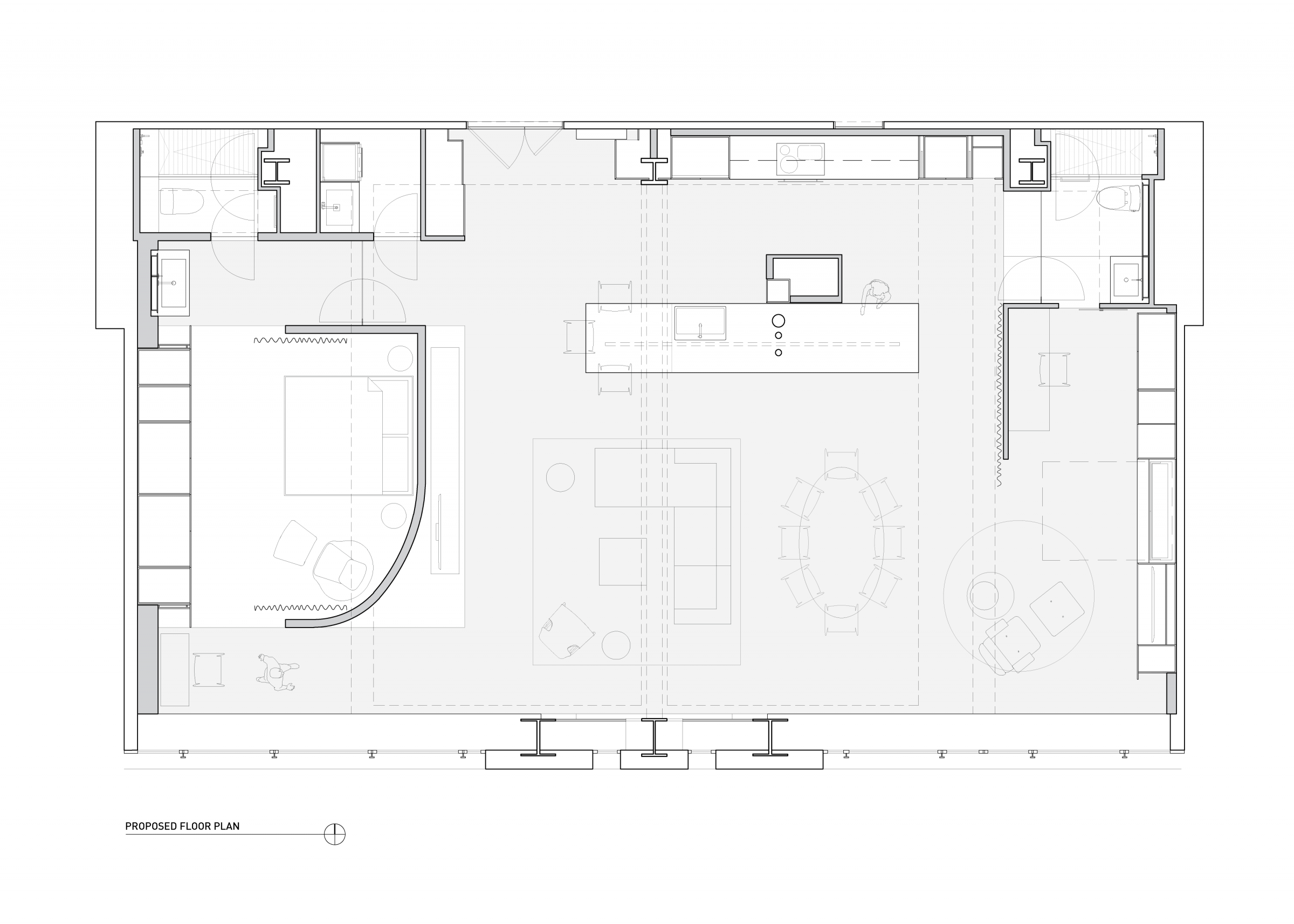
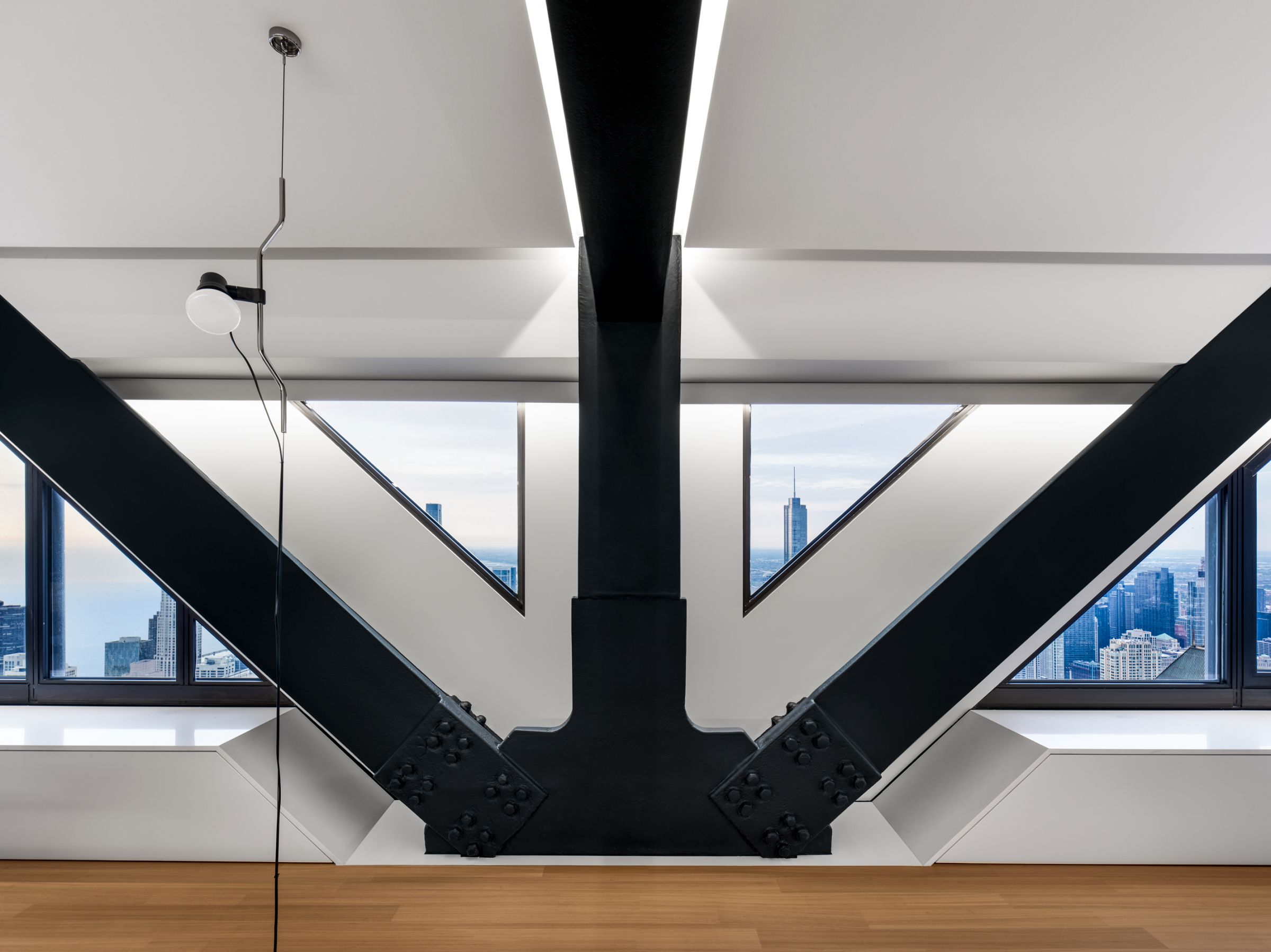
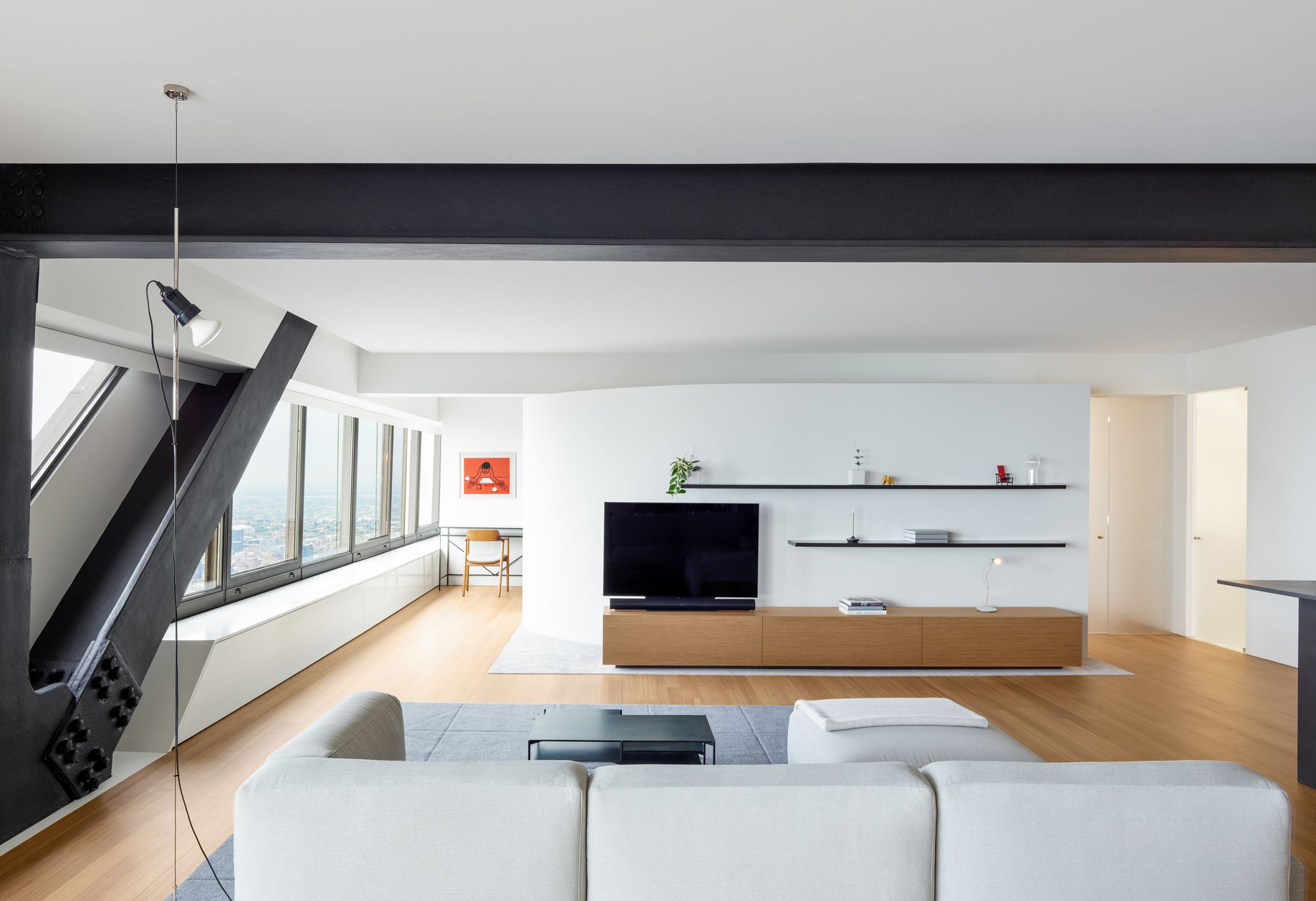
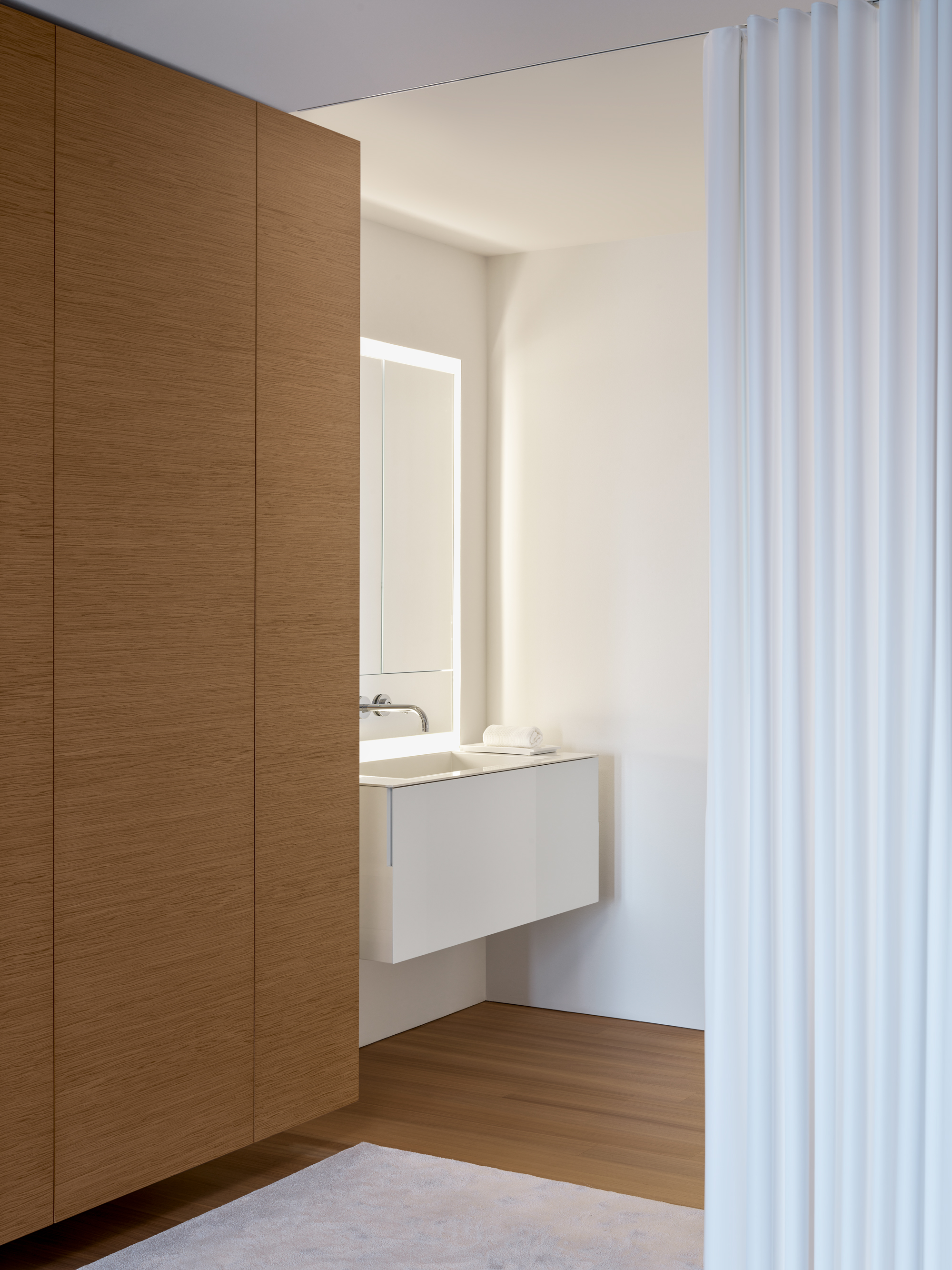
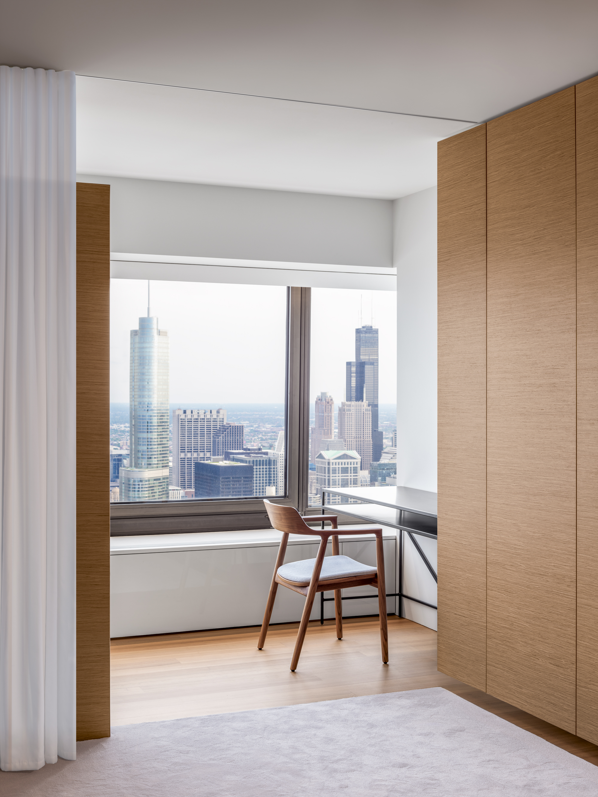
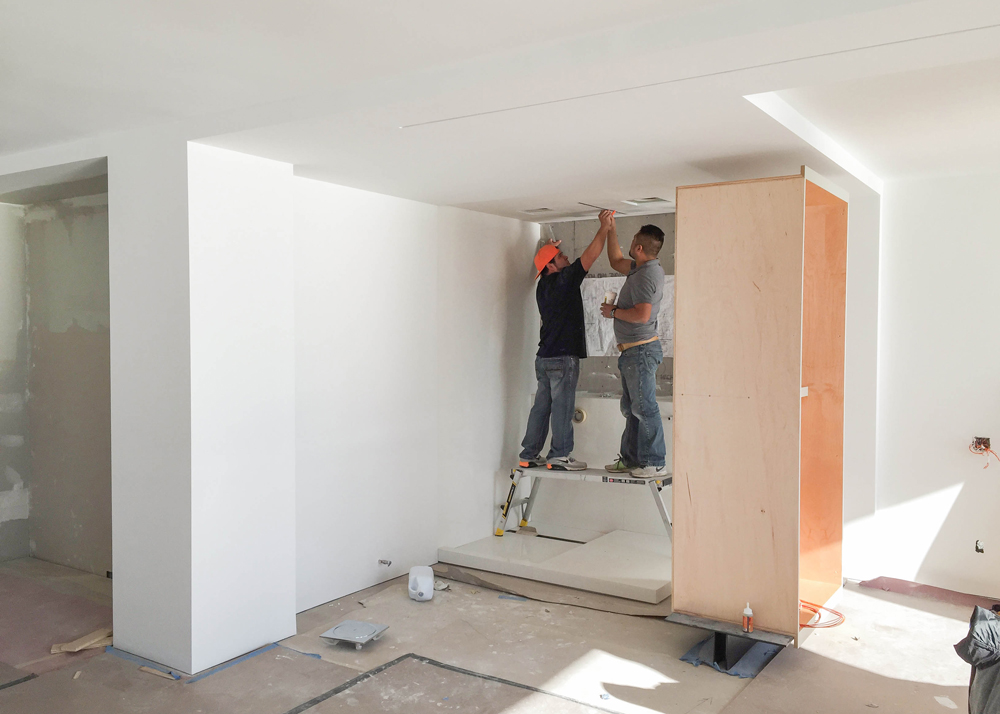
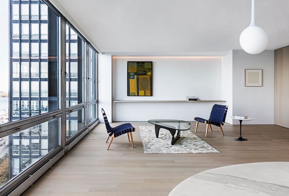
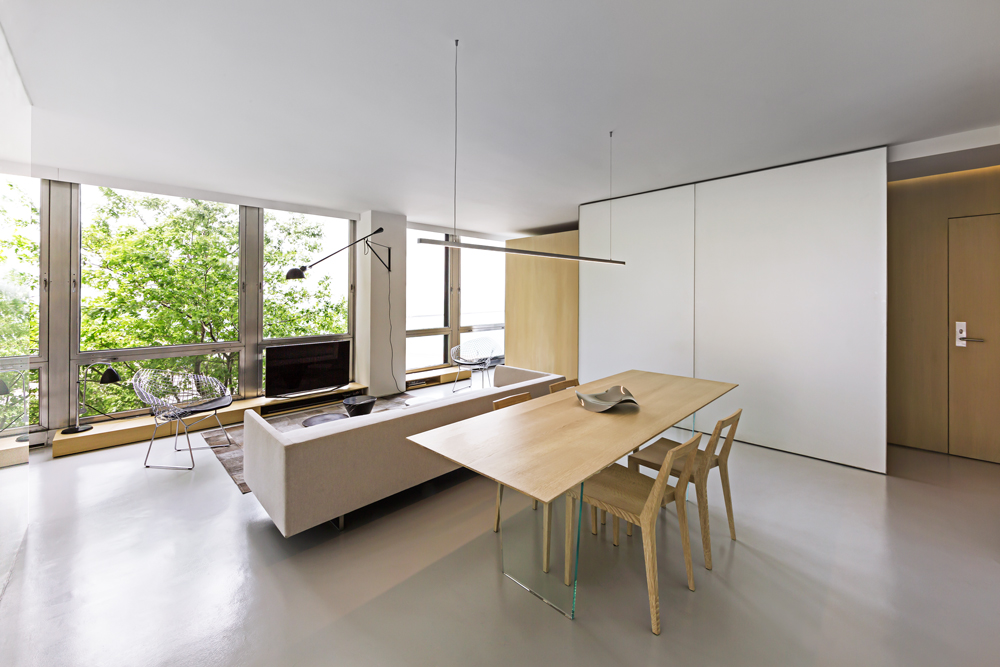
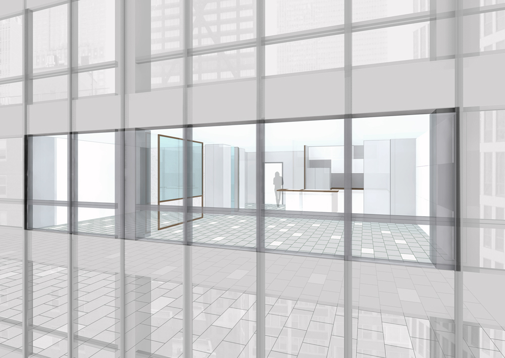
From these observations, our goal was not only to improve daily life in this iconic building, but to amplify the experience of being 1000 feet above ground. To achieve this, we established one continuous aperture across the length of the unit’s footprint, enabling a much more direct connection to the city and dynamic sky. As a result, all the room partitions were pulled away from the exterior and oriented outwards, unobstructed by walls or doors. The primary bedroom is now cocooned behind a curved wall, a formal strategy that opens the viewing angle from deeper sections of the apartment. The existing kitchen is entirely re-configured, seamlessly integrating the shared plumbing stacks. This new arrangement establishes a direct visual dialogue with the living space, as well as Chicago’s iconic city scape beyond.
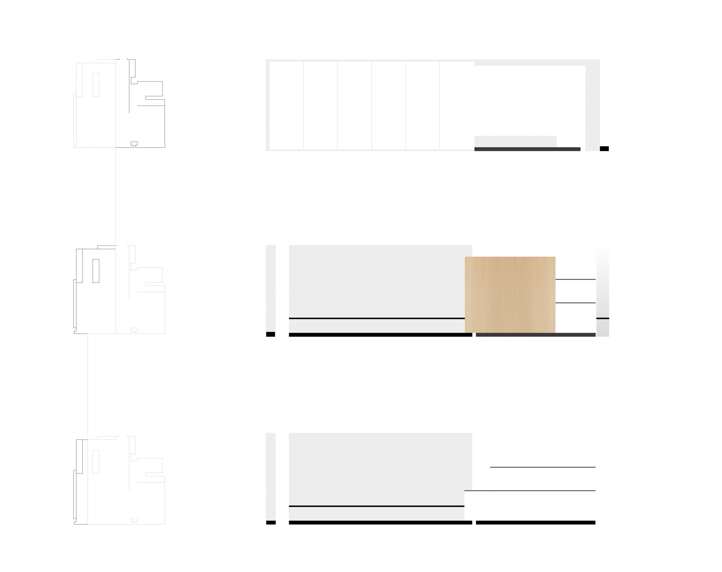
To further develop this relationship, we revealed the diagonal steel members, primary beam, and column. Current fireproofing technology enabled us to remove the old protective layers and free the steel. Now, for the first time since the building was erected, this structure can be seen and touched again. No longer simply structure, the steel bracing is a visual and tactile element that stretches across the living space, bringing the building’s exoskeletal frame inside.
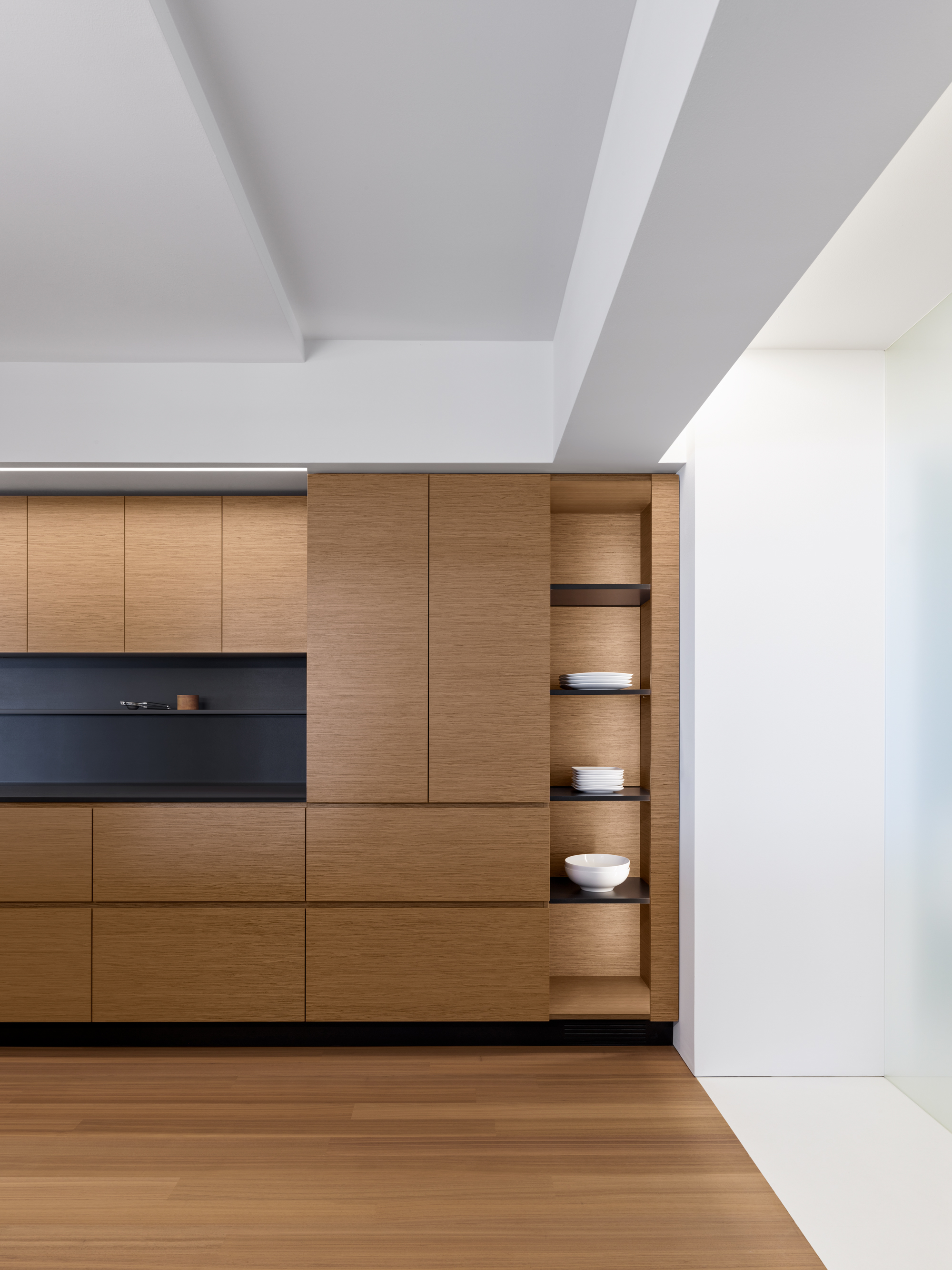
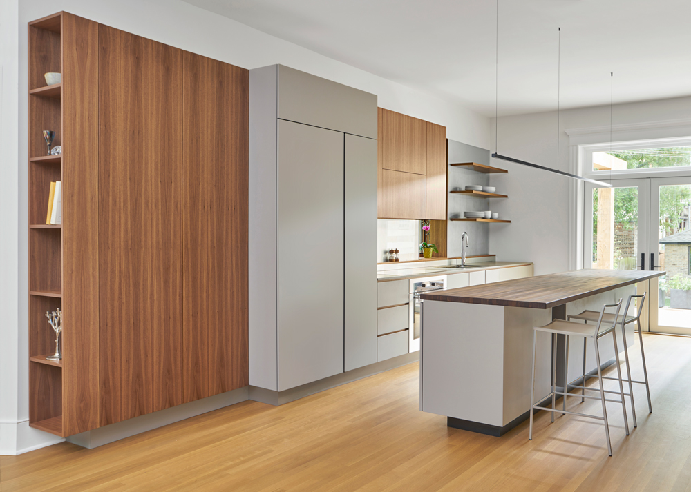
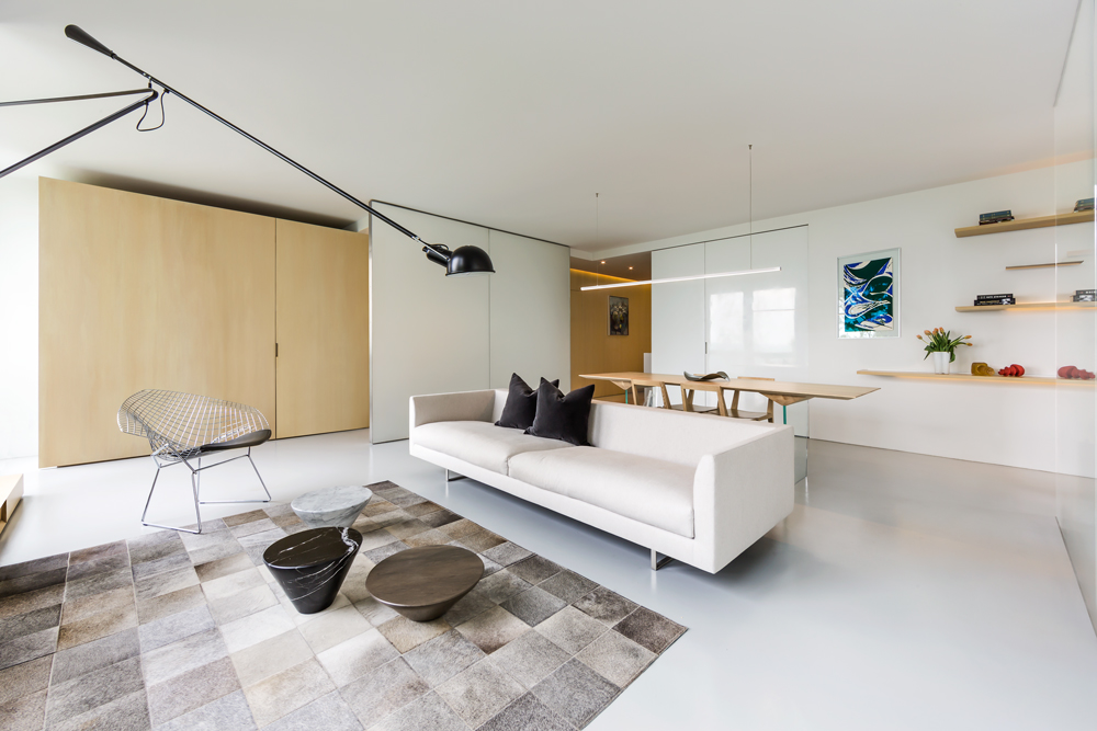
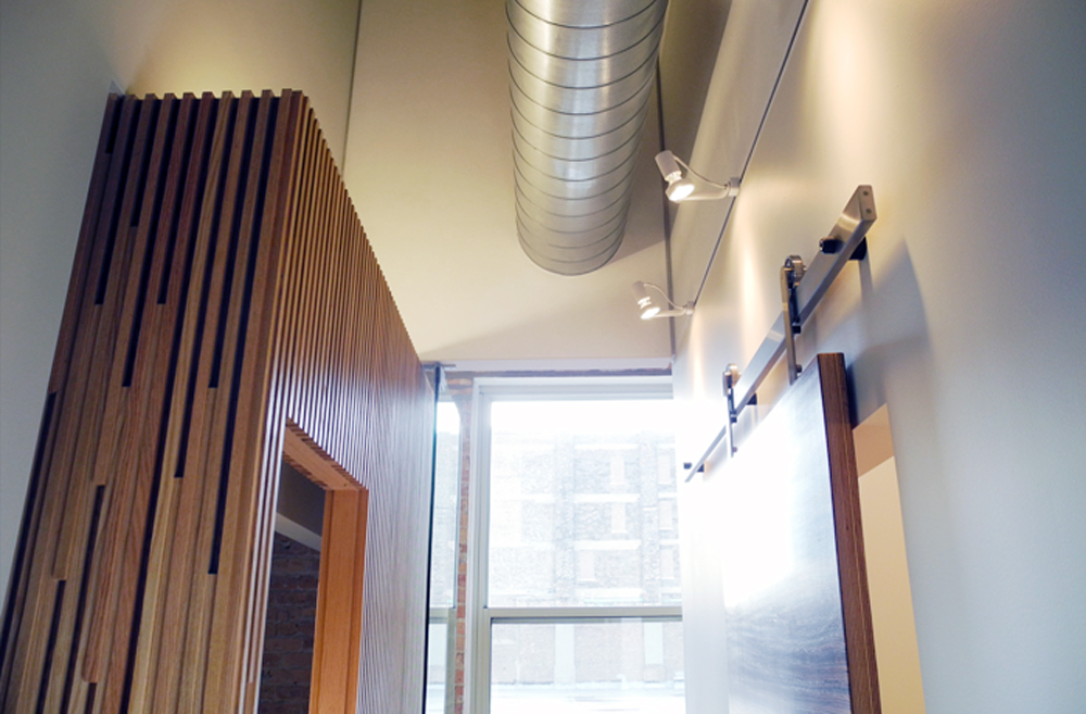
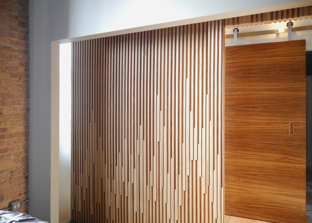
The remaining three perimeter walls of the apartment are visually unified using horizontally-oriented walnut paneling. The floating millwork cabinets contain most of the unit’s storage and a hidden pull-out bed that can form a second bedroom. A fabric room divider softens the interior as a theatric backdrop, while offering privacy as needed.
The selection of finishes and time period furniture pieces bring the unit harmoniously together, complementing the exposed heavy steel. This combination of elements attempts to create a link with the building’s identity of High Modernism, while adding a new perspective for our clients living inside this timeless masterpiece.
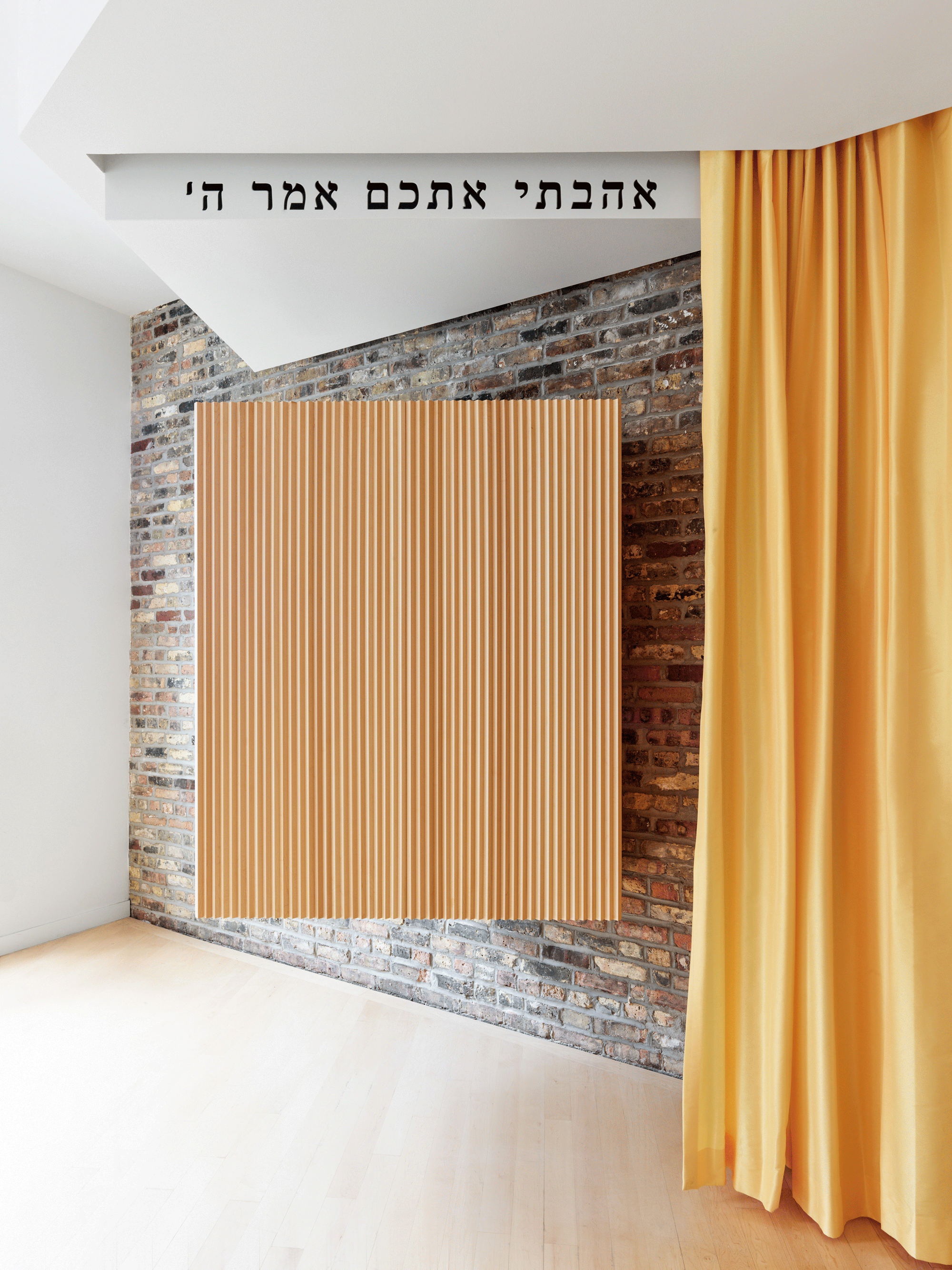
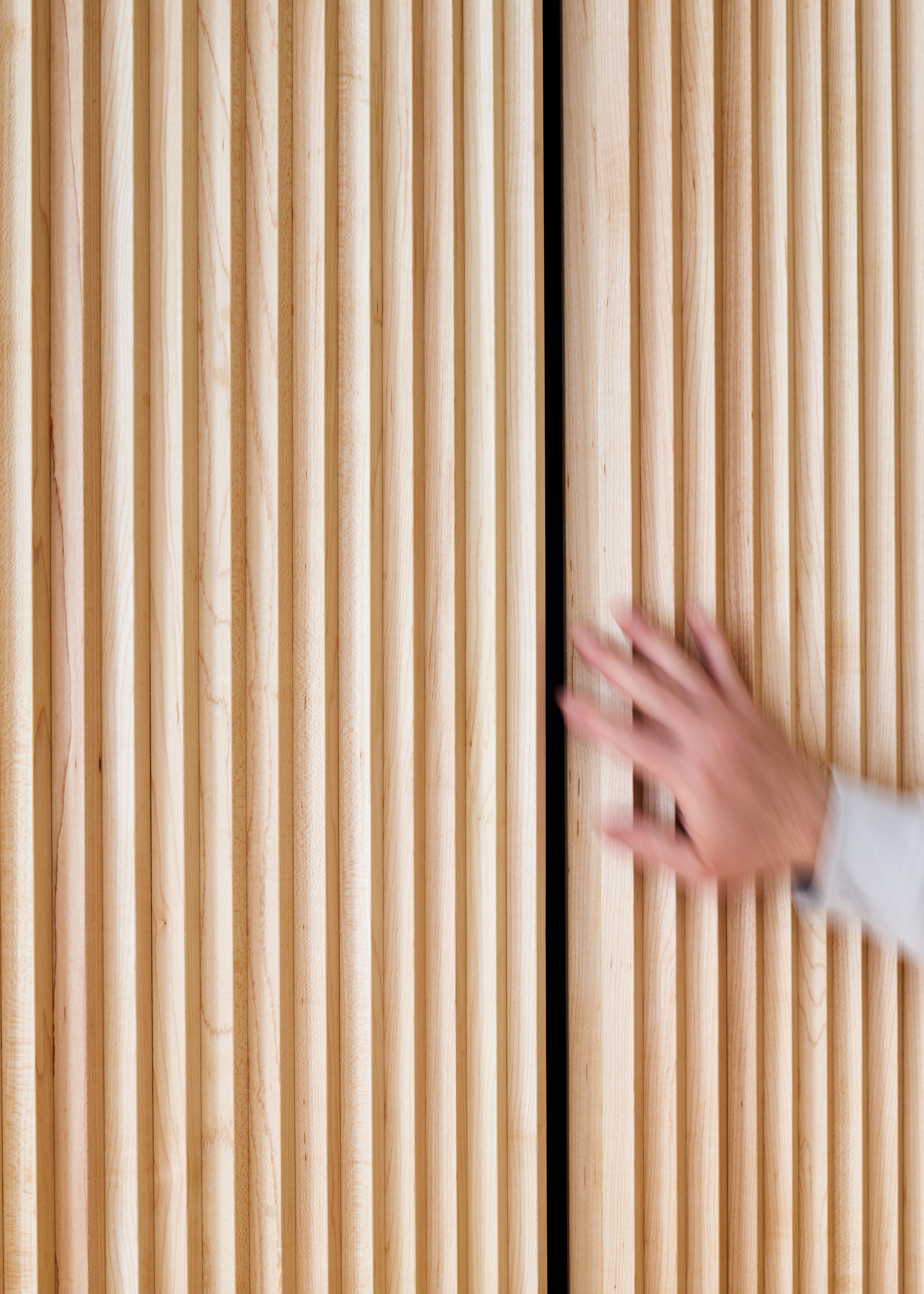
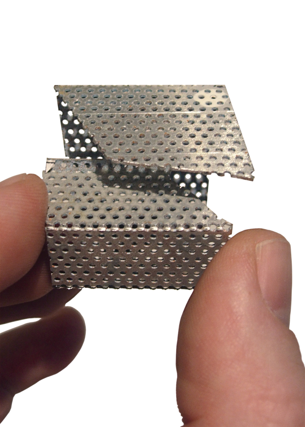
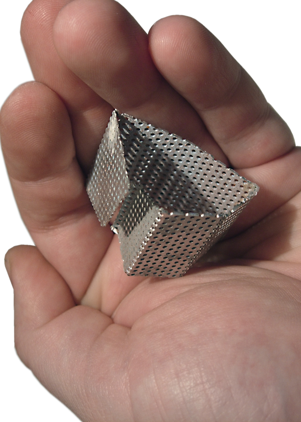
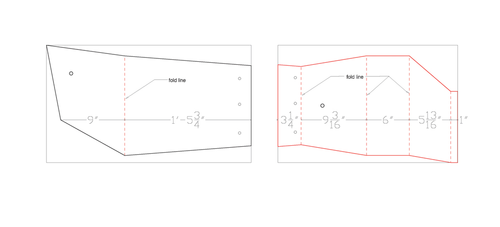
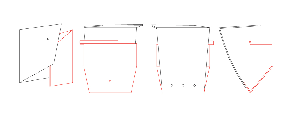
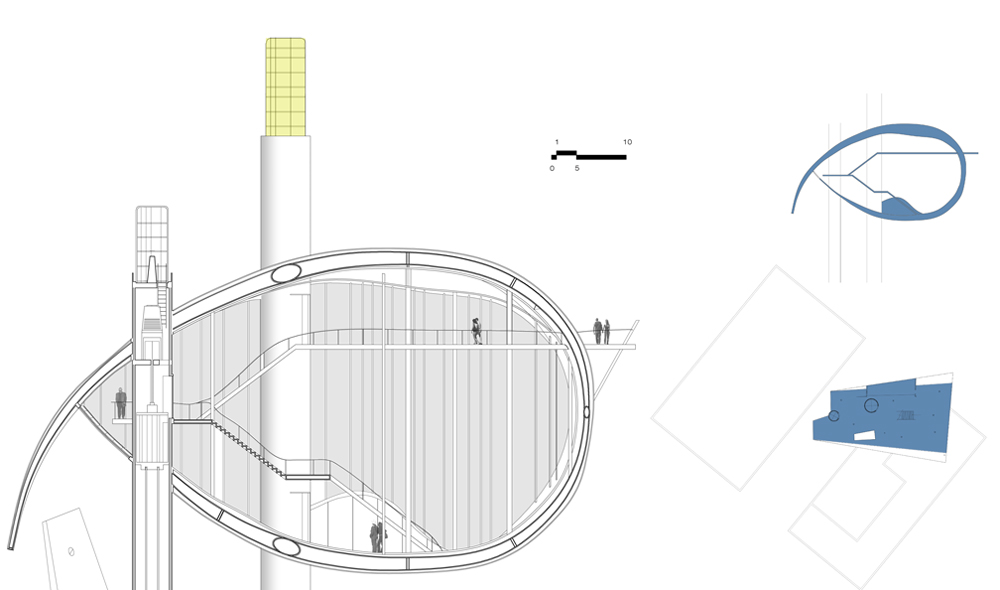
The Ark is a sacred storage object which contains the Torah scrolls, and it is found in all Jewish houses of worship. During the prayer services, the worshipers interact with this object, opening and closing its doors, removing the scrolls and reading from the Torah. The appearance and size of the Arks vary, and in most cases, it is meant to be the centerpiece inside the prayer room. For this Torah Ark design we were after an illusion, to have this sacred object appear to levitate in space, a focal point that somehow defies gravity. Its outer surface is articulated using the borrowed geometry in the Star of David. The triangulation of the maple slats integrates and hides all the seams, adding to the mystery in how one interacts with this Ark. Its tactile surface and the unique operation adds to the overall experience of this religious ceremony of opening and closing the Torah Ark’s doors.
This project represents our ongoing inquiry into visual lightness and continuity. In this renovation we explored juxtaposition, introducing a new spatial dialogue within the perceptive weight of a historic building.
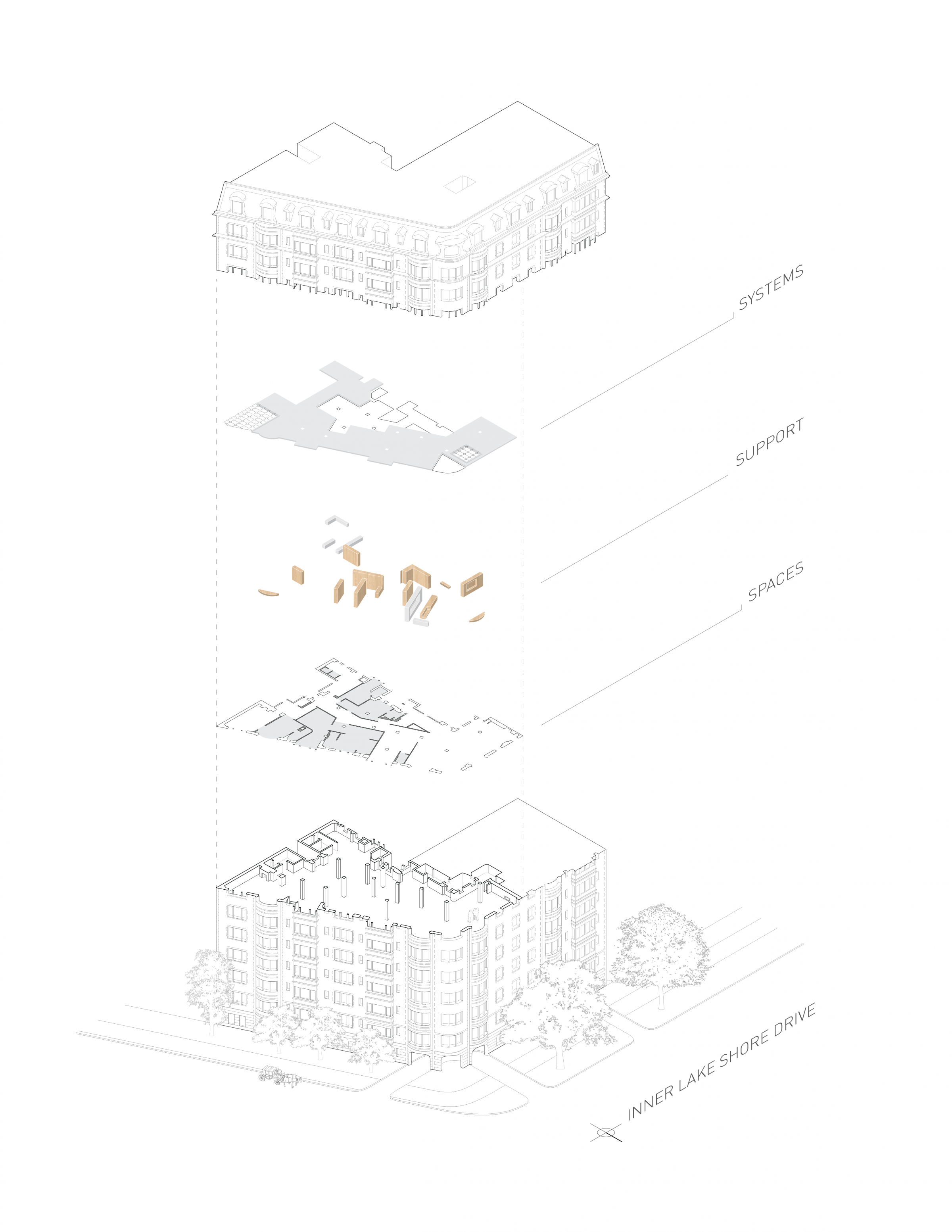
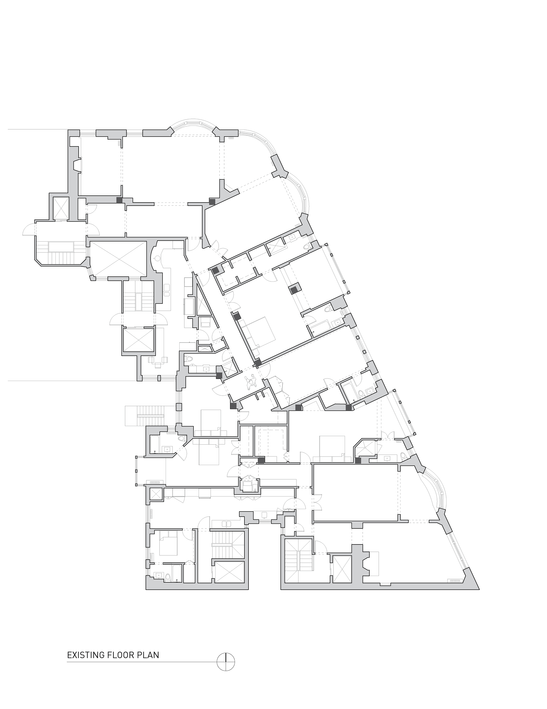
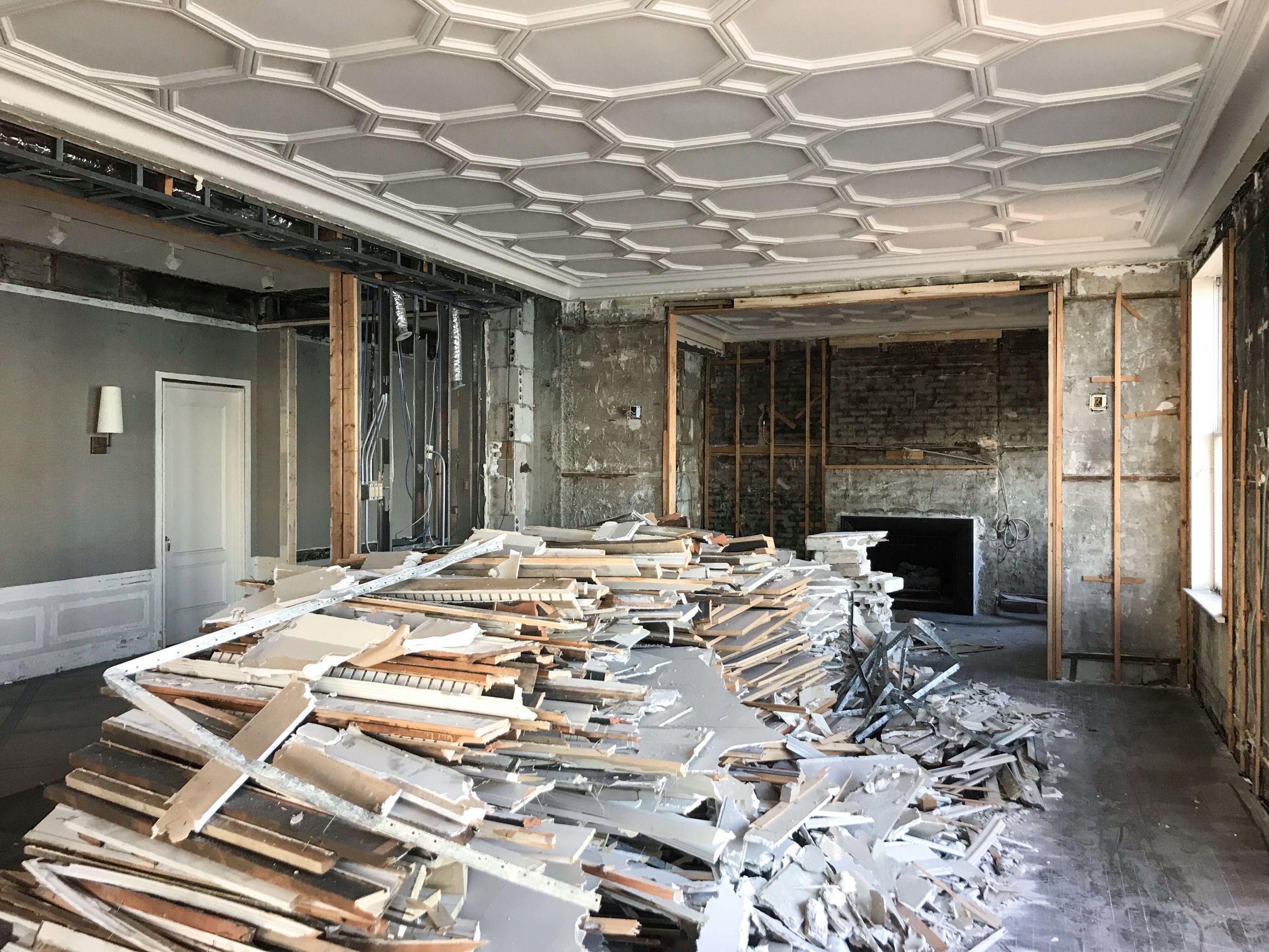
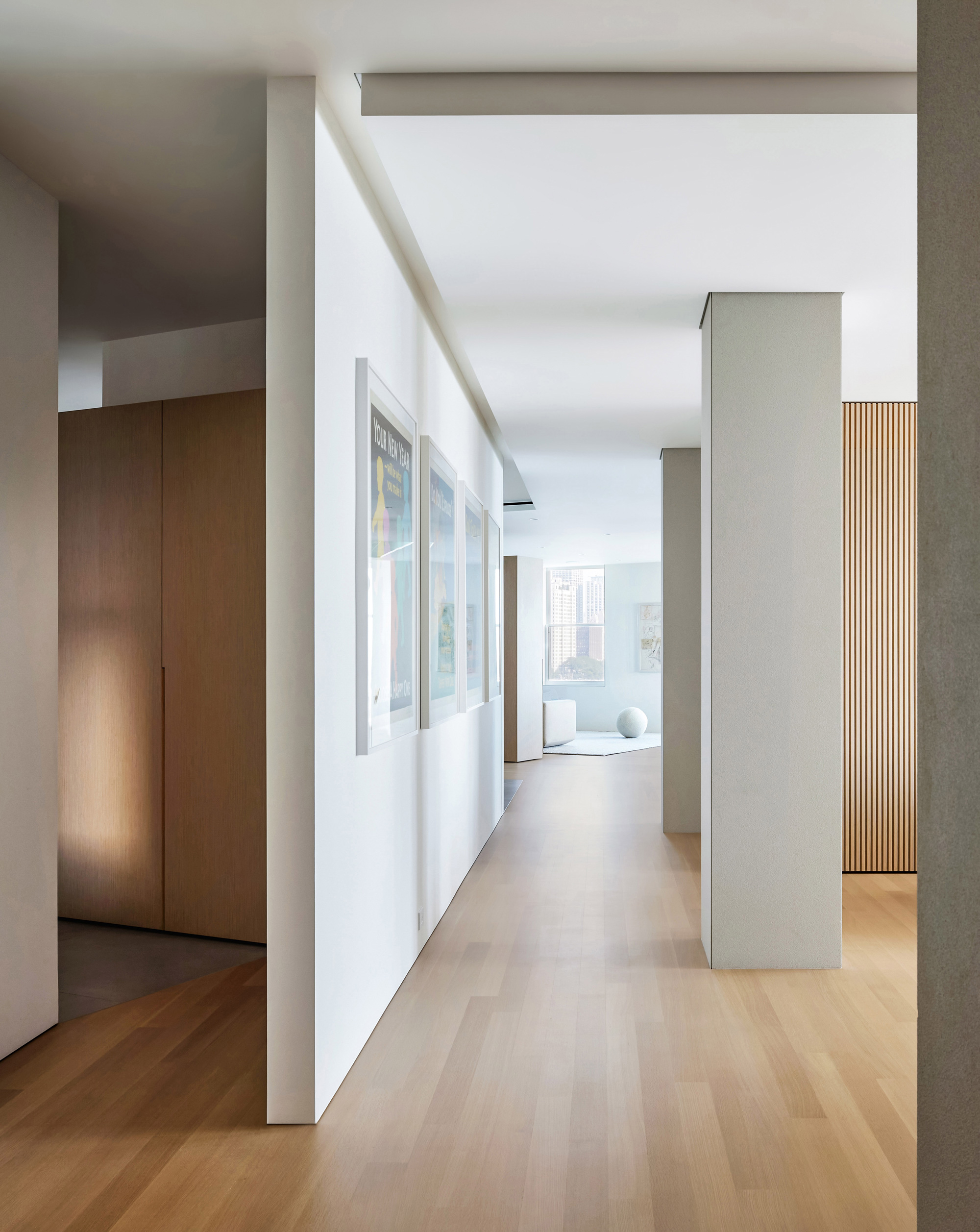
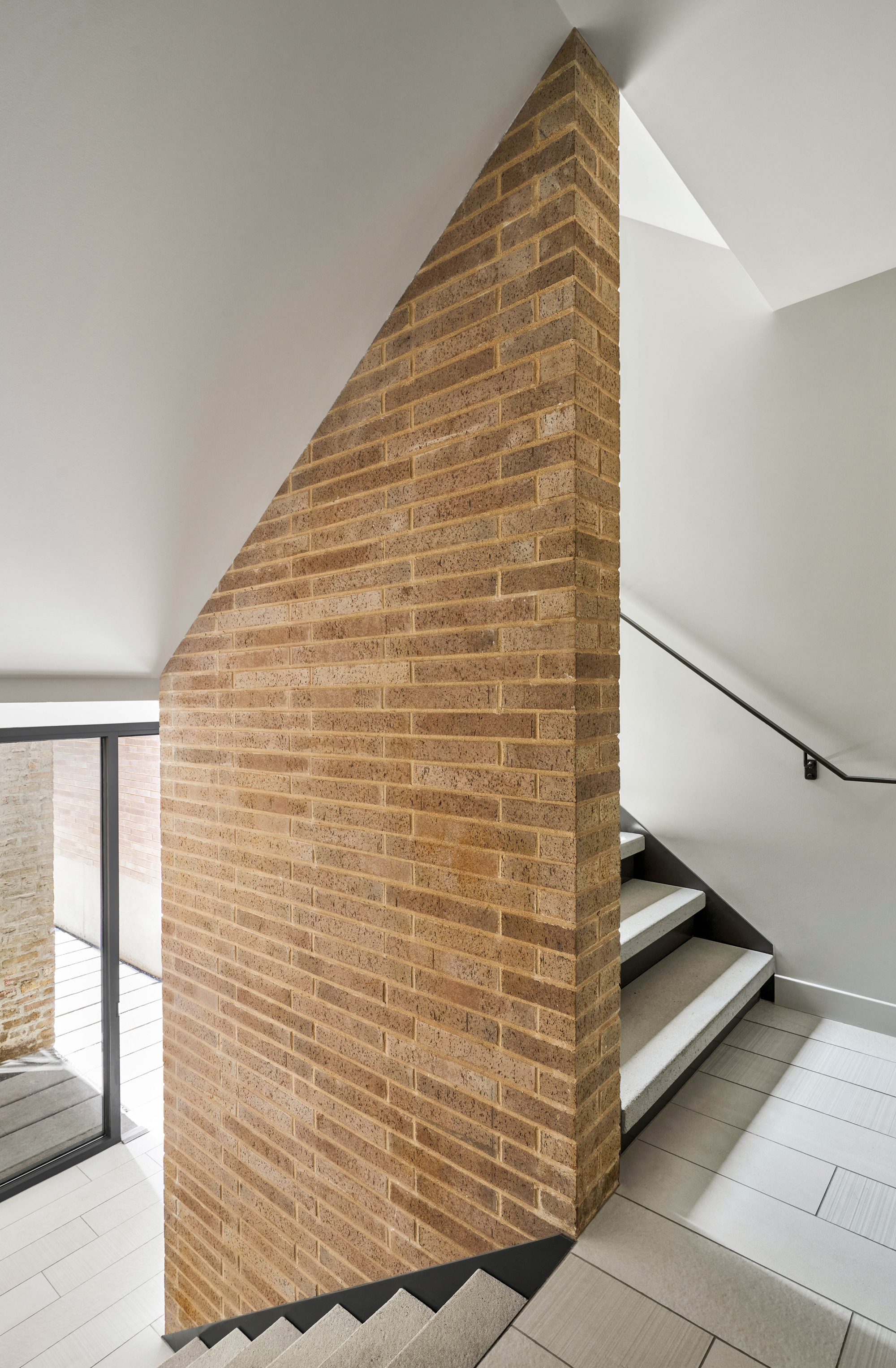
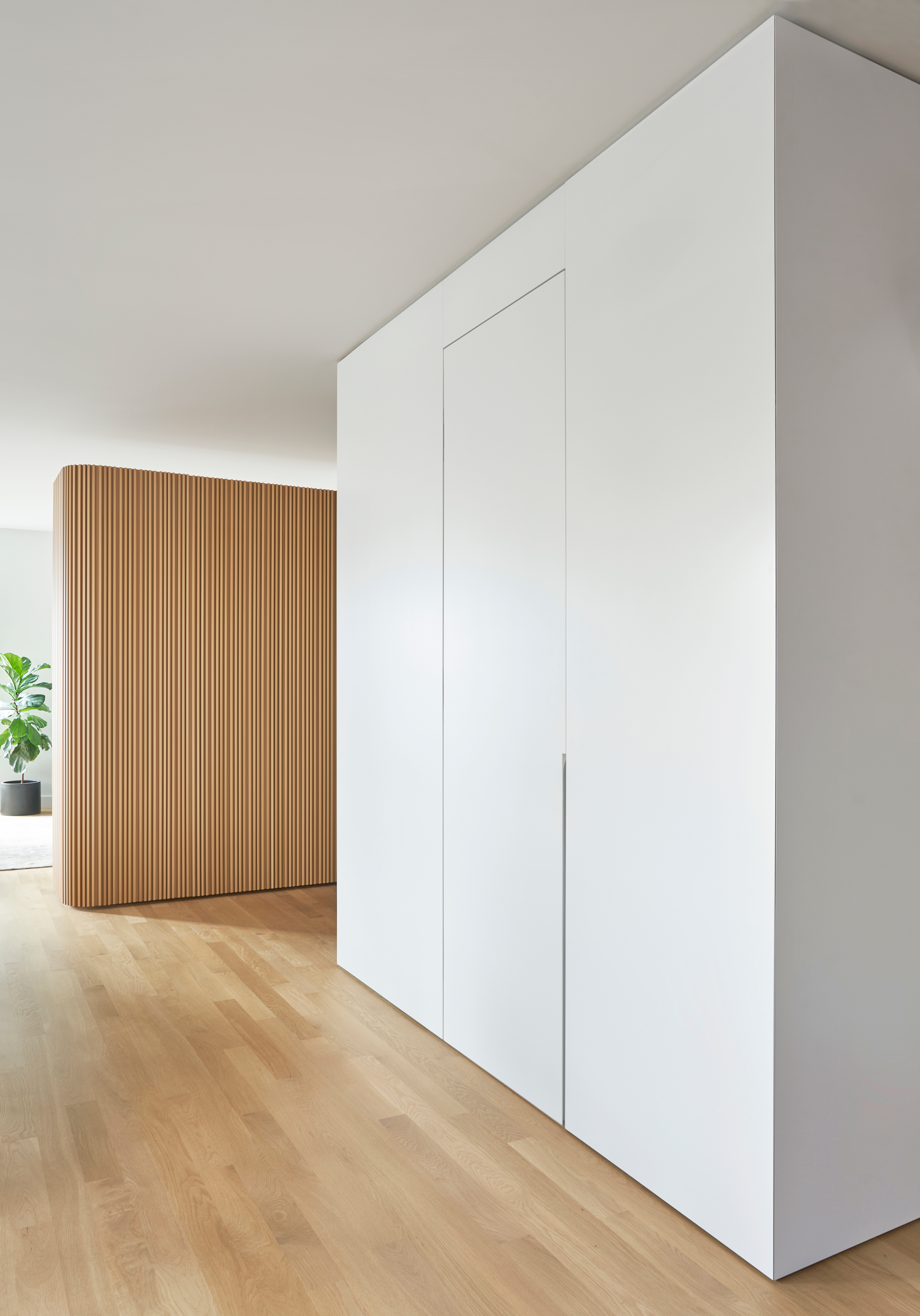
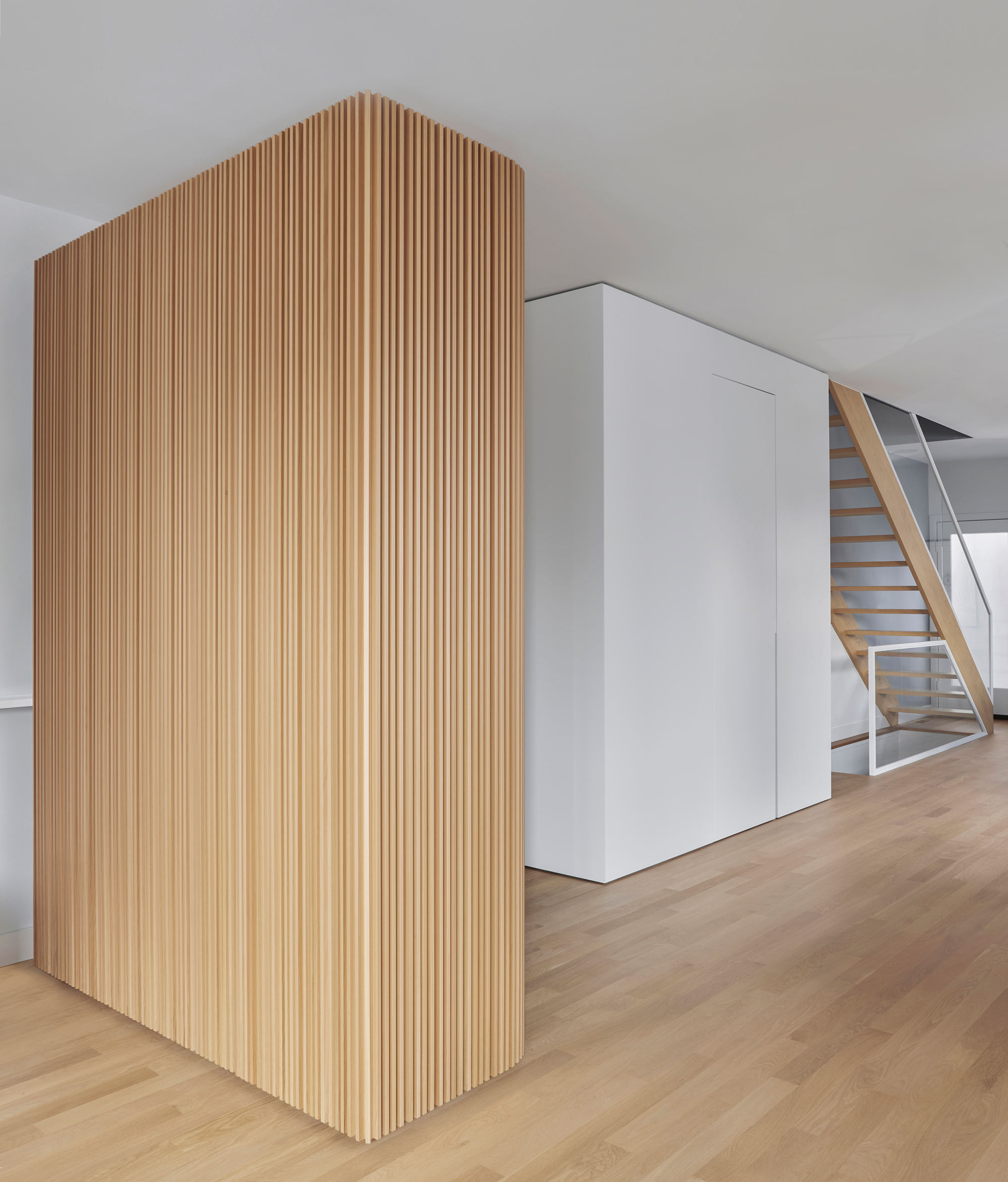
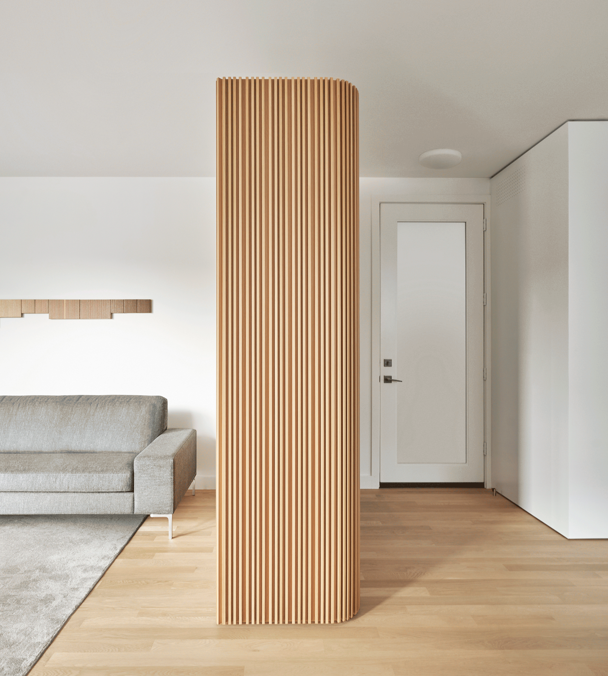
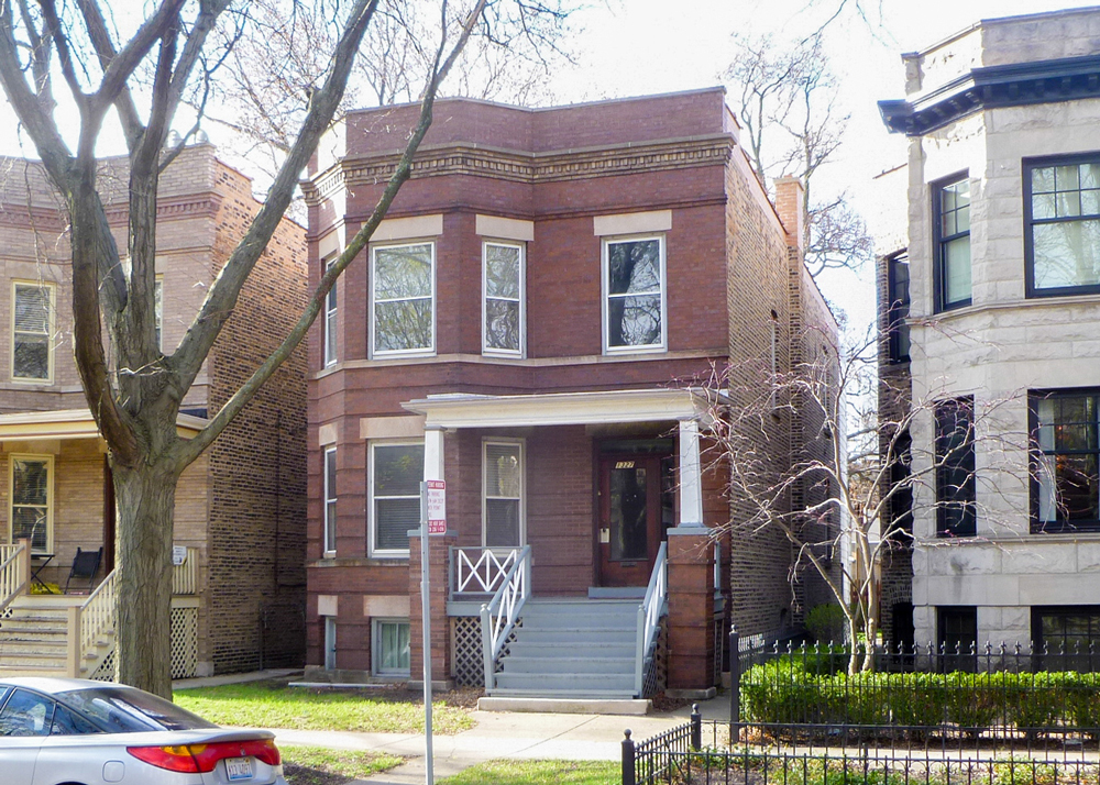
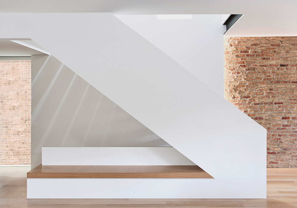
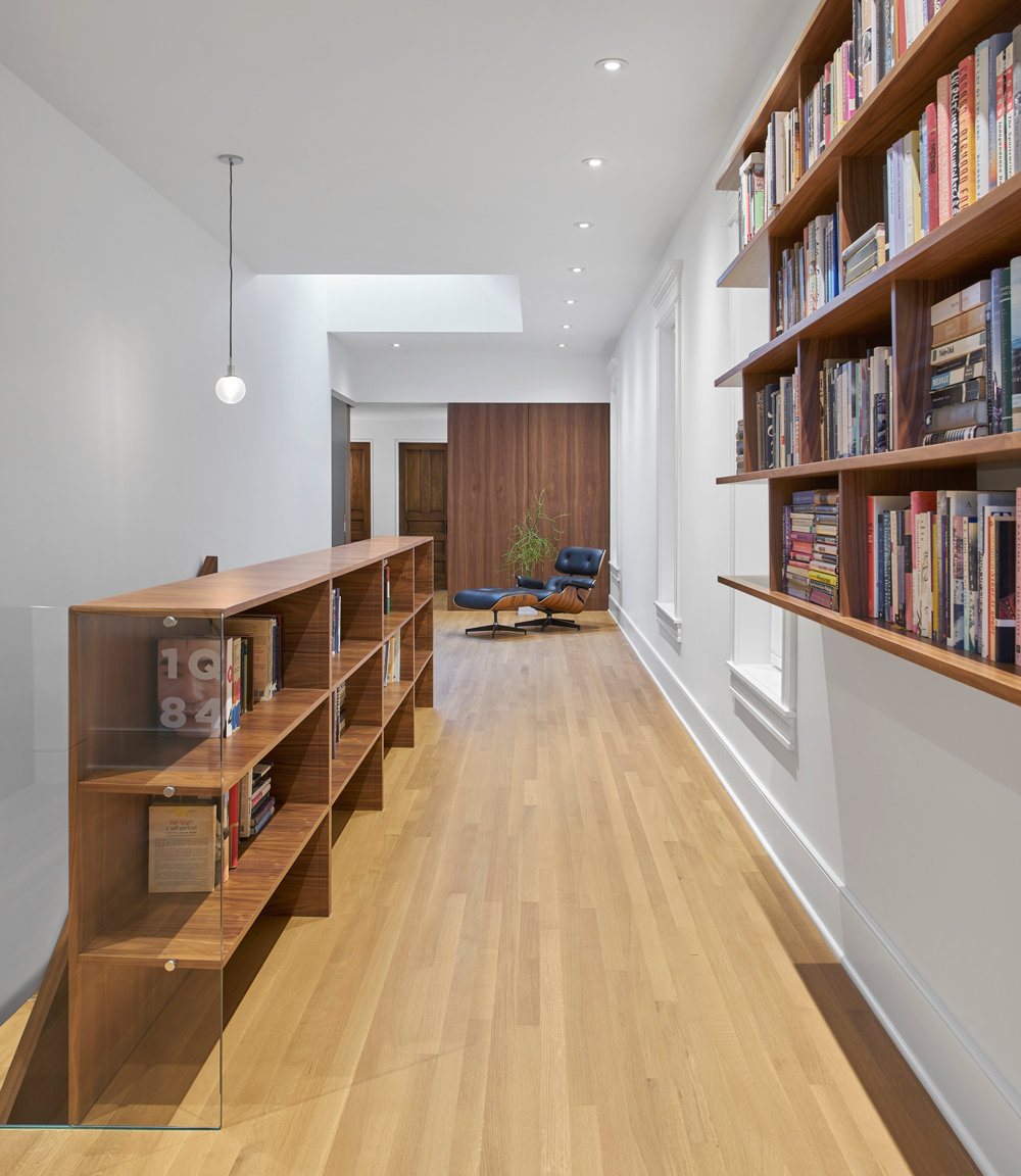
Erected in 1912, this 10-story landmark structure is one of the oldest multi-family buildings in Chicago. Originally built with 3 distinct units per floor, each uniquely shaped due to its location along the bend of Lake-Shore-Drive. In contrast to today’s lifestyle, these apartments were designed in a time of compartmentalized living, with servants and social formalities in place, resulting in a divided interior with little connection to the outside.
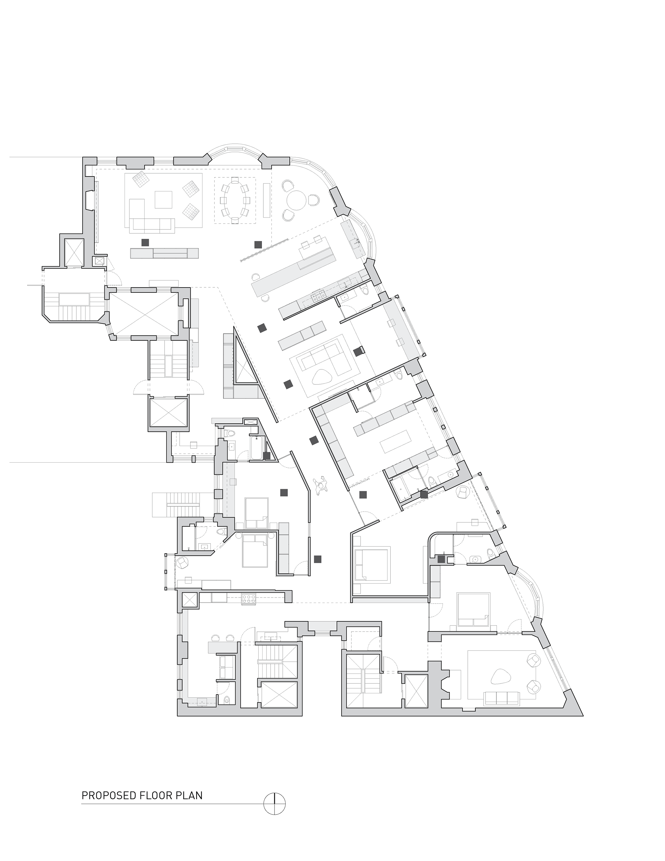
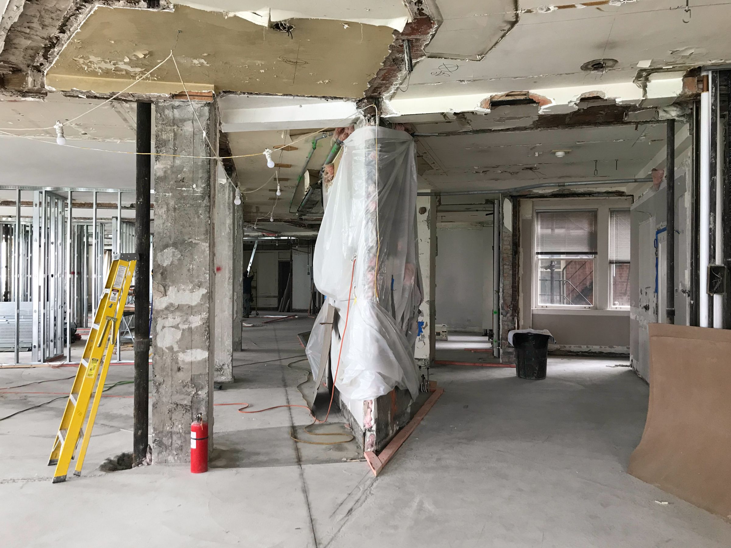
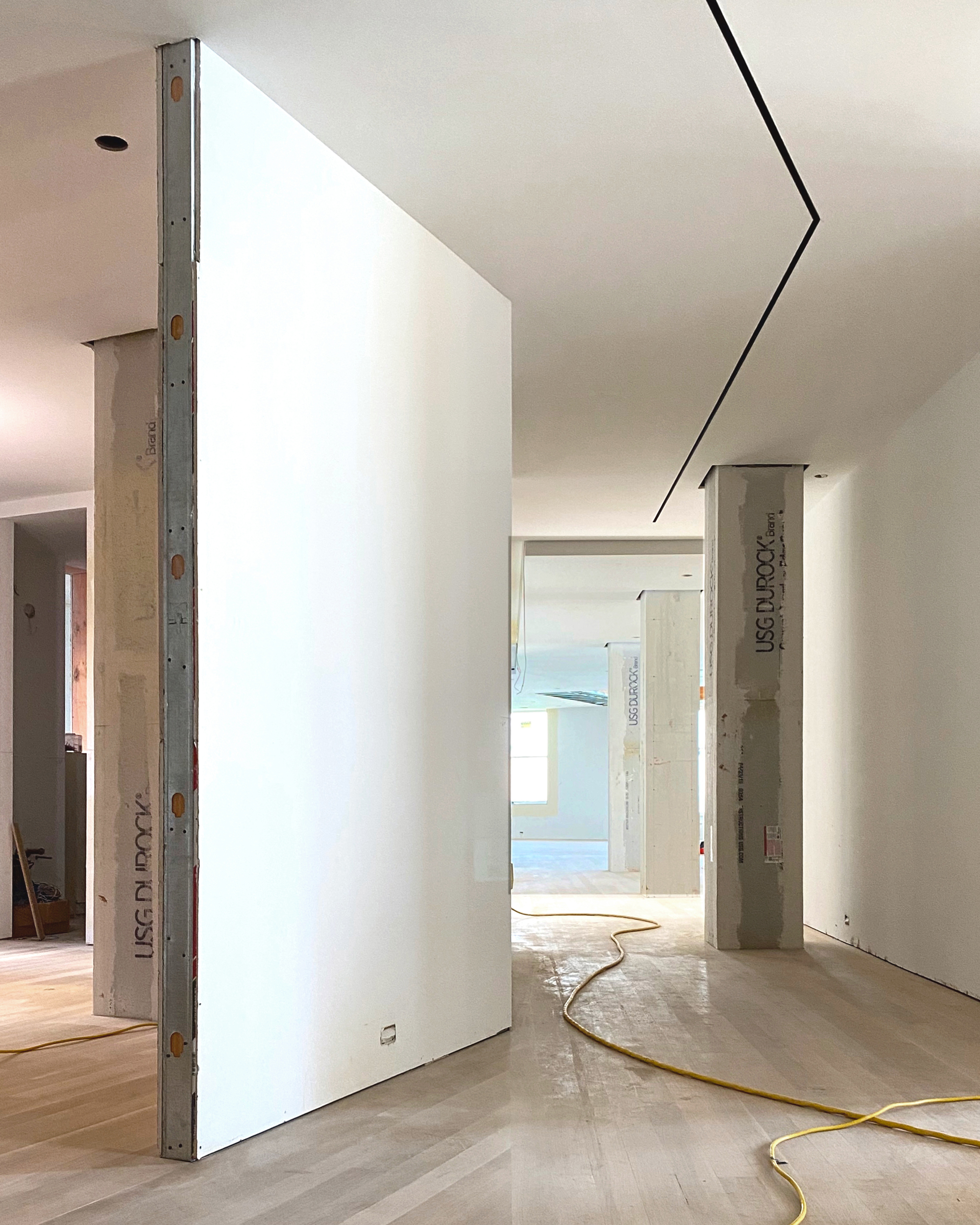
In our preliminary walk-through we experienced the weight of the period, characterized by thick ornate walls, narrow corridors, and maze-like configuration. Seeking to live in a brighter and much more open space, our clients tasked us to combine two large apartments as their new home. We responded by stripping the spaces down to core building elements, revealing the perimeter and structure. Newly liberated columns became the catalyst for organizing the entire dwelling, marching through the interior and bringing two distinct apartments together as one cohesive whole.
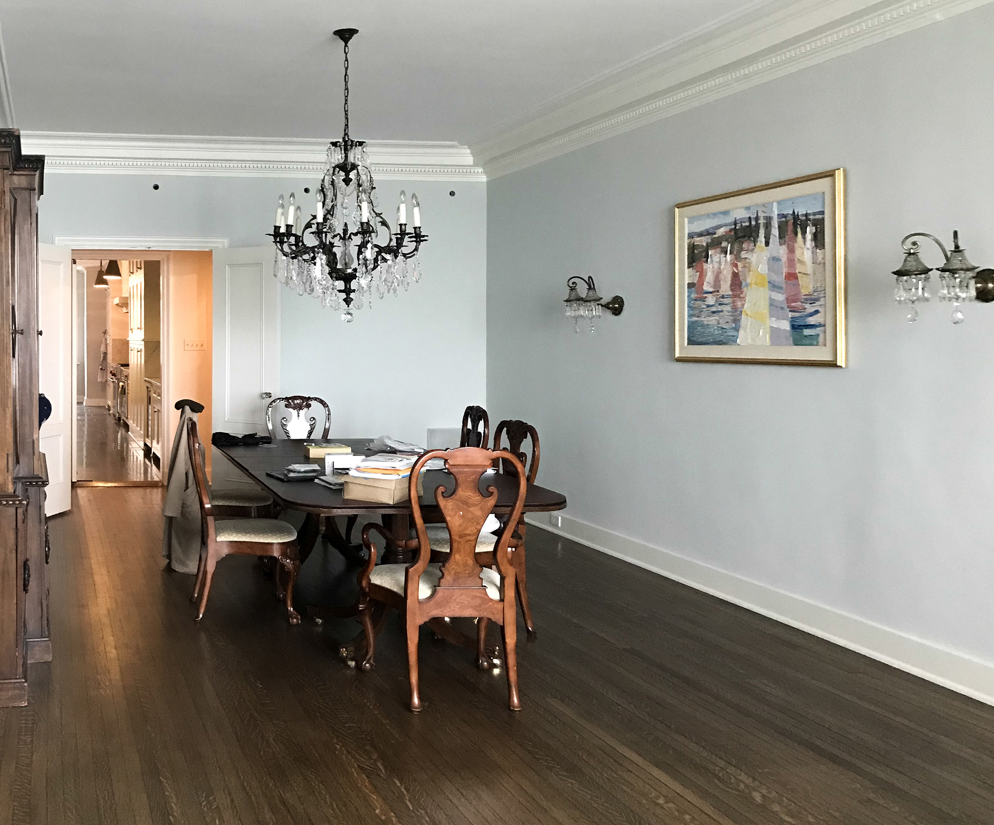
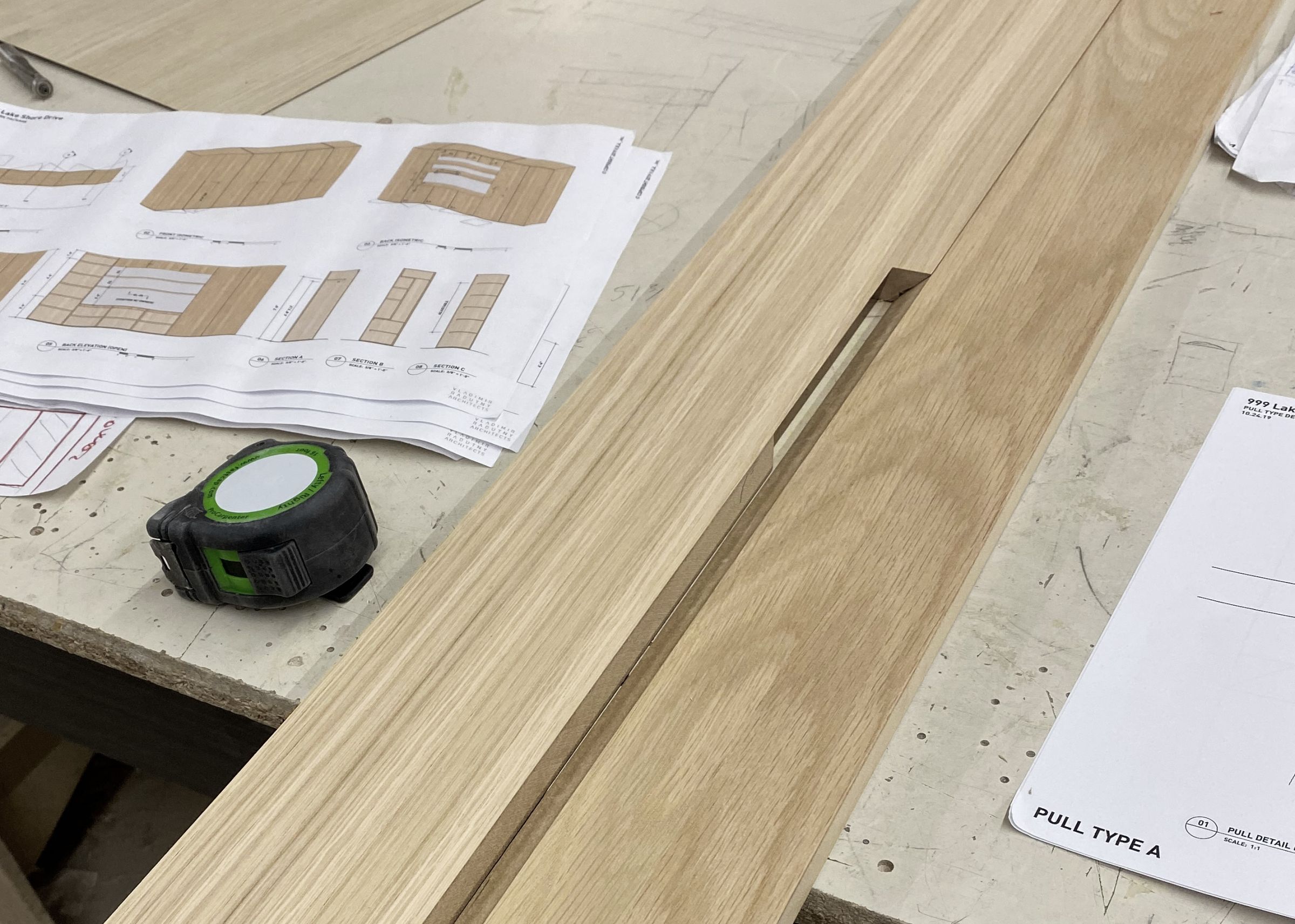
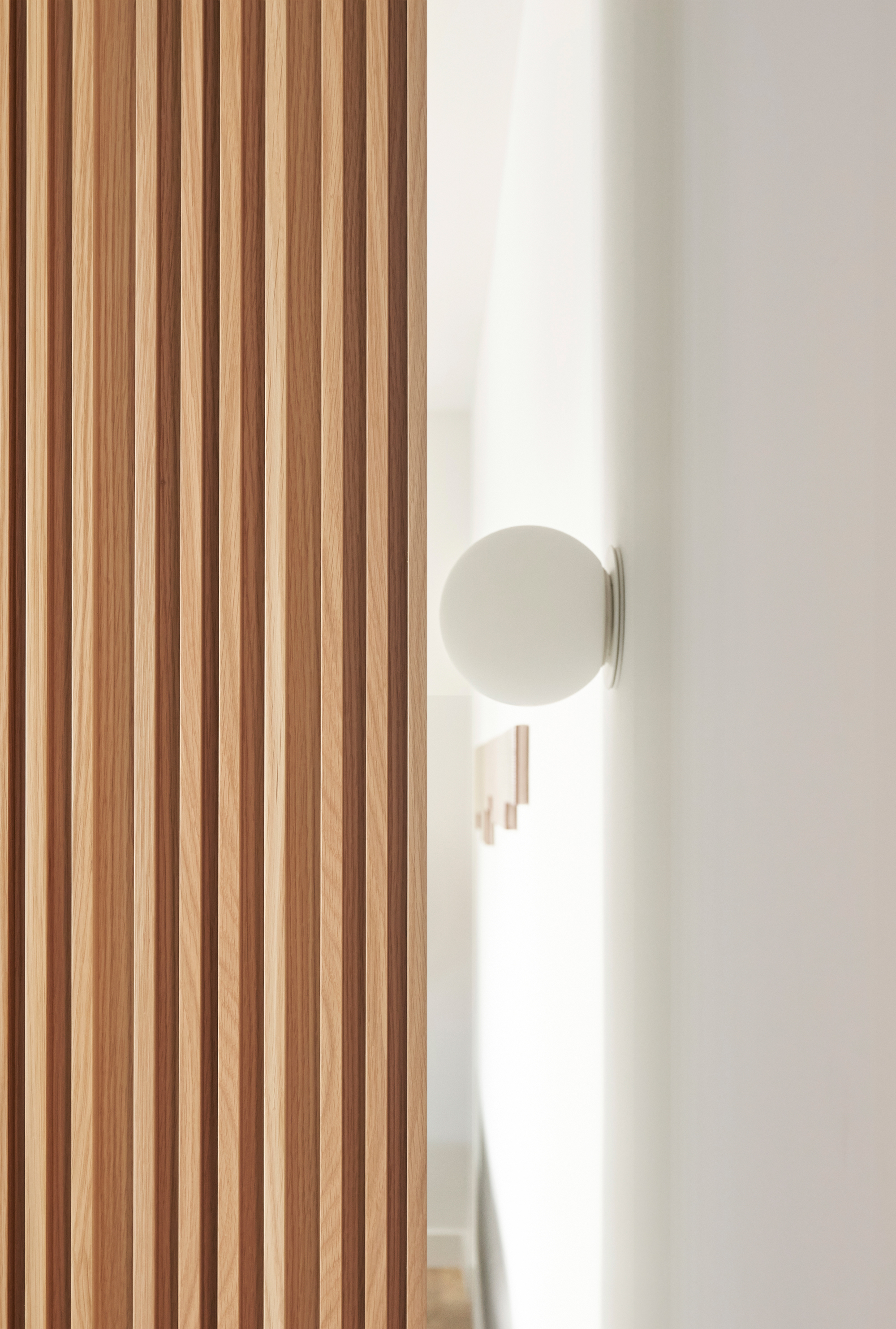
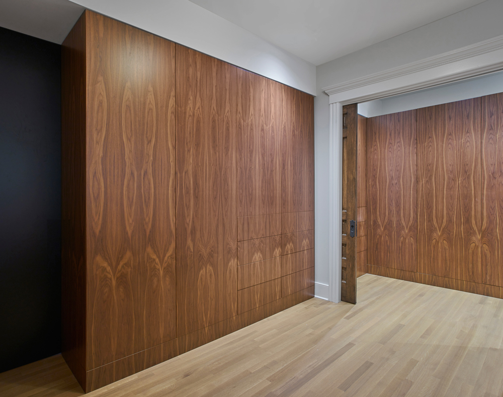
The geometry and scale of the building’s footprint presented opportunities to articulate new walls, ceilings and material transitions in unexpected ways. White oak cabinetry meanders throughout the apartment, gracefully interacting with the columns, ceilings, and floors. Thin steel frames with obscured glass transmit light from both the east and the west into a central circulation that connects sleeping and living. This connector serves as a gallery space where the walls guide the occupants and act as blank canvas for an ongoing collection of personal objects and art.
The kitchen was relocated at an intersection of primary living zones. From this area one can perceive the juxtaposition of key design elements choreographing open spaces and views. This is the only place within the apartment where one can experience the mood of Lake Michigan from north to south as well as views of the city to the west.
By sensibly stitching the past with a “lighter” design logic, we crafted a comfortable home, adding a new chapter to an ongoing story…
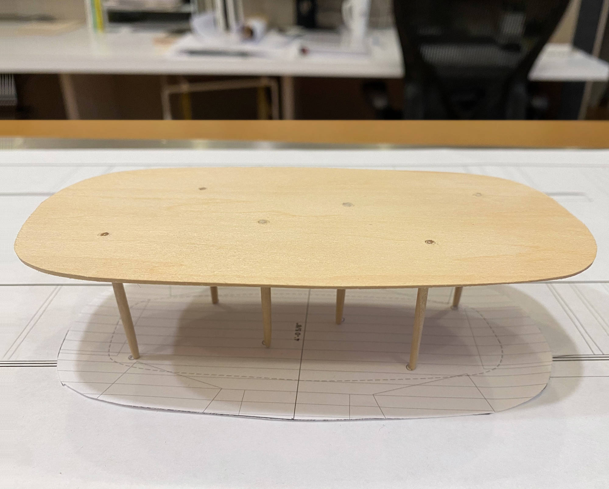
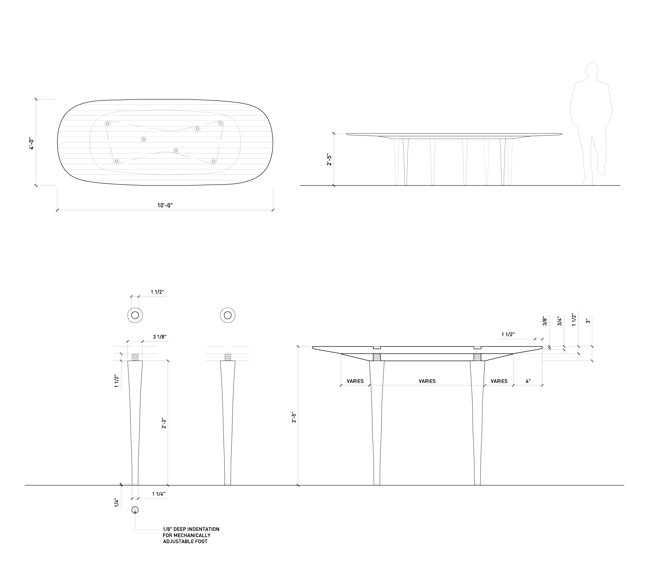
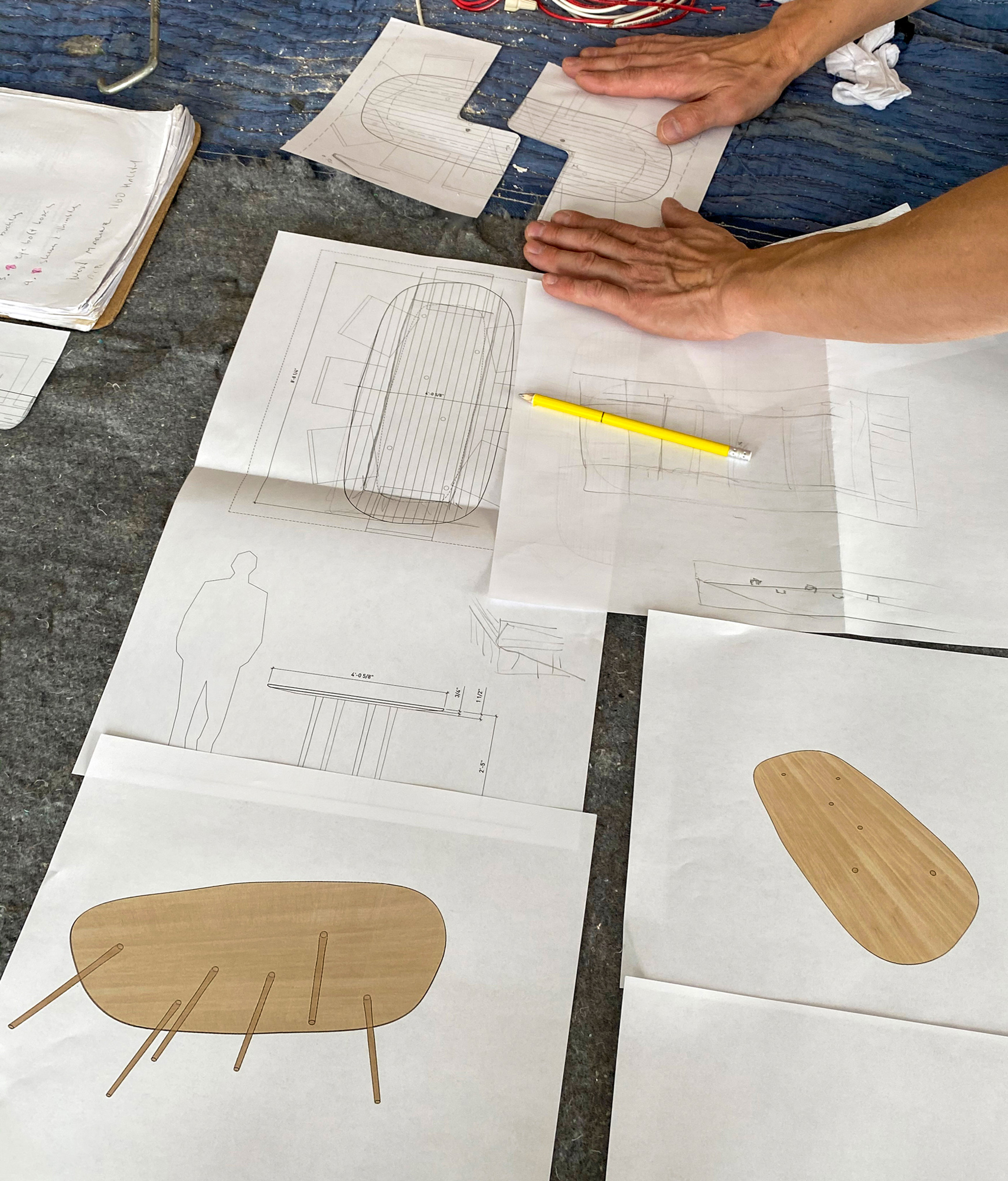
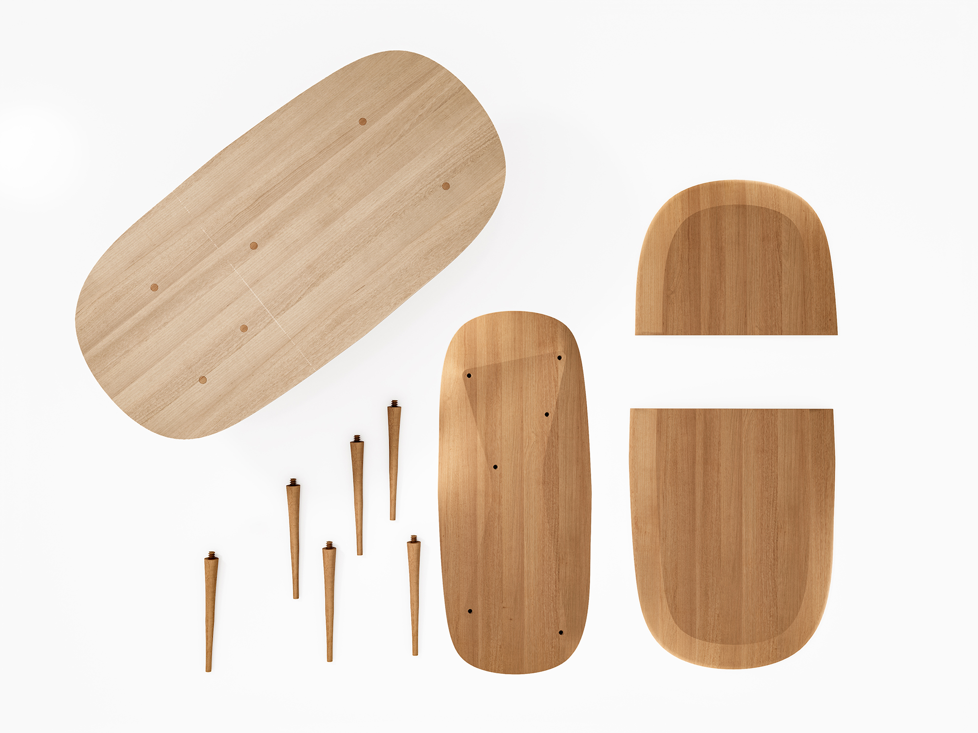
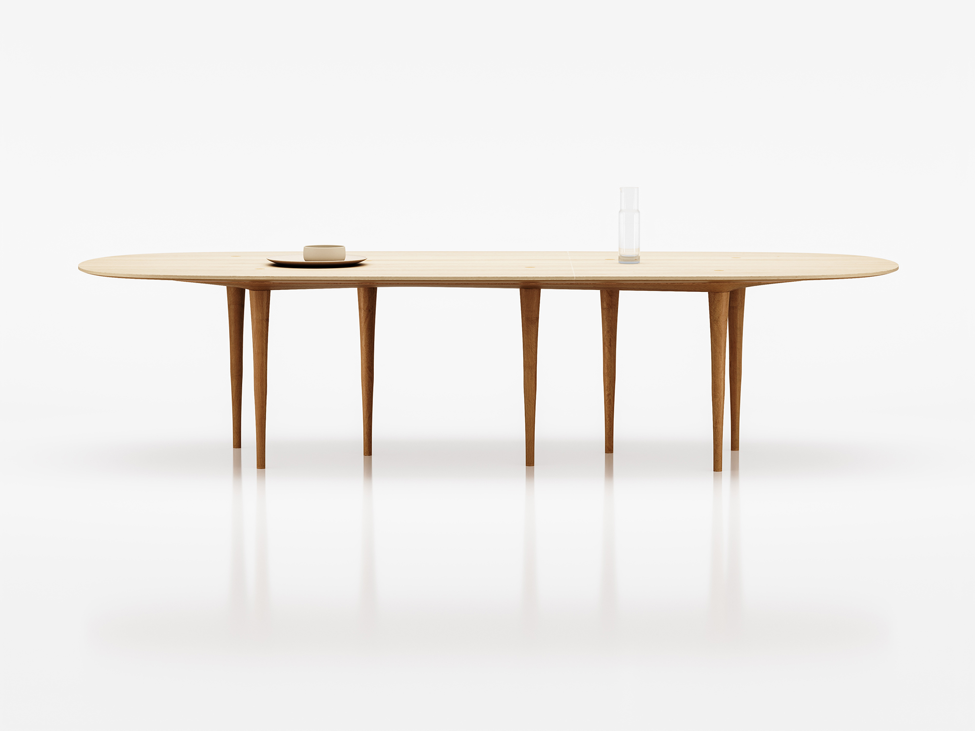
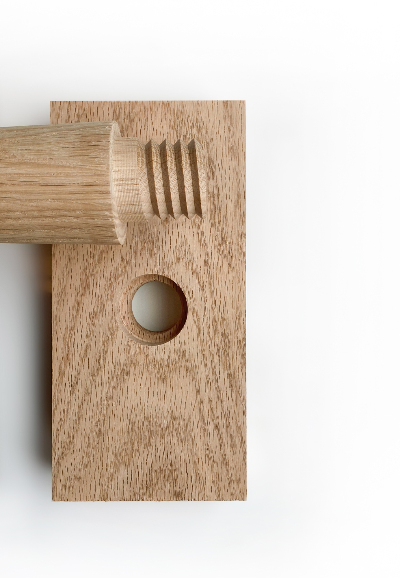
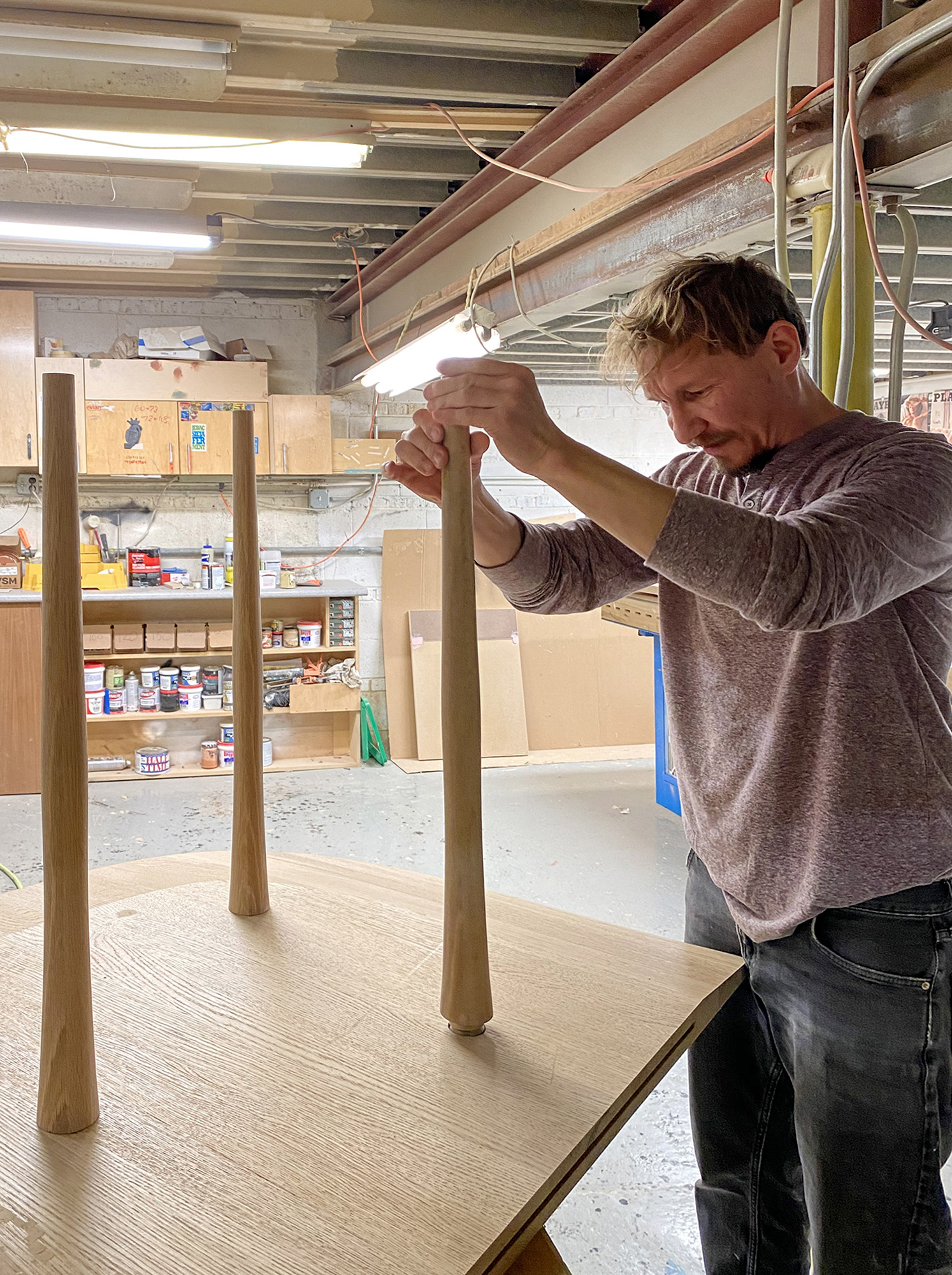
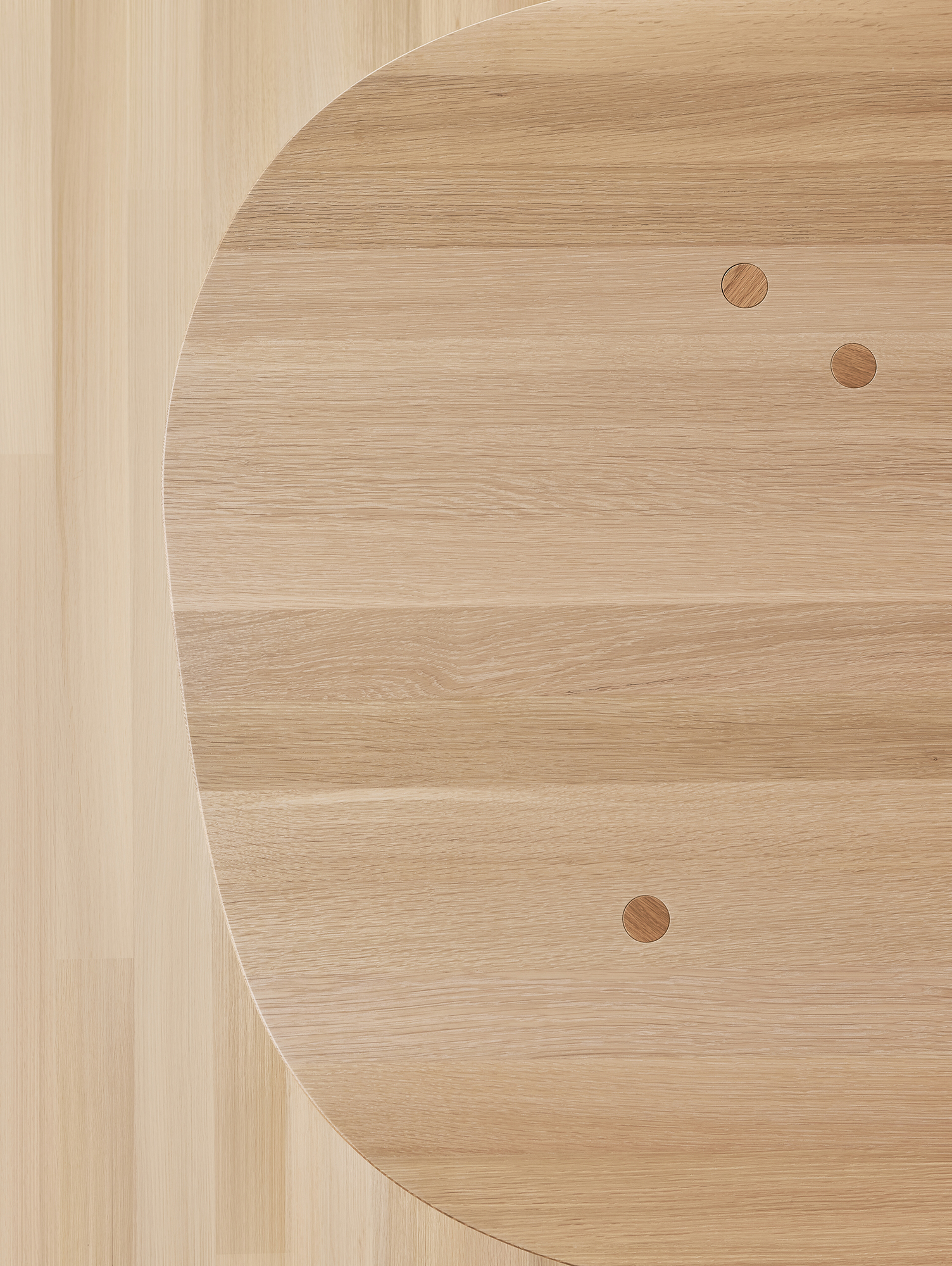
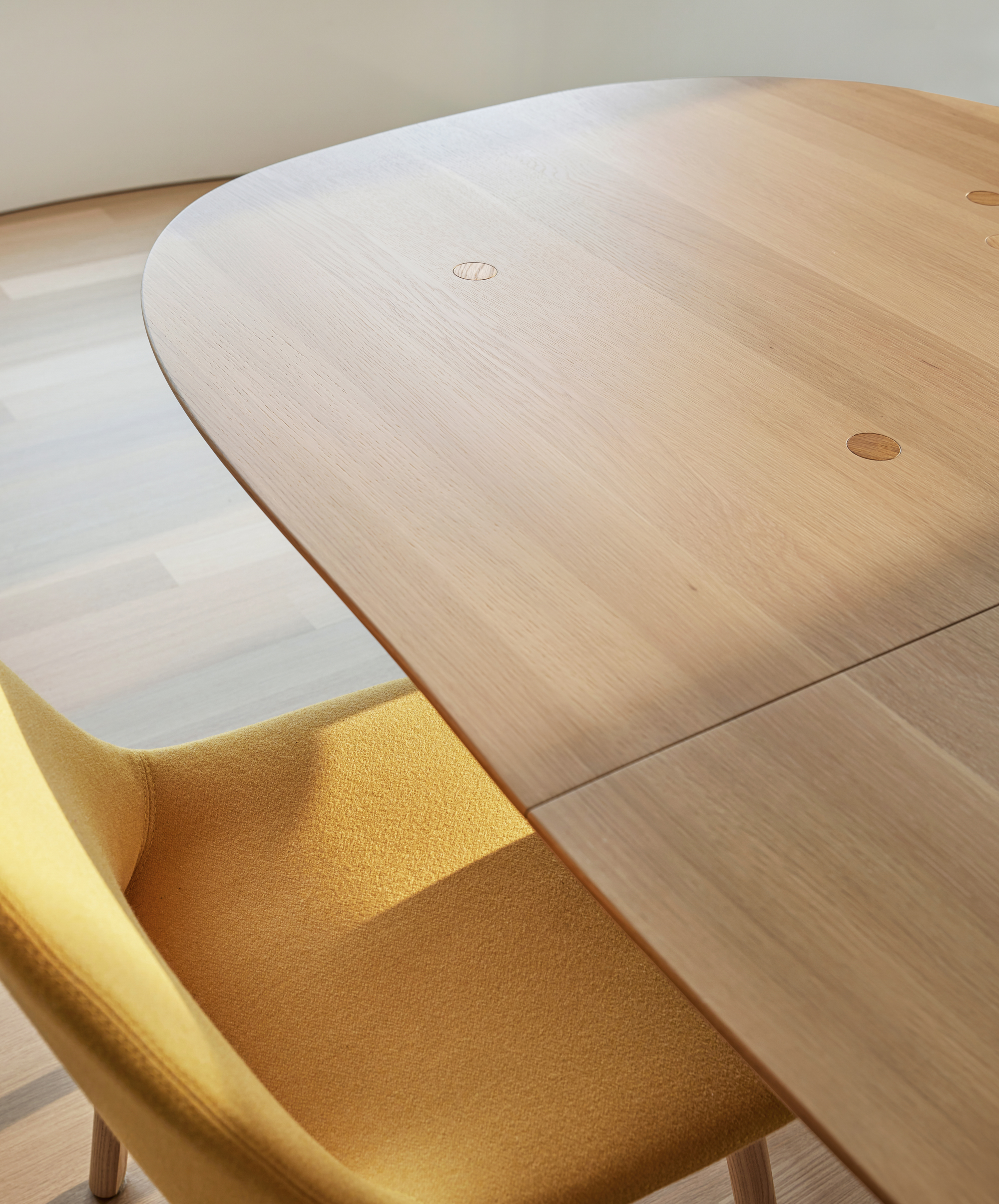
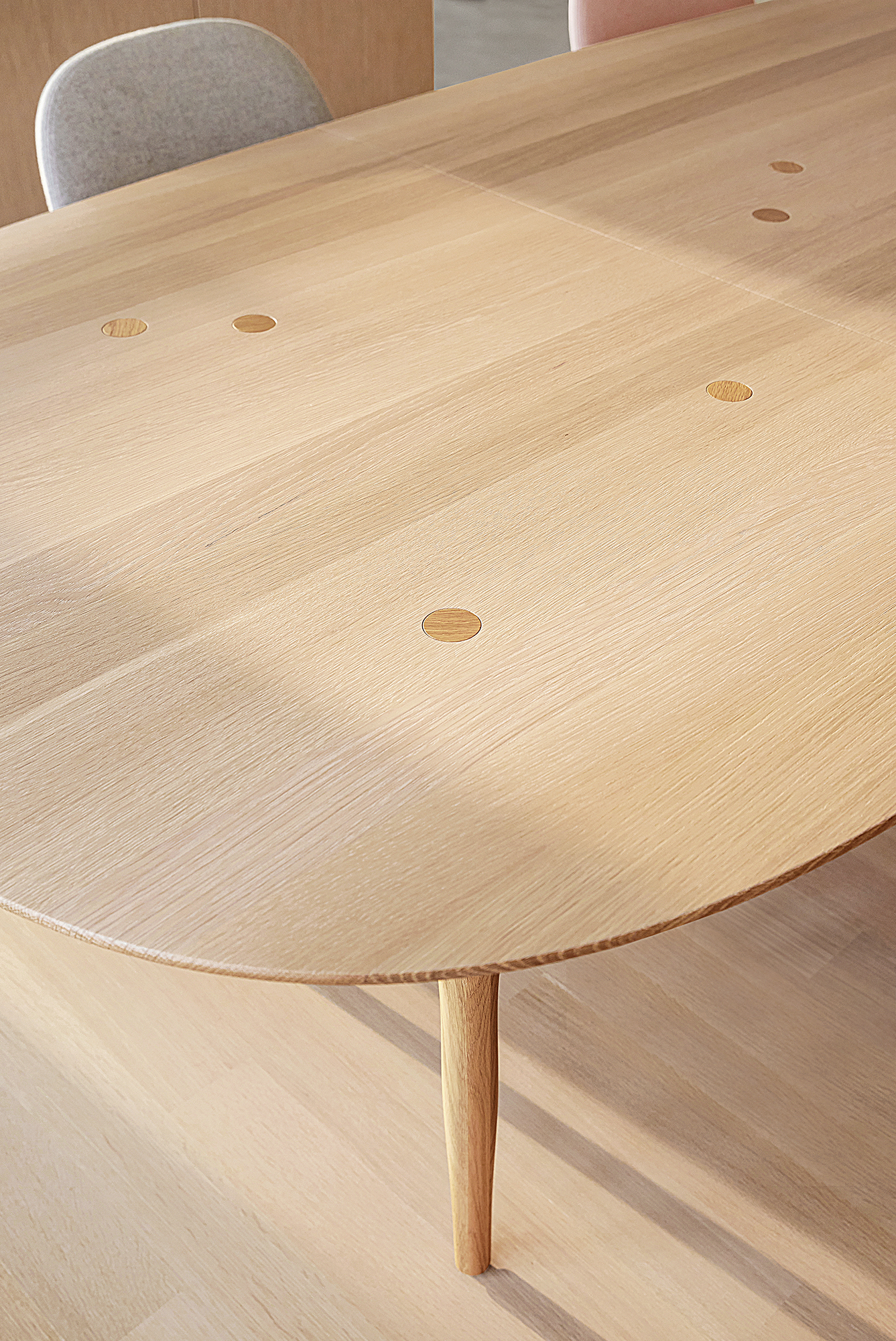
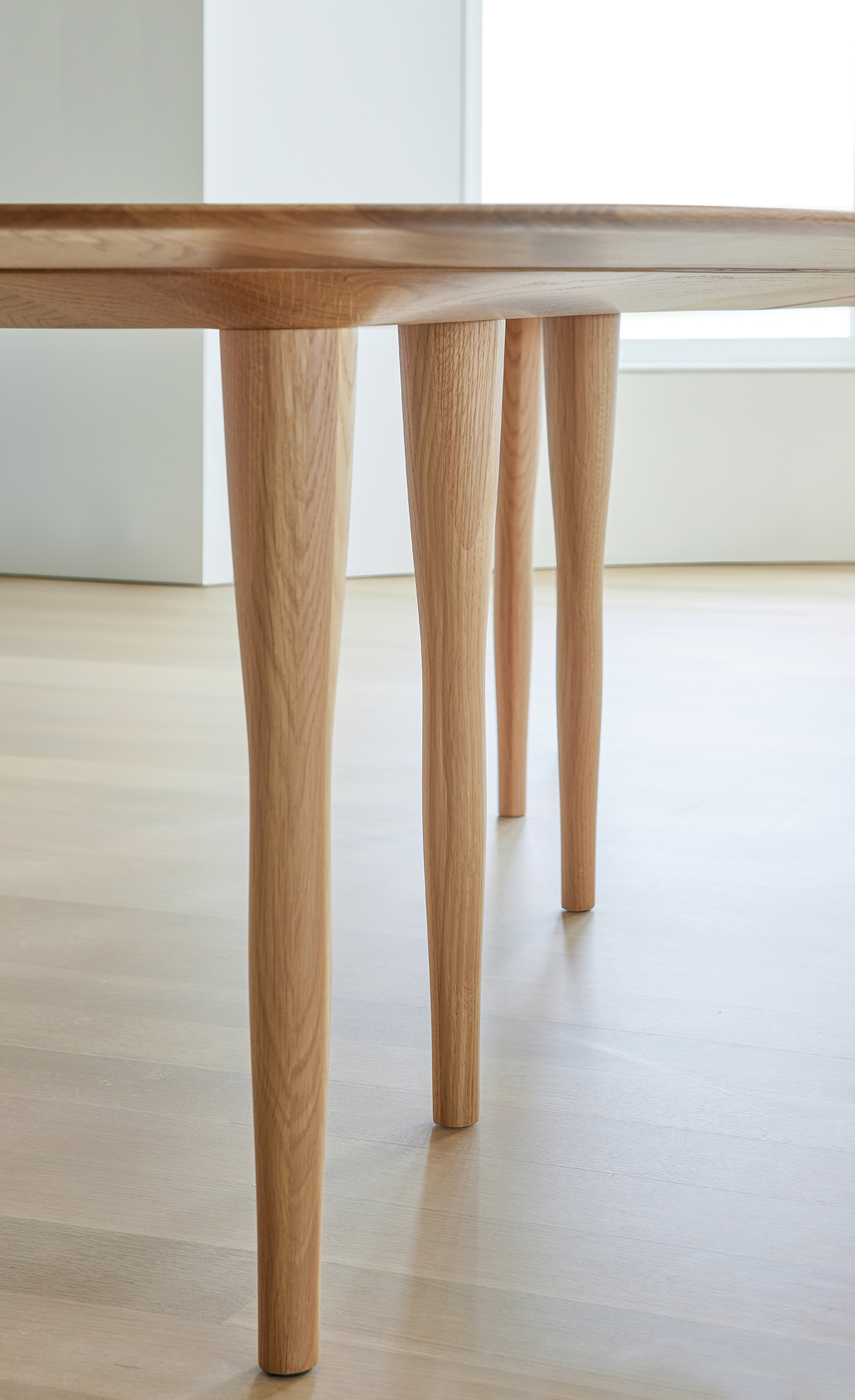
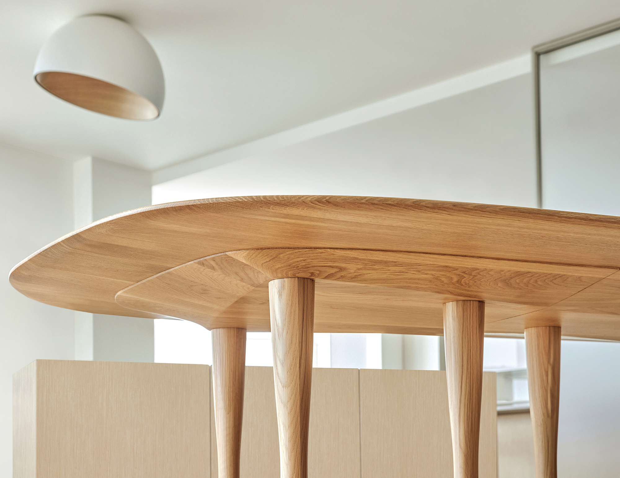
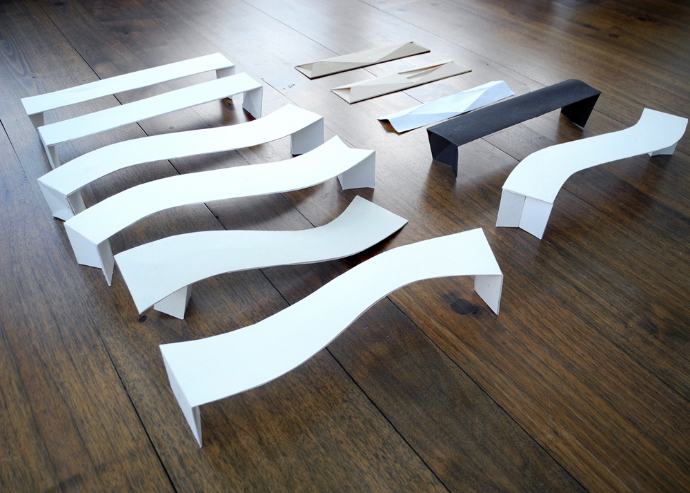
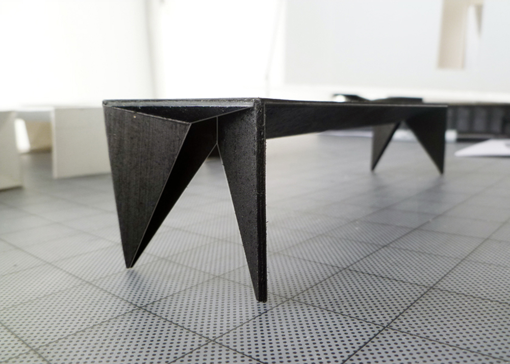
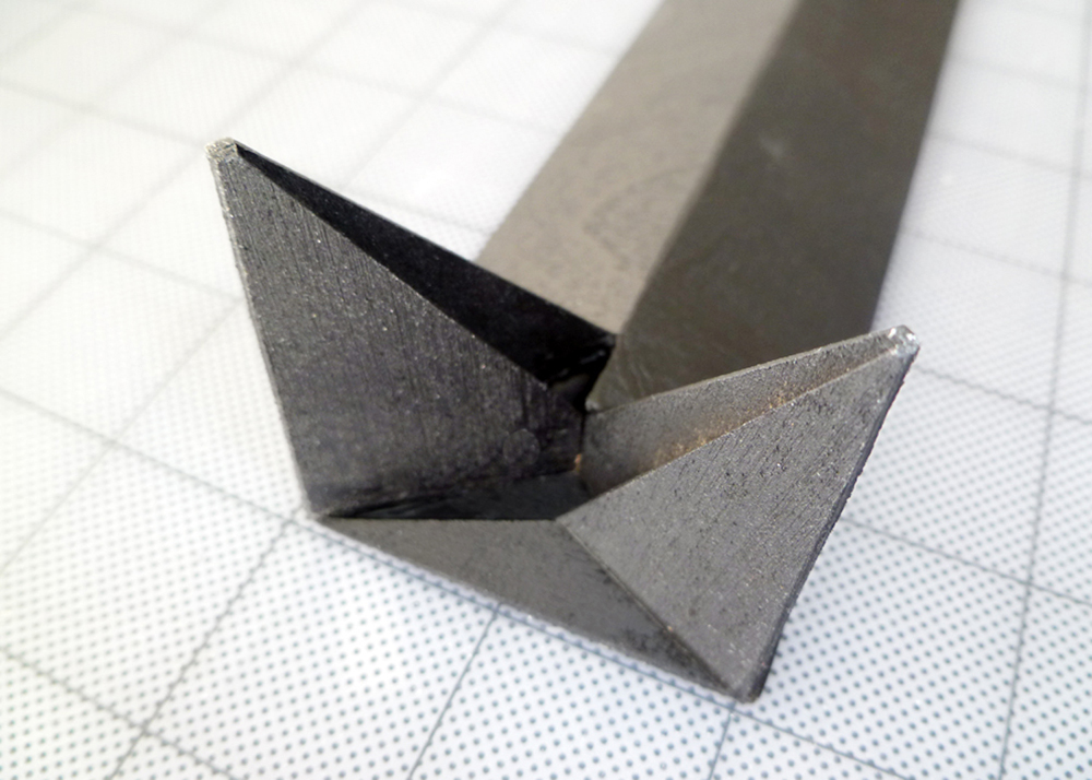
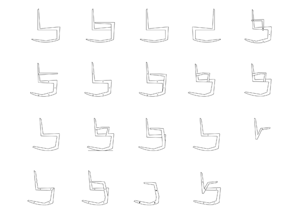
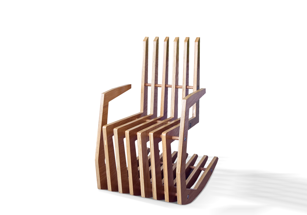
The “Imperfect” table is meant to be a conversation piece as it resides in one’s home. Its design explores the use of wood material and form, integrating both traditional and high-tech woodworking craft.
This table design re-shapes the ideal oval geometry. Its subtle contours offer flexibility in seating arrangement, absolving the desire for a set configuration. Its legs appear proportionally light and are positioned to create structural stability and ample legroom.
The Imperfect table is not just a one off furniture piece, it ranges in both size and finish. Choosing one will surely be an imperfect match.
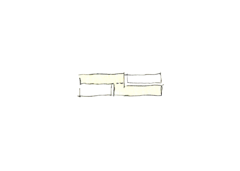
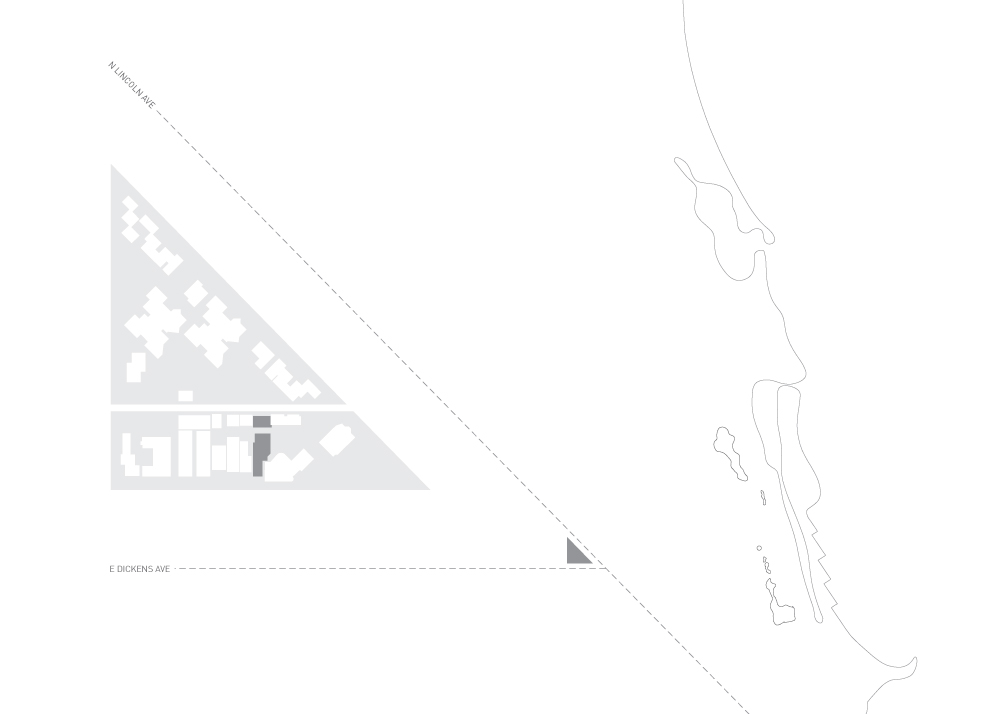
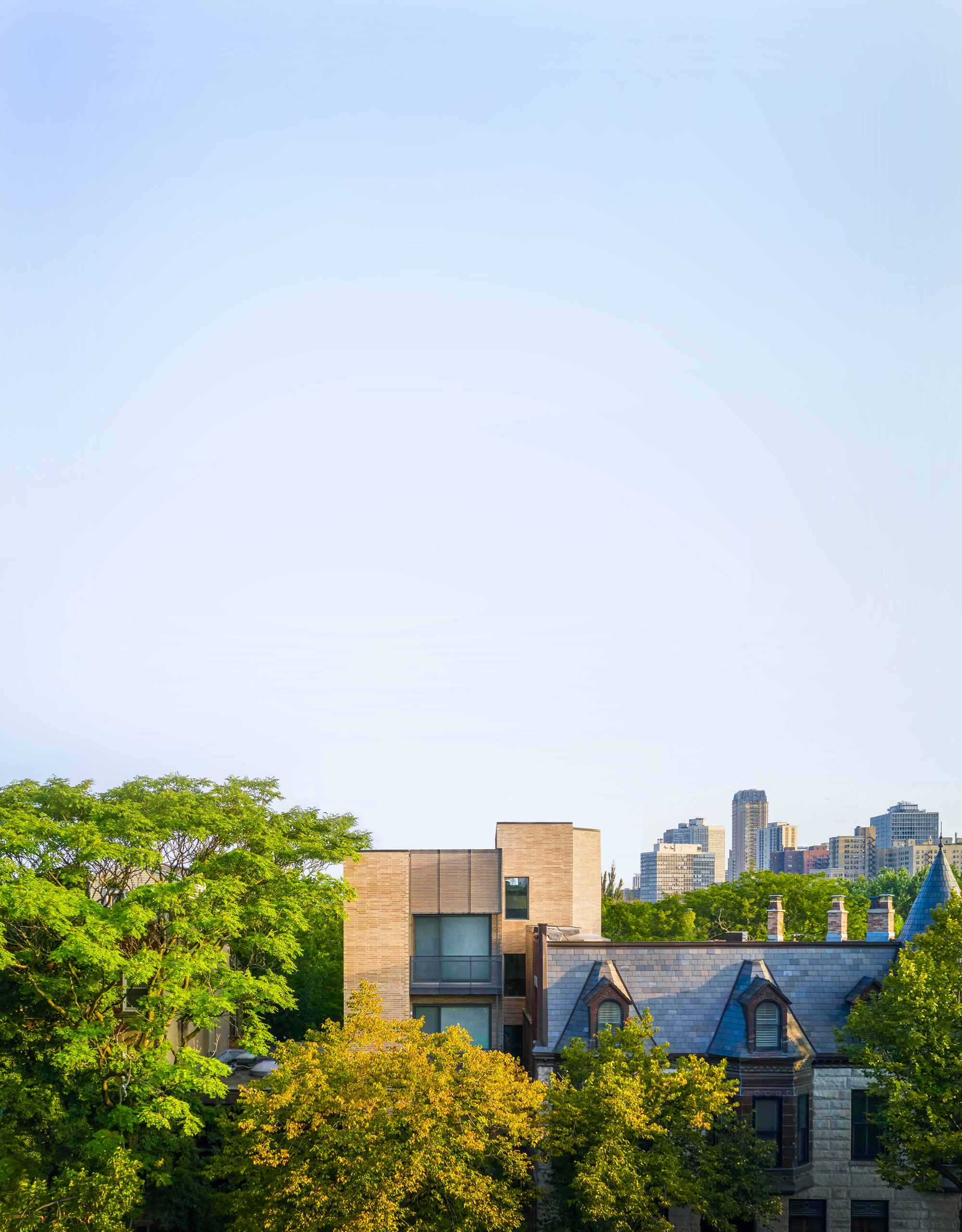
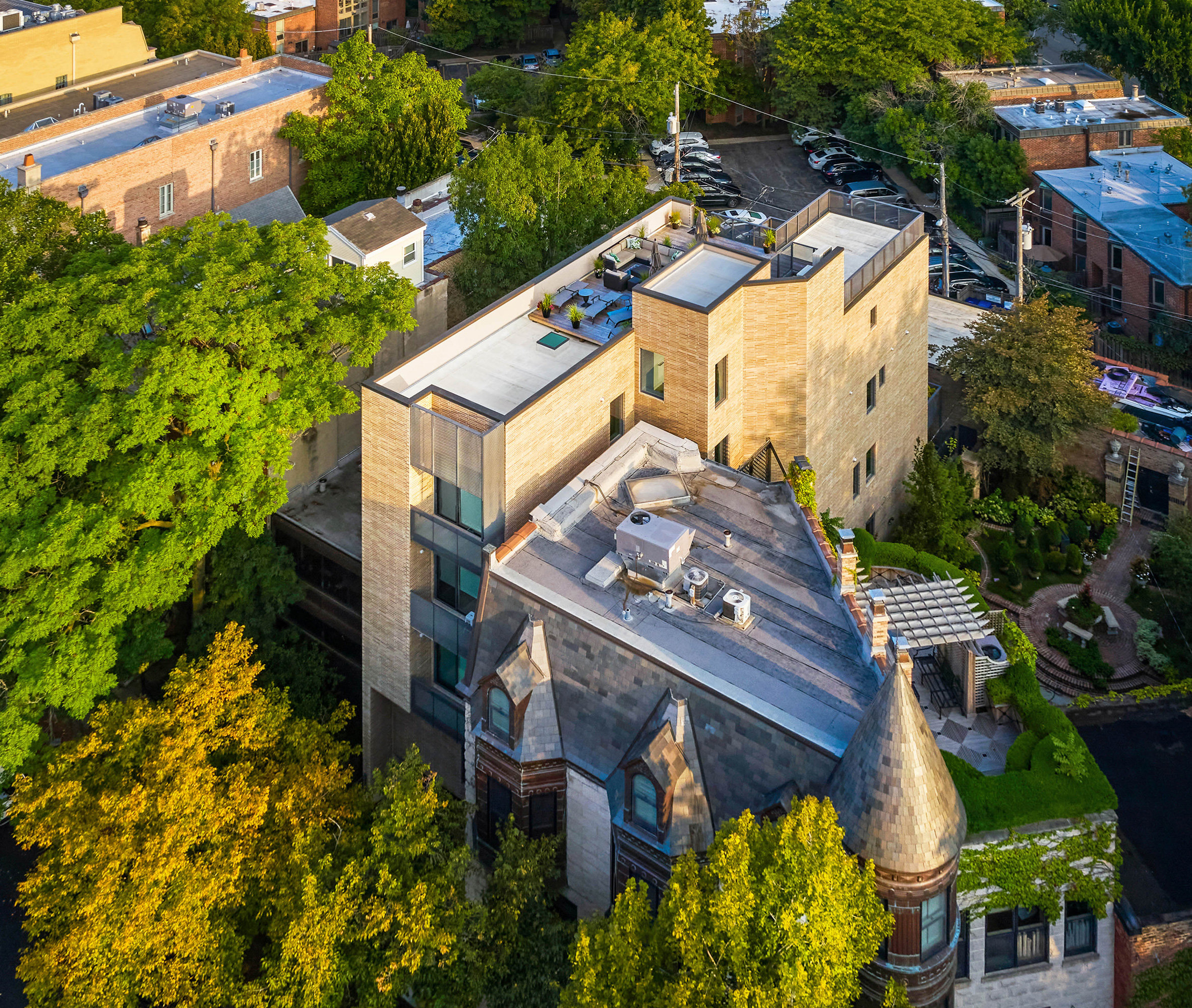
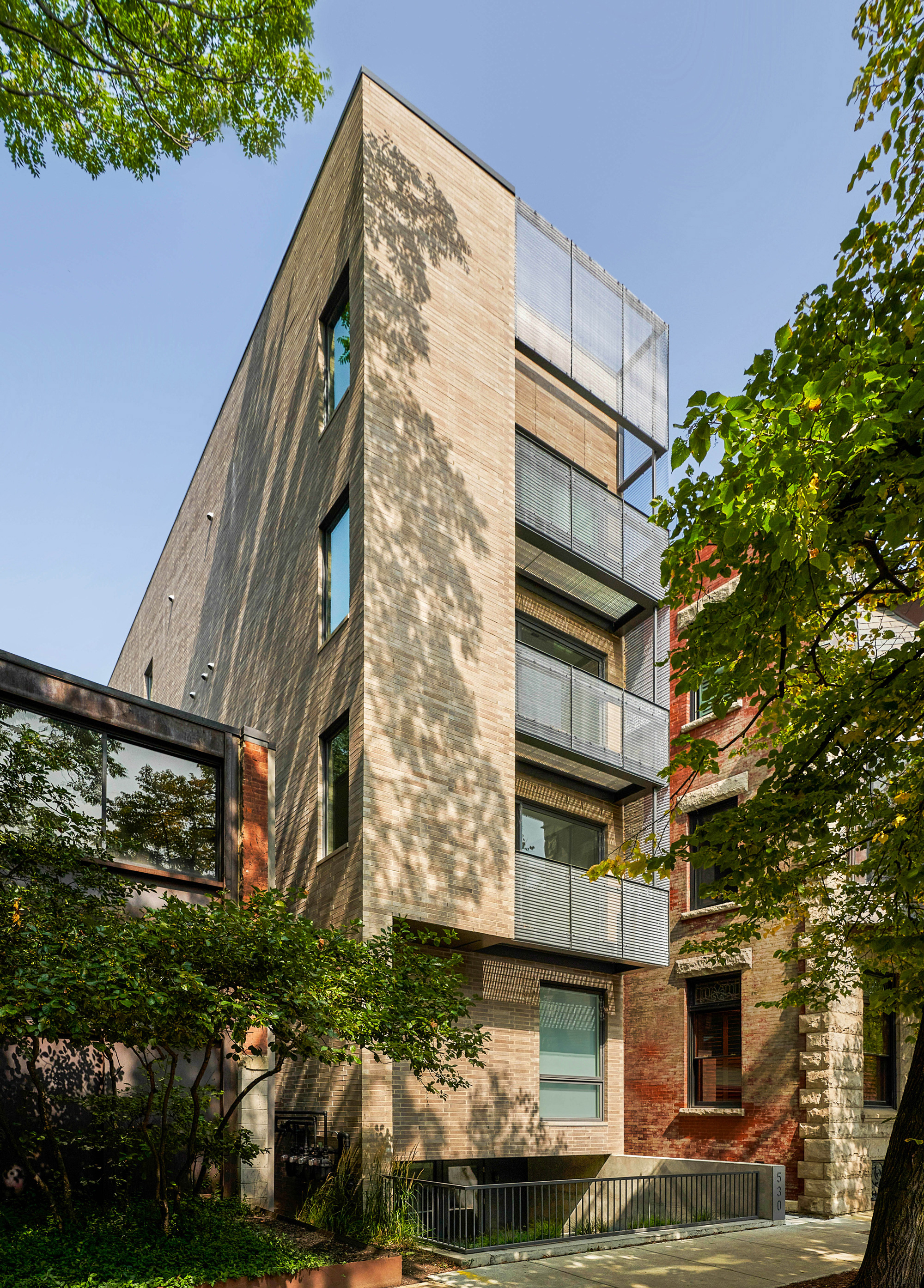
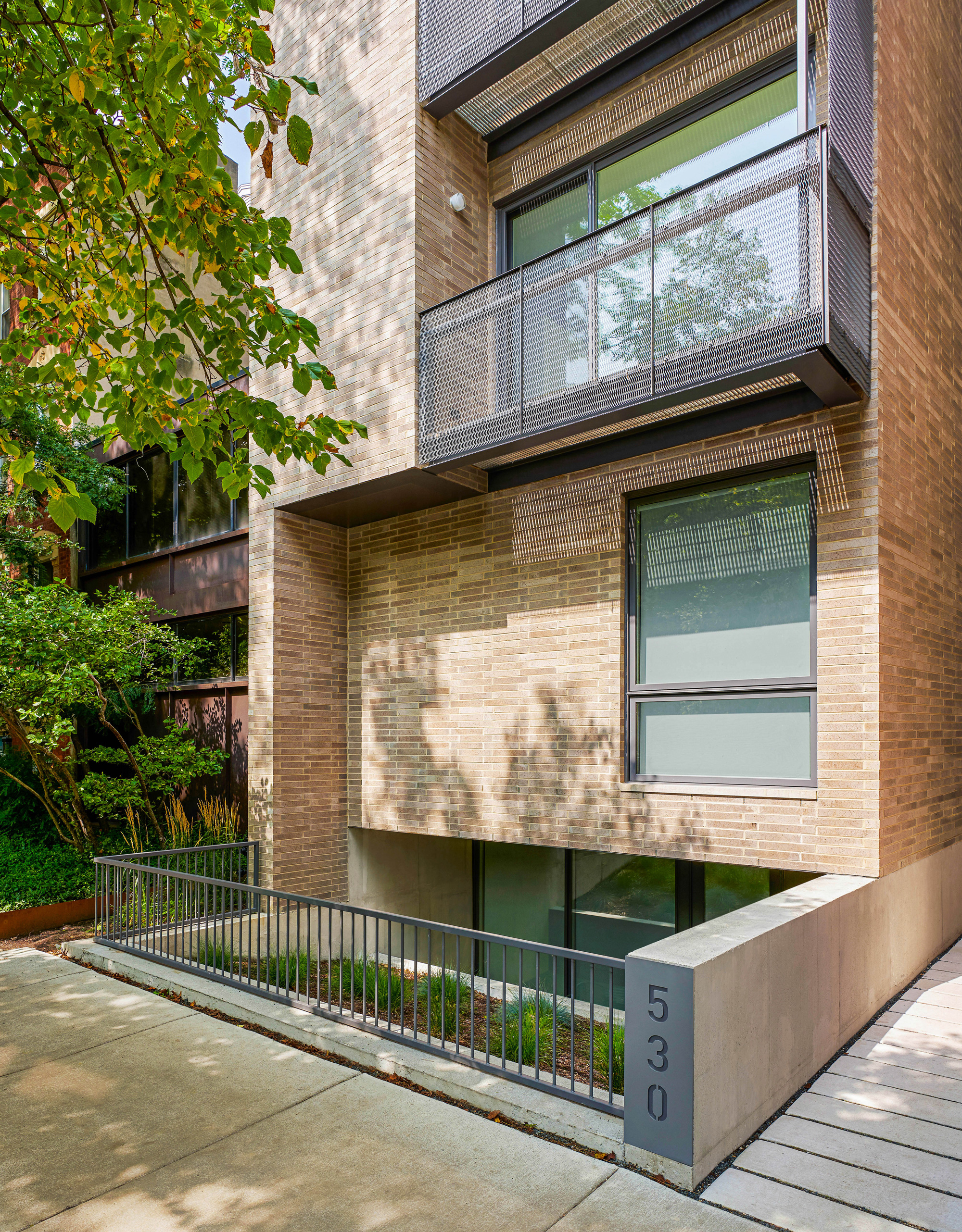
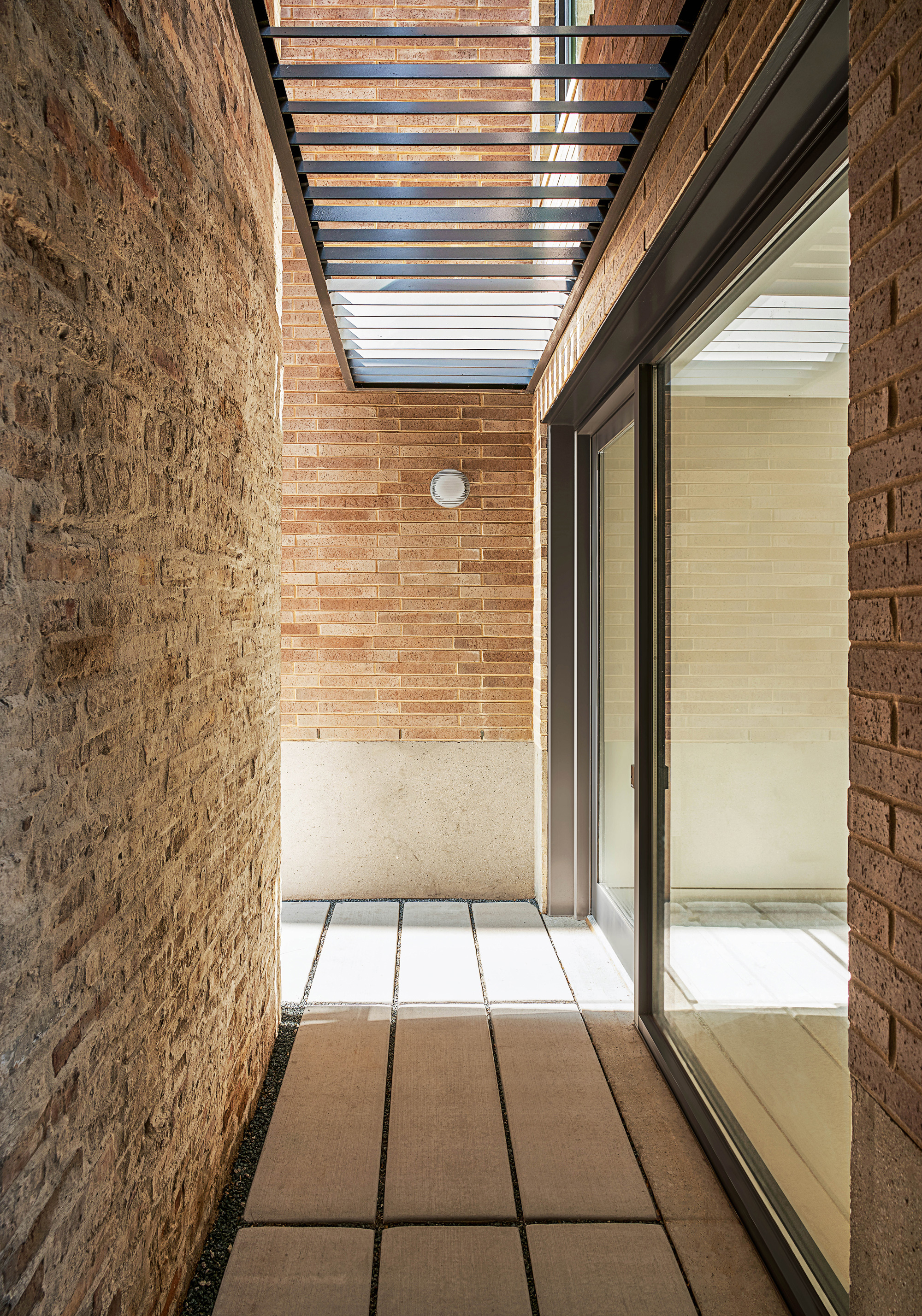
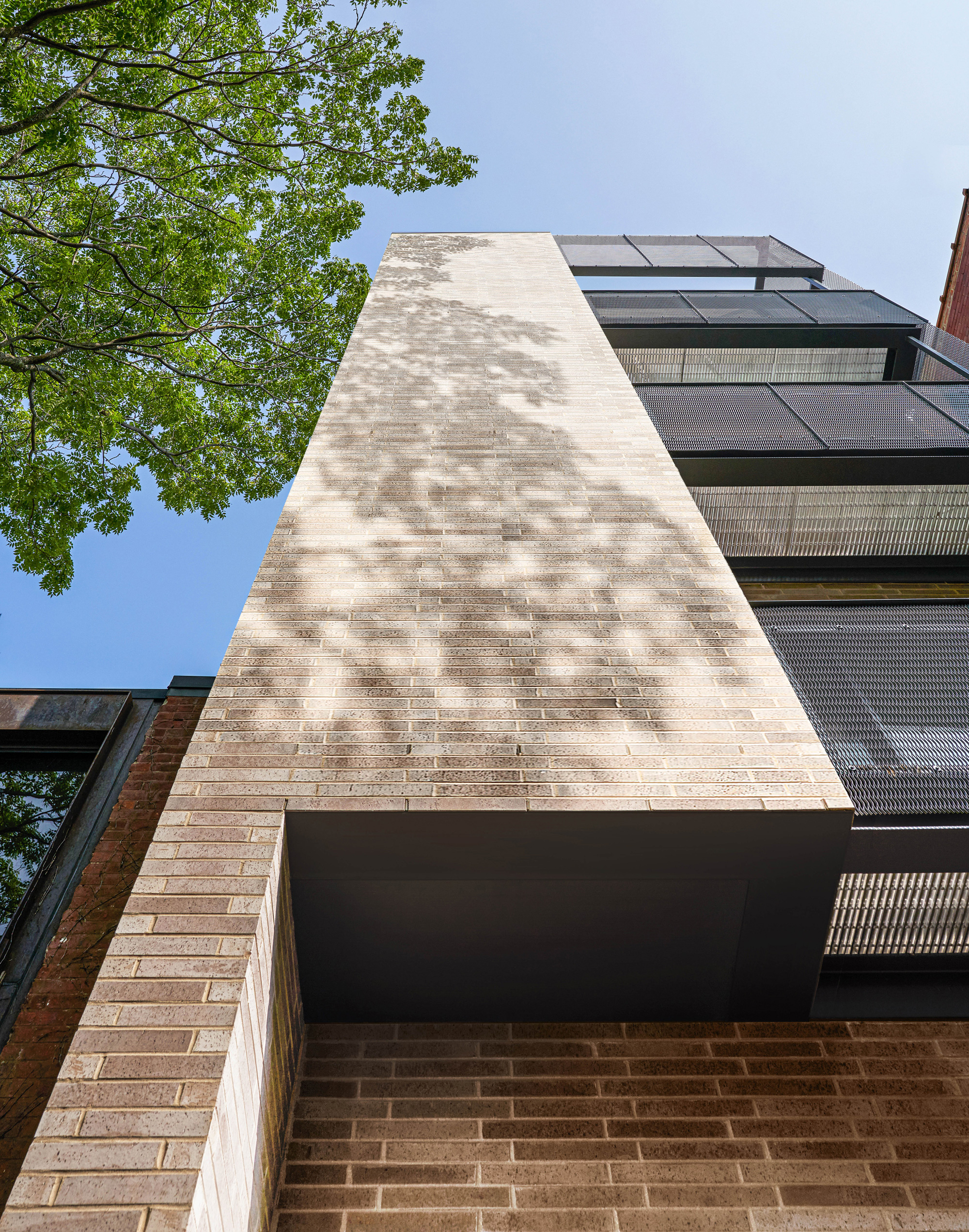
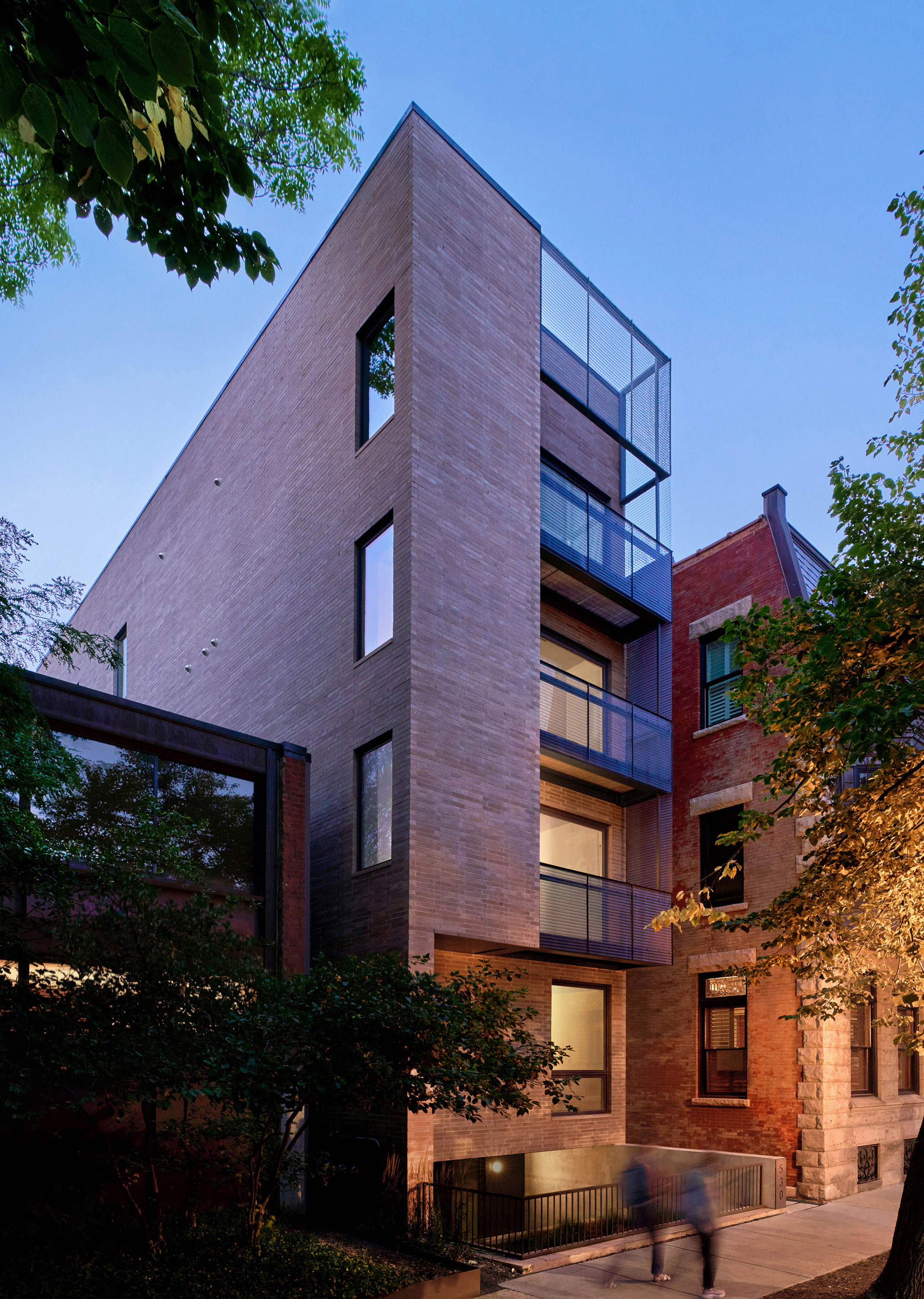
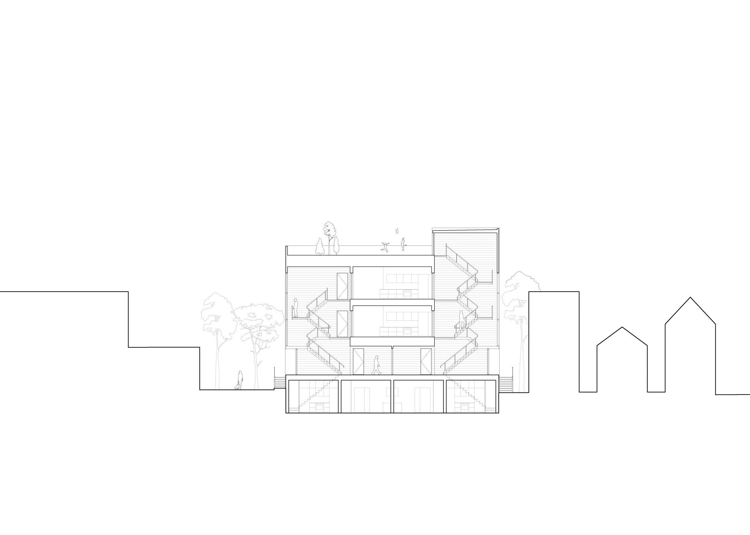
530 Dickens is a new four-unit multi-family building that aims to contribute to an already established architectural dialogue within its neighborhood context. It is situated on a beautiful tree lined street, nested between two noteworthy dwellings which respectively represent two periods of our city’s history. As a result of the Chicago fire of 1871 and subsequent street re-planning, the building site is rather atypical in shape. The southern pedestrian edge maintains an average Chicago lot dimension, yet the property steps and widens as it opens toward the rear.
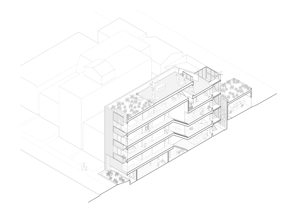
Tasked to design four duplex units with dedicated parking on an irregular site with adjacent buildings located directly on the property line, yielded unique challenges and a sectional project outcome. We utilized the side yard setback as exterior circulation corridor leading to the main building entry and positioned the primary interior vertical circulation at the middle of the building footprint, the widest section of the site. The entry procession considered the poetic nature of historic masonry walls as part of the pedestrian experience. In juxtaposing the new, more refined masonry, with the old Chicago common brick, we intended to create lasting impressions on both the homeowners and their visitors as they move between the two time periods of construction, generations apart.
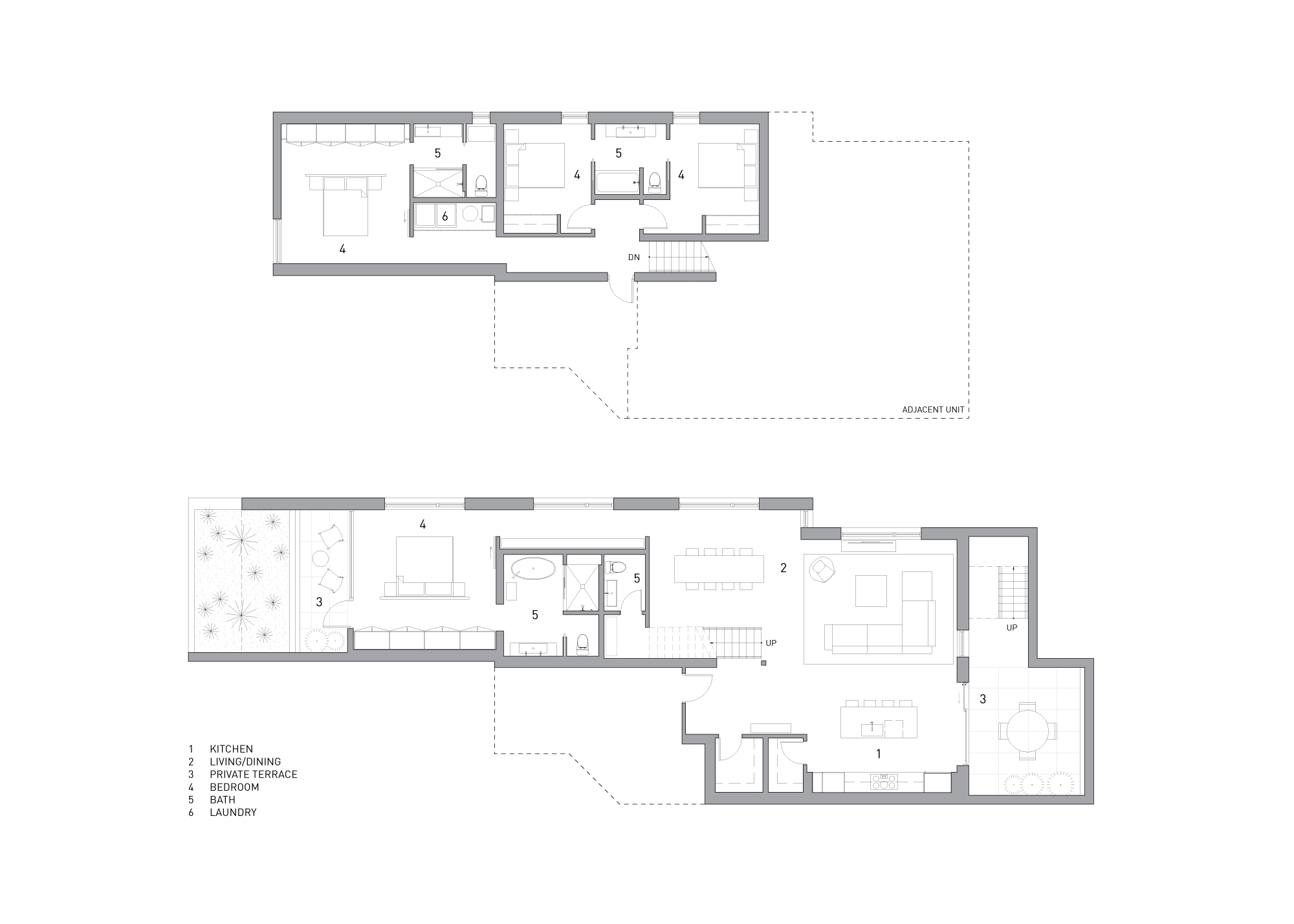
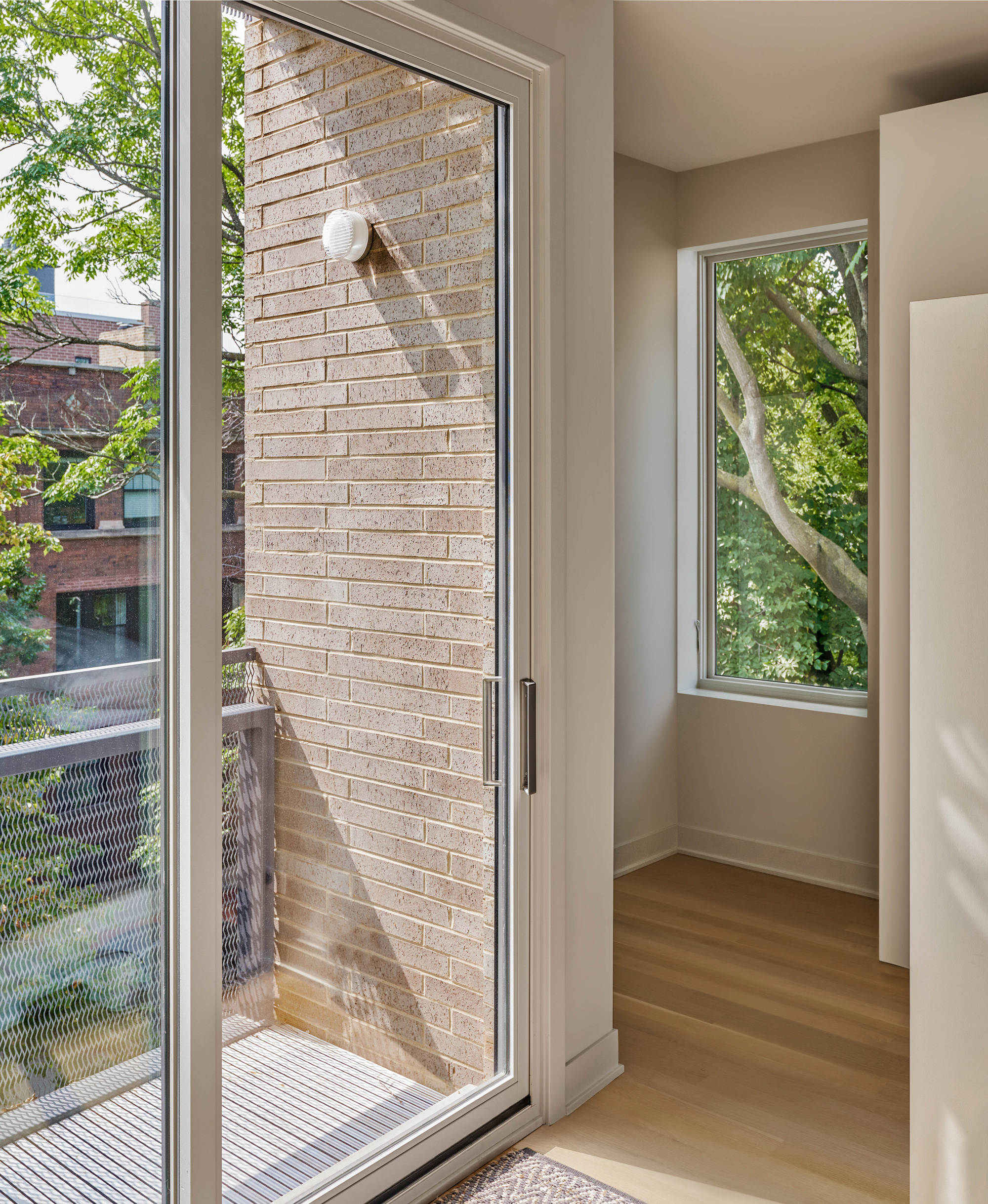
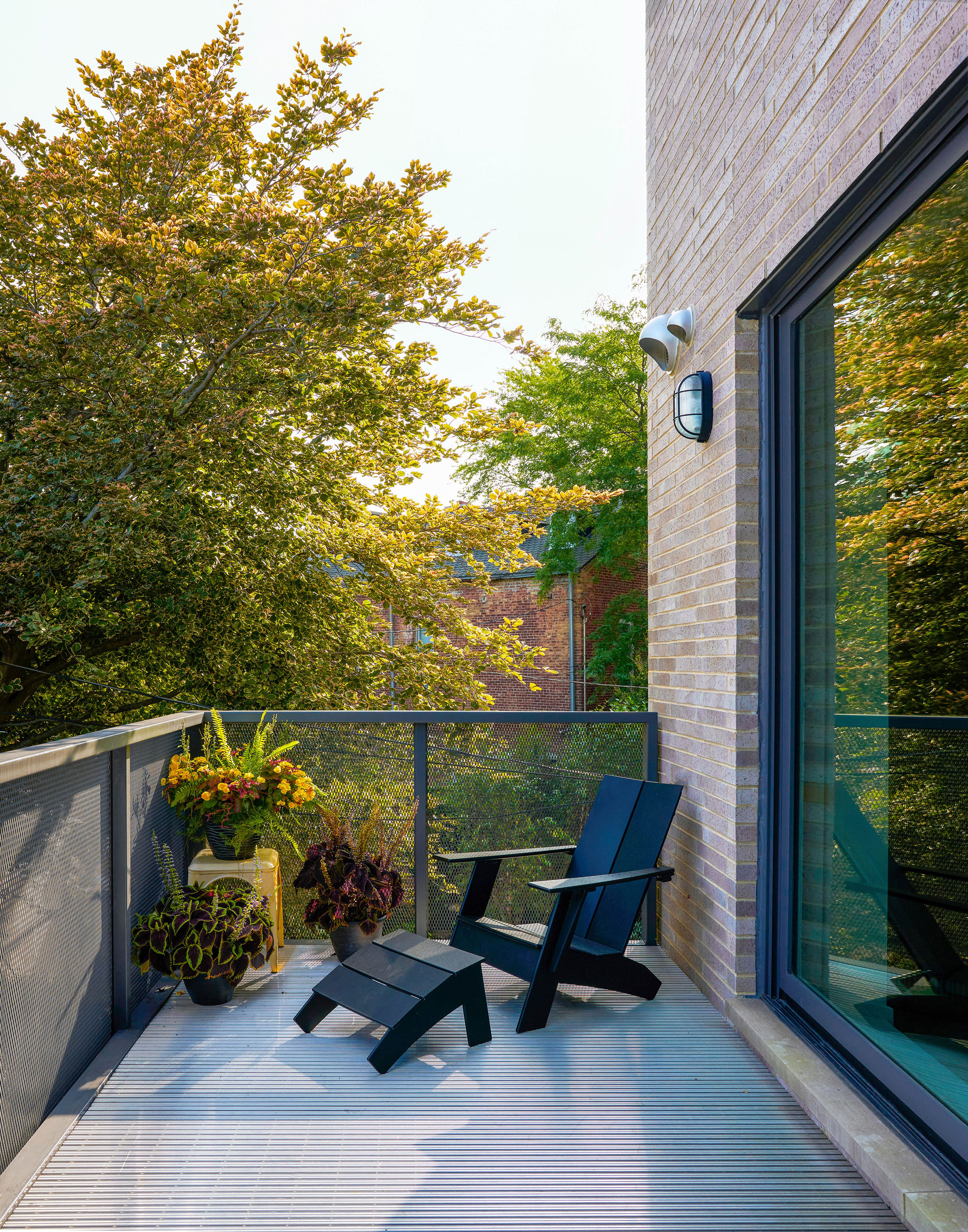
Furthermore, the building is organized as a series of overlapping Tetris-like dwelling spaces. The sleeping rooms are located towards the front, the narrowest section of the building, while the living spaces were placed at the back, where the lot opens up considerably. This arrangement enabled us to efficiently distribute the required building area, meeting zoning height constraints while maximizing for daylight within this bounding lot. In addition, this stacking approach was optimal in providing views and light in each living space, capturing all four orientations. Balconies and terraces are integrated at both ends of the building, promoting social connectivity with the surrounding context and creating opportunity for cross ventilation within each unit.
The outward reading of this building was carefully studied as its massing and scale is visible from numerous vantage points within the neighborhood. In order to integrated it into its context we built upon the surrounding material language of masonry and iron work, bringing the two together in a contemporary way. The formal notion of front, side, and rear was not part of our design conversations, but rather thinking of this building form as a response to the interior organization and site planning strategies. Furthermore, the large surrounding trees were considered not only for shade, but for their ability to paint mural-like shadows on the building’s broad masonry walls. Thus, subtly integrating the existing poetic qualities of place as part of the overall intent.
In our minds, the 530 Dickens building needed to feel like it belonged here, while also marking its place in time and becoming a well-intentioned neighbor for many years to come.
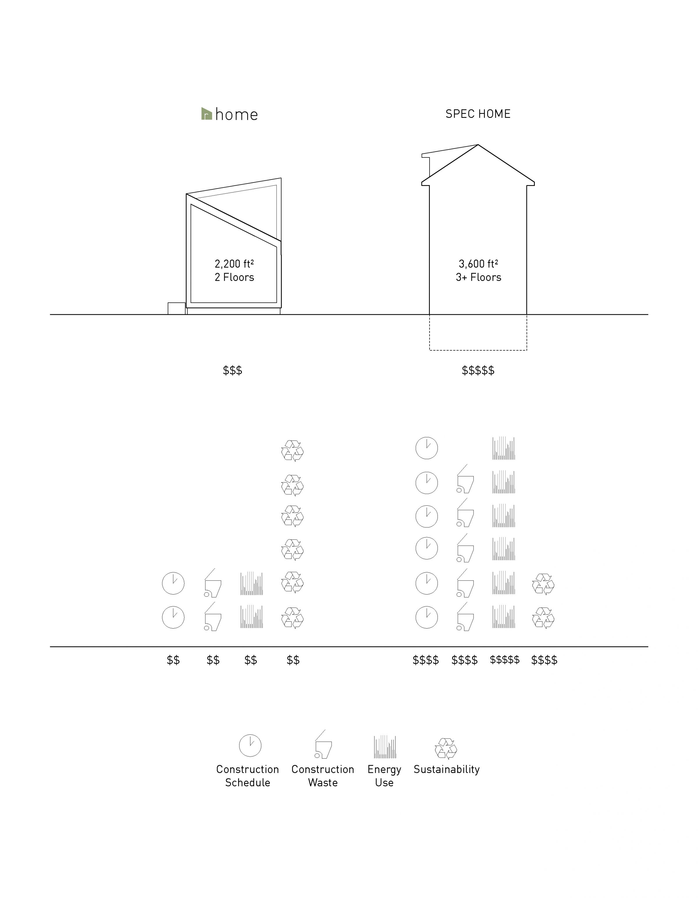
Imagine…
a home for today, built for tomorrow.
a home founded upon a sensibility to its city and to our planet.
a home designed to support a growing family and aging in place.
a home whose desired function you determine over time.
a home instilled with your sense of authorship and DIY influence.
a home where architectural fundamentals define domestic space.
Envision…
a new living paradigm of building, buying, and inhabiting Chicago.
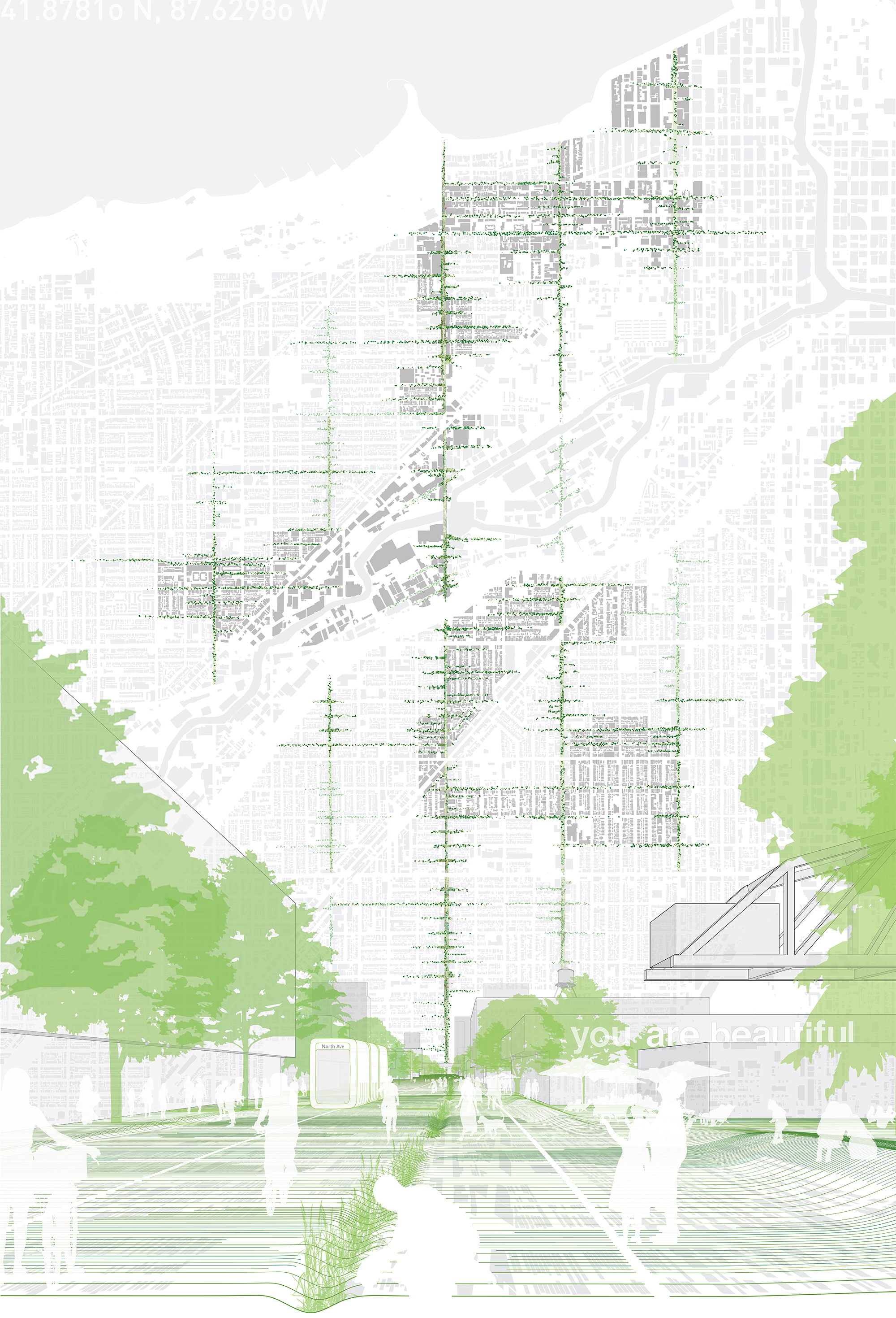
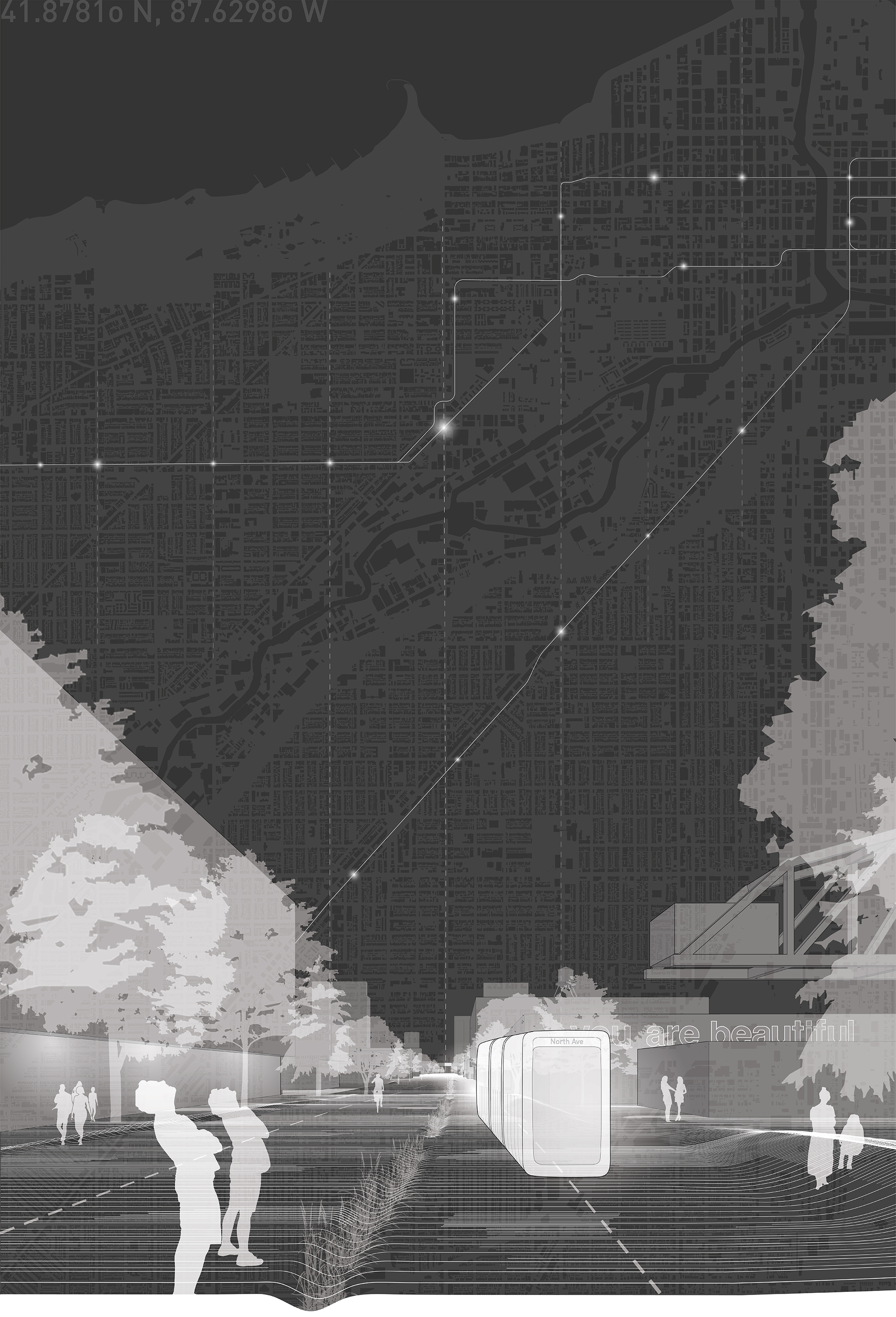
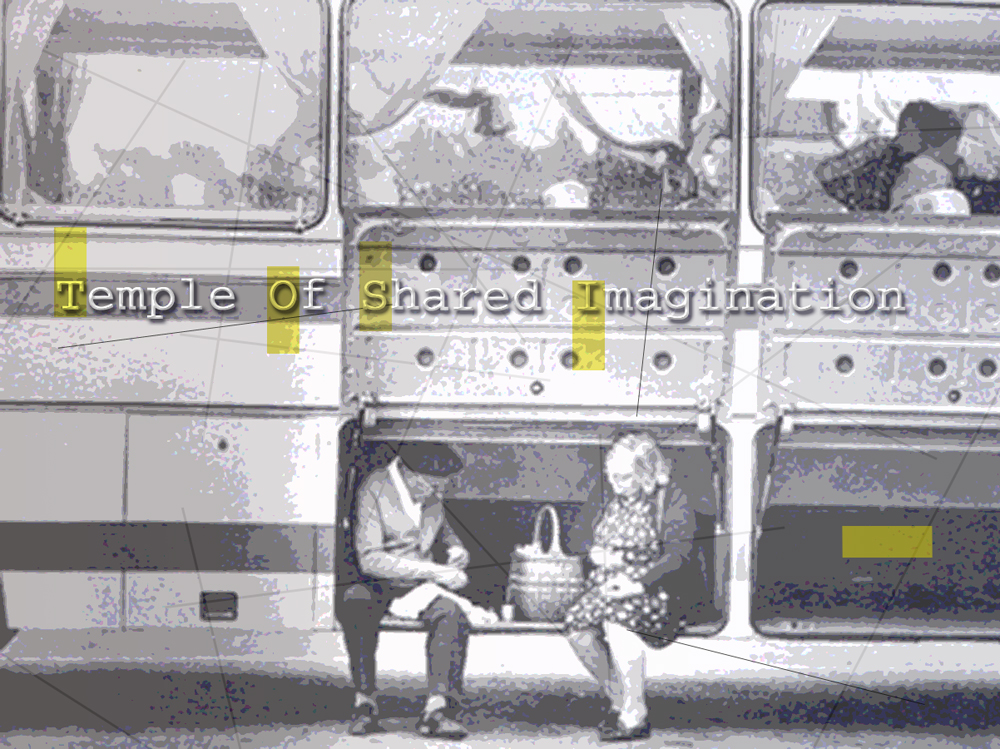
More than a speculative proposal, “Revisiting Our Avenue” is a vision for greater humanization of our city, transforming Chicago’s streetscapes from vehicular thoroughfares into a pedestrian-centric network. Aiming to connect us within our city, the vision proposes an alternate transport strategy along the North Avenue corridor that initiates transformation of other major thoroughfares. Our approach offers much of the avenue to the pedestrian, removing cars and introducing a “Surface El” as part of a curb-less streetscape. As precedents in other cities prove, this direction will catalyze a more sustainable and healthier Chicago.
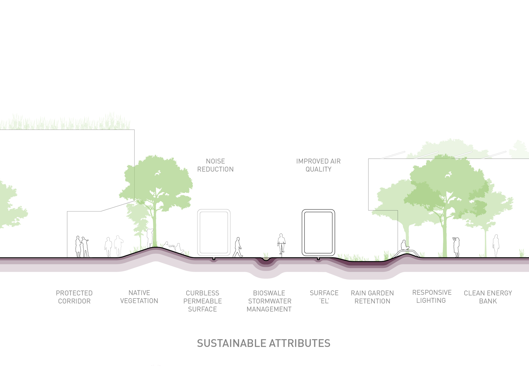
Posing a simple question, “What if there were no cars?” inspired us to imagine “Our Avenue” as something far greater than the traffic-centric corridor it is today. We propose creating zones of pedestrian mobility based on one’s desired speed of travel, in addition to rewriting the current zoning regulations for new and existing buildings along the avenue. By requiring carved facades, continuous overhead protection is provided for pedestrians throughout the year. Additionally, revitalization of our local ecology is achieved through the reconstitution of native landscapes and localized storm water management systems as well as harvesting and storing clean energy for the avenue and its adjacencies. Consequently, significant reduction in light pollution, noise, and heat island effect will provide physical and mental health improvements alongside cleaner air and clearer skies.
We can change our city’s fabric and trajectory by embracing the opportunities this proposal seeks, following in the steps of “Make no little plans.”
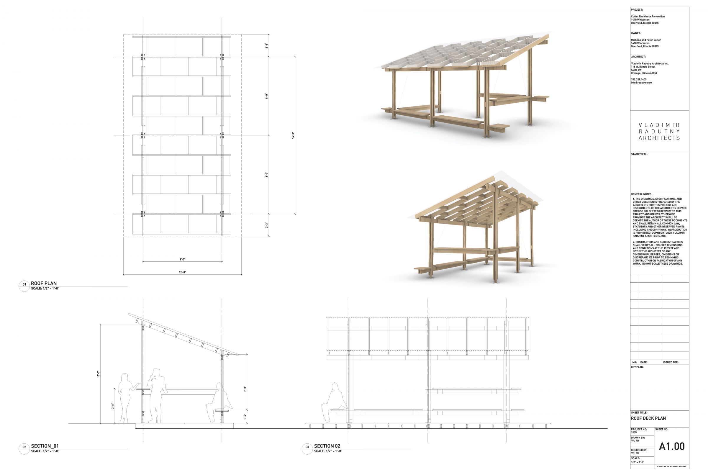
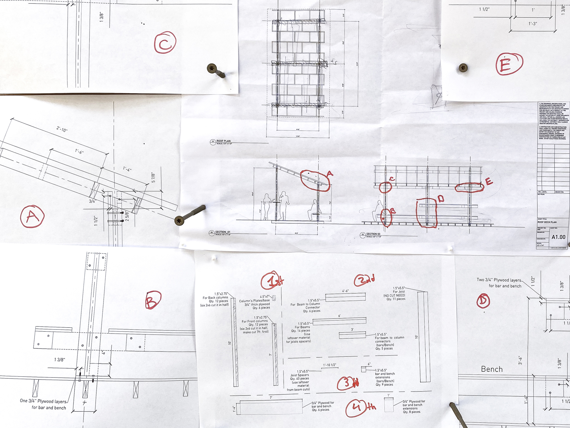
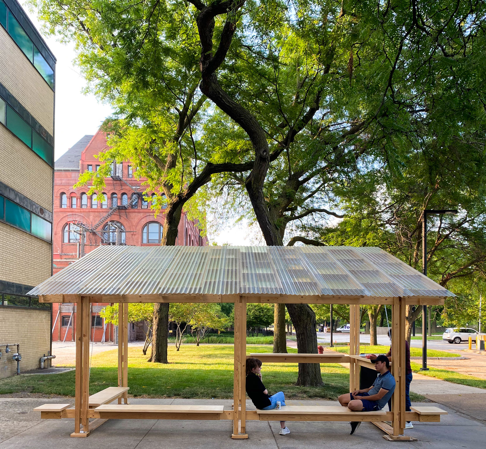
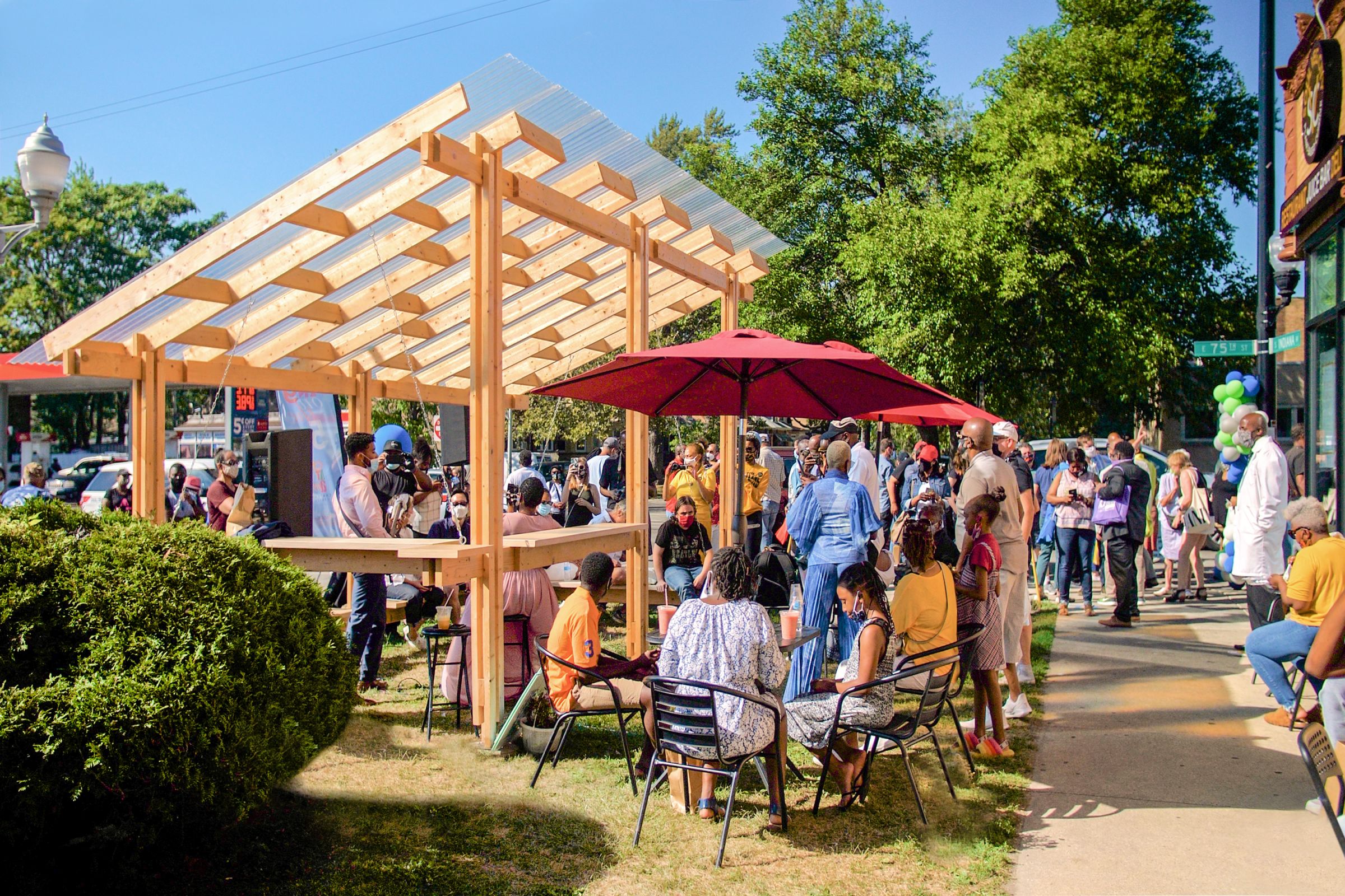
In joining “ARC-All Reimagining Chicago” an ad hoc Architecture group for COVID 19 re-opening on the South and West sides of Chicago, we offered our pro bono design services to develop, test, and build an outdoor, social distancing pavilion. Which in the end found its first home as part of the 75th Street Boardwalk project, supported by the Chicago Department of Transportation and the Greater Chatham Initiative.
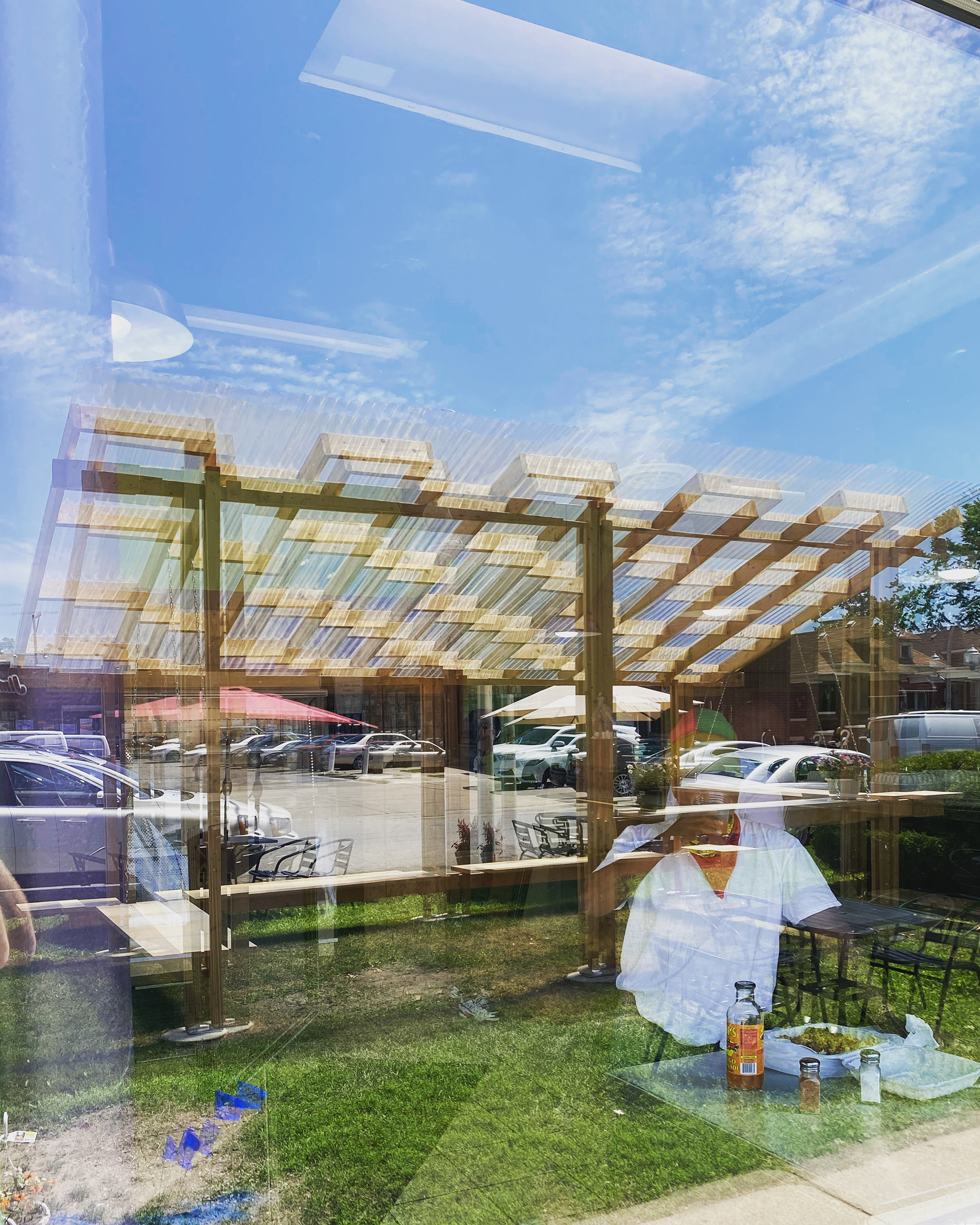
Inspired by the poetics of Laugier’s Primitive Hut, we utilized 2x6 lumber as the primary structure, expressing joinery and connections between members. For protection from the elements, we employed light weight fiberglass panels which diffuse sunlight while illuminating the shadows cast onto the ground. The outcome is a design that is modular, replicable, expandable, and easy to re-create.
Erected at a busy intersection on the South West side of Chicago, this friendly alien became a visually intriguing shelter with a variety of interactive eating possibilities built in. Drawing more attention to the restaurant that it served, it greatly helped with generating greater revenue for the owners. Demonstrating how architecture can truly have an immediate role in positively influencing its surrounding context.
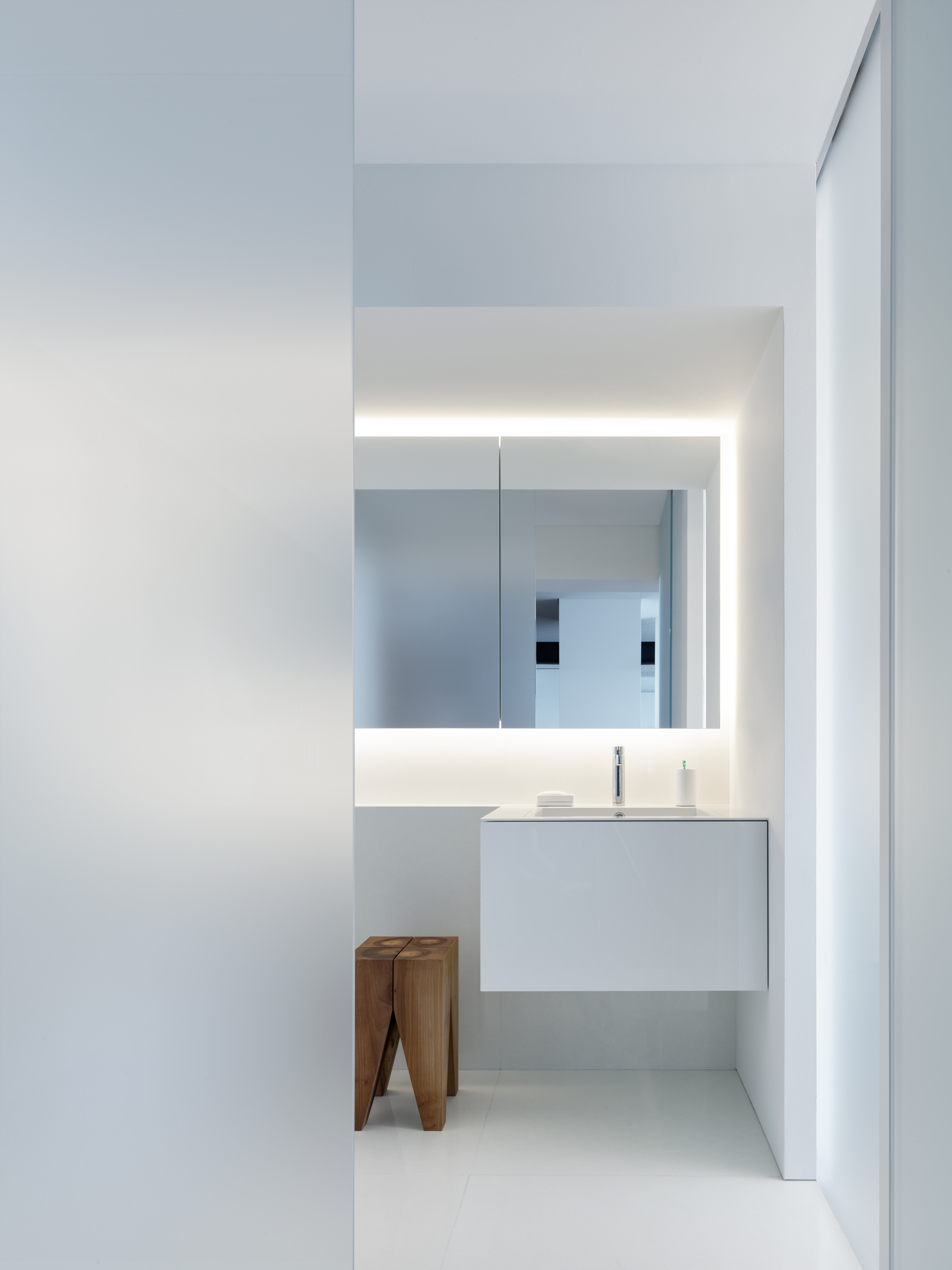
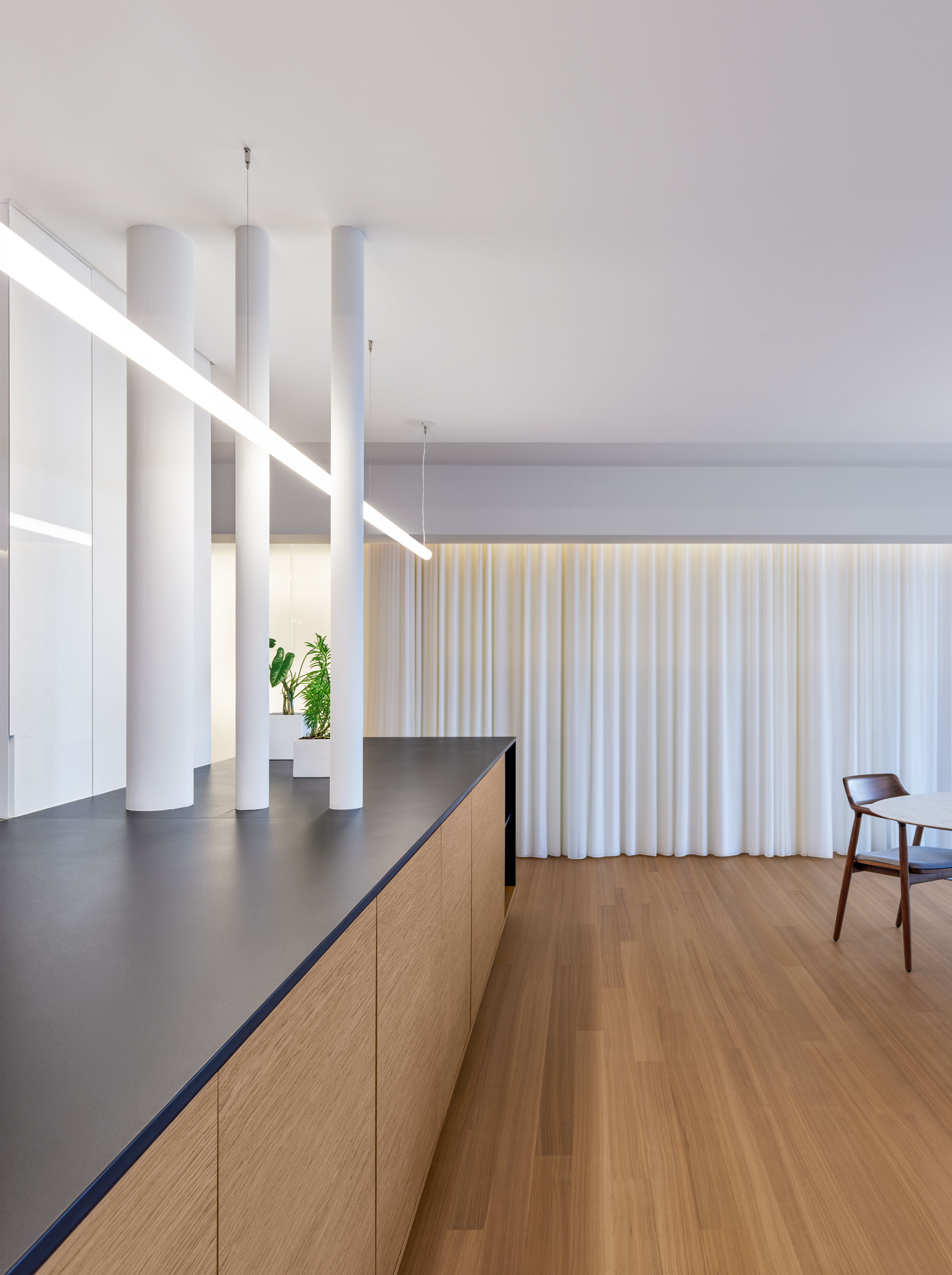
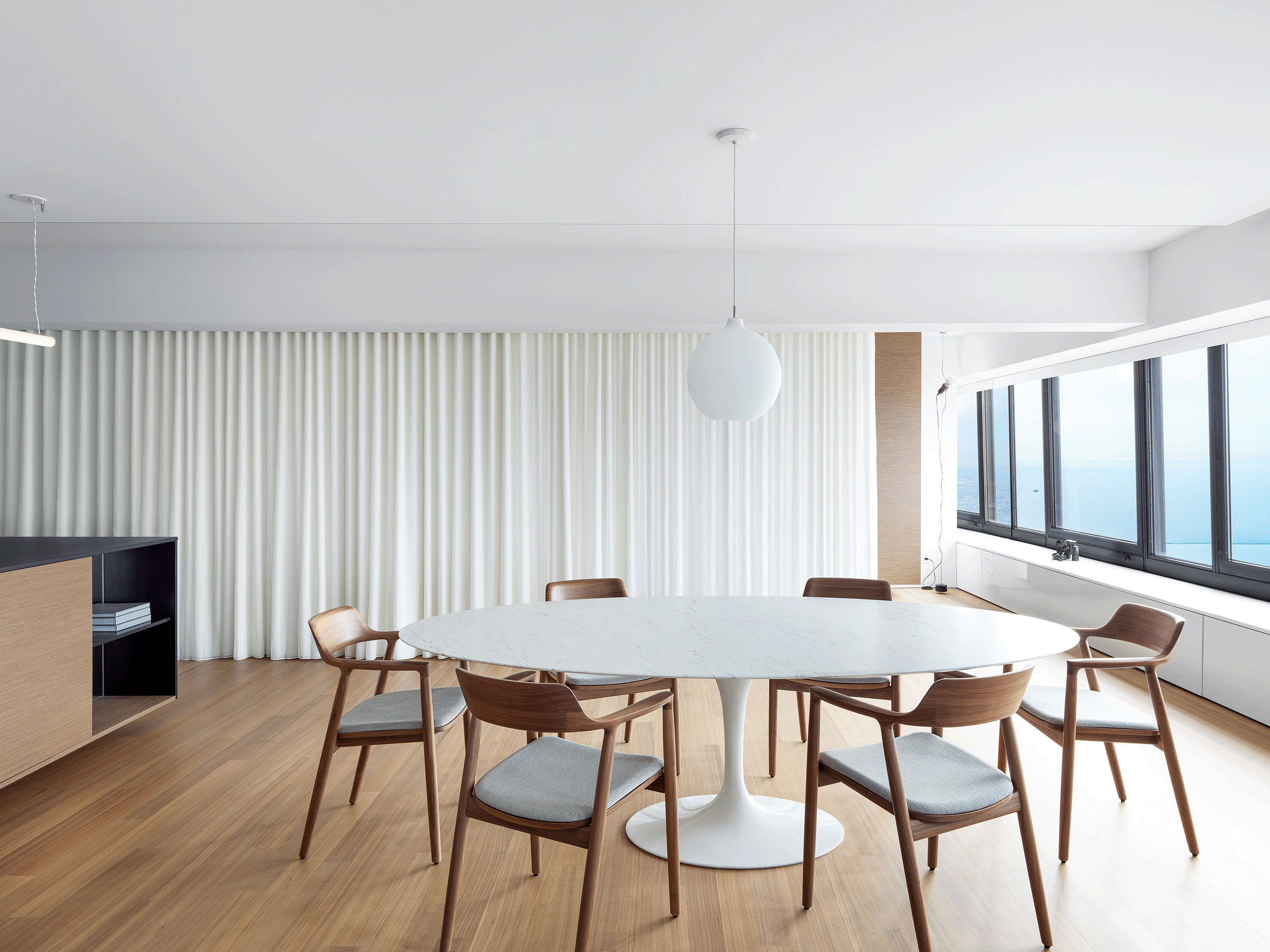
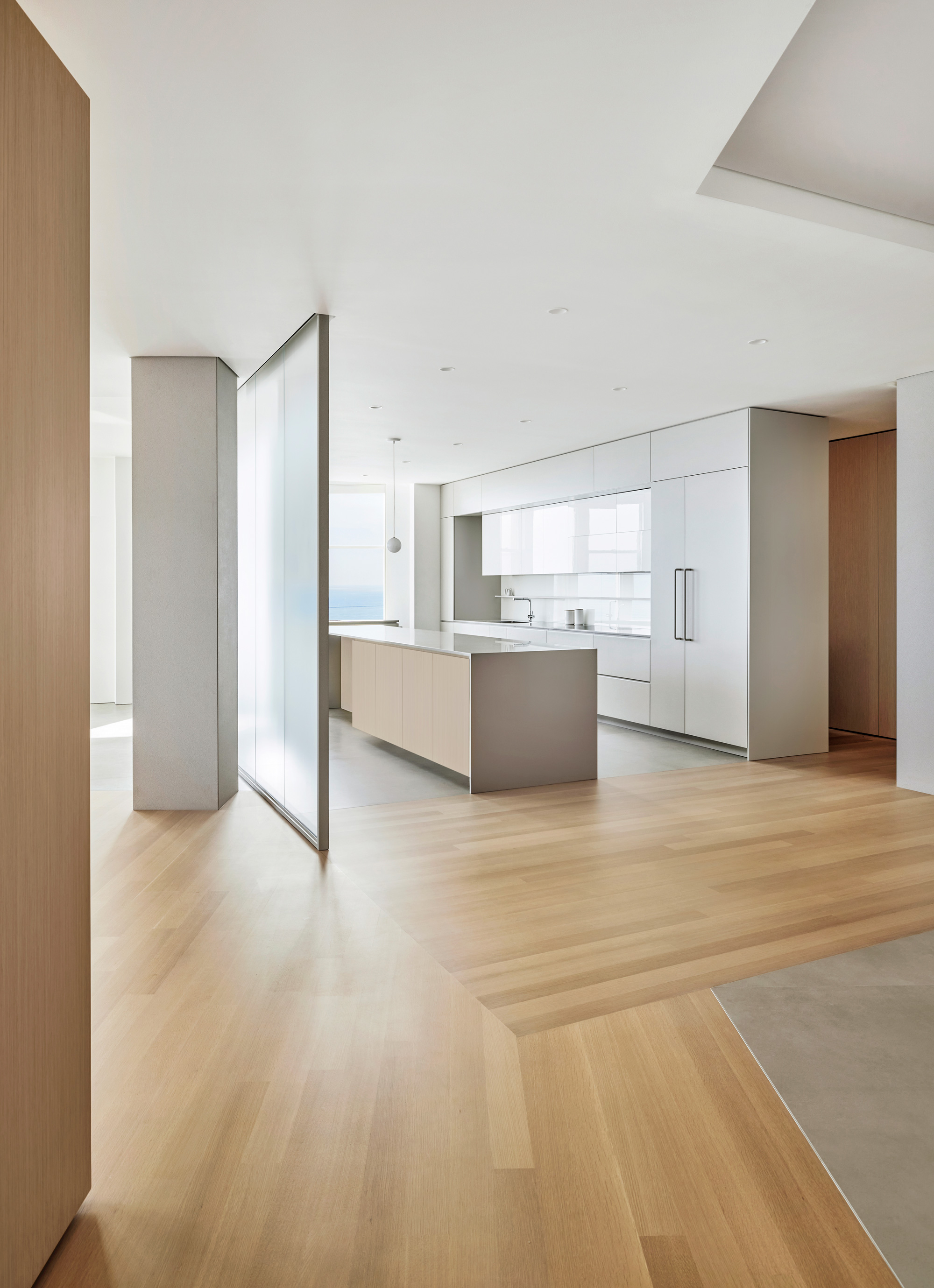
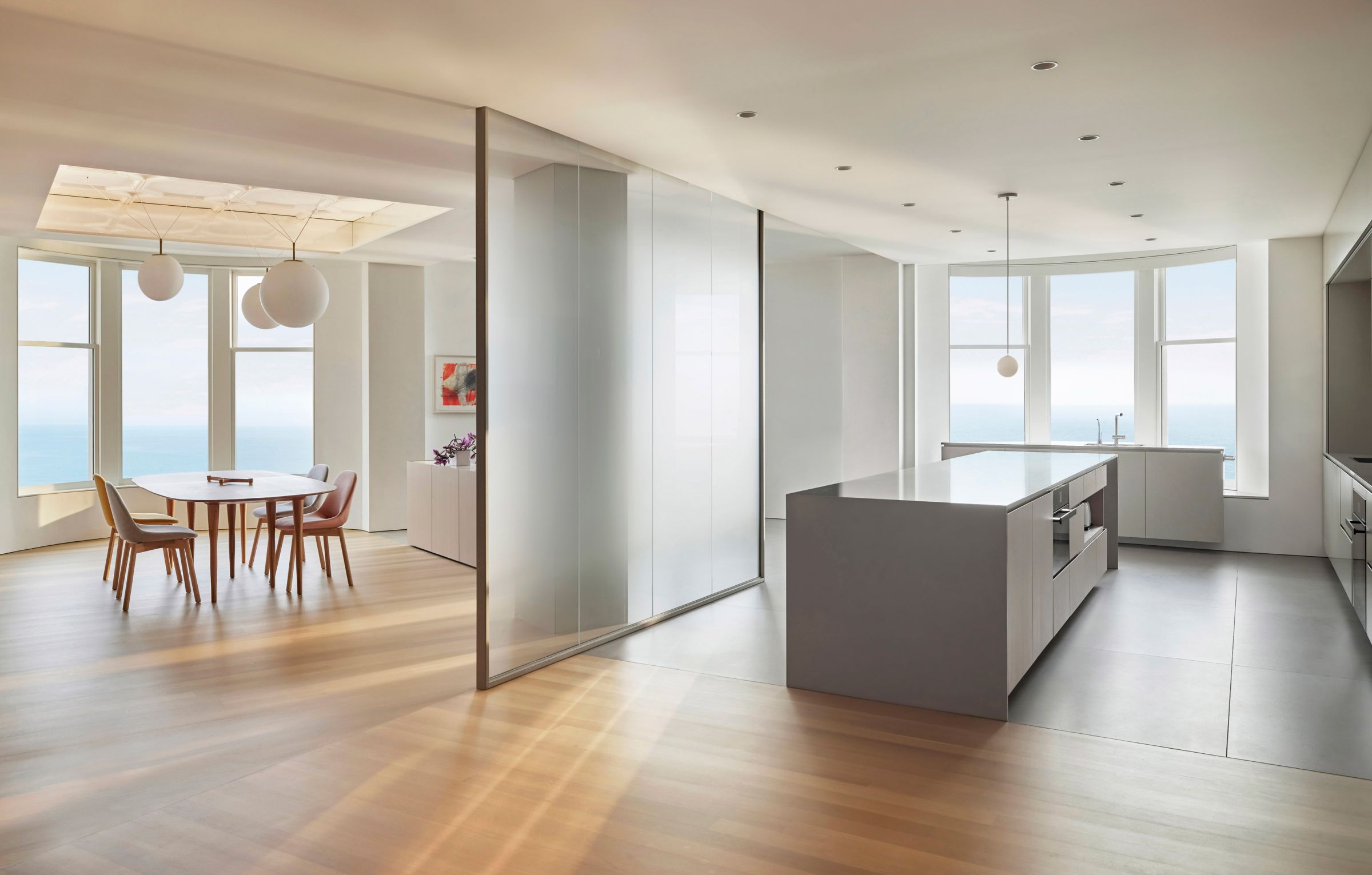
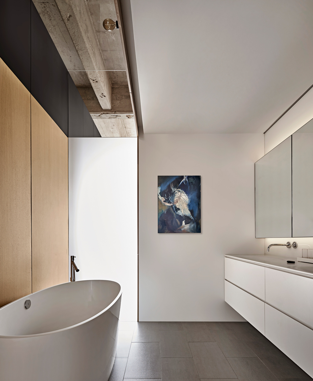
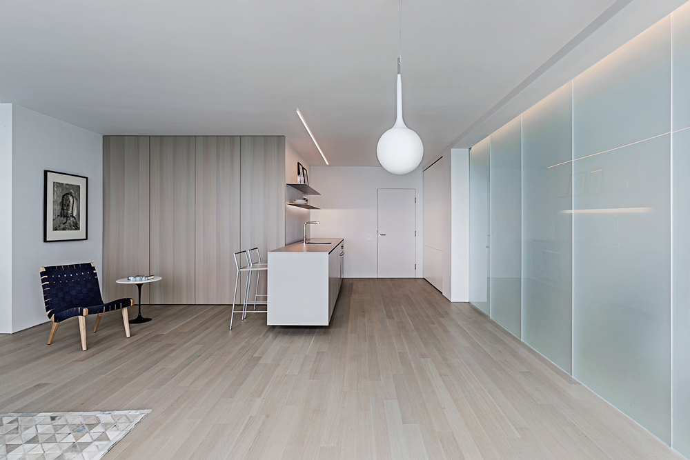
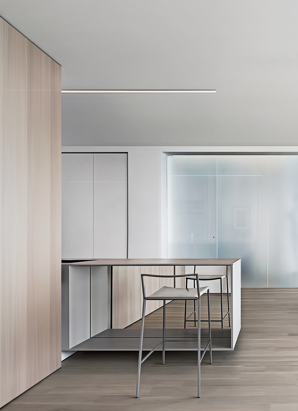
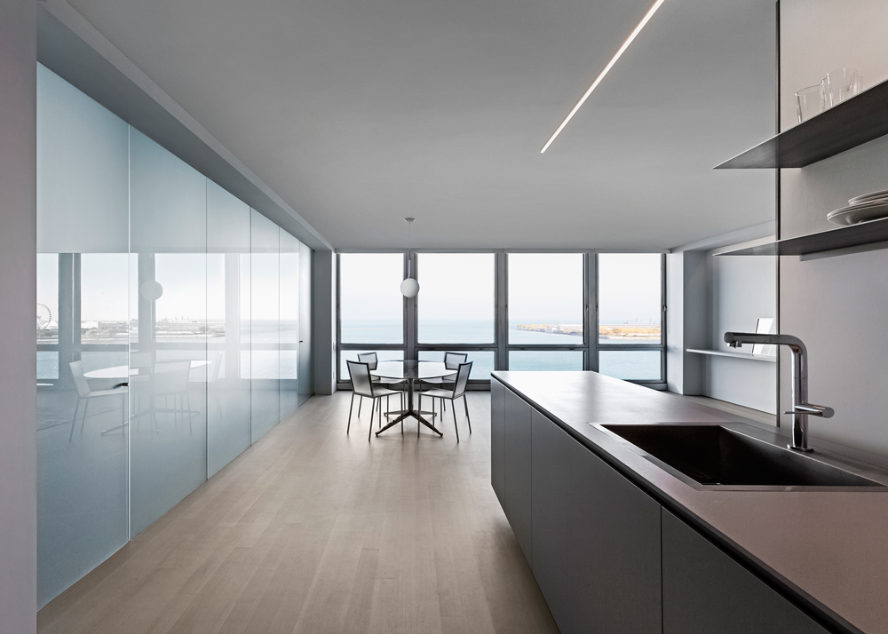
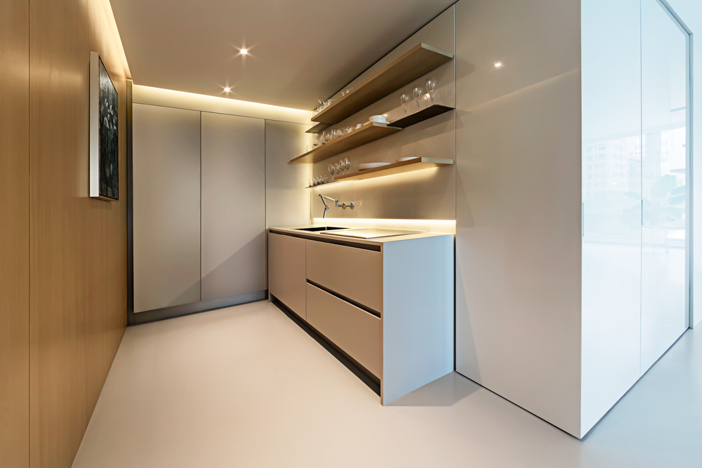
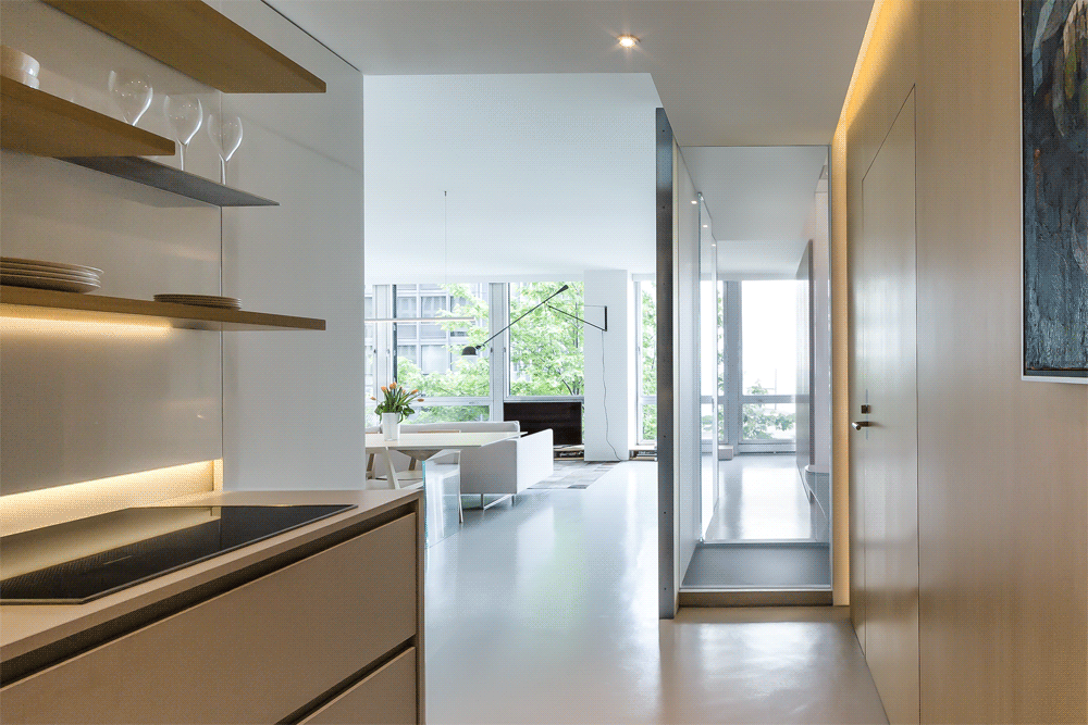
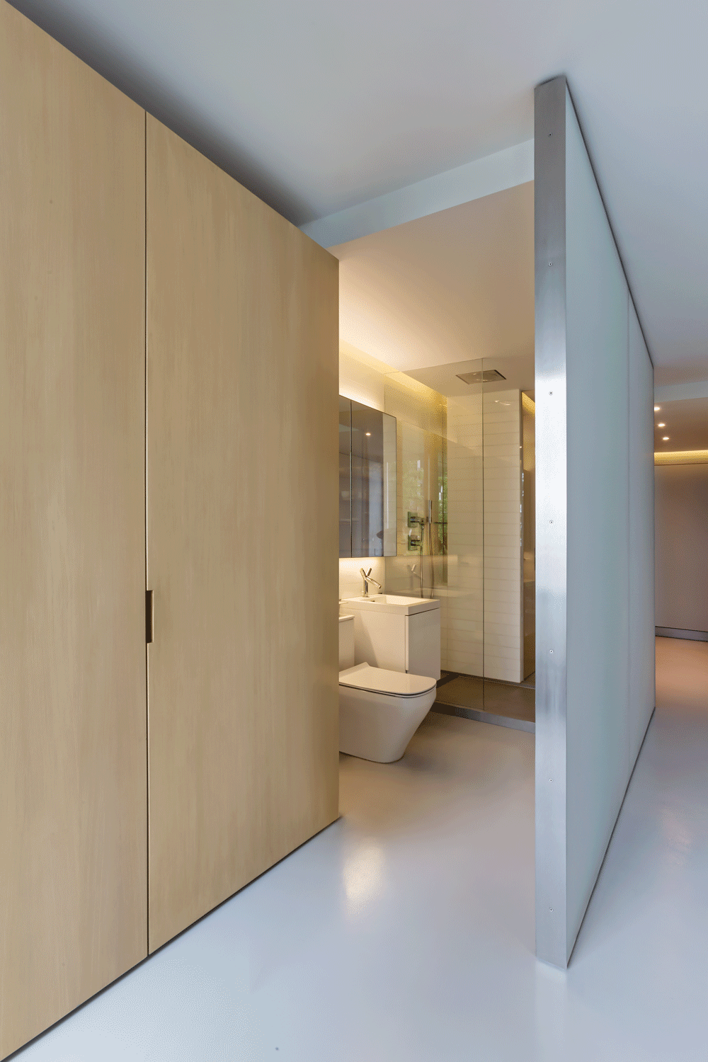
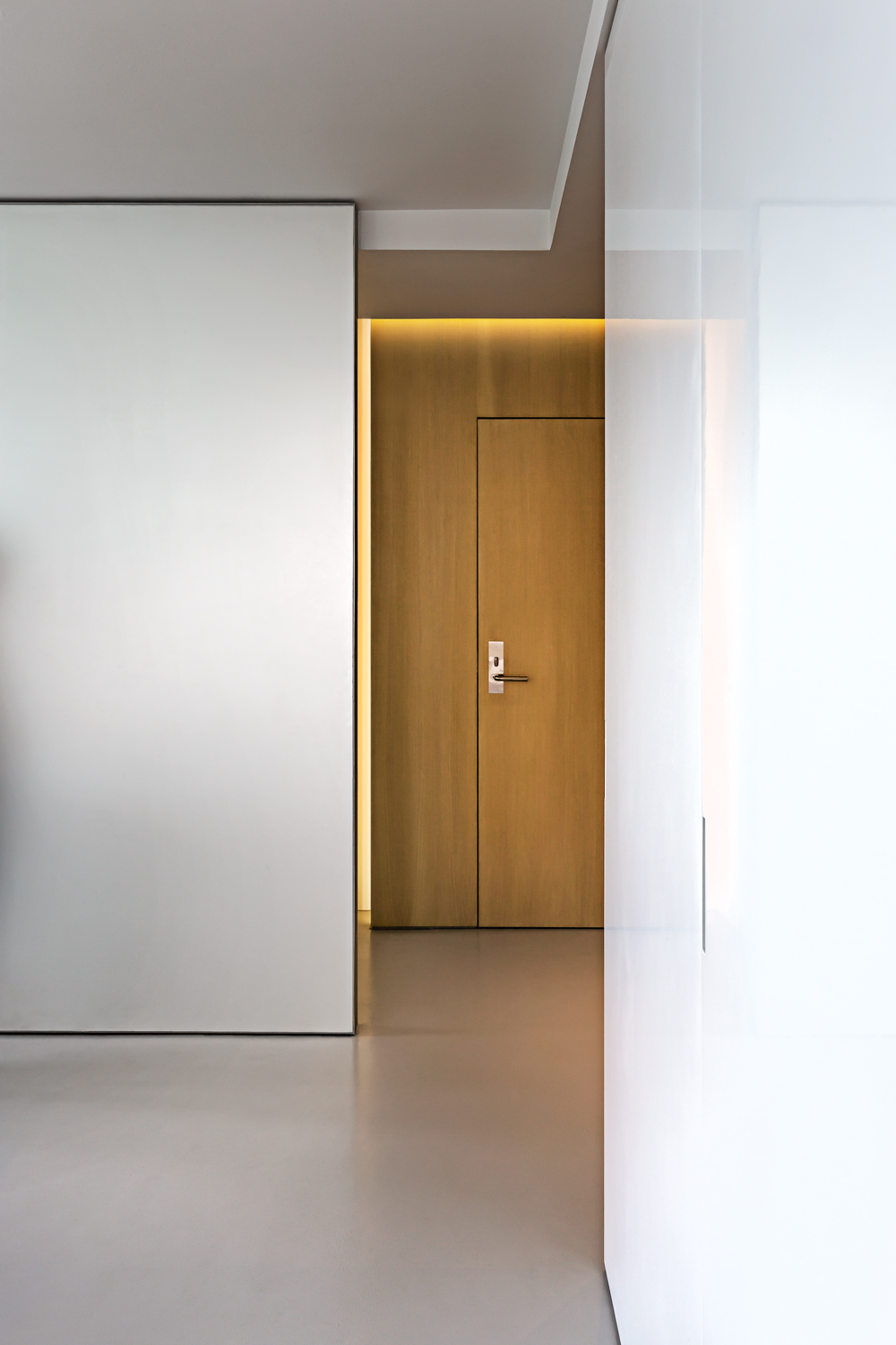
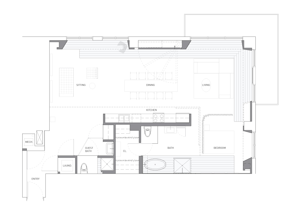
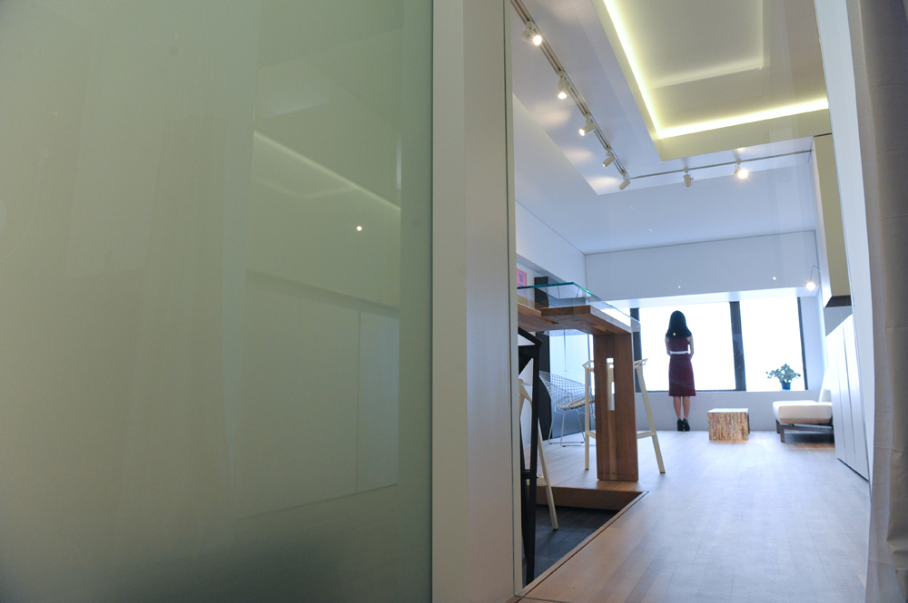
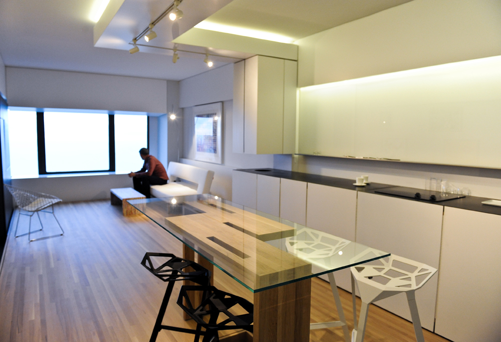
Oriented South towards the Chicago skyline, this 28th floor dwelling was renovated for a couple desiring an urban sanctuary as their second home. Captivating views and beautiful light were already present as the main ingredients for making this apartment a tranquil space. To further amplify this serenity, we freed the interior from visual obstructions towards the skyline and opened vantage points that did not previously exist. The interior composition of floating planes and articulated surfaces provide privacy and domesticity while maintaining a sense of openness and cohesion within the space.
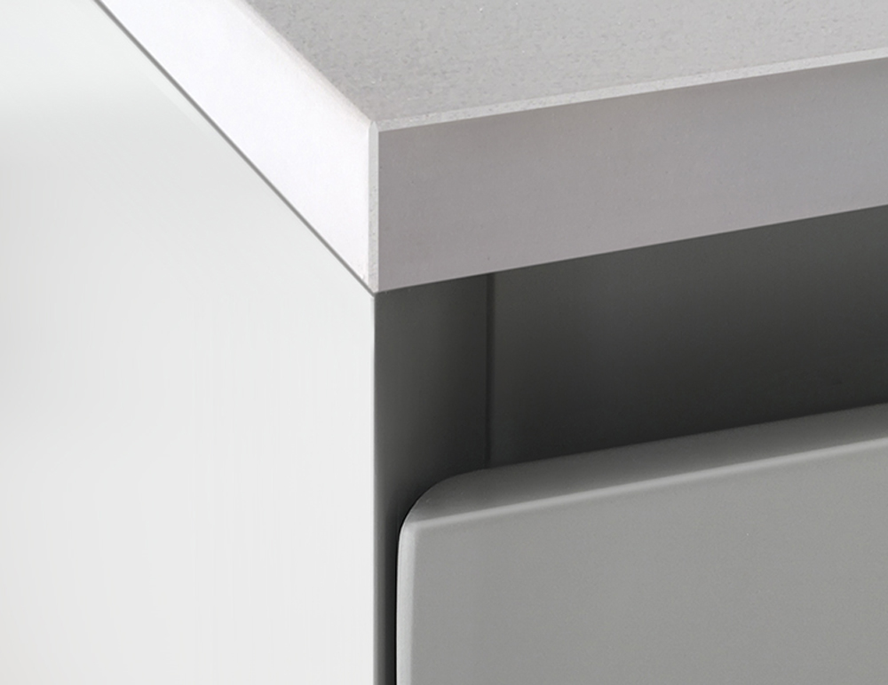
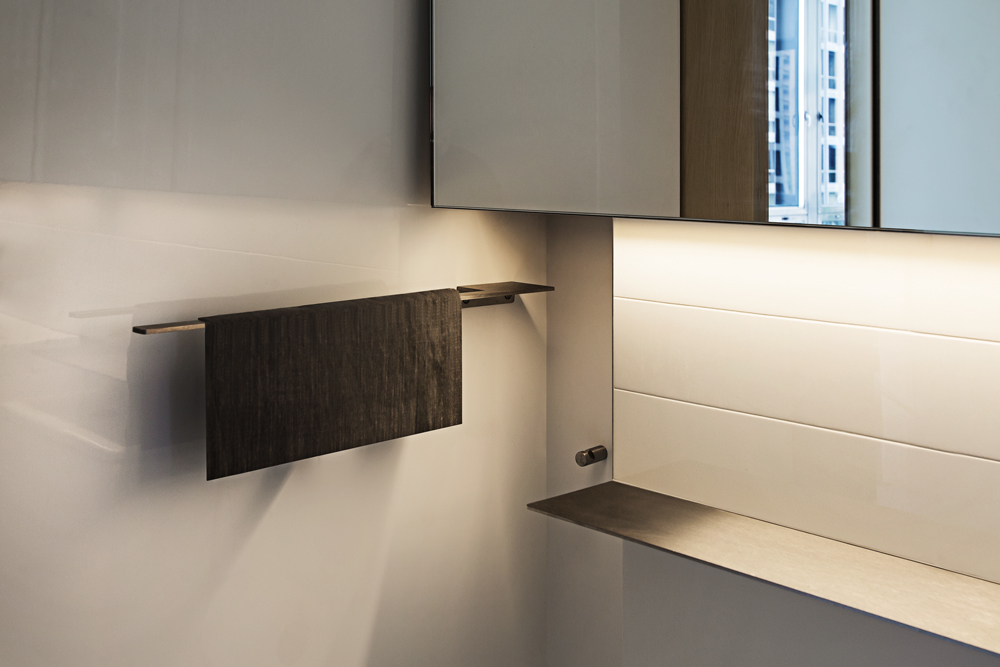
At entry, a tall white oak element welcomes you, concealing variety of daily functions within its tight grain clad walls. The opposing horizontal kitchen section compliments the tall millwork, extending visually into the mirrored backsplash niche. Shelves disappear and reemerge behind the delicate walls, creating a backdrop for everyday living things. These floating black lines organize the primary living space and become visually lighter as they elevate vertically above the ground plane. This play on visual continuity is employed throughout, where reflectivity creates illusions and connections between architectural elements and the spaces that they support.
The long east wall separates the bathroom as well as hides the primary storage. Its white reflective surface captures the urban setting and pulls the light further into the space. Once the white reflective separation ends, an absorbent material surface takes over on its opposing side. This change in material and texture is meant to evoke a greater sense of intimacy towards the more private areas of the apartment, while also forming a visual dialogue with the palette used inside the main room.
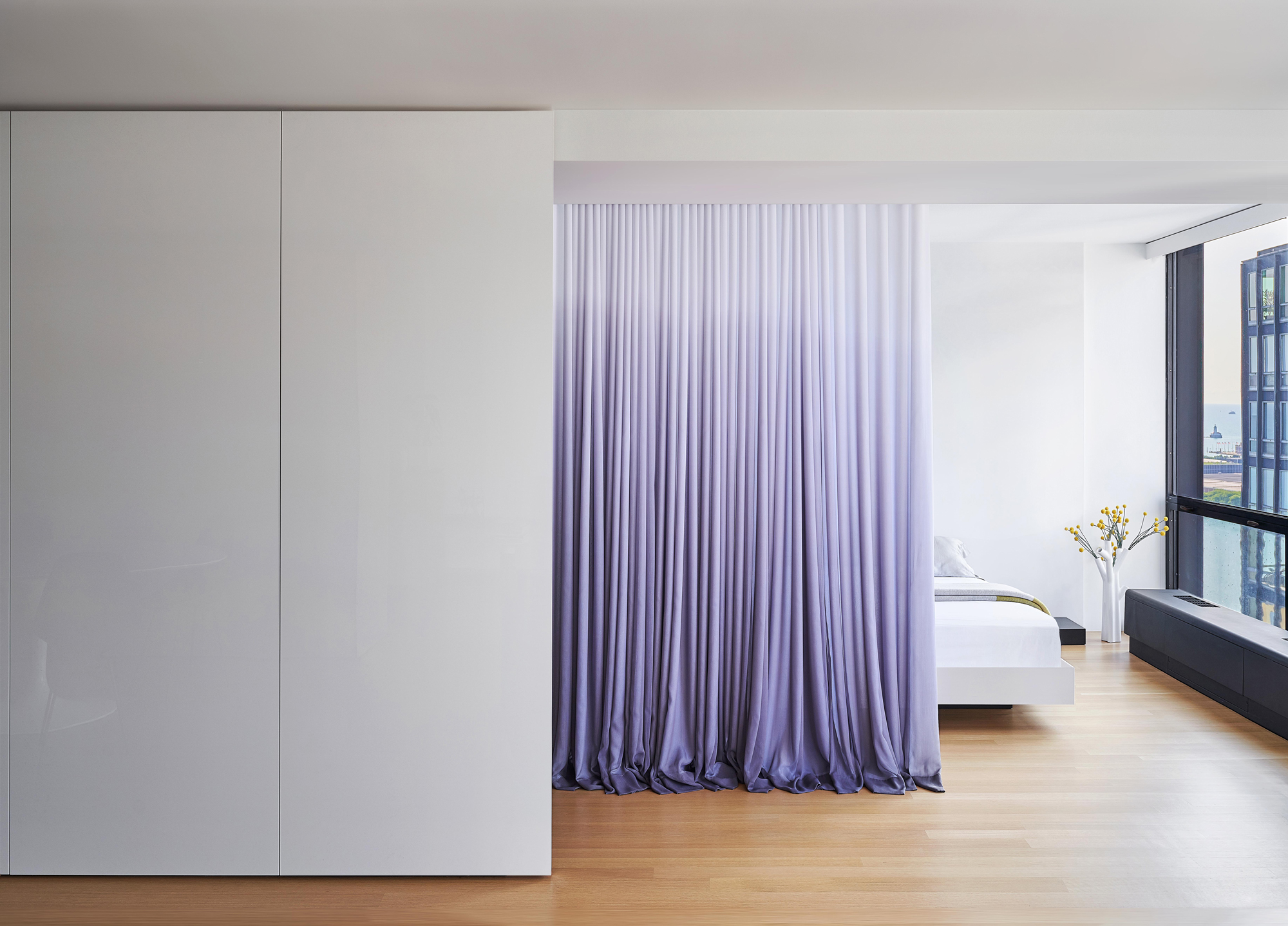
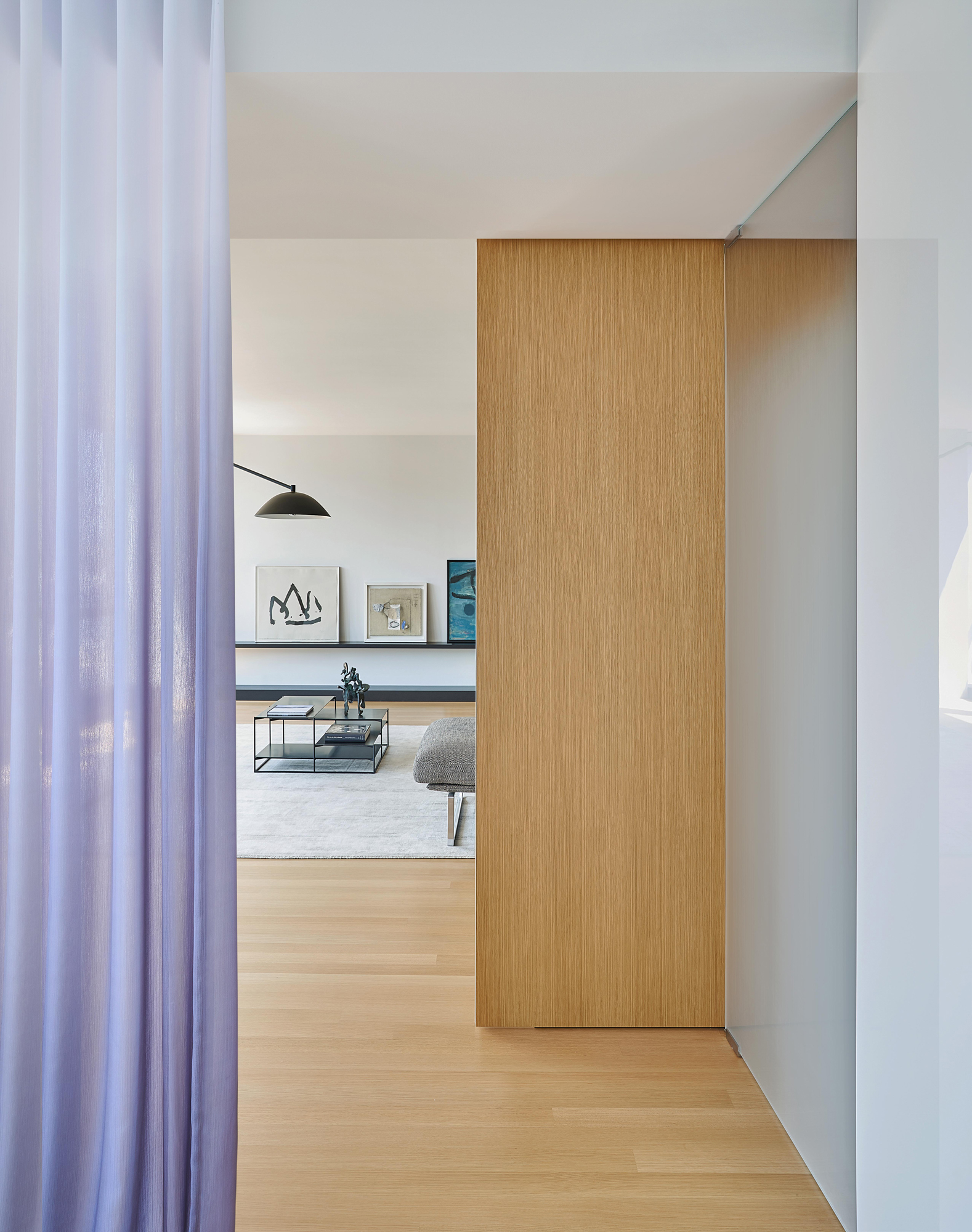
Where the opaque wall terminates it gives way to layers of fabric, echoing nature’s transition of water meeting sky. The curtain “wall” filters light and creates privacy as needed, allowing one to fully open the apartment towards the lakefront and the iconic 860/880 apartments across the way. Theatrically draped across the wood floor the fabric softens the refined ensemble, keeping the overall composition together as an enlivened, cohesive whole.
This intervention within the Mies Van Der Rohe designed apartment buildings embodies material restraint and highlights the precision of craft. It evokes a tranquil sense of place inside the historic context while focusing on the memorable city views and dynamic lakefront, capturing ephemeral qualities of natural light as it changes throughout each day.
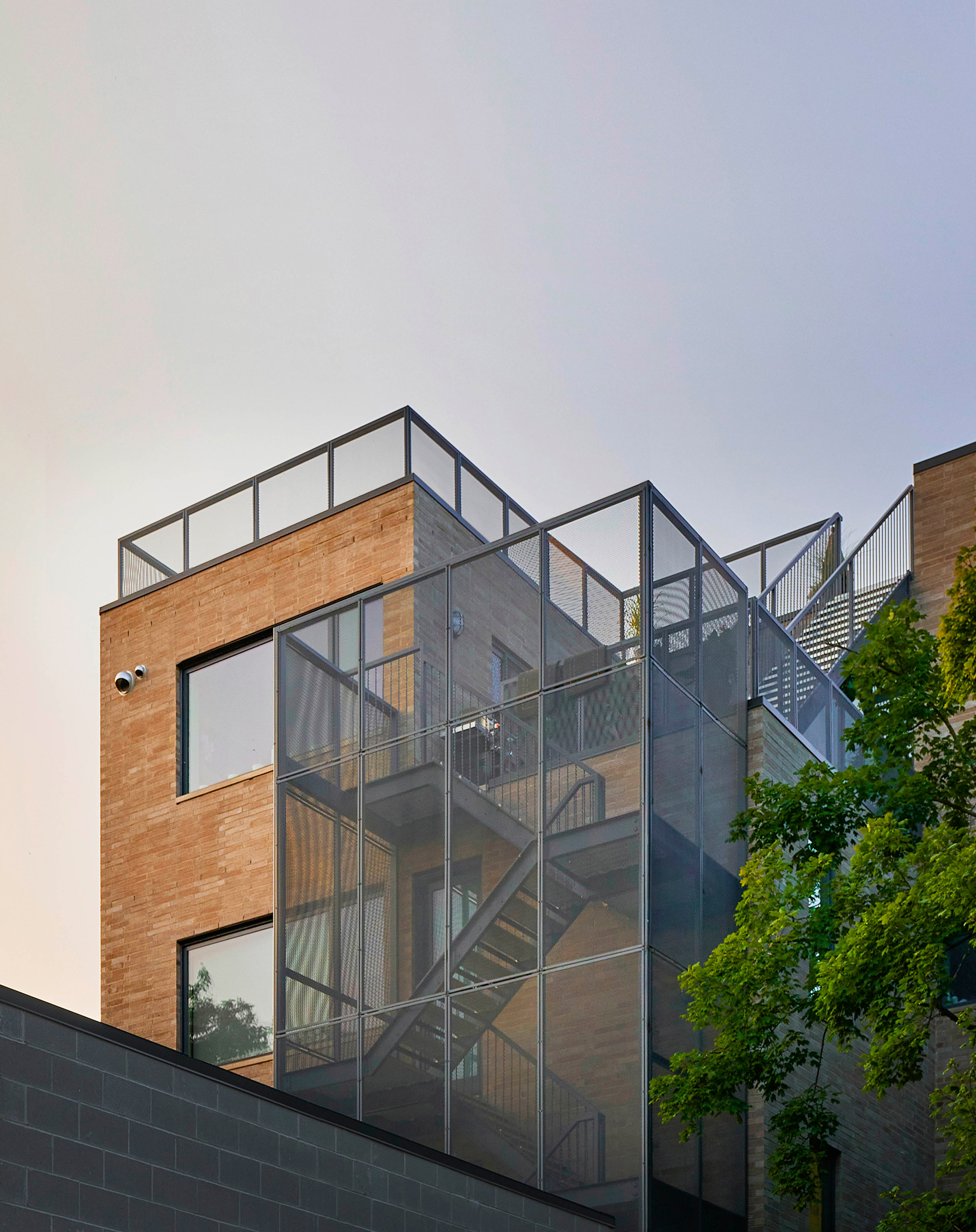
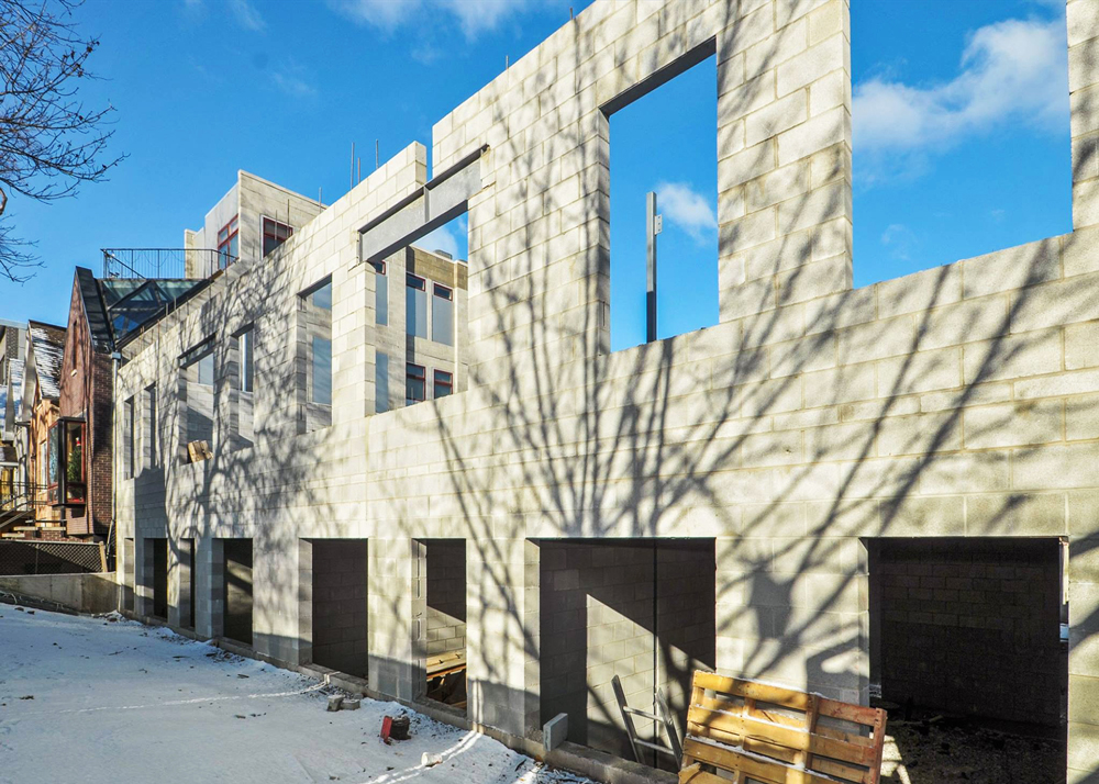
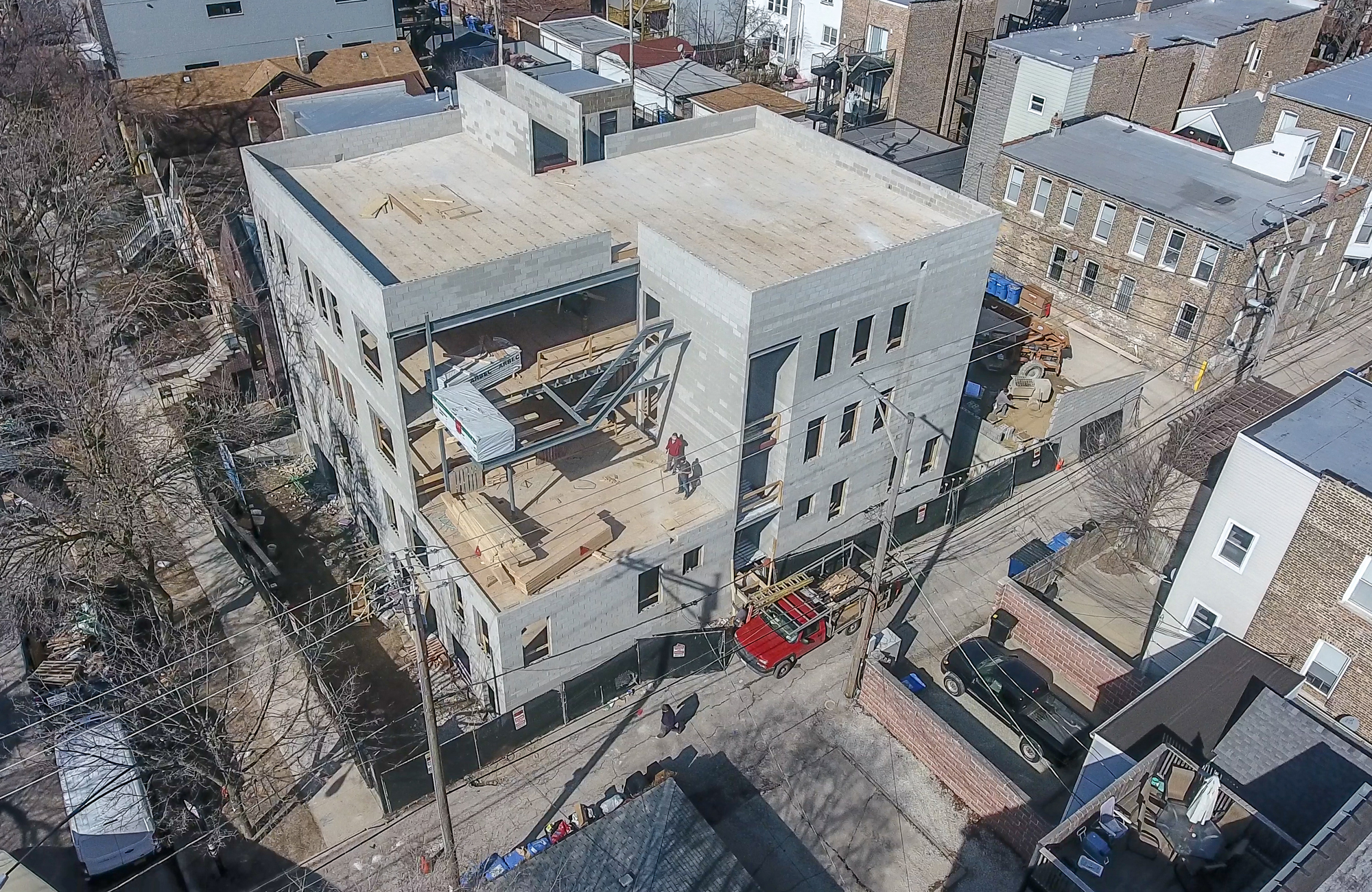
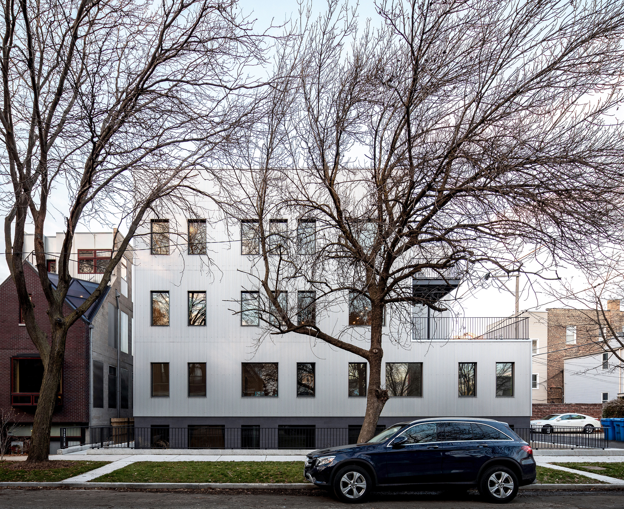
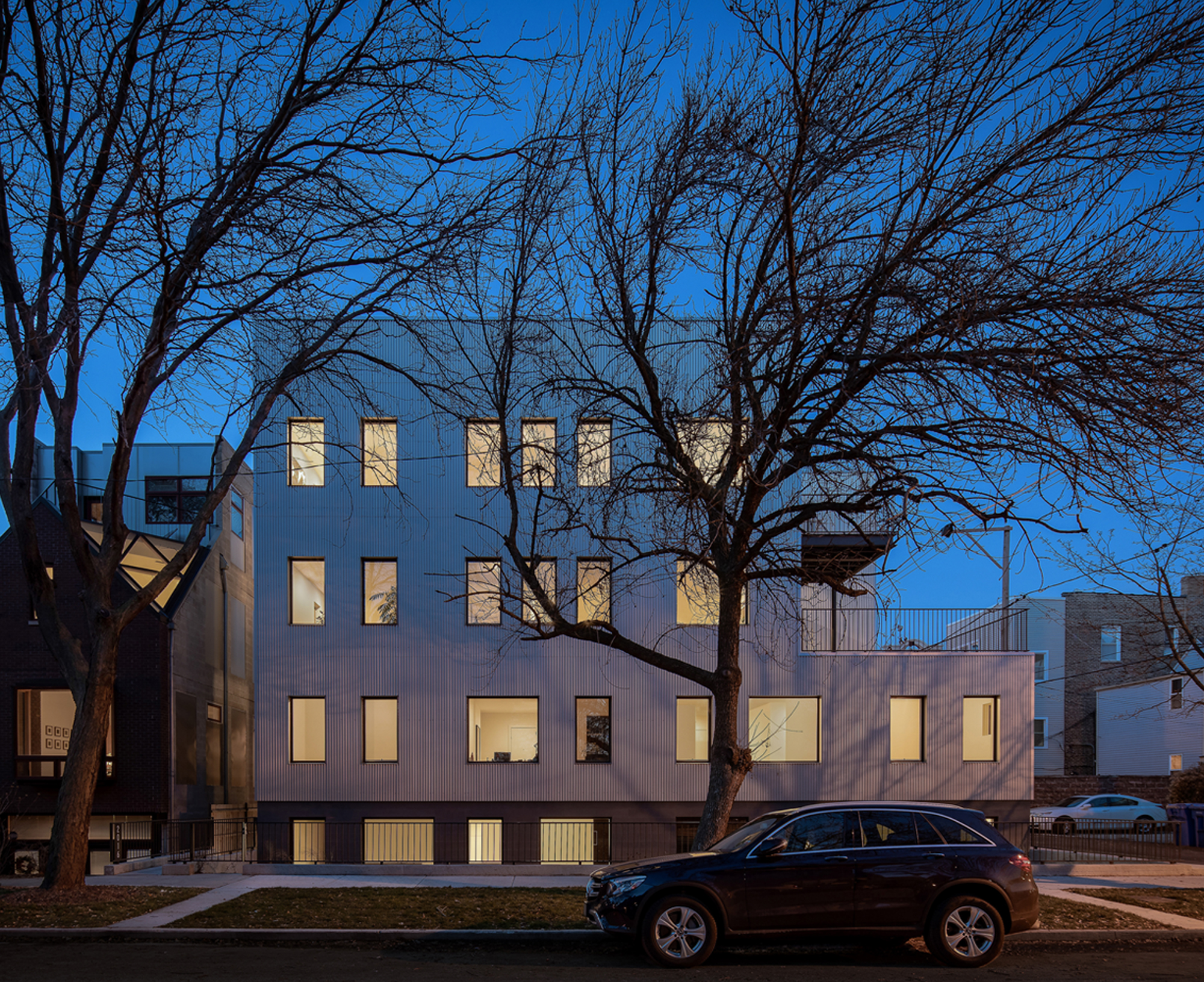
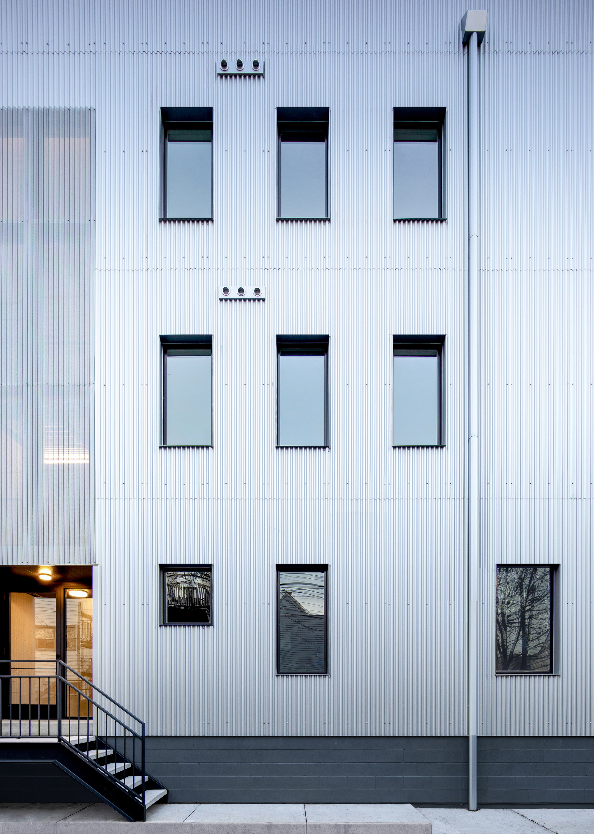
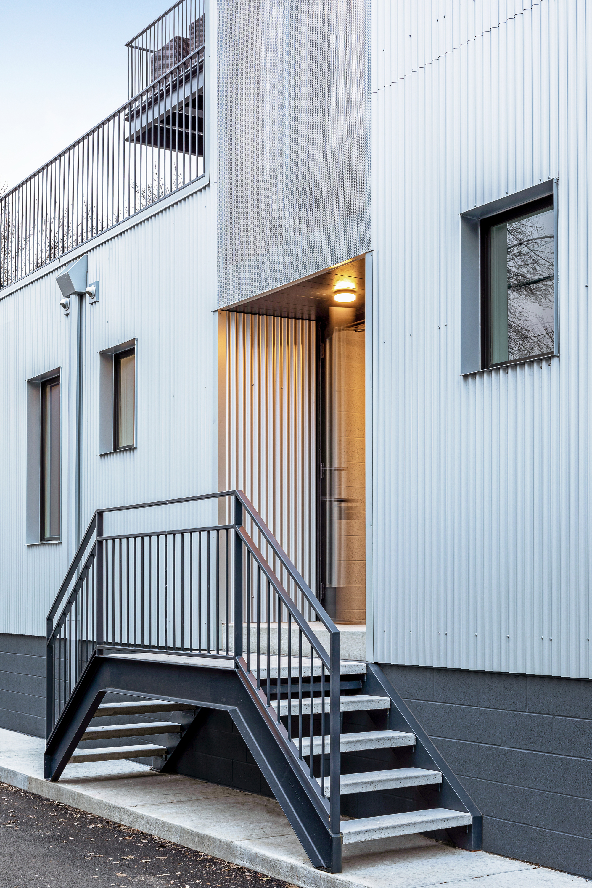
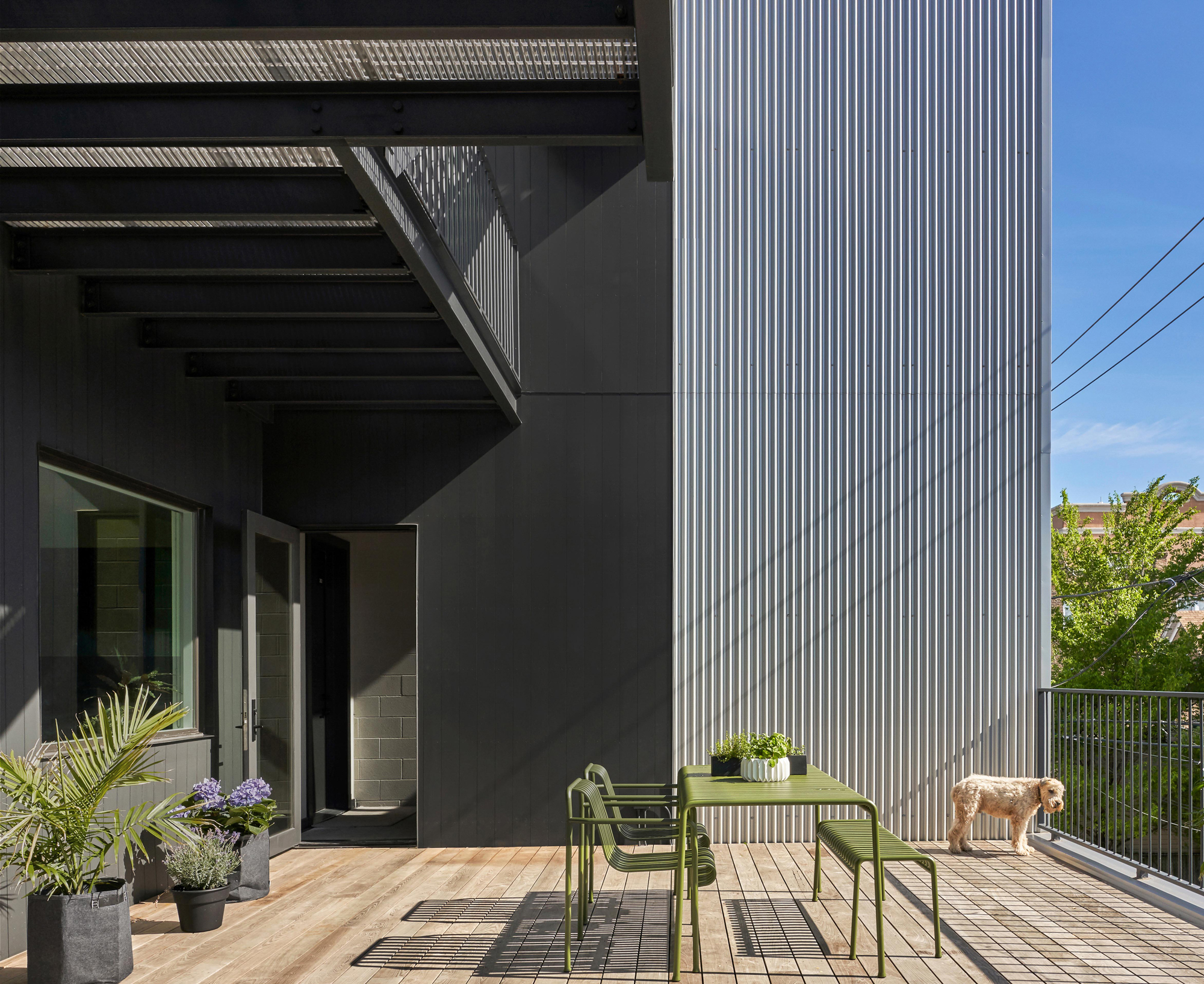
The 2016 West Rice residences are located in the heart of one of the Chicago’s oldest established neighborhoods, Ukrainian Village. Comprised of 4 uniquely configured duplexes with 4 single story units stacked above, this 8 unit residential typology is a design response to our client’s requirement to maximize the site’s buildable area.
This contemporary building development attempts to mark its place in time, exemplifying architecture expression for its immediate surrounding as well as the greater city context.
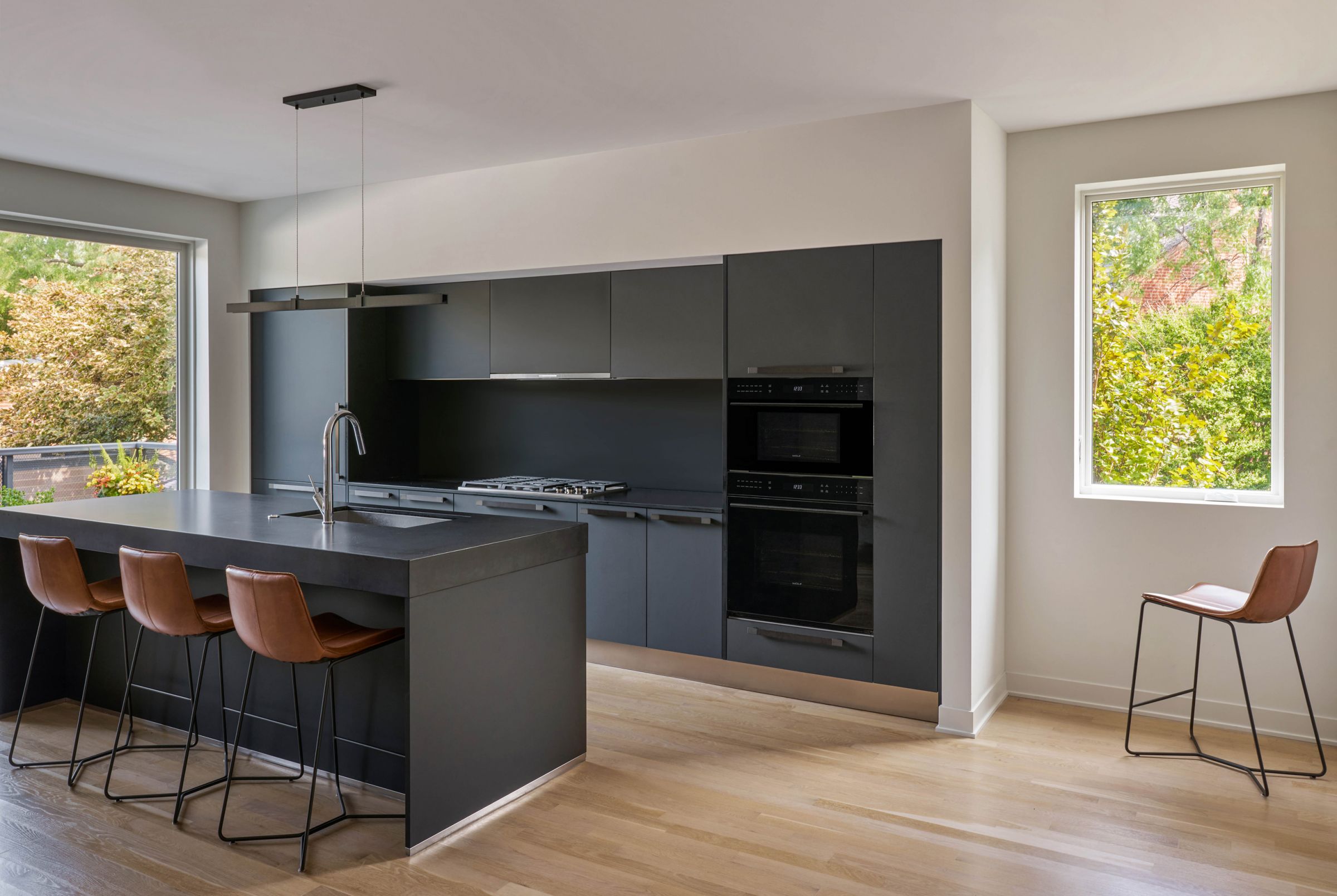
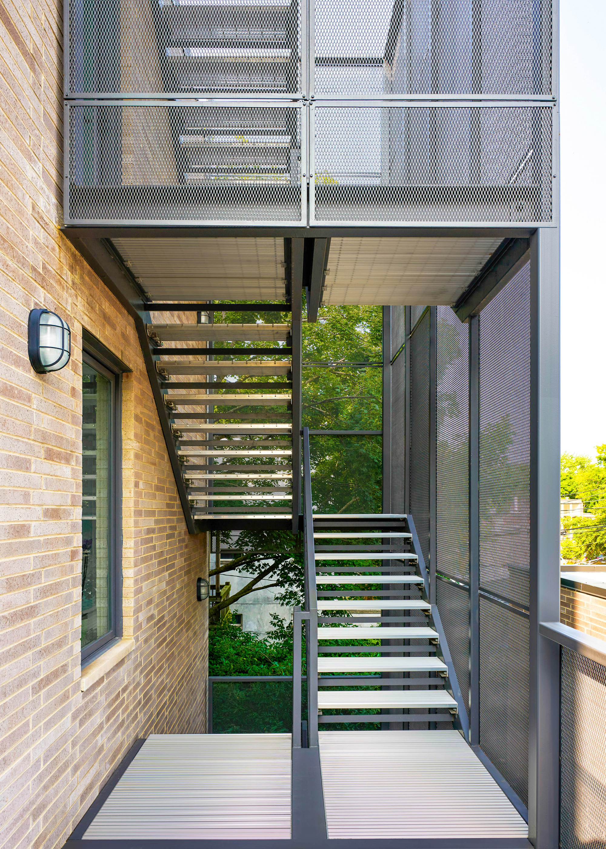
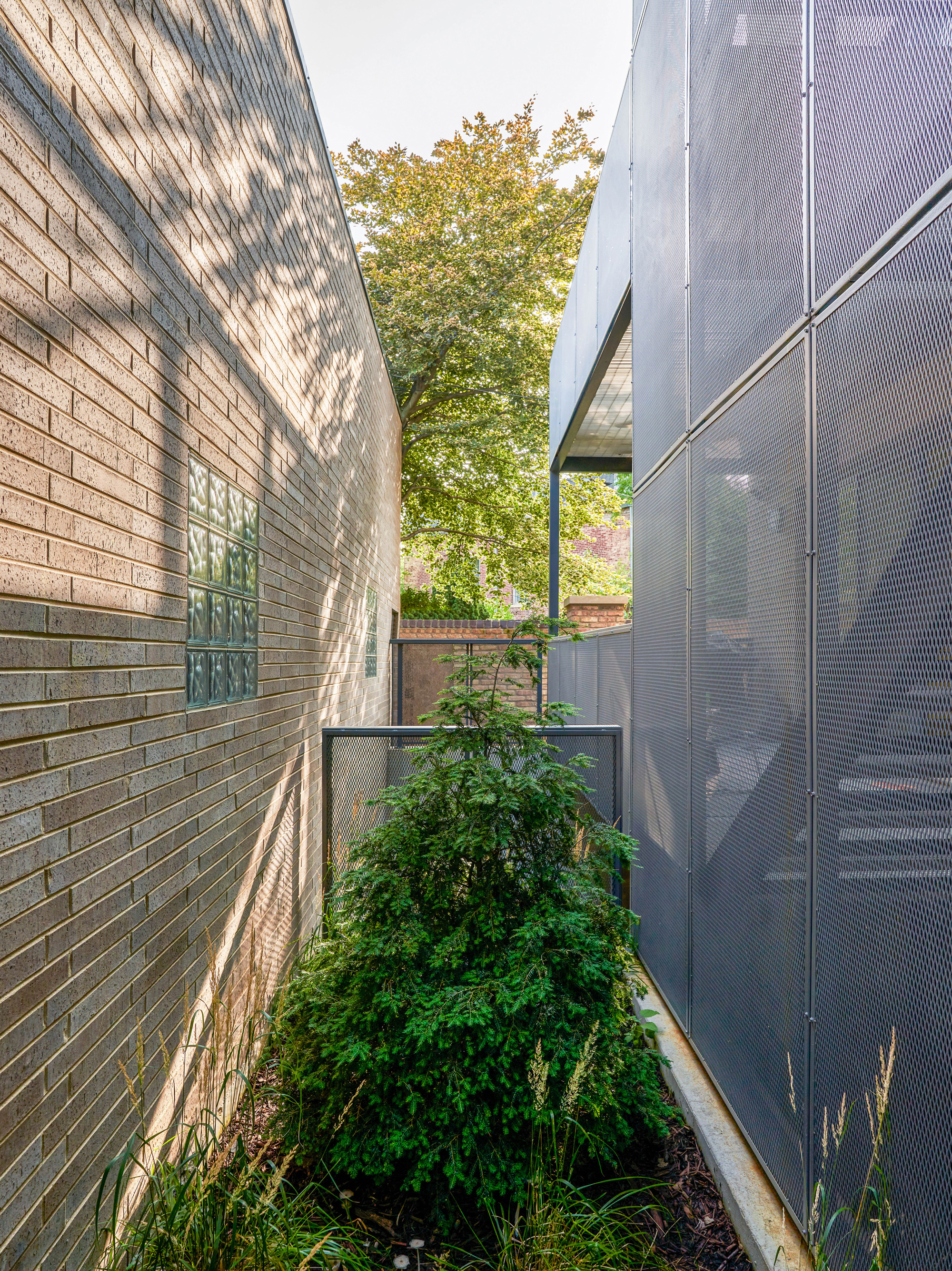
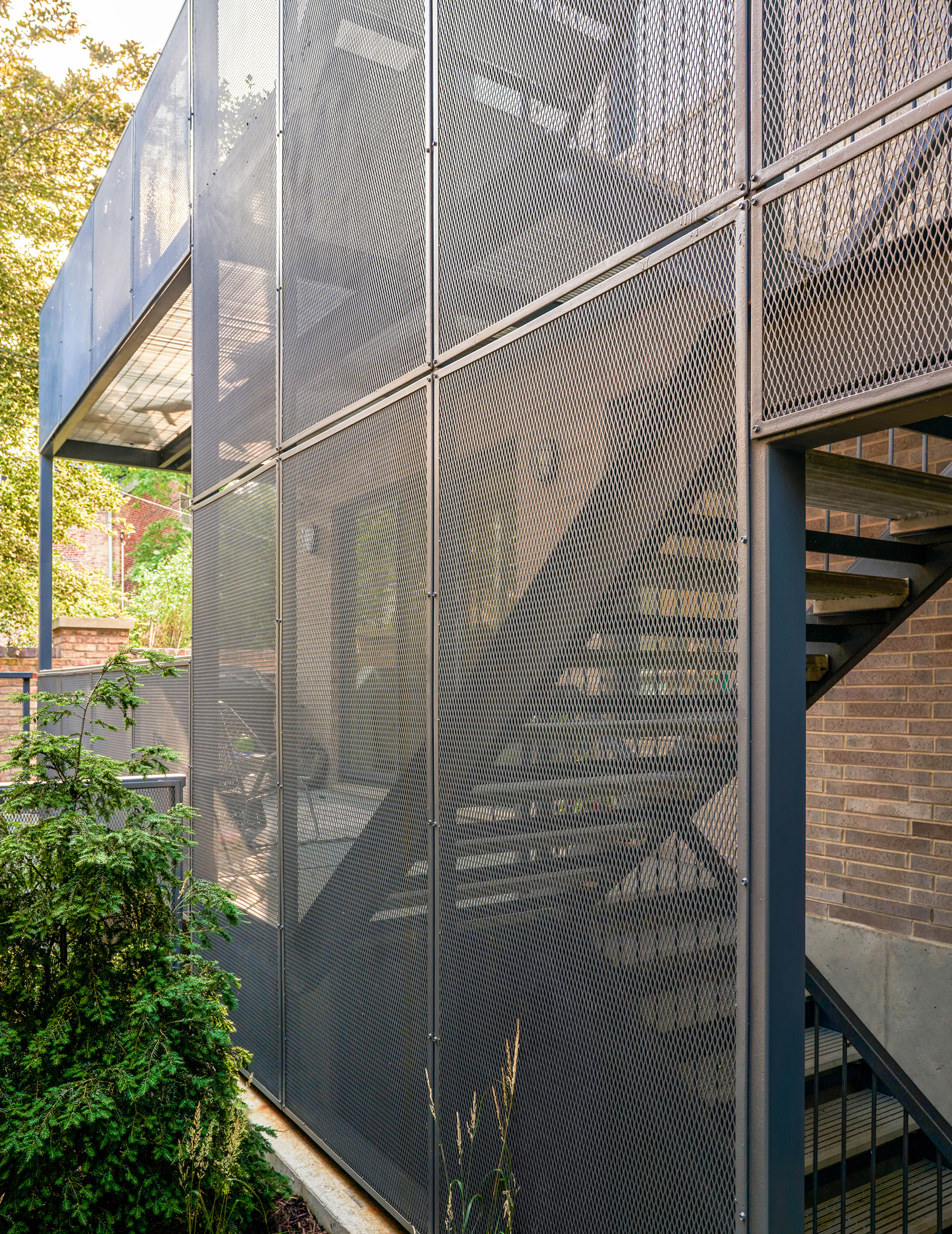
The building is organized as a small community of individual dwelling units wrapped in one contiguous skin. Unlike a single-family home, each residence is designed with at least three distinct orientations and an abundance of outdoor space, maximizing daylight and cross breezes throughout the day. The outward appearance of this building is a direct result of strategic interior planning, with two large cubic voids defining large terraces starting at the second floor. In these voids, the articulated steel balconies and stairs are nested, echoing Chicago’s infamous fire escapes and adding visual relief at the SE and NW corners of the site. Large, punched window openings in the building’s corrugated metal skin appear more as perforations within the overall mass, perceptively reducing the building scale amongst its fellow neighbors. Selected for its reflective qualities, the exterior cladding produces a dynamic play of light and shadow across all façades, highlighting atmospheric changes brought forth by the seasons and throughout the day.
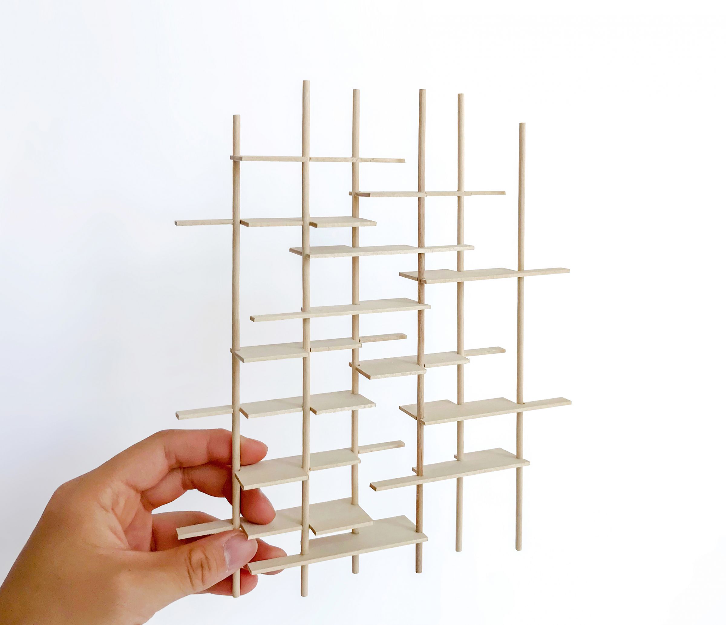
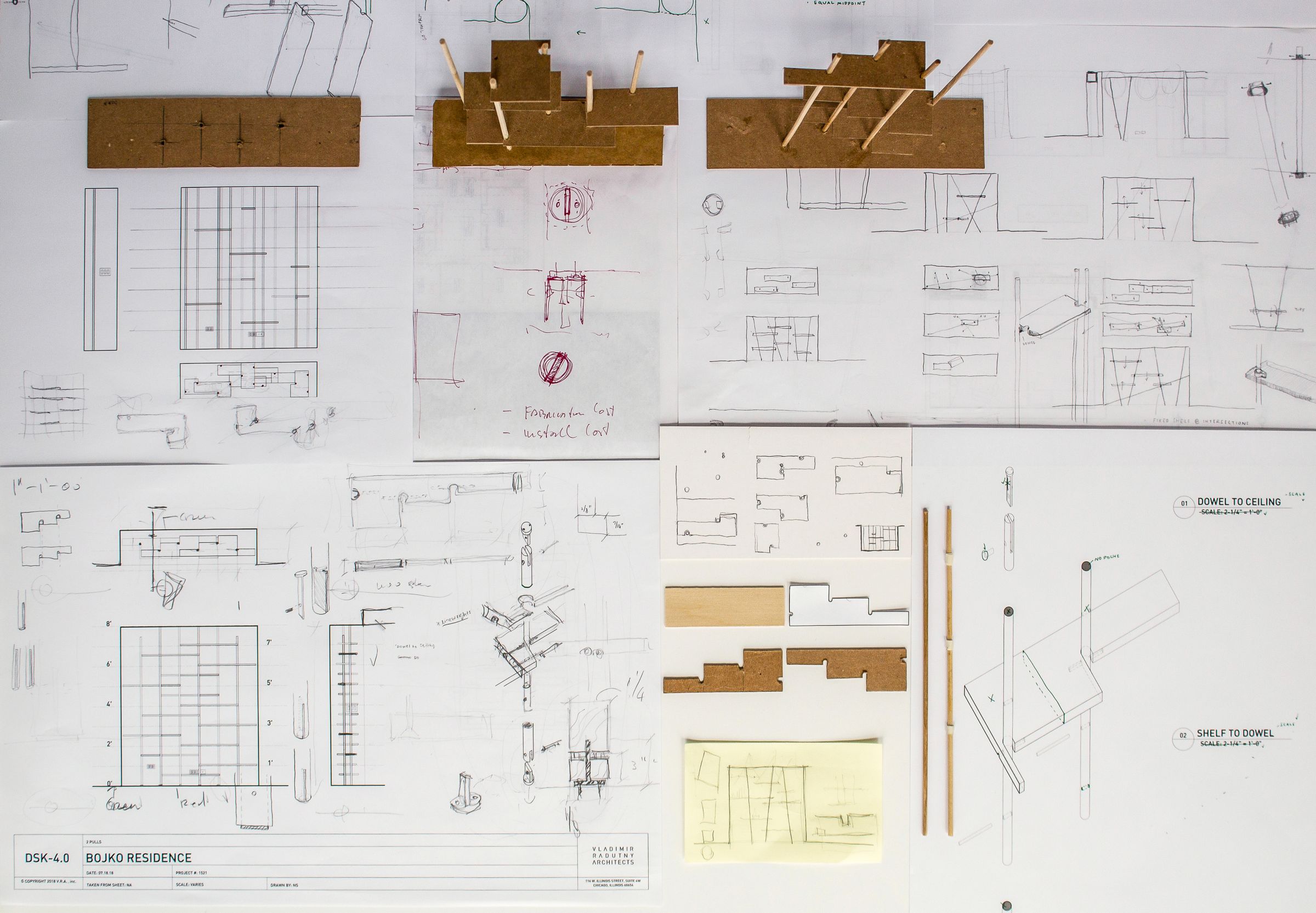
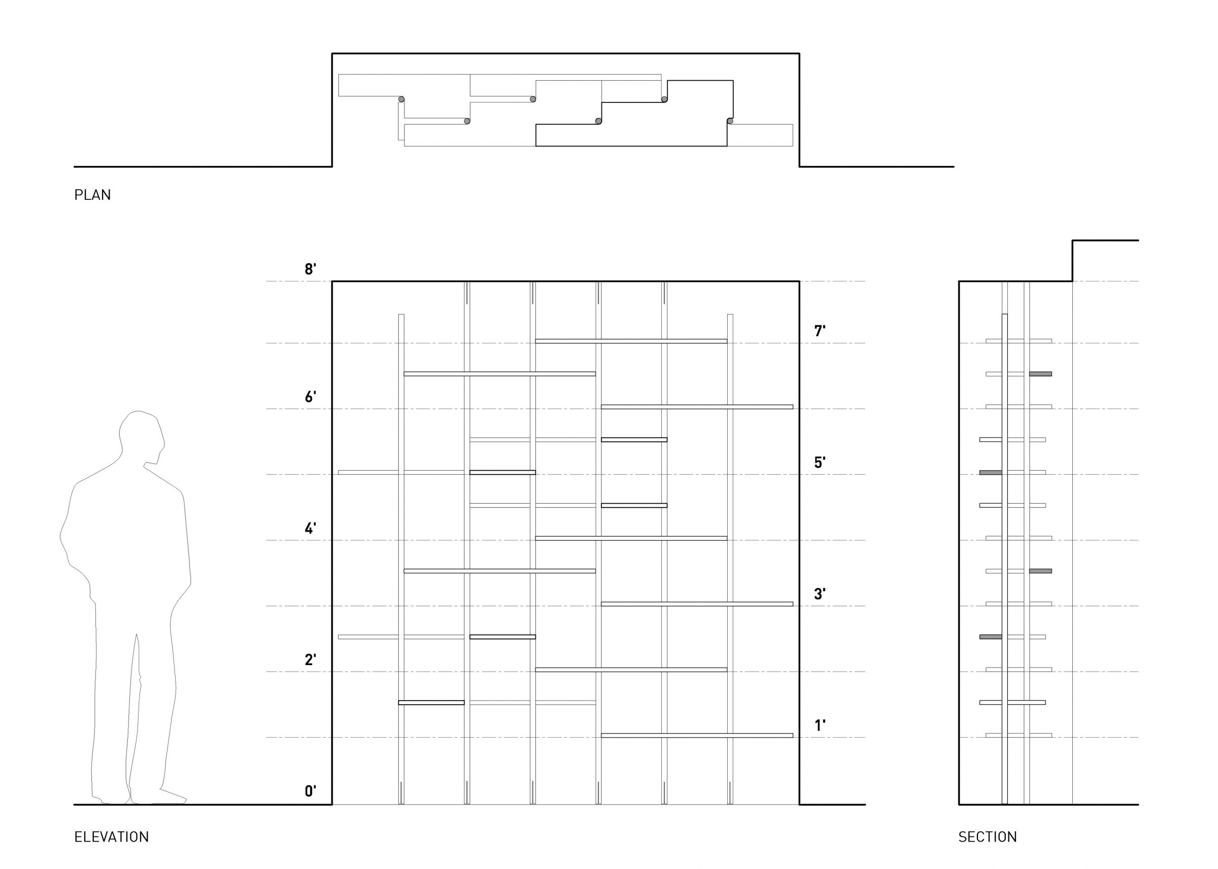
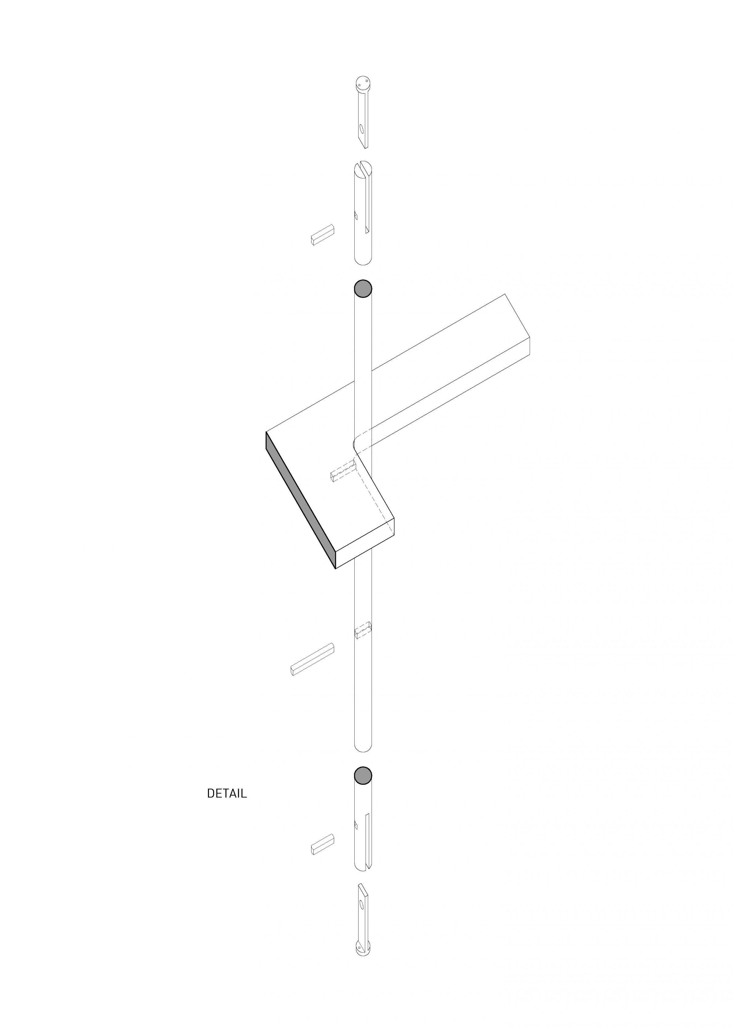
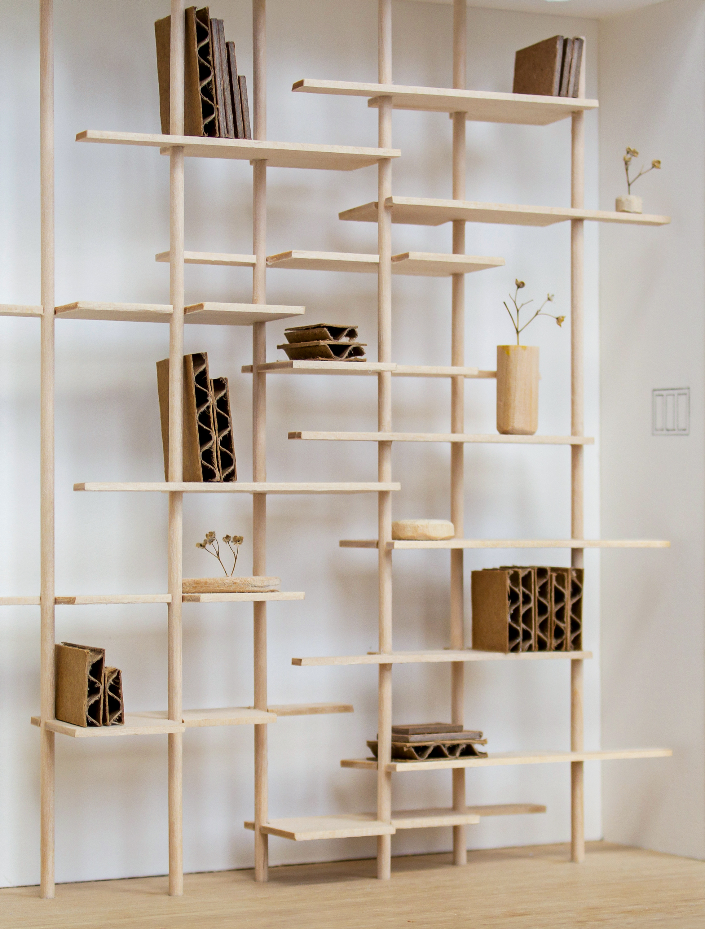
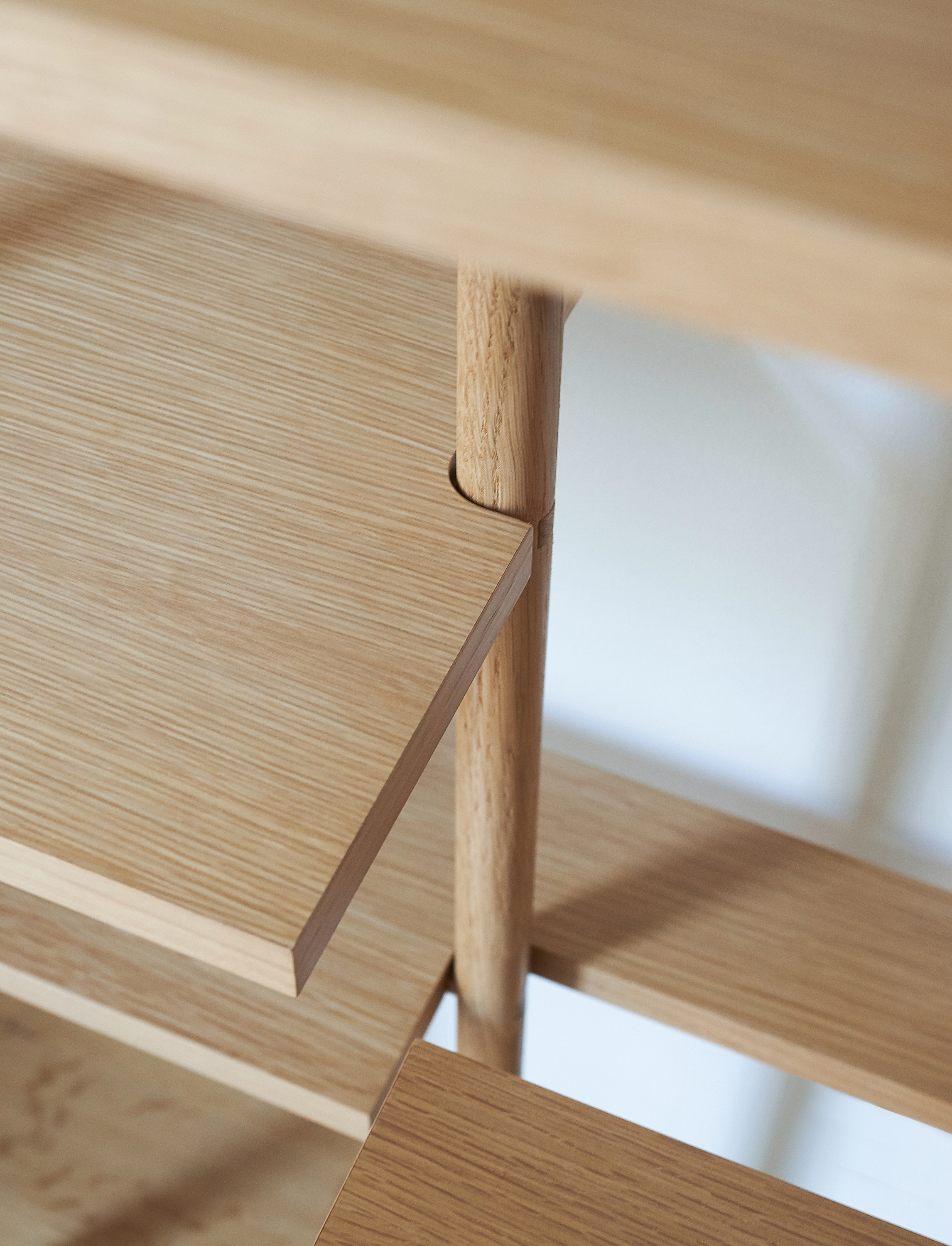
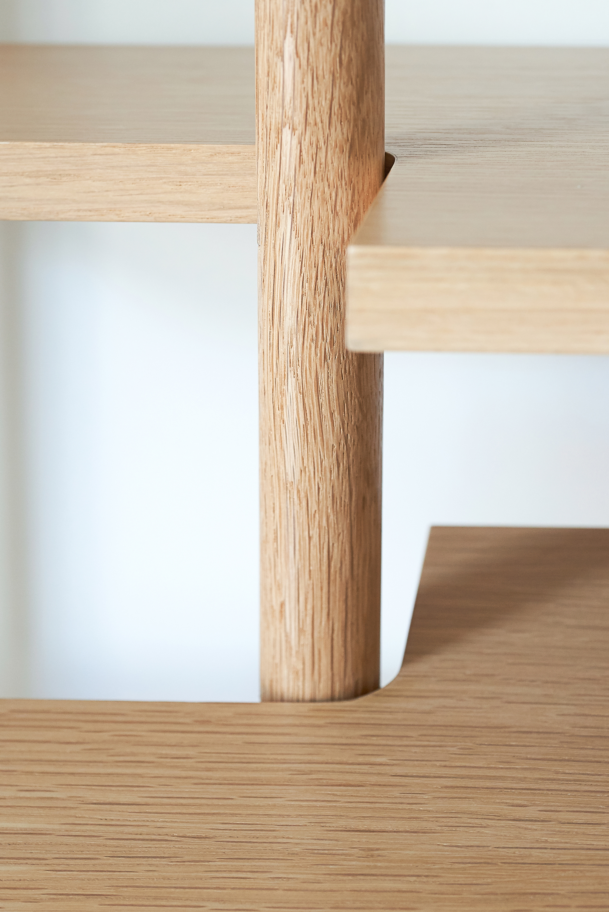
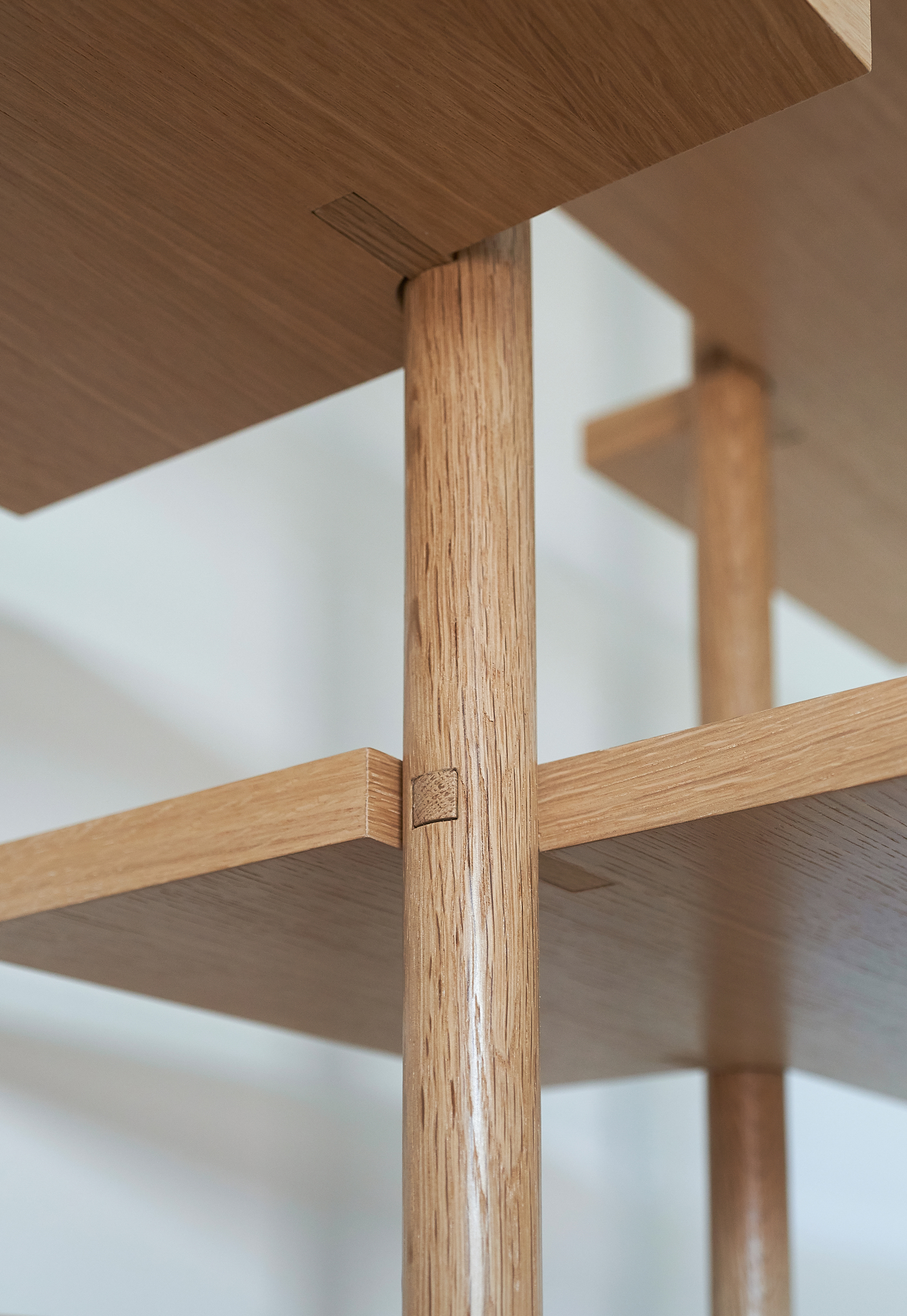
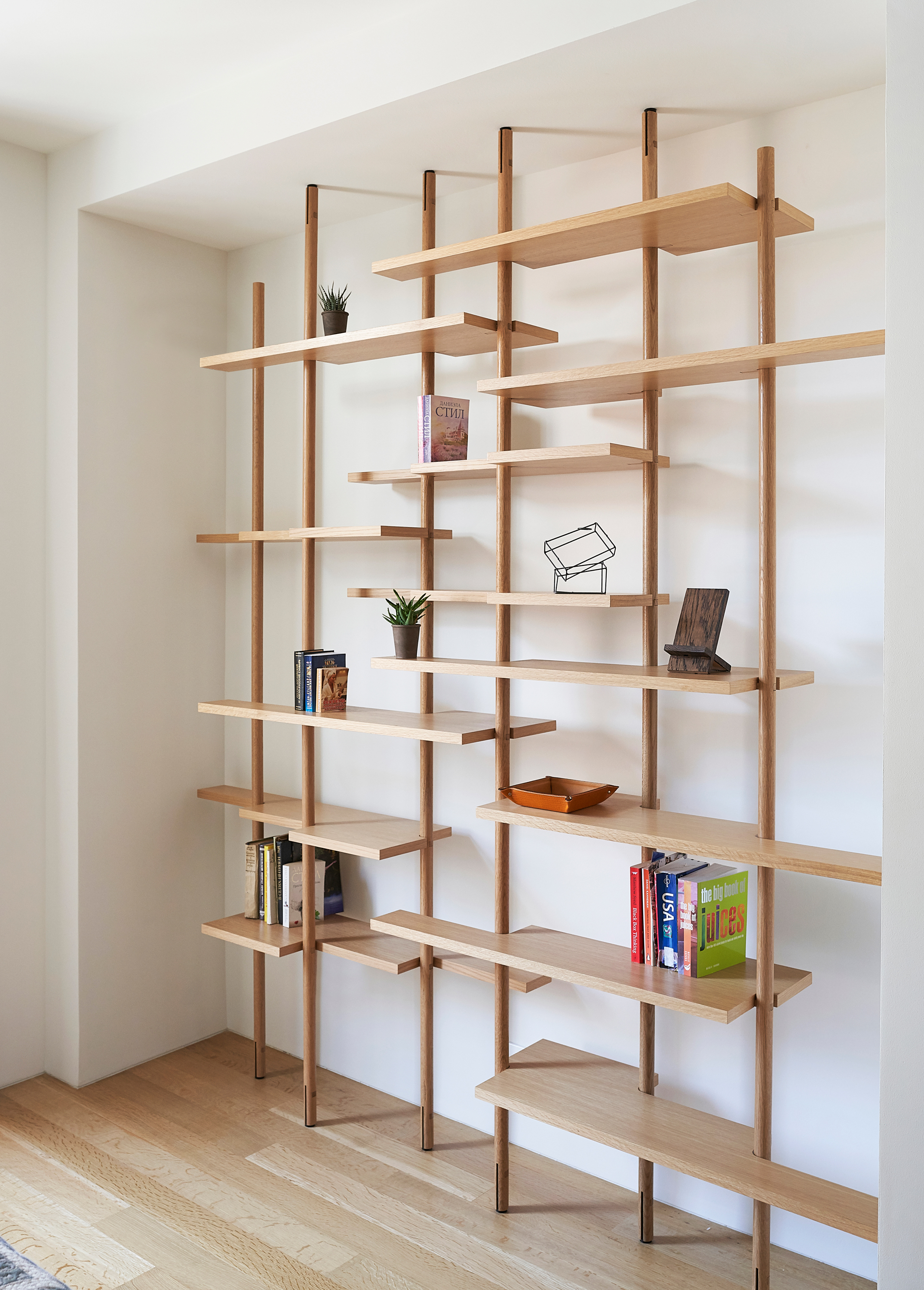
The Shelving Forest grew out from our client’s request to display one’s collection of personal items over time. Nested within an existing niche, this intricate system of six white oak supports and corresponding thirteen shelves create a visual backdrop within the room. The staggered modular geometry and the repetitive nature of a single mirrored and rotated shape allow for these shelves to visually hover in space. As with most furniture, attention is acutely placed on how the elements are put together. The intersection of vertical and horizontal is celebrated via a square pin inside a round dowel. From a distance these connections are not visible, but as one comes close to observe the objects on display, the intricate joinery is revealed. This assembly of parts to whole are now patiently awaiting to absorb more collectibles, hoping to fill out and grow denser as time passes by.
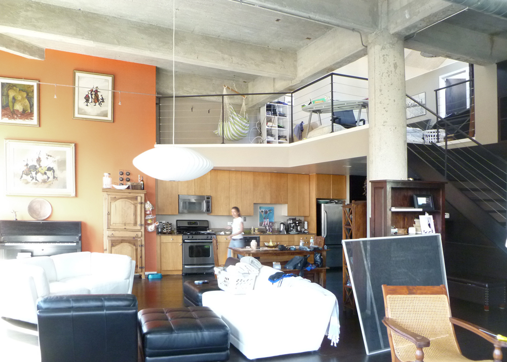
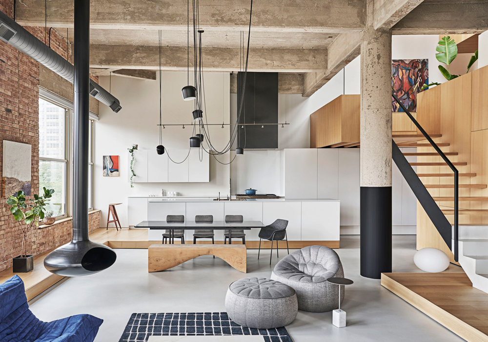
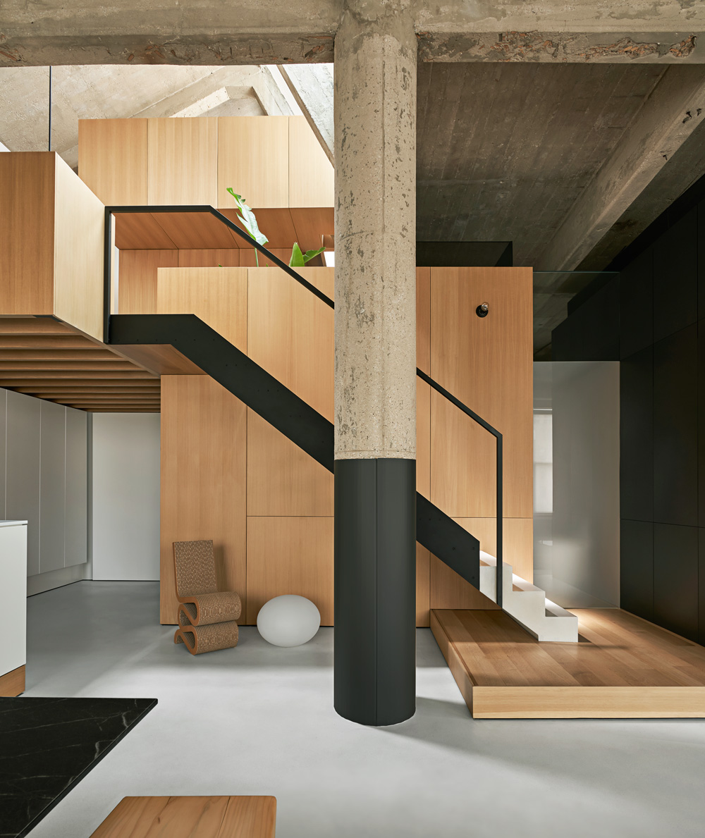
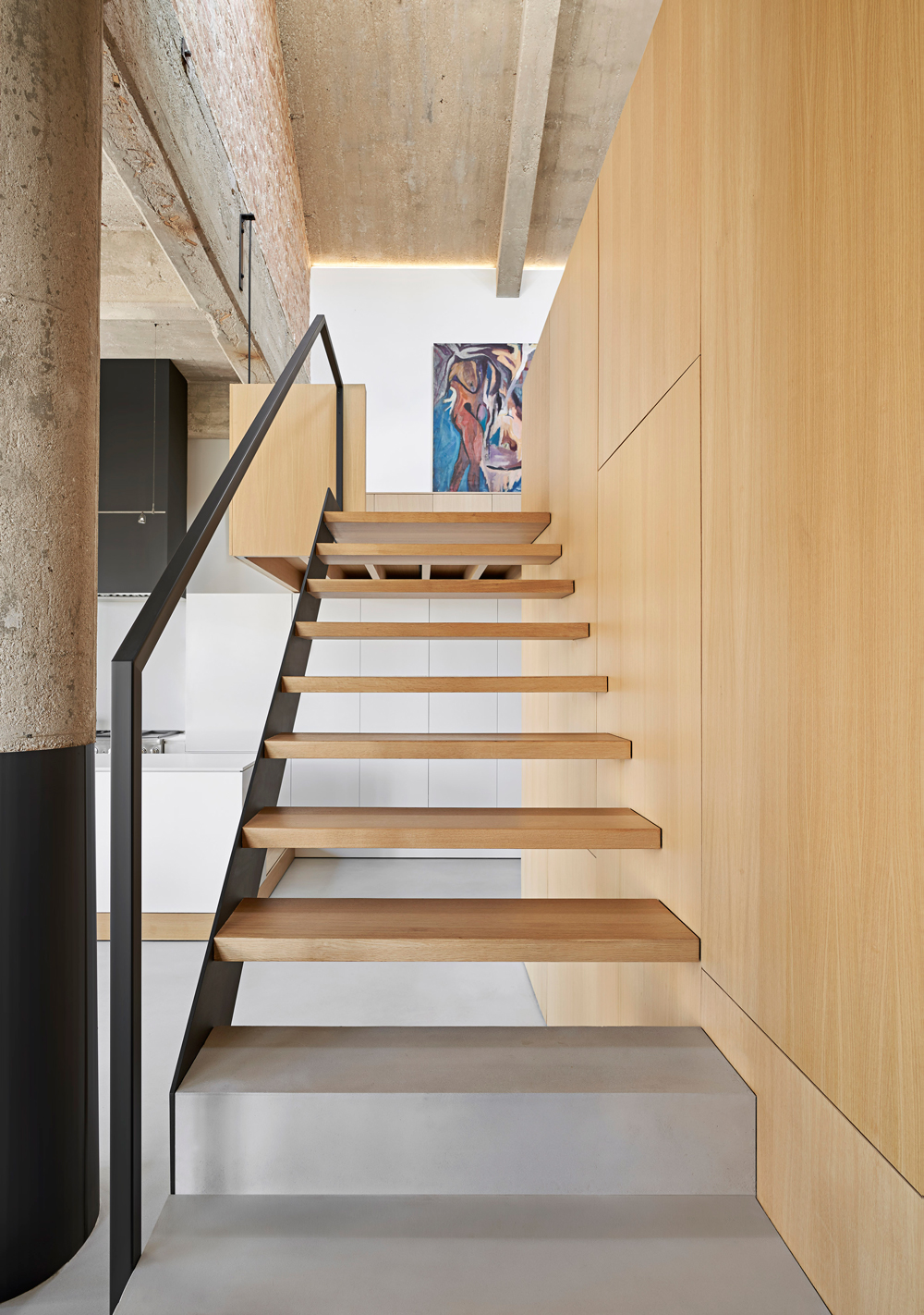
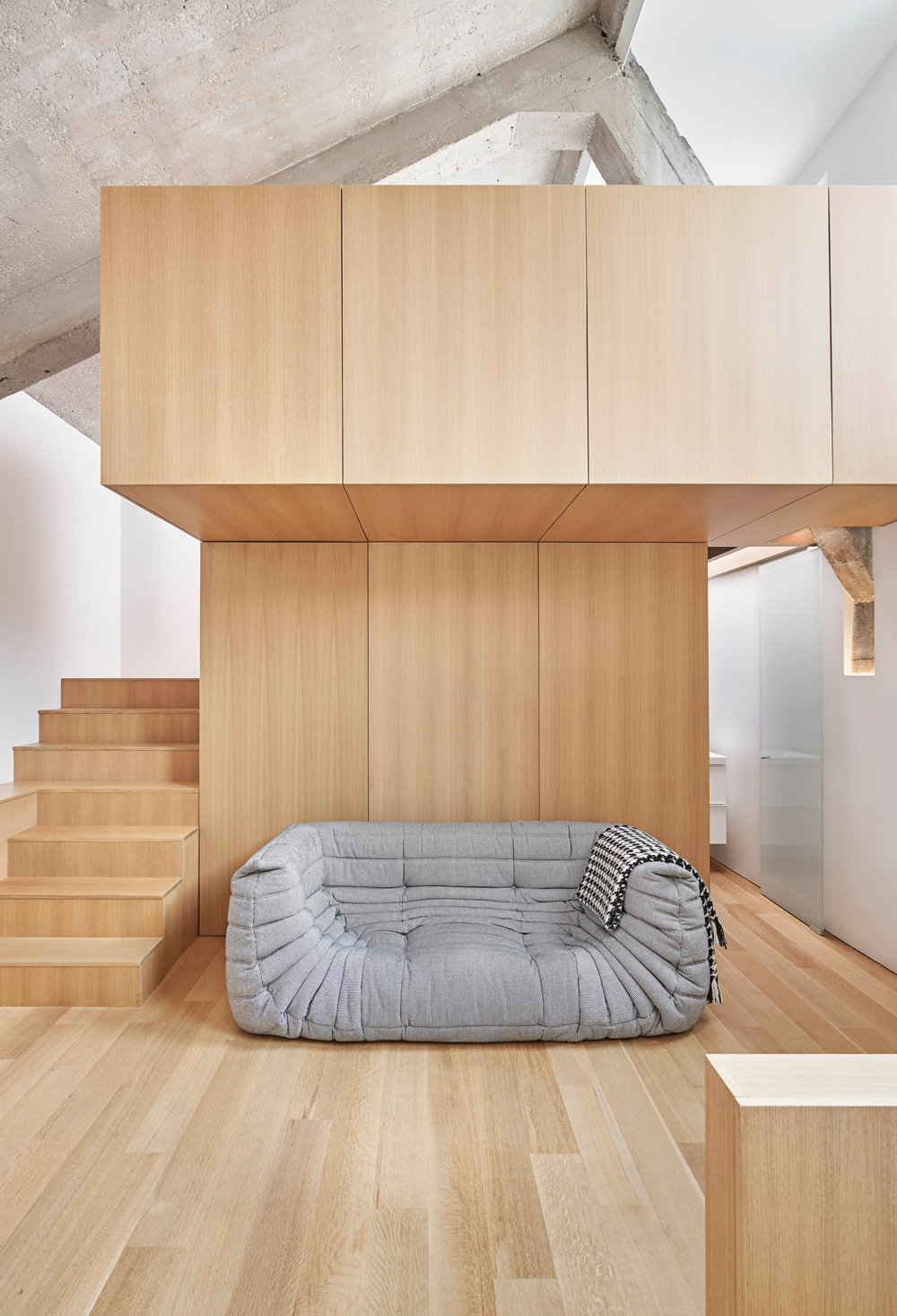
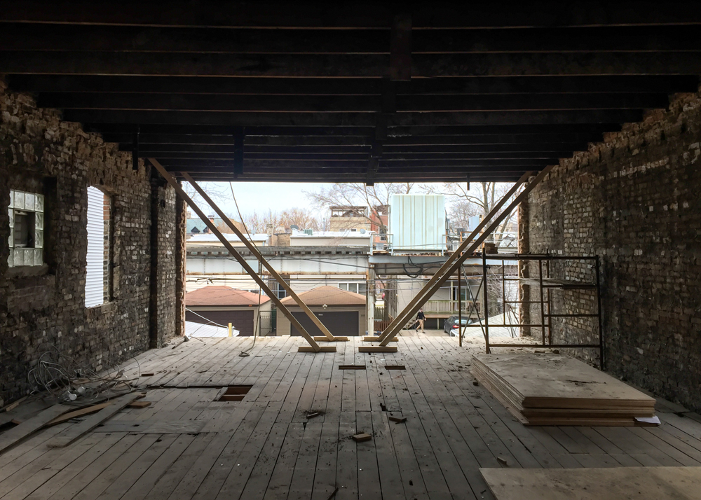
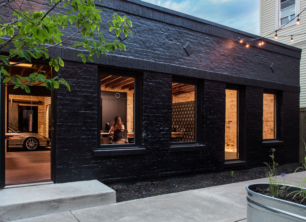
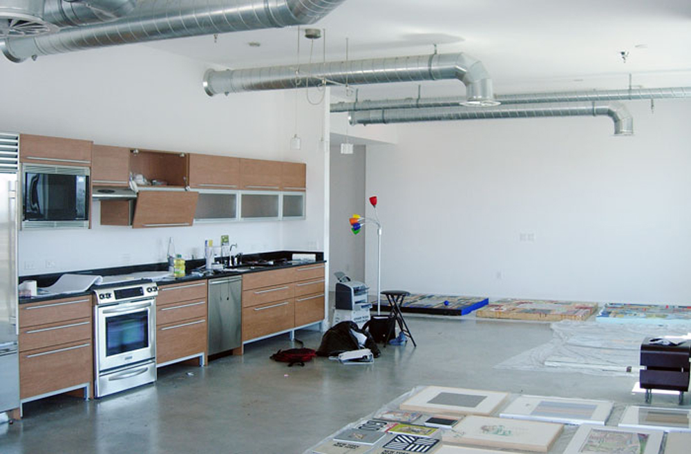
Inside a century old structure initially built for automotive assembly and display, we renovated a residence that was poorly functioning as a domestic space. In resolving the spatial problems inside this impressive volumetric shell we crafted a living environment that evokes mental wellness and inspiration within.
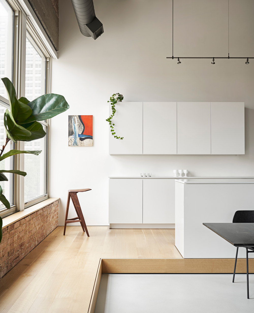
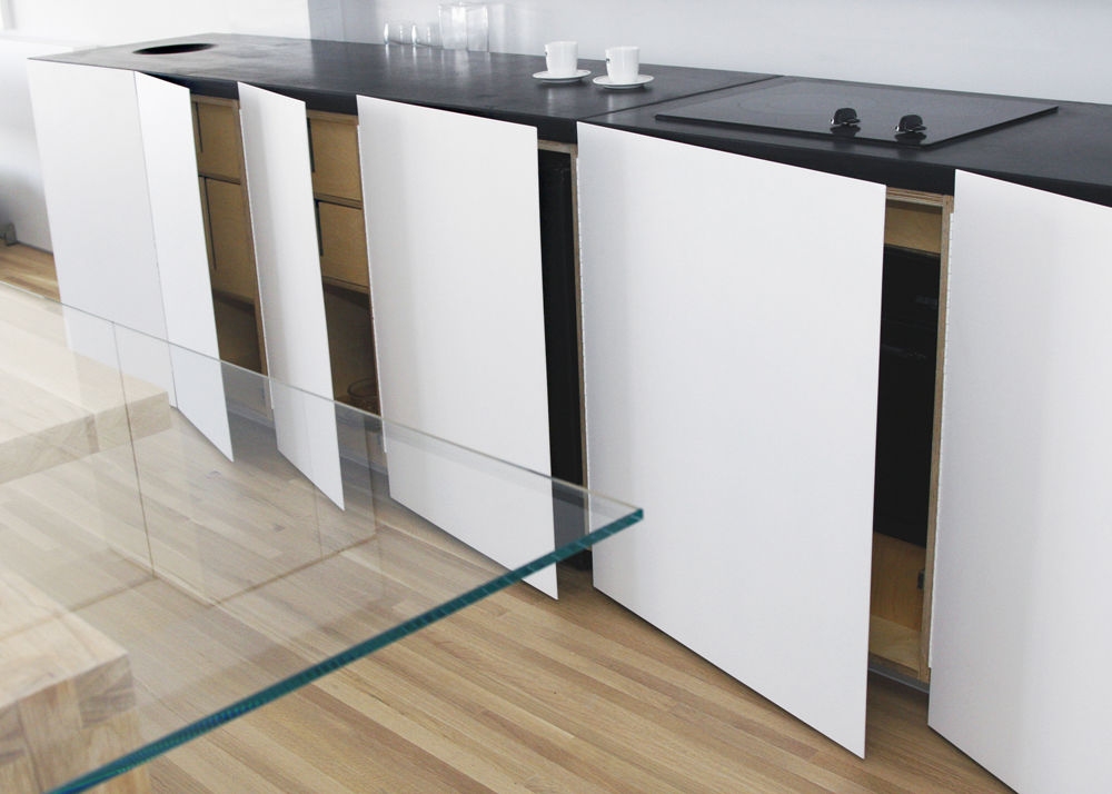
Now, as one enters this dwelling through a low, wood clad transition zone the overwhelming feeling of being inside a large industrial room is very much subdued. Scaled architectural components, material restraint and theatrical lighting throughout, lessens the overall spatial dominance, while openness and clarity of space is maintained. Living functions such as laundry, mechanicals and storage are integrated within the built-in cabinetry and dispersed strategically throughout the space. Kitchen elements are treated similarly and placed atop the raised platform to elevate one’s experience during preparation of meals with views in a direction of our city’s most iconic street, Michigan Avenue. The continuous wood platform organizes the vastness of the open room, providing an edge for more intimate furniture arrangement and a backdrop for plants and life objects collected throughout our client’s lives. Clad in black steel, the sleeping cube is situated away from the perimeter for greater noise and temperature control. Acting as a visual anchor atop a platform, it is fully programed, the metal skin transforms as panels open up, revealing one of many uses contained within. While its main purpose echoes a primal cave for sleeping, lined in wood paneling with borrowed daylight forms an oasis within.
As one moves between levels, a variety of unexpected vantage points and views are revealed. These upper levels function as sleeping space for visitors and couple’s work zones, enabling open living to have both separation and connectivity throughout the day. At the upper loft, where one finally comes close with the concrete ceiling, a doorway leads to a vast outdoor garden with views of our city’s majestic skyline.
These meandering spaces are three dimensionally distributed and yet assembled as a one cohesive home inside a raw industrial cloak.
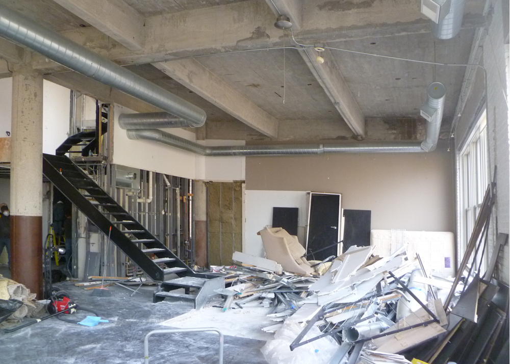
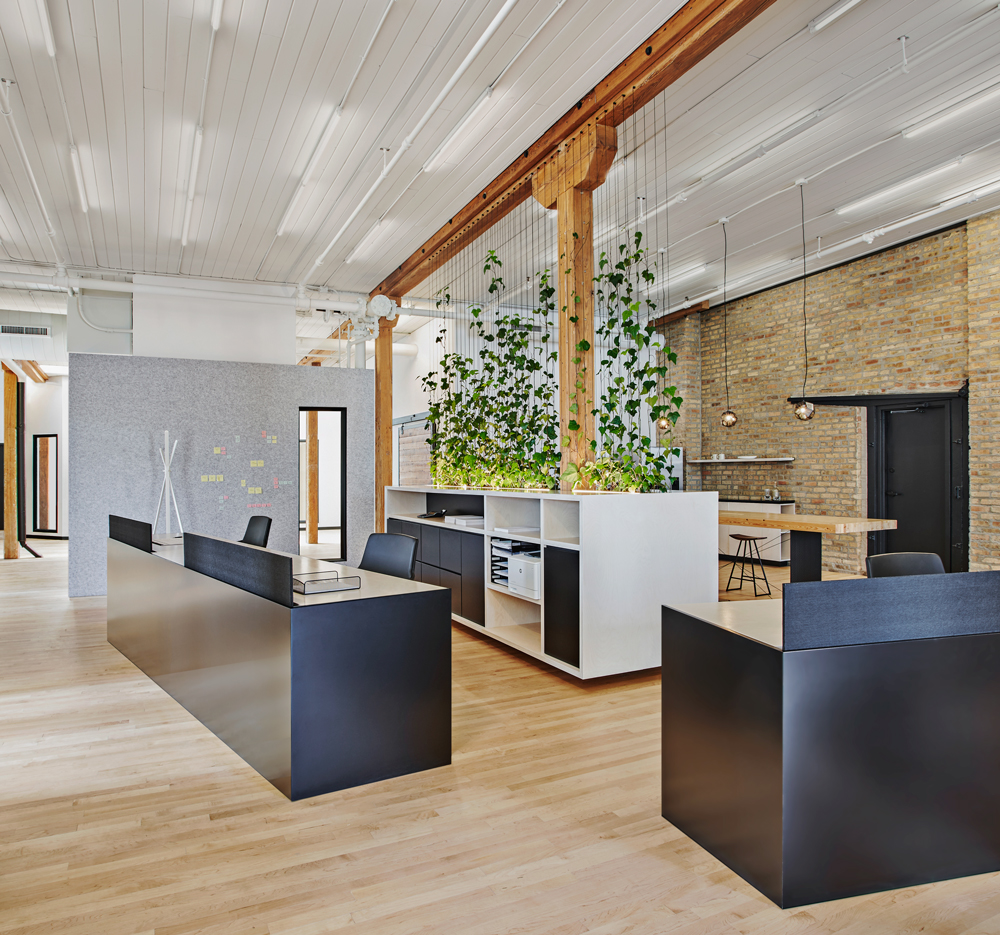
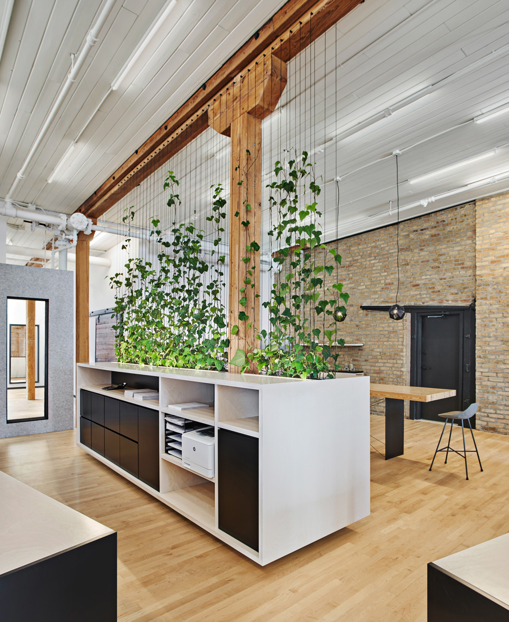
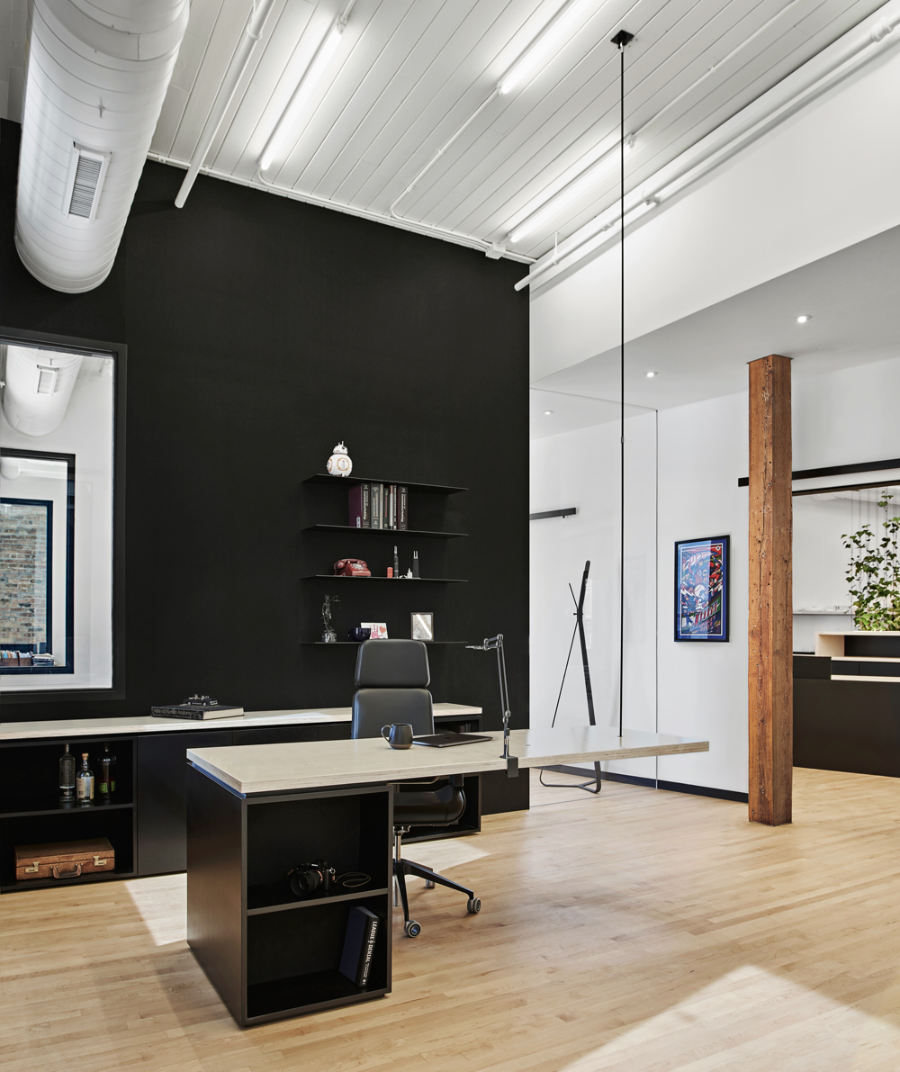
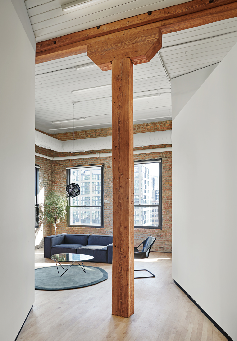
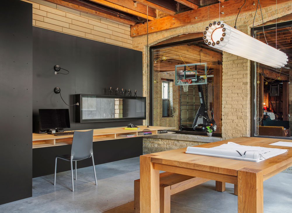
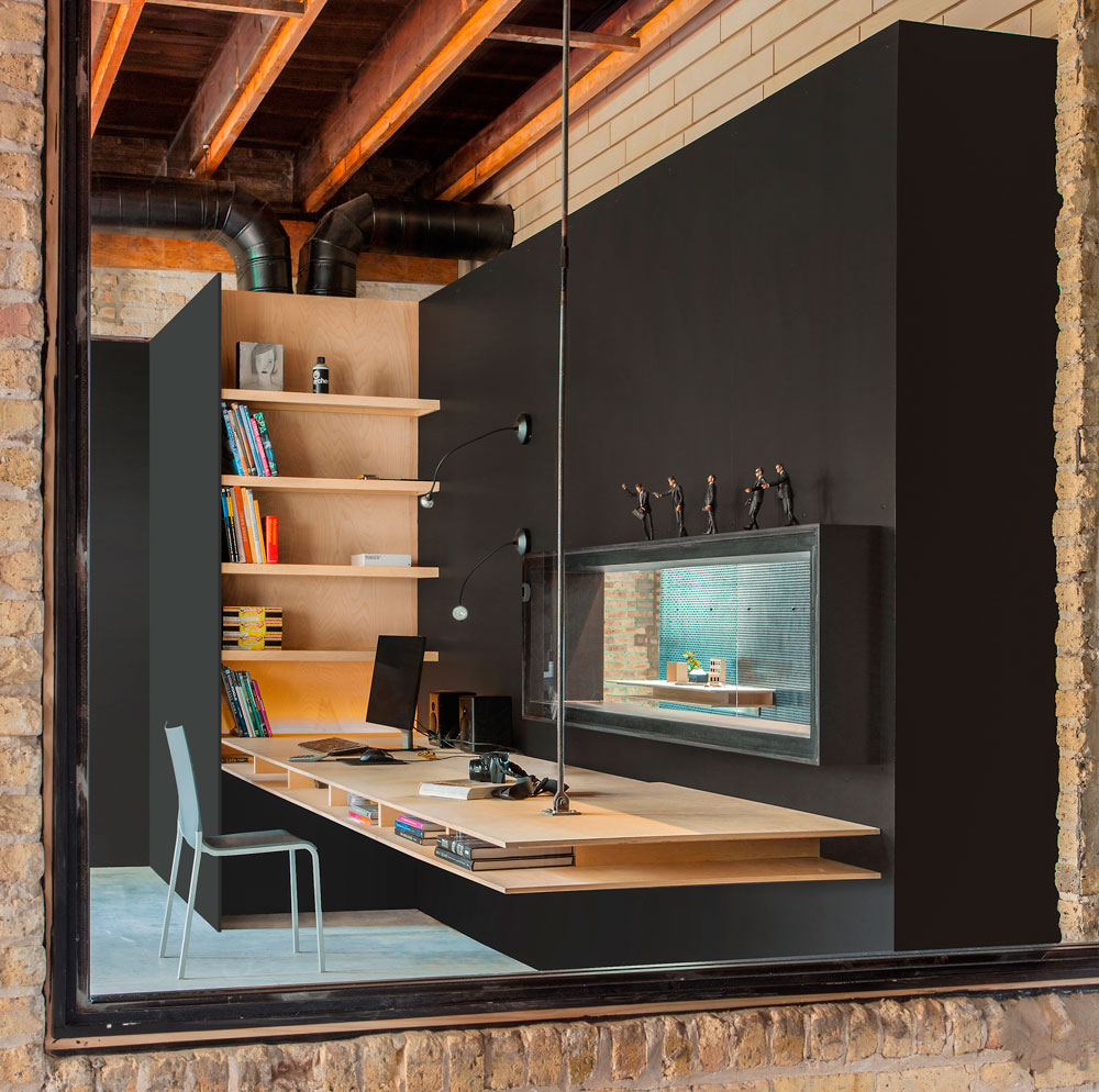
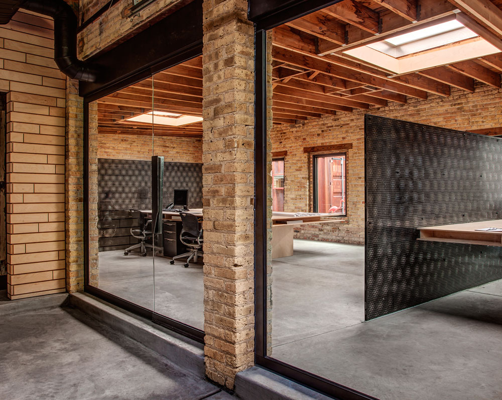
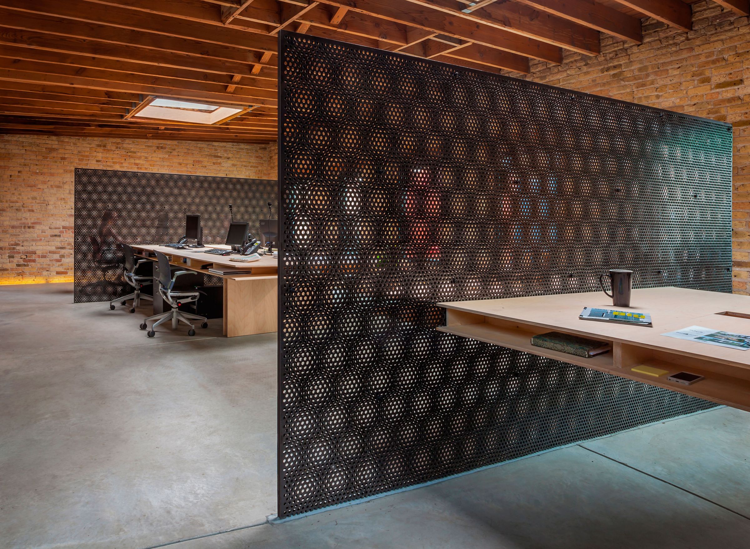
When visiting this understated manufacturing loft for the first time, we were captivated by the intrinsic elements of raw masonry walls, the distressed timber structure and the abundance of natural light. It’s immediate connection with the urban context captures the noise of city traffic, the views of elevated trains and the Chicago’s most iconic architecture. To us, these spatial nuances needed to be emphasized and brought forth for all users of our client’s new law firm.
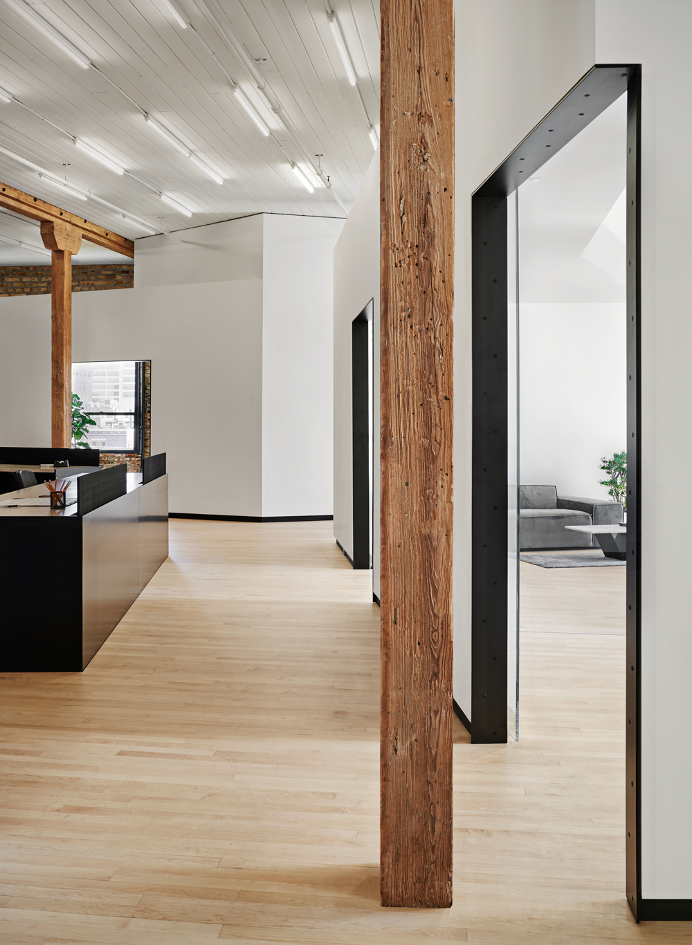
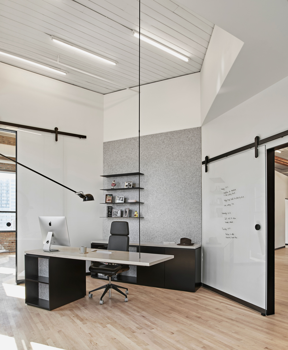
The development of the office plan yielded a choreographed configuration of heavy posts in various proximity to new partitions, openings, and circulation. Blank white walls weave in and out of the building’s columnar forest, like a sculptural installation, reflecting light and absorbing shadows. Offices with greater privacy needs are separated and pulled away from the adjacent exposures, forming a light-filled lounge at a corner pivot space. Extra-large openings are cut out in the new walls, enabling a direct working connection between the partners and their supporting legal team. Underlined in blackened steel these large apertures act as visual conduits towards the exterior and facilitate direct daylight deep into the inner working zones.
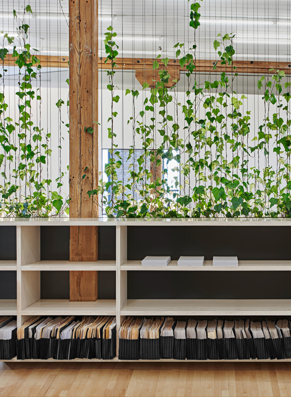
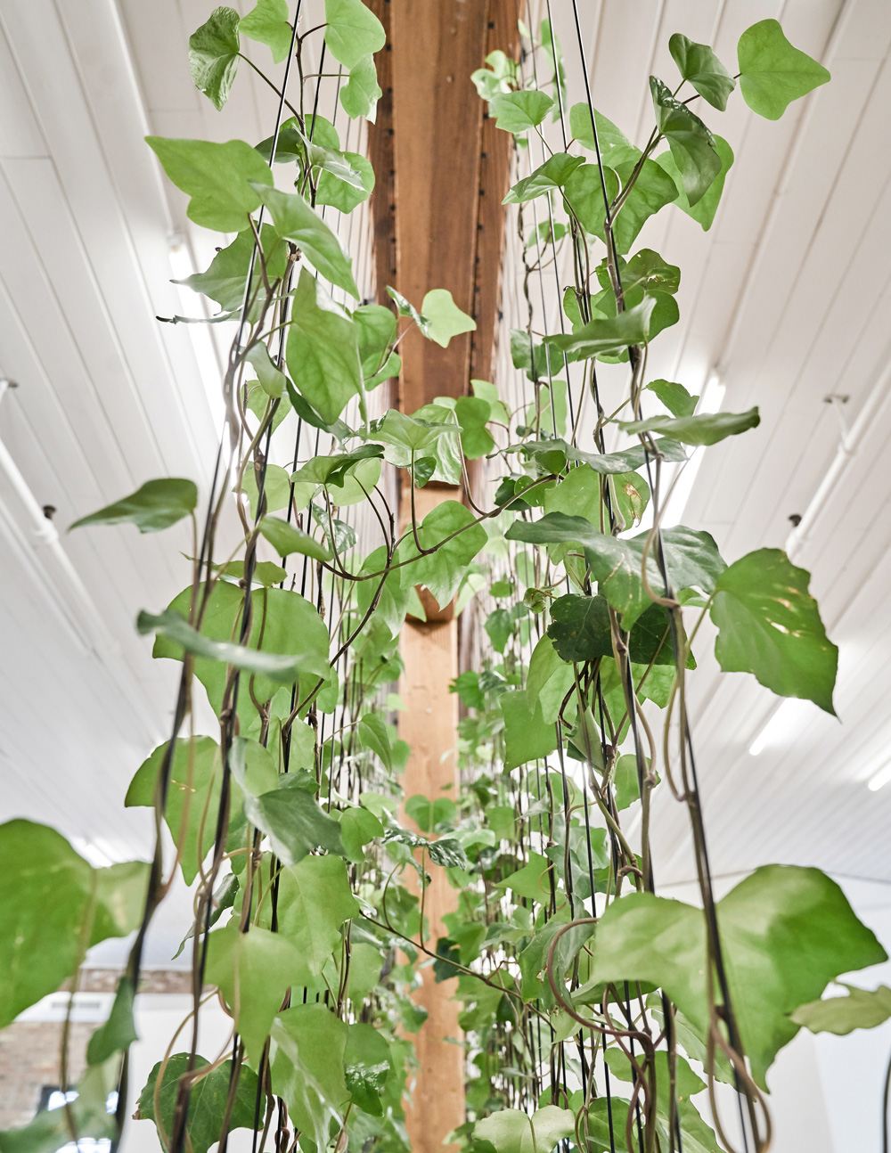
The heart of the office environment is anchored by plant life, via a delicate field of ivy, serving as a separation between work space and the kitchenette. Within the main storage element, the translucent green screen lightens the massiveness of this object visually suspending it from the heavy timber beam. Unlike the storage element, the block like desks anchor the work area. Intended for flexible use, and are oriented in the direction to maximize city views both through and in between the perimeter white walls.
Spatial design opportunities within timeworn structure exemplifies how thoughtful planning and organization is able to enrich the daily experiences of the individuals using their workspace.
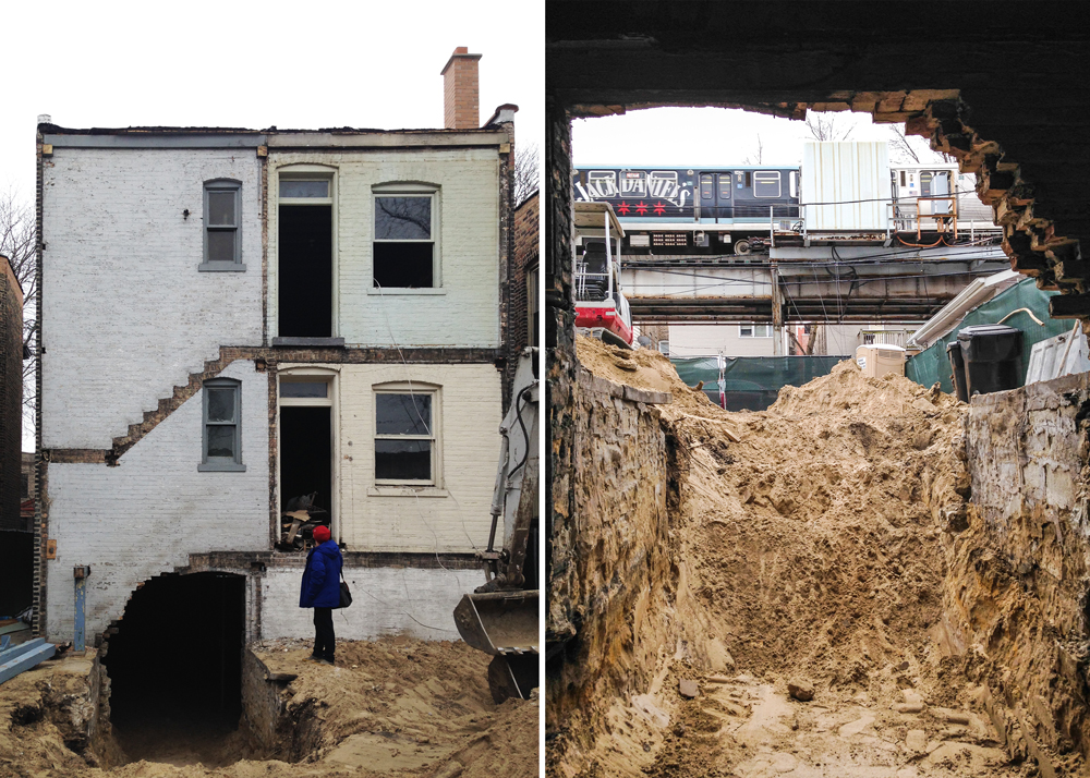
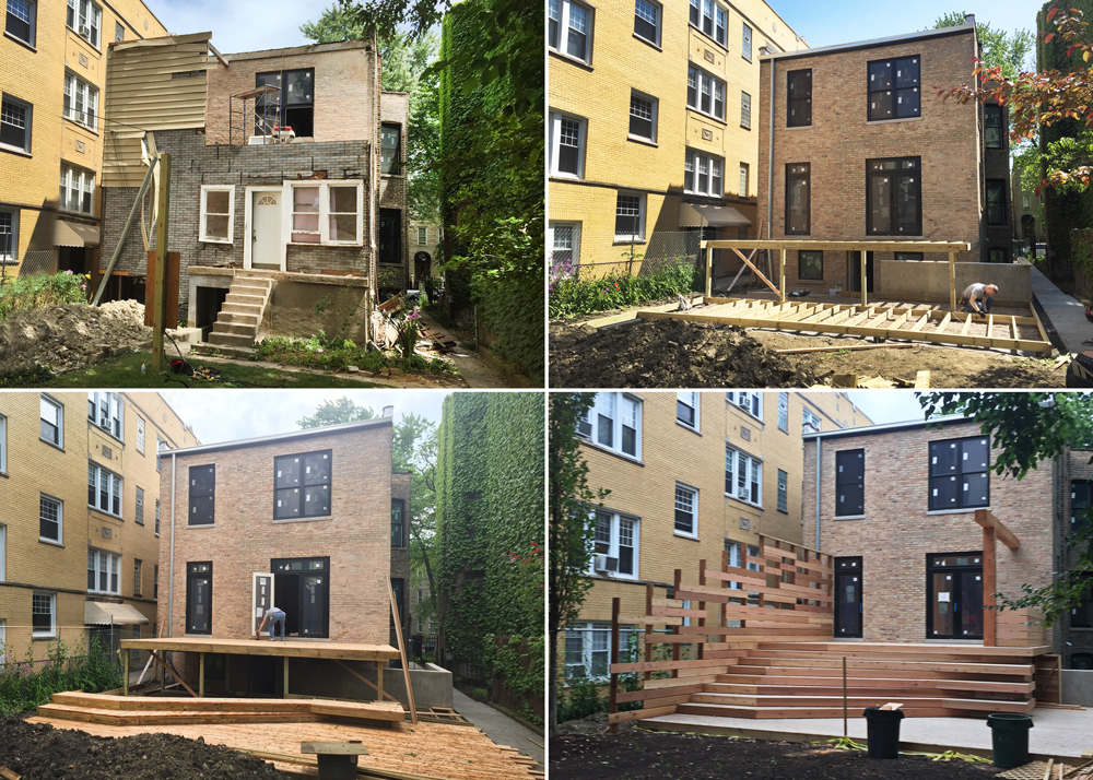
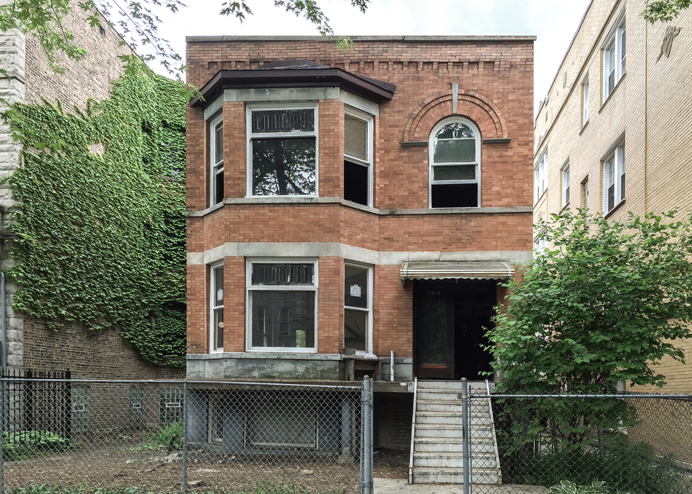
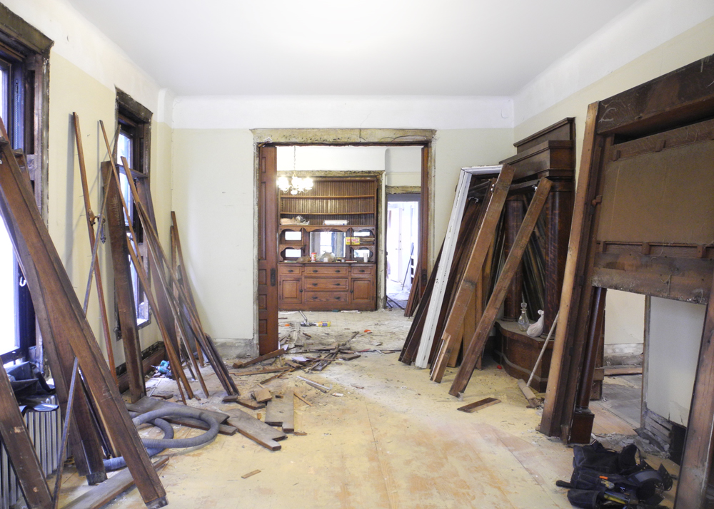
Situated 75 feet away from the elevated train tracks, close enough to hear “next stop”, as it’s announced over the intercom our clients desired to convert this masonry two-flat into a single-family home.
The existing conditions were dismal, nothing was level while dark interior, low ceilings and lack of connectivity between floor plates added to the complexity for the desired outcome. During design process we determined to eliminate everything within the existing masonry two-flat, preserving the exterior load bearing walls in-tact, while strategically puncturing the masonry shell for added daylight and views. We then stitched all new building levels together utilizing an articulated stair within a contiguous void, pulling natural daylight downward and connecting spaces via the play of light and shadow throughout the day. Furthermore, the neighboring exterior common brick walls now become the backdrop for the interior, as spaces are visually stretched outwards, blurring the boundary between the interior and the outside as we selectively kept some brick as finish material on the inside of the home as well.
While the front of the house remained preserved, the rear embraces the alley and the elevated train. Traditionally the rear of these buildings along the tracks have been very much a non-design priority, however, to us and to our clients this elevation was as equally important as the front, offering a new vantage for those passengers that ride the EL., building a visual marker for the passer by.
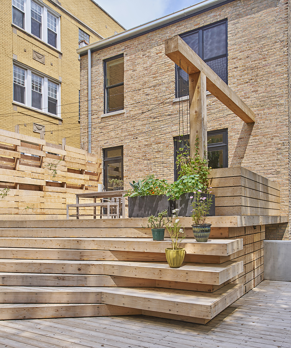
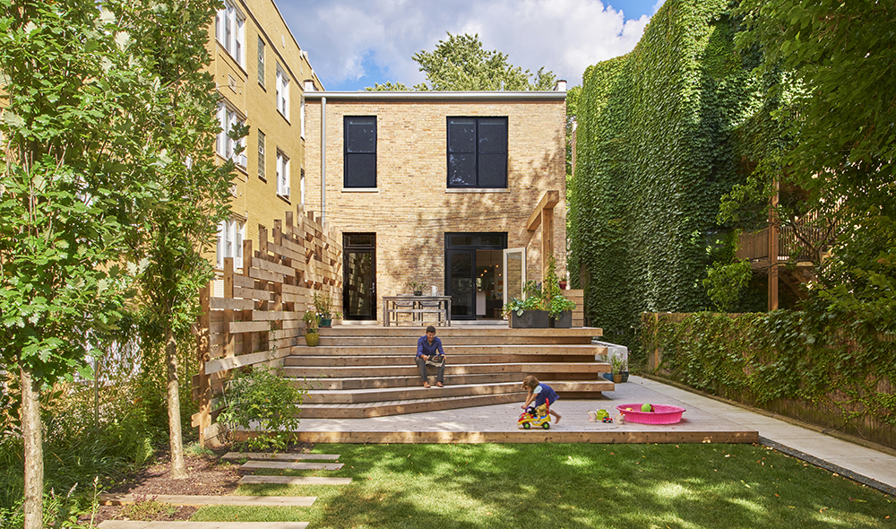
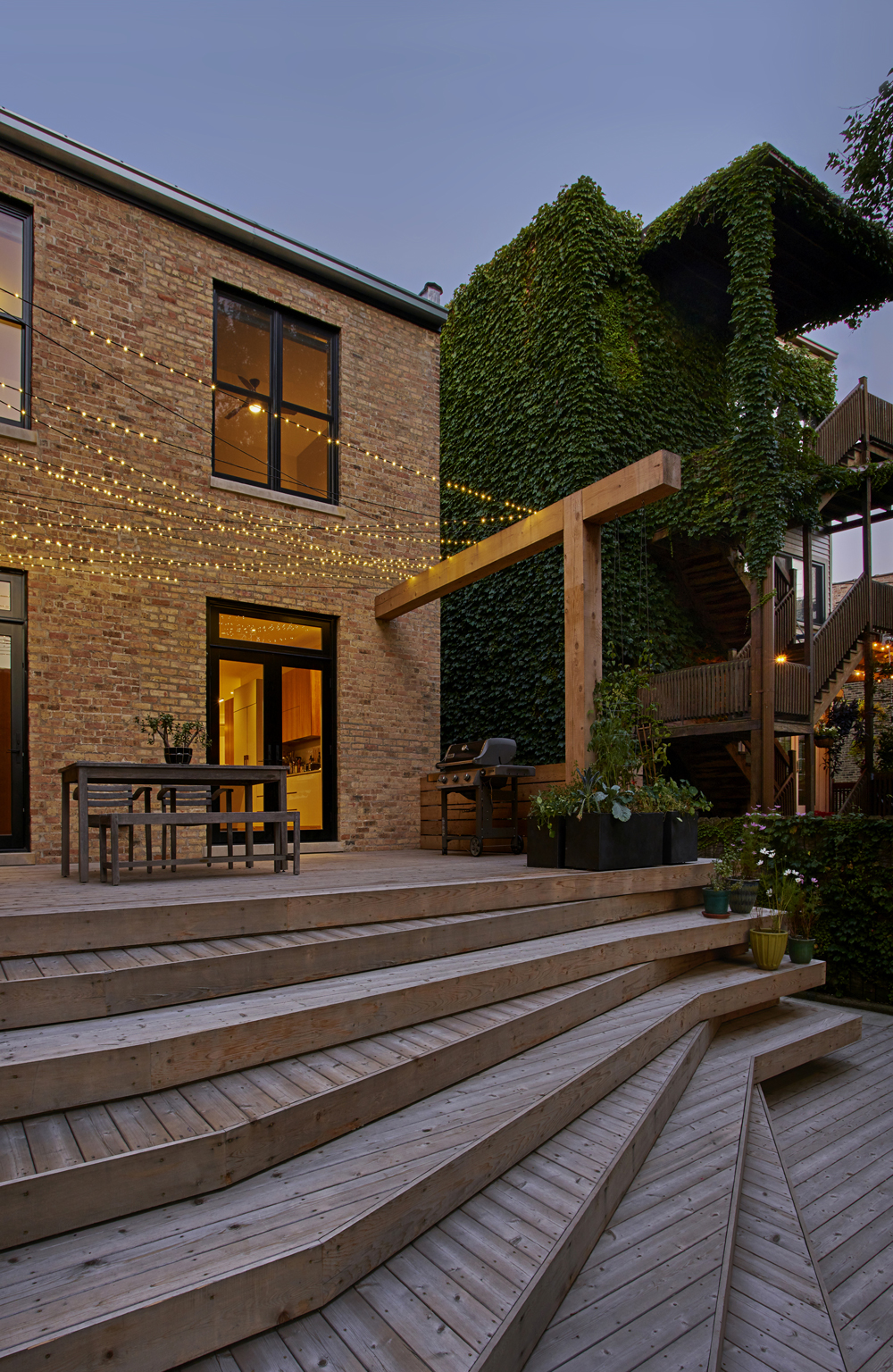
The exterior of this single family is thought of as an arrangement of continuous landscaped zones offering seasonal beauty for the homeowner, the neighbors, and an occasional passerby. The front, side, and rear yards are all stitched together using similar material palette of crushed bluestone gravel, large pavers, and indigenous plants. Varying in both color and aromas throughout the growing seasons, an urban landscape that is wild, yet beautiful is visible from the windows of both the home and the surrounding buildings.
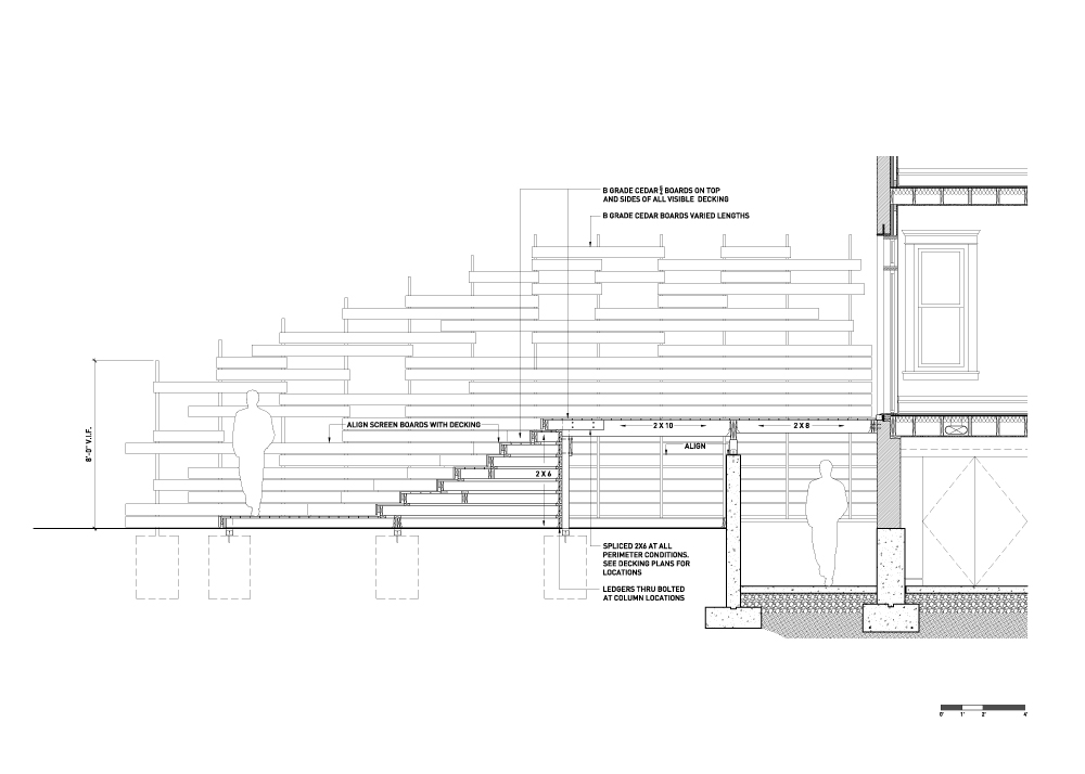
The principal element of this landscape project is the back yard, where the new sculpted deck transforms it into a place for gathering, refuge and play. Composed of cascading cedar platforms, the homes main living floor extends and gradually descends to grade. Each step widens and turns, letting the imagination run wild with its myriad functions. The oversized privacy screen is integrated into the overall composition such that it is not perceived as a wall to the neighbor on the North, but as a new shared elevation in between. Treating the overlap and density of wood elements similar at both sides allows for light and shadow to be mutually appreciated. Over time, the planted “Virginia Creeper” ivy will take over the screen, eventually climbing the guide wire and transforming the deck into a gazebo, adding extra shade and privacy as well as additional backyard splendor for all to admire.
Being tasked with converting this 100 year-old dilapidated Chicago two-flat into a single family home gave us an opportunity to respond to a question: How does one preserve and integrate the intangible building qualities of yesterday and today, while breathing new life into an existing derelict shell? Our approach to the question entailed observing the existing “heaviness” of both material and space, considering the juxtaposition of restraint and ornamental excess, exploring qualities of openness alongside compartmentalization, and superimposing old craft with new traditions.
Furthermore, our interest in “phenomenal transparency” as a space-organizing strategy was tested here both in section and plan. Newly-introduced walnut millwork elements were programmed as stairs, walls and storage; these elements physically and visually cut through space, connecting rooms and their adjacent zones. Salvaged old doors, hardware, and trim were seamlessly integrated with the new architectural language, keeping the design composition cohesive, and merging past and present together as one articulated thought. The result is a home that is light, connected, and fully functional for a growing family. The project thus introduces new spatial meaning into an early 20th century building, melding qualities from the past with a design logic and lifestyle for today.
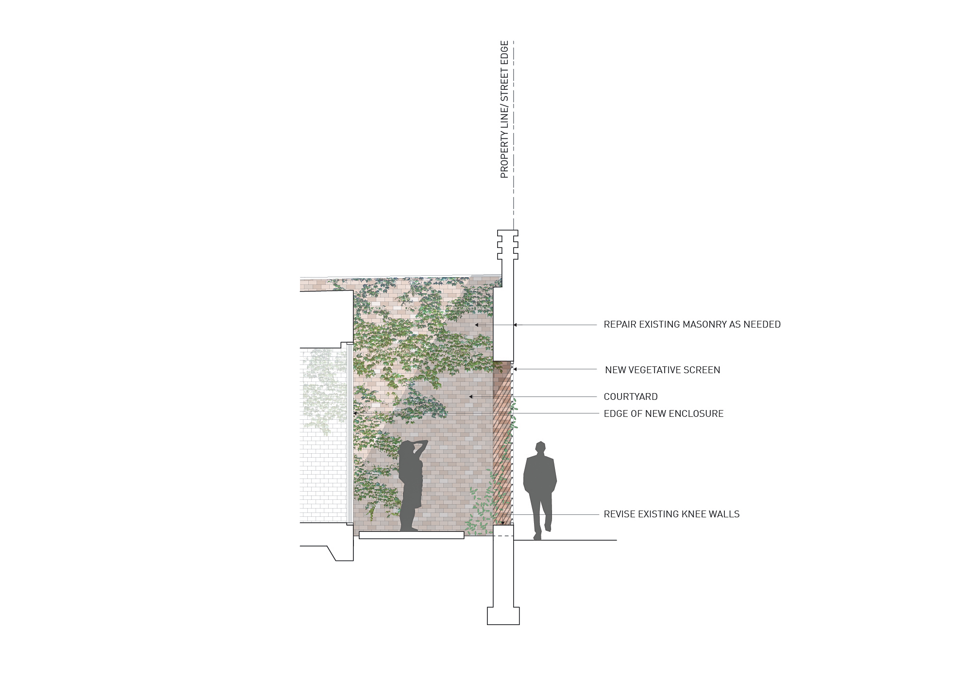
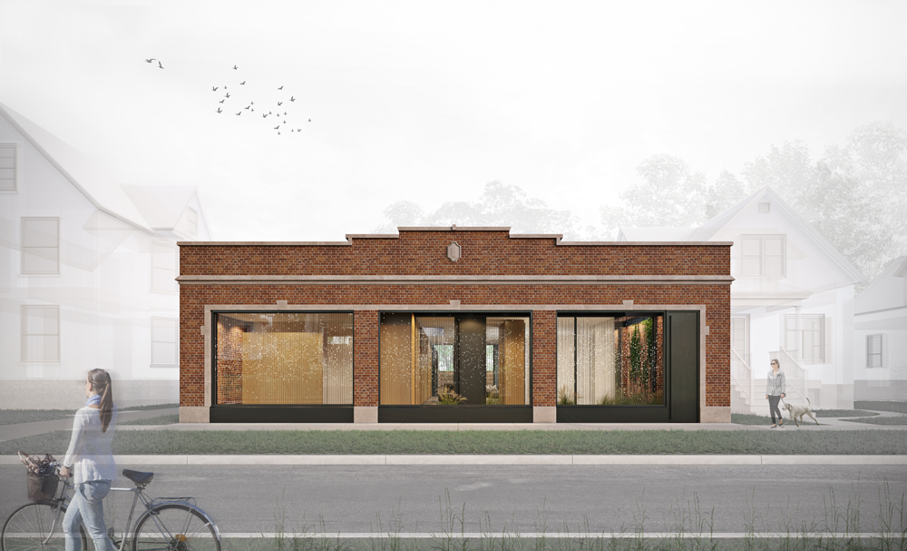
Located within an eclectic arts district of a suburban Chicago neighborhood, this neglected structure was acquired by our client as an opportunity to breathe new life and meaning to an existing shell for him and his college age kids.
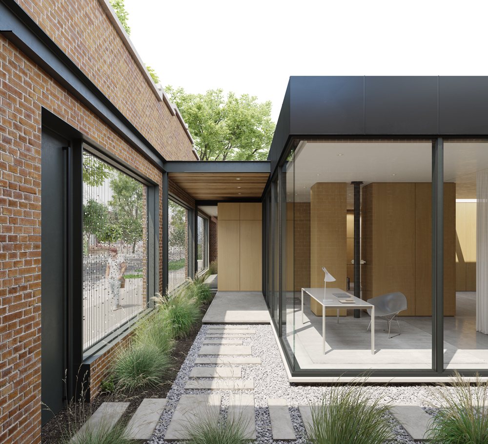
The building extends to the lot lines on three sides and amidst the rezoning process, the municipality mandated these three visible facades were to be kept. As such, we used this directive as an opportunity to resolve the two key elements the existing configuration lacked -privacy and daylight. Thus, we looked to the existing roof as a solution to create an interior courtyard. In cutting away the existing roof along the southern and eastern exterior walls, a newly formed semi-private space becomes a living threshold between the street’s hard edge and a new glass enclosure. Now, the sun’s rays are able to penetrate deep into the footprint of the home, revealing the poetic qualities of these masonry walls, which also serve as a new elevation seen from within.
The overall plan is anchored by the introduction of three multi-purpose, wood clad volumes, defining the sleeping areas along one side and the flexible family functions on the other. The placement of the garage in close proximity of the primary structure, together with its direct link to an integrated workspace defines another type of courtyard, opening up to the most intimate room of the home, the master suite. This auxiliary structure adds to the reinforcement of the interior and exterior organization while providing privacy from adjacent lots.
Overall, this project exemplifies the opportunities existing structures offer, in opposition to most buildings, which are razed in disregard.
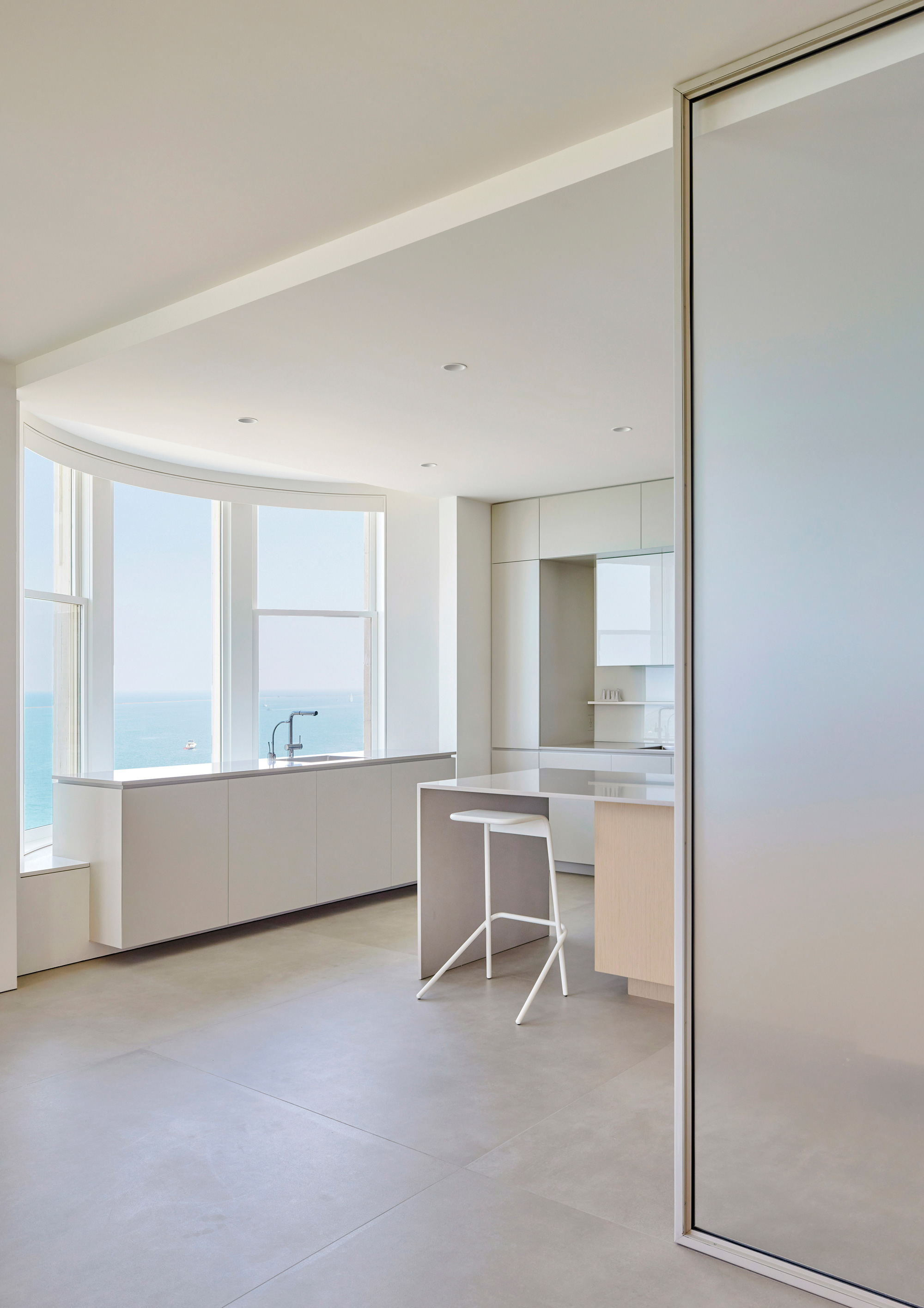
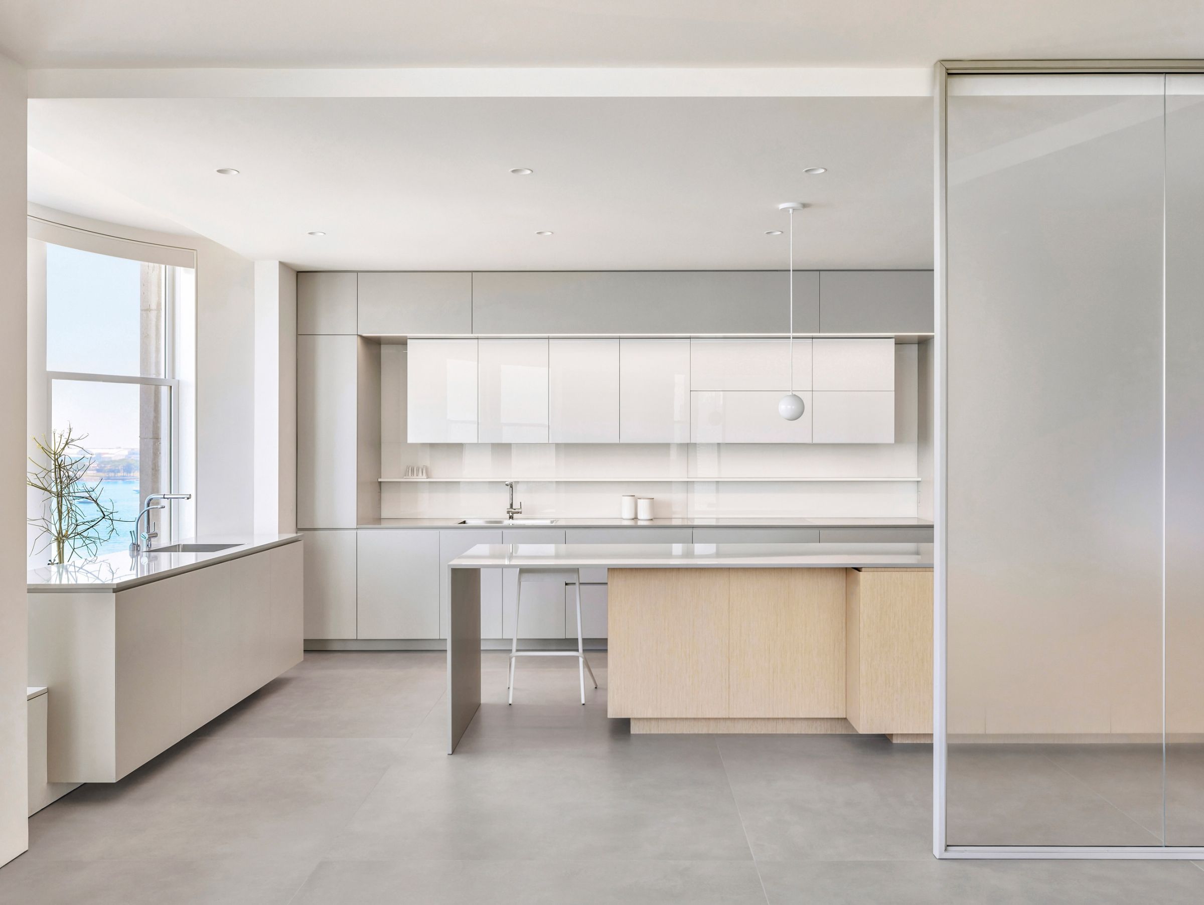
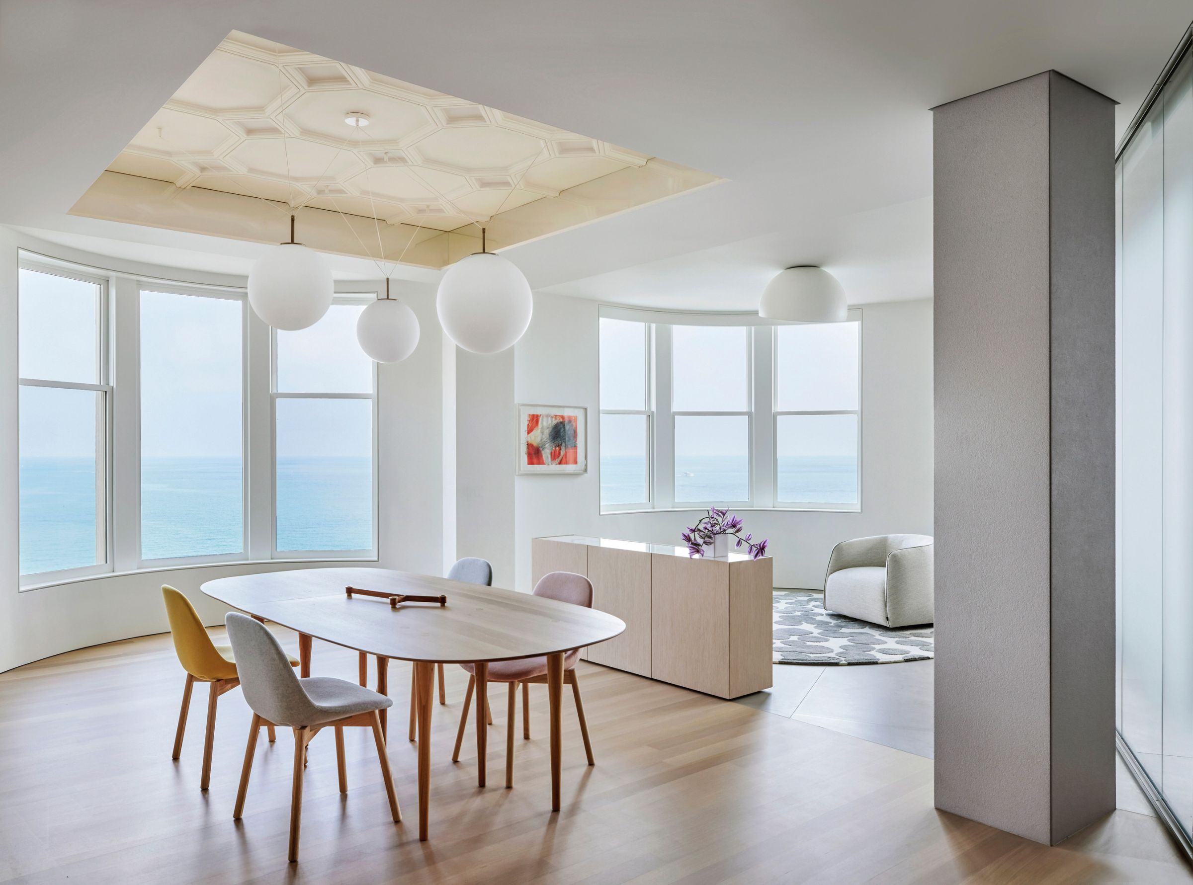
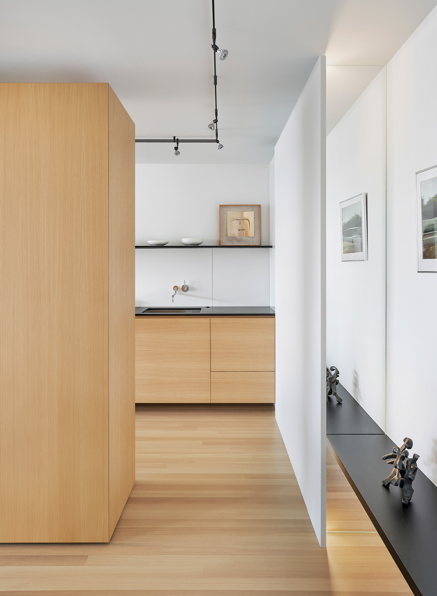
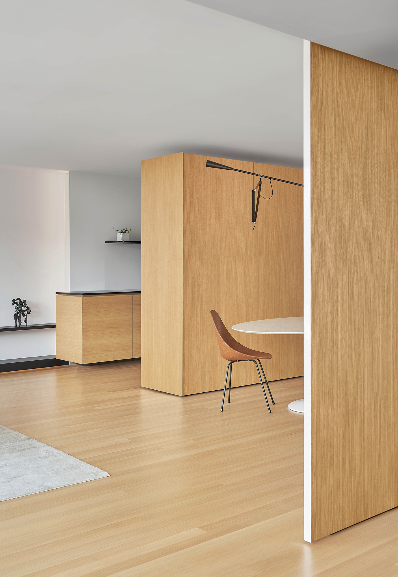
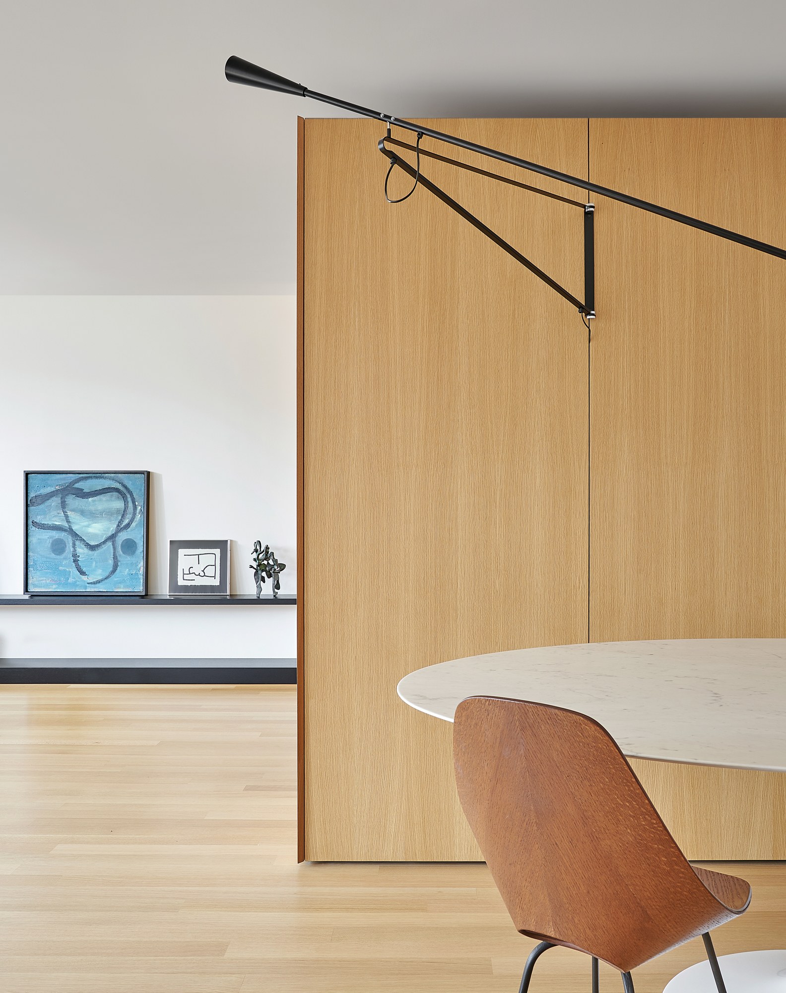
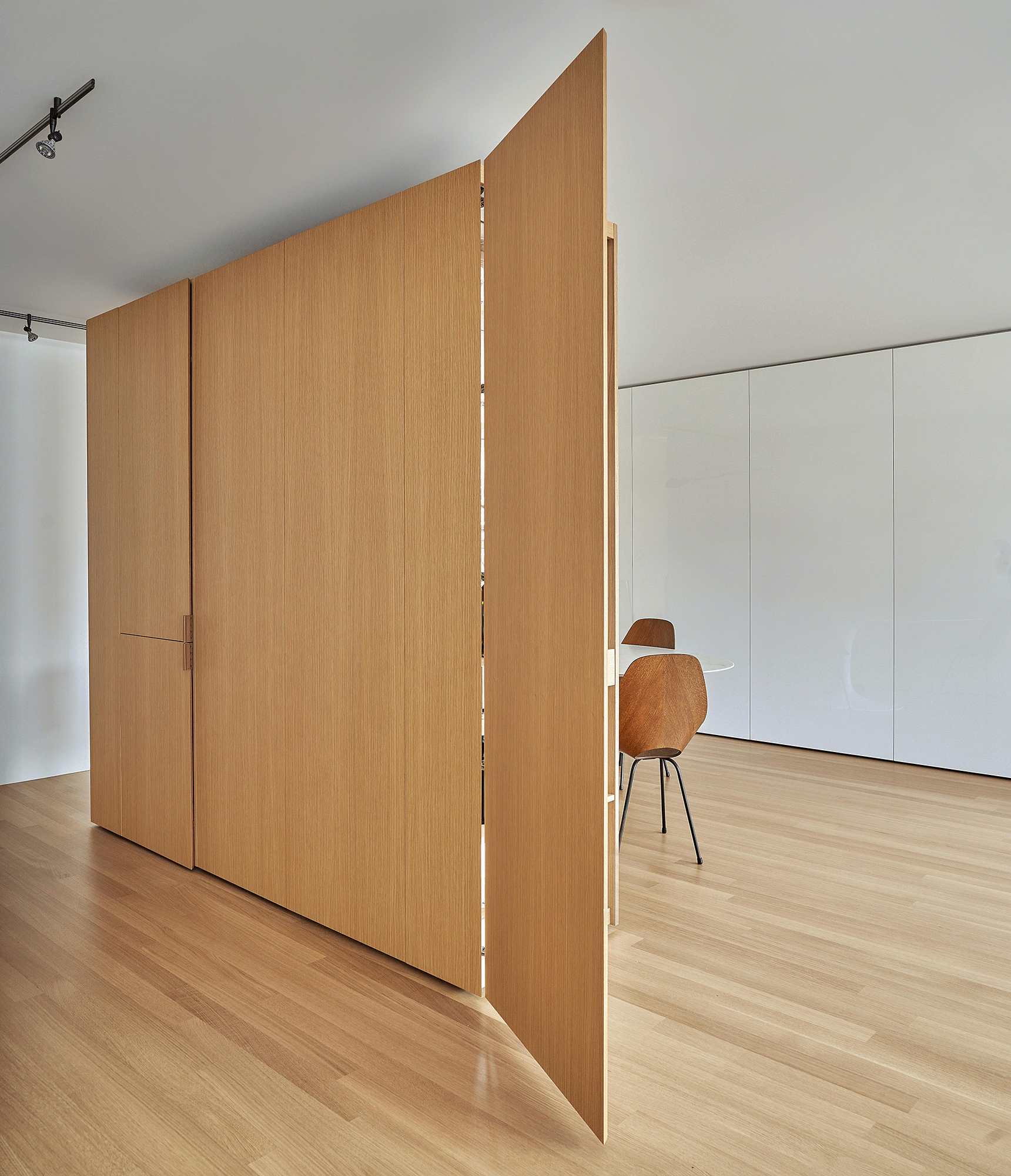
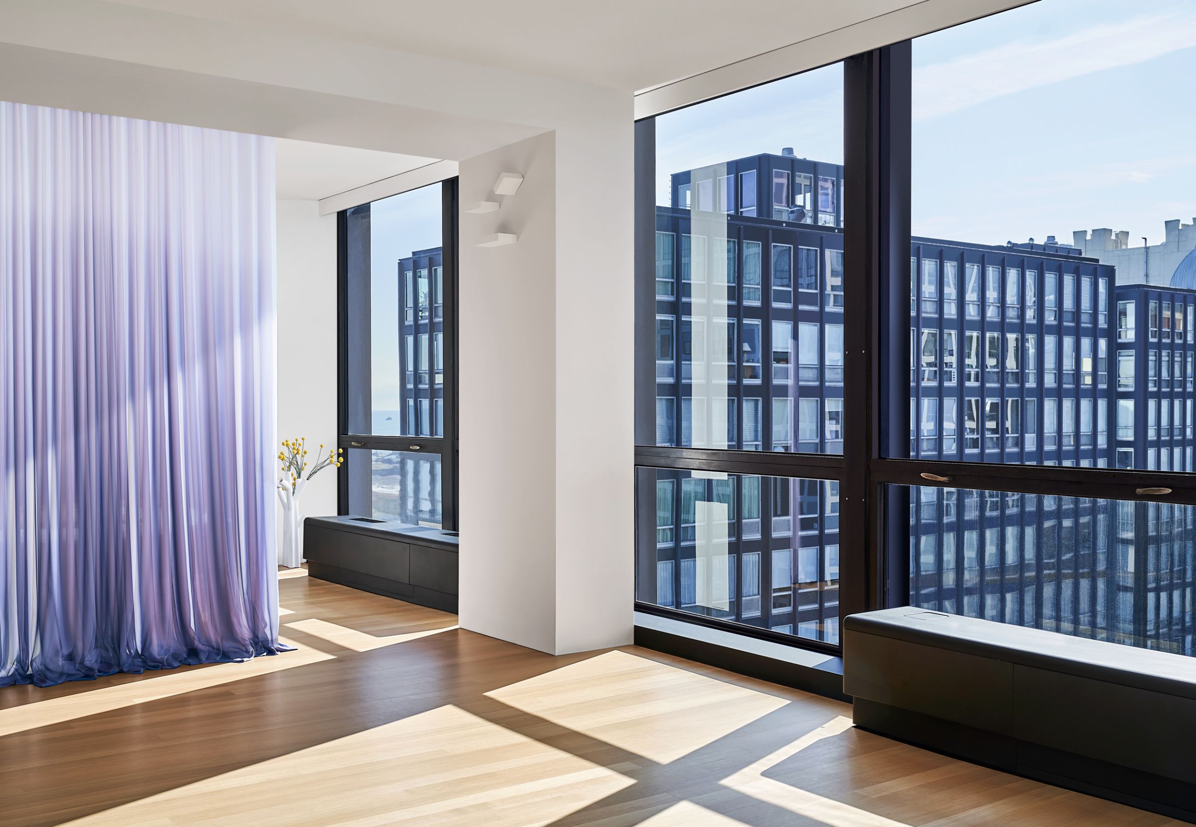
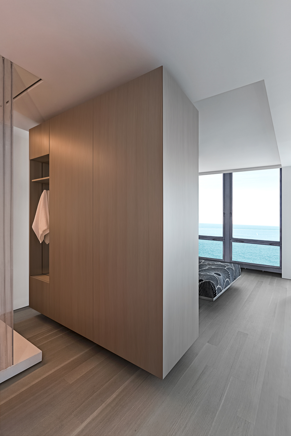
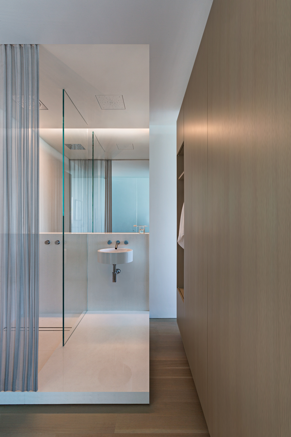
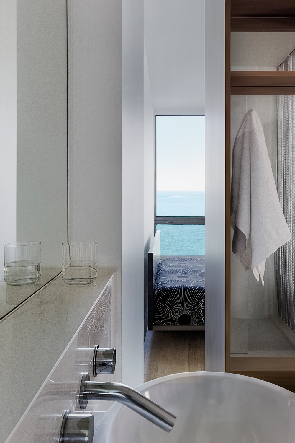
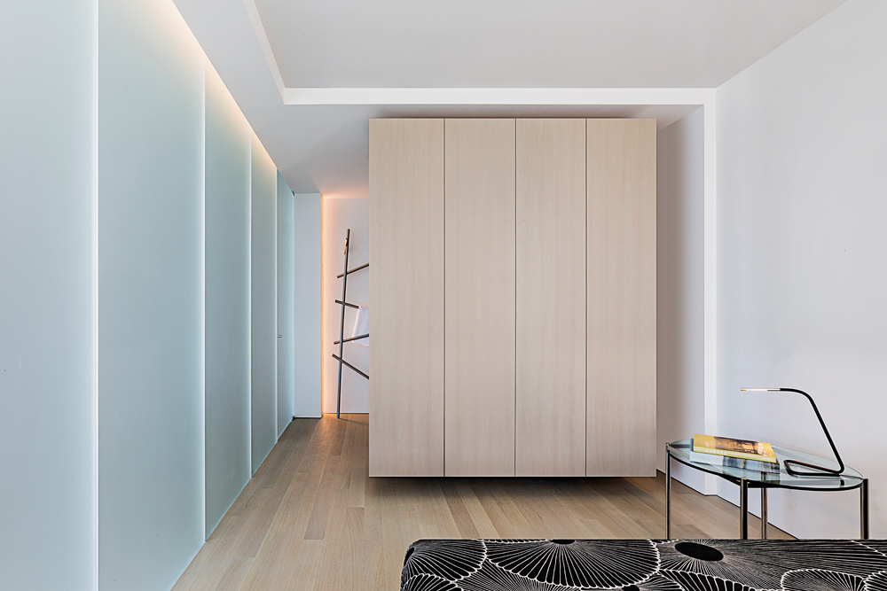
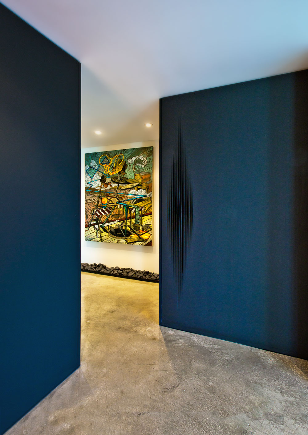
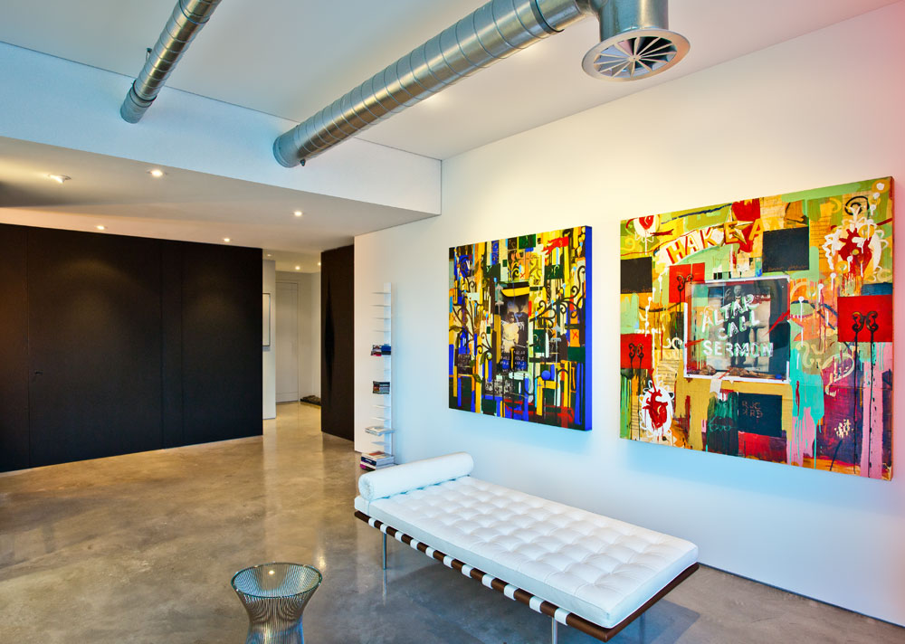
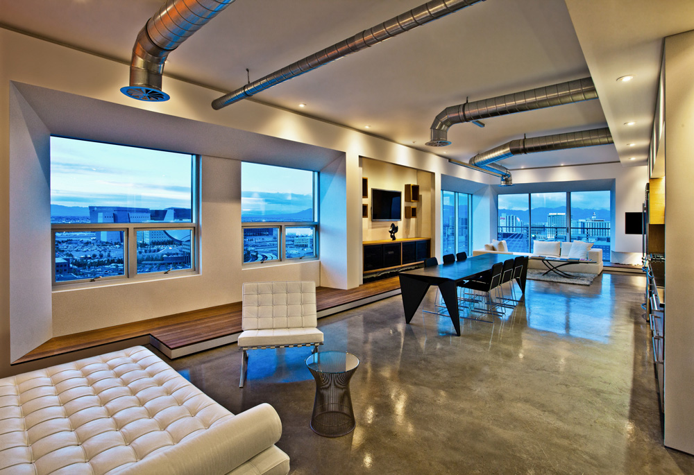
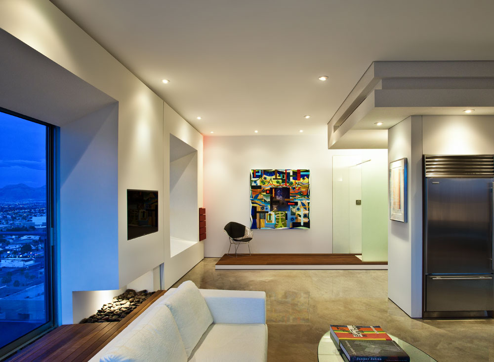
Within this iconic high-rise unit, our clients imagined their second home with few boundaries between them and the exterior breathtaking views. By removing all of the opaque walls and introducing an architectural language of floating volumes and space-defining planes, we created the desired spatial experiences that did not previously exist.
At the entry, while drawing direct connections with the lake, we added an open kitchen creating a multi-functional space. To the right, the carefully placed floating mass welcomes you, gesturing towards the main room. As it extends deeper into the living space, a reading nook is formed at the back of the projection, offering a sense of refuge inside of an open plan. When sitting, this projected element transforms, reflecting the adjacent spaces within its carved niche.
The integration of a seemingly continuous glass plane provides privacy between the two primary living zones. However, its true function is to create a backdrop of illusion, capturing the expansiveness of the exterior, as well as the dynamic mood changes of the Great Lake.
In re-orienting the plumbing-dependent elements of both the kitchen and bath towards the lake, we physically and visually connected them with adjacently shared zones. Now, one can admire the sunrise while showering and absorbing the horizontal morning light.
While placing emphasis on the refined expression of the building’s minimalist tradition, a quiet living space is formed for contemplation and refuge in the sky.
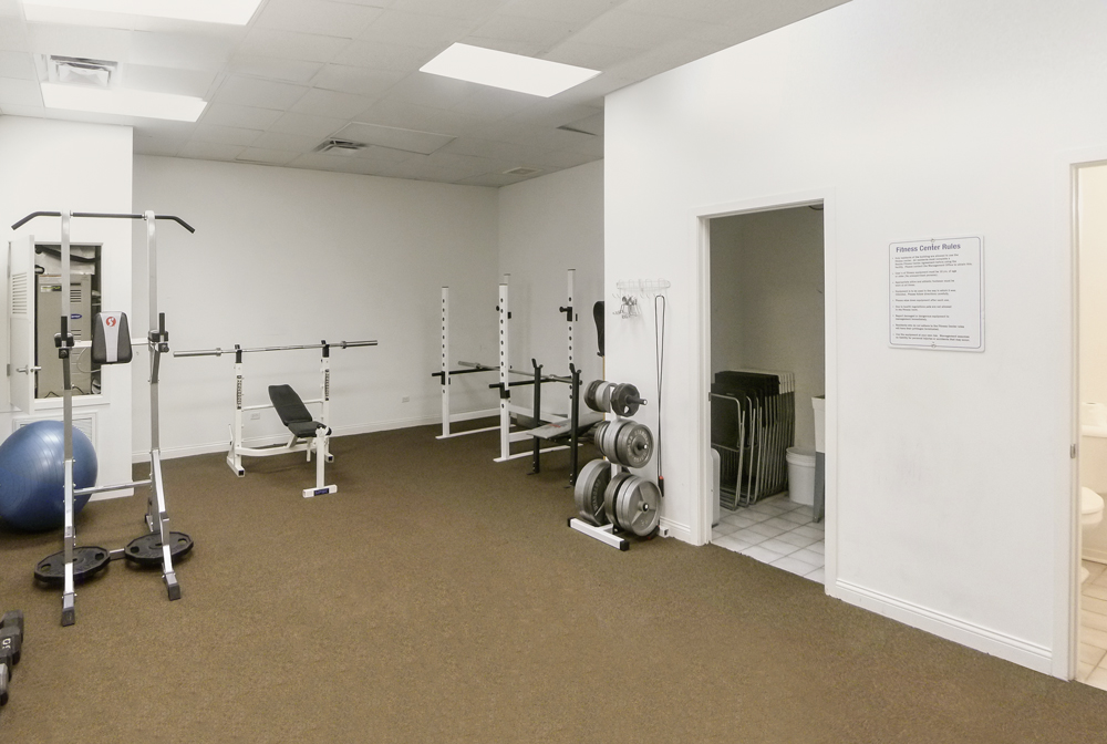
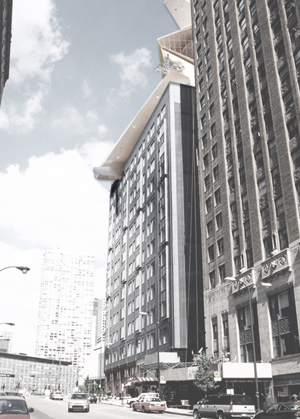
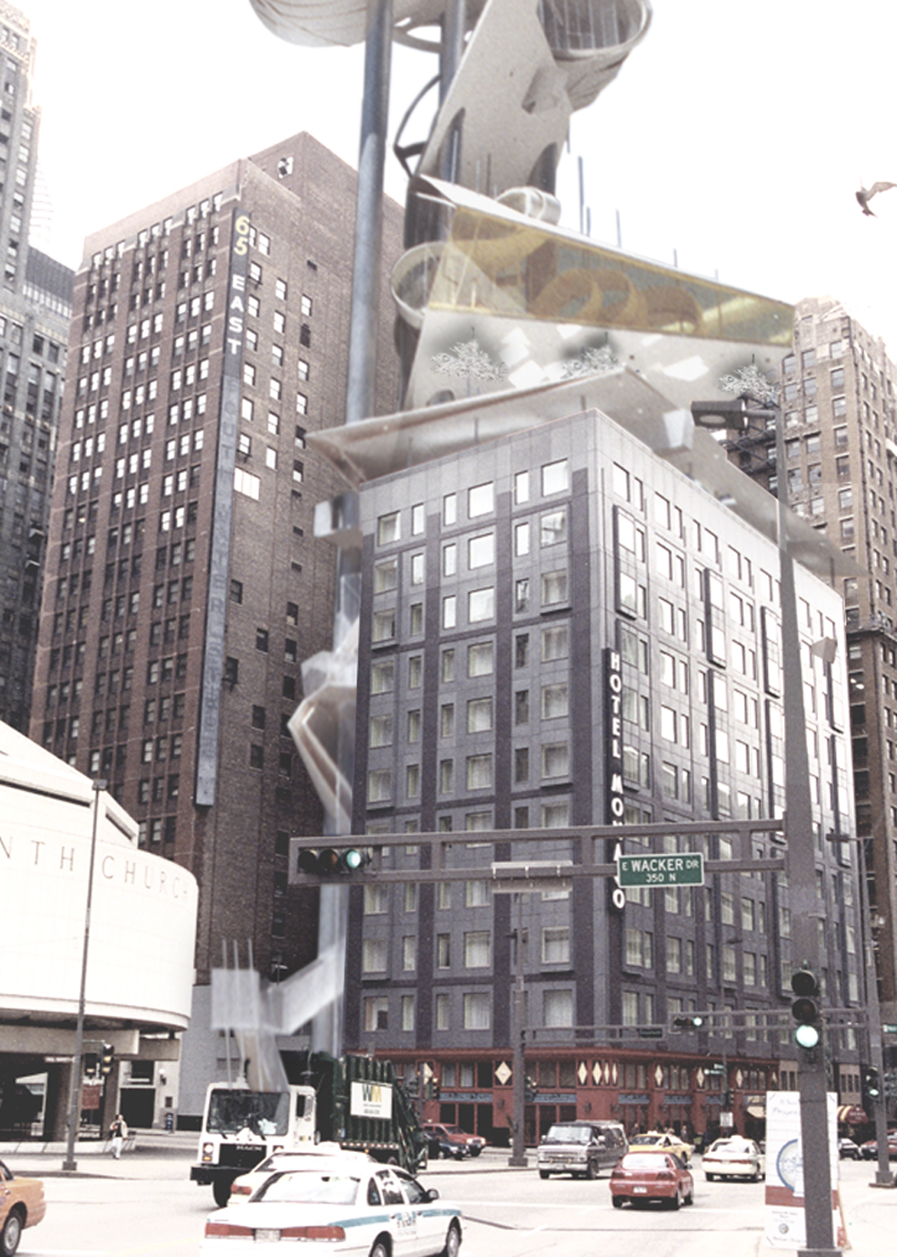
Four years after successfully renovating the common areas in the historic Locomobile Loft building, we were invited back to re-design its only amenity; an old, secluded fitness room. In contrast to the previous improvements of the common areas, this hidden space stood out as a derelict with little known use. Thus, our intent to make this program relevant again focused on augmenting the connection between the building tenants and their shared living place.
Strategically, the fitness room needed a revised entry sequence, distinguished from the existing unit doors. In creating a large cut and a subtle angle within the common wall, we formalized a polarizing entry along the context of the narrow, and long hall. Within this formed transition space, a large glass door acts as an aperture, providing a greater sense of comfort and security from within. On the inside of the room, we re-appropriated the non-fitness related functions, stacking them upward inside the reflective core. This new found verticality, literally, created much needed breathing room, while gaining the extra area at the main floor. An energy recovery ventilator was part of the new integrated mechanical system, offsetting energy use while enhancing the air quality for all.
A modular, undulating cladding strategy was employed as an exploration of how one comfortably occupies an inside corner within a small cube-like room. As a result, the perimeter becomes more flexible with greater freedom to place objects and supporting functions along the continuous wall. We utilized CNC technology for increased efficiency and fluidity, highlighting quality and craftsmanship, which the prior space severely lacked.
This dynamic space is a new chapter to building’s historic existence, and with the tenant’s increased awareness of improved spatial qualities, we hold confident it will withstand time and add an intrinsic value for all to share.
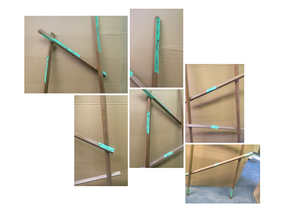
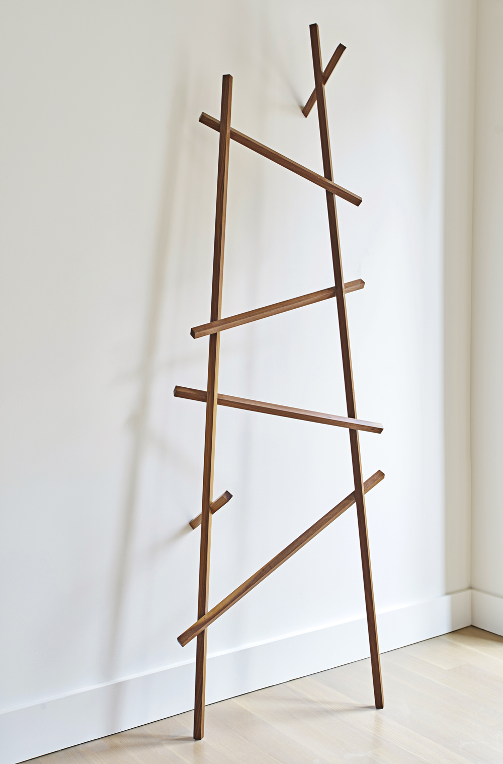
Symbi is a functional object with a desire to serve your daily hanging needs. Its other purposes is to offer visual pleasure as it leans gently against the wall, casting shadows on the adjacent surfaces. Initially designed as a Walnut and Maple composition of overlapping parts it can be modified to harmoniously reside within your dwelling.
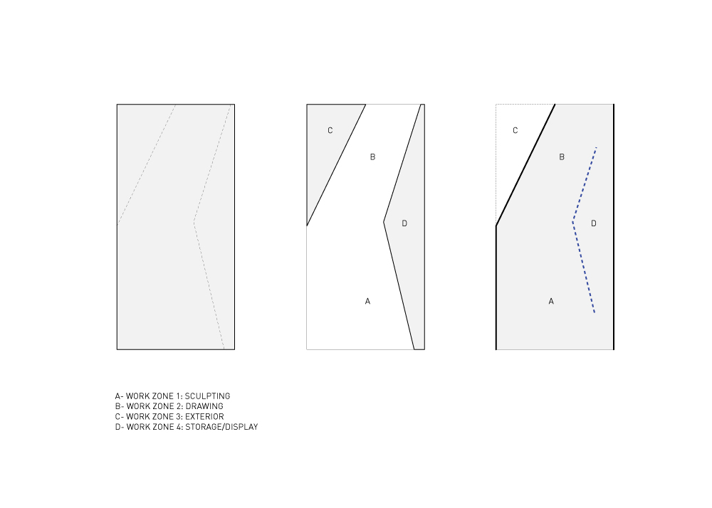
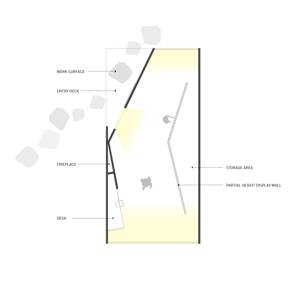
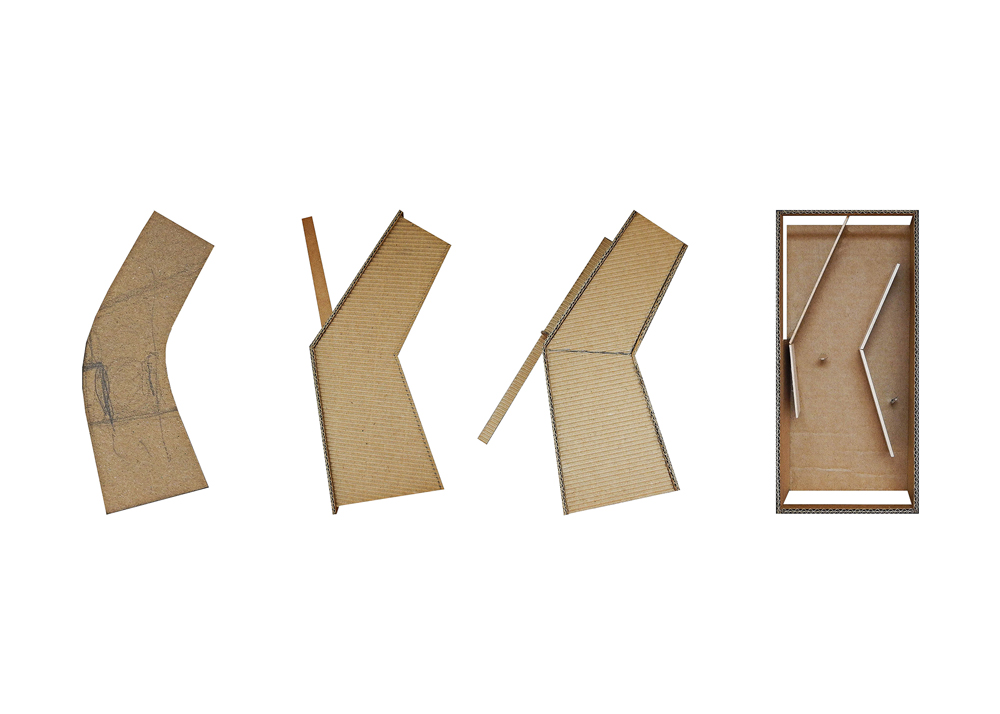
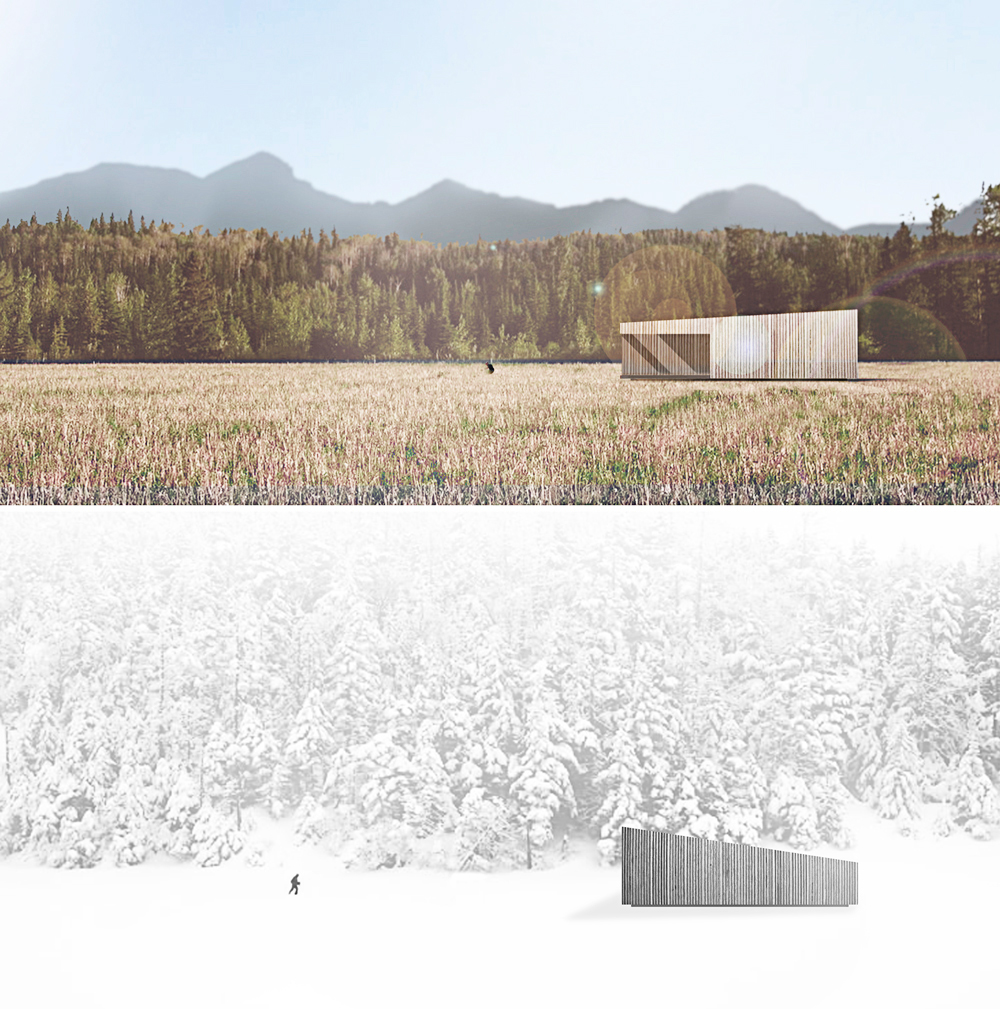
Given the prominence of the Vermont’s mountainous landscape, this artist studio is configured to maximize ones connection with its surroundings. From one end of the space capturing the views of the bolder tree lines and at the other the majestic mountain range.
The primary work area is located within an implied viewing tube of inspiration, defined by partial height walls inside a rectangular cedar clad enclosure. The plan contains double-sided display walls, desk space, distinct working zones and back of house storage, all within one open space. A wood-burning fireplace exists at the hinge point inside, keeping the space functional during the cold winter months.
The studio, though small has multiple states of existence. The dappling of light, dynamic casts of shadows, the sound of rain hitting the metal roof, the feeling of cross breezes are the materials of inspiration for the artist in his domain.
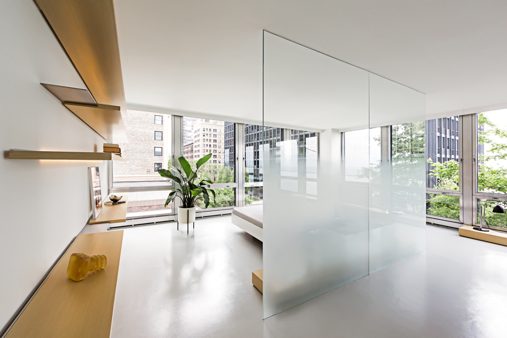
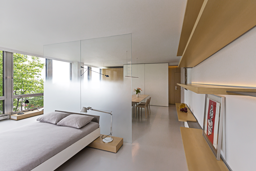
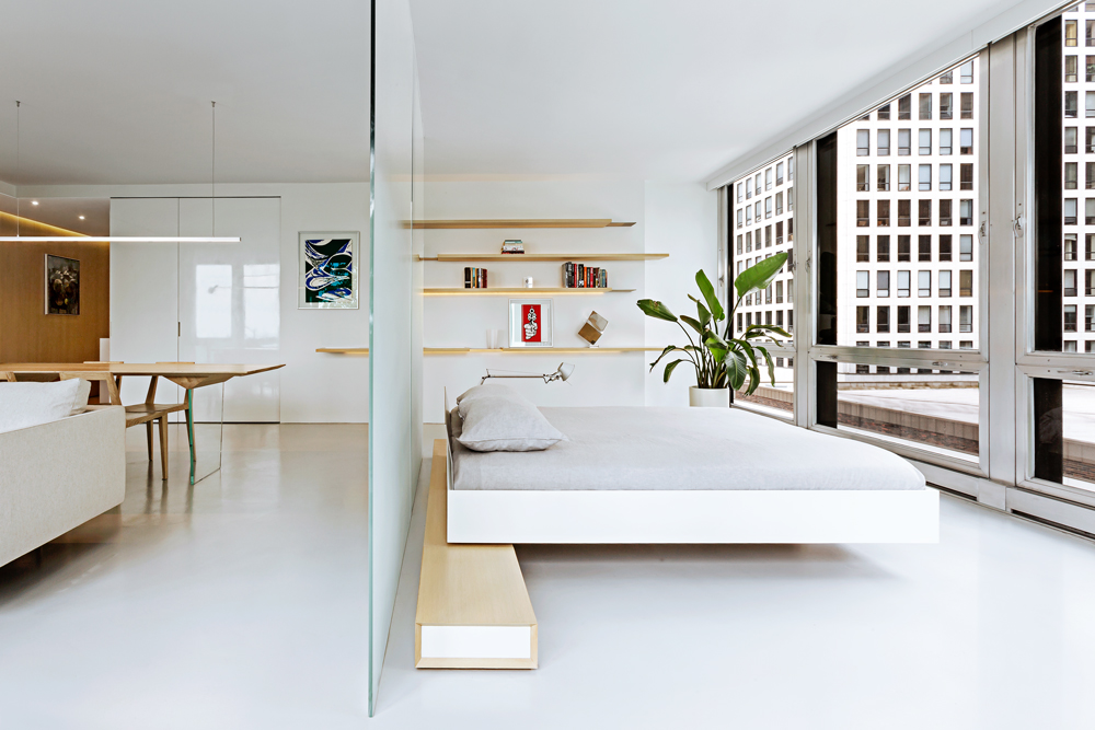
The renovation of this lower floor apartment began with a clear intent, to achieve unobstructed views towards the lake from all vantage points within the unit.
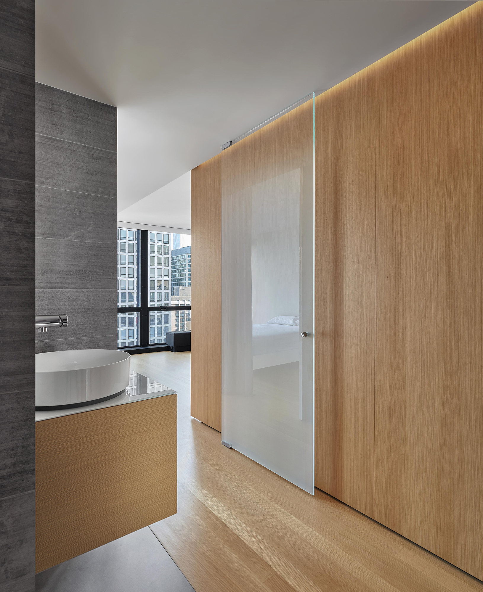
First, the sleeping and living arrangements were re-configured and separated with a floor to ceiling glass wall. The inherent properties of the material enables one to see the lake at any given time, either in the reflection or directly through. The applied gradient pattern in the glass adds a sense of privacy within this fully open plan. To further maintain the sight lines, we hid the large living clutter, integrating it within the perimeter demising zones. Behind what appears as a continuous wood wall, an abundance of storage space is allocated, while the floating shelves and low profile millwork add a sense cohesive stitching between the various living zones. Even in the selection of the furnishings we tried to keep the views clear choosing elements that are not opaque or solid. In the kitchen, the deepest and darkest area of the apartment we borrowed natural daylight through the bathroom space, by creating a direct aperture towards the lake through the layers of “smart” glass enclosure in the shower wall.
As a result, we achieved our initial intent, while paying subtle tribute to the building’s refined clarity and to its architecture master of less is more.
A Chicago developer tasked us to create a new office atmosphere within an existing single story masonry shell. Our strategy was to place emphasis on the intrinsic character of materials used to build this simple box. First, we needed to uncloak its forgotten beauty, hidden behind the layers of old gypsum skin. Once the perimeter was brought back to life, we kept clear of it, and began to introduce the components needed for an everyday “office use”.
An oversized communal desk with integrated storage was placed in the center of the room. Structurally supported by two thin perforated metal screens, the desks appear to be cut into smaller segments, defining multiple work areas needed within the single shared space. These striking sheets of metal are designed to be visually intriguing, enhancing the raw qualities of an existing skin. To further separate the office from its adjacent zones, we introduced a continuous black “binding wall” snaking through various programmatic needs. Storage, mechanical closet and a private office are carefully sculpted within this single move. The lack of natural daylight in the space was solved through the placement of large panes of glass as separating walls, borrowing light and adding views throughout. In challenging the notion of private space, a sense of community is achieved, providing a collaborative environment within a shared workplace. Now the occupants are more connected with their immediate surroundings and feel much less divided and contained.
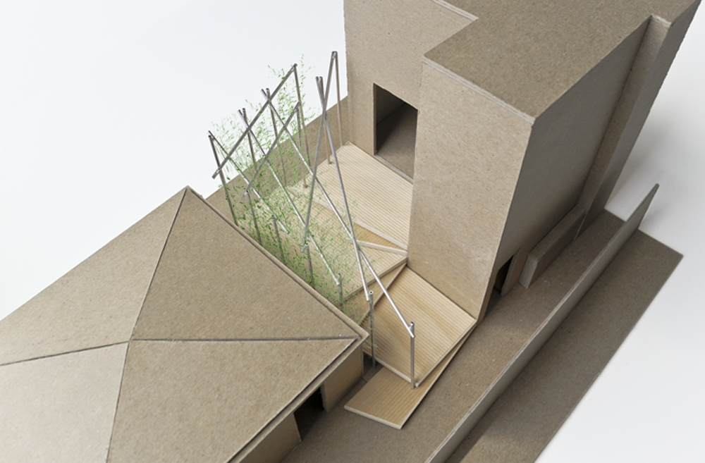
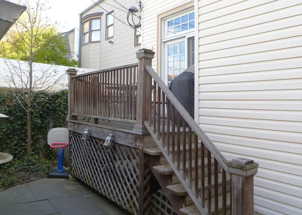
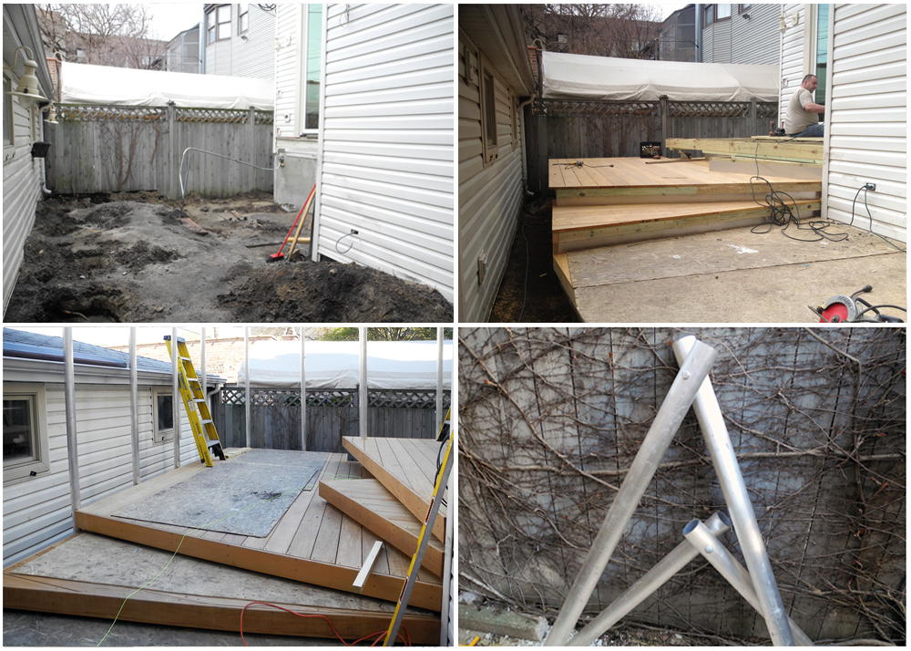
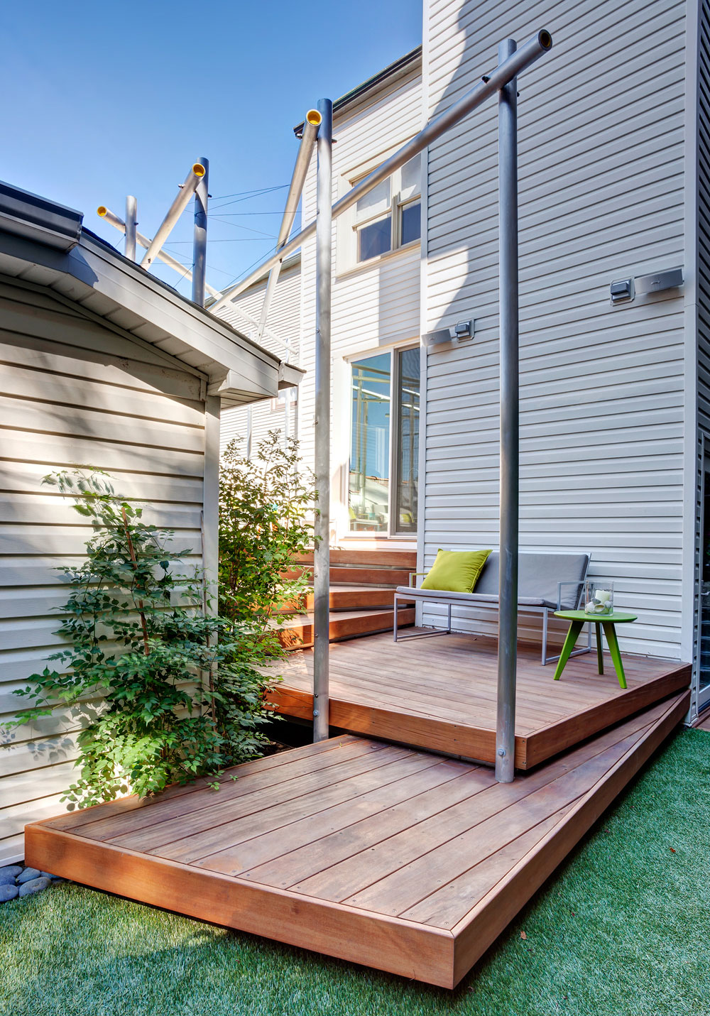
The solution for the renovation of this small, narrow exterior space was to create a multi-functional outdoor room.
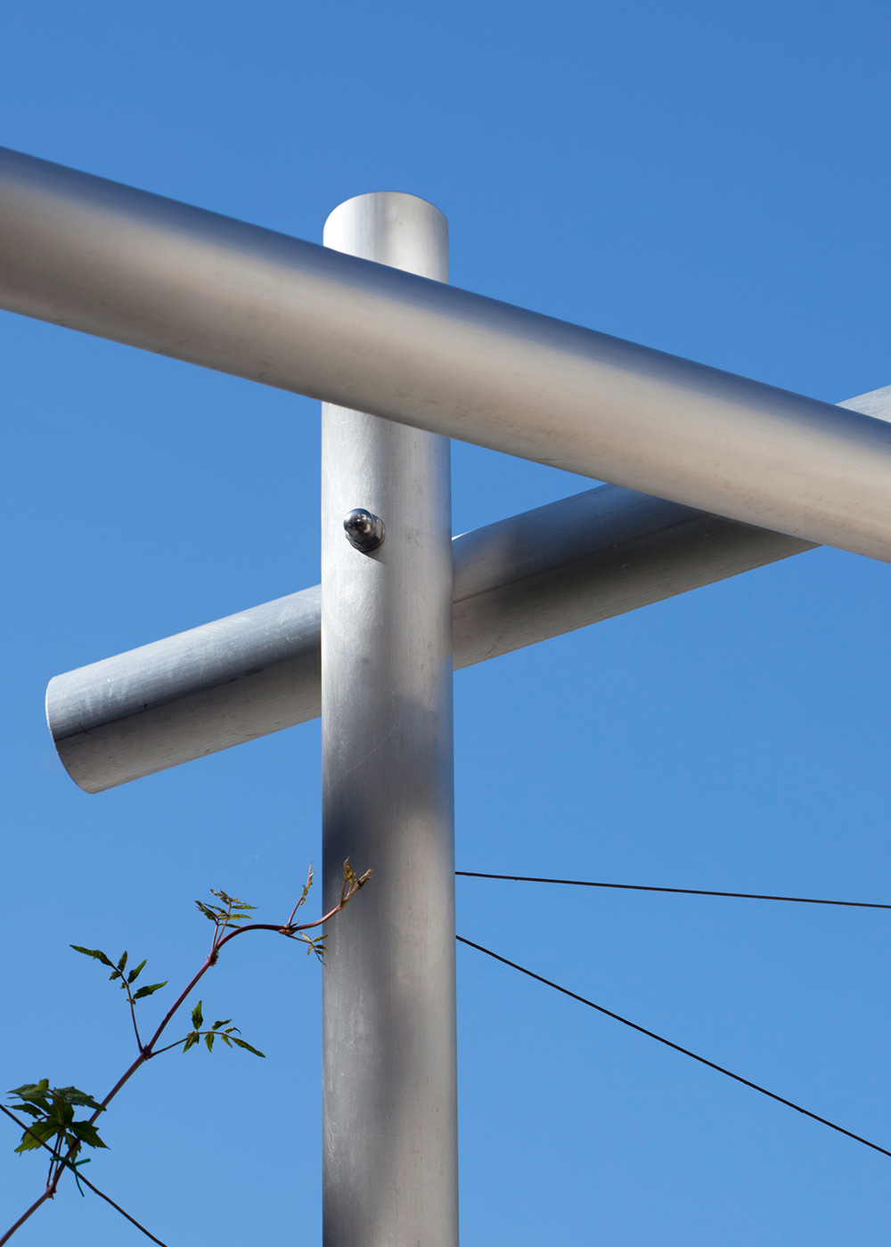
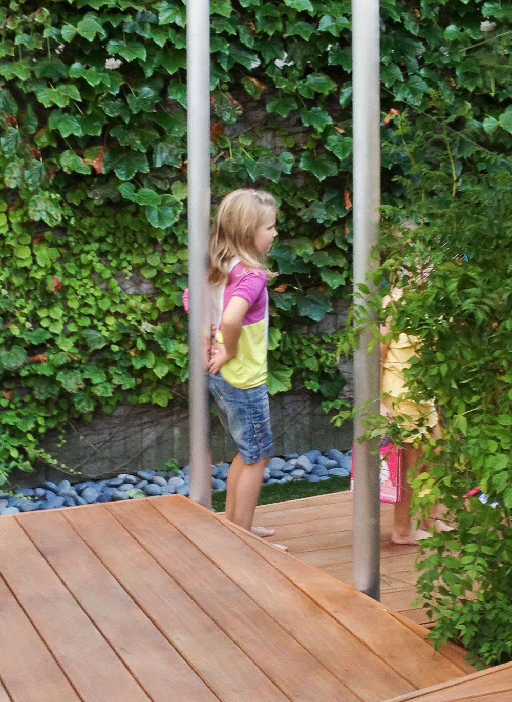
To maximize the use of this tight area, a series of cascading landings were introduced to subtly separate the functions of outdoor eating, relaxation and play. From the inside of the house, the exterior room was designed to appear as an extension of the interior. As one steps outside, they are enveloped by the surrounding trellis. Its aluminum tubular structure further reinforces a sense of enclosure, complementing the geometric fanning of the stacking decks. Once the vining plants make their way up the diagonal guide wires, they will provide additional shade, offer greater privacy and enhance the experience via the aromas of the flowering plants.
Throughout its lifespan, this 20th century Chicago greystone, had gone through various modifications, primarily at the rear, where the kitchen is located. This resulted in small, compartmentalized spaces that were dark, awkward and limiting in circulation. The client asked us to address these issues and to rethink the space so that it can easily absorb the daily family activities.
Through the removal of most of the interior walls and the strategic placement of the living elements, we created openness and added an abundance of natural light. In doing so, we formed opportunities for movement throughout the most active part of this home. To further underscore the circulation, emphasis was placed on the visual and physical connections between the newly-defined kitchen, dining and family areas. The result is a light, contemporary expression placed in subtle contrast to the rest of the home, marking a significant moment in the thoughtful evolution of its interior.
The second part of our involvement was to create a guest suite in the unfinished part of the basement. As with the renovation to the upper level, the theme of continuity persists. However, the individual challenges of this particular space resulted in a slightly different expression. In configuring the space, we worked around the existing structural elements, incorporating them into the project to every extent possible and finding design opportunities amidst the awkward quirks. The uneven foundation walls, sloping floors and old, painted beams were the catalysts for the precise solutions that now appear coordinated and well arranged. In this simple juxtaposition of materials, color and natural light, we were able to compliment the natural beauty of some of these hundred-year-old building components, making the newly created guest suite feel as an oasis from the rest of the home above.
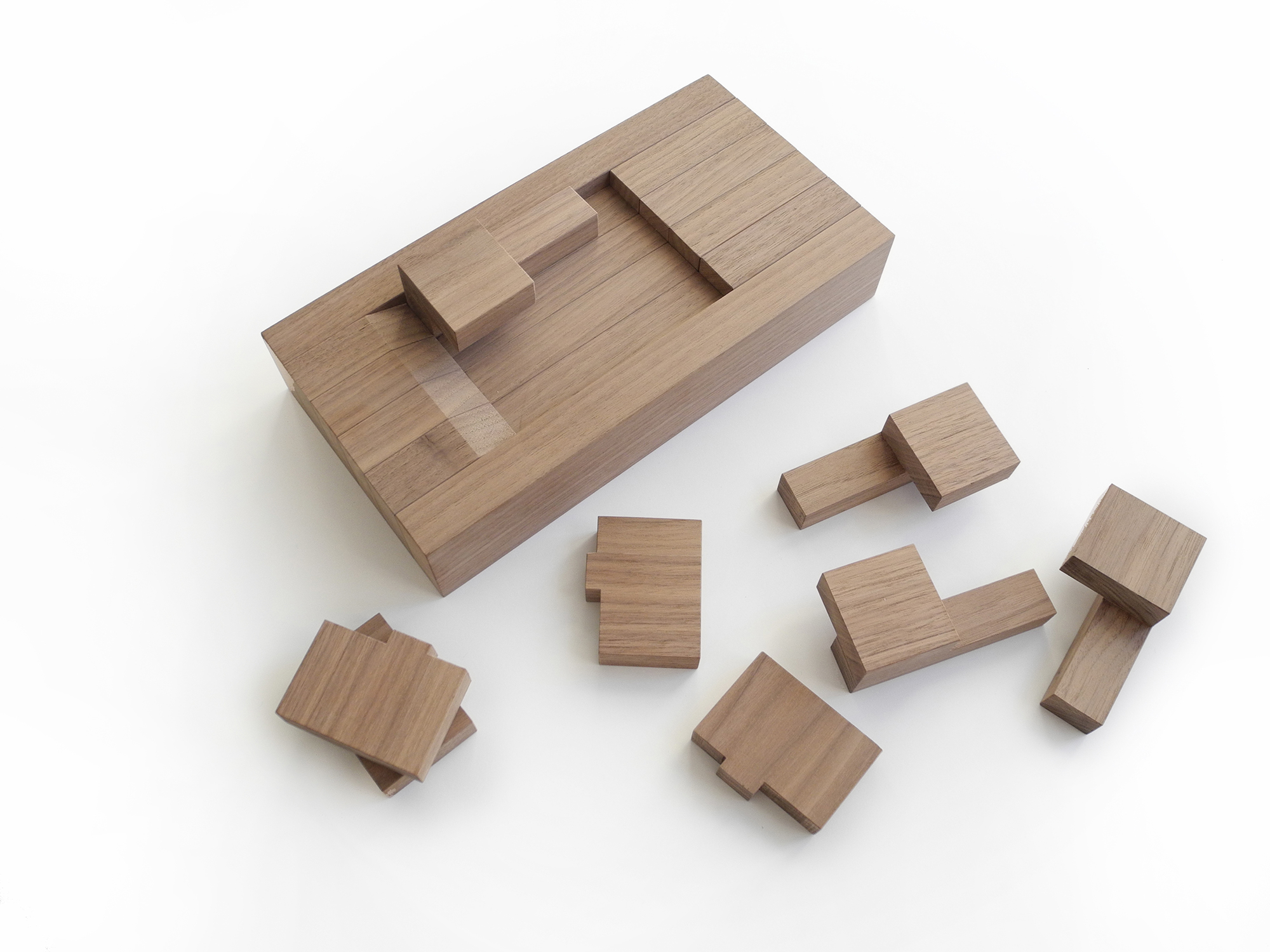
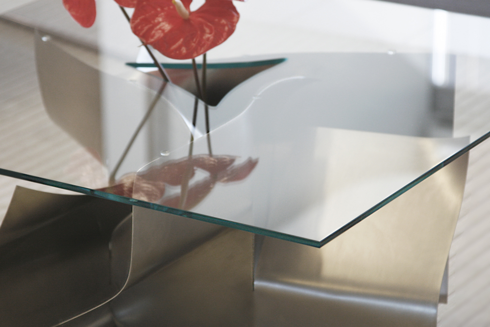
This coffee table base is designed as a sequential step-by-step assembly logic using three flat, rectangular sheets of material. The interlocking of the three discreet planes creates a triangulated form which, when subsequently bent, attains a rigid structural expression.
In order to achieve a functional purpose for this table, a rectangular piece of glass is placed on top of the base. A dialogue between the sculptural base and the rectangular top is created via the cutout within the glass. Mimicking the profile of the structure below, the resultant void provides a functional area for a flower vase. Fresh flowers emerge out of the base, complementing the organic nature of the table form.
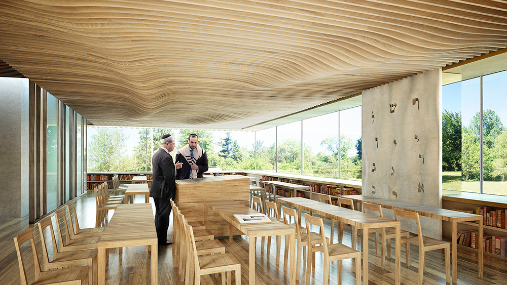
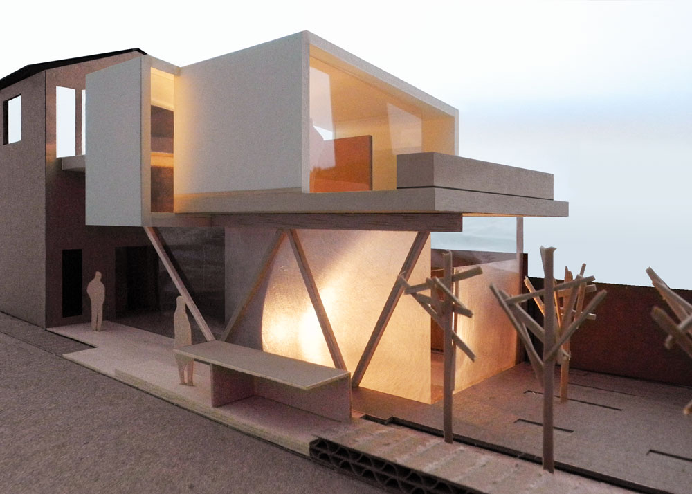
In establishing a new chapter within the Jewish community of Toledo the design for the Chabad House and its multitude of programs starts with the planning strategy for the overall site. The main building program is allocated at the highest point on this long narrow property, centrally placed from front to back. As a result, the building becomes a threshold between the outward public zone and a more secluded, private area beyond. To respect the low profile of the surrounding residential neighborhood, the educational program of the complex is nestled partially below grade and screened with native vegetation. This site specific approach enables the overall structure to appear as a one story volume from the main pedestrian street. Multiple access paths are integrated throughout, connecting the Center’s programs in a meandering configuration. A field house is placed adjacent to the main building, framing an intimate outdoor gathering space at the west end of the site.
The overall building form is the result of a rotation in the upper programmed volume. This shift allows the Center to face directly east, optimizing the direction of daily prayers. This configuration enables the complex to appear as though it opens-up and reaches-out, similar to Chabad’s role within the Toledo community. To further reinforce the inviting character of this facility, the proposed façade treatment softens the building’s rigid form. It evokes a sense of change and gentleness via the interplay of light and shadow on its rippling wood-clad folds.
On the interior, the main building’s program is arranged in such a way that each element functions as an independent part. Each takes part in defining the large multipurpose space, yet this organization allows for smaller functions to coexist within the overall open room. Colorful sliding glass partitions are inserted for greater visual intrigue and flexibility in subdividing the spaces further. In providing an uninterrupted visual connection with the outside combined with an abundance of daylight from all directions, a desired feeling of a spiritual home is attained. Providing a sense of place for the constituents of Chabad.
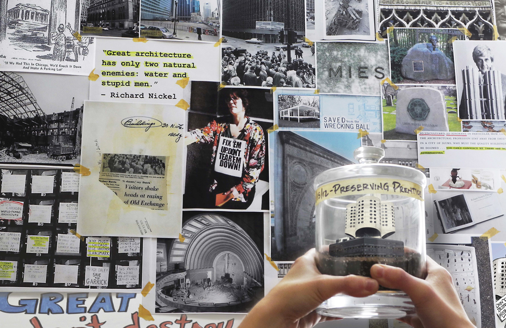
“Great architecture has only two natural enemies: water and stupid men.” – Richard Nickel
The government-endorsed push to demolish Prentice is a significant current event. Sadly, however, it represents just one in a much longer sequence of short-sighted actions. These tragedies have been repeated by a city which has all-too-often prioritized the rapid development of the ‘new’ over the thoughtful integration of the ‘old.’ Too many times in Chicago’s short history, significant buildings have been hastily razed, leaving only quiet echoes of the great lessons they once offered. Many have fallen; few have been saved, but the sad and tenuous appreciation for Chicago’s architectural history remains unchanged.
Our image does not aspire to answer the difficult question of how to breathe new life into this magnificent structure. It is instead a thoughtful gesture, hinged on history, meant to fuel the fight to keep it alive. How can we begin to assign new purpose to a building without first securing the commitment of its primary stakeholders? Before we speculate - before we create - it is imperative that a dedication to preserve our city’s history is elicited from these parties. They must realize the value of the treasure they hold in their hands and it is our job, as advocates for preservation, to harness all resources at our disposal to convince them. It is only then, with all parties devoted to a singular purpose, that the creative forces of the design community may be channeled into a newly-imagined future for Prentice.
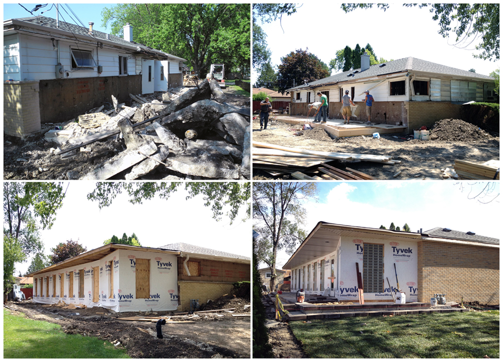
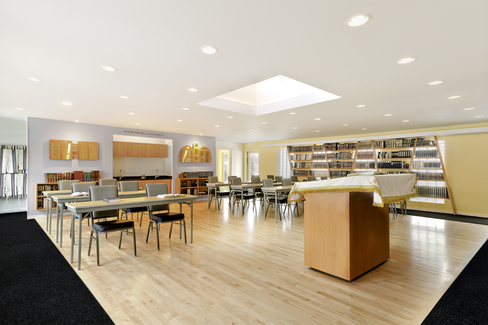
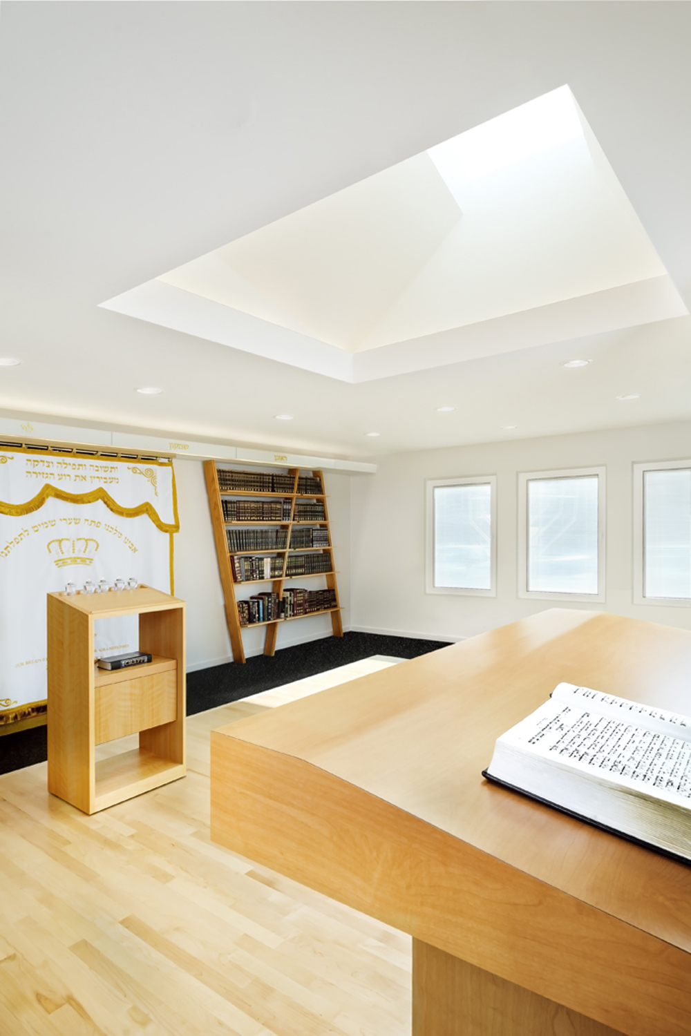
This renovation and addition to the Chabad FREE of Niles was driven by the need to improve and update a religious facility which had been operating in this 1950’s single story house for over 25 years. Through various previous renovations the building preserved its residential character; however, with the new updates and enlarged footprint this former residence now meets all the necessary requirements to function as an institutional facility.
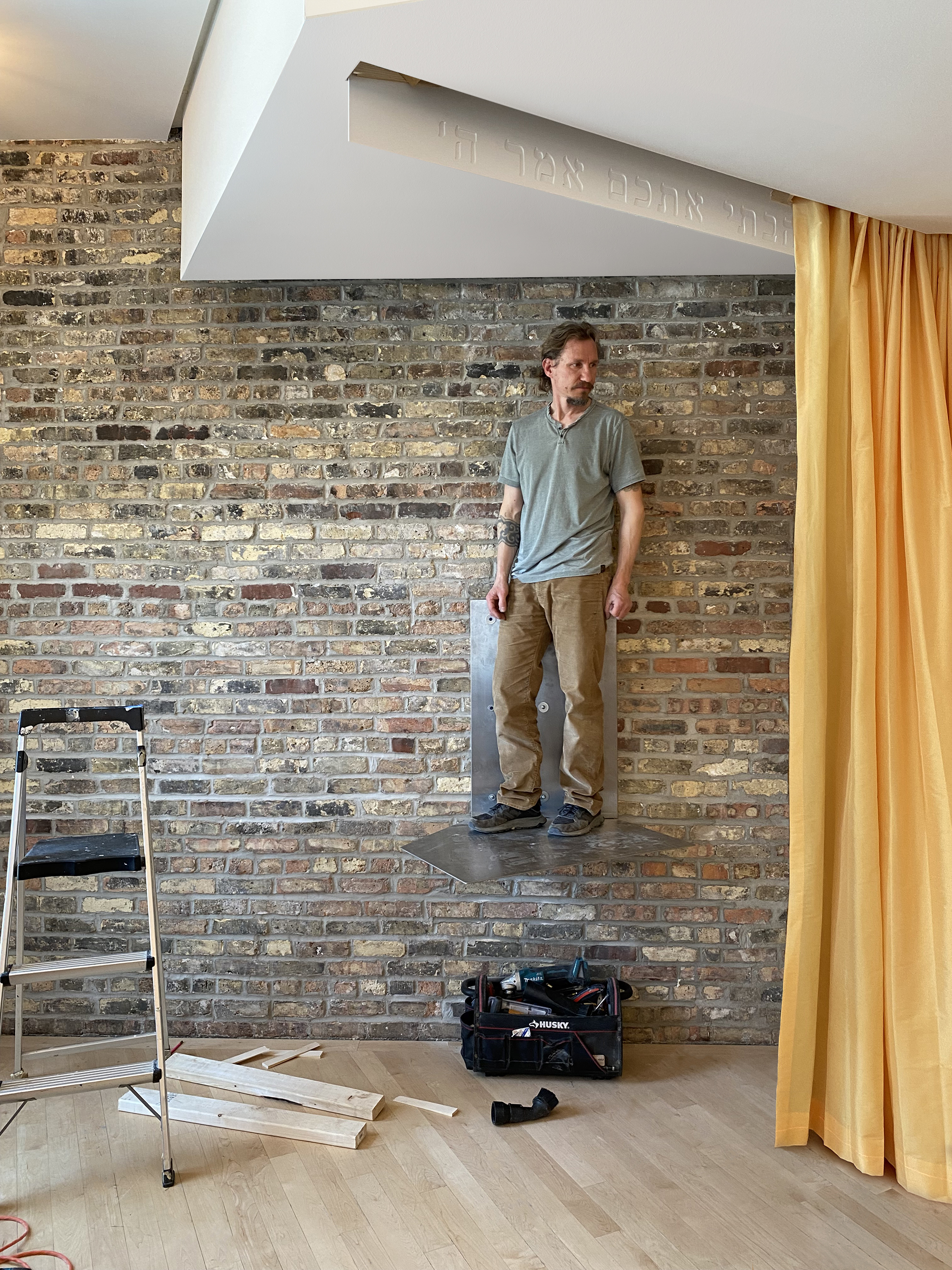
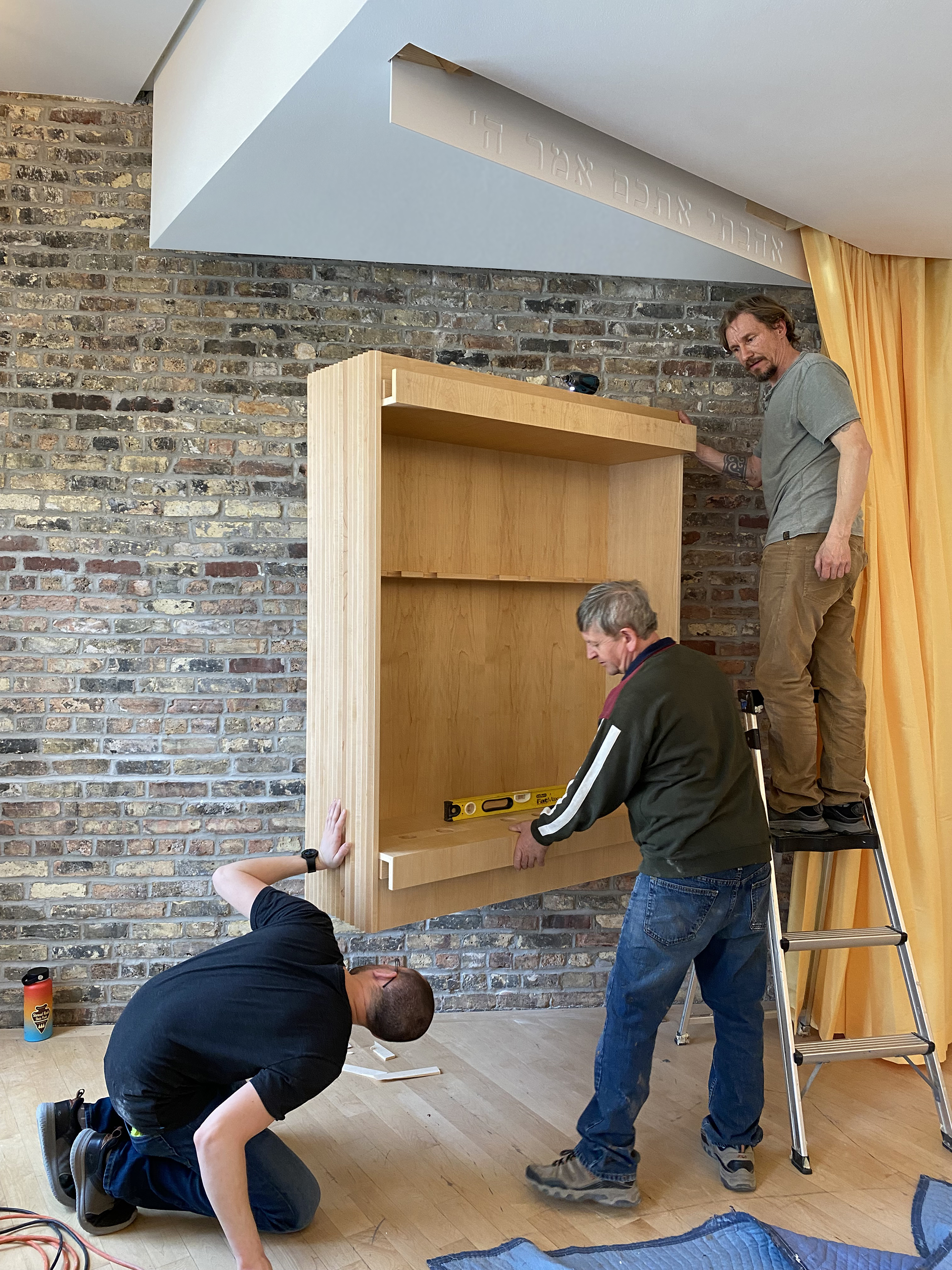
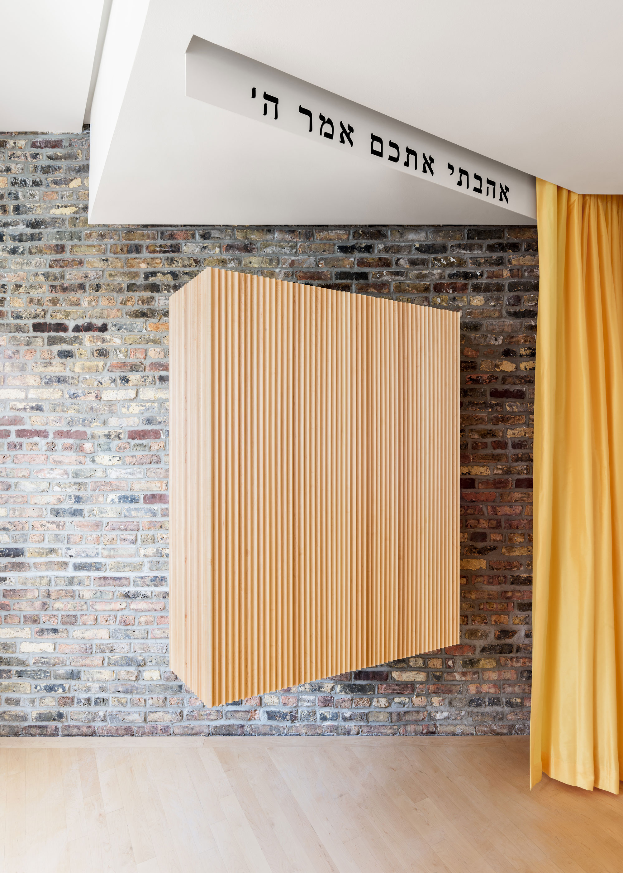
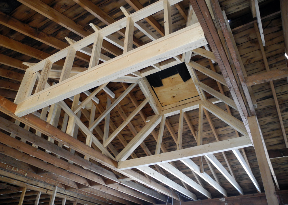
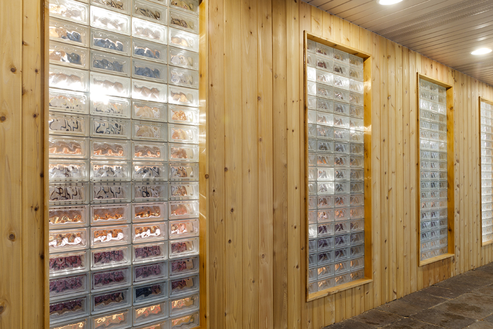
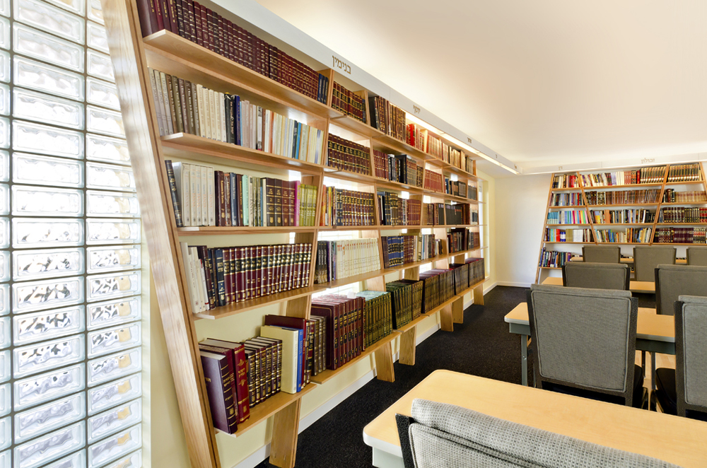
The organization of this newly renovated building was thought of in three parts, two service zones that flank the sanctuary space at the east and west sides. This resulted in a square plan for the main gathering space, providing greater flexibility for various functions and events. A new large skylight was inserted into the space to add much needed ceiling height for the ritual raising of the Torah (Hebrew Bible Scroll) during prayers. Book shelves wrap the space and are arranged in a diagonal pattern, subtly echoing the lines in the Star of David. Their placement is meant to be a reminder to the occupants that this religious center is not only a place for prayer but a sanctuary for learning as well.
Because the rear of the building is in close proximity to its neighbors, we wanted to reduce the scale and appearance of this newly added structure. It therefore sits in subtle contrast to the existing building configuration in geometry and material and is meant to read as an insertion rather than an addition. What appears as a kink in the rear façade, is a response to a strict build able area requirements. This architectural gesture forms a new entry and re-appropriates square footage to the zones in the building which need it more.
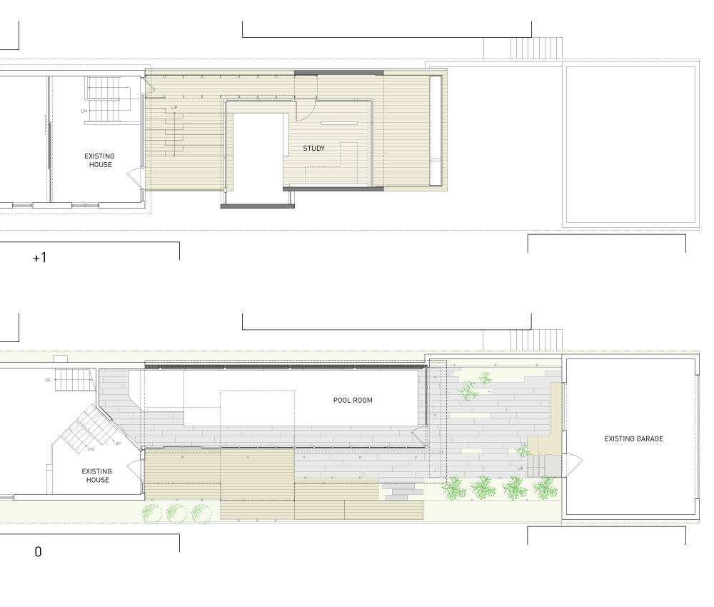
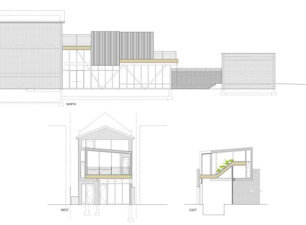
Tucked discreetly into a small Chicago block, this rear addition addresses the coexistence of two primary design criteria - integration and detachment. Integration drove the ground level, where an existing masonry, dark, pool room and a cluttered exterior courtyard were opened-up and then stitched back together to produce one contiguous interior/exterior space. By introducing new full height exterior glass walls for the pool enclosure and placing diagonal steel structure on the outside of the building envelope, we were able to achieve a sense of expansiveness within. Now, natural light is able to pour in at all times of the day and the owners can take advantage of a renovated landscape. Appearing to hover above, the brad cantilever ceiling plane not only adds to the visual extension of the room, but also serves as a desired covered walkway between the house and the open rear yard beyond.
Atop the pool, a mixed-use upper floor is formed, and a stepped garden links the upper level of the existing home to a new office space. Sitting perched on a plinth clad in Brazilian Ash (Garapa), the work space is wrapped in standing seam zinc panels with full height glass walls defining the other 3 sides. While seated at his desk like a captain of his ship, the connection to the outside is unobstructed. The neighborhood appears to be brought inside with vegetables and flowering plants cloaking the periphery. Light and air fully permeates the space and with a few extensions of the exterior materials being pulled inside, the office area accomplishes a greater sense of visual expansion.
The integration of this unique program within the constraint parameters of a city lot resulted in new areas for gardening, work and refuge.
This corner loft in a Las Vegas high-rise was purchased by a bachelor with the intent to display a large collection of paintings, varying from the 1950s- present. In contrast to the empty feeling of the existing space, we were captivated by the client’s unique collection of artwork and the stunning views from this high floor unit.
The decision was made to completely build out the viewing perimeter in order to transform it into one continuous, floating picture plane. As it wraps the existing interior, a series of ocular zones are created at each of the window openings, adding discreet spaces within this new wall. To re-capturing some of the lost square footage due to the new built-out wall we incorporated household functions within its depth at various strategic locations. This loft is further transformed with a raised wood platform, running continuously around the entire Northwest perimeter; it subtly defines a new zone within this seemingly open plan.
To underline the openness of this apartment, the majority of the existing partitions were removed. The entry sequence is reconfigured and is clad with black metal door panels enclosing two service areas. These large panels can be positioned in such a way as to provide a common hand washing area or a private second bath.
Formerly segregated, the main sleeping and bathroom areas are no longer visually disconnected. With the elimination of the existing partition wall and the removal of the dropped ceiling over the bathing area, more natural light fills the space. As one steps into the shower, the mountains at the North are in clear view and at no point are you disconnected from seeing the outside world. Separating the sleeping area is the new screen wall. Constructed from hanging ropes and varying wood end pieces, it appears dynamic and light. Its intent is to provide a sense of enclosure amidst an open plan while echoing the undulation of the desert landscape beyond.
The design for this dining table emerged from a desire to create an elegant and functional eating surface, intended to reside within an open-plan loft apartment. Because the table will be a center piece that will be seen and interacted with from all sides, achieving a sculptural appearance was of priority. As such, our goal was to create a dynamic, clear-span structure that is also thin and elegant in appearance. The use of triangulated origami-like surfaces made up of visually-separated materials provided the intent for which we were searching. A continuous shadow reveal in–between the sandwiched planes creates a linear void that can be traced from the foot of the table to the thin groove along its top. The primary table structure is integrated into the form and is inset from the outer edge. The middle diamond-shape element, which is primarily seen while one is sitting, acts as the binding structure between the two symmetrical halves. This not only provides the stability for the table but also adds to its overall sexiness.
This project mandated the division of an awkwardly-configured bedroom into two distinct sleeping quarters. Due to open character of the loft space and the existing tall ceilings, we approached the solution with the understanding that the new configuration would ultimately result in relatively small yet vertical zones. Thus, we chose to bring down one’s visual perception of the existing space and created a “binding” separation, while dedicating one window within each of the new rooms.
The new enclosure for the main sleeping zone is meant to read as an inserted-mass. After entering the space through a concealed door, one realizes that the mass is just a simple composition of two delicate, L-shaped walls. One of which is clad with alternating vertical
oak strips providing visual depth within. Both natural and artificial light brings out the resulting pattern and the intended articulation of the clad wall.
Ultimately, the small intervention has transcended the simplicity of its function (to separate) to become the main binding-element of the loft space, stitching together surrounding spaces and blurring the boundaries in between.
The Locomobile Lofts, located in Chicago’s Historic Motor Row on S. Michigan Avenue, is a building rich with historical narrative. The precursor to modern day automotive dealerships, the building was once used for the production, sale & distribution of Locomobile vehicles. When converted for residential use in 2004 by a Chicago Developer, the richness of the building’s history was cloaked with layers of conventional thought and a pallet of materiality devoid of any connection to the building’s industrial spirit.
In 2010, we were commissioned to create a new spatial identity. By reconfiguring the existing boundaries and establishing new thresholds in the sequence of movement, the renovation of the common spaces tries to marry the historical identity with the building’s present use. Moreover, it seeks to reemphasize the urban presence of the building by empowering the entry lobby, creating a bold, yet respectful presence along Michigan Avenue. By implementing new perforated wood cladding around the interior perimeter of the entry vestibule, the space becomes a discreet, welcoming threshold along a larger cohesive sequence of entry.
Large, backlit address signage illuminates the space, projecting its colored light onto the street. The rhythm of new floor & wall finishes, together with varying ceiling heights, complements an elaborate arrangement of new lights and wood panels. With the introduction of these new elements, the imbalance in scale between the former industrial function of the building and its current residential use is mediated. This renovation adds a new chapter in the historic timeline of the Locomobile building.
The newly renovated single-story space inscribes the functions of living, entertaining and yoga into a traditional suburban home. The Clients, having lived and traveled in the eastern world, aspired to transplant the character of Southeast Asian living into their home. Rather than forcing the marriage between these two dissimilar architectural languages, the choice to disconnect each from the other created a world within a world.
The fluid arrangement of spaces and the tectonic assembly of materials are in contrast to the rest of the house, thus providing a greater sense of transition from the everyday indoor environment. The conventional language of privacy enclosures is replaced with screening elements, typically found in the Eastern world. The partial height screens provide substantial visual privacy yet allow for light and air to permeate through the resultant voids. Drawing on the horizontality of plywood, the walls are assembled to appear woven. Each rectangular piece of Baltic birch plywood is placed individually, not unlike the tedious assembly of the hand-crafted water hyacinth furniture housed in the space.
The ceiling soffit adds an organizational framework between the vertical variation in the ceiling height and the overall plan. Its geometry is derived from the boundaries of existing infrastructural elements and runs counter to the direction of the spatial flow. The new vegetation embraces the walls, transforming the space and in time, enriches the planted environment.
This small studio unit was designed as an austere pallet of overlapping spaces and expressions. Subservient to the Client’s unique portfolio of Pop Art lithographs, the functional elements of open apartment living are hidden from view, allowing one to feel as though they’ve stepped into a gallery space wired for living rather an apartment space equipped to display art.
The unit’s only aperture opens to the north, framing Chicago’s iconic Lake Shore Drive; a view which seams together the dynamic composition of the undulating high-rise buildings with the fluidity of Lake Michigan. The image of these two worlds drove the organization of the unit’s interior. The sculptural interweaving of form and space speaks of the incidental voids amidst the City’s oscillating texture below.
Alternatively, the Client’s art collection is choreographed along the space’s west wall, becoming a spectacle of tranquility, a moment of pause similar to the calm found in looking onto the lake. The rare 2-sided lithographs are wall-mounted on hinged frames, offering the Client and his guests the ability to take all fragments in at once. Each time the work is engaged, the configuration changes. Over time, the wall shifts, adjusts and moves, becoming a real-time expression of the interplay between the viewer and his/her surroundings.
Custom table for a private client
This sun-shading device was designed as an extension to an existing outdoor deck structure. The permeable canopy acts as a semi-enclosed space, creating a transition into the house while providing shelter from the sun. New cedar columns are spliced to the existing wooden posts and sculpted to give support for the primary beams tying back to the existing masonry wall. A lattice of thinner elements is placed perpendicular to the beams in an alternating rhythm, casting dynamic shadows on the incidental surfaces. The deep horizontal projection of the canopy allows for greater shelter from the harsh southwest exposure, shielding the lower level of the house in the summer months while allowing the low-angle winter sun to permeate the home’s interior.
A new prototype for smart living in Chicago, the R-3 House embraces the multitude of restrictions acting on the standard single-family site. Rigid building codes and strict zoning constraints combined with a growing cultural concern for environmental sensitivity set the stage for a design process rich with fruitful constraints. The house works within the web of these obstacles, treating them as cornerstones to a design process focused on producing spaces that efficiently cater to the nuances of a smart lifestyle.
The project prides itself on efficiency, both spatially and environmentally. It begins with an awareness of its immediate surrounding, employing an integrated assembly of sustainable systems, passive strategies and recycled materials. Spatially, the house reclaims the full extent of interior space, eliminating the redundancy of circulation space which allows spaces to flow seamlessly, one to the next. Public and private zones are interactive, the qualities of each reinforcing the character of the other. The perimeter envelope adjusts along its length, creating a blurred relationship between interior and exterior spaces. It results in a streaming interior, rich with natural light, unobstructed views and connectivity to the neighborhood that it resides within.
Link-In table is designed as a fully collapsible table. This table doesn’t use any form of adhesive, so every part of the table is crucial in creating balance. This product is made out of maple wood boards that are assembled to overlap each other, and glass that functions as the final element to lock the construction in place.
A new two story Jewish cultural center is placed on the periphery of a residential neighborhood hovering slightly above the ground. Two wings, one housing a synagogue and other classrooms, embrace the visitor as one approaches the building. The visual transparency of the facades creates a departure from the paradigm of introverted religious institutions. In doing so, the traditional ceremonies are no longer hidden from people of other faiths. Its vertical glass fin structure oscillates between transparent and opaque relative to the viewing angle of the user.
A concrete shell unifies the two wings, its form echoing the folds of the Talis garment used by a married man during prayer. The sunken base of the building opens up to the west and houses a large dining area with an adjacent bath house wing. The base of the building is meant to function independently of the main body above yet activities overlap regularly. The building embodies openness and embrace, welcoming people of all ages to gather, pray, learn and rest.
Custom jewelry box for a private client
Custom chair for a private client
Custom rings for a private client
The desired objective for the renovation of this unit was a sense of lightness and openness. A solution to create an awareness of the apartment perimeter was achieved by providing a direct visual connectivity between living areas via the use of transparent, translucent and reflective materials. New partitions are slightly pulled away from the existing walls, shadow gaps and variation in material depths allow the eye to focus beyond the initial surfaces.
The primary partition between the living and bedroom is built using two glass types. Translucent glass providing privacy to the bedroom sits atop a clear section which allows for an uninterrupted visual continuity between the adjacent spaces. The exterior glass wall of the apartment has an inherent reflective quality at night. To stress the illusion of a space flowing out into the city, emphasis was placed on the perpendicular orientation of the ceiling lights as well as the floor pattern. This reinforced a mirror effect, making the space appear larger than it actually is. Polished slate stone tiles in wet areas provide ease of maintenance and create a subtle zone differentiation within the open space. Direct rays of sunlight wash the rest of the cleft tiles evoking the natural beauty of the slate strata. In the warm months the slate stays cool to the touch while during the cold season it retains the heat from the building’s radiant heating system.
Custom stand for a private client
Custom table for a private client
Custom table for a private client.
Watercolor studies were created while traveling through Europe, capturing the dynamic qualities of space, place and time while exploring various watercolor techniques
Custom necklace designed for a private client
The Temple of Shared Imagination (TOSI) is a place of continuity, mystery and discovery. It is a space that evolved as an outcome or a response to the dense urban fabric found in the vibrant business district of Chicago’s downtown.
TOSI is an attempt to create a place where architecture evokes the imagination of its users by creating a link between the city and its people. It introduces a new architectural language into its context as well as a variation of extreme architectural experiences for its inhabitants.
During the evolution of the design, a pedestrian bridge emerged as a segment of a larger entity; a phenomenal link between inhabitants of the project and the street.